Square fonts as copy-ready AI prompts: flat block capitals with right-angled corners, pixel letters on a grid, glowing LED scoreboard dots, stepped Aztec carving and solid 3D blocks. These are prompts, not font files: type your word, copy, and paste into ChatGPT or Gemini, or generate it right away on FontVibe.
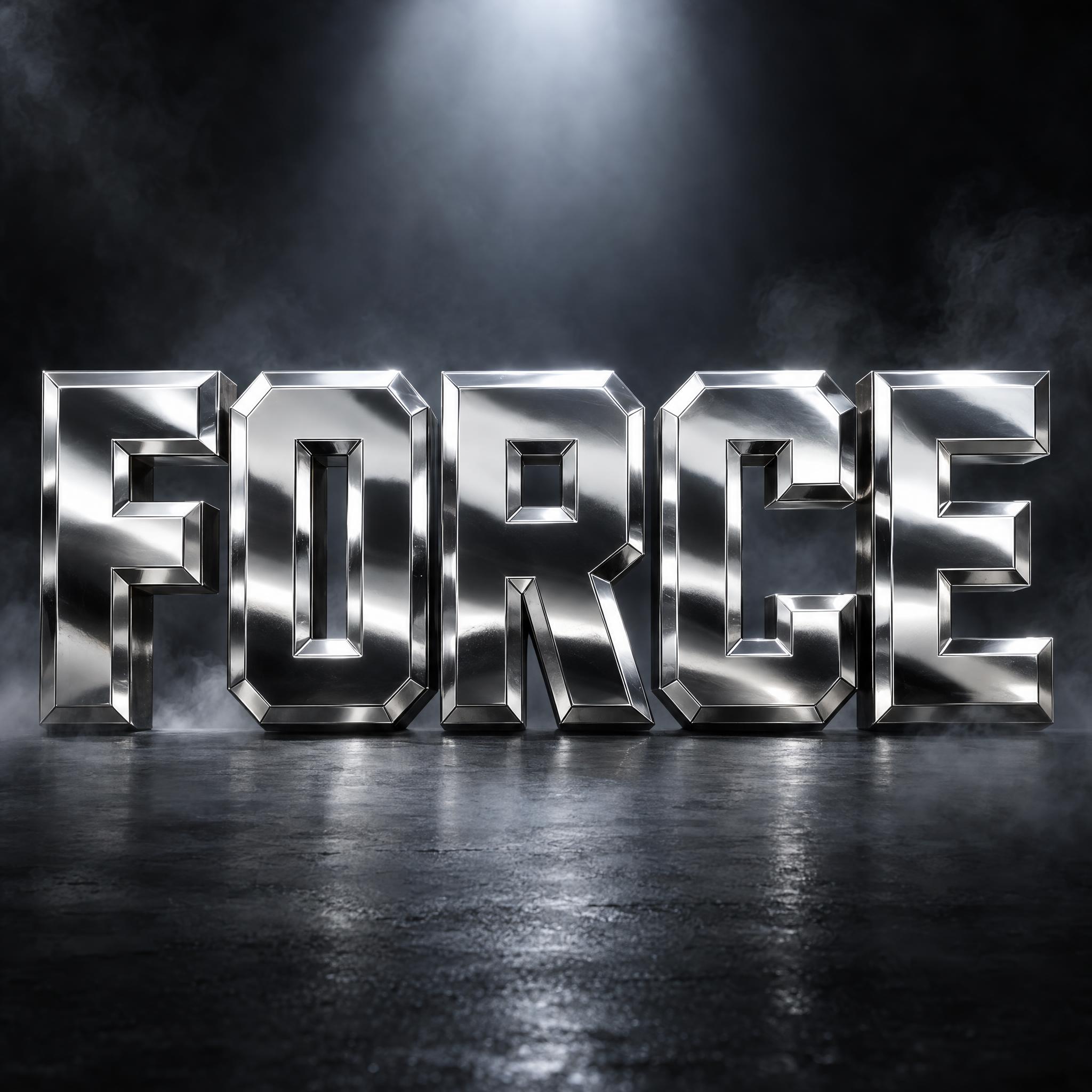
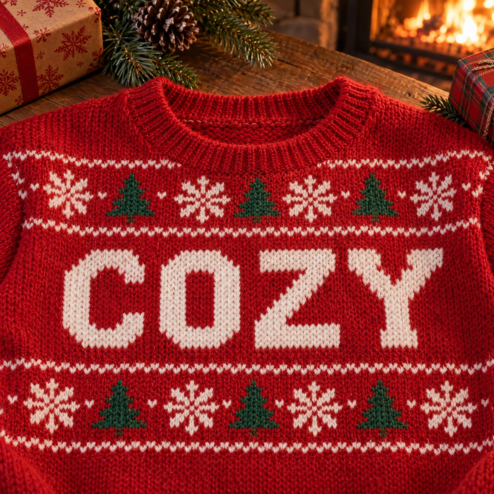
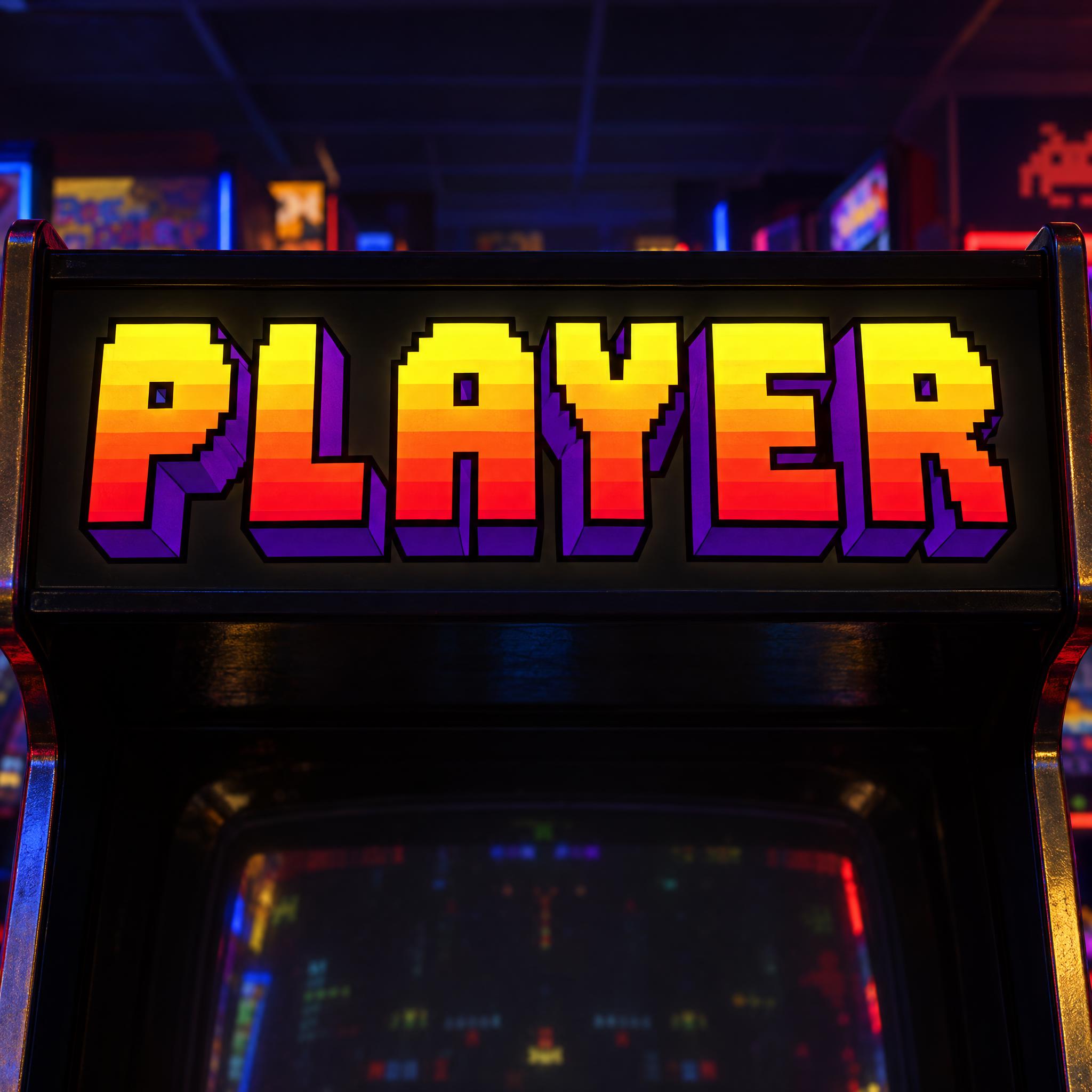
Type your word, copy the full prompt and paste it into ChatGPT, Gemini or any image model.
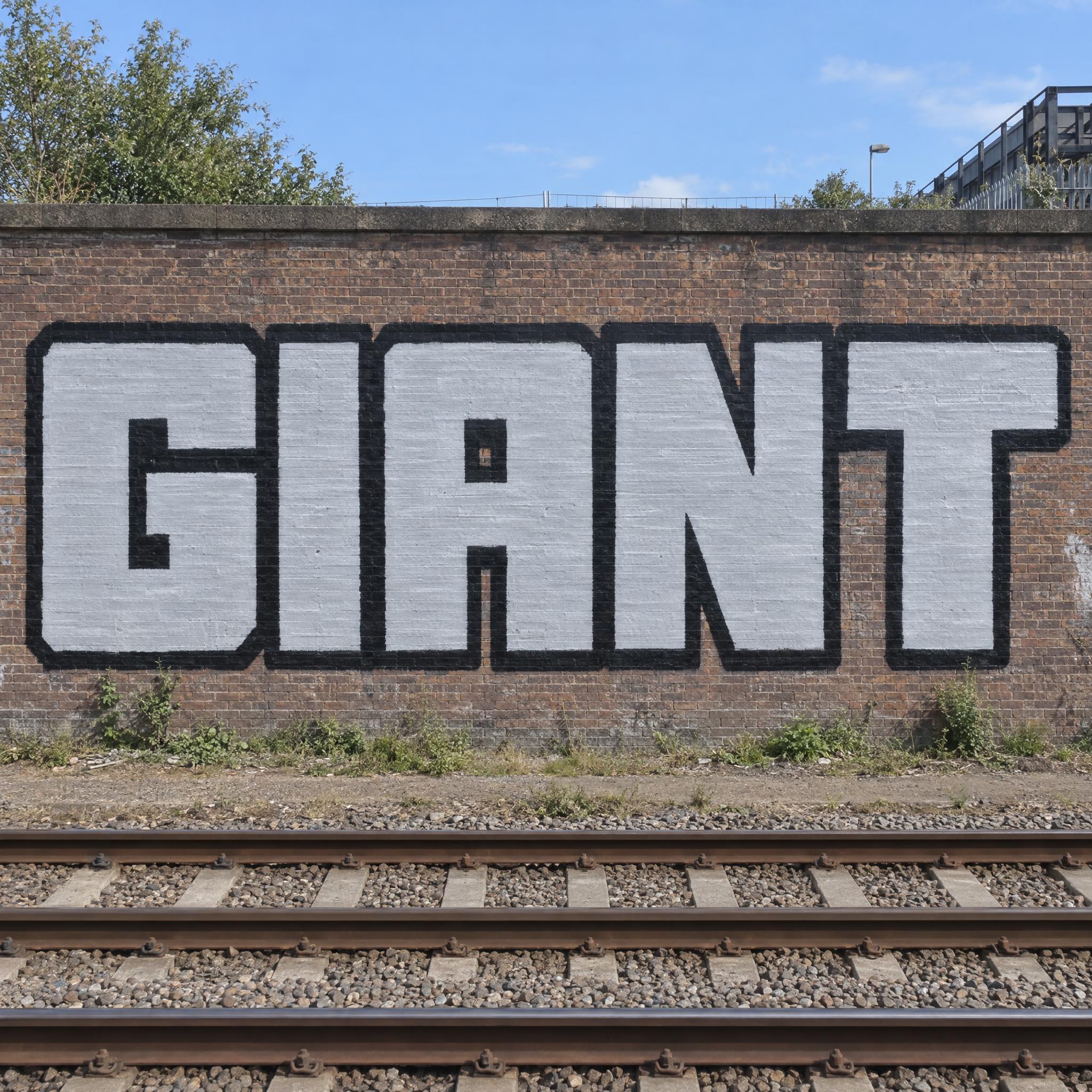
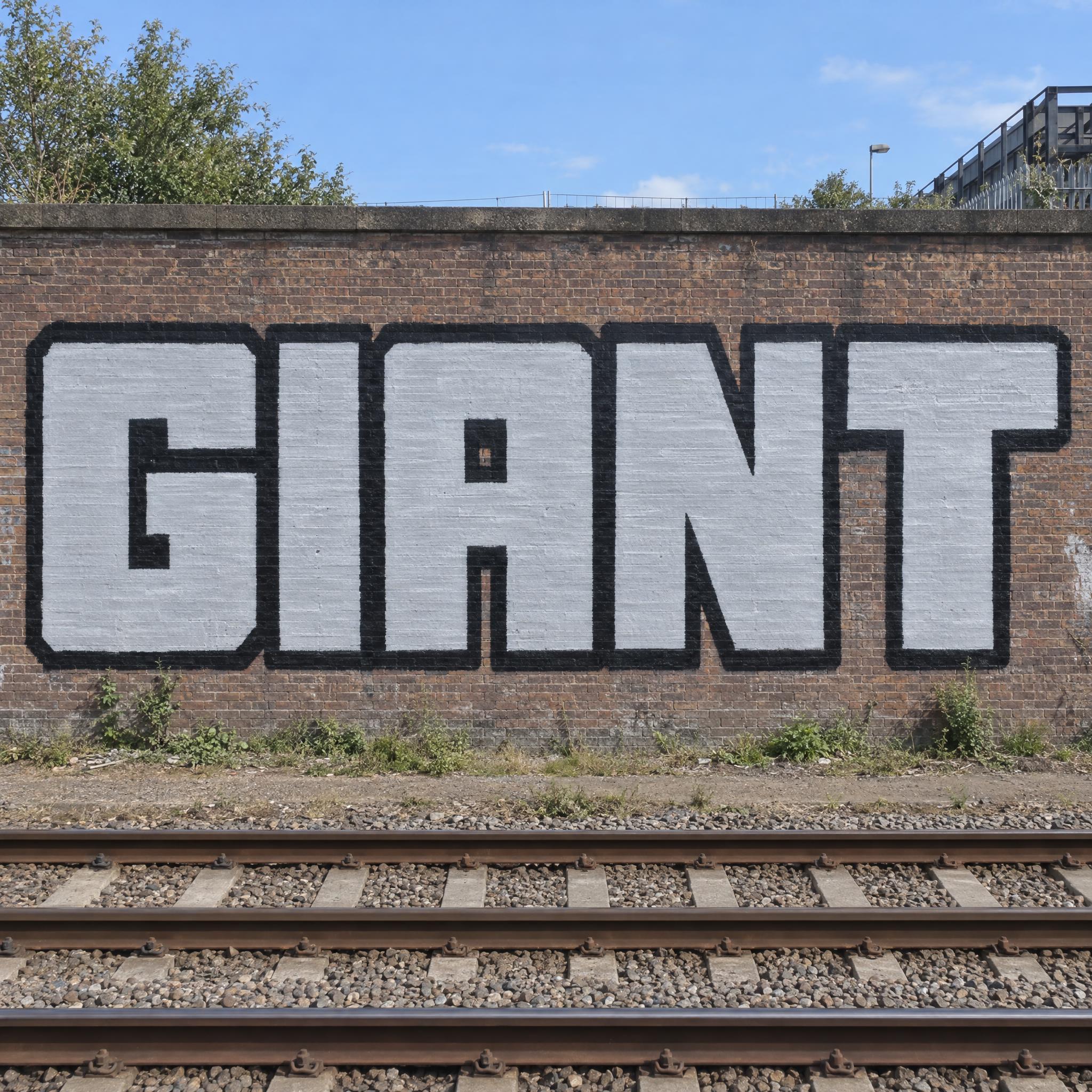
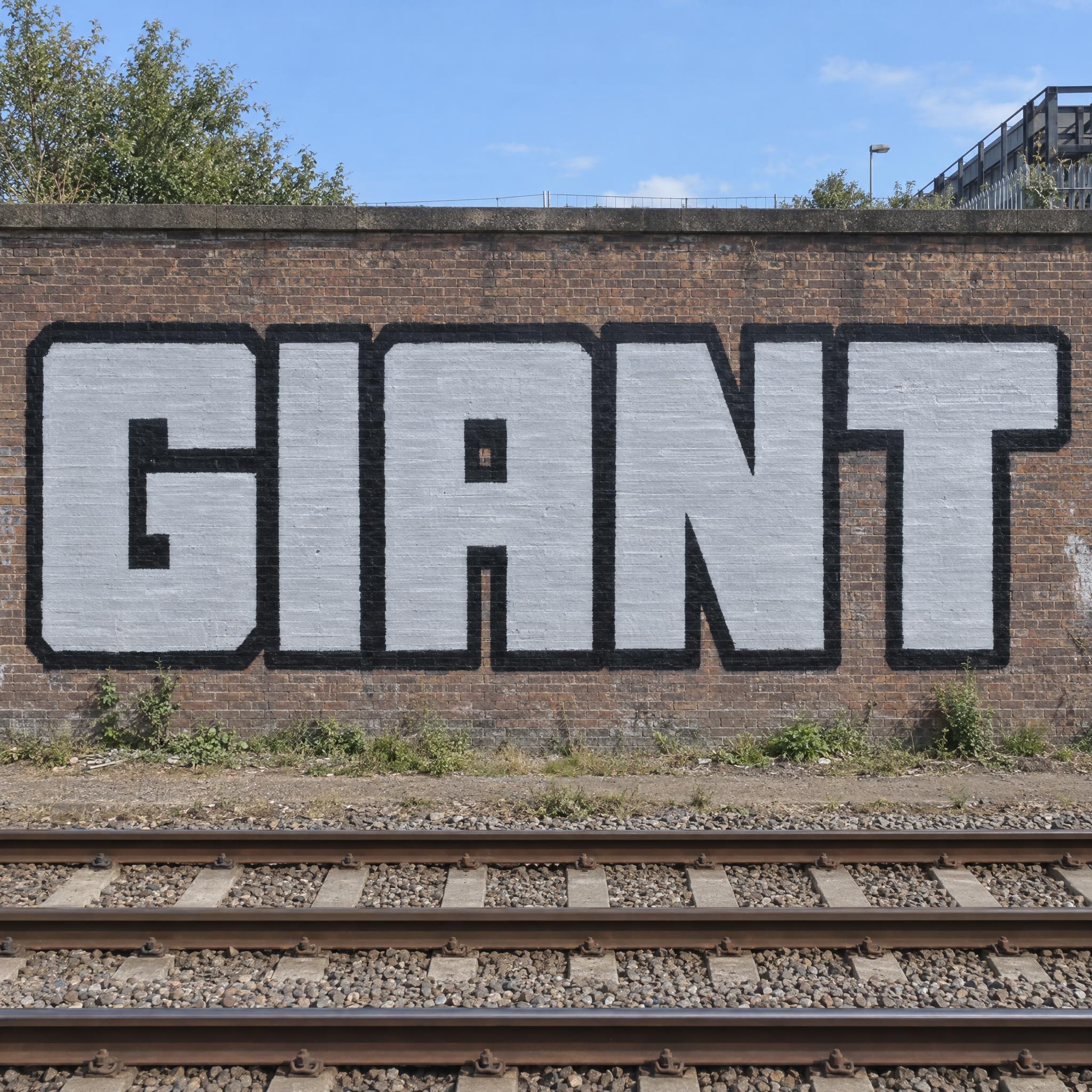
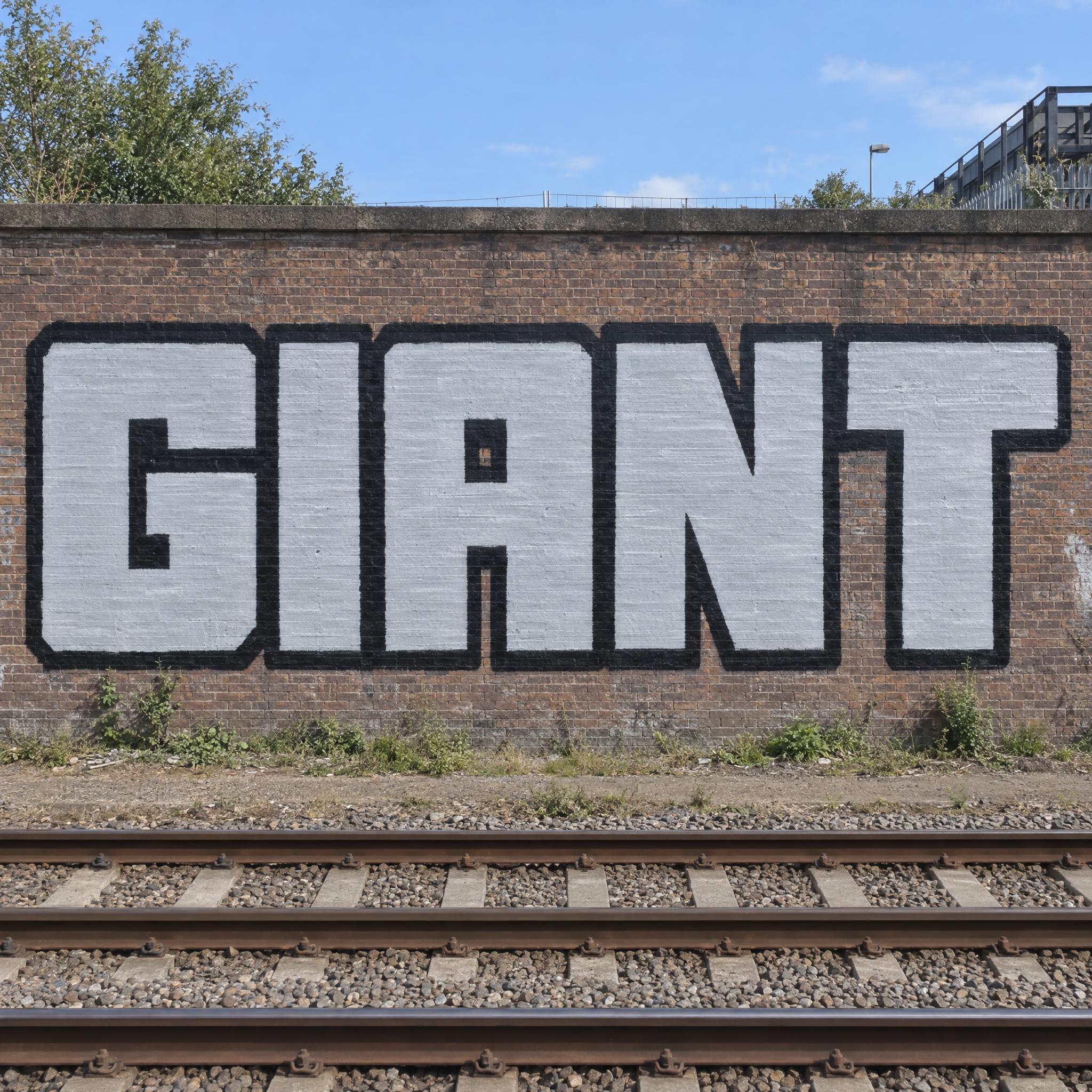
TextWrite the word "GIANT". Spell it exactly as written, without adding or changing any letter.
Font designBlockbuster graffiti lettering: giant square block capitals with every stroke the same heavy thickness, straight edges and right-angled corners, the letters standing tall and packed close together with only a narrow gap between them, every letter easy to read. The letters are completely flat, with no 3D depth or shadow. Each letter is filled with paint from a roller, solid but with faint roller streaks running across it, and has a thick outline of even width. The fill is light silver-grey and the outline is black. Like a huge roller piece seen from a passing train.
SceneThe word is painted huge along a long brick wall beside railway tracks, seen straight on in clear afternoon light. The word is centered, spans most of the width and reads clearly.
Open one for the prompt and real results on each image model.


Tested October – November 2026. First attempts from our test ledger: 719 images, 22 fonts, 7 languages, each one checked by eye.
How to read it: 124 / 141 means 141 images tested and 124 spelled the word right on the first try; the percentage is that share. The Latin, Chinese / Japanese and Arabic columns split the same count by the script of the word.
| Model | Right first time | Latin | Chinese / Japanese | Arabic | Most common issue |
|---|---|---|---|---|---|
| GPT Imagegpt-image-2.5-sunburst · xhigh | 100% 144 / 144 | 100% 89 / 89 | 100% 38 / 38 | 100% 17 / 17 | Text in the background |
| Nano Bananagemini-nano-banana-2.1 | 100% 146 / 146 | 100% 89 / 89 | 100% 38 / 38 | 100% 19 / 19 | Colors drift |
| Seedreamdola-seedream-5-0-pro-260628 | 88% 124 / 141 | 93% 83 / 89 | 87% 33 / 38 | 57% 8 / 14 | Extra words added |
| Grok Imaginegrok-imagine-image-2.0 · medium | 93% 135 / 145 | 97% 86 / 89 | 95% 36 / 38 | 72% 13 / 18 | Unreadable letters |
| Qwen-Imageqwen-image-3.0-pro | 75% 107 / 143 | 82% 73 / 89 | 76% 29 / 38 | 31% 5 / 16 | Unreadable letters |
How we test: images are made through FontVibe with each model’s API, sending the prompt as is; we count only each model’s first image for every font and language and check the spelling by eye. Apps such as ChatGPT may rewrite prompts, so results there can differ. For the full data, email [email protected].
A square font swaps curves for straight lines and right angles. The prompts on this page build one in layers: the square shape, how the corners are cut, what the letters are built from, a pattern or depth, and a scene that explains why the letters are square. The examples are quoted word for word from the prompts of the fonts on this page.
Image models drift back to round letters unless the prompt says where the curves went. Name straight edges, right-angled corners and one even stroke weight in a single phrase.
“giant square block capitals with every stroke the same heavy thickness, straight edges and right-angled corners” — Blockbuster Graffiti
A pure right angle looks like a block of paint; a corner clipped at a short angle looks athletic or military. Say which corners stay square and which are cut.
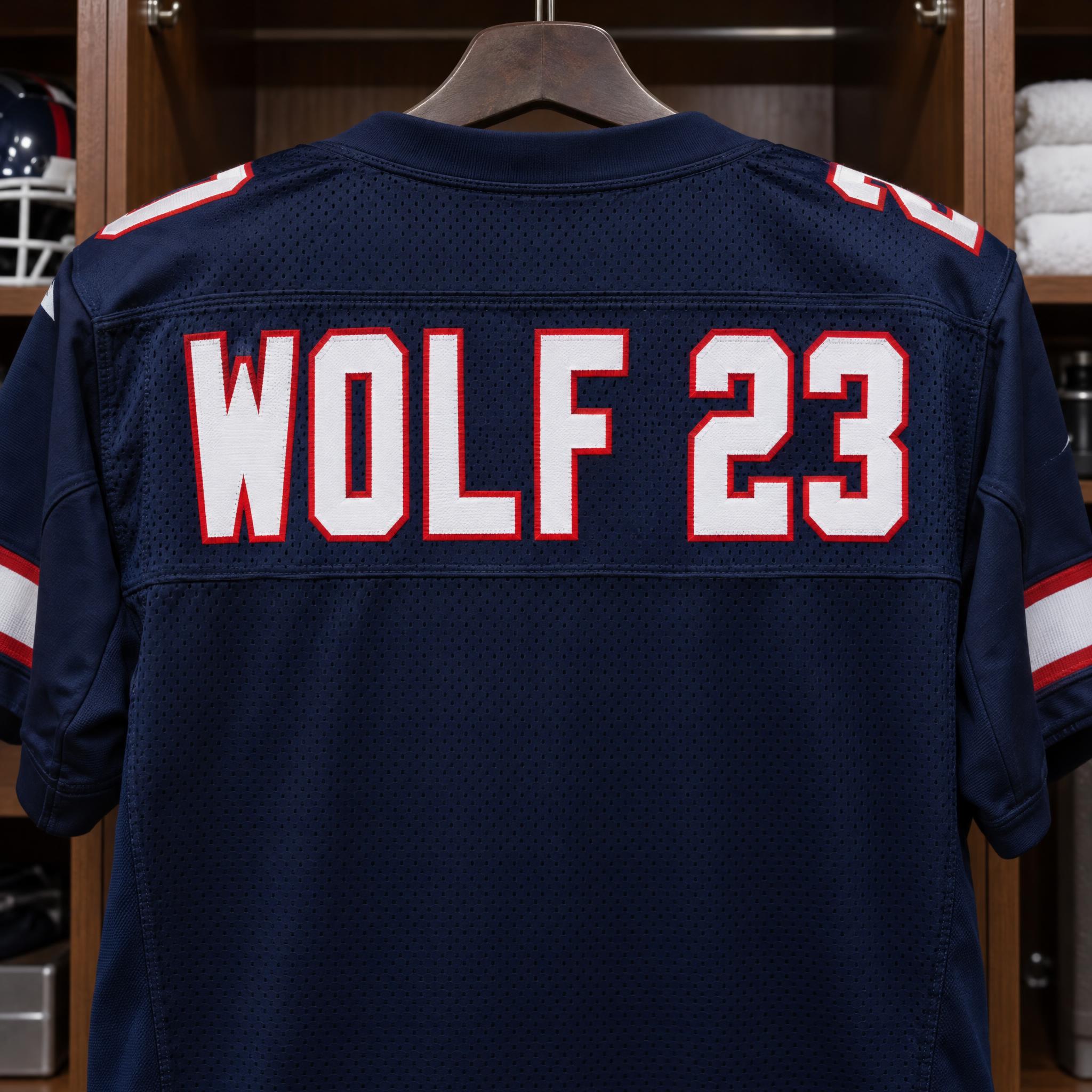
“straight sides, squared outer corners and small clipped inside corners” — Jersey Number Font
Pixel and stitch styles get their squareness from the grid, not from the outline. Give the stroke width in blocks and say what happens to diagonals.
“every stroke exactly one block thick, with stair-stepped diagonals and curves and no smooth or blurred edges” — Pixel Font
An LED board keeps square corners even though every dot is round. Ask for the unlit dots too: they show the grid and make the board believable.
“the unlit dots show faintly as dark grey circles across the whole panel” — Scoreboard Font
Square letters leave flat, wide faces. Steps and carved frets fill them without breaking the outline.
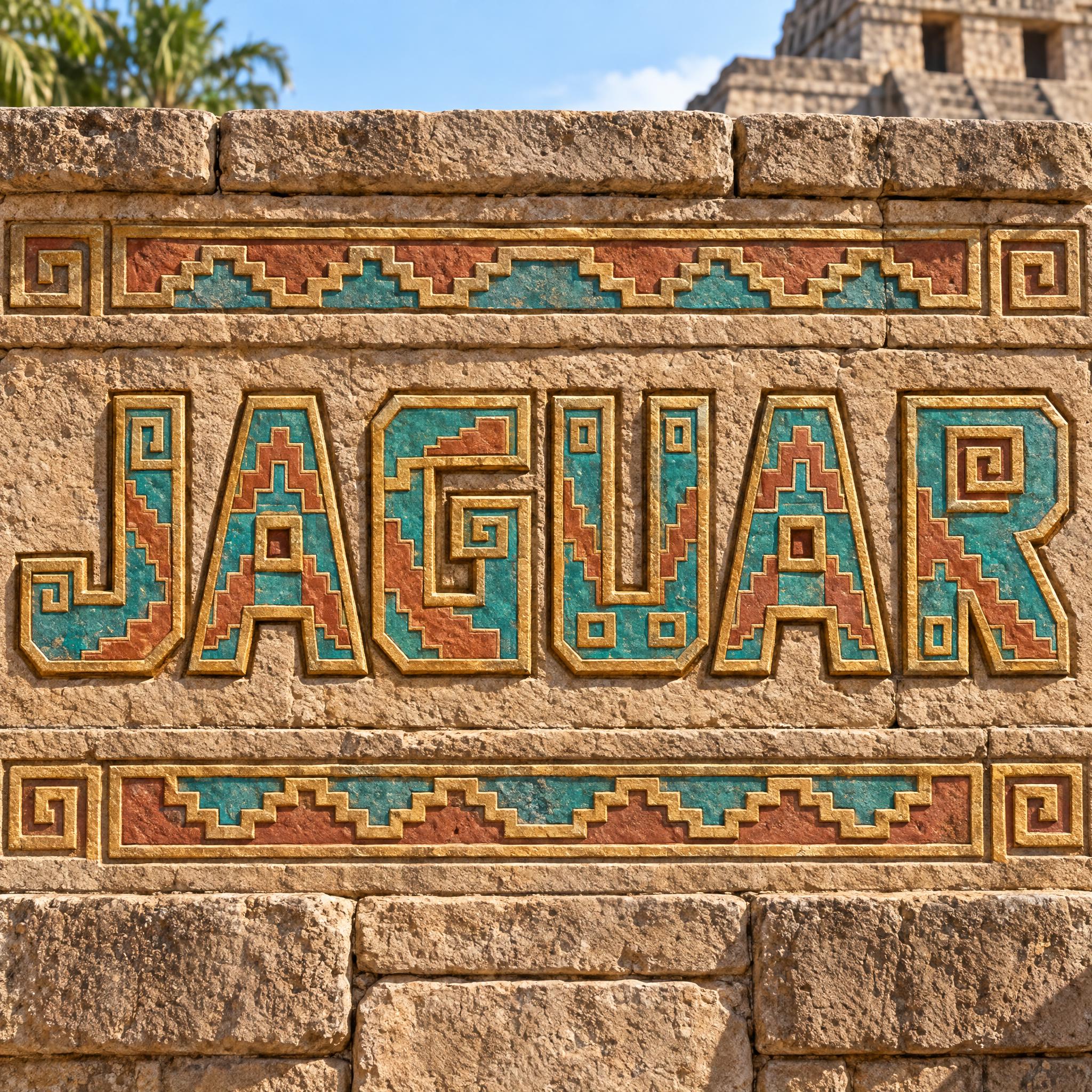
“bold, blocky capital letters built only from straight lines and right-angle steps” — Aztec Font
Square letters extrude cleanly because every face is flat. Put the depth in a separate sentence so you can delete it for a flat version.
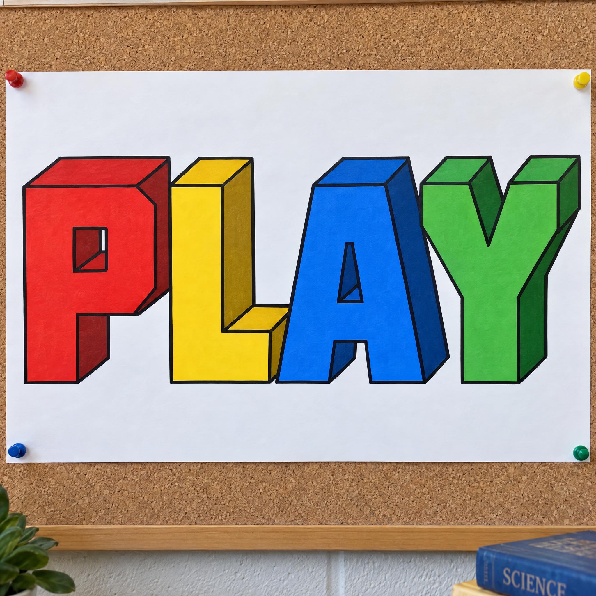
“Each letter is extruded back and down to the right into a deep solid block, so its top and right side faces show.” — 3D Block Letters
A CRT screen, a stadium board or a train-side wall tells the model why the letters are square, and keeps it from smoothing them.
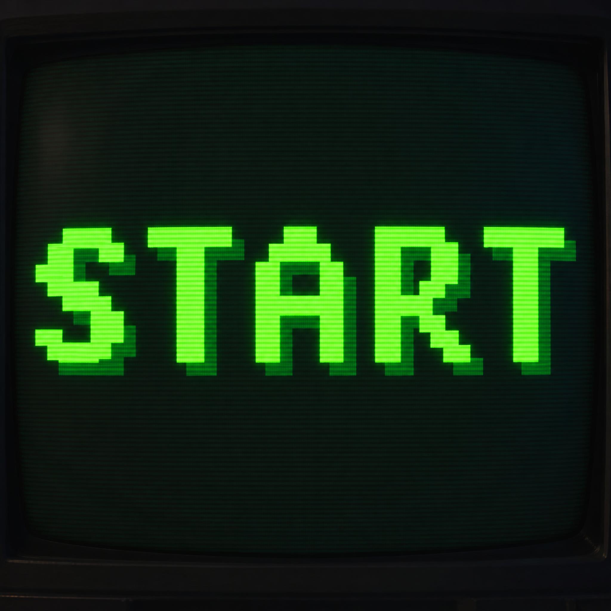
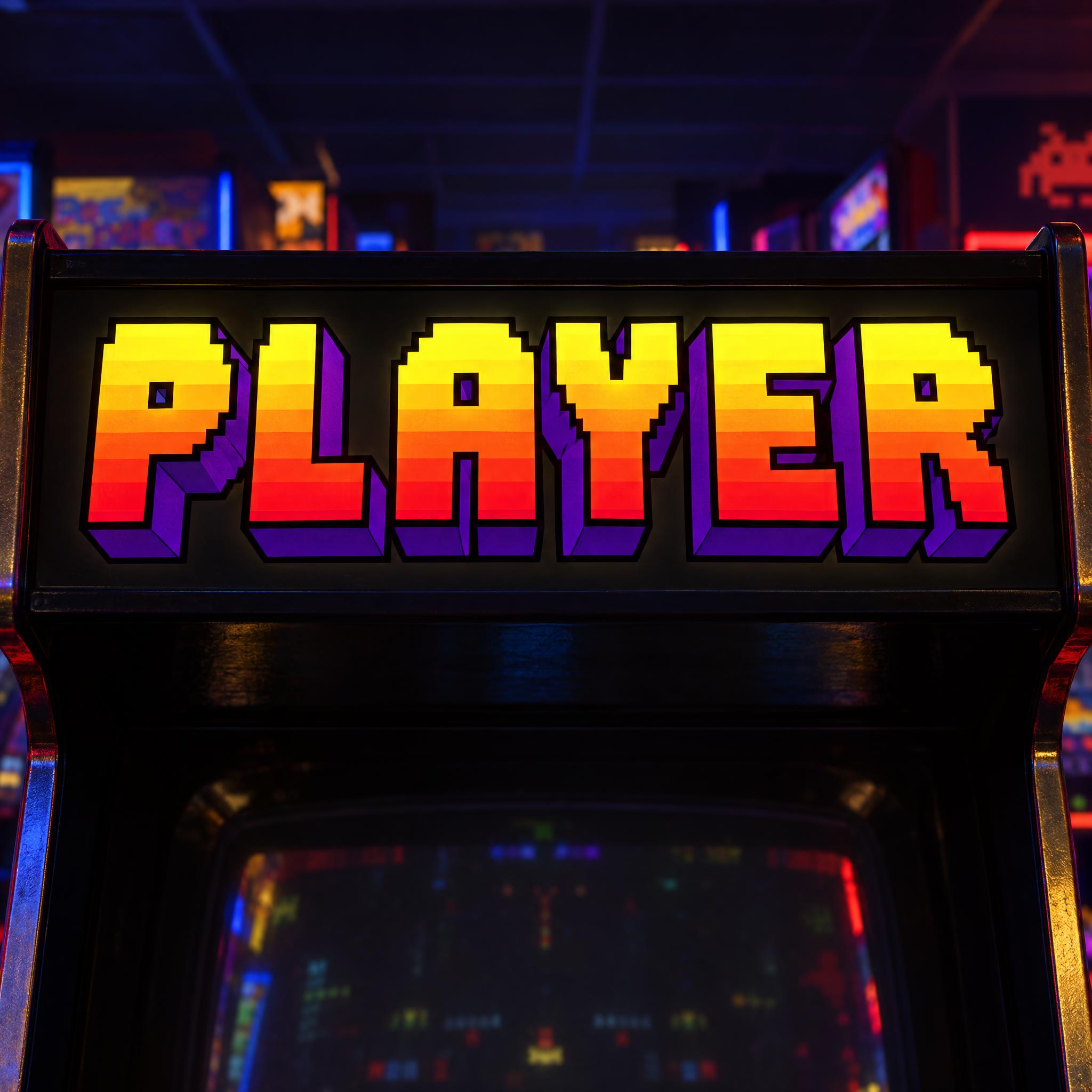
“The word glows on a dark CRT game screen in a dim room, with faint scanlines.” — Pixel Font
Square letters appear wherever a grid, a screen or a tile does the drawing. Pick the style by where the word will be seen.
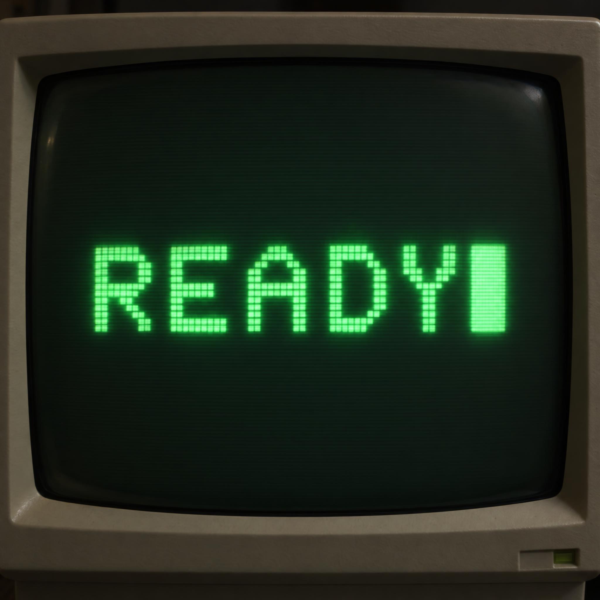
A bitmap font stores each glyph as an array of pixels, and the limited memory and processing power of early computers forced them to use bitmap fonts only. Stepped square letters still read as an old computer or game screen for that reason. Pixel Font and Video Game Font draw that look.
Sources: Wikipedia — Computer font
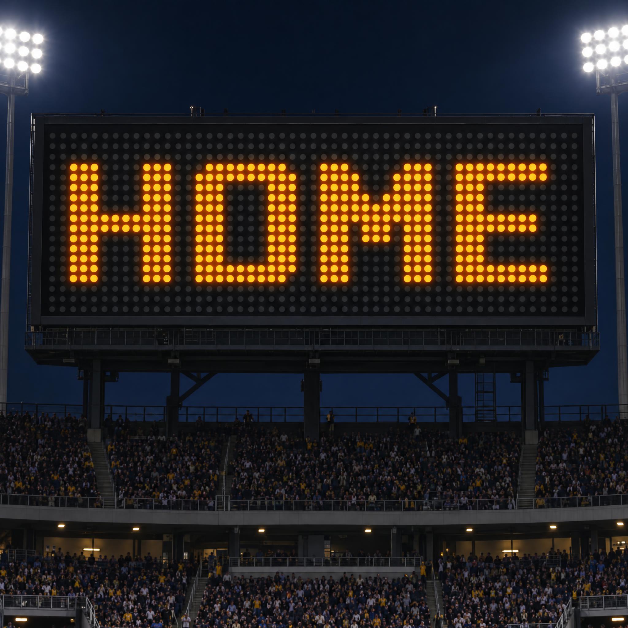
A dot-matrix display shows text by switching selected dots on and off in a rectangular grid; a common size for one character is 5 × 7 pixels. Scoreboard Font builds the word from round LED dots with square corners.
Sources: Wikipedia — Dot-matrix display
Eurostile, designed by Aldo Novarese in 1962, has a squarish superellipse shape that evokes television screens of the 1950s and 1960s, and it is one of the most popular fonts in science-fiction television. For that look, see futuristic font or the squared-off wordmark style of Tesla Font.
Sources: Wikipedia — Eurostile
Jersey Number Font draws tall block numbers with squared outer corners in heat-pressed twill, and Scoreboard Font puts a team name on a stadium board. For more team lettering, see jersey font and sports fonts.
Square letters are older than screens. Square Kufic, a bare form of Arabic writing, developed in the 12th century; it was invented in Iraq and used prominently in Iranian architecture, with bricks and tiles working as pixels. Legibility is not a priority of the script: in Iran entire buildings are sometimes covered with tiles spelling sacred names, a technique known as banna'i.
In print, the squared Latin capital arrived in the 1950s. Microgramma, designed by Aldo Novarese and Alessandro Butti in 1952, was released without a lowercase, in five styles. Novarese followed it in 1962 with Eurostile for the Nebiolo foundry in Turin, and its squarish superellipse shape evokes the television screens of the 1950s and 1960s.
Computers made square letters part of everyday life. Early computers had so little memory and processing power that they could use only bitmap fonts, which store each glyph as an array of pixels. At sizes a bitmap font was not drawn for, many systems enlarge it by nearest-neighbour resampling, which adds rough, jagged edges. Those stair steps are now a style of their own, and the pixel prompts on this page ask for them on purpose.
Sources: Wikipedia — Kufic (Square Kufic) · Wikipedia — Eurostile · Wikipedia — Computer font
Giant flat capitals with right-angled corners, painted with a roller.
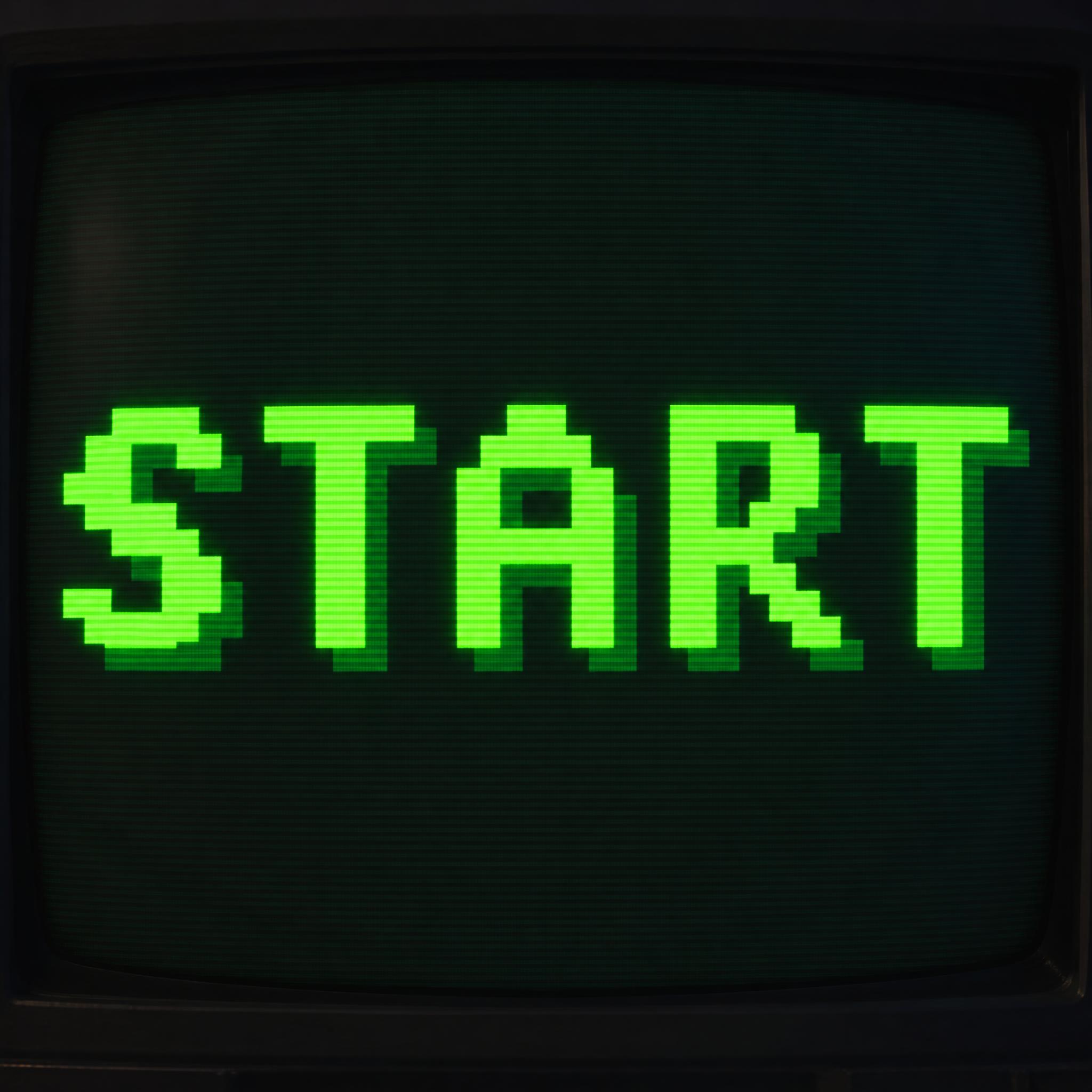
Letters built from square blocks on a coarse grid, like an 8-bit game title.
Round amber LED dots on a square grid, with the unlit dots showing.
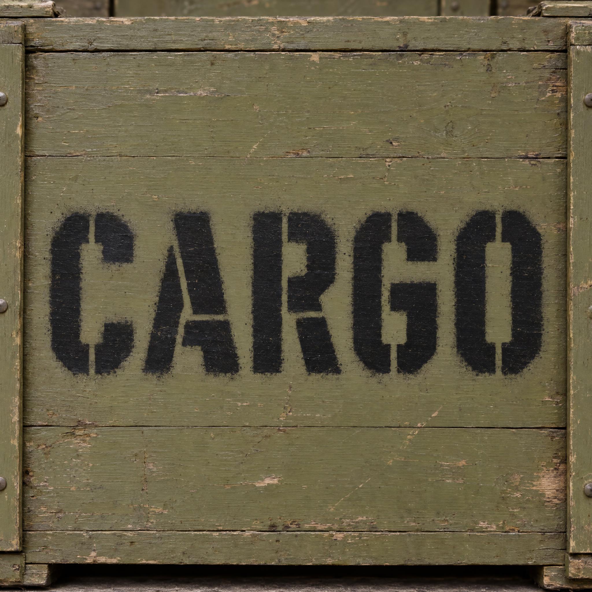
Square-shouldered capitals broken by stencil bridges, sprayed on an army crate.
Right-angle steps filled with carved frets and spirals, in turquoise and terracotta.
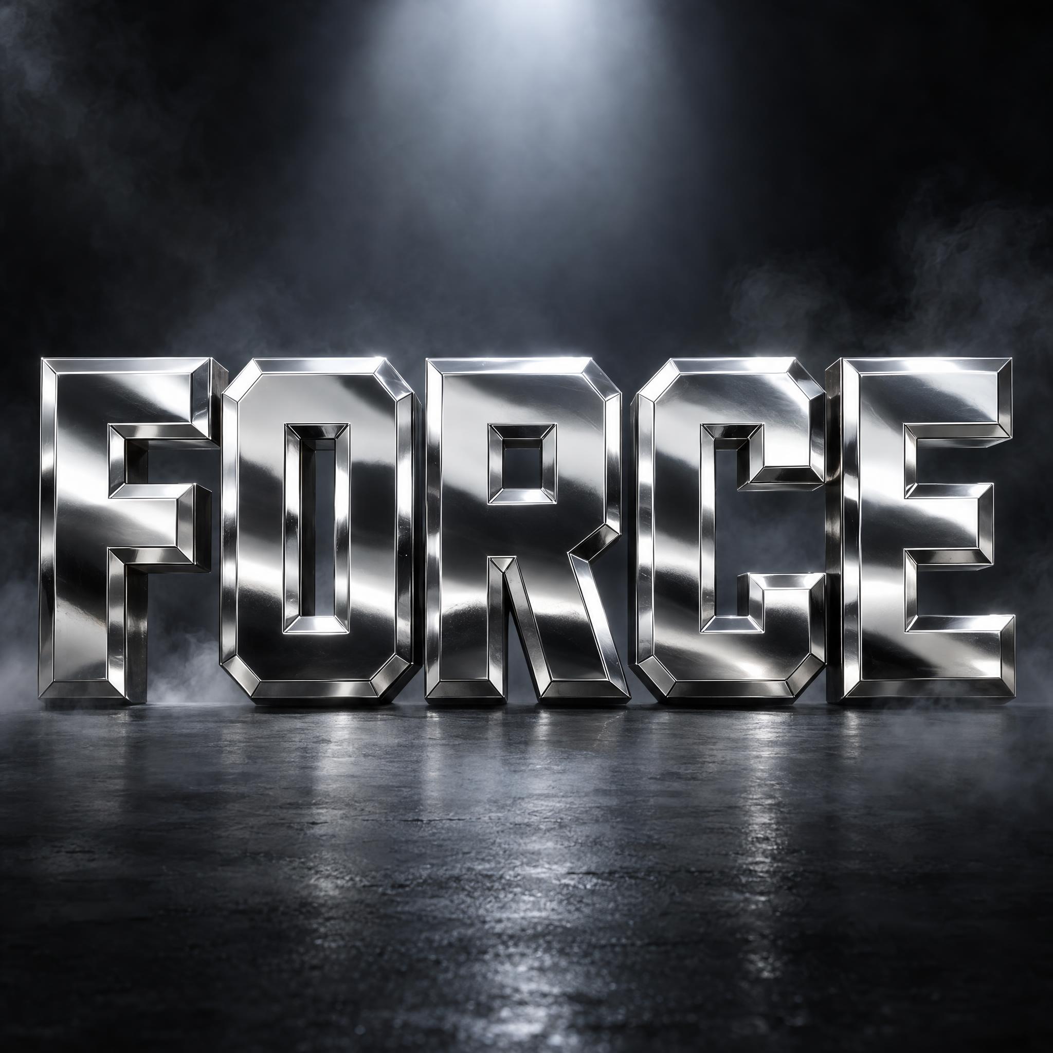
Chunky square-cornered letters extruded into solid coloured blocks.
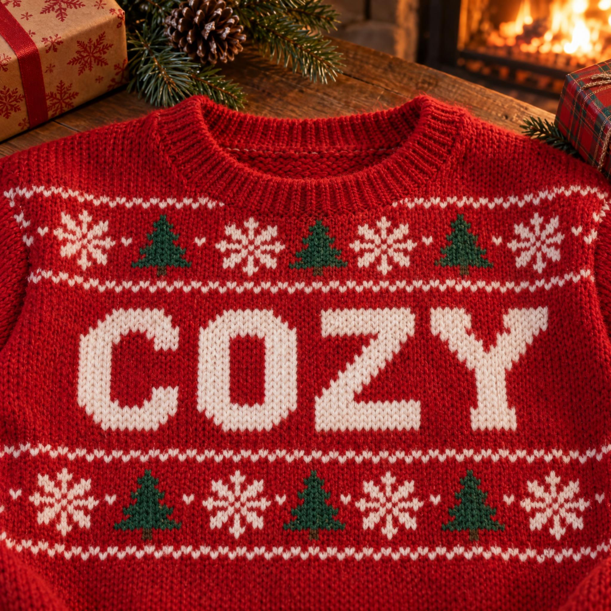
Letters stitched on the square grid of an ugly Christmas sweater.
Tall, narrow letters: the other way to change a letter's proportions.
A square font is lettering whose curves are replaced by straight lines and right-angled corners, so O, C and S look like boxes with openings. On this page each style is an AI prompt that draws your own word that way: flat blocks, pixels, LED dots or carved steps.
Not quite. Block letters usually means plain, thick capitals of even weight, with ordinary round curves. A square font turns the curves themselves into corners. For thick letters in 3D, try 3D Block Letters; for collegiate block letters, Varsity Font.
A pixel font is one kind of square font: the letters are built from square blocks on a grid, so diagonals become stair steps. Other square fonts keep smooth straight edges and only square off the corners, like Blockbuster Graffiti.
Pixel Font for a flat 8-bit look, Video Game Font for an arcade marquee with depth, and Minecraft Font for a voxel block-game title.
No. They are prompts that make a picture of your word with an AI image model, not font files. Use the result as a finished title, logo or poster image.