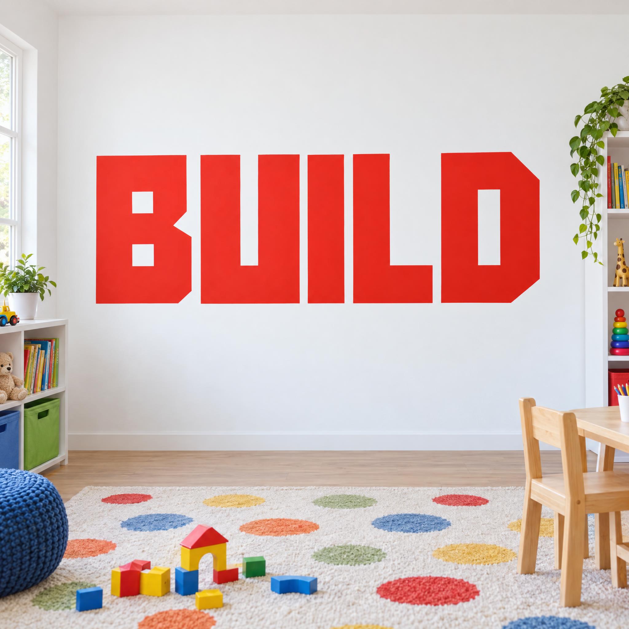
Heavy capitals squared off so every curve becomes straight lines and right angles, with small rectangular holes, set tight and filled with one flat colour.
TextWrite the word "BUILD". Spell it exactly as written, without adding or changing any letter.
Font designBlocky lettering: heavy capital letters squared off so that every curve becomes straight lines and right-angled corners, with thick strokes of even width and small rectangular holes; the letters sit close together on one baseline and every letter reads at a glance. Each letter is one solid, flat shape with crisp edges. Every letter is bright tomato red. Flat paint on the surface, with no 3D extrusion or drop shadow.
ScenePainted large on a white wall in a bright kids' playroom, no other text; the word is centered, large and clearly readable.
107 words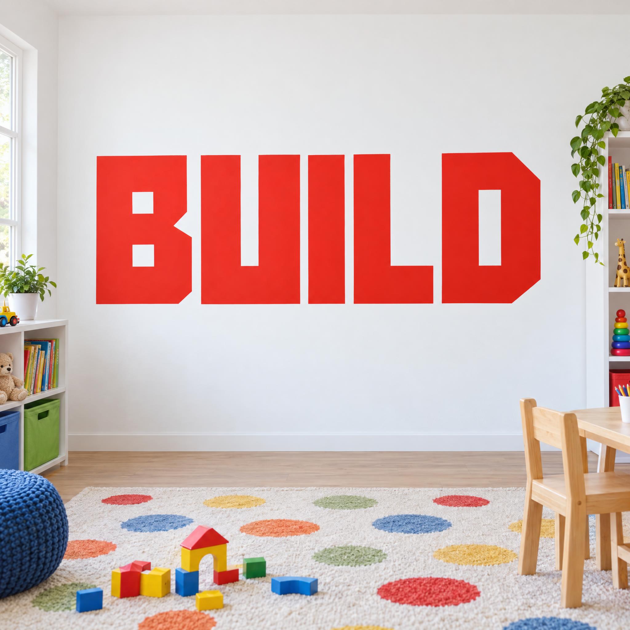
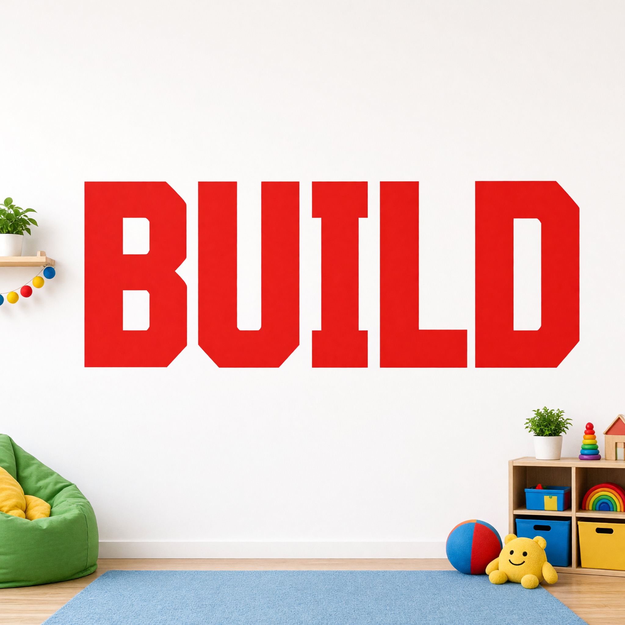
One prompt pasted into each image model as-is. These are the unedited results, so you can pick the model that suits you.
The cleanest squared-off letters, with the D's right side clipped at the corners, in a bright playroom.
The biggest word, filling almost the whole width.
Squared letters with clipped corners and the most toys and props in the room.
The smallest word, in a softer red, in a pink-toned room.
The edges step like pixels instead of running straight.
The button opens FontVibe in DIY mode with this prompt already in it, unchanged. Type a name, a brand or a single word, pick a model and generate. GPT Image, Nano Banana, Seedream, Grok and Qwen are all in one account, so you can see which one squares off every curve and keeps the letters flat, without signing up to five apps. Every account gets free credits each month with no card needed, and you can export a transparent PNG for a logo, a poster or a T-shirt print.
Layers in the order the prompt states them. Change one layer and the rest keeps working.
Every AIFont prompt opens with the same text part. "Spell it exactly as written, without adding or changing any letter" earns its place here: once every curve is squared off, a U and an O, or a D and a 0, can end up looking alike. This line keeps the spelling fixed while the shapes change.
"Blocky lettering:" tells the model the whole word is one squared-off display style, not ordinary bold capitals.
"heavy capital letters squared off so that every curve becomes straight lines and right-angled corners" is the whole idea of the font. Saying what happens to the curves, rather than just asking for square letters, is what makes a B or a D lose its round bowl. "with thick strokes of even width and small rectangular holes" keeps the letters dense: the holes stay small, so each letter reads as a block. "the letters sit close together on one baseline" packs them into one solid row.
"Each letter is one solid, flat shape with crisp edges." rules out the usual extras: no outline in another colour, no inner highlight, no texture. The block is the letter and nothing else.
"Every letter is bright tomato red." is the only colour sentence. One strong colour keeps the blocks reading as blocks. Change this sentence alone to change the colour.
"Flat paint on the surface, with no 3D extrusion or drop shadow." is the one negative in the prompt. Ask for block letters and many models build 3D blocks or add a shadow; this keeps the word painted flat on the surface.
"Painted large on a white wall in a bright kids' playroom" puts the letters where a font this loud is often used, and "the word is centered, large and clearly readable" keeps the word the star. Swap this part for your own use.
Small edits that stay on-style. Change one thing at a time.
Type it in the box next to Prompt above and copy again. Short words in capitals work best: a name, a brand, a word like PLAY. Letters with curves, such as S, C, G and O, show off the squared shapes most.
Swap "Every letter is bright tomato red." for one of these.
Replace "Painted large on a white wall in a bright kids' playroom" with one of these.
The prompt sets no frame size. Pick the ratio in your app, or add "Wide 16:9 image." or "Tall 4:5 image." at the end. A long word or a banner suits 16:9; a poster suits 4:5.
AI fonts that share the most tags with Block Font.
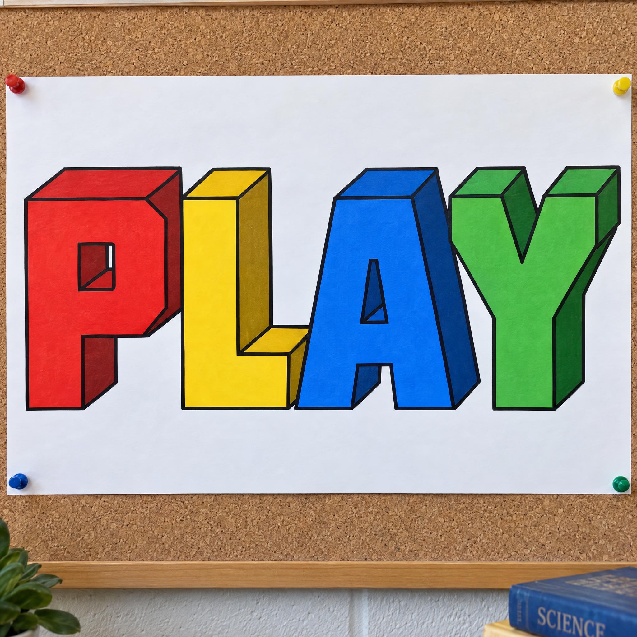
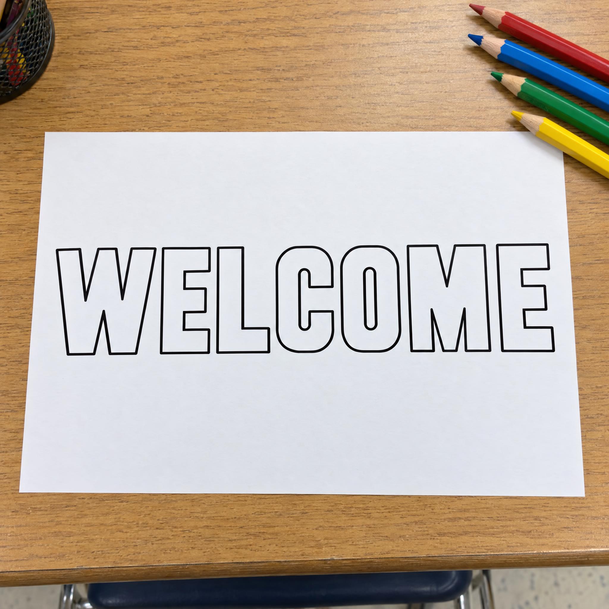
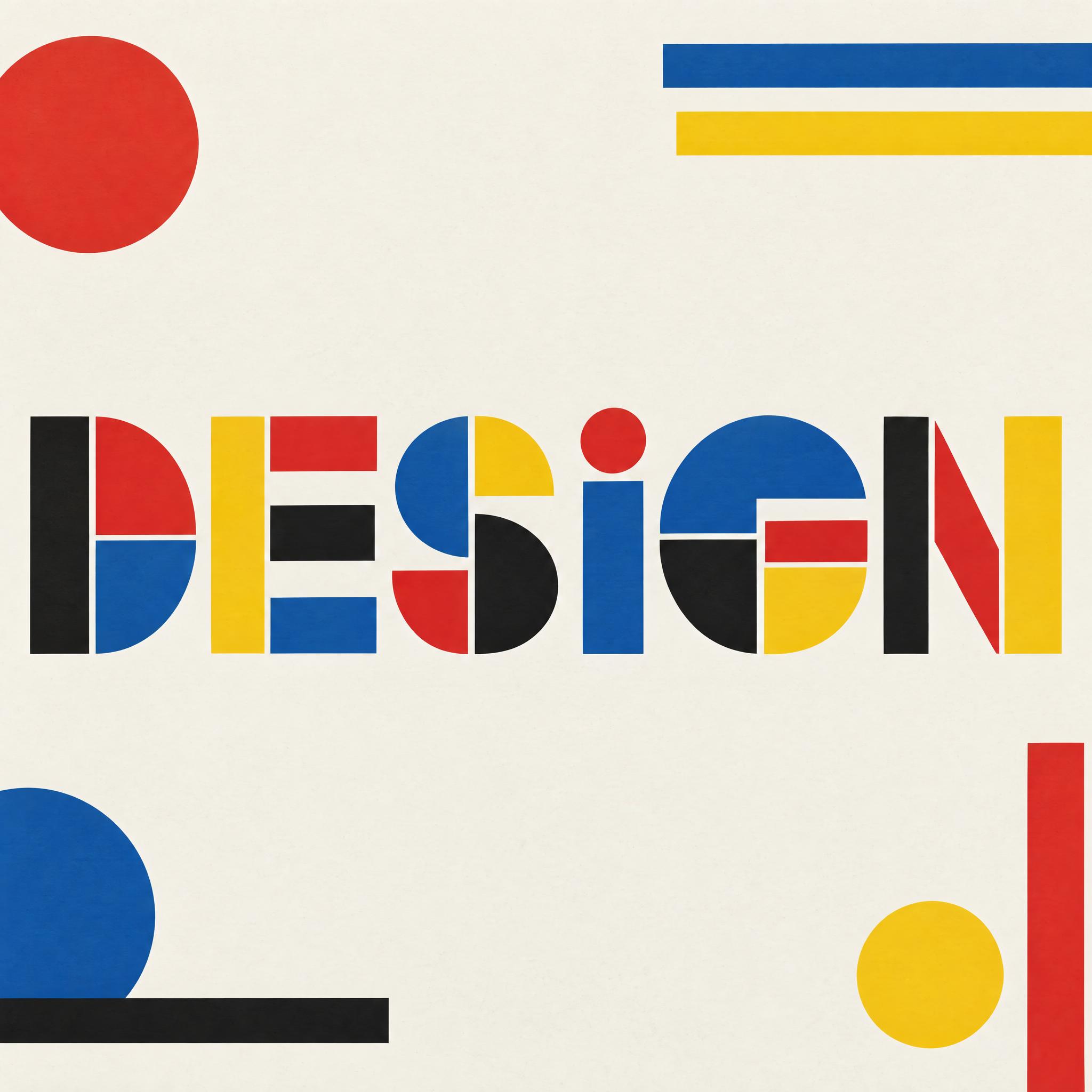
AI fonts for a second line, a logo lock-up or a poster footer.
Block Font draws your word as heavy capitals with no curves left in them. Every round part, the bowl of a B or D, the belly of a U, is rebuilt from straight lines and right-angled corners, the strokes are thick and even, and the holes inside letters shrink to small rectangles. The letters stand close together on one baseline, and each one is a single solid shape with crisp edges, filled with flat tomato red: no outline, no shading, no 3D side.
Type your word in the box above the prompt, copy it and paste it into ChatGPT, Gemini, Grok, Qwen or Seedream. The prompt has three parts: the text, the font design and the scene. The font design makes the squared-off letter shapes, the solid fill, the colour and the flat finish; the scene paints the word large on the white wall of a bright kids' playroom, and you can swap it for your own. Every image on this page is what each model returned from the unchanged prompt, with no retouching.
Use it for posters and headlines, logos for toy and kids' brands, wall lettering for playrooms and nurseries, T-shirt prints and big painted murals. If you came looking for a block letter font that reads from across a room, this is the solid, squared-off one.
Details from the original render. Every one of them is named in the prompt.
Every round part is rebuilt from straight lines and right angles.
Heavy capitals with strokes of one width.
Holes inside letters shrink to small rectangles.
Letters stand close together on one baseline.
Pulled from the render. Handy when you build the rest of the design around the word.
Block letters were named by the people who painted them. In his 1871 textbook Sign Writing and Glass Embossing, the master sign-painter James Callingham wrote that sign-writers were content to call the heavy, square-ended letters block letters, long before type founders took them up and renamed them Egyptian. He also gave the sign-writer credit for the plain square sans-serif letter, painted about half a century before the type founders turned to it around 1810.
Printing caught up slowly. Around 1816 William Caslon IV produced the first sans-serif printing type in England, a capitals-only face called Two Lines English Egyptian, and in 1837 the Boston Type and Stereotype Foundry published a set of sans-serifs under the name gothic, believed to be the first in America. Signs kept their lead for a practical reason: type could not yet be printed in large sizes, so early sans-serif lettering on shops and walls was painted or carved by hand.
This prompt goes back to the painted wall and takes the plain block capital one step further. Every curve is replaced with straight lines and right angles, the holes shrink to small rectangles, and the letter is one flat coat of a single colour, the kind of shape you could mark out with a ruler and fill in with one brush. That is where it parts from 3D Block Letters, which pushes the same capitals back into coloured blocks.
Sources: Wikipedia — Sans-serif
Sign-writers plaster heavy Egyptian letters over London shops and walls.
William Caslon IV issues Two Lines English Egyptian, capitals only.
A Boston foundry publishes sans-serifs under the name gothic.
James Callingham records that sign-writers call these letters block letters.
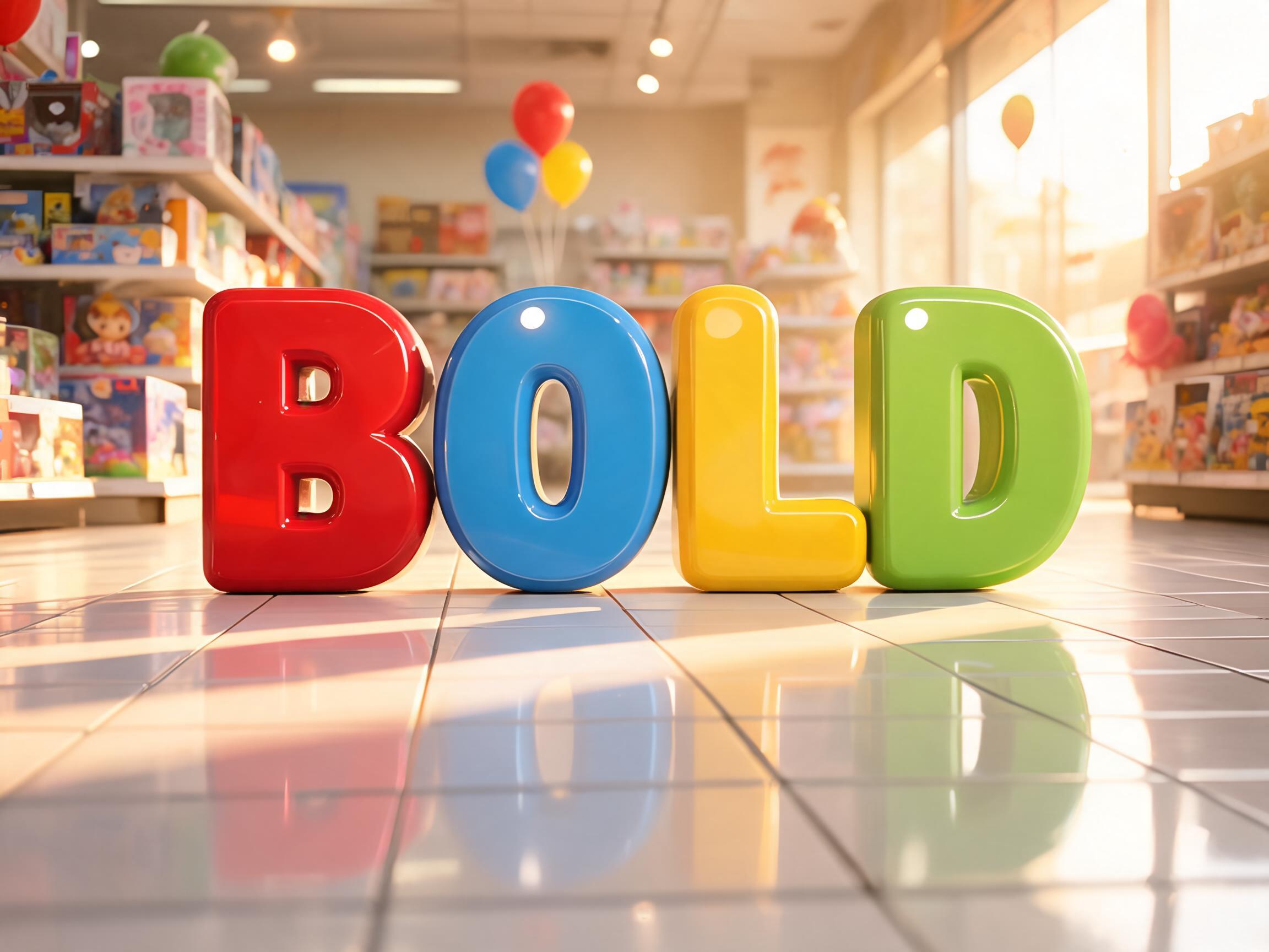
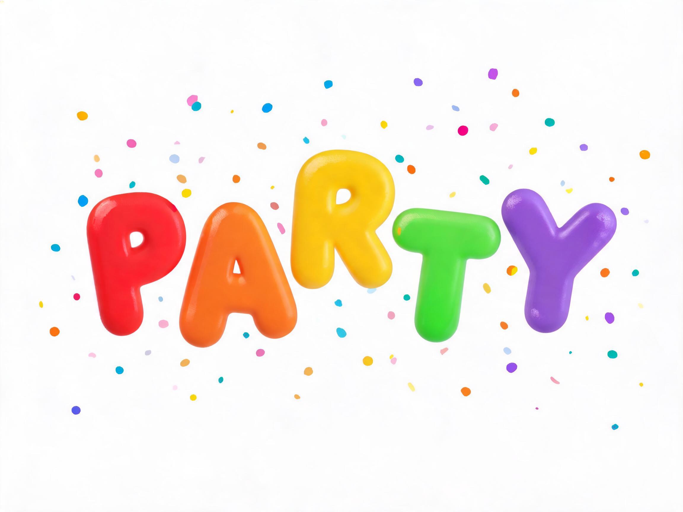
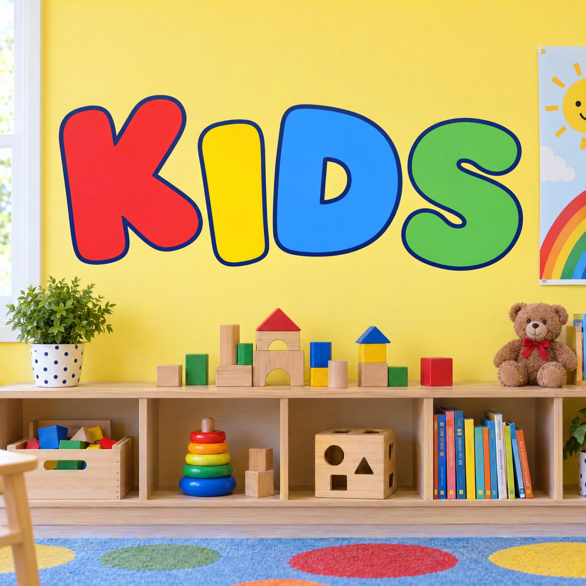
In English all five spelled BUILD correctly. GPT Image gives the cleanest version: every curve squared off, flat and evenly red. Grok makes the word biggest; Nano Banana clips a few corners and fills the room with toys; Seedream draws it smallest in a softer red; Qwen's edges step like pixels. Compare them side by side above.
No. It is a prompt that makes a picture of your word with an AI image model. There is no font file, so you can't type with it in Word or Figma. This page is for when you want the finished block lettering as an image.
Ask for a few letters at a time rather than all 26 at once; long strings are where models start dropping or doubling letters. Type something like ABCDEF, then GHIJKL, and keep the prompt the same so every batch matches.
3D Block Letters pushes each capital back into a coloured block with a darker side. Blockbuster Graffiti is silver roller paint with a thick black outline on a city wall. Jersey Number Font is cut twill with clipped corners, and Stencil Font has bridges in every letter. Block Font is the plain one: squared-off, solid, flat and one colour.
Type it in the box next to the prompt and copy the full prompt again. Capitals and short words keep the letters heavy and tight.
Change only "Every letter is bright tomato red.", for example to "Every letter is deep cobalt blue."
Pick the ratio in your app if it has one. If not, add "Wide 16:9 image." or "Tall 4:5 image." at the end of the prompt.
Replace the scene with a plain one, for example "The word is on a plain white background.", and remove the background in any editor. Or use the FontVibe button above: it can export a transparent PNG.
Copying the prompt is free. Whether the image costs anything depends on the app you paste it into, and what you may do with the image depends on that app's terms.