Bold fonts as copy-ready AI prompts: heavy, thick letters that hold a title, a logo or a T-shirt print, from chunky 3D blocks and tight black sportswear capitals to fat retro script and thick brush strokes. These are image prompts, not a bold text generator and not font files: type your word, copy, and paste into ChatGPT or Gemini, or generate it right away on FontVibe.
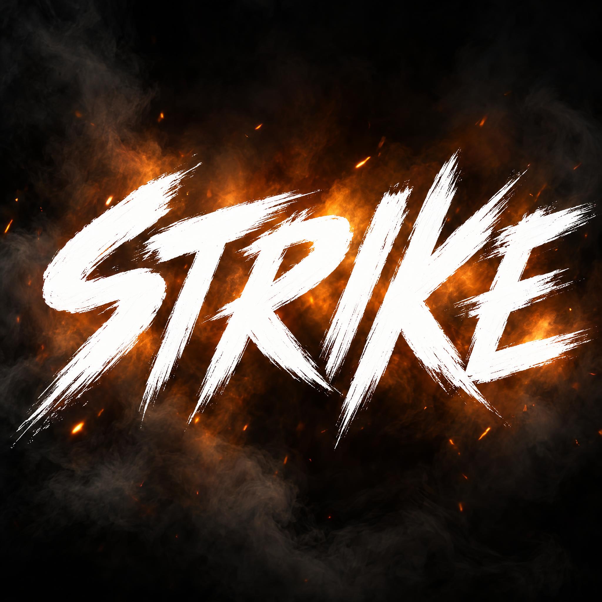
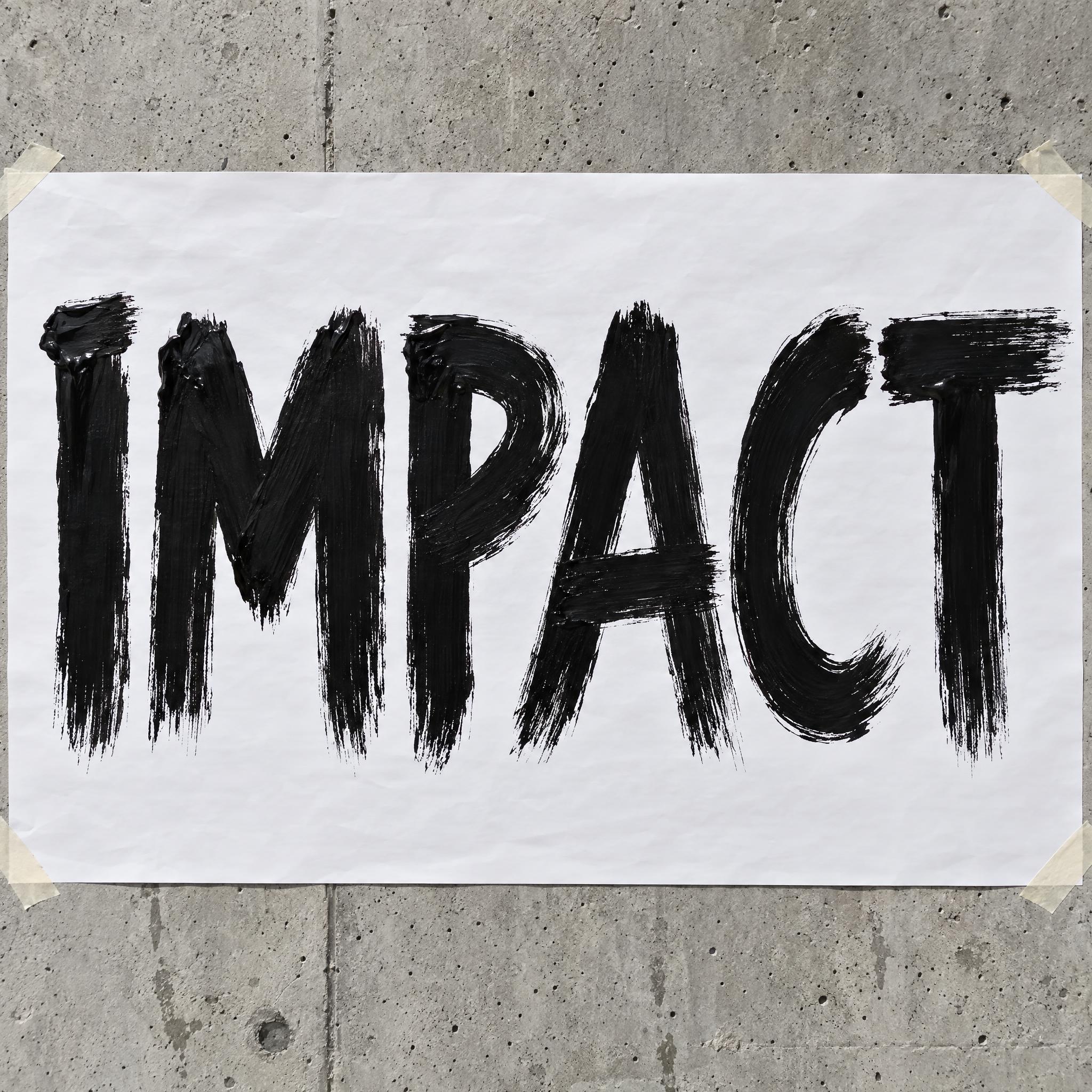
Type your word, copy the full prompt and paste it into ChatGPT, Gemini or any image model.
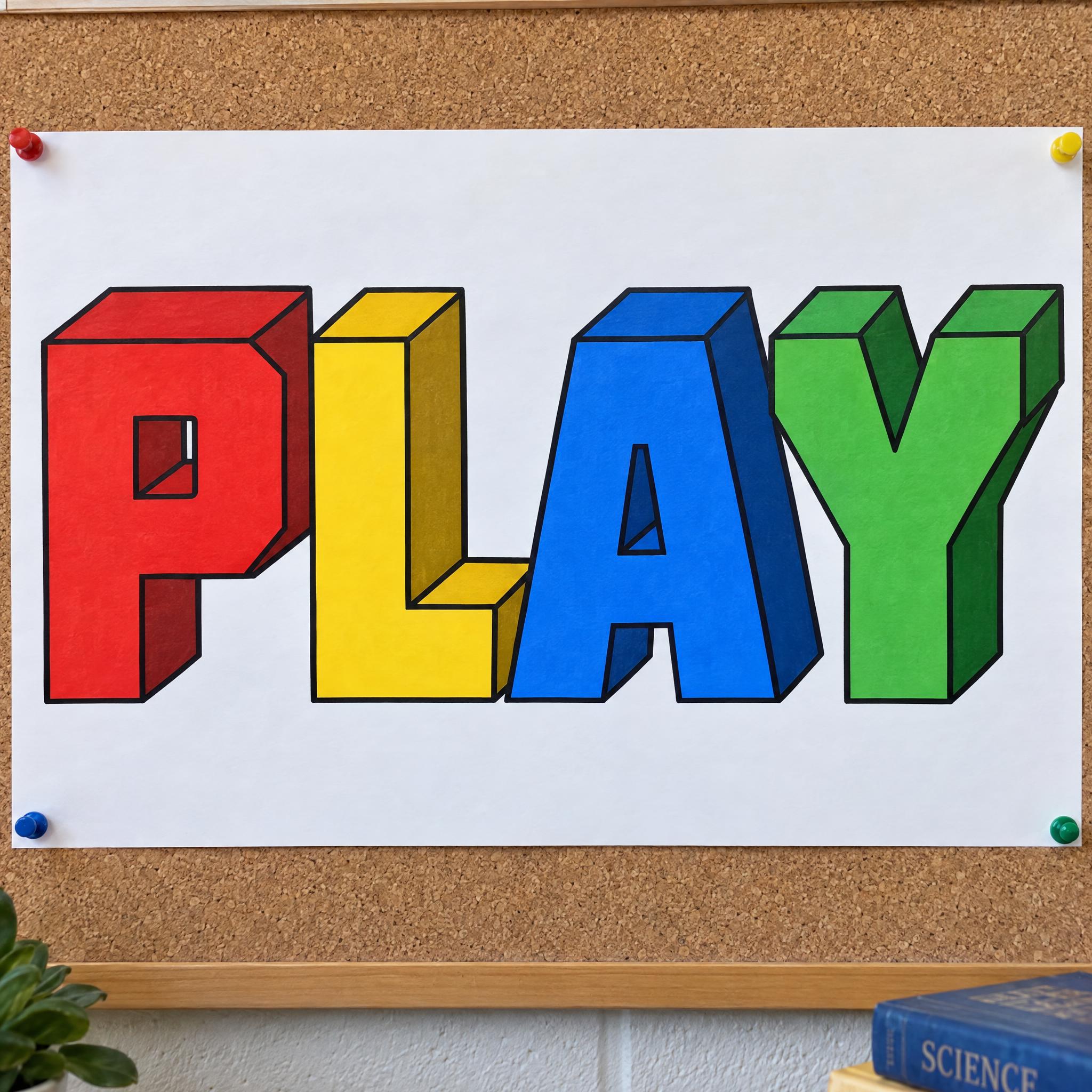
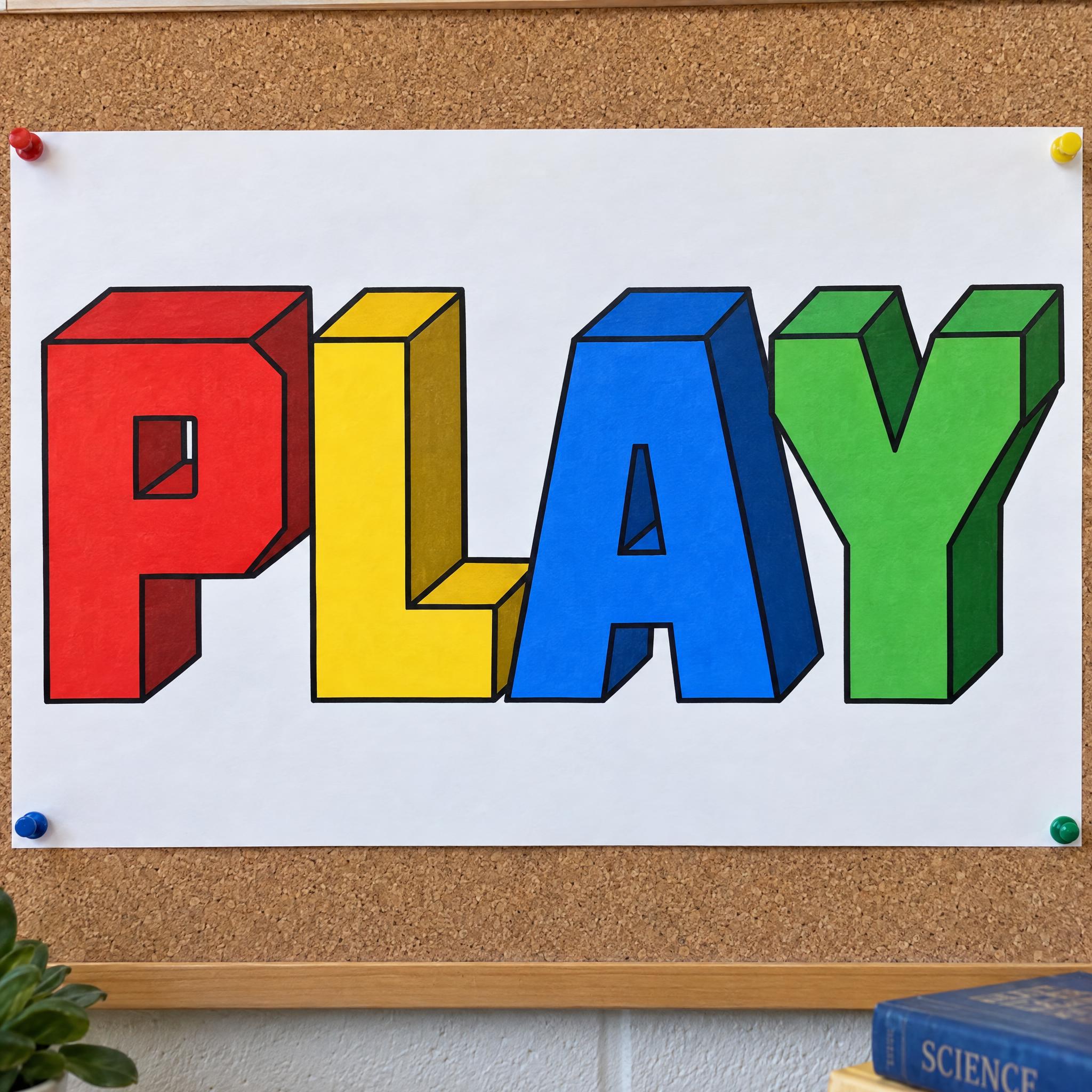
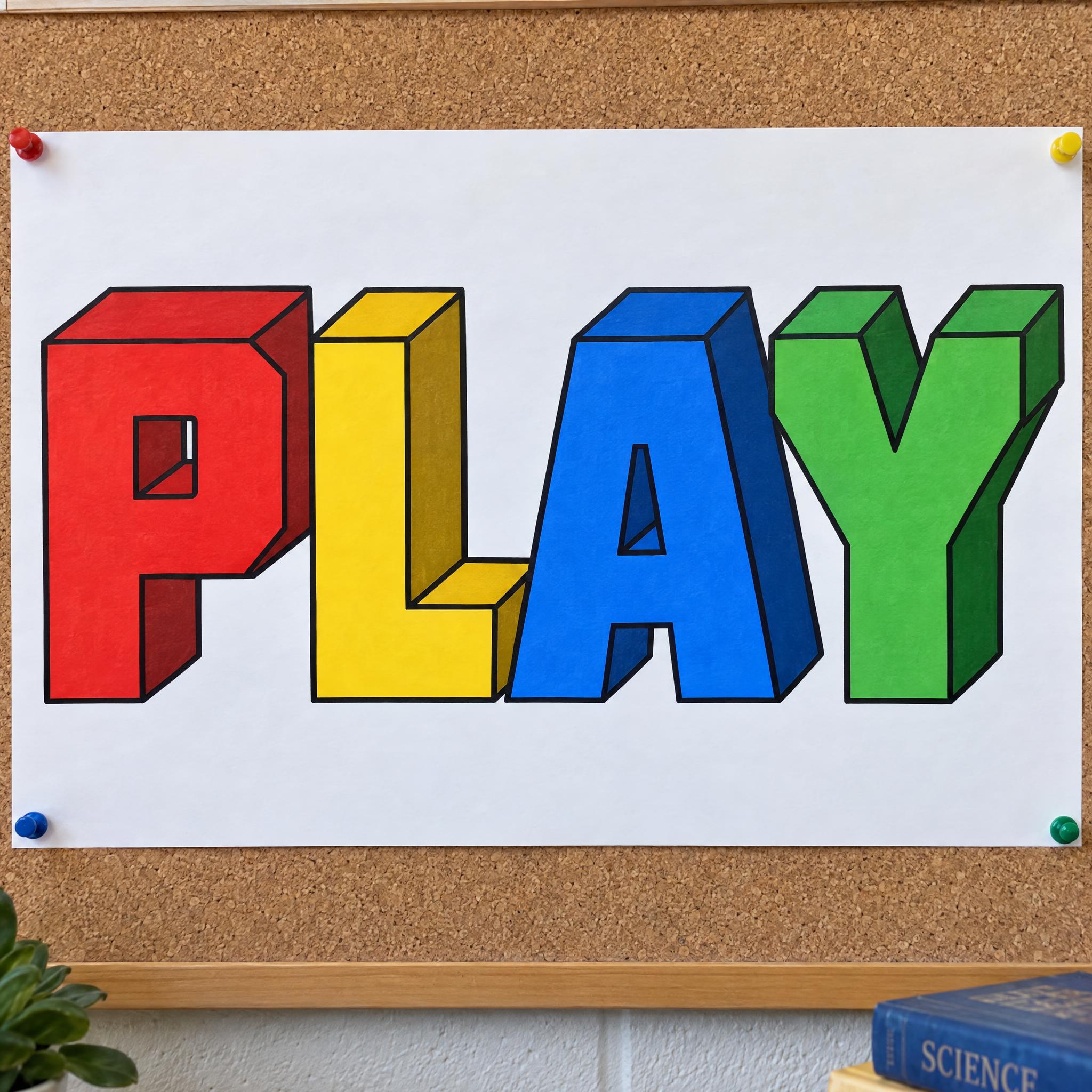
TextWrite the word "PLAY". Spell it exactly as written, without adding or changing any letter.
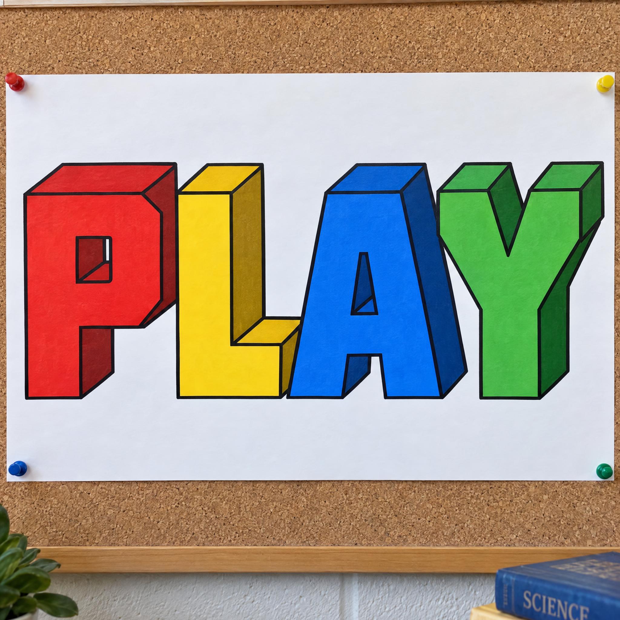
Font design3D block lettering: chunky capital letters with square corners and thick, even strokes, set side by side; every letter reads at a glance. Each letter is extruded back and down to the right into a deep solid block, so its top and right side faces show. The letters themselves are the blocks, not letters printed on cubes. The letters alternate red, yellow, blue and green, one colour per letter, with the side faces a darker shade of the same colour. Every edge of the front face and the block has a crisp black outline.
SceneDrawn on a large sheet of white poster paper pinned to a classroom corkboard, in bright daylight. The word is centered, spans most of the width and reads clearly.
Open one for the prompt and real results on each image model.
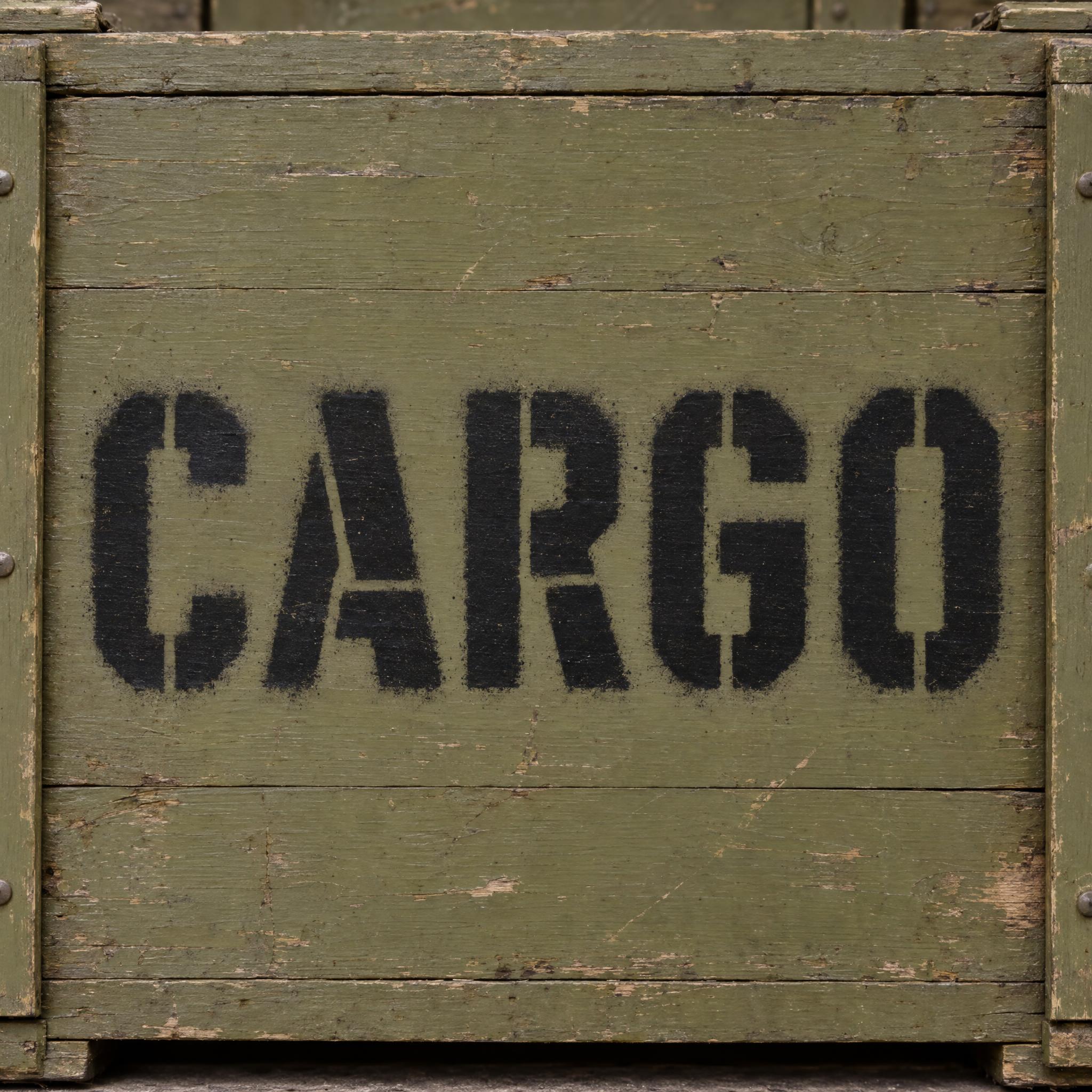
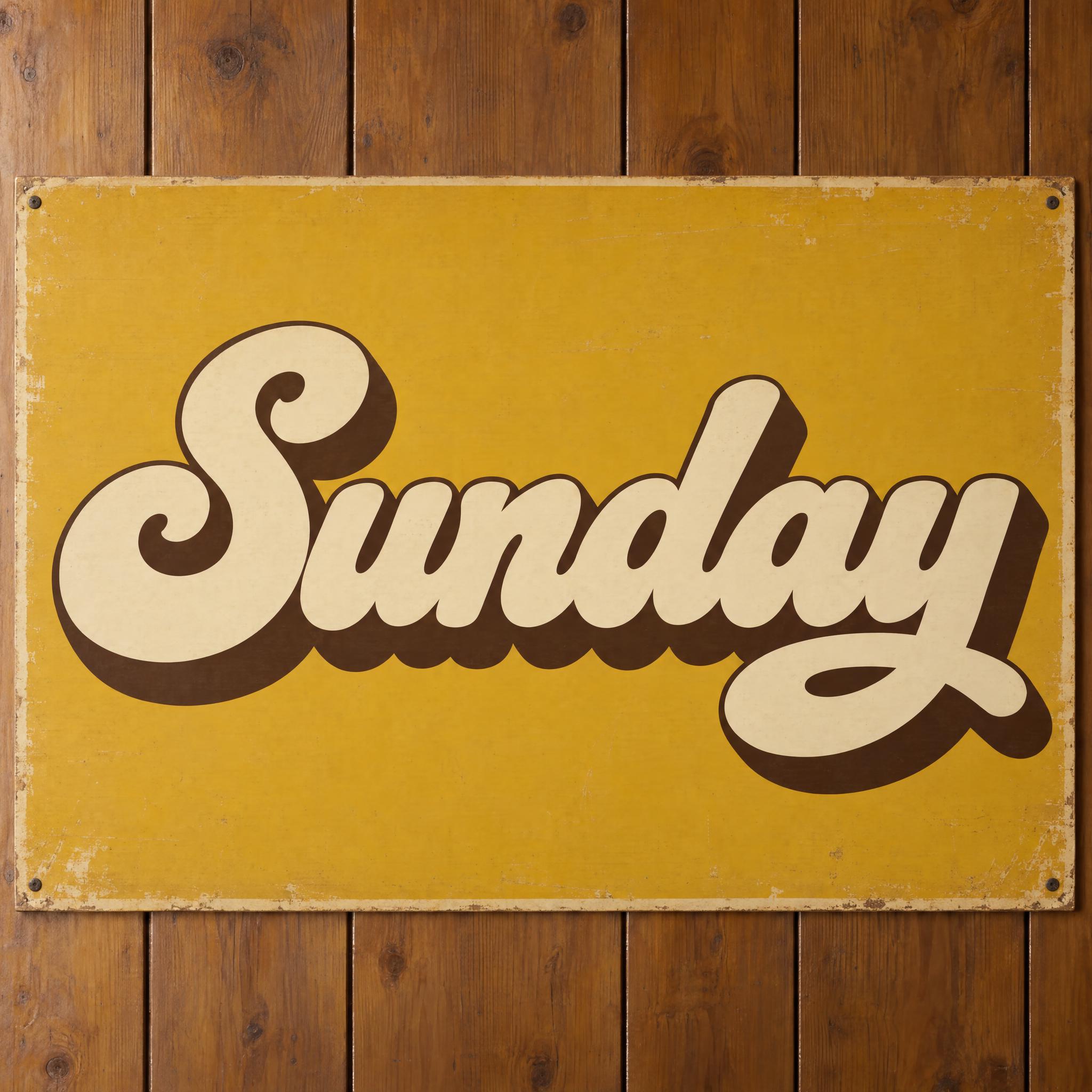
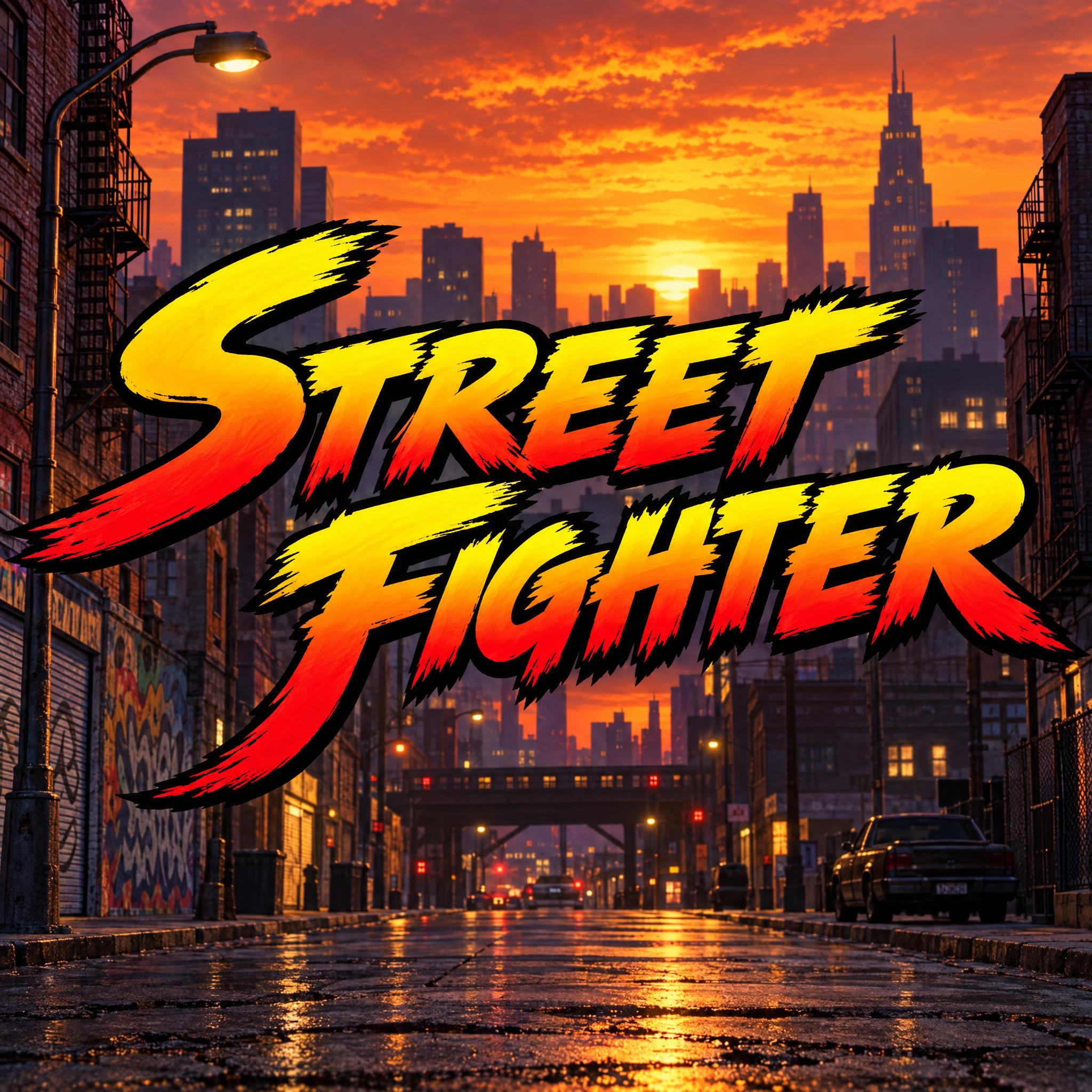
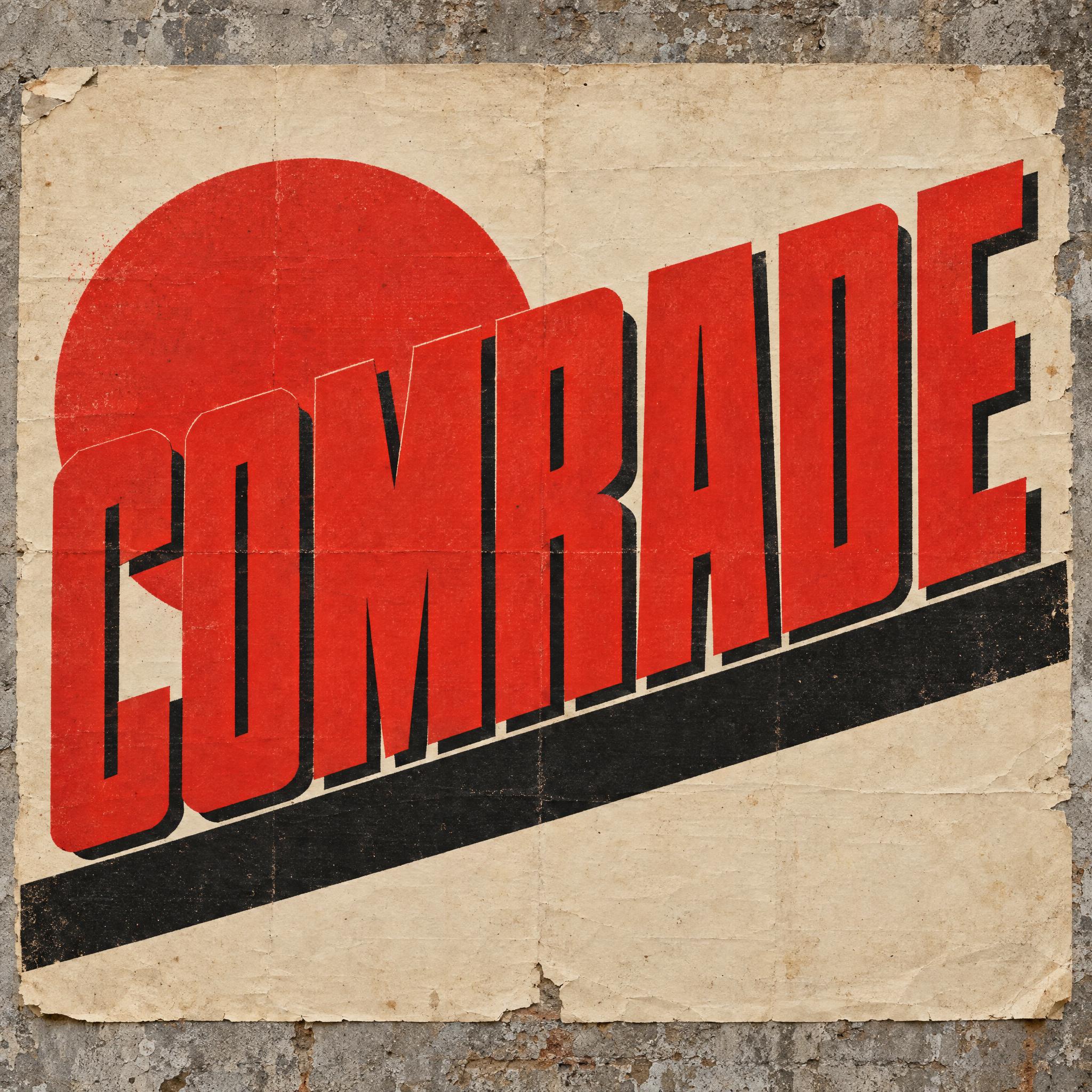

Tested October – November 2026. First attempts from our test ledger: 1423 images, 49 fonts, 7 languages, each one checked by eye.
How to read it: 284 / 290 means 290 images tested and 284 spelled the word right on the first try; the percentage is that share. The Latin, Chinese / Japanese and Arabic columns split the same count by the script of the word.
| Model | Right first time | Latin | Chinese / Japanese | Arabic | Most common issue |
|---|---|---|---|---|---|
| GPT Imagegpt-image-2.5-sunburst · xhigh | 98% 284 / 290 | 99% 198 / 200 | 98% 60 / 61 | 90% 26 / 29 | Style drifted |
| Nano Bananagemini-nano-banana-2.1 | 99% 288 / 292 | 100% 201 / 201 | 95% 58 / 61 | 97% 29 / 30 | Extra words added |
| Seedreamdola-seedream-5-0-pro-260628 | 85% 224 / 263 | 90% 159 / 177 | 88% 52 / 59 | 48% 13 / 27 | Wrong case |
| Grok Imaginegrok-imagine-image-2.0 · medium | 93% 267 / 287 | 95% 187 / 197 | 92% 56 / 61 | 83% 24 / 29 | Unreadable letters |
| Qwen-Imageqwen-image-3.0-pro | 74% 216 / 291 | 84% 166 / 198 | 74% 45 / 61 | 16% 5 / 32 | Wrong case |
How we test: images are made through FontVibe with each model’s API, sending the prompt as is; we count only each model’s first image for every font and language and check the spelling by eye. Apps such as ChatGPT may rewrite prompts, so results there can differ. For the full data, email [email protected].
Bold on its own tells a model almost nothing; it will thicken whatever font it had in mind. A good prompt says how heavy, keeps the letters readable as the strokes grow, and picks a build: narrow or wide, sans or serif, flat or 3D. The examples are quoted word for word from the prompts of the fonts on this page.
Heavy, very heavy and extremely heavy give different results. Pair the weight with the shape of the letters and their ends, and add tiny counters if you want the densest look.
“extremely heavy, condensed sans-serif capital letters with a strong forward slant, straight flat-cut ends and tiny counters” — Nike Font
The holes in a, e, o and R are the first thing to close up when strokes get fat, and a closed letter stops reading. Ask for small but open counters in the same breath as the weight.
“the strokes are so heavy that the counters are small but stay open, and every letter reads at a glance” — Thick Cursive Font
Tall condensed letters packed tight look loud and urgent; wide ones look solid and sporty. Say which, and say how close the letters sit.
“tall, tightly condensed, very heavy sans-serif capital letters with flat ends and straight sides, packed so close that neighbouring letters almost touch” — Marvel Font
Heavy serif capitals with strong contrast are the classic newspaper headline. Name the serifs and the contrast so the model does not drift back to a plain sans.
“heavy, tightly condensed serif capitals with strong thick-and-thin contrast and short, sharp serifs” — Newspaper Font
A solid extrusion makes a word look heavier still. Describe which faces of the block show, so the depth reads as part of the letter, not a separate shadow.
“Each letter is extruded back and down to the right into a deep solid block, so its top and right side faces show.” — 3D Block Letters
Thick letters can melt into a dark or busy scene. A double outline separates each letter and then the whole word.
“Each letter has a thick white outline, and a thick black outline wraps the whole word outside the white.” — Gaming Font
Scripts and brush styles drift toward delicate calligraphy. One short negative keeps the weight where you asked for it.
“Never a thin, delicate calligraphy script.” — Thick Cursive Font
Many people searching bold font want bold text to paste into a bio or a chat. That is a different thing, and it helps to know which one you need.
The bold letters you paste into a social bio come from the Mathematical Alphanumeric Symbols block of Unicode, styled Latin and Greek letters and digits meant for maths. Unicode recommends not using them in general text in place of formatting, though people use them on social media, for example for a stylised user name, and devices without support show boxes or question marks. This page does something else: it makes a picture of your word in heavy lettering with an image model.
Font weights run on a scale from 100 to 900: normal is 400, bold is 700, extra bold is 800 and black, also called heavy, is 900. Most letters on this page sit at the black end, far heavier than the bold of body text, because a title or a logo has to carry from a distance.
Sources: MDN — font-weight
Heavy letters come in very different builds: square 3D Block Letters for a kids poster, tight slanted Nike Font for sport, Thick Cursive Font for a retro shirt, Brush Stroke Font for a festival poster. Decide what the word is for, then pick the build.
Bold type is a nineteenth-century arrival. Early fonts had no matching bold, so a printer who wanted a word to stand out set it in a generally heavy face, often a Clarendon or another slab serif, and bold for emphasis is still used that way, as in the keywords of a printed dictionary.
The original Clarendon is credited to Robert Besley, a partner in the Fann Street Foundry in London, who registered it in 1845 under Britain's Ornamental Designs Act; the protection ran out three years later and other foundries copied it. The typographer James Mosley called it the first type actually designed as a related bold, made to sit alongside the roman text it was set with, while Walter Tracy saw the related bold as a twentieth-century creation, so which bold came first is still argued. Clarendon was especially popular for posters, which is why it is linked with wanted posters and the American Old West; Wanted Poster Font and the western font page draw that look.
Today weight is a scale. Geometric sans-serif families, for example, were expanded into multiple weights and condensed styles, and the numbered steps from thin to black let a designer choose exactly how heavy a word should be. The prompts on this page work the same way in words: they say how heavy, how narrow and how tight, then add depth, outlines or a brush when the job needs them.
Sources: Wikipedia — Emphasis (typography) · Wikipedia — Clarendon (typeface) · Wikipedia — Sans-serif · MDN — font-weight
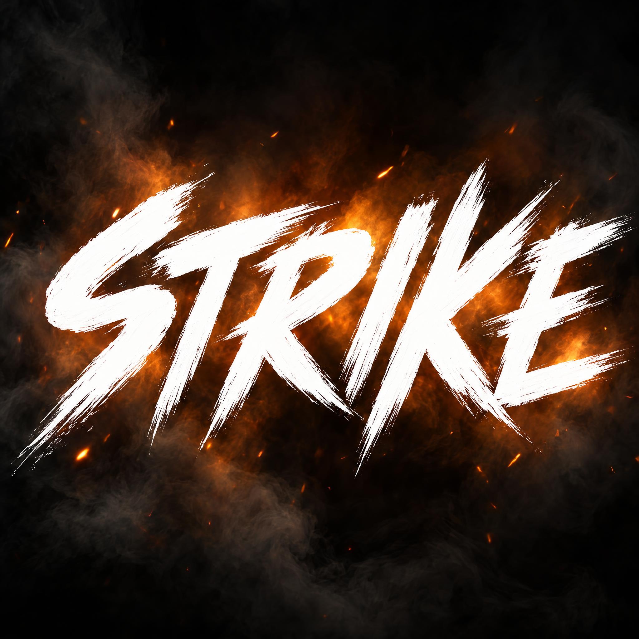
Extremely heavy, narrow and slanted, packed until the sides nearly touch.
Tall condensed white capitals inside a tight red rectangle.
Chunky square capitals extruded into deep solid blocks, one colour each.
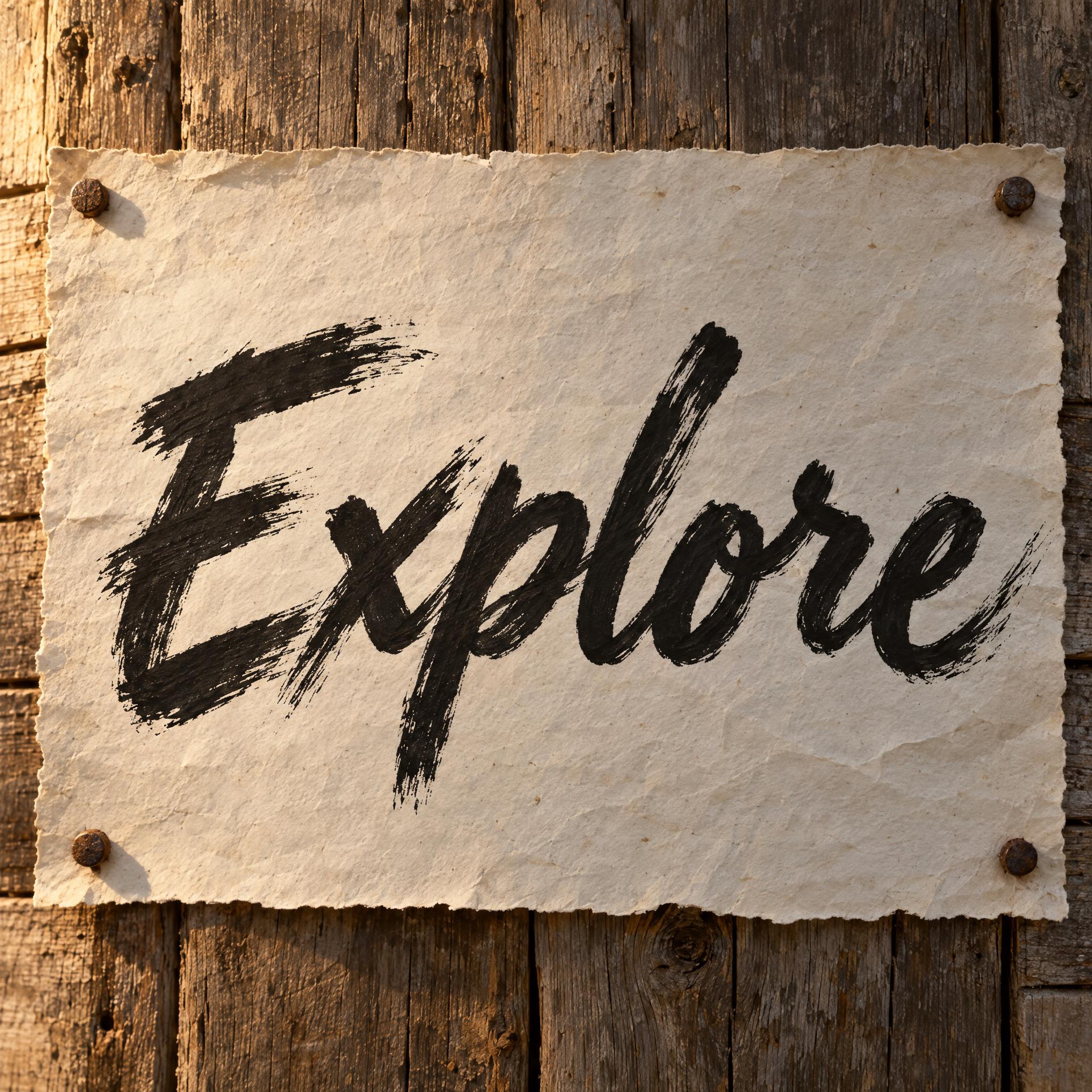
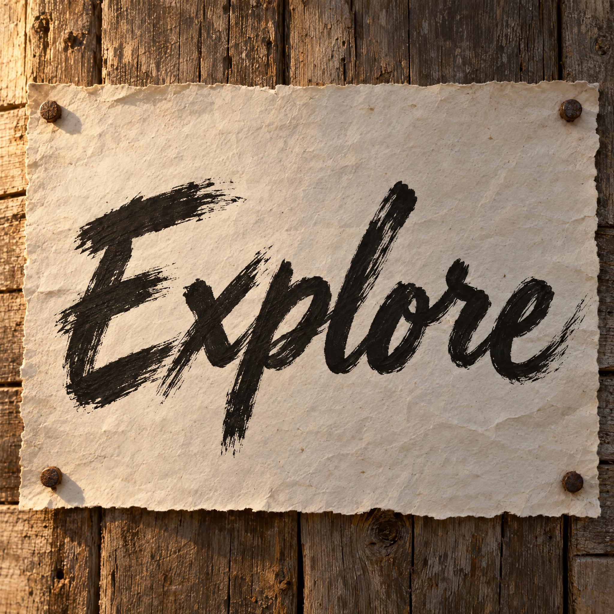
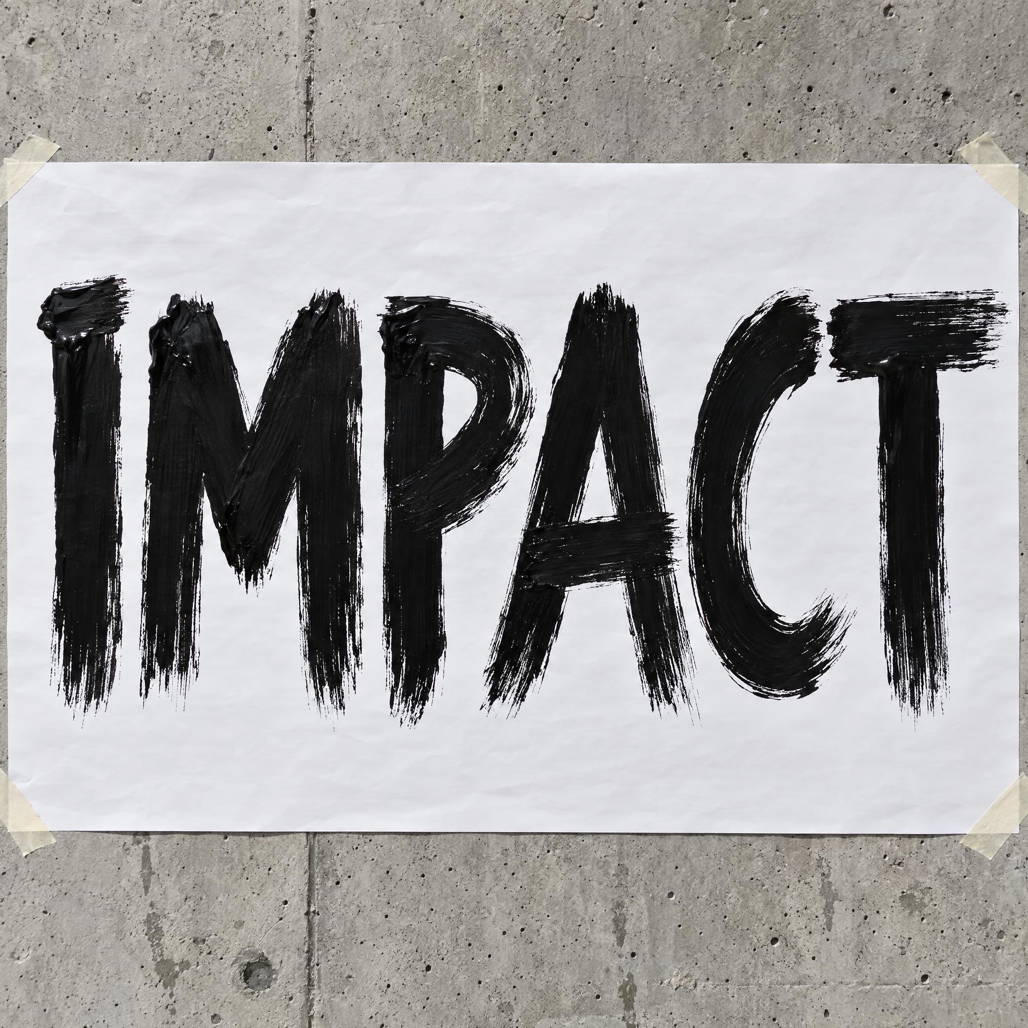
Thick strokes of a loaded brush with ragged, dry edges.
Fat, rounded joined letters with a solid drop shadow.
Condensed black serif capitals on old newsprint.
Wide slanted capitals with clipped corners and white and black outlines.
Heavy leaning title letters and bouncing sound effects.
A bold font has thicker strokes than regular text, so the word looks heavier and stands out. On this page each bold style is an AI prompt that draws your own word in heavy lettering as an image.
No. A bold text generator swaps your letters for bold-looking Unicode characters you can paste as text. These are prompts for image apps like ChatGPT and Gemini: you get a picture of your word, for a title, logo, poster or shirt.
Pasted bold text is made of special Unicode letters meant for maths, and Unicode advises against using them as ordinary text; devices without support show boxes or question marks. For a chat message, use the app's own formatting. For a bold word as an image, use a prompt here.
They are steps on the same weight scale: bold is 700, black or heavy is 900. Most prompts here aim for the black end, because a title or logo needs weight that carries at a distance.
For a sporty print, Nike Font or Gaming Font. For a retro shirt, Thick Cursive Font. For a playful kids design, 3D Block Letters. Keep the background plain so the letters cut out cleanly.
As strokes get thicker, the holes inside letters close and neighbouring letters merge. Keep the sentence about small but open counters, use short words, and generate again if a letter is lost.
No. They are prompts that make an image of your word with an AI model, not font files to install. For bold body text, use the bold weight of an installed font.