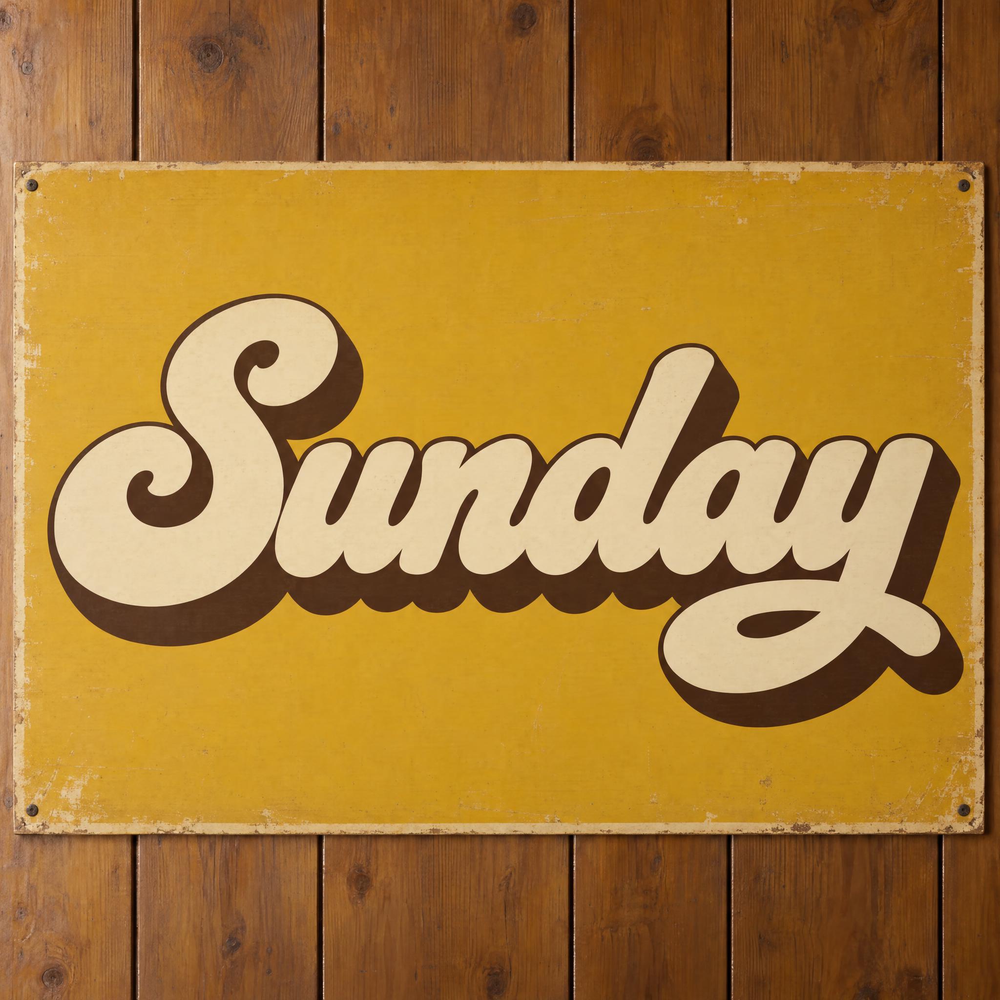
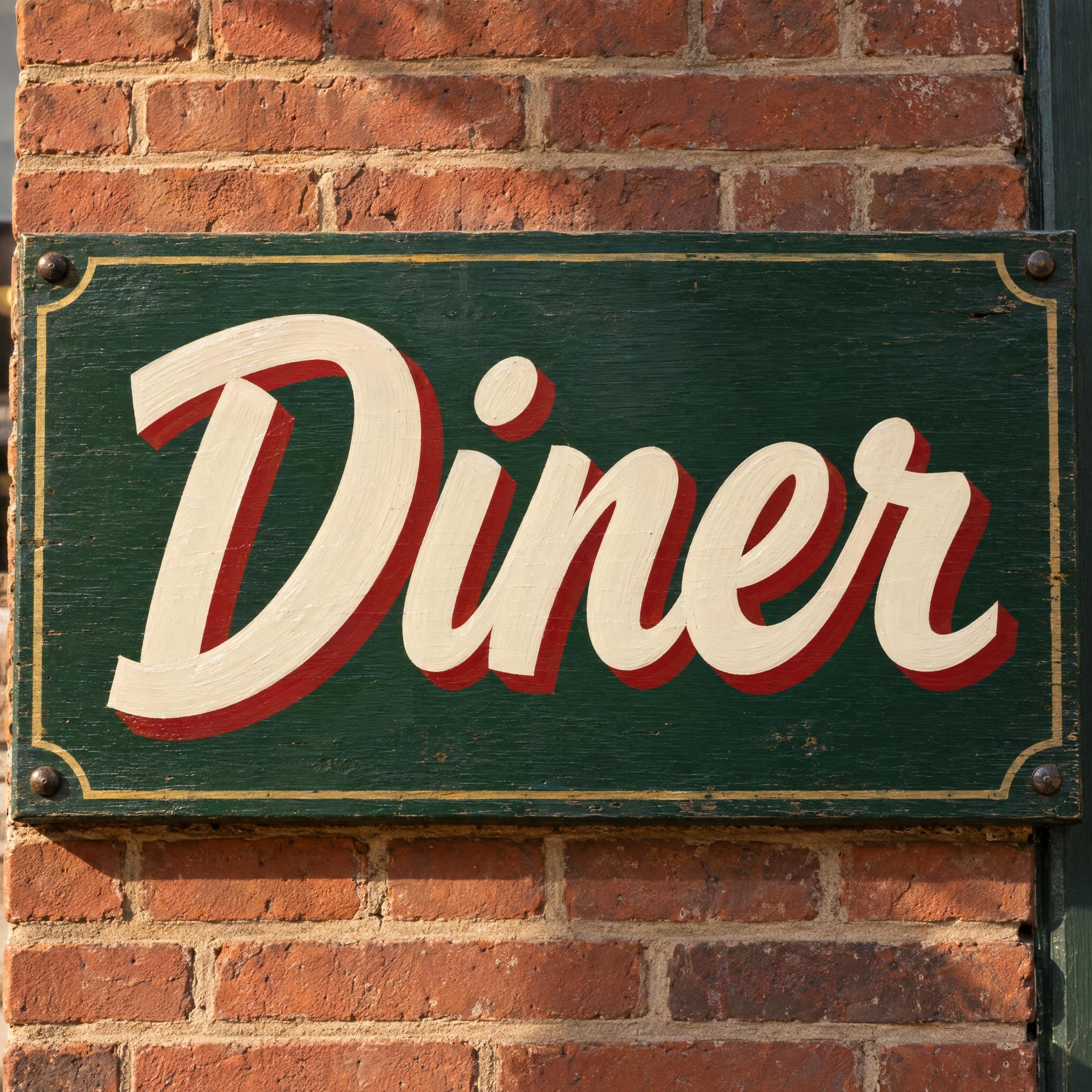
Retro fonts as copy-ready AI prompts, sorted by decade: groovy 70s record-cover letters, 80s synthwave chrome, melting 60s concert-poster type, a heavy retro script and hand-painted shop signs. These are prompts, not font files: type your word, copy, and paste into ChatGPT or Gemini, or generate it right away on FontVibe.
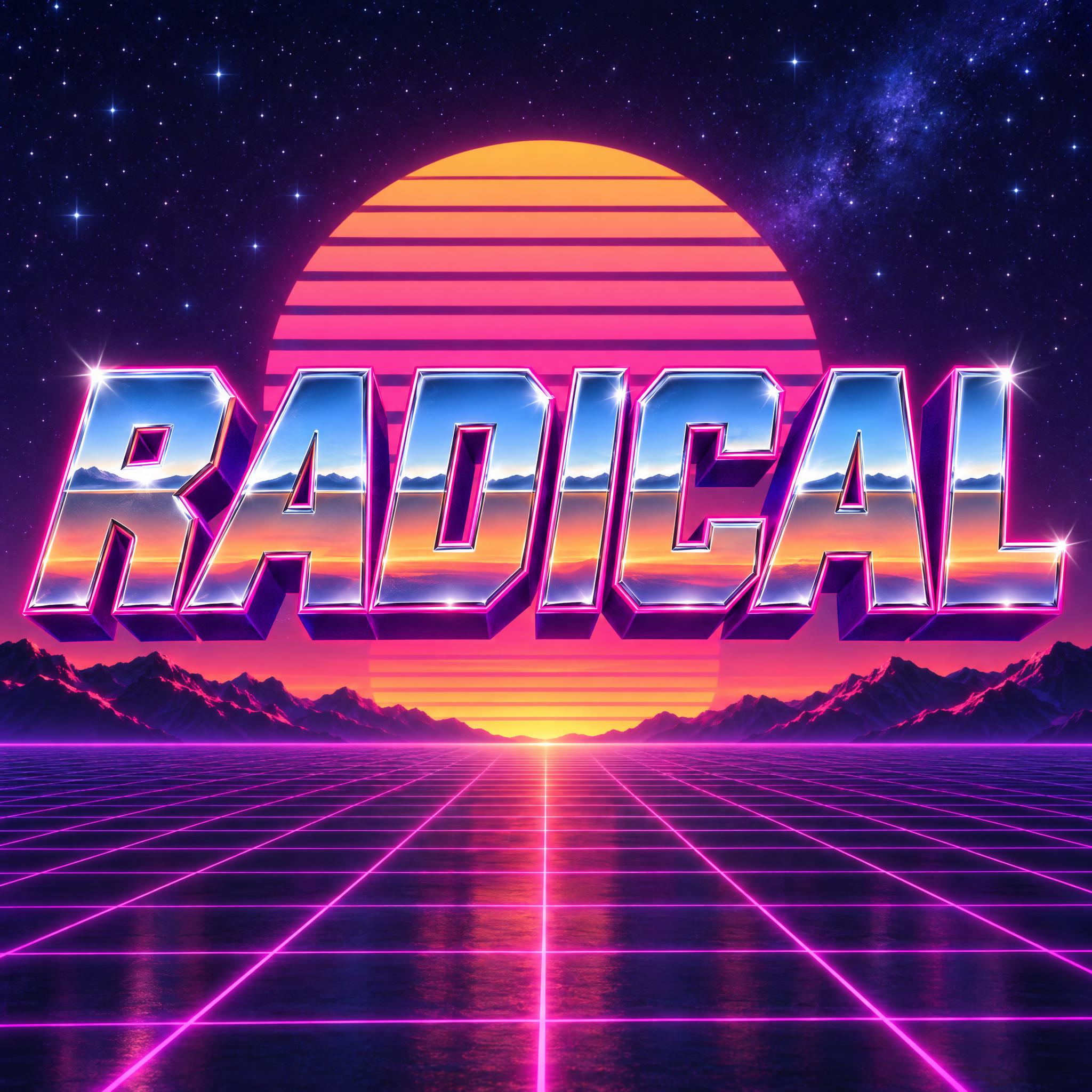
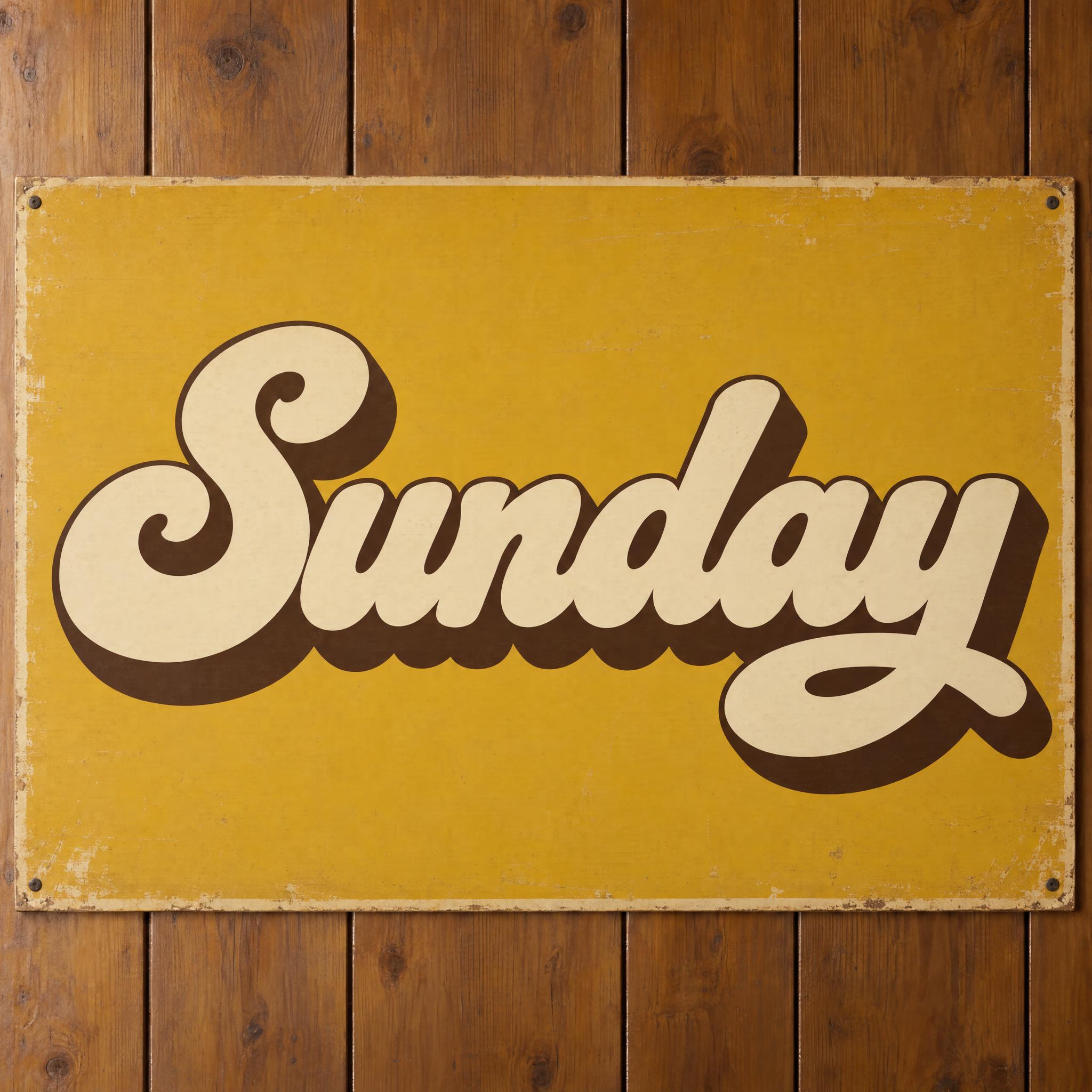
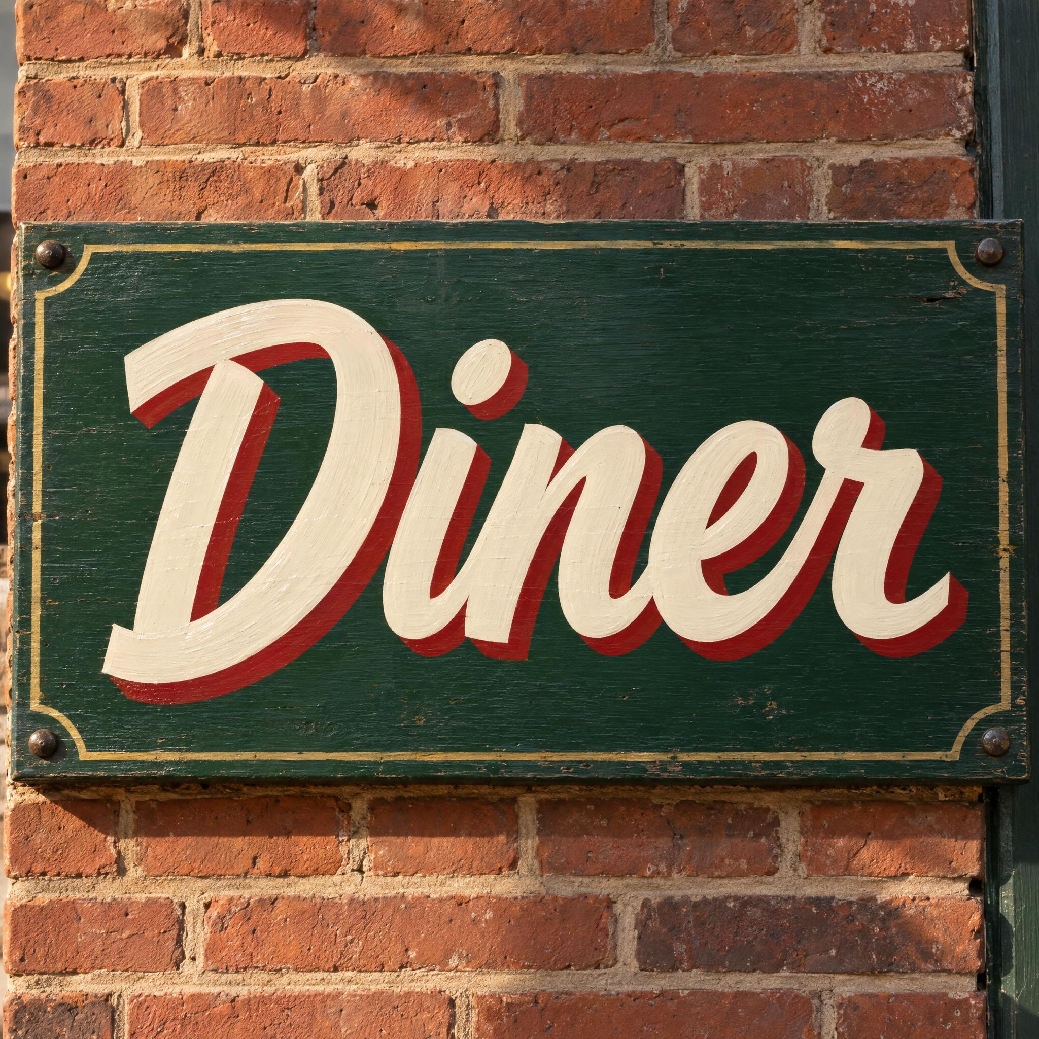
Type your word, copy the full prompt and paste it into ChatGPT, Gemini or any image model.
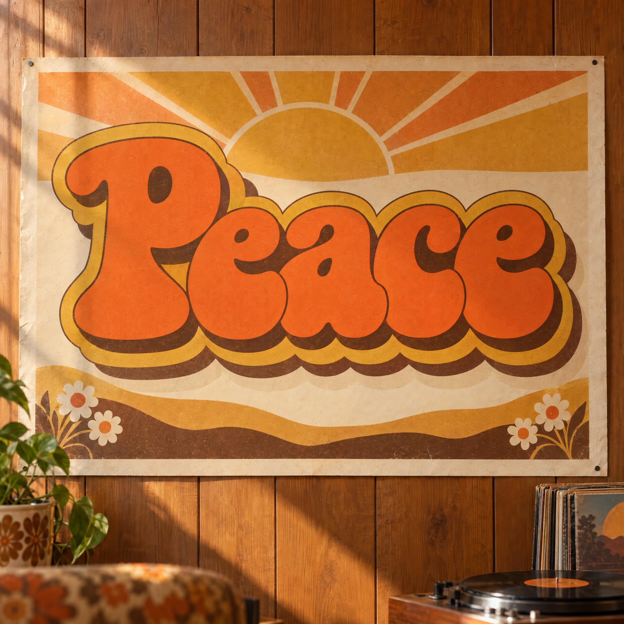
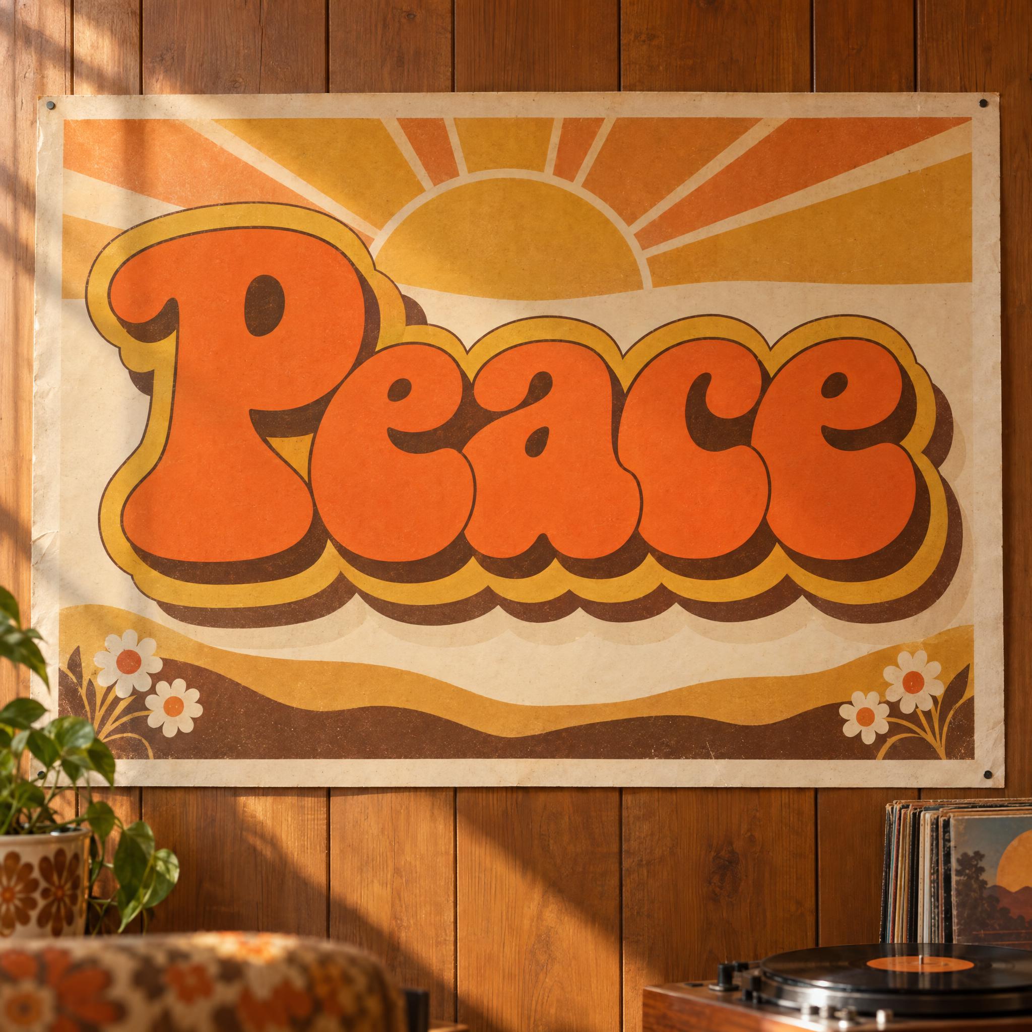
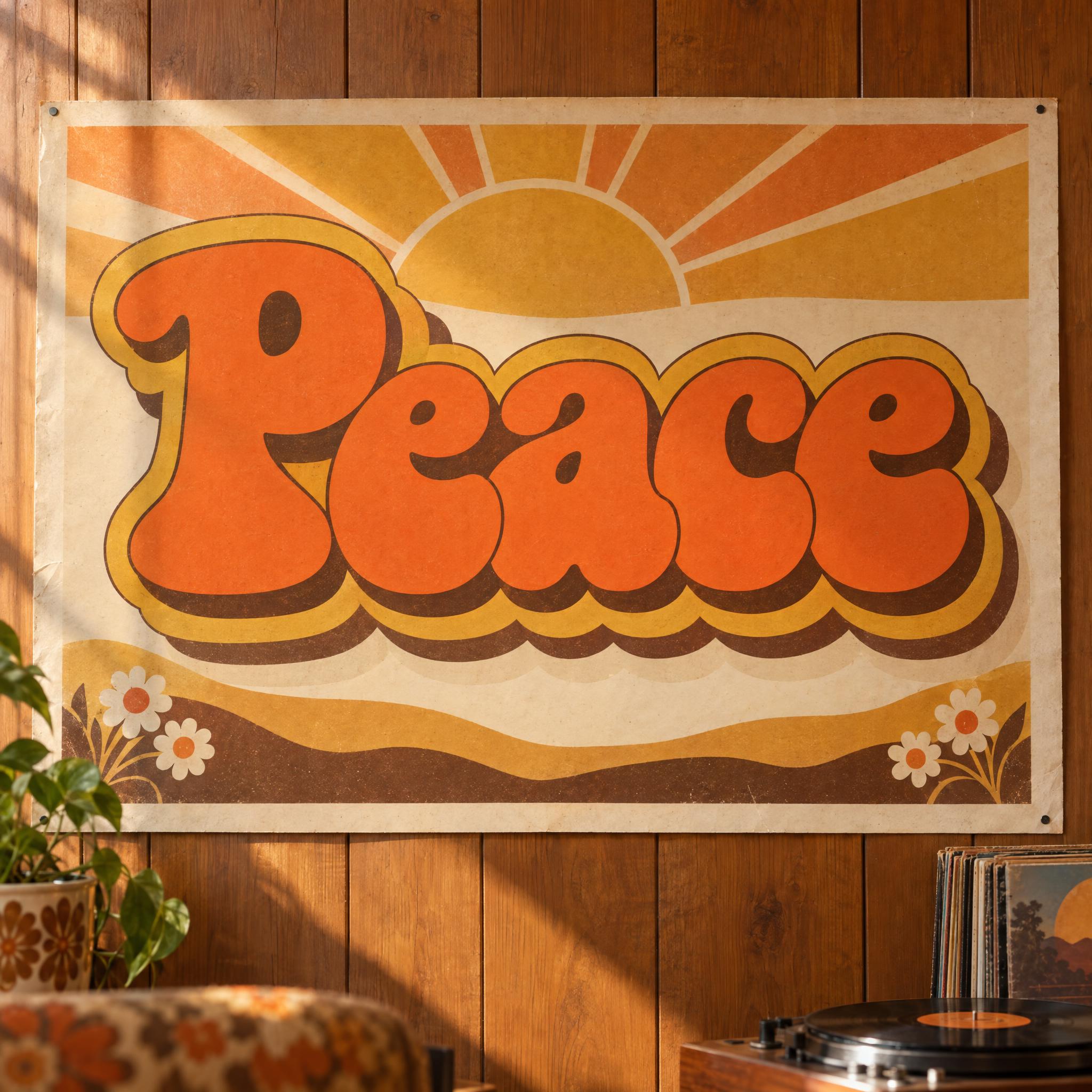
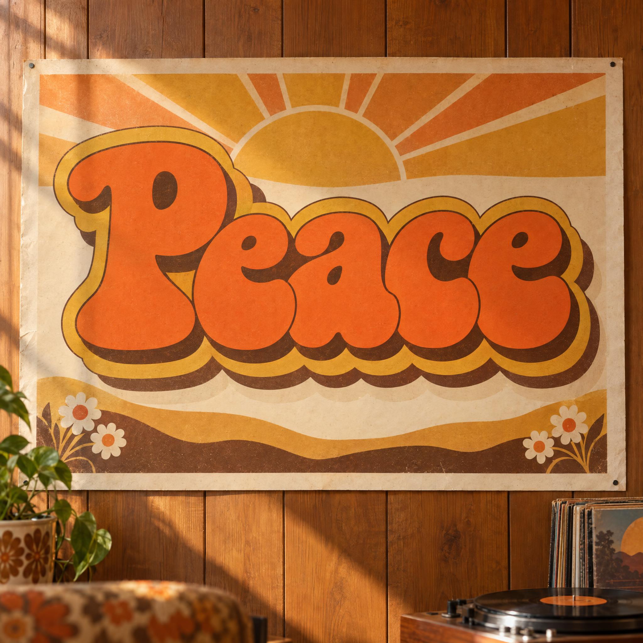
TextWrite the word "Peace". Spell it exactly as written, without adding or changing any letter.
Font designGroovy 70s lettering: very bold, soft rounded letters with swelling curves and bouncy shapes, a capital first letter and lowercase after it, the letters packed close and slightly overlapping, every letter reading at a glance. The letters are warm orange. Behind the word sit three outline layers in mustard yellow, brown and cream, each stepped down and to the right like stacked retro stripes. Flat colours with a slight printed grain. Like the title on a 1970s record cover.
SceneThe word is printed on a 1970s poster on a wood-panelled wall, in warm afternoon light. The word is centered, spans most of the width and reads clearly.
Open one for the prompt and real results on each image model.
Tested October 2026. First attempts from our test ledger: 176 images, 5 fonts, 7 languages, each one checked by eye.
How to read it: 30 / 36 means 36 images tested and 30 spelled the word right on the first try; the percentage is that share. The Latin, Chinese / Japanese and Arabic columns split the same count by the script of the word.
| Model | Right first time | Latin | Chinese / Japanese | Arabic | Most common issue |
|---|---|---|---|---|---|
| GPT Imagegpt-image-2.5-sunburst · xhigh | 100% 35 / 35 | 100% 20 / 20 | 100% 10 / 10 | 100% 5 / 5 | None recorded |
| Nano Bananagemini-nano-banana-2.1 | 100% 36 / 36 | 100% 20 / 20 | 100% 10 / 10 | 100% 6 / 6 | None recorded |
| Seedreamdola-seedream-5-0-pro-260628 | 83% 30 / 36 | 100% 20 / 20 | 100% 10 / 10 | 0% 0 / 6 | Wrong letter |
| Grok Imaginegrok-imagine-image-2.0 · medium | 97% 33 / 34 | 100% 20 / 20 | 100% 10 / 10 | 75% 3 / 4 | Wrong letter |
| Qwen-Imageqwen-image-3.0-pro | 66% 23 / 35 | 70% 14 / 20 | 90% 9 / 10 | 0% 0 / 5 | Wrong case |
How we test: images are made through FontVibe with each model’s API, sending the prompt as is; we count only each model’s first image for every font and language and check the spelling by eye. Apps such as ChatGPT may rewrite prompts, so results there can differ. For the full data, email [email protected].
Retro is not one letterform but a decade. A good retro prompt names the decade first, then builds the look in layers: a skeleton, a palette, one signature effect, a printed surface and an object from the era. The examples are quoted word for word from the prompts of the fonts on this page.
Each decade has its own letter shape: soft, bouncy, very bold letters for the 70s; wide, sharp, forward-leaning capitals for the 80s. Put the decade and that shape in the first sentence, because the model fills in a lot from the decade alone.
“Groovy 70s lettering: very bold, soft rounded letters with swelling curves and bouncy shapes, a capital first letter and lowercase after it, the letters packed close and slightly overlapping, every letter reading at a glance.” — Groovy Font
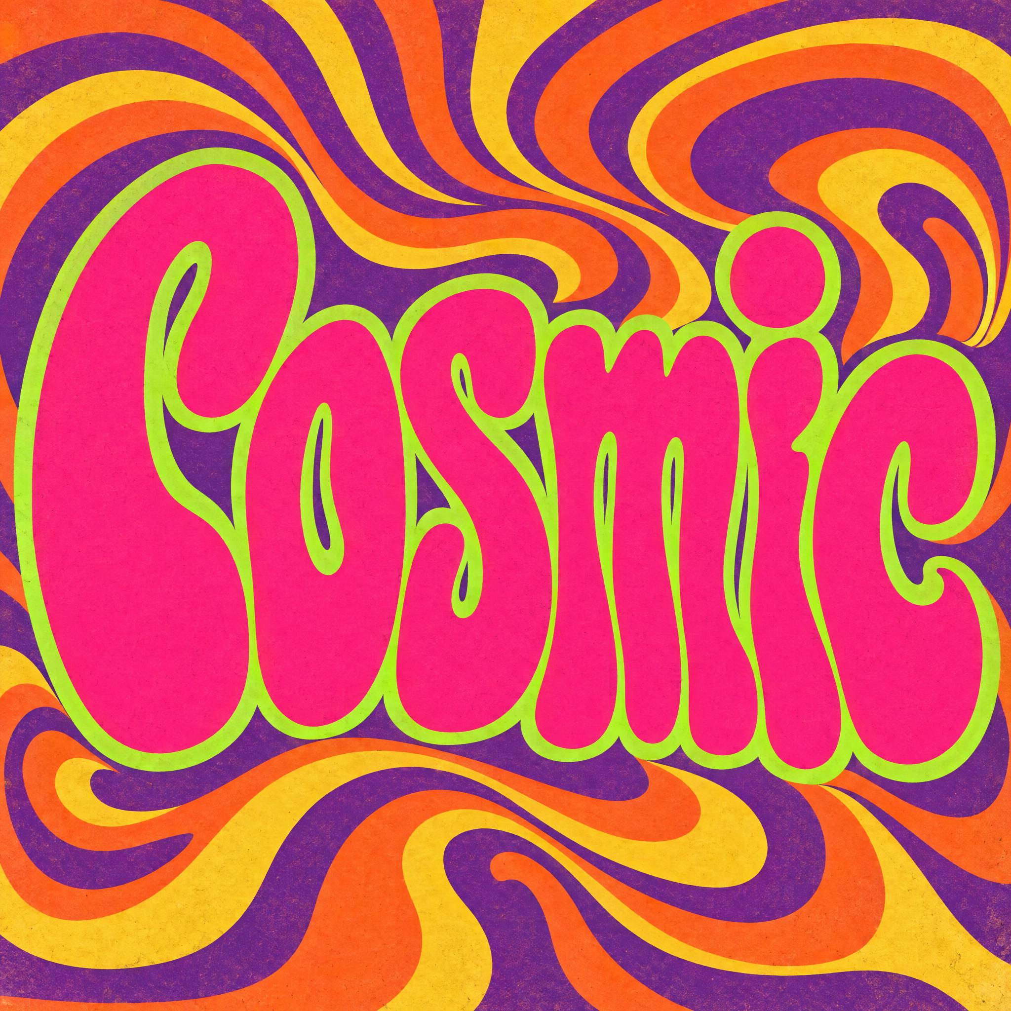
The 60s look is different again: tall letters that melt into each other. Asking for two decades at once hands the model two looks to average, so pick one and describe its shape.
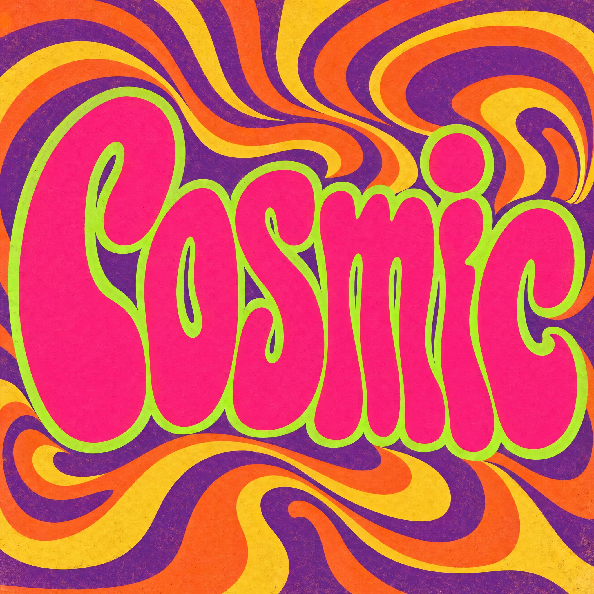
“Psychedelic 60s poster lettering: tall, heavy letters that melt and stretch into wavy, flowing shapes, a capital first letter and lowercase after it, the counters squeezed into small curved slits and the letters pressed tightly together; every letter still reads clearly.” — Psychedelic Font
Colour does much of the dating: orange, mustard and brown for the 70s; hot pink, purple and chrome for the 80s. One short sentence lets you swap the palette without touching the letters.
“The letters are warm orange.” — Groovy Font
Each decade has a trick the eye spots before it reads the word: stacked offset outlines in the 70s, a chrome face cut by a horizon line in the 80s. Describe one in detail; two or three effects fight each other.
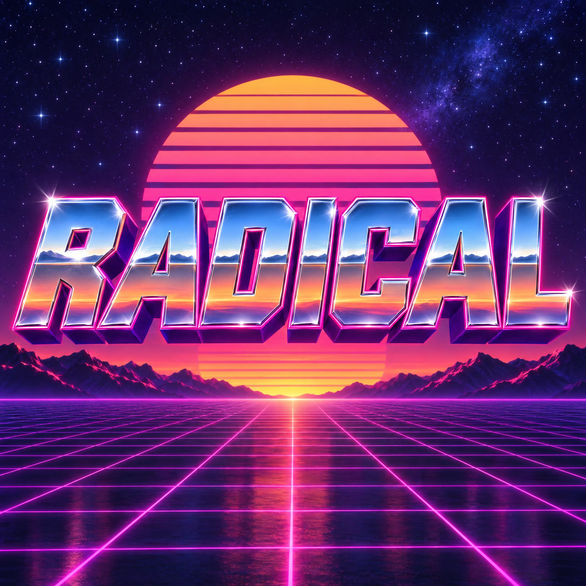
“Each letter face is polished chrome split by a horizon line across the middle, reflecting blue sky above and warm orange-pink below, with a bright star glint on one corner.” — 80s Font
Old lettering lived on paper and painted boards, so flat colour with a little grain looks older than a smooth digital gradient. One sentence is enough.
“Flat colours with a slight printed grain.” — Groovy Font
End the style with something the model has seen thousands of times: a record sleeve, an album cover, a concert poster. It pulls the whole image toward the right year.
“Like the title on a 1980s synthwave album cover.” — 80s Font
A wood-panelled wall, a neon grid running to the horizon, a swirling poster. The scene finishes the date stamp, so the letters don't have to carry it alone.
“The word floats over a neon grid running to a striped sunset, under a starry sky.” — 80s Font
Retro spans half a century of lettering. You can usually date a retro font by three things: the letter shape, the palette, and the object it first appeared on.
Mid-century American motels, coffee shops and drive-in restaurants caught drivers' eyes with elevated signs, bold neon letters and Space Age ornaments such as starbursts and boomerangs. A dedicated 50s font is still to come; for a hand-painted vintage shop sign today, use Sign Painter Font.
Sources: Wikipedia — Googie architecture
San Francisco rock posters, at their height from about 1966 to 1972, used ornate lettering, rubber-like distortions and saturated colours in glaring contrast. Psychedelic Font draws that melting poster type.
Sources: Wikipedia — Psychedelic art
The 70s look is fat and soft. Cooper Black, an ultrabold face with soft, low-contrast strokes, turned up on album covers such as David Bowie's Ziggy Stardust and the Doors' L.A. Woman. Groovy Font is the record-cover look with stacked stripes; Thick Cursive Font is the heavy joined script with a drop shadow, like a surf-shop T-shirt.
Sources: Wikipedia — Cooper Black
The neon-and-grid look comes from synthwave, a music genre of the mid-to-late 2000s built on 1980s film scores and video games. Its subgenre outrun, named after the 1986 arcade racing game Out Run, became the name for the look itself: magenta neon and gridlines. 80s Font draws it.
Sources: Wikipedia — Synthwave
The 90s are several looks, not one. Grunge design used distressed, torn lettering; Ray Gun magazine, art-directed by David Carson, is the famous example. Pictures tagged 90s lettering today also mix in graffiti and fat bubble shapes. A dedicated 90s font is still to come; for now, try graffiti letters or bubble letters.
Sources: Wikipedia — Grunge (graphic design)
The Y2K aesthetic looks back at the late 1990s and early 2000s: metallic chrome, lime, orange and hot pink, gradients, and chunky or rounded fonts. A dedicated Y2K font is still to come.
Sources: Wikipedia — Y2K aesthetic
| You want | Try | Why |
|---|---|---|
| A 70s party flyer or record cover | Groovy Font | Fat, bouncy letters with stacked stripes |
| A synthwave or gaming title | 80s Font | Chrome face, hot-pink outline, neon grid |
| A 60s gig or festival poster | Psychedelic Font | Melting letters, clashing colours |
| A retro shirt or shop logo in script | Thick Cursive Font | Heavy joined script with a drop shadow |
| A vintage hand-painted sign | Sign Painter Font | Flat-brush strokes and glossy enamel |
Retro is a young word. It has been used since 1972 for new things that deliberately borrow the look of the past, and what it borrows is mostly the recent past, not antiquity. In France, rétro, short for rétrospectif, took hold in the 1970s with films and novels that revisited the Nazi occupation, and was soon applied to nostalgic fashion. Retro, in one description, is nostalgia with a dose of cynicism and detachment.
Lettering is where the decades show most. In the 1960s, phototypesetting gave designers far more freedom over type styles and sizes, and psychedelic typefaces drew on Art Nouveau. In San Francisco, Wes Wilson's posters for the Fillmore made letters look as if they were moving or melting; he took the idea from Alfred Roller's block lettering and the way it filled the space, and wanted lettering people had to stop to figure out. The same phototype years produced many distorted versions of Cooper Black, an ultrabold 1922 face that became far more popular in pop culture after the Beach Boys' Pet Sounds cover in 1966.
Each revival copies one before it. The 1980s came back through synthwave, a music genre of the mid-to-late 2000s whose look is magenta neon and gridlines; the 2011 film Drive brought it to a wide audience. In the 2020s the Y2K aesthetic did the same for the turn of the millennium. That is why a retro font today can mean four or five different decades, and why this page sorts them by decade.
Sources: Wikipedia — Retro style · Wikipedia — Psychedelic art · Wikipedia — Wes Wilson · Wikipedia — Cooper Black · Wikipedia — Synthwave · Wikipedia — Y2K aesthetic
Fat, soft, bouncy letters with stacked mustard, brown and cream stripes.
Wide chrome capitals with a hot-pink outline over a neon grid.
Tall letters melting into each other, hot pink on acid green.
Heavy joined script with a solid drop shadow.
Flat-brush show-card letters in glossy enamel.
Neon script and atomic starbursts. Coming later.
Torn, distressed type, graffiti and bubble shapes. Coming later.
Liquid chrome, candy colours and rounded, chunky letters. Coming later.
A retro font is lettering that imitates a past decade, most often somewhere between the 1950s and the early 2000s: groovy 70s, 80s chrome and neon, 60s psychedelic posters, Y2K chrome. On this page each style is an AI prompt that draws your own word in that look.
Close enough for searching. Retro, strictly, is a new design that copies the past; vintage is the everyday word for things that look old. People use both for the same lettering, so this page covers both.
Groovy Font: very bold, soft, bouncy letters in warm orange with three stacked outlines behind them. For a 70s script, use Thick Cursive Font.
Not yet as a single style. Each of those decades is several looks at once, so they are described in the decade guide above, and dedicated prompts will follow.
No. They are prompts, not .ttf or .otf files. You get your word as a finished image, with the stripes, chrome or poster colours drawn around your exact letters, which an installed font can't do.
The comparison on this page counts how often each model spelled the word right on the first try across these styles and seven languages. Whichever you use, check every letter: overlapping and melting shapes can hide a mistake.
Copying the prompts on AIFont is free. What you may do with the image depends on the terms of the app that generated it, so check that app's rules before you print or sell.