Calligraphy fonts as copy-ready AI prompts: copperplate, Spencerian, modern bounce, italic, Gothic and brush lettering. These are prompts, not font files: type your word, copy, and paste into ChatGPT or Gemini, or generate it right away on FontVibe.
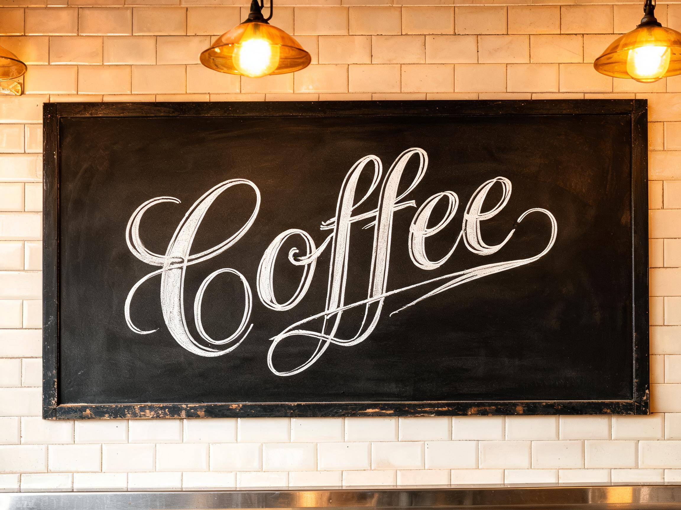
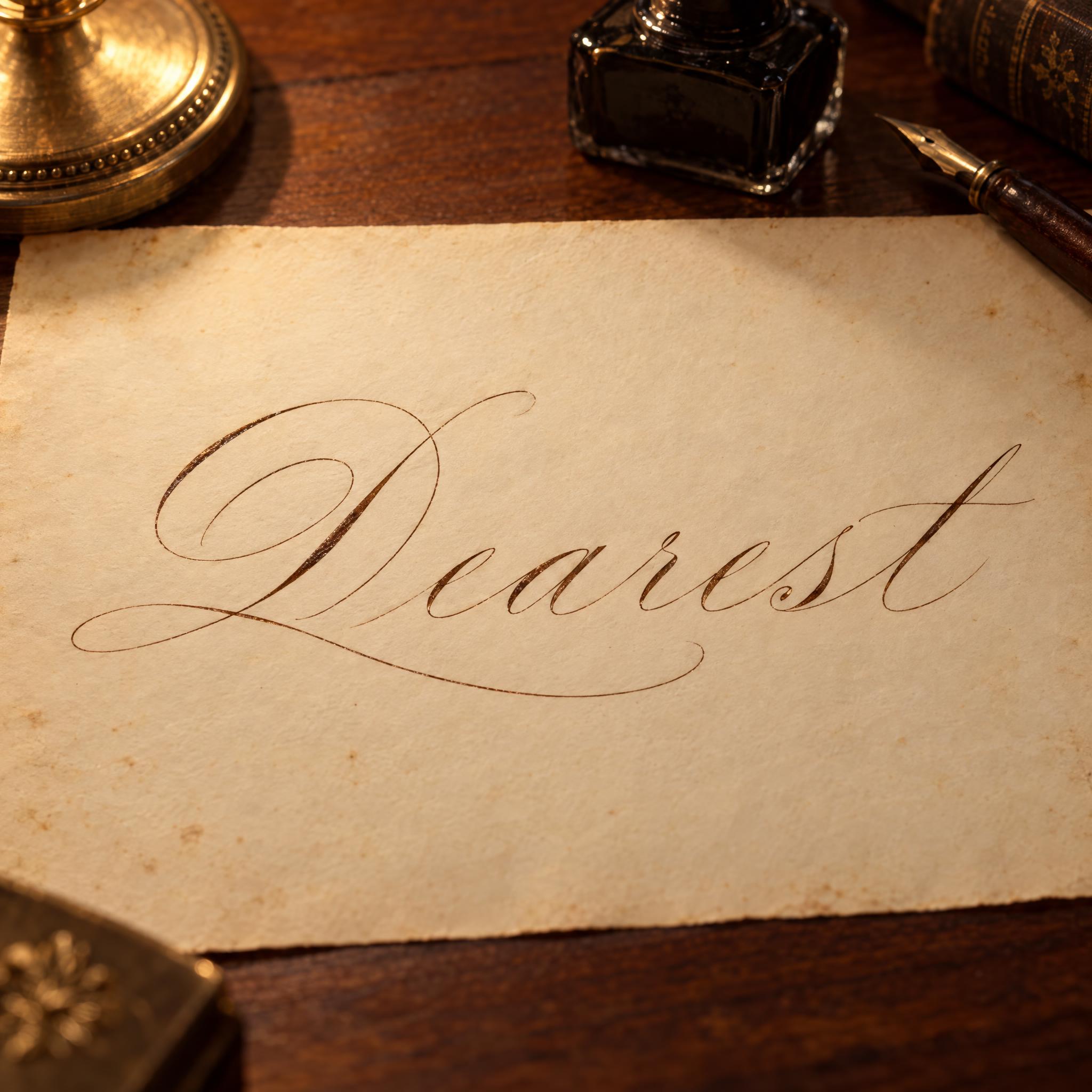
Type your word, copy the full prompt and paste it into ChatGPT, Gemini or any image model.
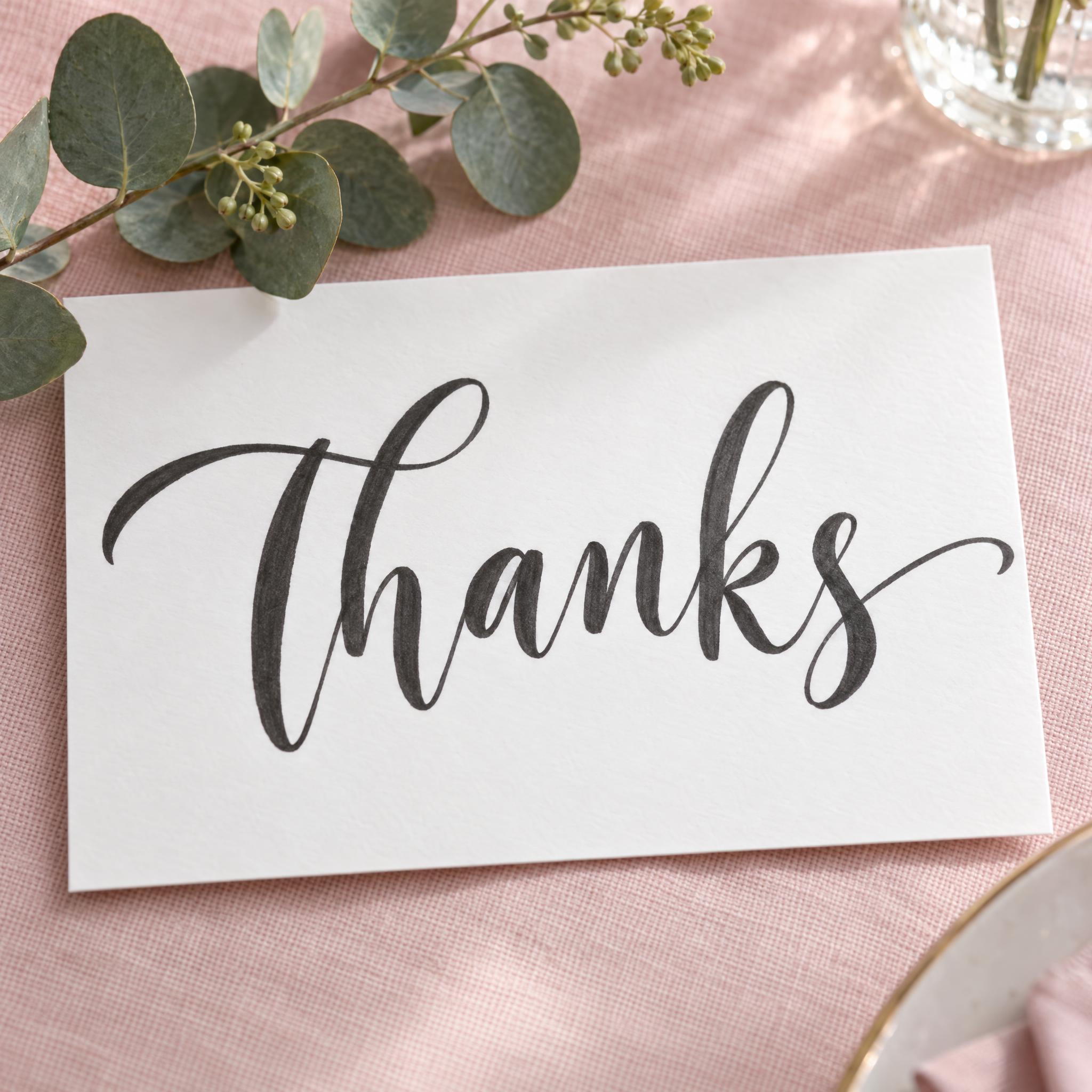
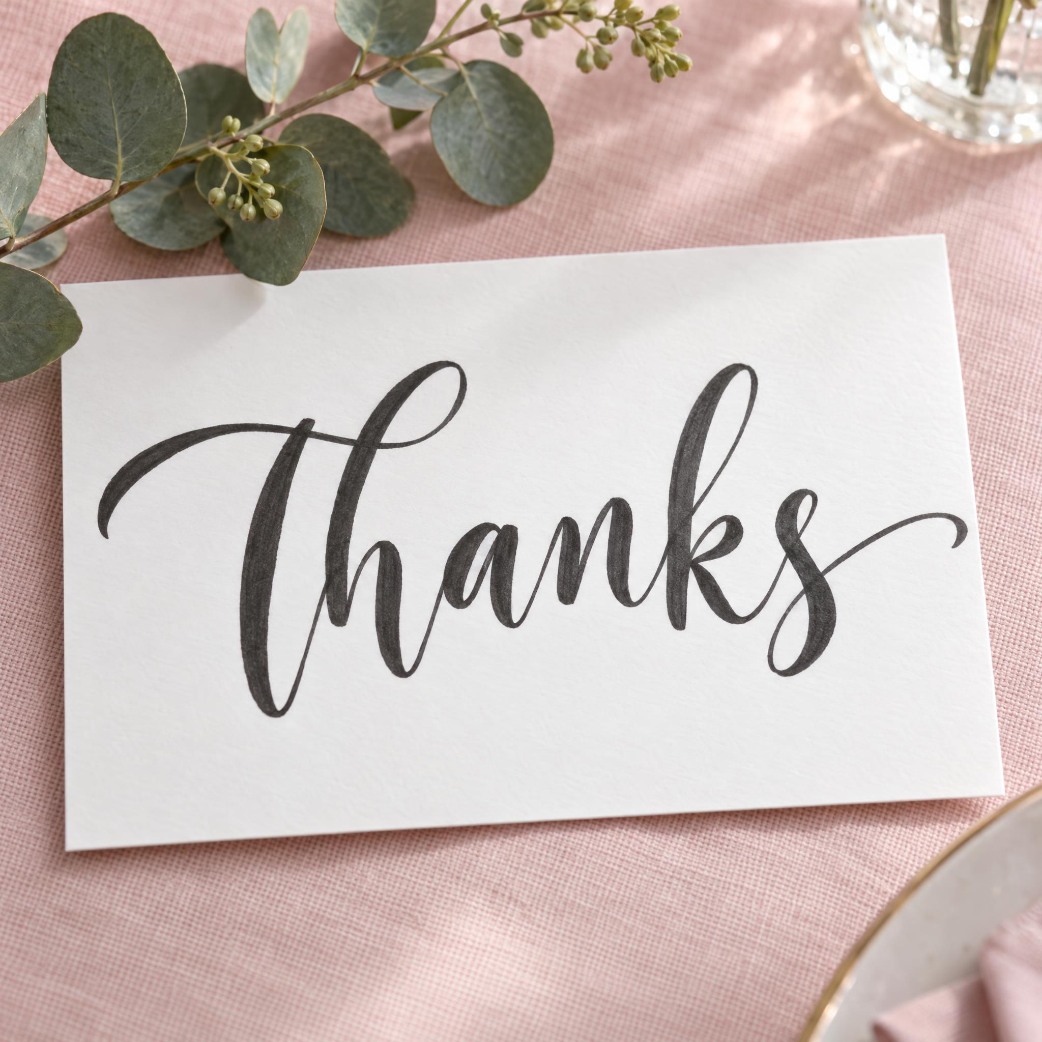
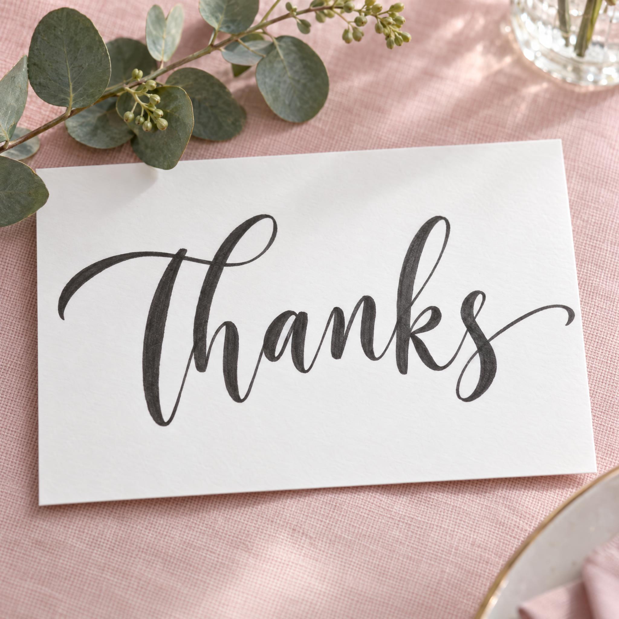
TextWrite the word "Thanks". Spell it exactly as written, without adding or changing any letter.
Font designModern calligraphy lettering: a relaxed contemporary script written with a flexible brush pen, the letters joined in one flowing line after a loose, oversized capital. Instead of sitting on one straight line the letters bounce, some lifted above the baseline and some dropped below it, and the slant shifts a little from letter to letter. Every downstroke is pressed into a thick, smooth stroke while every upstroke stays thin, the loops are oversized and round, and the last letter ends in a long sweeping exit stroke; every letter clearly readable. The ink is soft charcoal black. Strokes are solid and smooth with rounded ends. Never an evenly slanted formal script. Like the hand-lettered signs at a modern garden wedding.
SceneThe word is written on a white card resting on a blush pink tablecloth beside a sprig of eucalyptus, in soft daylight. The word is centered, spans most of the width and reads clearly.
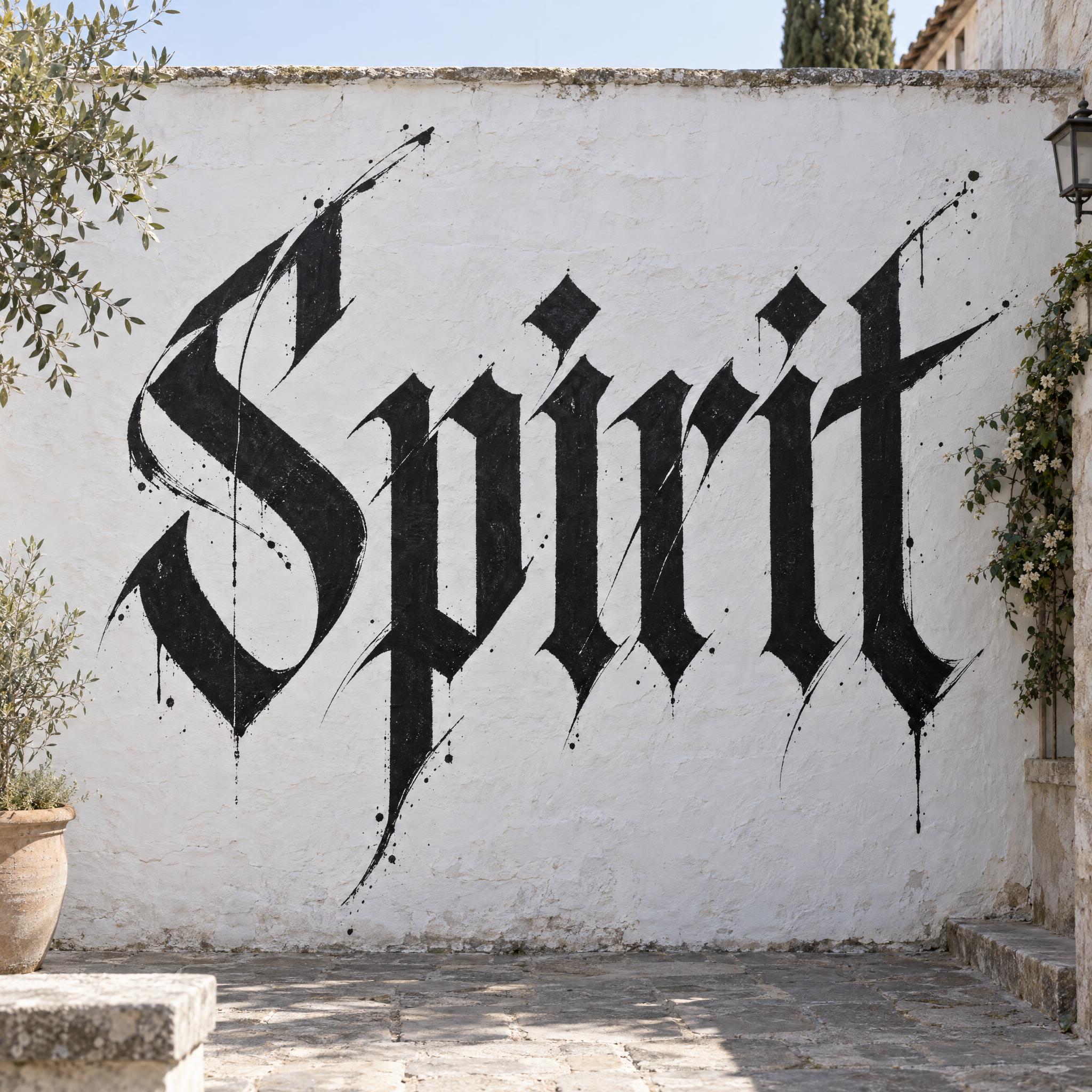
Open one for the prompt and real results on each image model.
 Premium
Tested October 2026. First attempts from our test ledger: 326 images, 9 fonts, 7 languages, each one checked by eye.
How to read it: 63 / 67 means 67 images tested and 63 spelled the word right on the first try; the percentage is that share. The Latin, Chinese / Japanese and Arabic columns split the same count by the script of the word.
| Model | Right first time | Latin | Chinese / Japanese | Arabic | Most common issue |
|---|---|---|---|---|---|
| GPT Imagegpt-image-2.5-sunburst · xhigh | 94% 63 / 67 | 100% 38 / 38 | 100% 18 / 18 | 64% 7 / 11 | Wrong letter |
| Nano Bananagemini-nano-banana-2.1 | 100% 64 / 64 | 100% 36 / 36 | 100% 18 / 18 | 100% 10 / 10 | Small style drift |
| Seedreamdola-seedream-5-0-pro-260628 | 88% 57 / 65 | 97% 35 / 36 | 89% 16 / 18 | 55% 6 / 11 | Extra letter |
| Grok Imaginegrok-imagine-image-2.0 · medium | 94% 61 / 65 | 100% 36 / 36 | 89% 16 / 18 | 82% 9 / 11 | Style drifted |
| Qwen-Imageqwen-image-3.0-pro | 68% 44 / 65 | 83% 30 / 36 | 72% 13 / 18 | 9% 1 / 11 | Extra words added |
How we test: images are made through FontVibe with each model’s API, sending the prompt as is; we count only each model’s first image for every font and language and check the spelling by eye. Apps such as ChatGPT may rewrite prompts, so results there can differ. For the full data, email [email protected].
Every calligraphy prompt on this page is built from the same layers, one sentence each. The examples are quoted word for word from the prompts of the fonts on this page.
Calligraphy is decided by the tool. A flexible pointed pen, a broad-edged pen and a brush pen make three different families of letters, so the first sentence names the hand and the pen together.
“Copperplate script lettering: formal English roundhand written with a flexible pointed pen, every letter leaning at the same steep angle and joined in one even rhythm.” — Copperplate Script
Compare this with the copperplate line: a broad-edged pen held at one angle gives thick and thin by direction, not pressure. Change the pen in this sentence and the whole hand changes.
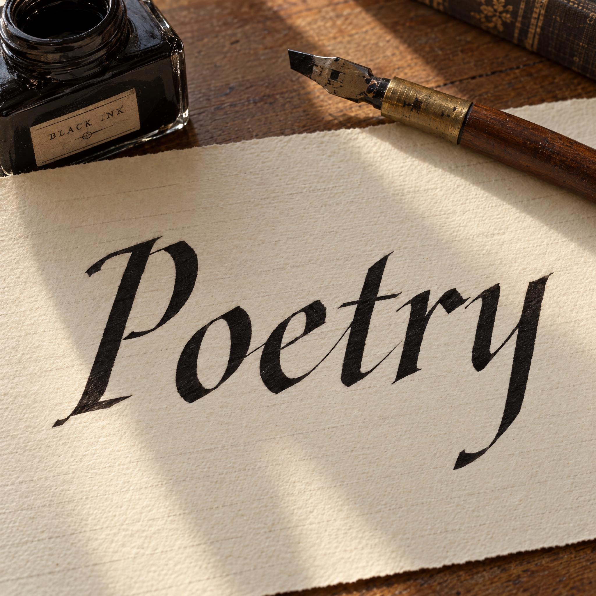
“Italic calligraphy: a quick, elegant hand written with a broad-edged pen held at one steady angle, so every stroke is thick or thin by its direction alone: downstrokes and diagonals broad, horizontals and upstrokes fine.” — Italic Calligraphy
Models know that calligraphy has thick and thin strokes, but not where. Say it: pressure on the downstroke, hairline on the way up. This sentence is what makes the word look written rather than typed.
“Each downstroke swells into a heavy shade where the pen was pressed, while every upstroke and connecting stroke stays hairline-thin, so thick and thin alternate sharply.” — Copperplate Script
Formal hands keep one slant and one baseline; modern calligraphy breaks both on purpose. Without this sentence most models fall back to a neat copybook script.
“Instead of sitting on one straight line the letters bounce, some lifted above the baseline and some dropped below it, and the slant shifts a little from letter to letter.” — Modern Calligraphy
Keep colour in one sentence, so you can swap black ink for sepia, gold or a colour gradient without touching the letterforms.
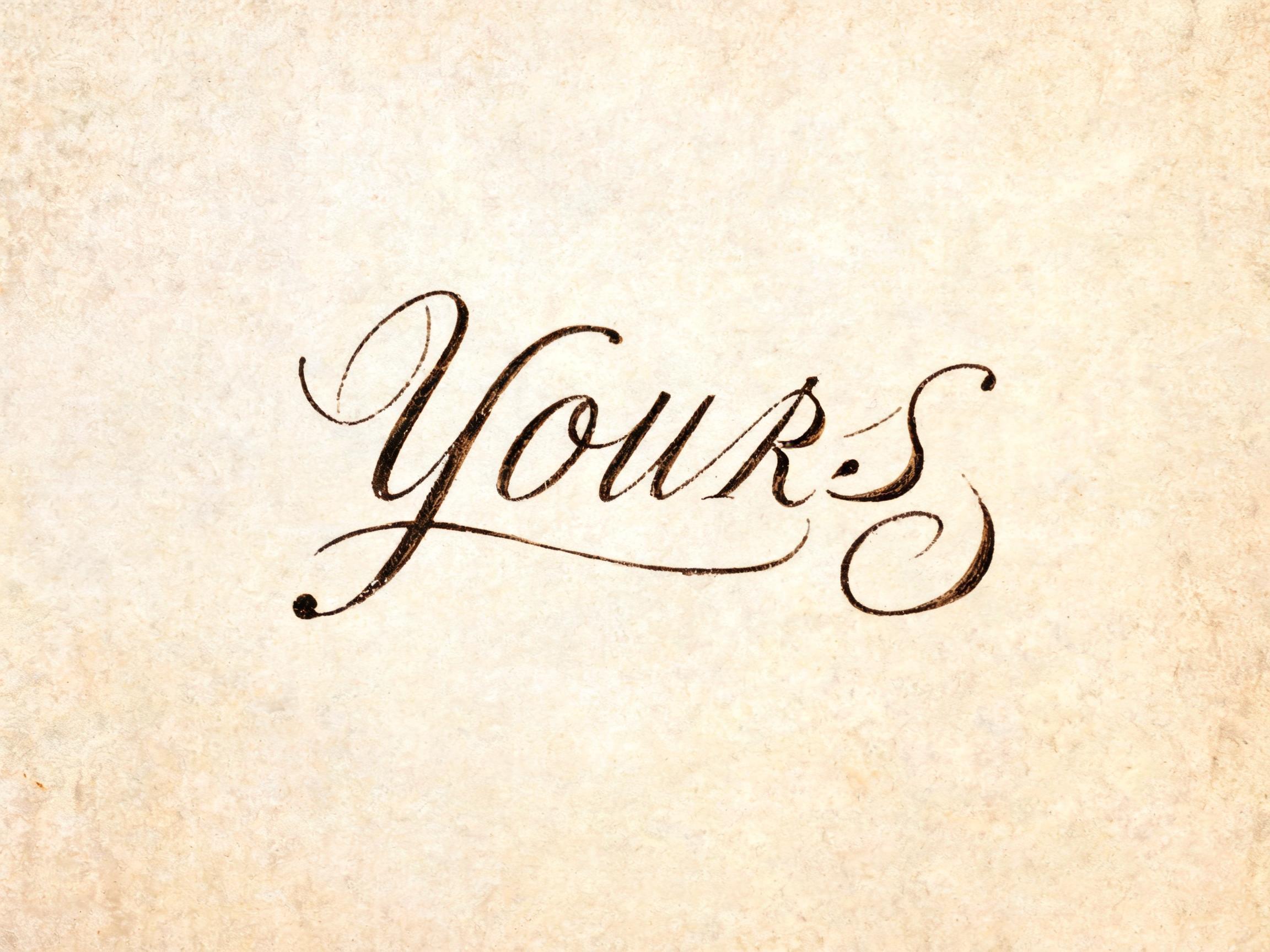
“The ink is dark sepia brown.” — Spencerian Script
Rule out the hand the model is most likely to draw instead. For a broad-nib italic that is the looped, pressure-swollen pointed-pen script most models draw for the word calligraphy.
“Never a looped, pressure-swelling pointed-pen script.” — Italic Calligraphy
Calligraphy lives on paper: envelopes, cards, certificates, journals. A real surface and soft light make the ink read as ink.
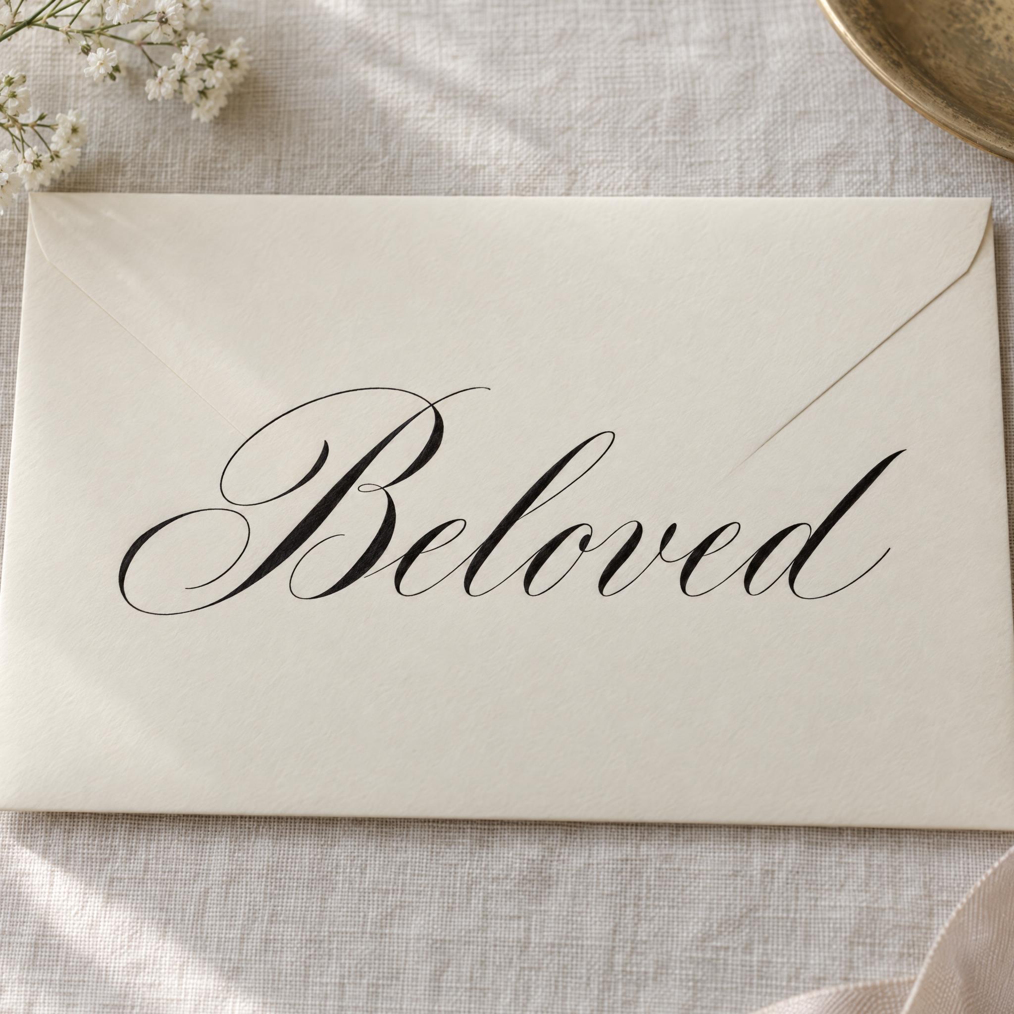
“The lettering is written on a cream cotton wedding envelope lying on a pale linen tablecloth in soft window light.” — Copperplate Script
Calligraphy hands were made for different jobs. Pick by what the word is for.
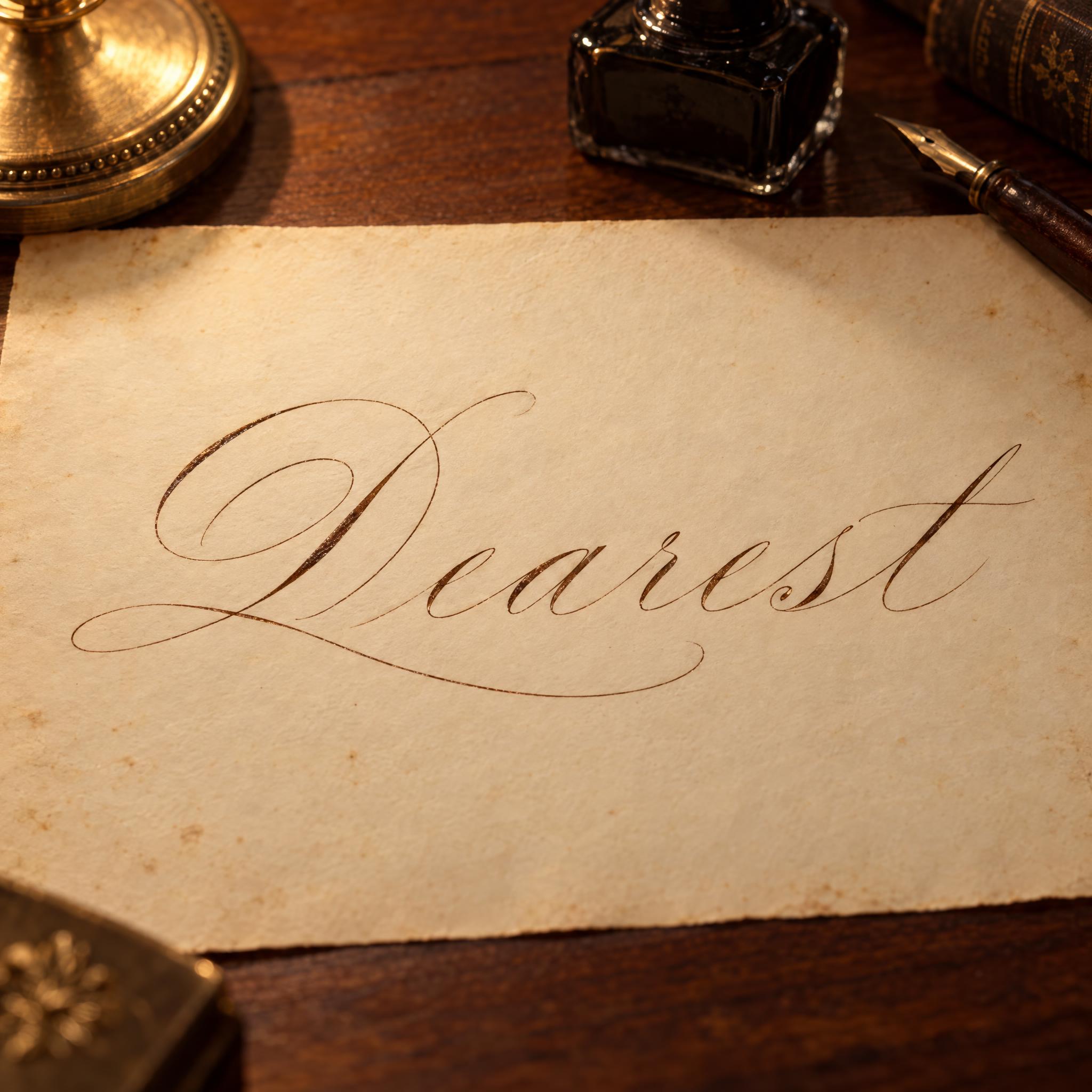
For envelopes and invitations, Copperplate Script gives the classic formal hand with heavy shades; Modern Calligraphy gives the relaxed, bouncing look of today's wedding signs.
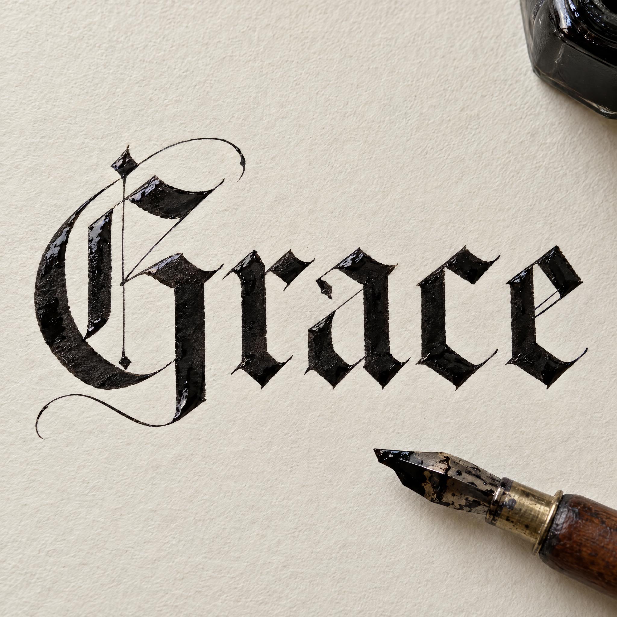
Spencerian Script is light and airy, the hand of 19th-century American letters; Italic Calligraphy is narrow and bookish, made for lines of poetry and certificates.
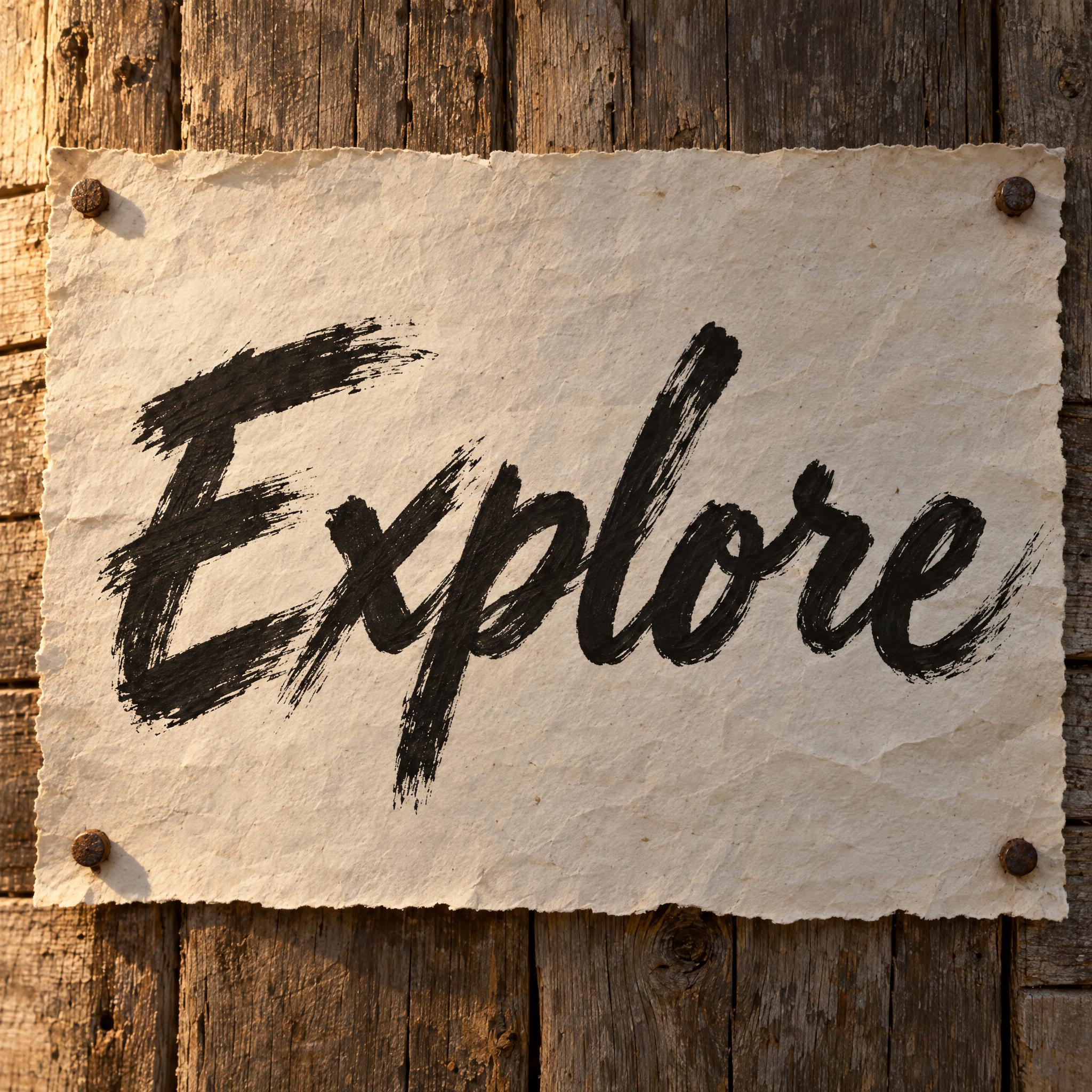
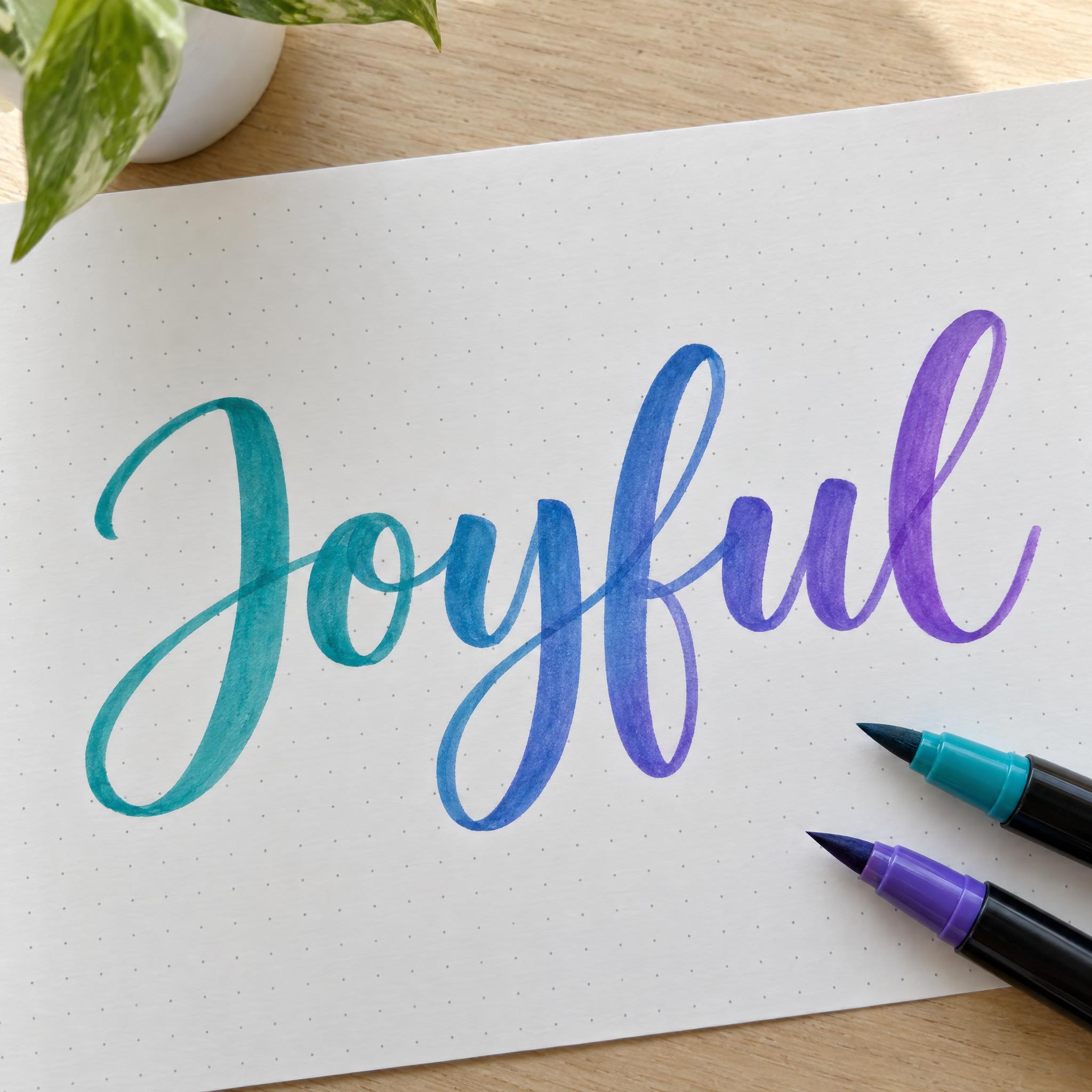
Brush Lettering is the smooth brush pen script of journals and greeting cards, and Brush Script paints a bold dry-brush script for posters and logos.
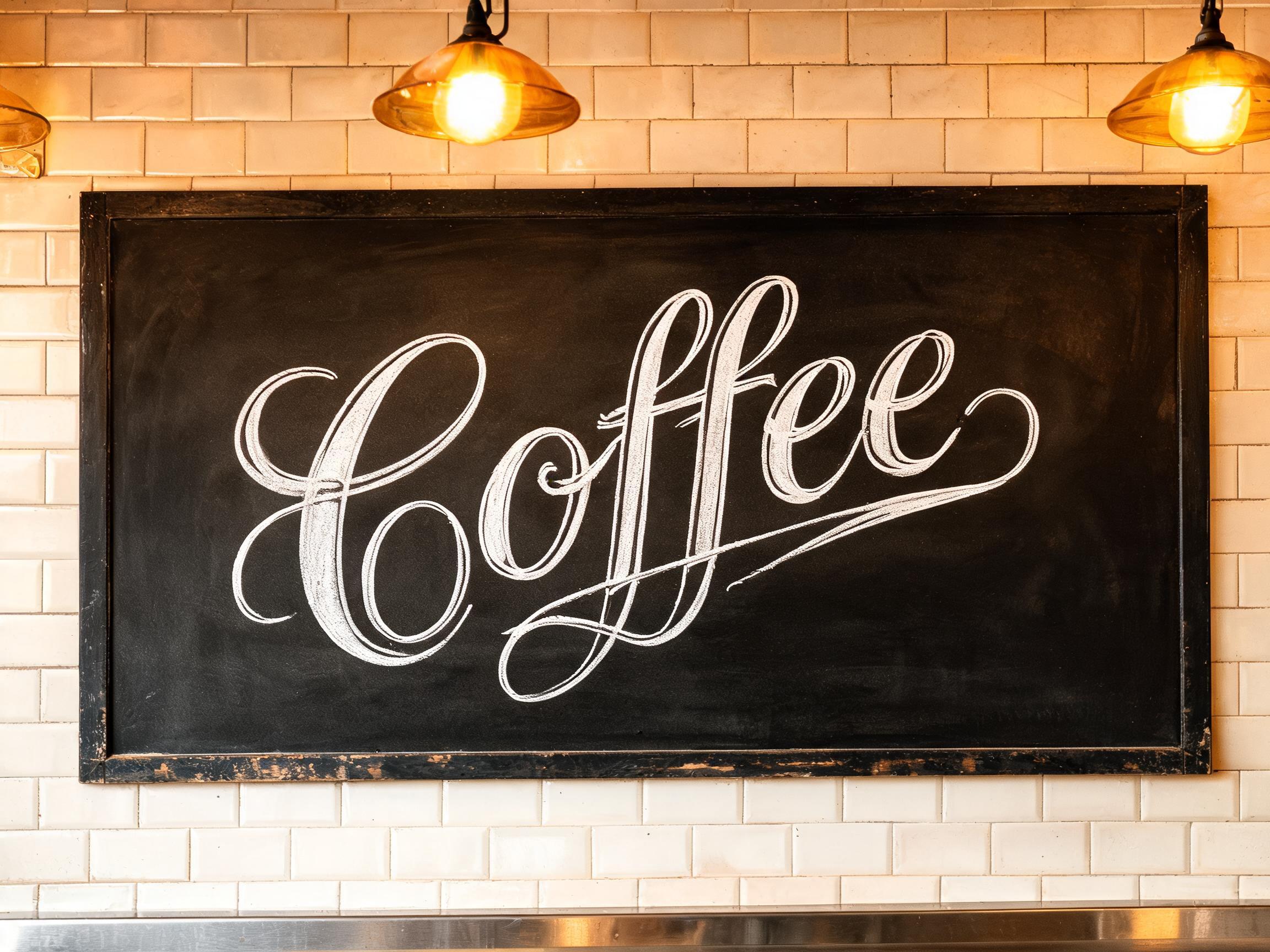
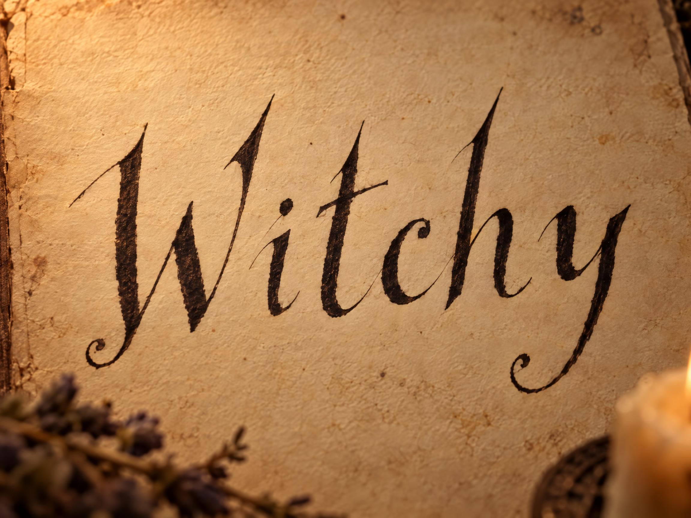
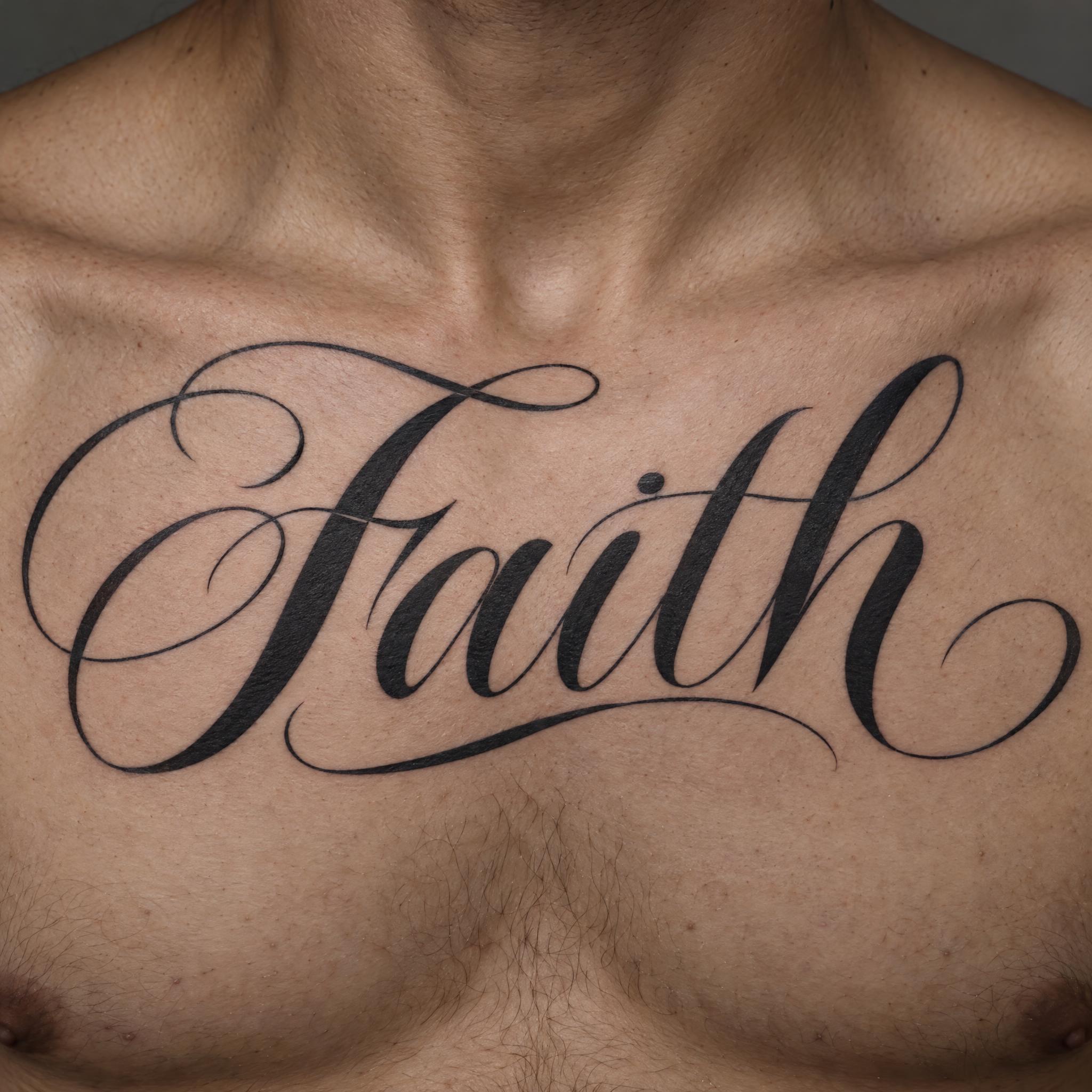
For medieval drama use Gothic Calligraphy; for a wall, Calligraffiti; for skin, Calligraphy Tattoo.
Type your word in the box next to the prompt at the top, copy it and paste it into any image app, or press Generate on FontVibe to try five models in one place. Every style below works the same way from its own page.
| You want | Try | Why |
|---|---|---|
| Formal wedding envelopes | Copperplate Script | Heavy shades, steady slant |
| A light, old letter | Spencerian Script | Fine hairlines, big oval capitals |
| Modern wedding signs | Modern Calligraphy | Bouncing letters, big loops |
| Poems and certificates | Italic Calligraphy | Broad-nib, narrow and slanted |
| Journals and cards | Brush Lettering | Smooth brush pen, colour fade |
| Bold posters and logos | Brush Script | Dry brush, ragged edges |
| Medieval titles | Gothic Calligraphy | Broad-nib blackletter |
| A tattoo script | Calligraphy Tattoo | High contrast, long swashes |
Western calligraphy is a history of pens. From about the 5th century, Roman book hands gave way to uncial; under Charlemagne, Alcuin's scribes developed the Carolingian minuscule, first used in a manuscript finished in 783. During the 12th century that round hand was compressed into blackletter, the broad-nib Gothic script, and in the 15th century Italian scribes went back to older models and designed the italic hand. In 1522 Ludovico degli Arrighi, a scribe at the papal chancery, published La Operina, the first book devoted to writing it.
Printing ended the manuscript, but not handwriting. In England, copybooks printed from engraved copper plates, gathered in George Bickham's The Universal Penman (1733–1741), gave the pointed-pen round hand its name, copperplate. In America, Platt Rogers Spencer's Spencerian script, developed around 1840, became the everyday business hand from about 1850 to 1925.
By the end of the 19th century the broad-pen craft had been forgotten, and Edward Johnston, whom Wikipedia calls the father of modern calligraphy, rebuilt it; his 1906 handbook Writing & Illuminating, & Lettering shaped a generation of scribes. The last change came with the brush pen, which Sailor invented in 1972 and Kuretake made a commercial success in 1973: it is the pen behind the modern calligraphy and brush lettering styles on this page.
Sources: Wikipedia — Western calligraphy · Wikipedia — Ludovico Vicentino degli Arrighi · Wikipedia — Copperplate script · Wikipedia — Spencerian script · Wikipedia — Edward Johnston · Wikipedia — Calligraphy · Wikipedia — Brush pen
Formal pointed-pen round hand with heavy shades.
Light 19th-century American penmanship with big oval capitals.
Bouncing letters, big loops and a long exit stroke.
Broad-nib chancery hand, narrow and slanted.
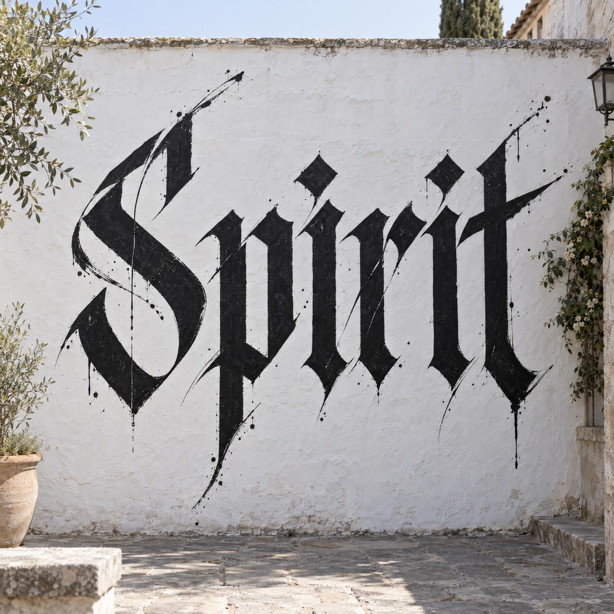
Broad-nib blackletter with diamond-shaped corners.
Smooth brush pen script with a colour fade.
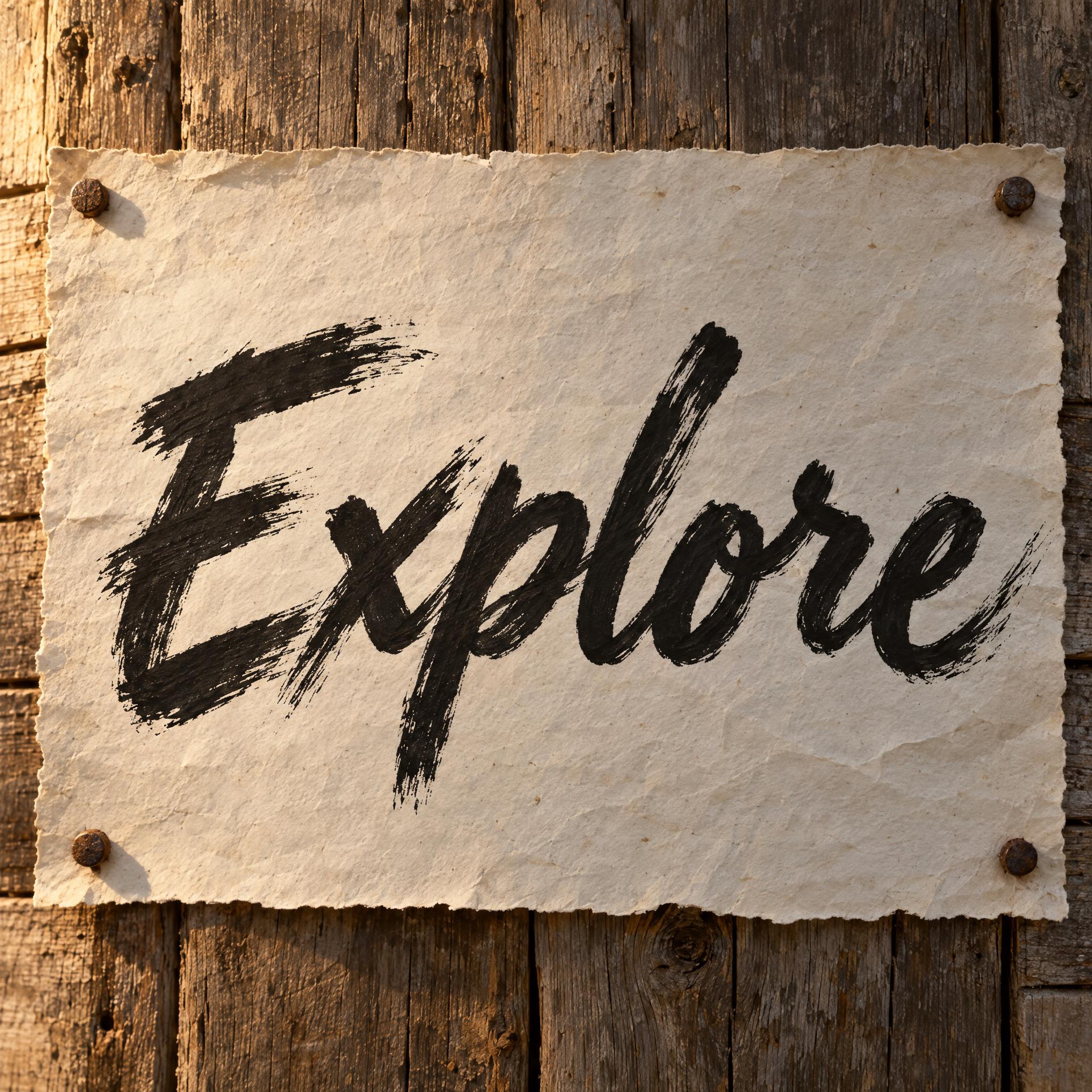
Bold painted script with ragged, dry edges.
Calligraphy painted large on a wall.
High-contrast pointed-pen script for skin.
A calligraphy font imitates writing done with a calligraphy pen or brush: thick and thin strokes, joined letters and flourishes. Each style on this page is an AI prompt that draws your own word in that hand.
This page works as one. Type your word in the box at the top, copy the prompt and paste it into ChatGPT, Gemini, Grok or Seedream, or press Generate on FontVibe to make it right away and compare models. Every style below has the same box on its own page.
No. They are prompts, not .ttf or .otf files. You get your word as a finished image, with the shades, loops and joins drawn for your exact letters, which an installed font can't do.
For formal invitations and envelopes, Copperplate Script. For a relaxed, modern look on signs and place cards, Modern Calligraphy. Both are on this page.
The comparison on this page counts how often each model spelled the word right on the first try across these styles and seven languages. Whichever you use, check every letter: loops and joins can hide a mistake.
Copying the prompts on AIFont is free. What you may do with the image depends on the terms of the app that generated it, so check that app's rules before you print or sell.