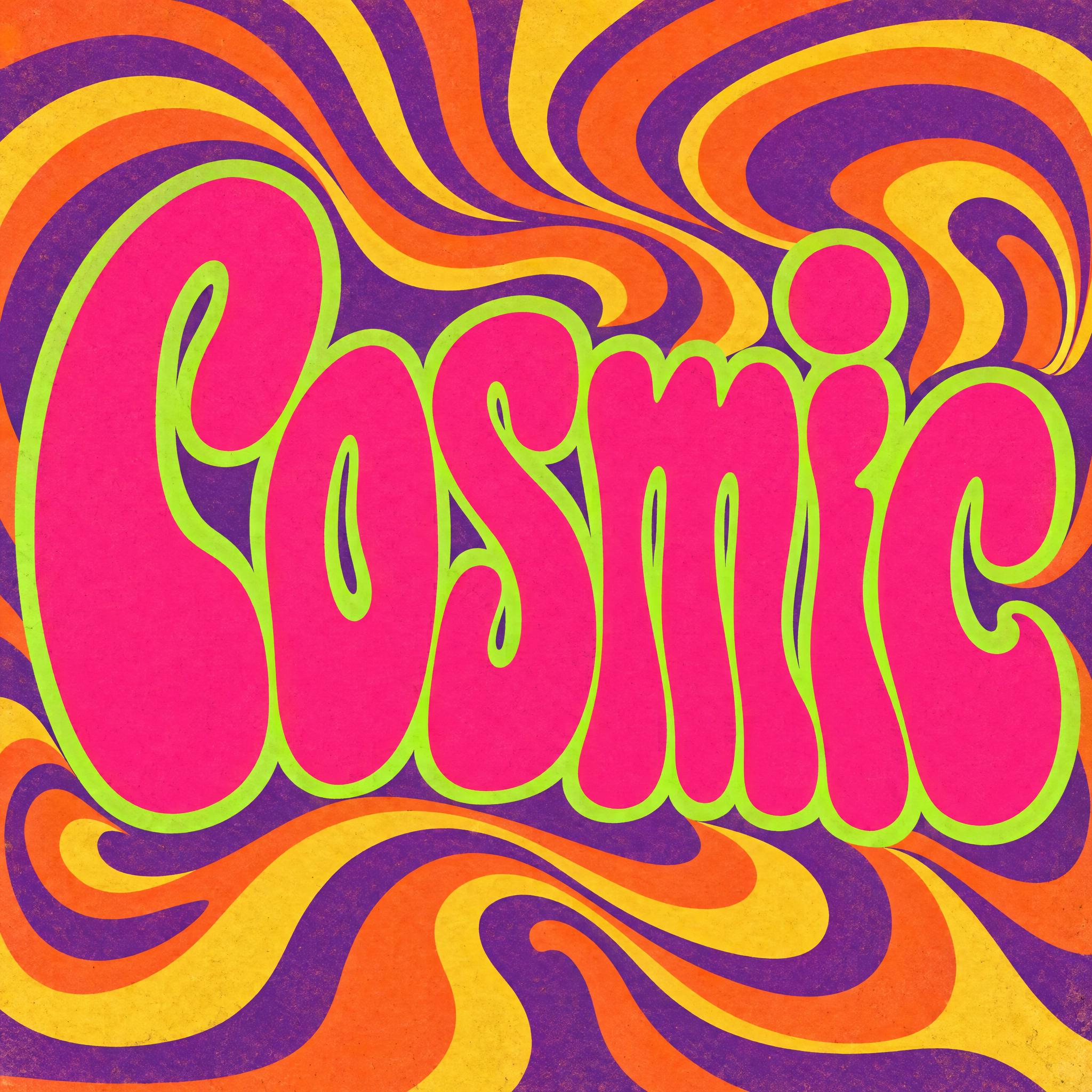
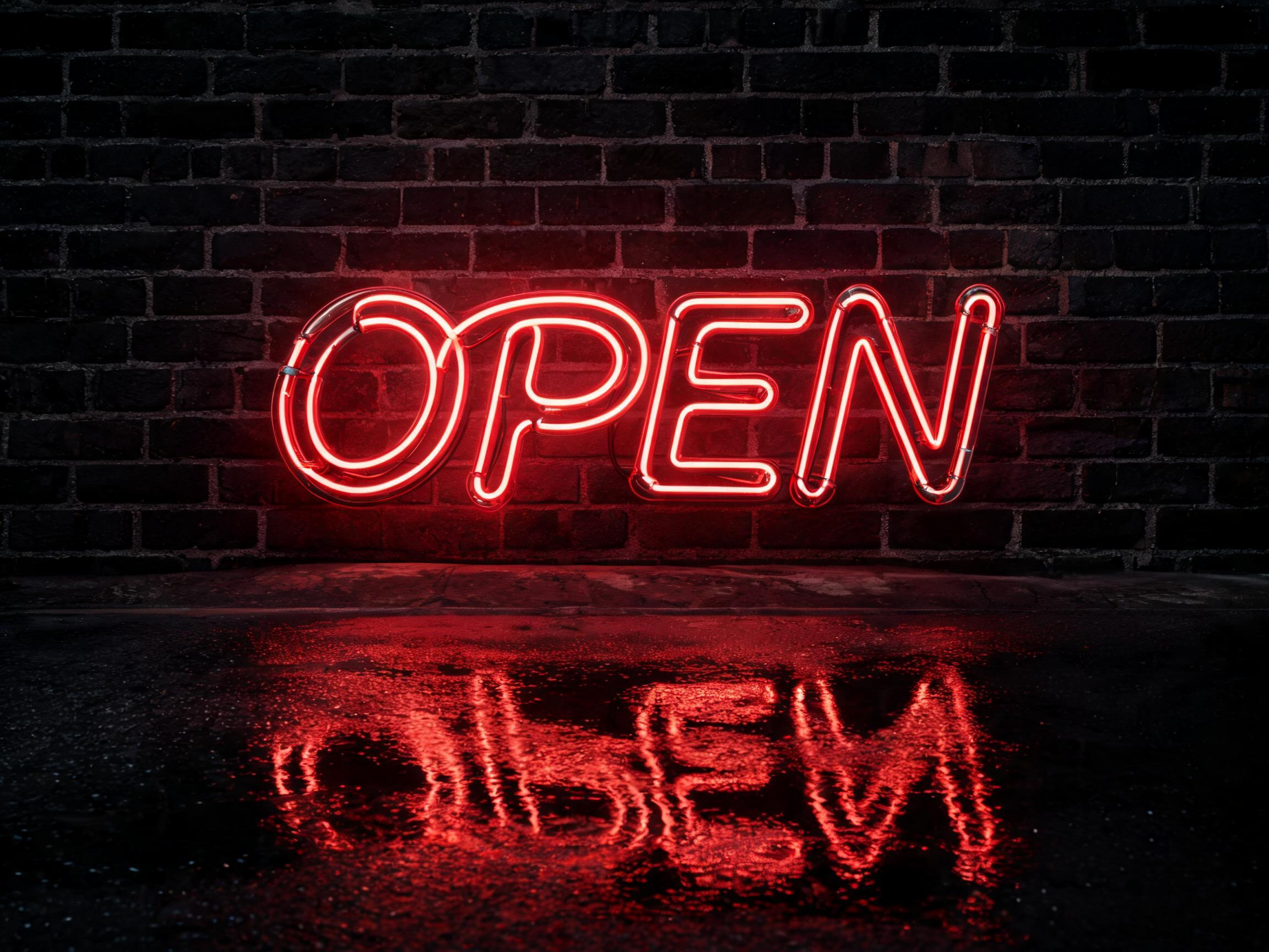
Tall, heavy letters that melt into wavy shapes, counters squeezed to slits and letters pressed together, hot pink with a thick acid-green outline.
TextWrite the word "Cosmic". Spell it exactly as written, without adding or changing any letter.
Font designPsychedelic 60s poster lettering: tall, heavy letters that melt and stretch into wavy, flowing shapes, a capital first letter and lowercase after it, the counters squeezed into small curved slits and the letters pressed tightly together; every letter still reads clearly. The letters are hot pink with a thick acid-green outline. Flat poster colours with a slight printed texture. Like the lettering on a 1960s rock concert poster.
SceneThe word fills a vintage poster with swirling orange, purple and yellow stripes around it. The word is centered, spans most of the width and reads clearly.
110 words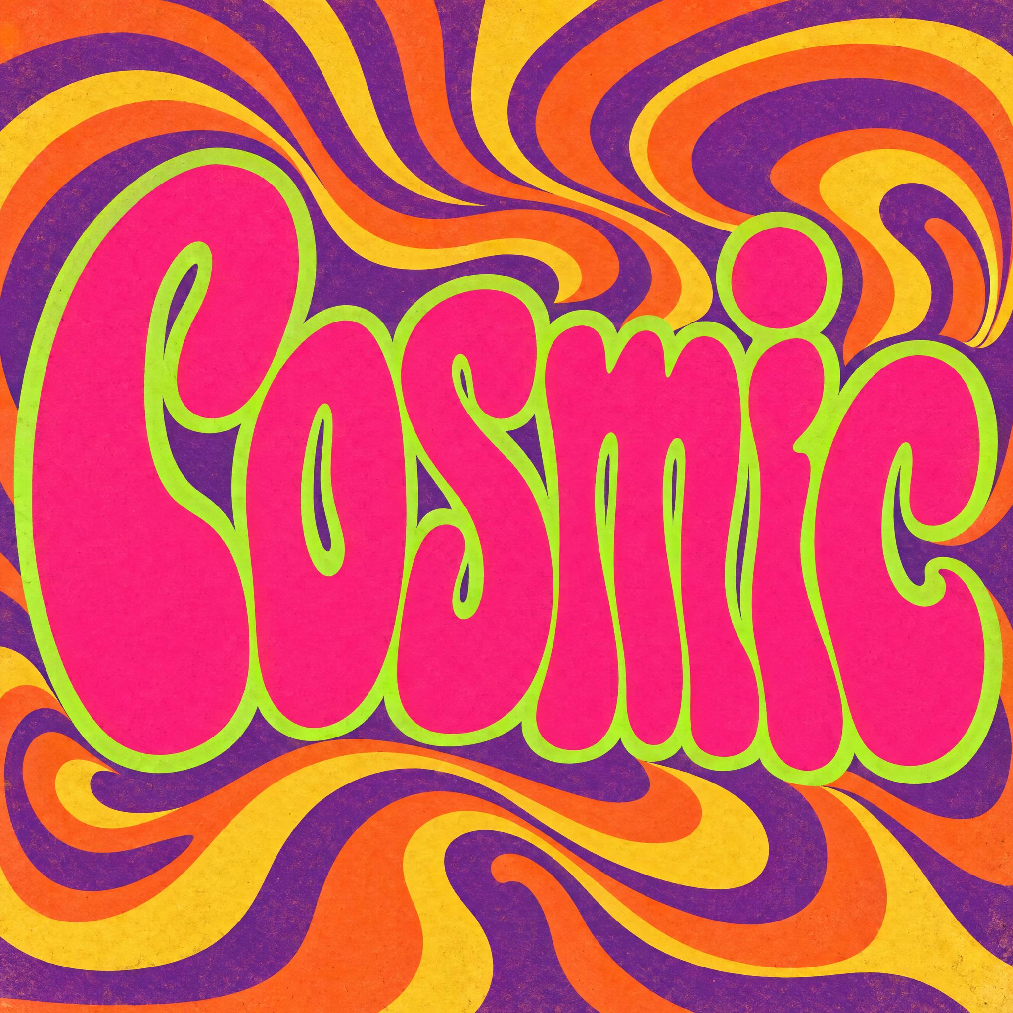
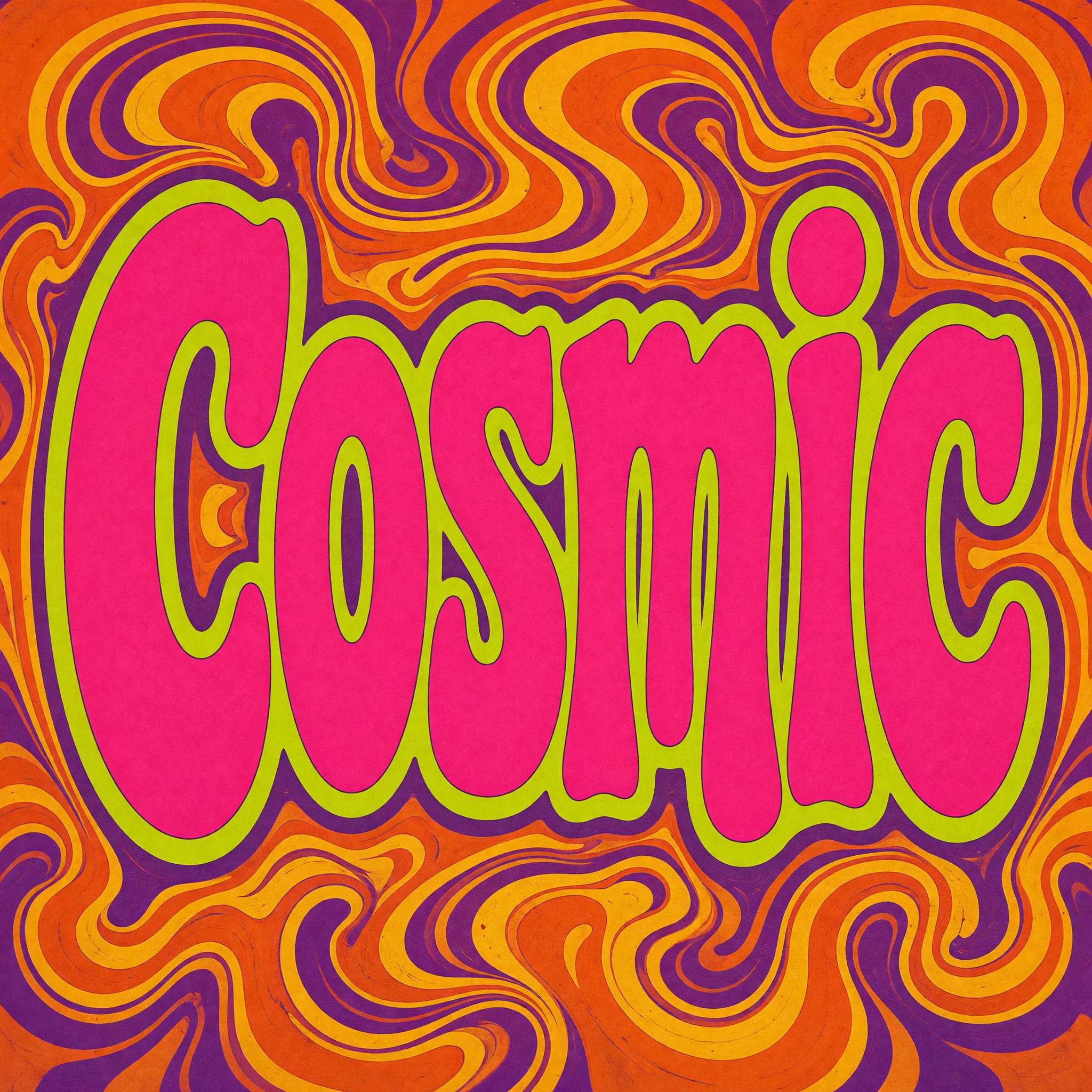
One prompt pasted into each image model as-is. These are the unedited results, so you can pick the model that suits you.
Broad orange and purple swirls; the green outline is thin and bright.
A marbled background with tiny curls; the letters are the widest.
The tallest, narrowest letters, with a black line outside the green.
Straight wavy stripes behind; the pink is lighter and the outline thinner.
All capitals, stretched to fill the whole height. The prompt asks for a capital first letter and lowercase after it; Qwen wrote COSMIC in capitals. We ran it once more and got capitals again. The spelling is right, only the case ignores the prompt.
The button opens FontVibe in DIY mode with this prompt already in it, unchanged. Type your word, pick a model and generate. GPT Image, Nano Banana, Seedream, Grok and Qwen are all in one account, so you can see which one melts the letters furthest while keeping every one readable, without signing up to five apps. Every account gets free credits each month with no card needed, and you can export a transparent PNG to put the word on your own poster or shirt.
Layers in the order the prompt states them. Change one layer and the rest keeps working.
Every AIFont prompt opens with the same text part. “Spell it exactly as written, without adding or changing any letter” comes first because melting letters are easy to merge, and a model may let two of them become one.
“Psychedelic 60s poster lettering” names the decade and the object at once. Poster matters: the same word on a record sleeve or a T-shirt print tends to come out tamer.
“tall, heavy letters that melt and stretch into wavy, flowing shapes” is the core of this font. Tall and heavy give the melt something to work with; thin letters just look wobbly.
“a capital first letter and lowercase after it” keeps the poster rhythm of tall caps and round lowercase. Qwen ignored it in four languages and wrote capitals; the letters were still right.
“the counters squeezed into small curved slits and the letters pressed tightly together” makes the word fill its space like a 60s poster, with almost no air inside or between letters.
“every letter still reads clearly” is the brake. 60s posters were famously hard to read; this prompt wants the look, not the puzzle, so the word has to come out right.
“The letters are hot pink with a thick acid-green outline.” is the clash. Change both colours together and keep them far apart on the colour wheel, or the vibration is lost.
“Flat poster colours with a slight printed texture.” keeps out gloss and 3D. These posters were printed in flat inks.
“Like the lettering on a 1960s rock concert poster.” gives every model the same object to aim for.
“The word fills a vintage poster with swirling orange, purple and yellow stripes around it.” sets the backdrop. “The word is centered, spans most of the width and reads clearly.” keeps the word the hero. Change this part for your own use: a T-shirt, a van, a festival banner.
Small edits that stay on-style. Change one thing at a time.
Type it in the box next to Prompt above and copy again. Short words work best: melting letters need height and room, and a long phrase squeezes them into thin noodles.
Swap “The letters are hot pink with a thick acid-green outline.” for “The letters are orange with a thick violet outline.”, “The letters are red with a thick turquoise outline.” or “The letters are yellow with a thick purple outline.” Keep the two colours opposite each other.
Replace “The word fills a vintage poster with swirling orange, purple and yellow stripes around it.” with “The word is printed across a tie-dye T-shirt hanging on a fence.”, “The word is painted on the side of a flower-covered camper van.” or “The word fills a festival banner over a field at dusk.”
The prompt sets no frame size. Concert posters are tall, so “Tall 3:4 image.” suits it; for a banner add “Wide 16:9 image.” at the end, or pick a ratio in your app.
AI fonts that share the most tags with Psychedelic Font.
AI fonts for a second line, a logo lock-up or a poster footer.
Psychedelic Font writes your word like the lettering on a 1960s rock concert poster: tall, heavy letters that melt and stretch into wavy, flowing shapes, a capital first letter and lowercase after it. The counters are squeezed into small curved slits and the letters press against each other until the word fills its space, yet every letter still reads. Hot pink letters with a thick acid-green outline, in flat poster colours with a little printed texture, give it the colour clash those posters were known for. It is the 1960s entry among our retro fonts; for the softer, rounder 70s look see Groovy Font.
Type your word in the box above the prompt, copy it and paste it into ChatGPT, Gemini, Grok, Qwen or Seedream. The prompt has three parts: the text, the font design and the scene. The font design makes the melting letters and the pink and green; the scene fills a vintage poster with swirling orange, purple and yellow stripes, and you can swap it for your own. Every image on this page is what each model returned from the unchanged prompt, with no retouching.
Use it for gig and festival posters, album and playlist covers, T-shirts and stickers, or any hippie, trippy or wavy word that should look like it is moving.
Details from the original render. Every one of them is named in the prompt.
Tall, heavy letters that flow into wavy shapes.
The holes inside letters shrink to small curved slits.
Letters press against each other and fill the space.
A capital first letter, lowercase after it.
Pulled from the render. Handy when you build the rest of the design around the word.
Where this AI font earns its keep.
The melting letters of San Francisco rock posters are usually traced back to Wes Wilson. The colours have another source. Victor Moscoso, born in Galicia in 1936, studied at Cooper Union in New York and at Yale before moving to San Francisco in 1959, which made him the first of the 1960s rock poster artists with formal academic training. One of his teachers at Yale was the painter Josef Albers, and Moscoso's use of vibrating colours, pairs that seem to flicker where they meet, came from him.
Moscoso's posters for the Family Dog dance-concerts at the Avalon Ballroom brought him international attention, and so did his Neon Rose posters for the Matrix during the 1967 Summer of Love. In 1968 he moved on to underground comix, and in 2018 the AIGA named him a medalist.
This prompt borrows the logic, not any one poster. Hot pink against a thick acid-green outline is a pair of colours that buzzes where they touch, and the swirling orange, purple and yellow stripes keep the whole sheet moving. The melting, tightly packed letters make you look twice before you read the word, but a line in the prompt makes sure you still can.
Sources: Wikipedia — Victor Moscoso
After Cooper Union and Yale, where Josef Albers taught him, Victor Moscoso moves to San Francisco.
His Neon Rose posters for the Matrix win international attention during the Summer of Love.
All five drew the melting letters, the hot pink and the acid-green outline in every language. Nano Banana adds a thin black line outside the green and draws the tallest, narrowest letters; Seedream uses lighter pinks and spiral or ring backgrounds; Grok gives the poster a marbled background and a worn print texture; GPT Image sits between them with broad swirls. Qwen got every word's letters right, but in English, Spanish, Portuguese and German it ignored the capital-then-lowercase instruction and wrote COSMIC, ViAjE, ViaGeM and KOSMOS, again on the second try. In Arabic Qwen first added a letter and Seedream first swapped one; both were right on the second try. We have no native Arabic reviewer yet, so some Arabic verdicts wait for native speakers. Compare them side by side above.
Yes to both. Hippie font and trippy font searches mostly show this late-60s poster look: melting letters in clashing colours. If you want a softer, rounder hippie look from the 70s, try Groovy Font.
A wavy text effect usually bends ordinary letters along a curve. Here the letters themselves melt and stretch, so the word looks like it was drawn by hand for a poster. For a simple wave, ask your app to bend the text along a wave instead.
Groovy Font is the 1970s: fat, round letters in warm orange with stripes stacked behind. Psychedelic Font is the late 1960s: tall letters melting into each other in pink and green. All our retro fonts are sorted by decade.
Type it in the box next to Prompt above, then copy the full prompt. Keep it short, start it with a capital, and check that no two letters have melted into one.
Change only “The letters are hot pink with a thick acid-green outline.”, for example to “The letters are orange with a thick violet outline.” Keep the two colours far apart so they still clash.
Pick the ratio in your app if it has one. If not, add “Tall 3:4 image.” or “Wide 16:9 image.” at the end of the prompt.
No. It is a prompt that makes a picture of your word in psychedelic poster lettering with an AI image model, so there is nothing to install and you cannot type with it.
Copying the prompt is free. Whether the image costs anything depends on the app you paste it into, and what you may do with the image depends on that app's terms.