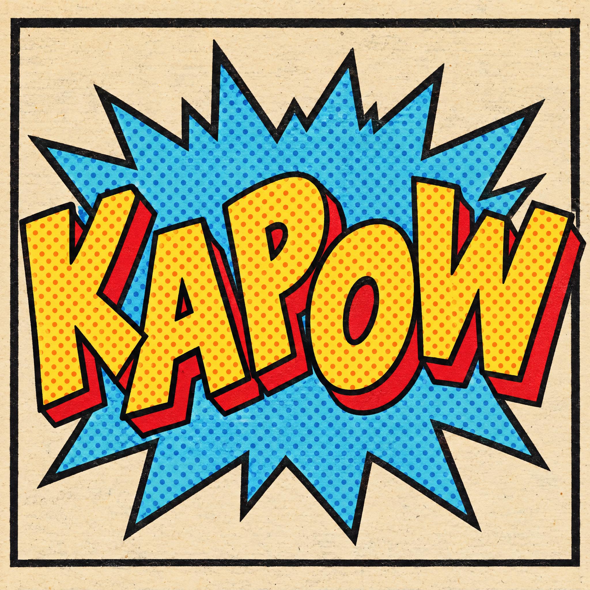
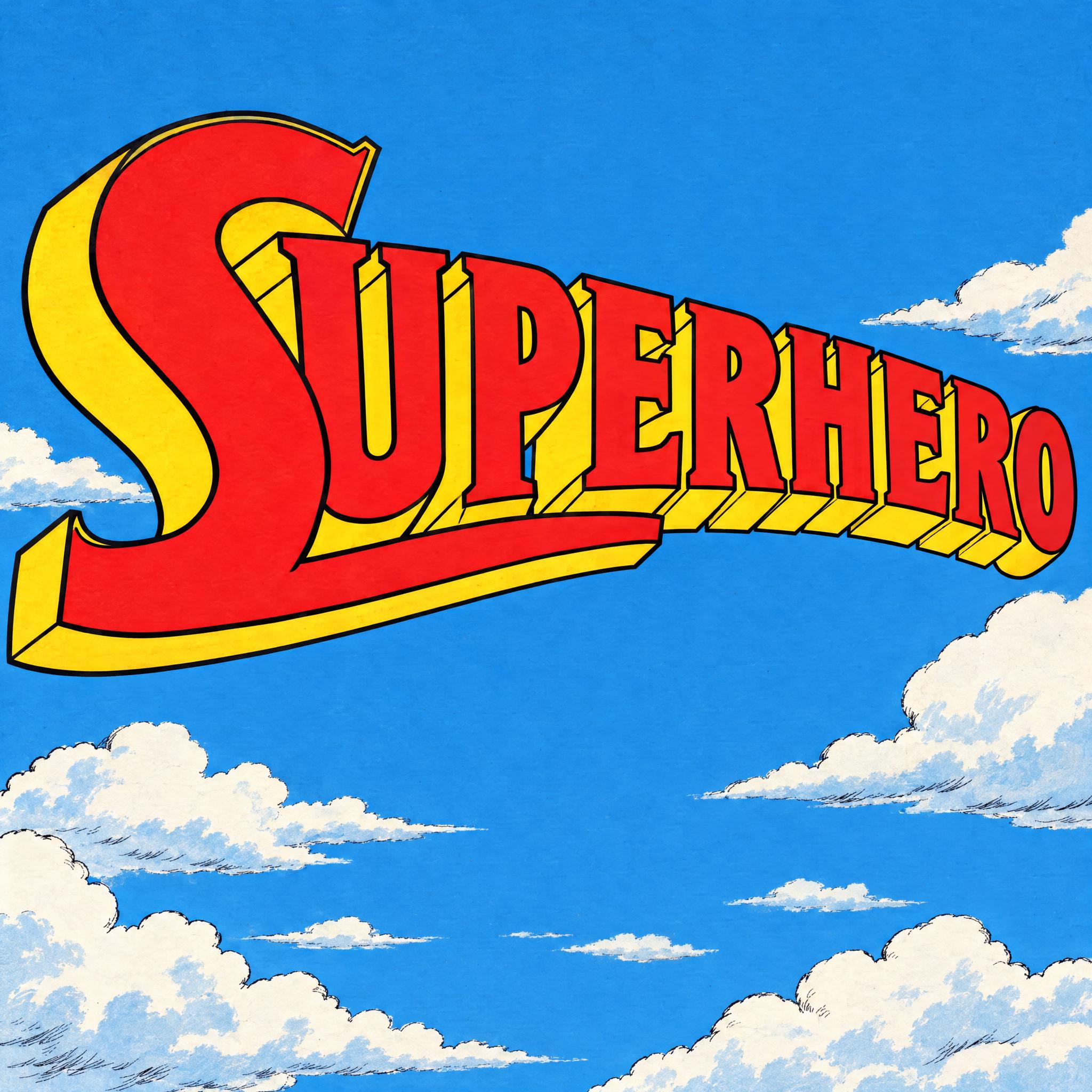
Comic book fonts as copy-ready AI prompts, for the three jobs lettering does on a comic page: a pop art sound effect bursting out of the panel, hand-lettered dialogue in a speech balloon, and a superhero title logo rushing at you in 3D. These are prompts, not font files: type your word, copy, and paste into ChatGPT or Gemini, or generate it right away on FontVibe.
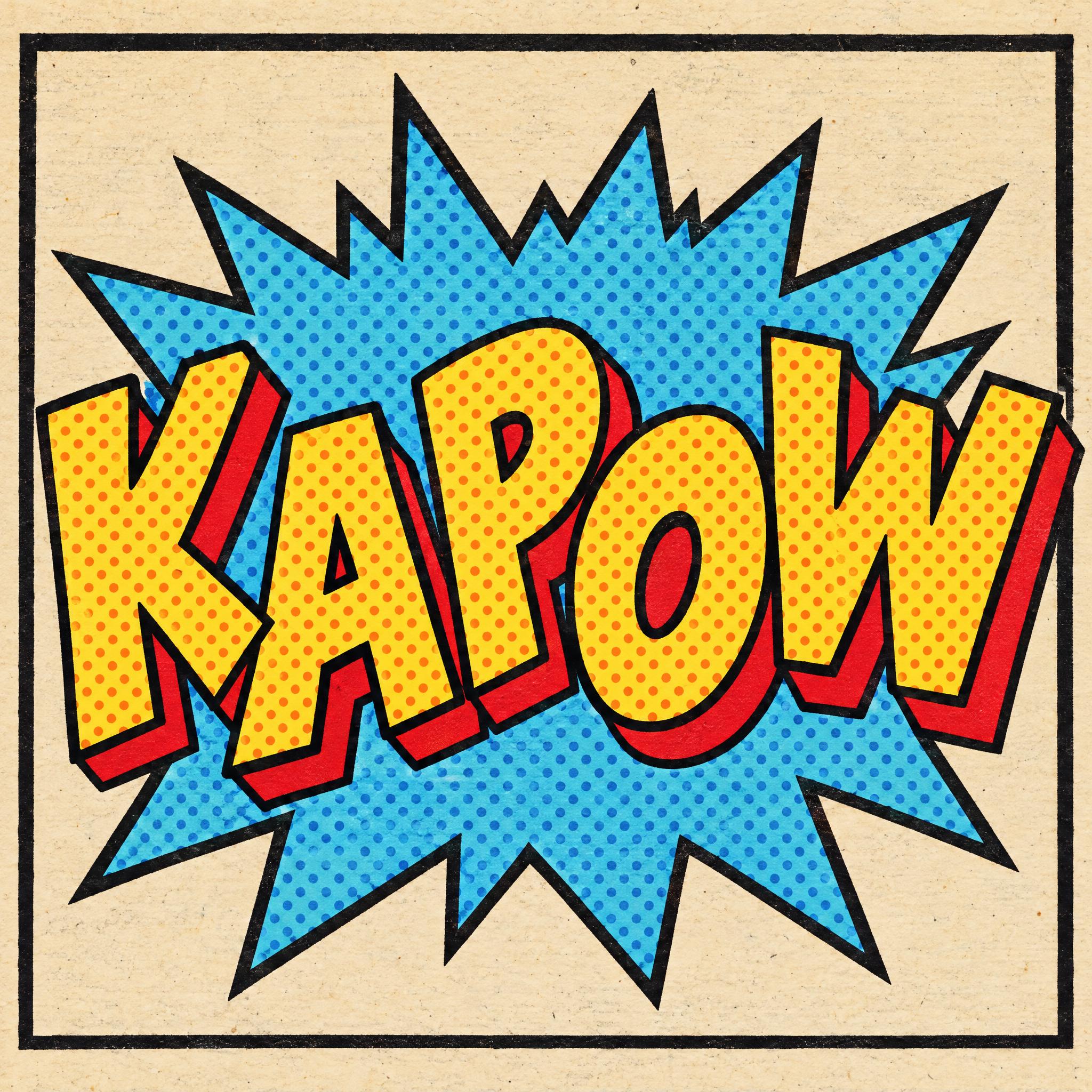
Type your word, copy the full prompt and paste it into ChatGPT, Gemini or any image model.
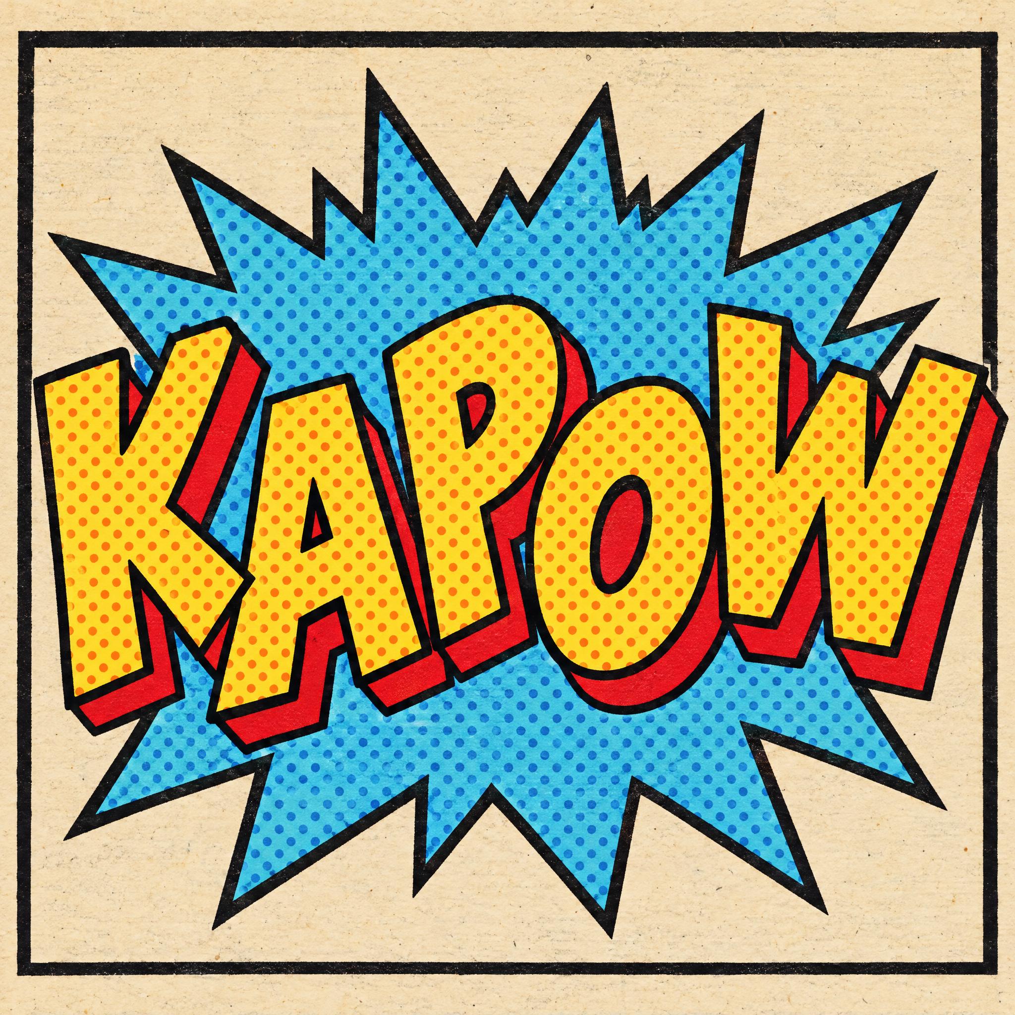
TextWrite the word "KAPOW". Spell it exactly as written, without adding or changing any letter.
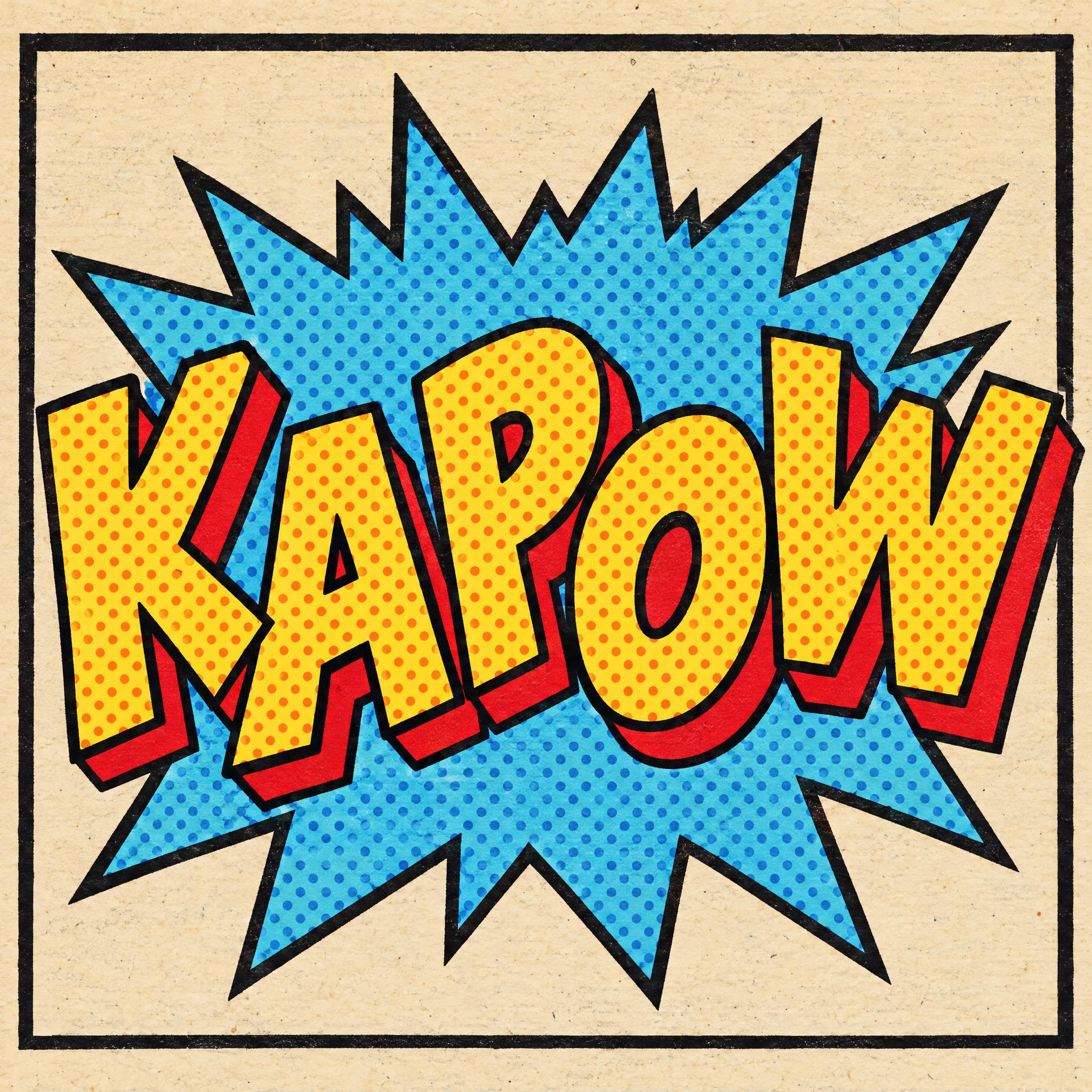
Font designPop art comic sound-effect lettering: fat, rounded, bouncing capital letters, each tilted at a different angle and set a little above or below the next, every letter reads at a glance. Each letter has a solid drop shadow offset to the lower right. The letter faces are filled with Ben-Day halftone dots. A thick black outline runs around every letter and its shadow, and a large jagged explosion burst, outlined the same way, sits behind the word. The letters are bright yellow with orange dots, the shadow is red, and the burst is cyan with blue dots. All colours are flat ink, with no gradients or shine. Like a sound effect on a 1960s comic book page.
ScenePrinted in a comic panel with a thick black border on slightly yellowed newsprint; the word is centered, fills most of the width, reads clearly and is the only text in the image.
Open one for the prompt and real results on each image model.
Tested November 2026. First attempts from our test ledger: 104 images, 3 fonts, 7 languages, each one checked by eye.
How to read it: 19 / 20 means 20 images tested and 19 spelled the word right on the first try; the percentage is that share. The Latin, Chinese / Japanese and Arabic columns split the same count by the script of the word.
| Model | Right first time | Latin | Chinese / Japanese | Arabic | Most common issue |
|---|---|---|---|---|---|
| GPT Imagegpt-image-2.5-sunburst · xhigh | 100% 21 / 21 | 100% 12 / 12 | 100% 6 / 6 | 100% 3 / 3 | None recorded |
| Nano Bananagemini-nano-banana-2.1 | 100% 21 / 21 | 100% 12 / 12 | 100% 6 / 6 | 100% 3 / 3 | Colors drift |
| Seedreamdola-seedream-5-0-pro-260628 | 95% 19 / 20 | 100% 12 / 12 | 83% 5 / 6 | 100% 2 / 2 | Wrong letter |
| Grok Imaginegrok-imagine-image-2.0 · medium | 100% 21 / 21 | 100% 12 / 12 | 100% 6 / 6 | 100% 3 / 3 | None recorded |
| Qwen-Imageqwen-image-3.0-pro | 81% 17 / 21 | 92% 11 / 12 | 100% 6 / 6 | 0% 0 / 3 | Extra words added |
How we test: images are made through FontVibe with each model’s API, sending the prompt as is; we count only each model’s first image for every font and language and check the spelling by eye. Apps such as ChatGPT may rewrite prompts, so results there can differ. For the full data, email [email protected].
Comic lettering is a family of jobs, not one typeface. A good prompt first decides which job the word does on the page, then builds it in layers: the letterforms, how they were made, the container around them, depth if it is a logo, one colour sentence and a panel to sit in. The examples are quoted word for word from the prompts of the fonts on this page.
A sound effect, a line of dialogue and a cover logo look nothing alike. Name the job first, then describe the letters that job uses: fat and bouncing for a noise, small and even for speech, heavy and leaning for a title.
“Pop art comic sound-effect lettering: fat, rounded, bouncing capital letters, each tilted at a different angle and set a little above or below the next, every letter reads at a glance.” — Pop Art Font
Mainstream comics were lettered by hand, in capitals. Say so, and say what pen made them, or a model will reach for a tidy typed font.
“hand-lettered capital letters written with a fine felt-tip marker, every stroke the same even thickness and slightly uneven like real handwriting” — Comic Lettering Font
Comic pages were printed in flat ink on cheap paper. For the classic look, shut the door on gradients and gloss, which models add by default to anything that says comic.
“All colours are flat ink, with no gradients or shine.” — Pop Art Font
Dialogue lives in a balloon, a sound effect in a burst. Describe the container as plainly as the letters: shape, outline, and where the tail points.
“The word sits inside one white oval speech balloon with a smooth black outline and a short pointed tail at its lower left.” — Comic Lettering Font
A cover logo is the one place comic lettering goes 3D. Ask for the extrusion as a separate sentence so you can drop it for a flat look.
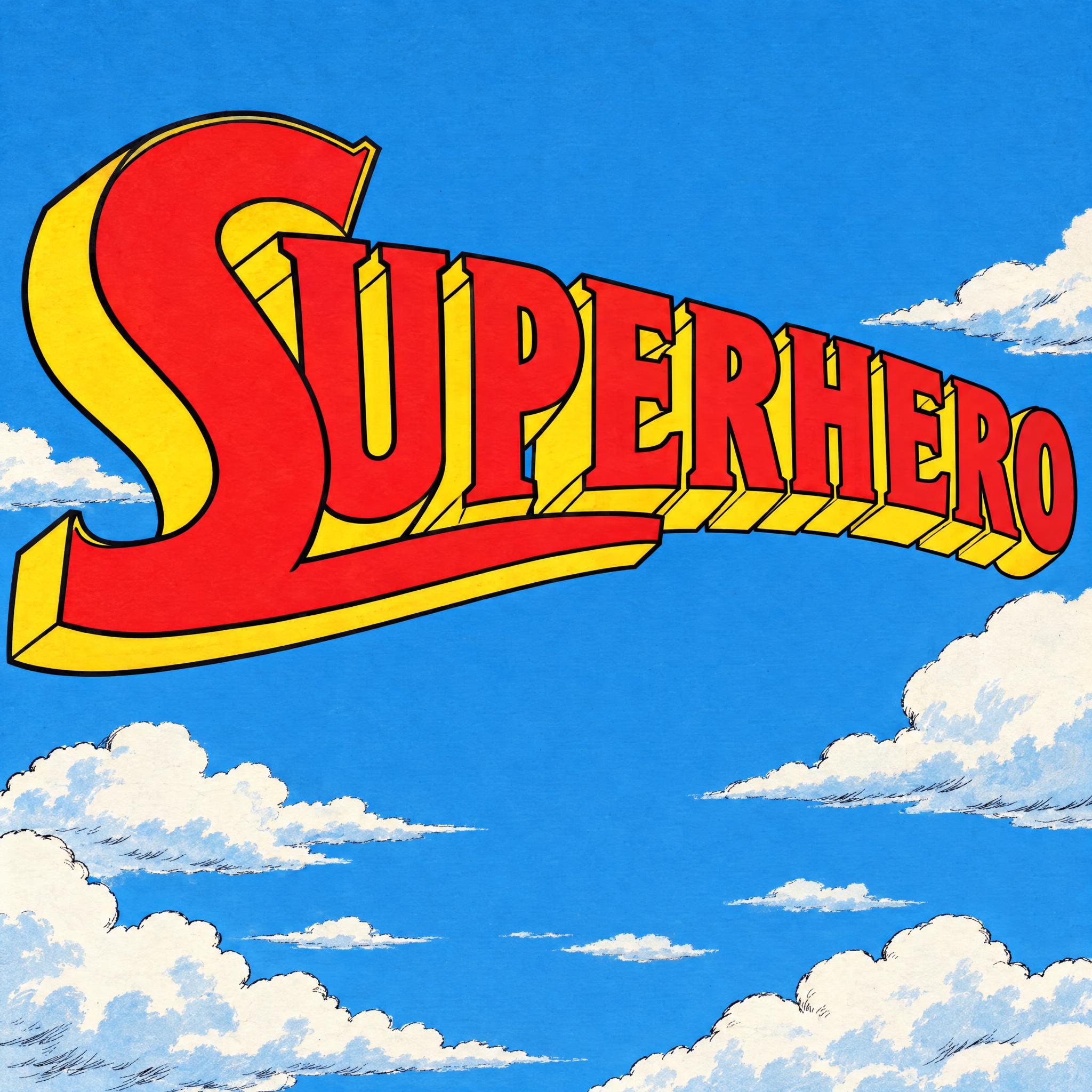
“Each letter is extruded backward into a deep solid block.” — Superhero Font
Shields, bats and stars belong to real characters. One short sentence keeps a superhero logo yours instead of a copy.
“There is no shield or emblem around the word.” — Superhero Font
A panel border and old newsprint finish the look, and the only text in the image keeps models from inventing captions or a second balloon.
“Printed in a comic panel with a thick black border on slightly yellowed newsprint; the word is centered, fills most of the width, reads clearly and is the only text in the image.” — Pop Art Font
Words drawn into pictures are much older than comics. Mesoamerican art between 600 and 900 CE used speech scrolls, wispy lines joining speech to a speaker's mouth, and 18th-century printed broadsides carried word balloons: political cartoons of the American Revolution used them, and so did James Gillray in Britain. Richard F. Outcault's Yellow Kid, generally credited as the first American comic strip character, first wore his words on his shirt; balloons were added as early as 1896, and by the start of the 20th century they were everywhere.
Comic books came next. Historians consider Famous Funnies: A Carnival of Comics, from 1933, the first true American comic book, and Famous Funnies No. 1, cover-dated July 1934, sold 68 pages for ten cents. Superman made his debut in Action Comics No. 1 in June 1938, and the Golden Age of comic books ran from the late 1930s through roughly the end of the 1940s. These were colour magazines printed on newsprint.
Every letter on those pages was drawn by hand, by the cartoonist or by a letterer. Mainstream comics settled on capitals, partly for a practical reason: capitals need three guidelines, mixed case needs five. Marvel tried mixed-case lettering from 2002 to 2004, and most titles went back to capitals. Today most comics are lettered on a computer with fonts that imitate hand lettering. That is why comic book font means three things at once: the dialogue in the balloons, the sound effects in the art and the logo on the cover, each with its own prompt on this page.
Sources: Wikipedia — Speech balloon · Wikipedia — American comic book
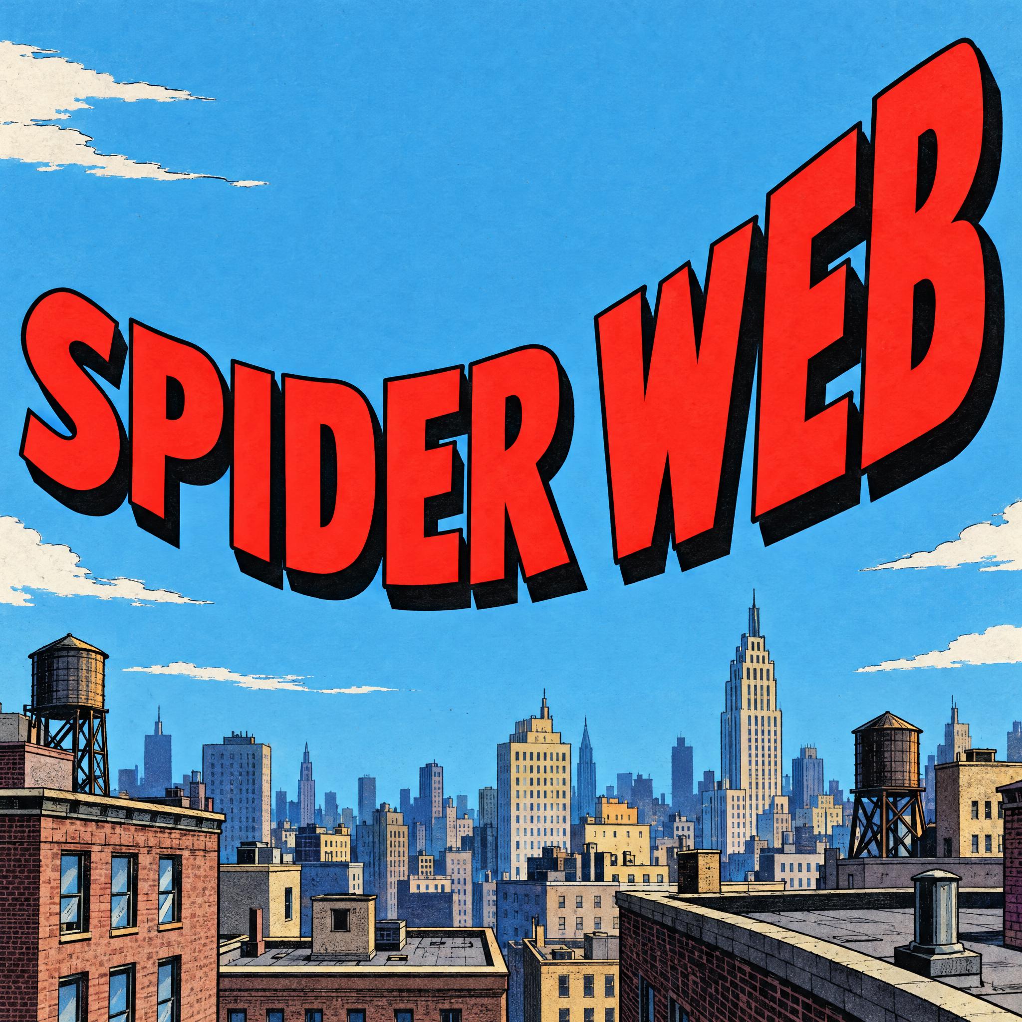
Fat bouncing capitals with Ben-Day dots, a block shadow and an explosion burst.
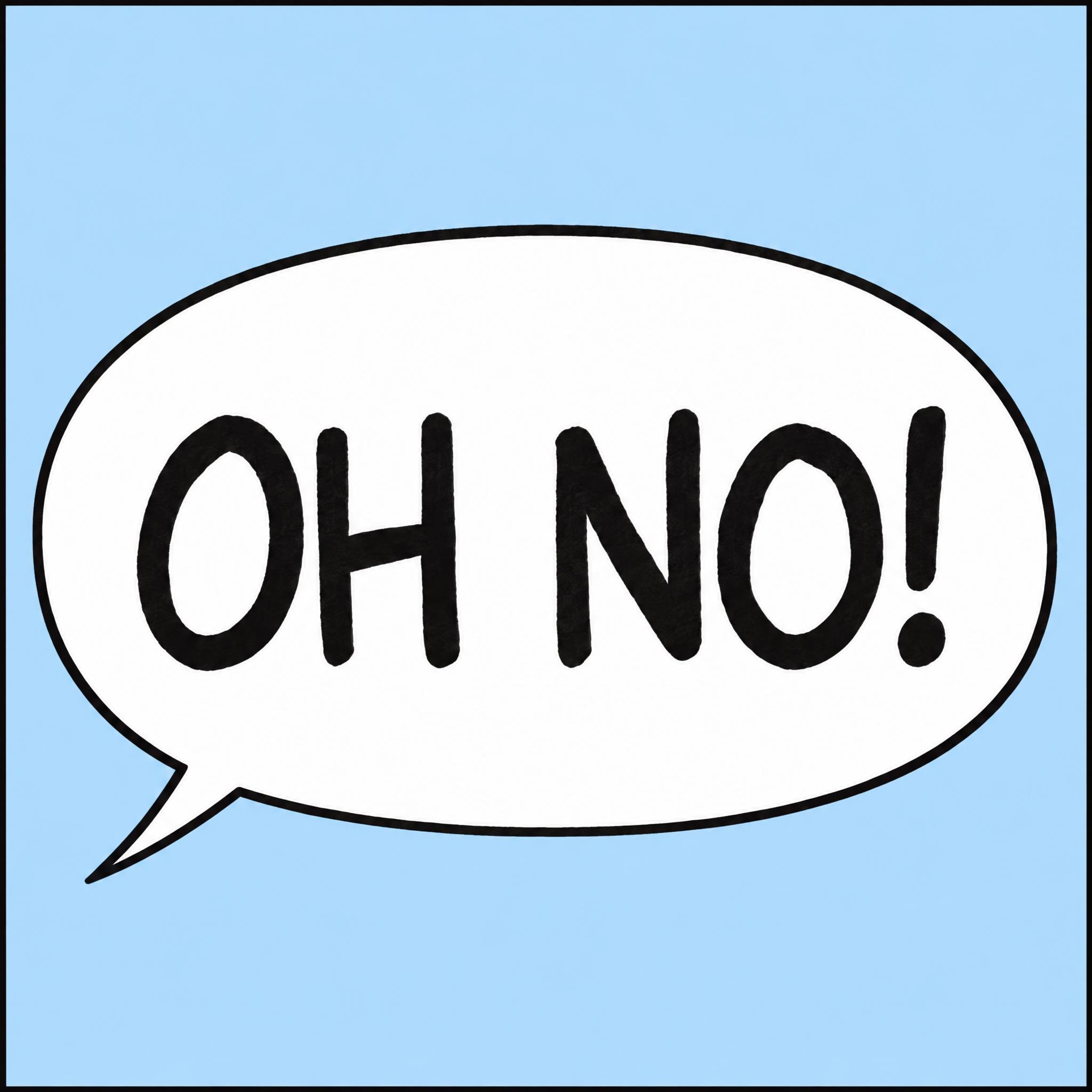
Even felt-tip capitals lettered by hand inside a white balloon.
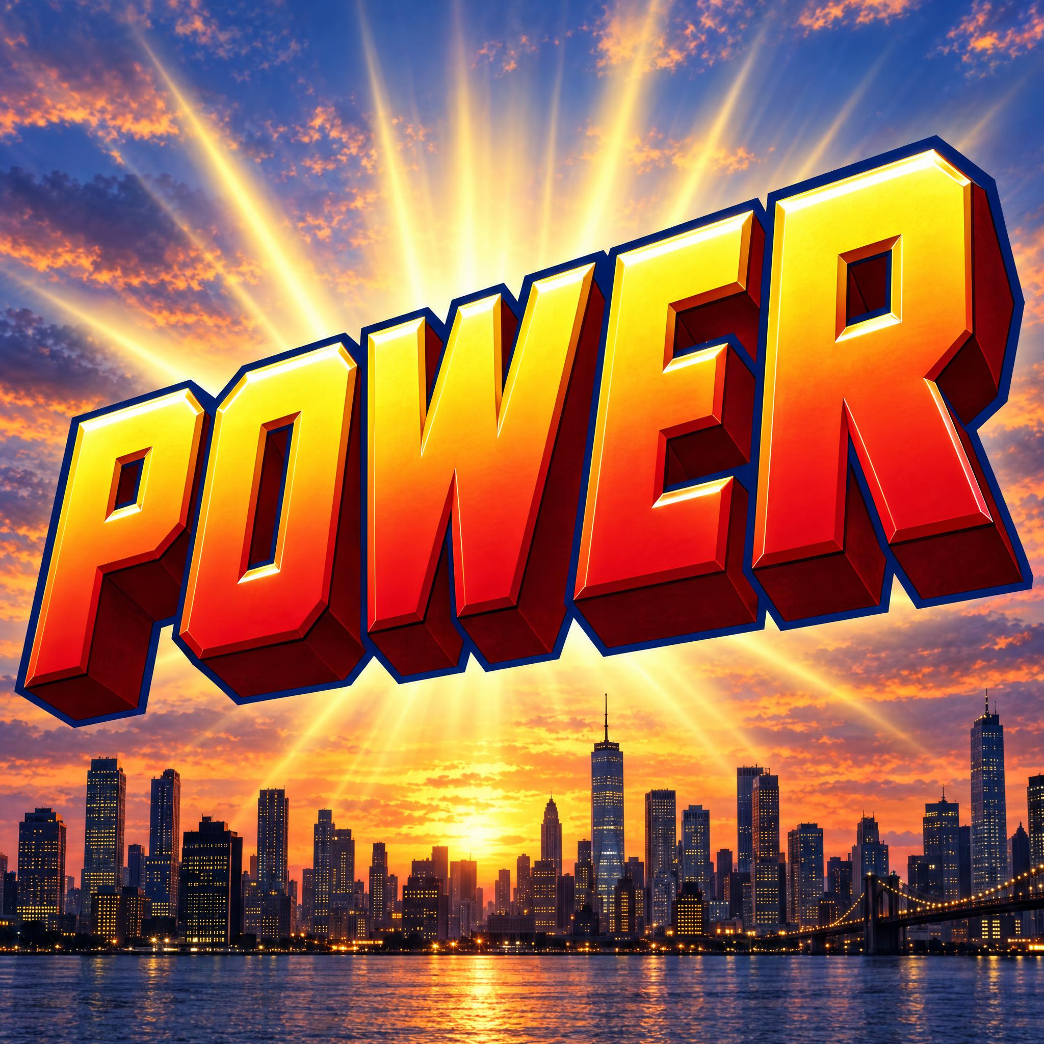
Heavy leaning block letters in perspective, extruded and bevelled.
Japanese comics: ink-brush sound effects with a white outline, in black and white.
Lettering in the manner of famous comic and film titles. Coming later.
A comic book font is lettering that looks like it came off a comic page: a loud sound effect, hand-lettered dialogue in a balloon, or a heavy title logo. On this page each of those is an AI prompt that draws your own word in that style.
Comic Sans borrows the feel of comic lettering, but it is a typed font and looks like one. Comic Lettering Font draws the thing it imitates: capitals written by hand with a felt-tip, inside a real speech balloon.
Mostly habit with a practical root: hand letterers needed three guidelines for capitals and five for mixed case. Marvel tried mixed case from 2002 to 2004 and went back. Our prompts ask for capitals for the same reason readers expect them.
Pop Art Font. It draws the word as a sound effect: bouncing capitals, Ben-Day dots, a black outline and an explosion burst behind it.
Superhero Font gives you the look of a superhero cover logo for your own name, team or hero. It leaves out shields and emblems, which belong to their characters; logos of real series are their owners' trademarks.
Comic book fonts come from American comics: coloured sound effects, capitals in balloons and 3D cover logos. A manga font comes from Japanese comics, printed in black and white, with sound effects inked by brush and outlined in white.
No. They are prompts that make a picture of your word with an AI image model, not font files. They are for a finished sound effect, balloon or logo as an image.