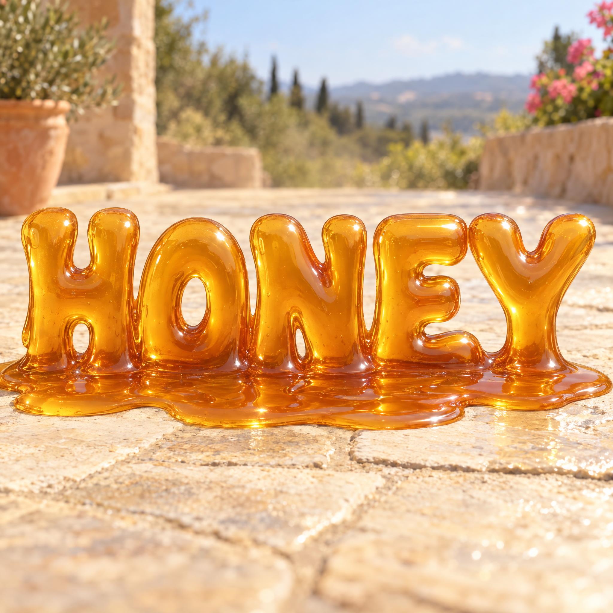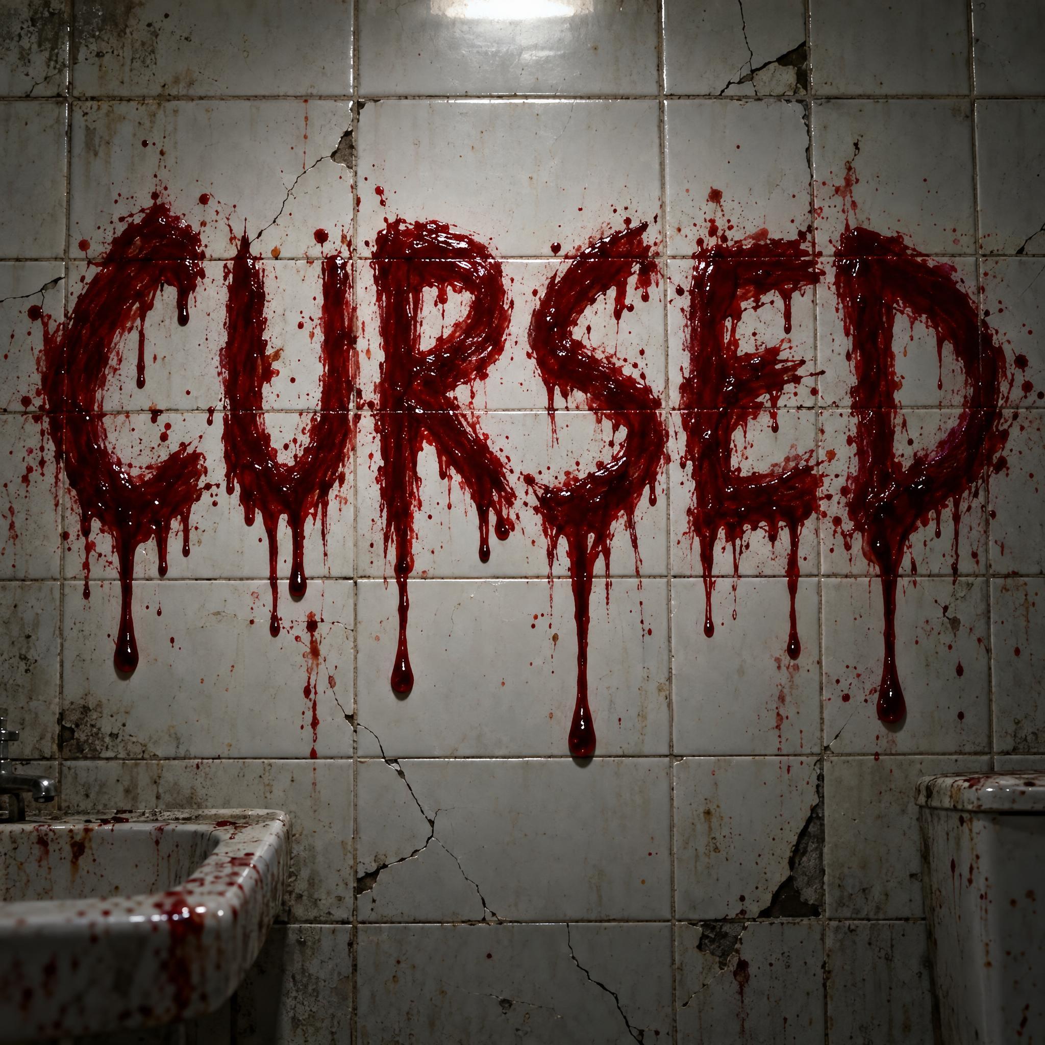
Drip fonts as copy-ready AI prompts, in the kinds of dripping letters people look for: black graffiti paint running down a wall, neon green slime, letters melting into syrup, horror blood and cartoon Halloween drips. These are prompts, not font files: type your word, copy, and paste into ChatGPT or Gemini, or generate it right away on FontVibe.
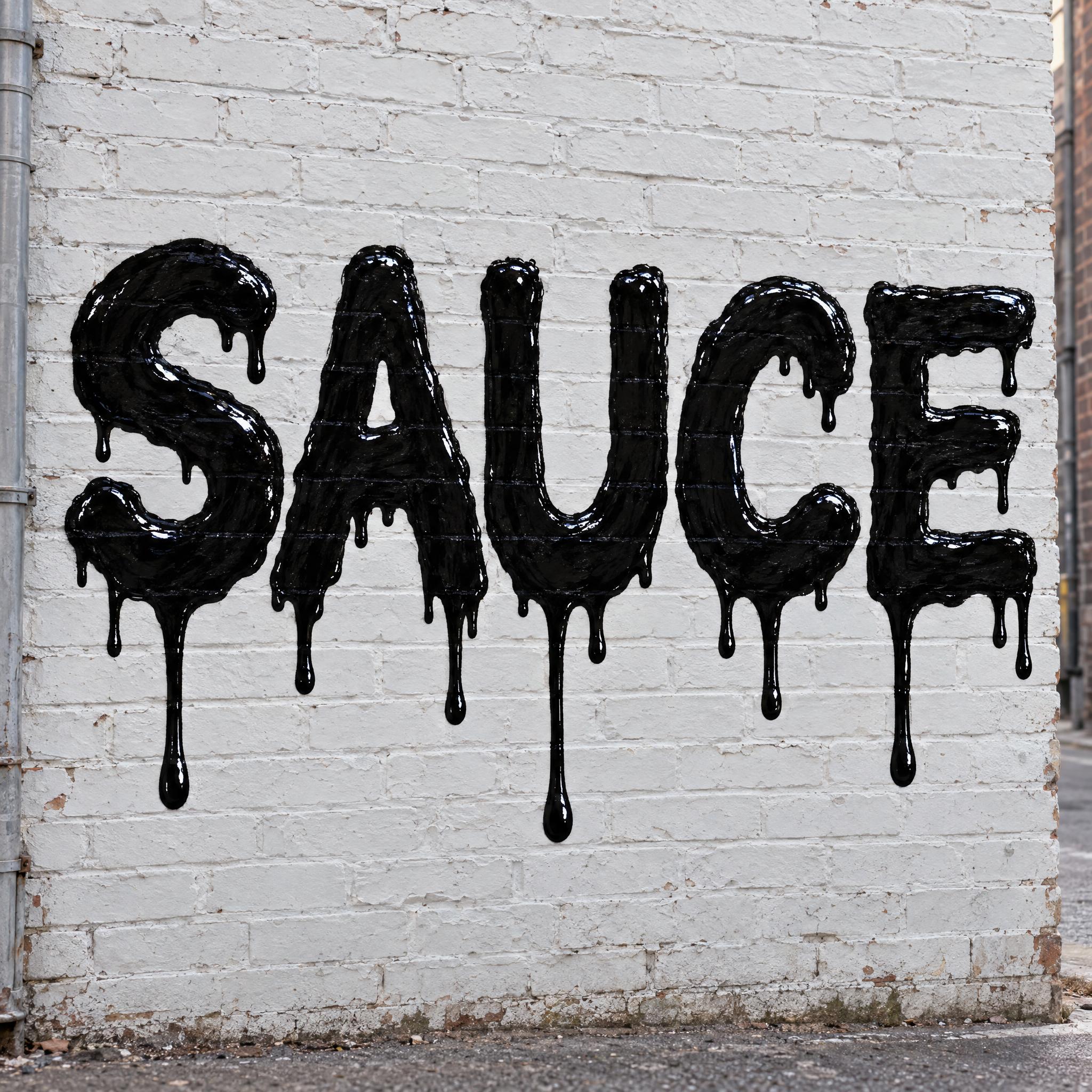
Type your word, copy the full prompt and paste it into ChatGPT, Gemini or any image model.
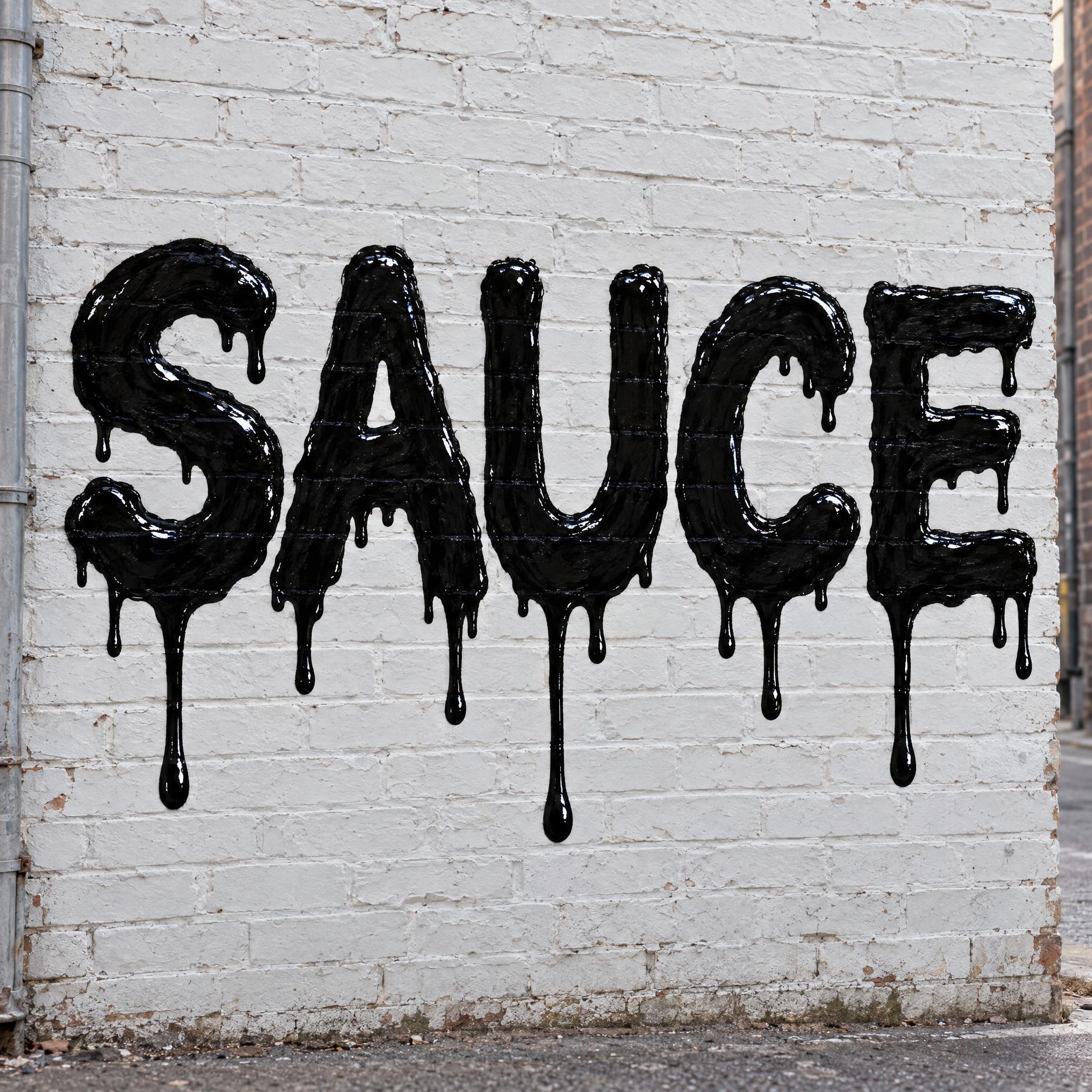
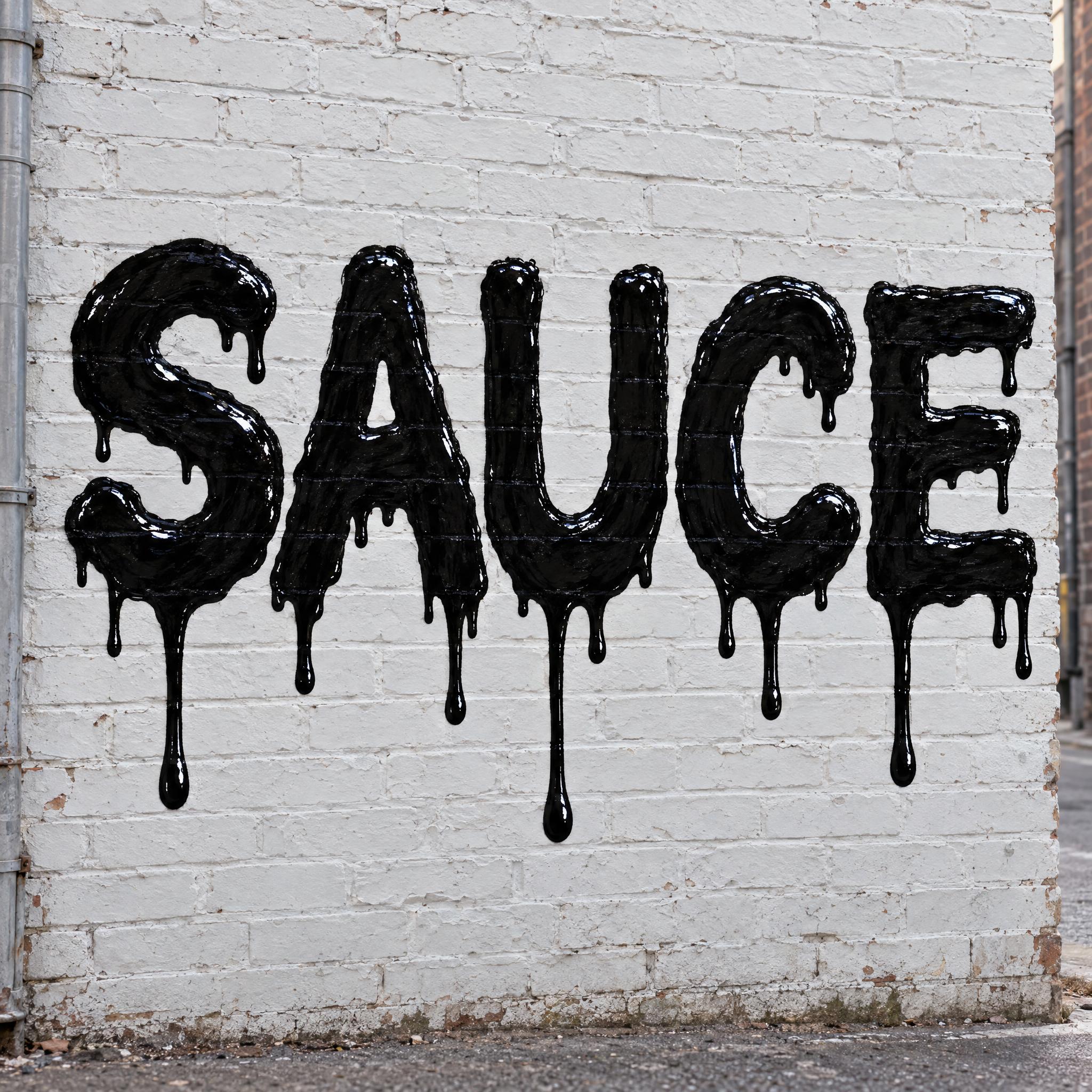
TextWrite the word "SAUCE". Spell it exactly as written, without adding or changing any letter.
Font designDrip lettering: bold, heavy capital letters painted by hand like a street graffiti piece, with slightly uneven edges, every letter easy to read. Thick paint runs down from the bottom edge of every letter in drips of very different lengths, some short and some reaching far below the word, each ending in a round drop. The letters stay solid and whole above the drips. Every letter is jet black paint. The paint is wet and glossy, with small bright highlights along the letters and drips. Crisp clean edges, with no spray mist or splatter around the word. Like wet paint lettering running down a city wall.
ScenePainted on a whitewashed brick wall in a city alley, in soft daylight, with no other text; the word is centered, fills most of the width and reads clearly.
Open one for the prompt and real results on each image model.
Tested October – November 2026. First attempts from our test ledger: 180 images, 5 fonts, 7 languages, each one checked by eye.
How to read it: 35 / 36 means 36 images tested and 35 spelled the word right on the first try; the percentage is that share. The Latin, Chinese / Japanese and Arabic columns split the same count by the script of the word.
| Model | Right first time | Latin | Chinese / Japanese | Arabic | Most common issue |
|---|---|---|---|---|---|
| GPT Imagegpt-image-2.5-sunburst · xhigh | 100% 36 / 36 | 100% 20 / 20 | 100% 10 / 10 | 100% 6 / 6 | None recorded |
| Nano Bananagemini-nano-banana-2.1 | 97% 35 / 36 | 100% 20 / 20 | 90% 9 / 10 | 100% 6 / 6 | Extra words added |
| Seedreamdola-seedream-5-0-pro-260628 | 89% 32 / 36 | 100% 20 / 20 | 90% 9 / 10 | 50% 3 / 6 | Letters out of order |
| Grok Imaginegrok-imagine-image-2.0 · medium | 97% 35 / 36 | 100% 20 / 20 | 100% 10 / 10 | 83% 5 / 6 | Wrong letter |
| Qwen-Imageqwen-image-3.0-pro | 86% 31 / 36 | 95% 19 / 20 | 90% 9 / 10 | 50% 3 / 6 | Extra letter |
How we test: images are made through FontVibe with each model’s API, sending the prompt as is; we count only each model’s first image for every font and language and check the spelling by eye. Apps such as ChatGPT may rewrite prompts, so results there can differ. For the full data, email [email protected].
Every dripping letter is a liquid and a direction: what the letters are made of, and where it runs. A good prompt keeps the letters solid at the top, says how the liquid leaves them, and rules out the effect next door, such as spray mist or splatter. The examples are quoted word for word from the prompts of the fonts on this page.
Drips eat letters if you let them. Say that the letters stay solid and the liquid only leaves from the bottom.
“The letters stay solid and whole above the drips.” — Drippy Font
Drips of equal length look like a pattern, not paint. Ask for very different lengths and give each one a round end.
“in drips of very different lengths, some short and some reaching far below the word, each ending in a round drop” — Drippy Font
Paint, slime, syrup and blood move differently. The material sentence decides whether you get hard runs, stretchy strings or a slow sag.
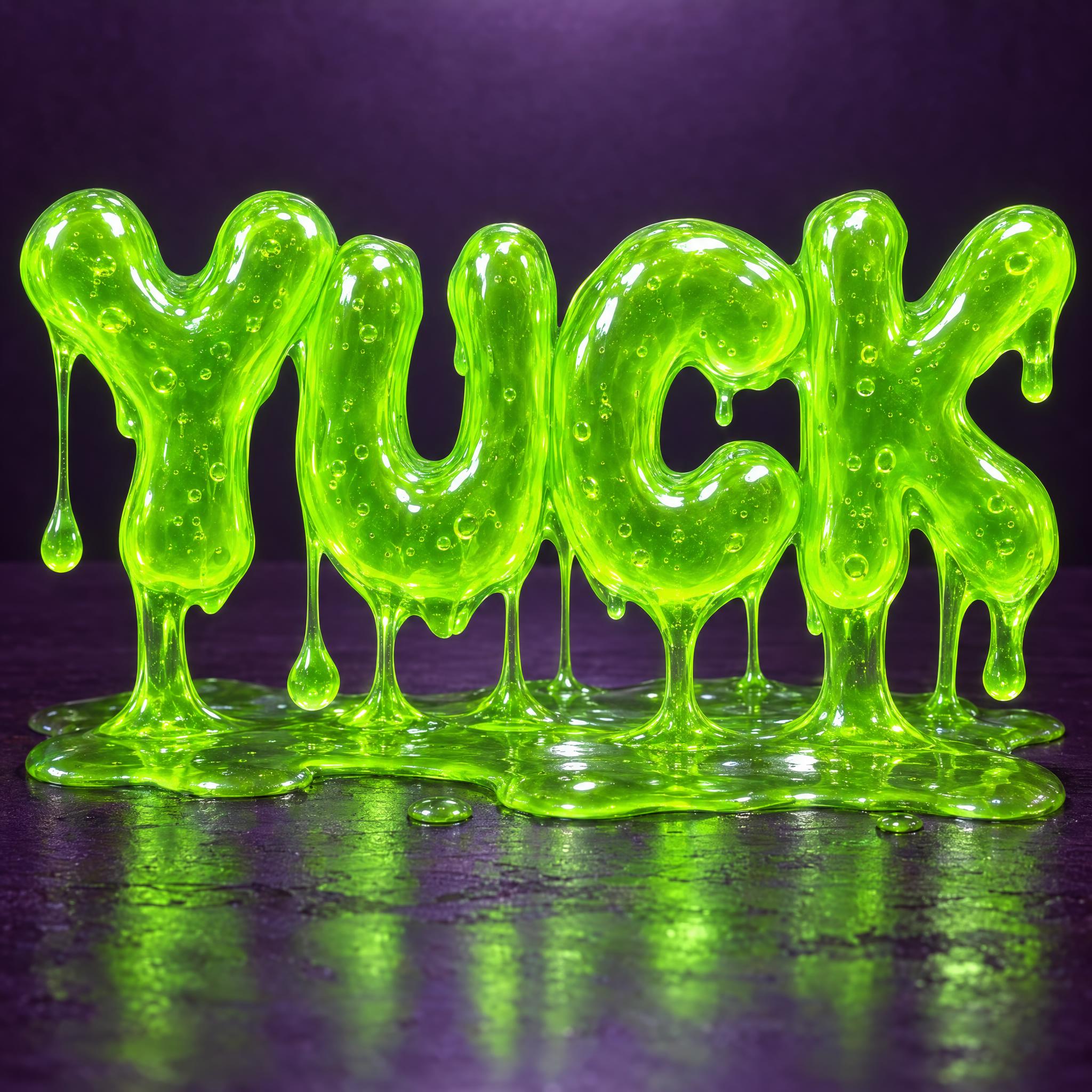
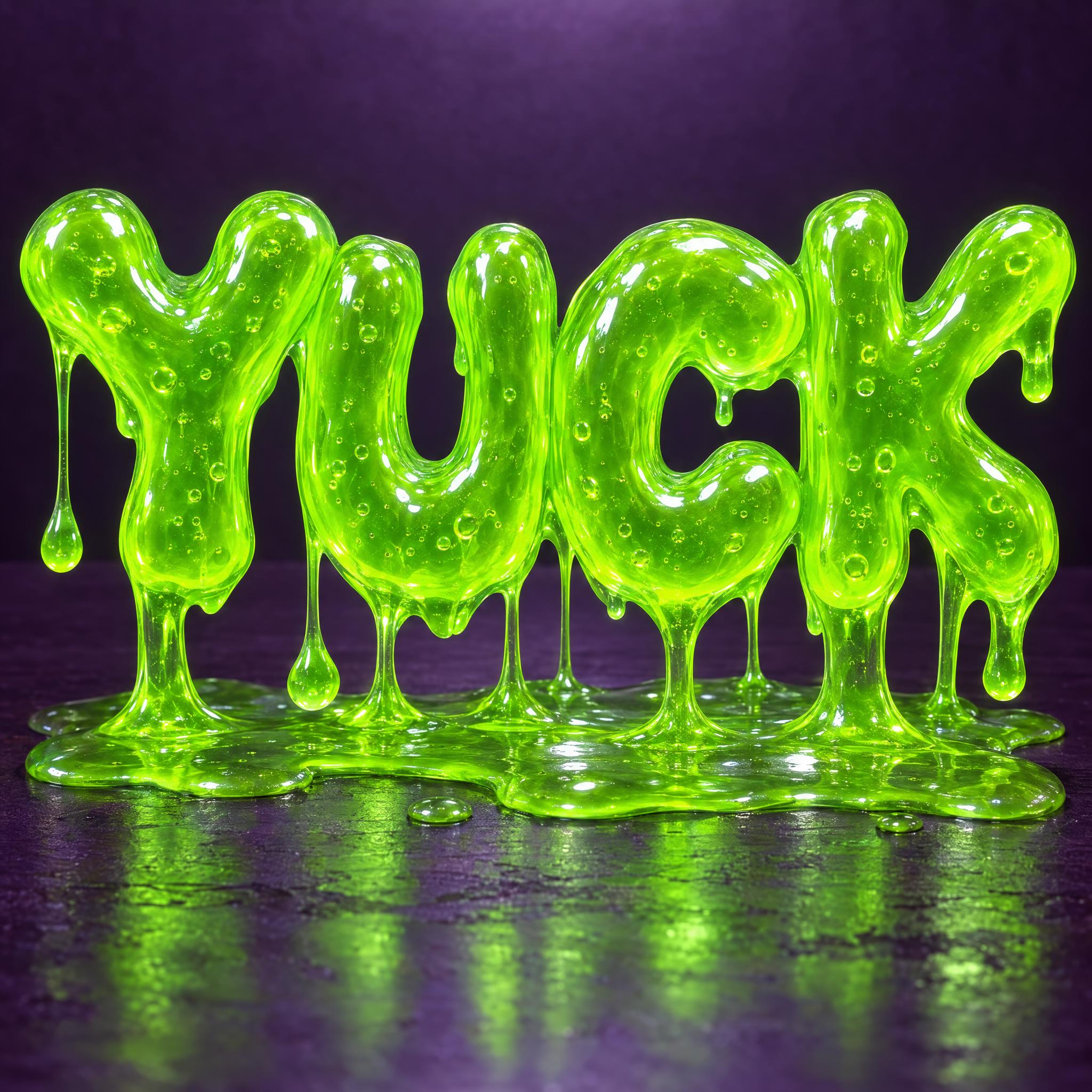
“Each letter is made of translucent slime, with light glowing through it and tiny air bubbles trapped inside.” — Slime Font
Melting is not dripping: the letter itself softens. Say that the top keeps its shape and the base spreads, and rule out thin drips.
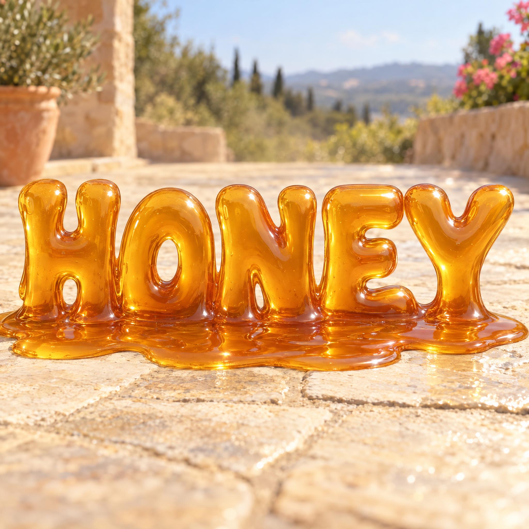
“The whole letter shape sinks and spreads, rather than hanging thin separate drips.” — Melting Font
Drip prompts drift into spray haze and splatter. One sentence about what is not around the word keeps the edges clean.
“Crisp clean edges, with no spray mist or splatter around the word.” — Drippy Font
A puddle or a wall tells the model which way gravity pulls. Slime and melting letters pool on a surface; paint runs down a wall.
“it collects in a glossy puddle under the word” — Slime Font
Highlights are what make a drip look fresh rather than printed. Ask for gloss and small bright highlights.
“The paint is wet and glossy, with small bright highlights along the letters and drips.” — Drippy Font
Dripping letters go wrong in a few predictable ways, and most of them come from mixing up liquids that behave differently.
A drip is gravity: liquid leaves the bottom edge and runs straight down. Splatter is thrown paint that lands all around the word. Paint Splatter Font and Spray Paint Font carry a few drips only as an accent, which is why they belong to other looks.
Drippy Font is solid black with hard edges; Slime Font lets light through and stretches into strings. Say which you want, or the model gives you something in between.
In Melting Font the lower half of every letter sags and spreads; in a drip font the letter stays whole and the liquid leaves it. Ask for both at once and you get blobs.
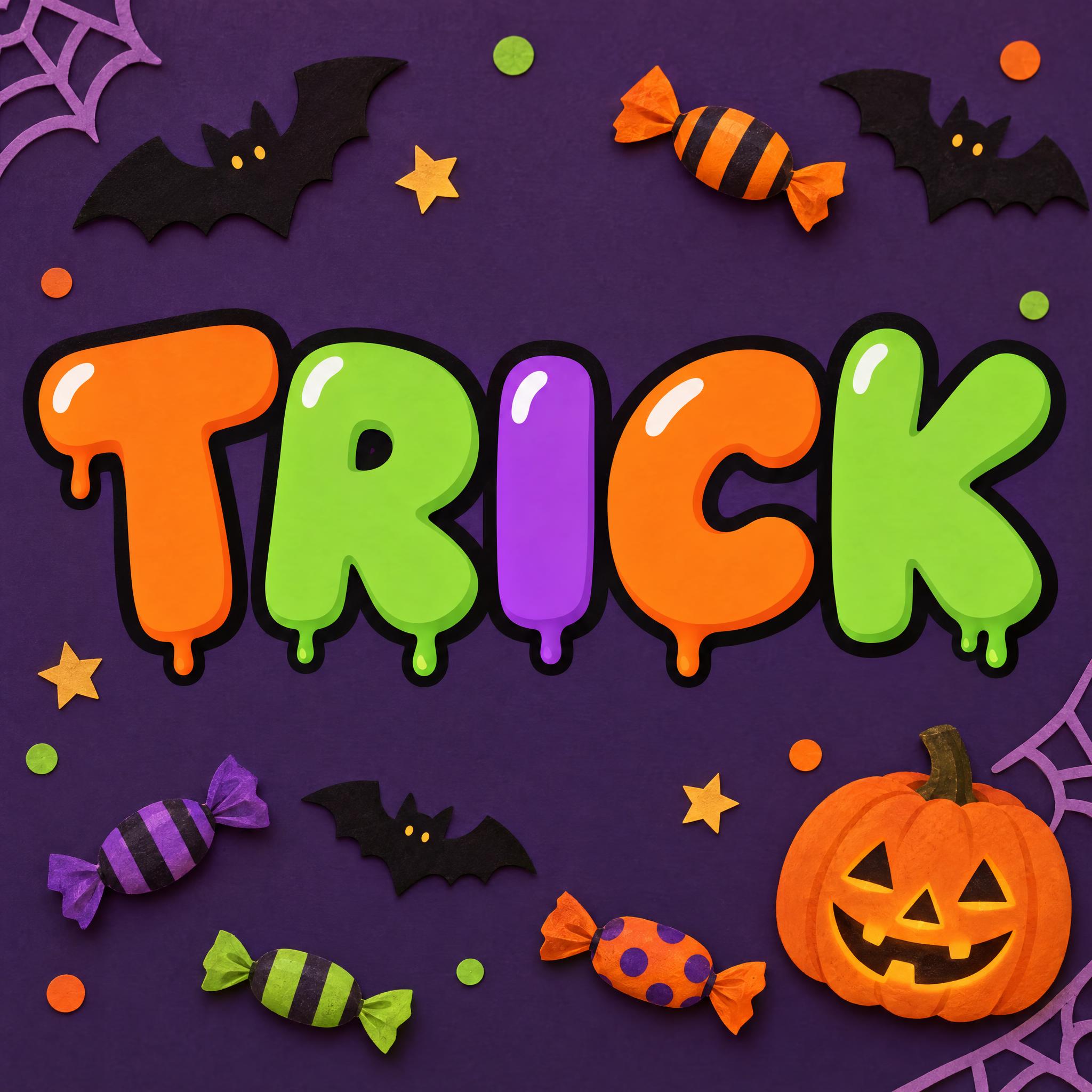
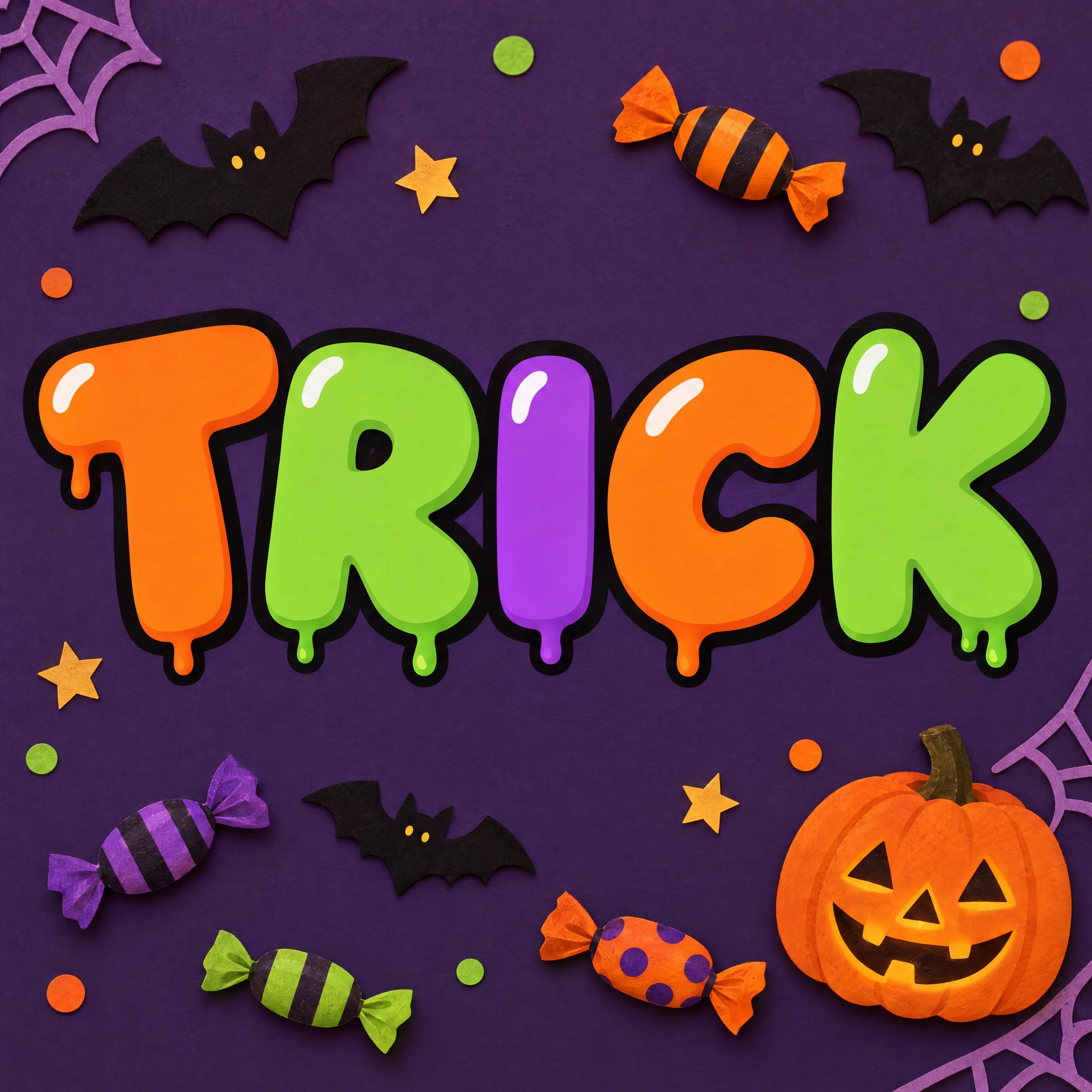
On Halloween Bubble Letters the drips are short, round and outlined like the letters, so they read as cartoon slime rather than real liquid. That suits a kids' party invitation; for real wet paint, ask for gloss and highlights instead.
| You want | Try | Why |
|---|---|---|
| A streetwear logo, mixtape cover or skate graphic | Drippy Font | Black graffiti capitals with long glossy paint runs |
| A kids' party, toy packaging or a gross-out thumbnail | Slime Font | Translucent green slime with strings and a puddle |
| A summer menu, dessert label or ice-cream poster | Melting Font | Syrup letters that sag into one puddle |
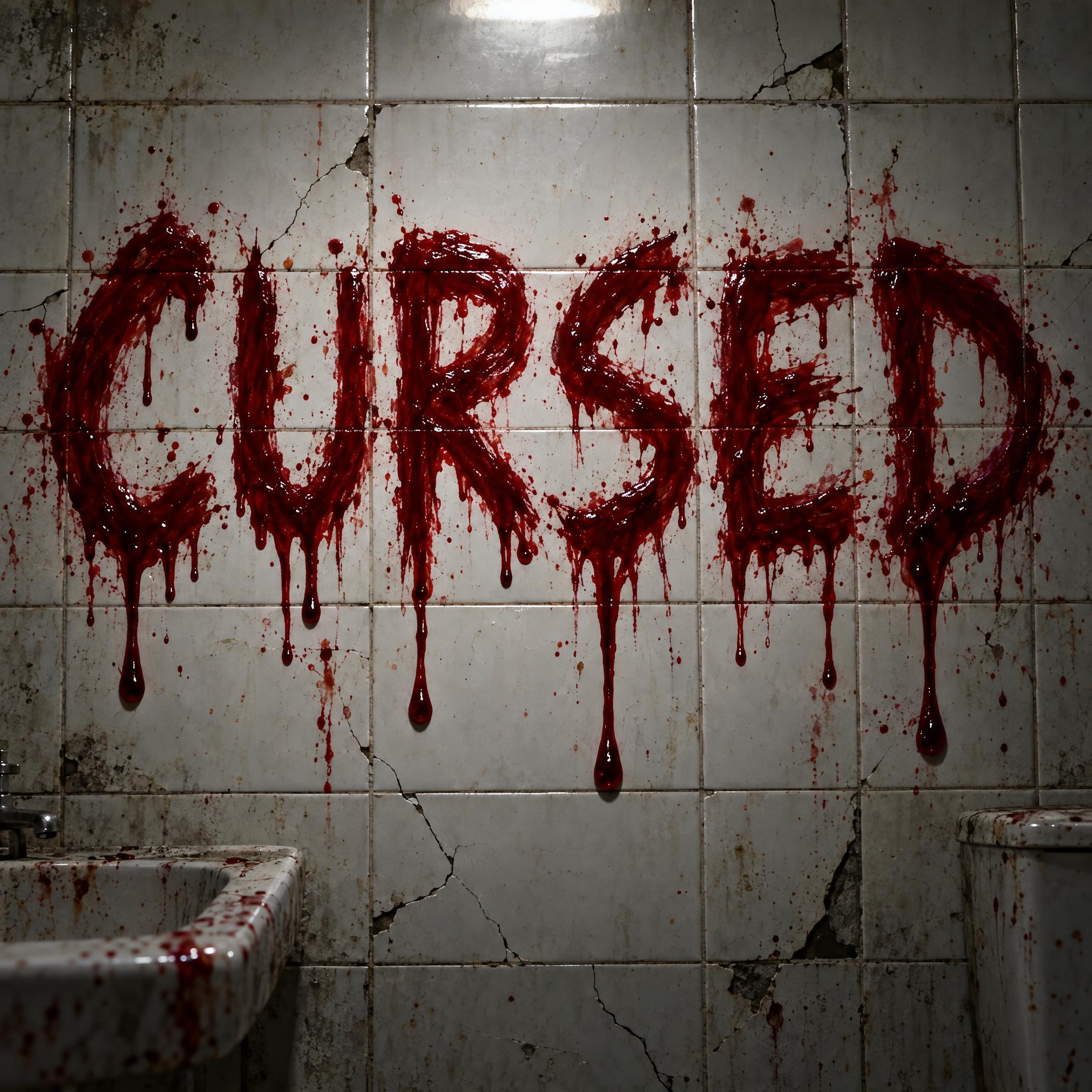
| A horror poster or haunted-house sign | Blood Font | Rough crimson letters with long blood drips |
| A Halloween invitation for kids | Halloween Bubble Letters | Flat cartoon bubble letters with round slime drips |
Painters usually treated a drip as a mistake, until some began to use it on purpose. In the first half of the twentieth century Francis Picabia, André Masson and Max Ernst experimented with dripping and pouring, and Ernst swung a punctured bucket of paint over a horizontal canvas to draw his lines. Janet Sobel, who began painting in 1937, pioneered the drip technique: the critic Clement Greenberg cited her works as the first all-over painting he had seen, and mentioned that Jackson Pollock had noticed her painting in the 1940s.
Pollock went on to use drip painting almost exclusively, but with the canvas on the floor: he made his large compositions horizontally to prevent his paint from running. On a wall, paint runs. Krylon spray paint was heavily used in the New York City subway graffiti era, from the early 1970s to the late 1980s, and writers even named one version of the can after its label promising no runs, drips or errors.
Drip lettering keeps exactly what that label promised to take away. Paint, slime, syrup and blood each run in their own way, and each has its own story: the graffiti markers behind Drippy Font, the toy and television slime behind Slime Font, the soft watches behind Melting Font. Each font page on this site tells its own branch.
Sources: Wikipedia — Drip painting · Wikipedia — Janet Sobel · Wikipedia — Glossary of graffiti
Heavy hand-painted black capitals with glossy runs of very different lengths.
Fat translucent neon-green letters sagging into sticky strings and a puddle.
Amber syrup letters whose lower halves sag and spread into one puddle.
Rough crimson horror letters with long blood drips on a tile wall.
Outlined Halloween bubble letters with short round slime drips.
Frozen letters hung with icicles. Coming later.
Sweet glossy drips for desserts and sweets. Coming later.
Lettering with liquid running off it: paint, slime, blood or syrup. On this page each style is an AI prompt that draws your own word with that liquid.
In dripping letters the letter stays whole and liquid runs off its bottom edge. In melting letters the letter itself goes soft and slumps, as in Melting Font.
Drippy Font: black hand-painted capitals with thick runs. To match a brand colour, change only the colour sentence and keep the line about clean edges, so the logo stays sharp in print.
Because the prompt never said where the liquid goes. Say that the letters stay solid and whole and the paint runs only from the bottom edge, as Drippy Font does.
No. They are prompts that make a picture of your word with an AI image model, not font files. For typing long text you need a font file; these are for a finished logo, cover or poster as an image.