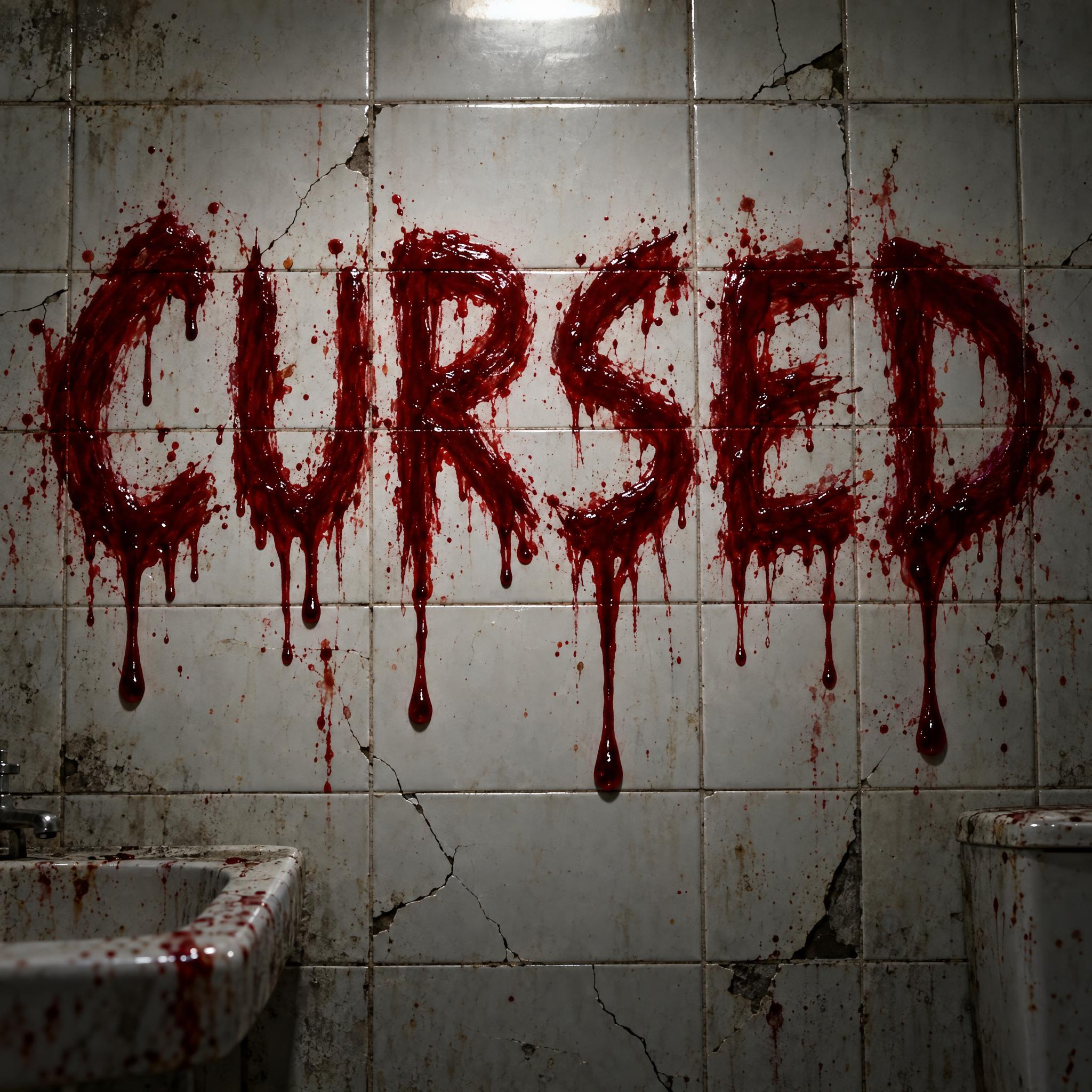
Bold red letters smeared in fresh blood, with long wet drips running down from every letter.
TextWrite the word "CURSED". Spell it exactly as written, without adding or changing any letter.
Font designBlood horror lettering: bold uppercase letters with rough, uneven edges, as if smeared on with fresh blood, every letter easy to read. Thick blood runs down from the bottom edge of each letter in long drips of different lengths, some ending in a heavy round drop. The letters are deep crimson red. The blood looks wet and glossy, darker where it is thick, with a few small spatters around the letters. Like the title on a classic slasher movie poster.
SceneThe word is smeared across a cracked white tile wall in a dim abandoned bathroom, under harsh overhead light. The word is centered, spans most of the width and reads clearly.
126 words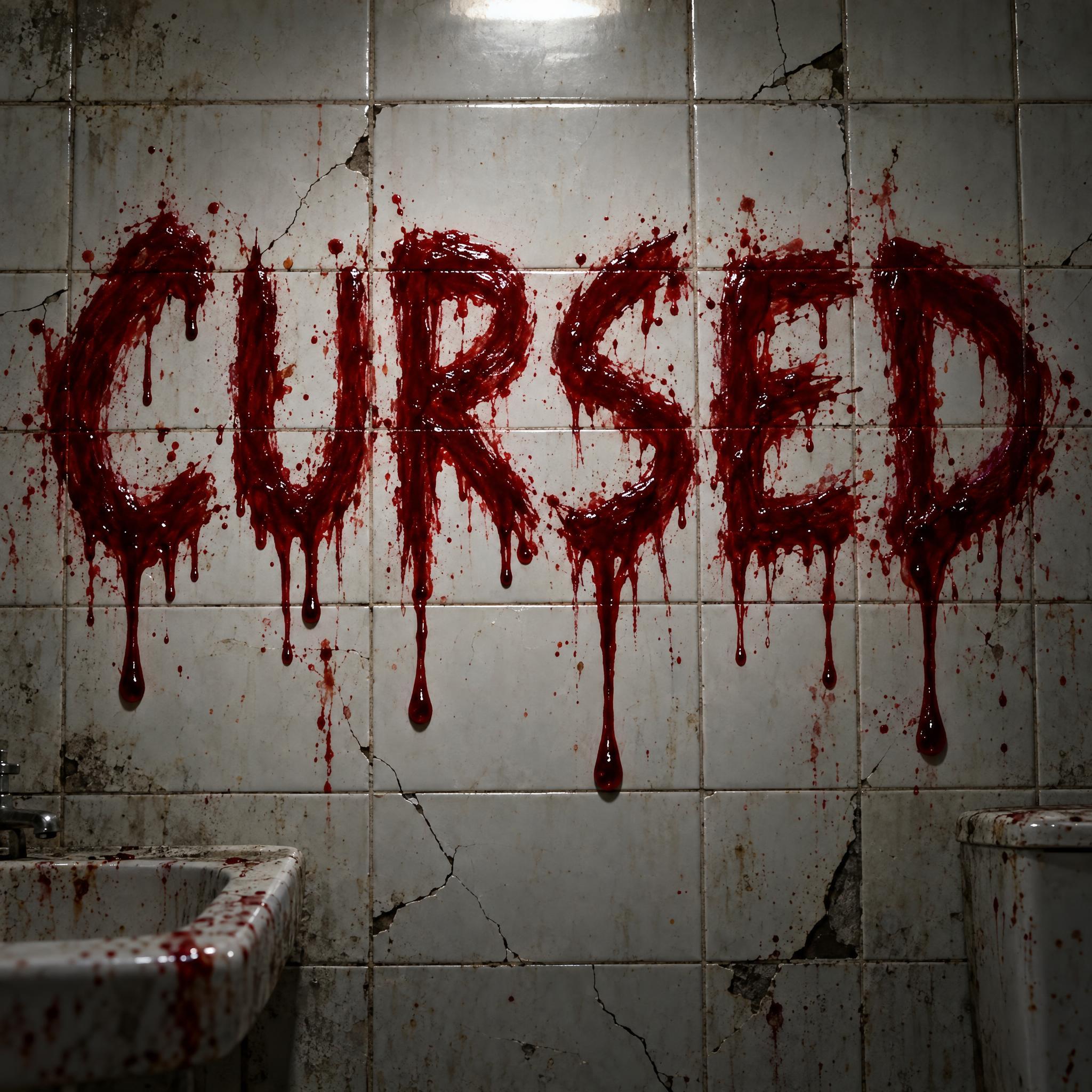
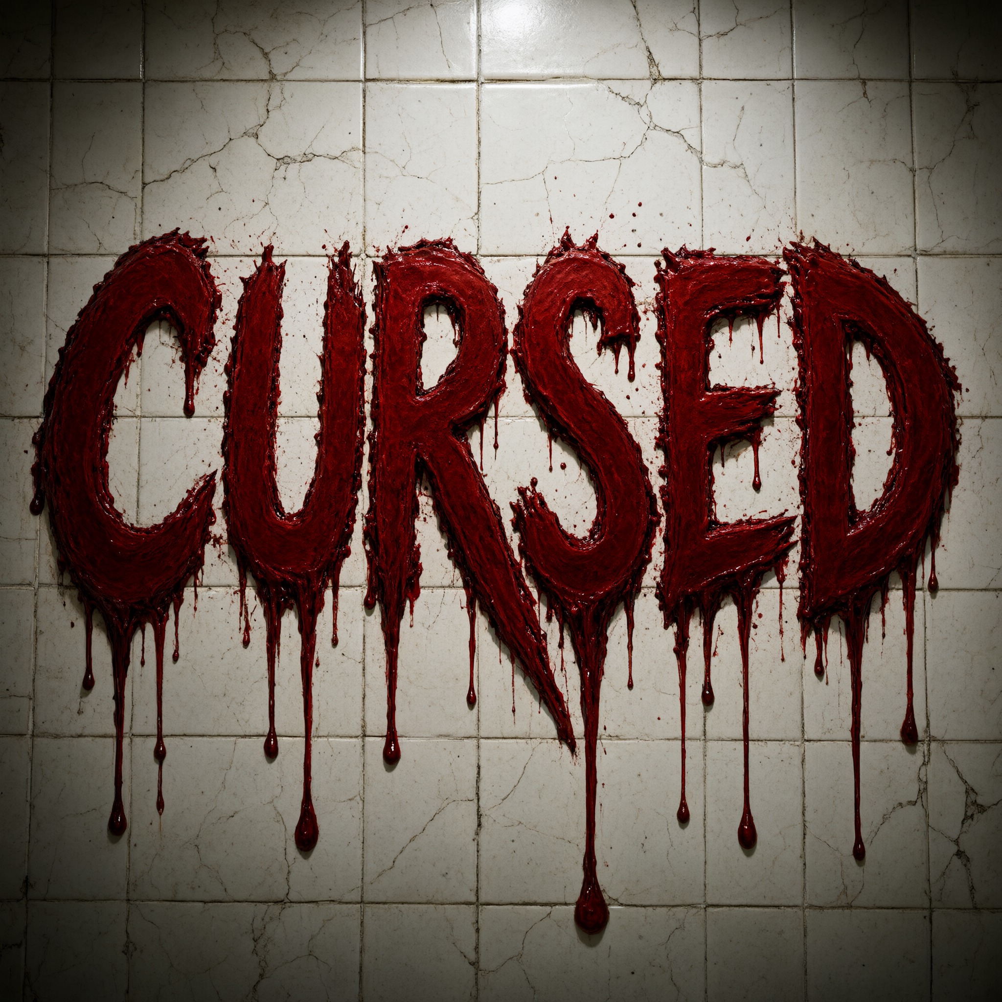
One prompt pasted into each image model as-is. These are the unedited results, so you can pick the model that suits you.
The messiest of the five: rough, smeared letters with dense spatter all around, and a sink and toilet in the corner of the shot.
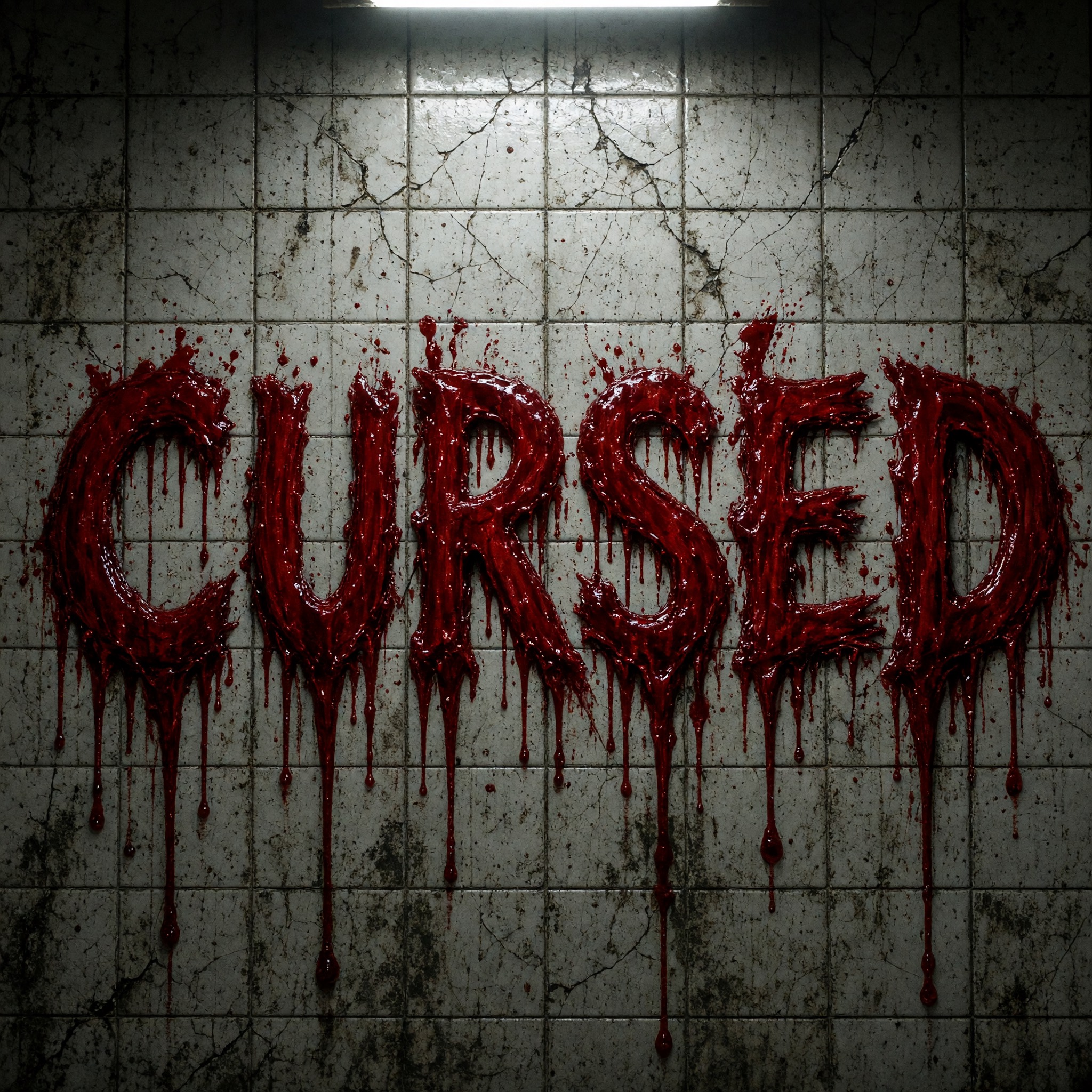
Thick, clotted blood with many drips under every letter, on grimy grey tiles.
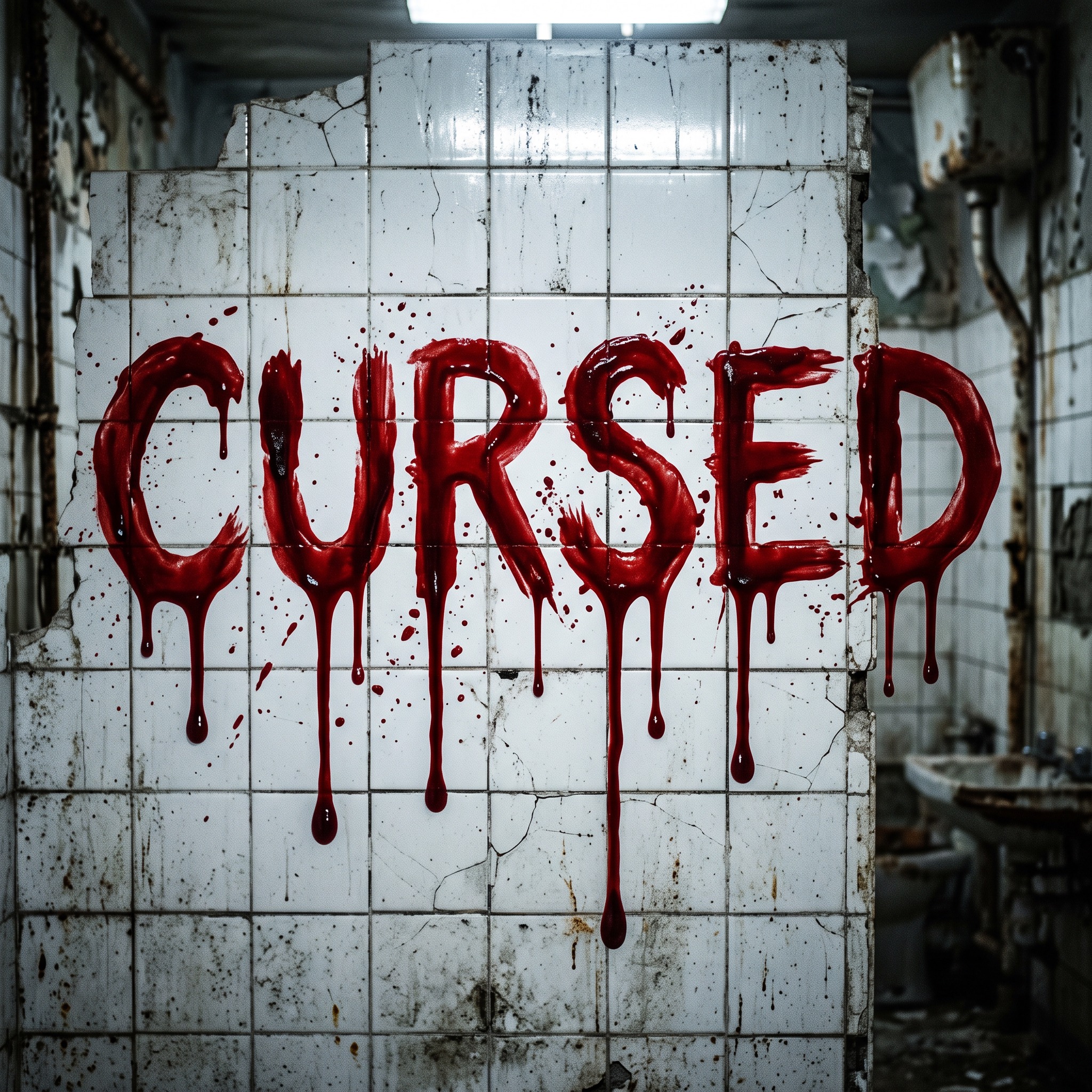
The cleanest letters, with long glossy drips and big round drops on a stark white wall.
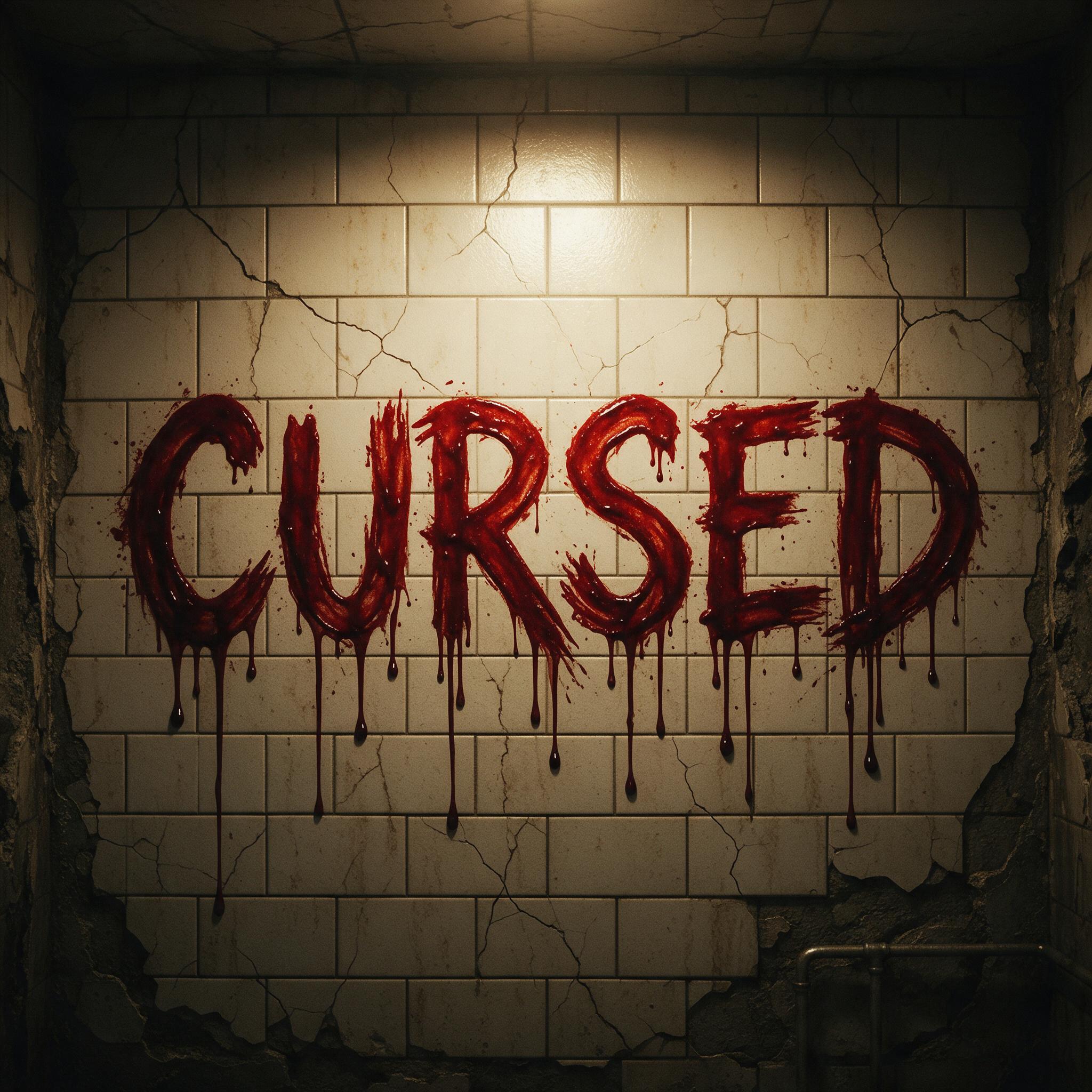
Brushy, hand-smeared letters with thinner drips, in the darkest and warmest light.
The heaviest letters, with jagged edges and long drips ending in round drops, close up on cream tiles.
The button opens FontVibe's DIY mode with this prompt already filled in, as-is, so all you do is type your word, pick a model and generate. GPT Image, Nano Banana, Seedream, Grok and Qwen are all there under one account instead of five different apps, so you can see which one drips the way you want. Every account gets free credits each month with no card needed, and you can export a transparent PNG to drop onto a poster or thumbnail.
Layers in the order the prompt states them. Change one layer and the rest keeps working.
Every AIFont prompt opens with the same text part. "Spell it exactly as written, without adding or changing any letter" comes first, so the model settles the spelling before it starts smearing and dripping the letters. Drips are easy to misread as extra strokes; a locked spelling keeps them as decoration.
"bold uppercase letters with rough, uneven edges, as if smeared on with fresh blood" gives the hand-made, finger-painted look of blood on a wall. "every letter easy to read" stops the mess from eating the word: a horror title still has to be read in a second.
"Thick blood runs down from the bottom edge of each letter in long drips of different lengths, some ending in a heavy round drop" is the heart of the font. Drips of different lengths look poured, not stamped, and starting them from the bottom edge keeps the letter shapes whole above them.
"The letters are deep crimson red." is the colour sentence, on its own so you can change just this line. Crimson reads as blood; a brighter red starts to look like paint.
"The blood looks wet and glossy, darker where it is thick, with a few small spatters around the letters" makes it fresh rather than dried. The darker pools give the drips weight, and a few spatters finish the scene without crowding the word.
"Like the title on a classic slasher movie poster." gives every model the same reference for the weight, the red and the mood.
"The word is smeared across a cracked white tile wall in a dim abandoned bathroom, under harsh overhead light" is the horror-film shot of a message left on a wall; the white tiles make the red stand out. "The word is centered, spans most of the width and reads clearly" keeps the word the star. Swap the wall for a poster, a mirror or a sheet of paper.
Small edits that stay on-style. Change one thing at a time.
Type it in the box next to Prompt above and copy again. Short, loud words such as a title, a name or a warning work best; the drips need room under every letter.
Change "The letters are deep crimson red." to "The letters are dark, almost black, red.", "The letters are bright neon red." or "The letters are toxic green slime."
Replace "smeared across a cracked white tile wall in a dim abandoned bathroom" with "printed as a title on a black movie poster", "smeared across a fogged bathroom mirror" or "written on an old wooden door".
The prompt sets no frame size. Pick 16:9 in your app for a YouTube thumbnail or 9:16 for a story, or add "Wide 16:9 image." at the end.
AI fonts that share the most tags with Blood Font.
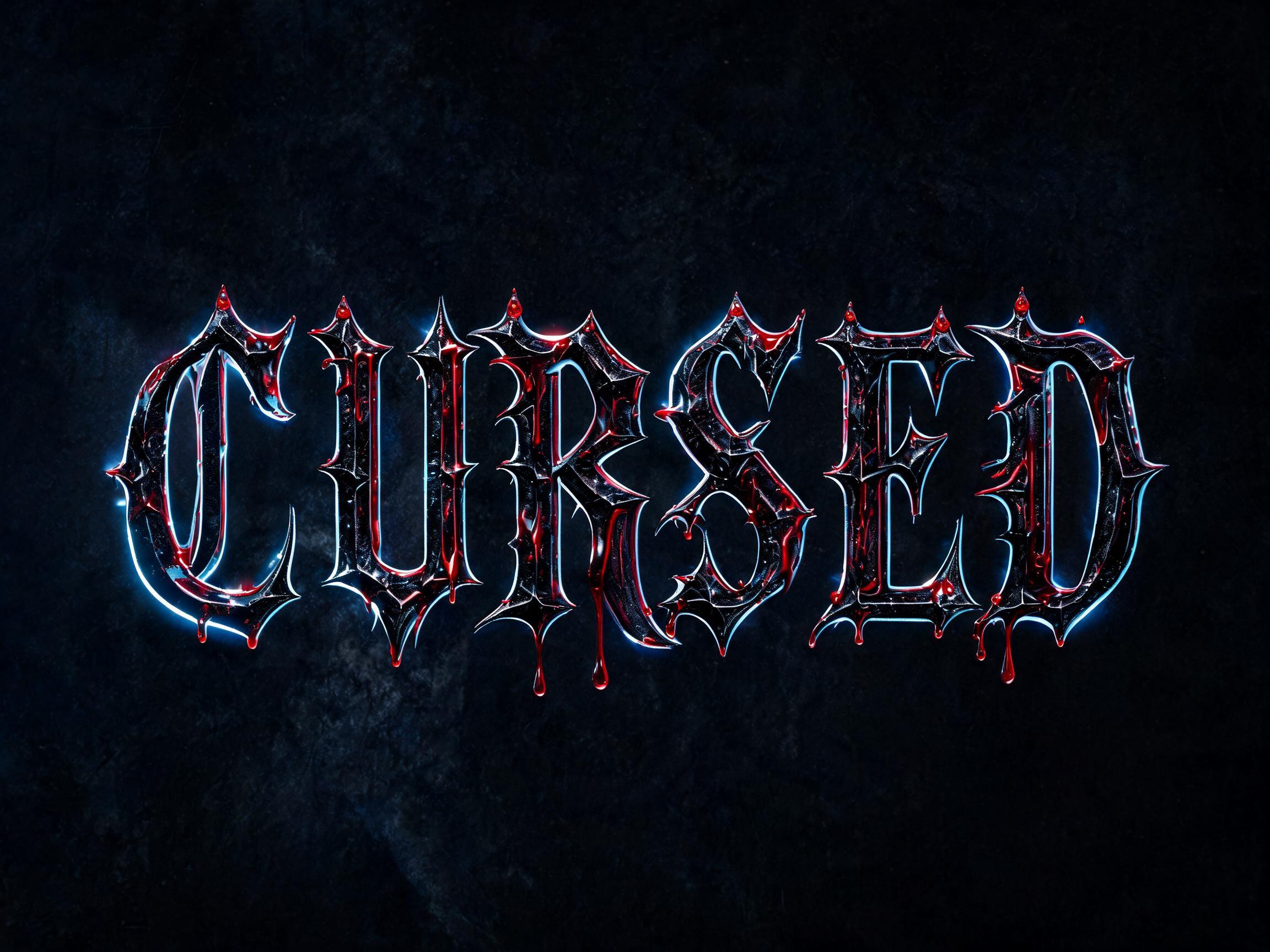
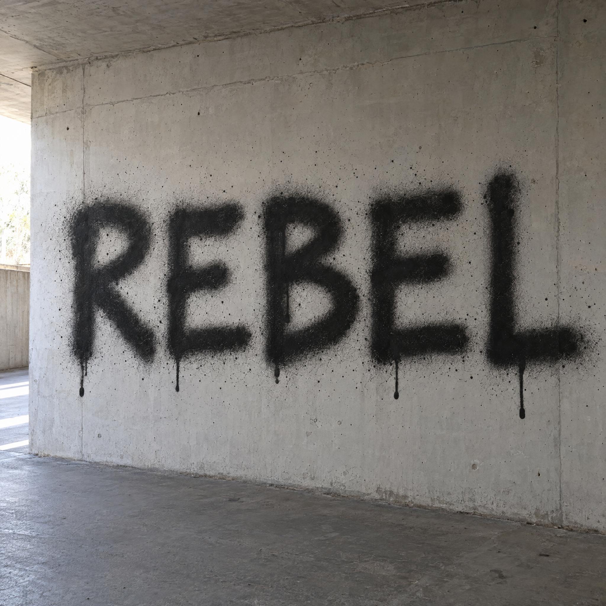
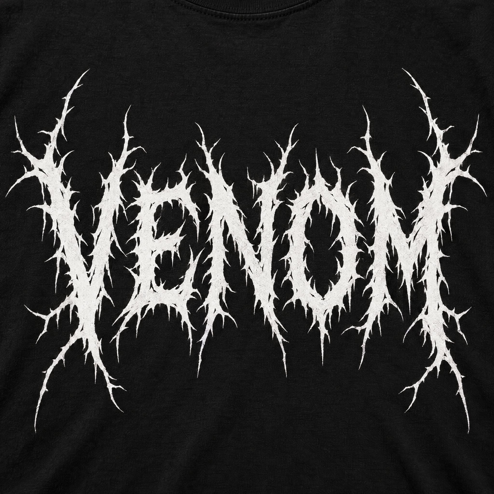
 Premium
AI fonts for a second line, a logo lock-up or a poster footer.
Blood Font writes your word the way horror movies do it: bold uppercase letters with rough, smeared edges, as if painted on with fresh blood, and thick drips running down from the bottom of every letter, some ending in a heavy round drop. The red is a deep crimson, wet and glossy, darker where the blood pools, with a few spatters around the word.
Type your word in the box above the prompt, copy it, and paste it into ChatGPT, Gemini, Grok or any other AI image app. The prompt has three parts: the text, the font design and the scene. The font design is what makes the blood lettering; the scene is yours to change. Every image on this page was made by pasting the prompt unchanged into each model, and nothing was retouched.
Use it for horror movie titles and posters, Halloween flyers and haunted house signs, YouTube thumbnails for scary stories, and album covers that need to look dangerous.
Details from the original render. Every one of them is named in the prompt.
Bold uppercase letters with uneven edges, as if painted on by hand.
Blood runs down from the bottom of every letter in drips of different lengths.
Some drips end in a fat, round drop.
Deep red, glossy and darker where the blood is thick.
Pulled from the render. Handy when you build the rest of the design around the word.
Where this AI font earns its keep.
Blood running down a title is older than the slasher film. Before the 1960s, horror posters were painted by hand, and the lettering did as much work as the picture: large, swooping letters, jagged, dripping and often three-dimensional, made a film feel dangerous before anyone had seen it.
Then blood became the subject itself. Blood Feast (1963), directed by Herschell Gordon Lewis and produced by David F. Friedman, is considered the first splatter film, and its gore drew crowds for years. George A. Romero later coined the term splatter cinema. This prompt borrows that red: fresh, wet and still running, rather than the dried, cracked blood of an old ghost story.
Sources: AIGA Boston — The Design of Horror: The Poster · Wikipedia — Blood Feast · Wikipedia — Splatter film
Herschell Gordon Lewis's Blood Feast opens, and is later considered the first splatter film.
All five wrote the word correctly in every language, Arabic included, and all five drew red letters with blood running down from them. GPT Image is the messiest, with the most spatter; Nano Banana has the cleanest, glossiest drips; Seedream looks the most hand-smeared; Grok's blood is thick and clotted; Qwen's letters are the heaviest. In Arabic, Qwen built the word as a floating 3D shape instead of smearing it on the wall. Compare them side by side above.
Type it in the box next to Prompt above, then copy the full prompt. Check the spelling in the image letter by letter: a long drip can look like an extra stroke, and a model can still slip.
Yes. Replace the colour sentence with "The letters are dark, almost black, red." for dried blood, or with "The letters are toxic green slime." for a monster look.
No. An AI font is a prompt, not a .ttf or .otf file. You paste it into an image model and it draws your word as a finished image, with the drips, gloss and spatter that an installed font can't give you.
Not here. Copy-and-paste blood text generators swap your letters for Unicode symbols; they can't add real drips or colour. This page gives you a prompt that makes a picture of your word, which you can post, print or use as a thumbnail.
Copying the prompt on AIFont is free. Generating the image uses the app you paste it into, so that app's own free limits or plan apply.