Gothic fonts as copy-ready AI prompts: sharp modern blackletter, vampire movie titles, spellbook ink, carved tombstones, cyber sigilism and death metal logos. These are prompts, not font files: type your word, copy, and paste into ChatGPT or Gemini, or generate it right away on FontVibe.
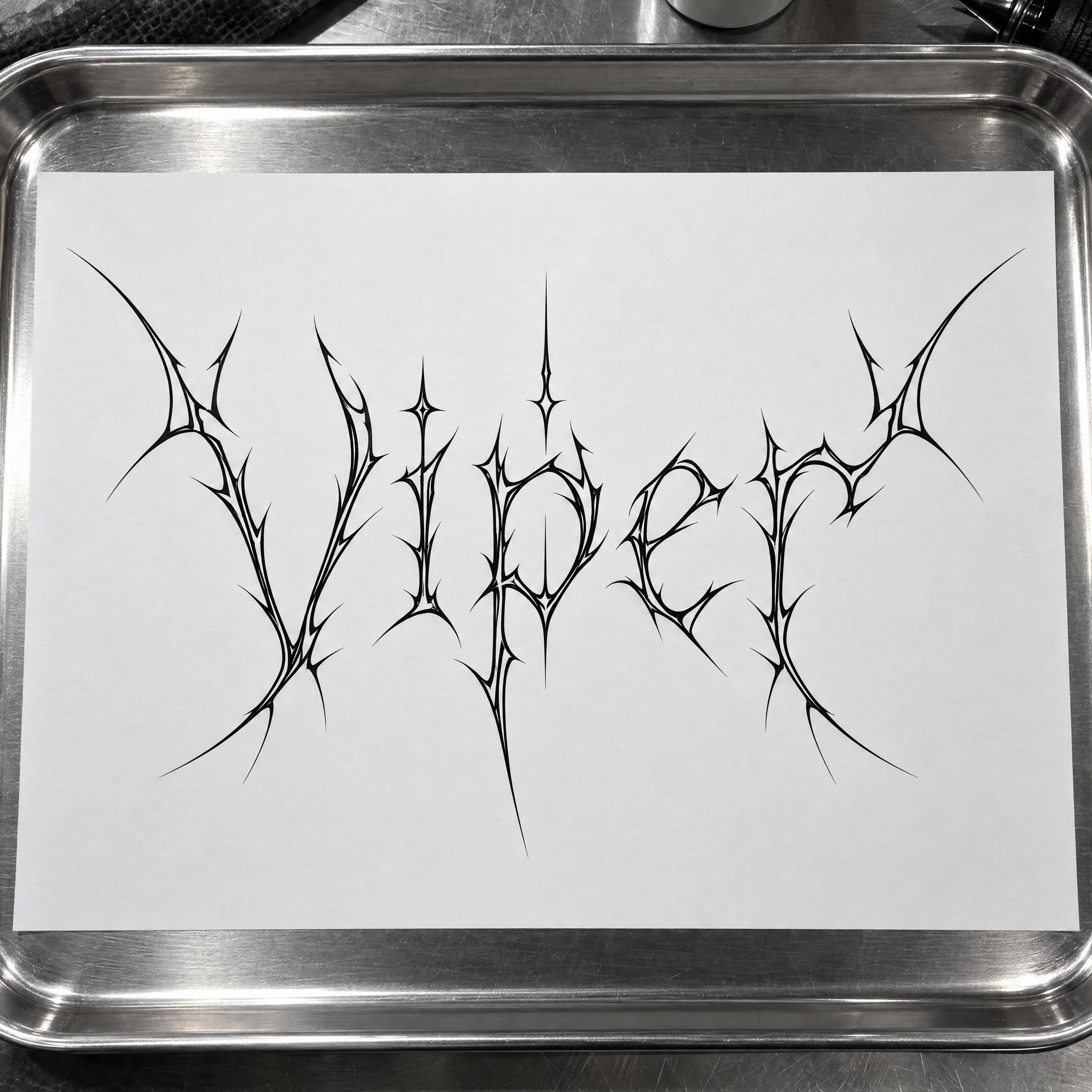
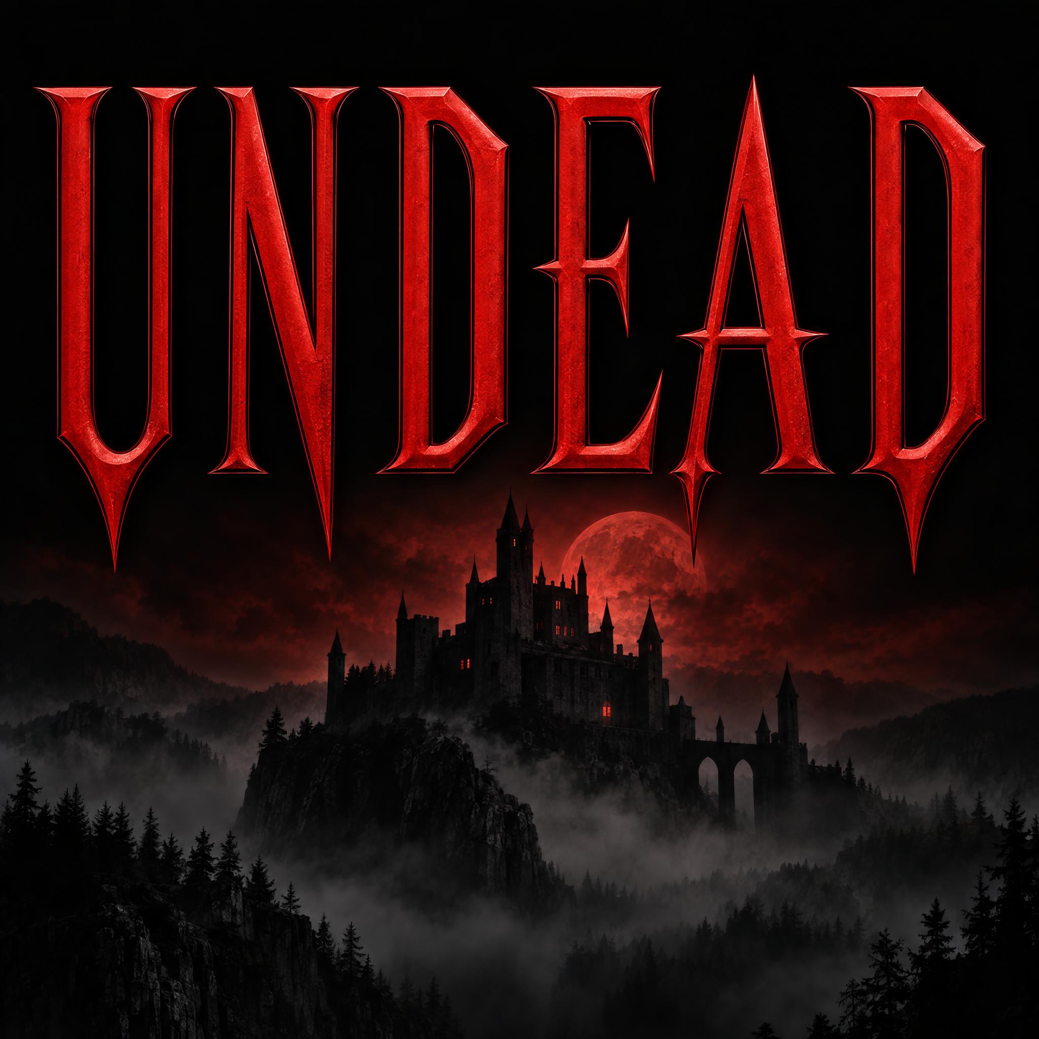
Type your word, copy the full prompt and paste it into ChatGPT, Gemini or any image model.
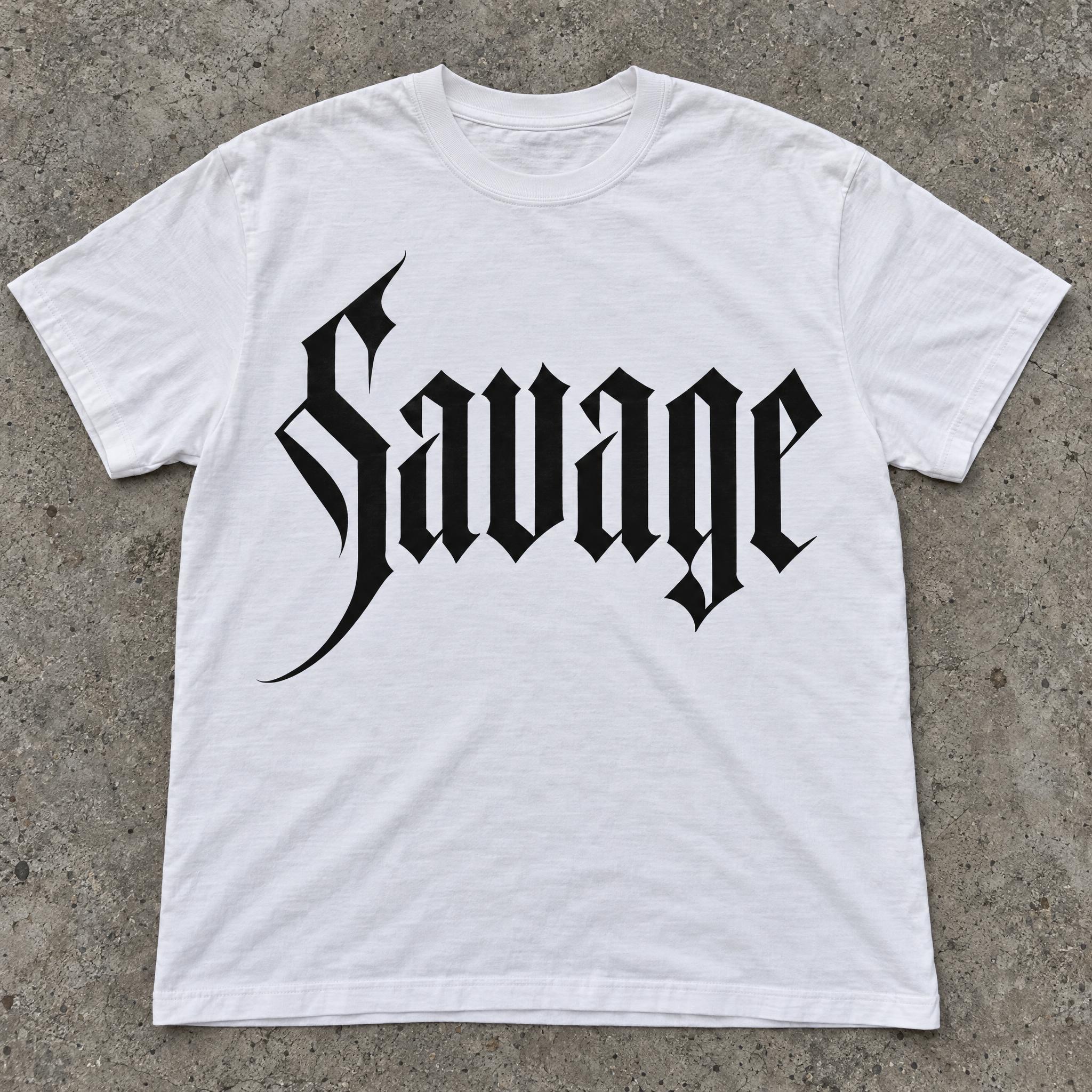
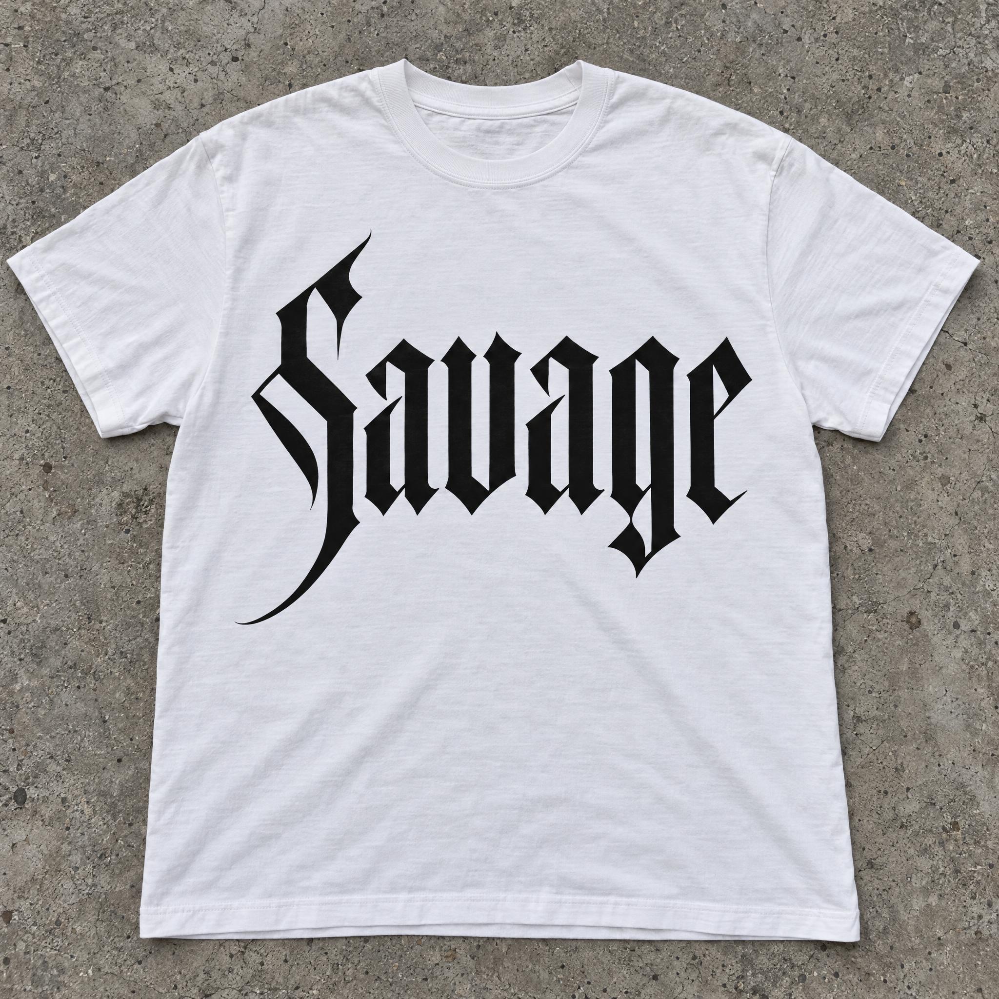
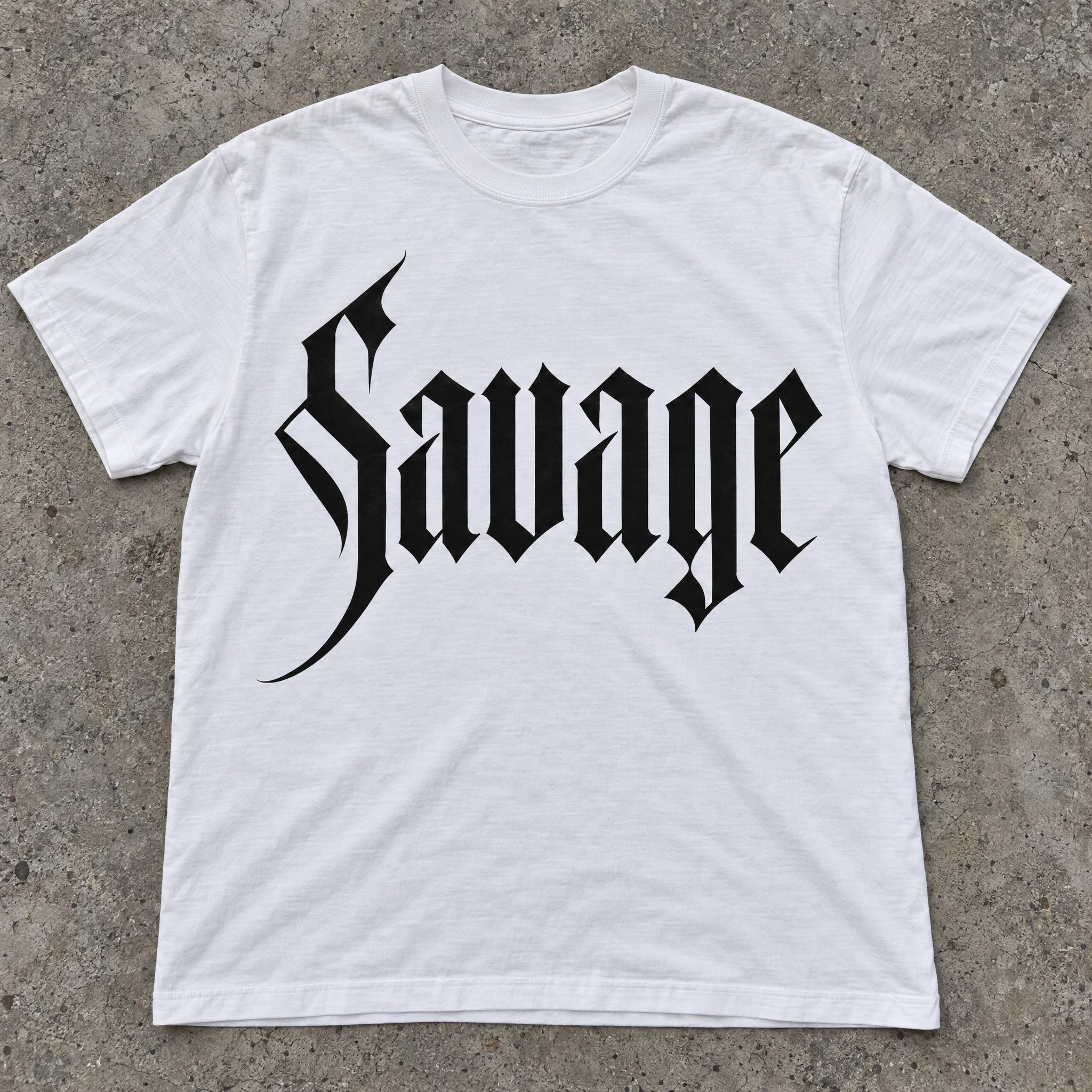
TextWrite the word "Savage". Spell it exactly as written, without adding or changing any letter.
Font designModern blackletter: a clean, sharpened take on Gothic script with tall, narrow letters, thick straight vertical stems and razor-thin diagonal hairlines, pointed angular cuts where curves would be, and one long sharp swash on the capital; every letter reads at a glance. The letters are solid black. The edges are perfectly crisp and smooth, like vector artwork. Never an aged, ornate medieval blackletter with faded ink. Like the logo on a high-end streetwear label.
SceneThe word is screen-printed on a white T-shirt laid flat on concrete. The word is centered, spans most of the width and reads clearly.
Open one for the prompt and real results on each image model.
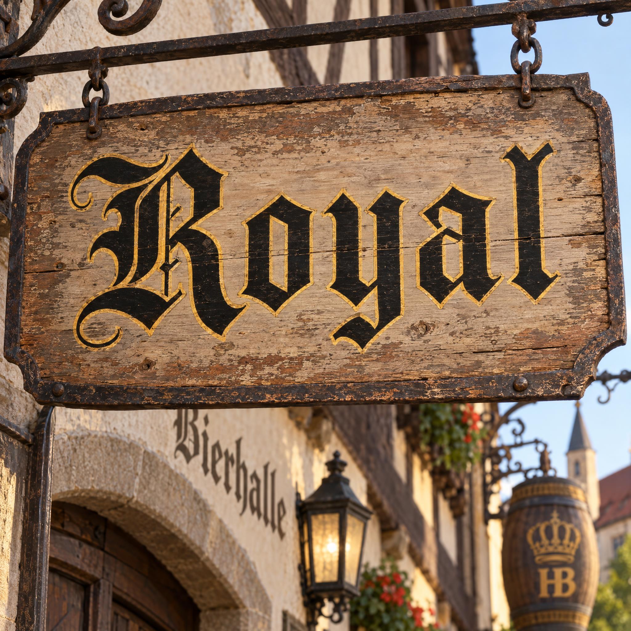
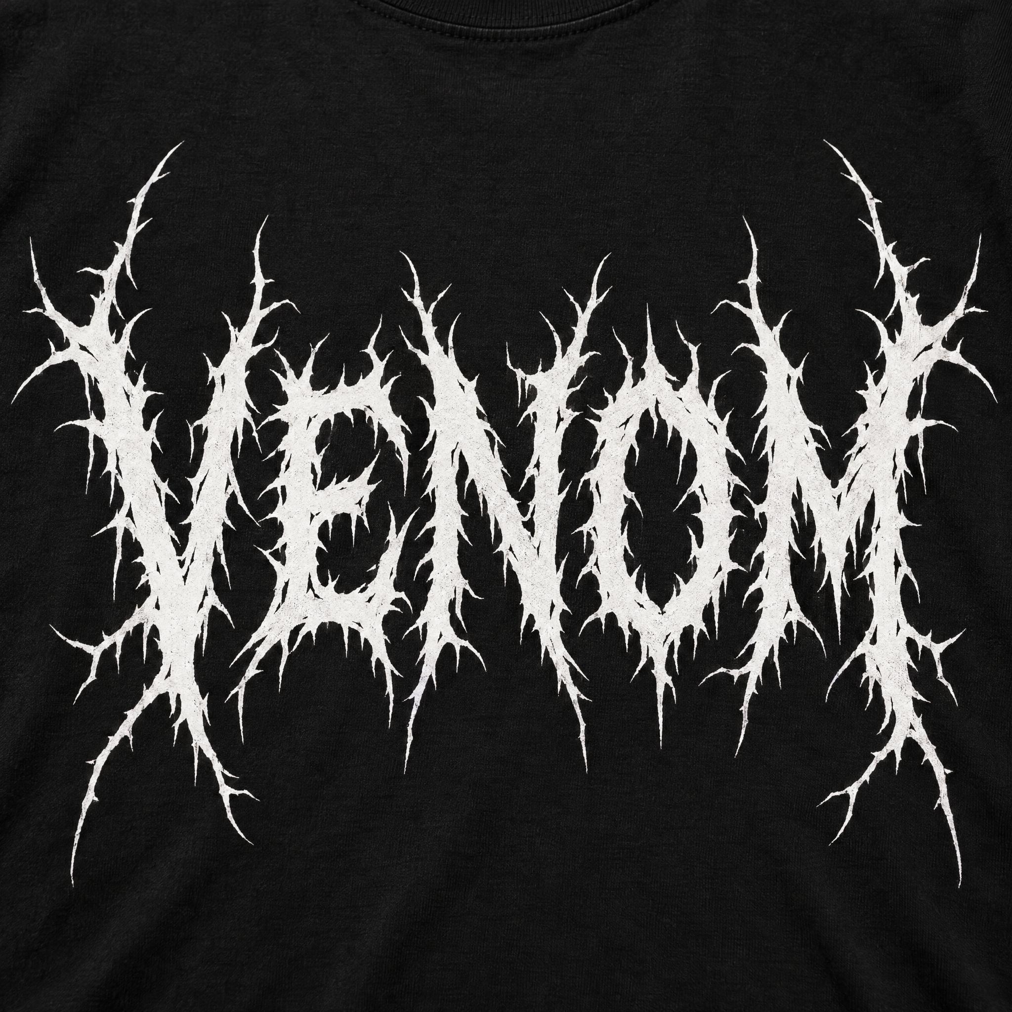
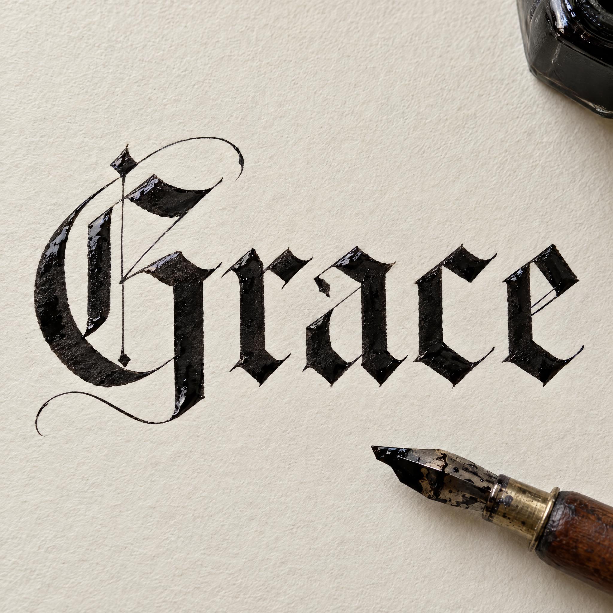
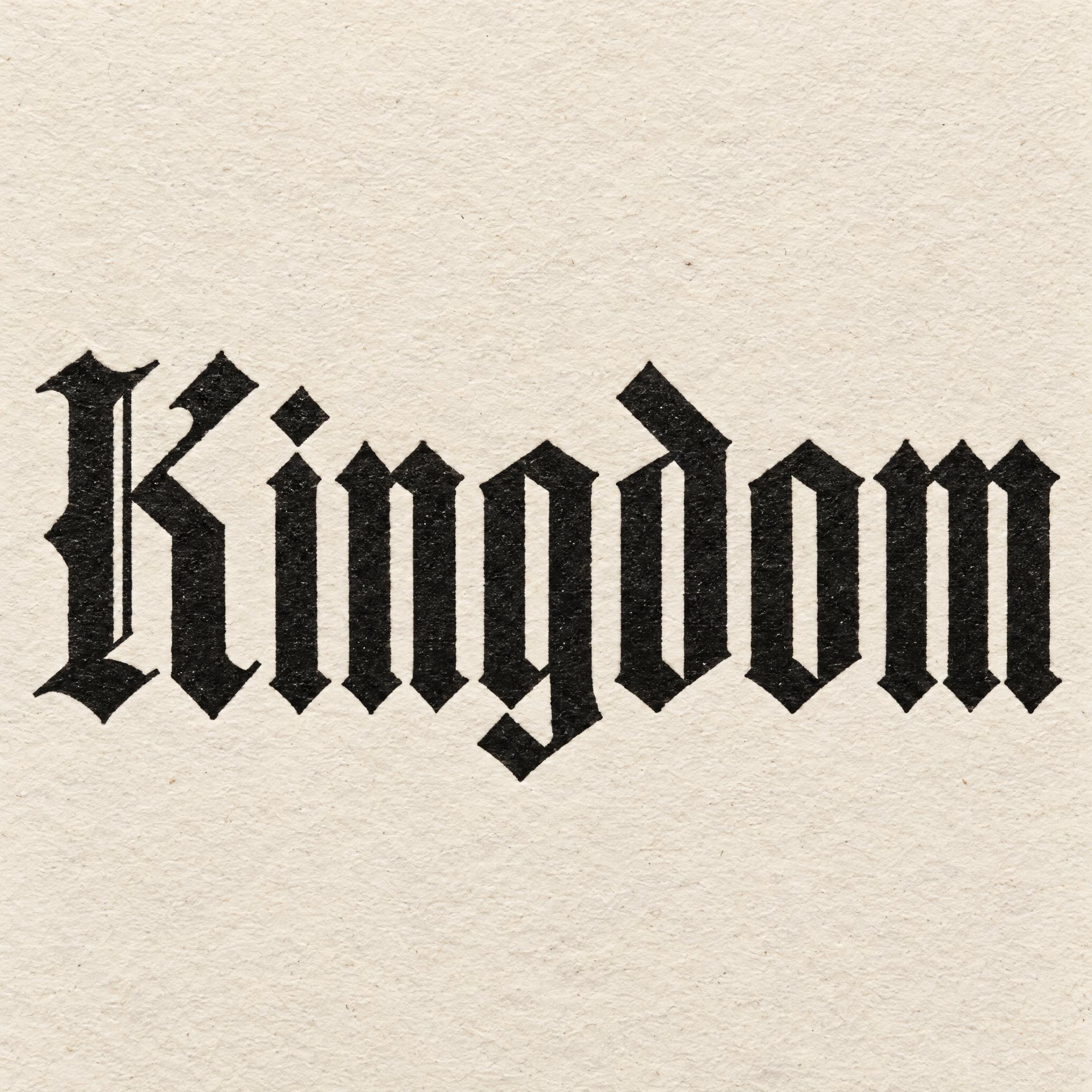
Tested October 2026. First attempts from our test ledger: 437 images, 12 fonts, 7 languages, each one checked by eye.
How to read it: 82 / 87 means 87 images tested and 82 spelled the word right on the first try; the percentage is that share. The Latin, Chinese / Japanese and Arabic columns split the same count by the script of the word.
| Model | Right first time | Latin | Chinese / Japanese | Arabic | Most common issue |
|---|---|---|---|---|---|
| GPT Imagegpt-image-2.5-sunburst · xhigh | 94% 82 / 87 | 98% 47 / 48 | 100% 24 / 24 | 73% 11 / 15 | Extra letter |
| Nano Bananagemini-nano-banana-2.1 | 97% 84 / 87 | 100% 48 / 48 | 96% 23 / 24 | 87% 13 / 15 | Style drifted |
| Seedreamdola-seedream-5-0-pro-260628 | 89% 77 / 87 | 100% 48 / 48 | 92% 22 / 24 | 47% 7 / 15 | Unreadable letters |
| Grok Imaginegrok-imagine-image-2.0 · medium | 88% 77 / 88 | 98% 47 / 48 | 88% 22 / 25 | 53% 8 / 15 | Style drifted |
| Qwen-Imageqwen-image-3.0-pro | 68% 60 / 88 | 90% 43 / 48 | 64% 16 / 25 | 7% 1 / 15 | Wrong case |
How we test: images are made through FontVibe with each model’s API, sending the prompt as is; we count only each model’s first image for every font and language and check the spelling by eye. Apps such as ChatGPT may rewrite prompts, so results there can differ. For the full data, email [email protected].
Gothic is a mood more than a single letterform, so the prompt builds the darkness in layers: a skeleton, sharp ends, a dark colour, an old surface and a gloomy place. The examples are quoted word for word from the prompts of the fonts on this page.
Most gothic lettering stands on one of three skeletons: blackletter with broken, angular curves; tall serif capitals for a horror title; or a crooked hand, as in a spellbook. Name it in the first sentence, because everything else sits on top of it.
“Modern blackletter: a clean, sharpened take on Gothic script with tall, narrow letters, thick straight vertical stems and razor-thin diagonal hairlines, pointed angular cuts where curves would be, and one long sharp swash on the capital; every letter reads at a glance.” — Modern Gothic Font
What reads as dark sits mostly at the ends of the strokes: wedge serifs, points, thorns. Describe them precisely and the letters turn menacing without any gore.
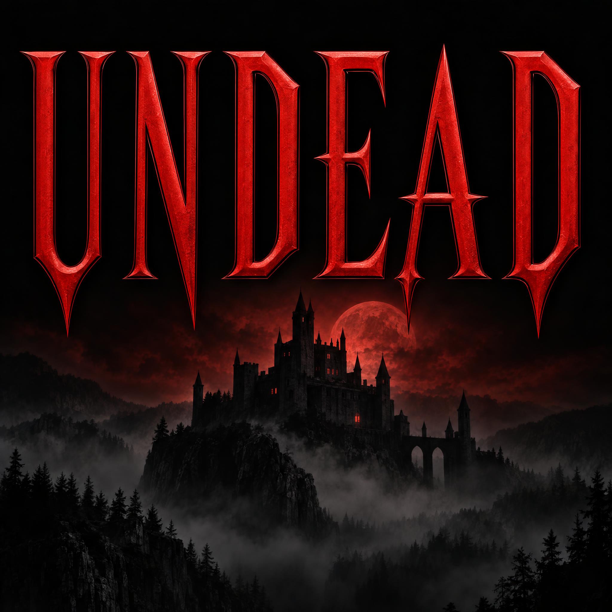
“Vampire horror title lettering: tall, narrow capital letters with sharp wedge serifs that taper into fang-like points, long pointed tips on the crossbars and a slight flare at the top of each stem, evenly spaced and perfectly symmetrical; every letter reads at a glance.” — Vampire Font
A witchy, occult look comes from imperfection: letters leaning at different angles, thin stems, curls at the ends. Ask for it, or the model tidies everything into a neat typeface.
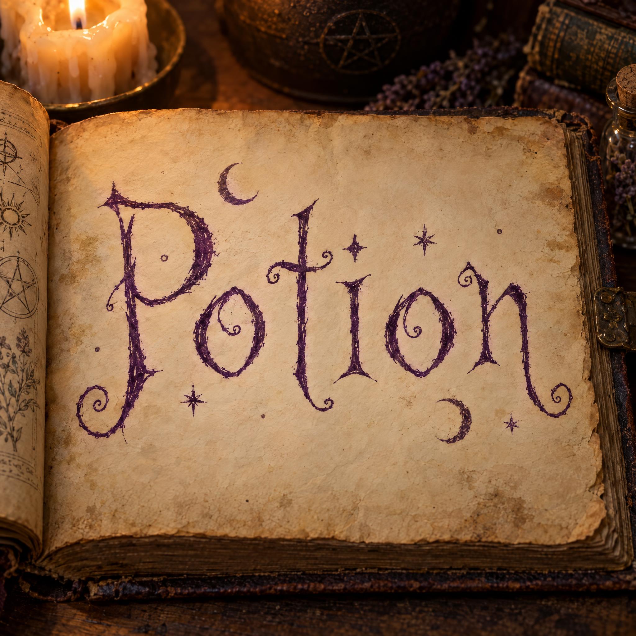
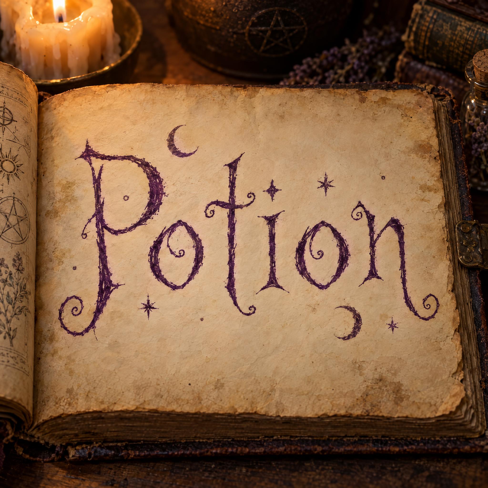
“Witch lettering: spindly, hand-inked letters that lean at slightly different angles, with long thin stems, pointed serifs and strokes that curl into small hooks and spirals at the ends, like the handwriting in an old spellbook; every letter reads at a glance.” — Witch Font
Blood red, deep purple, black or stone grey. One sentence for colour lets you swap it without touching the letterforms.
“The letters are deep blood red.” — Vampire Font
Age does a lot of the work: chipped granite, moss, vellum, dry quill ink, a satin bevel. One sentence about the material is enough.
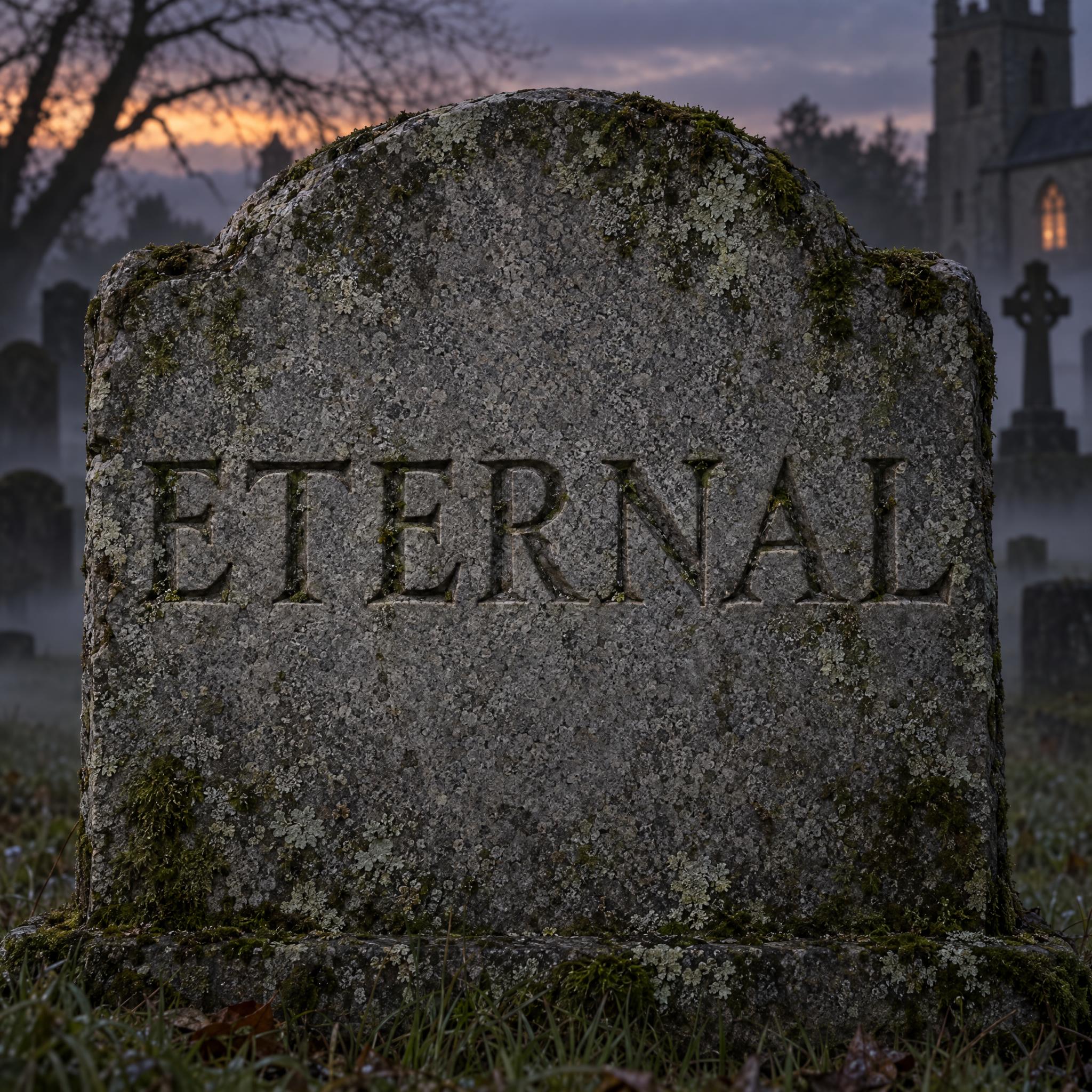
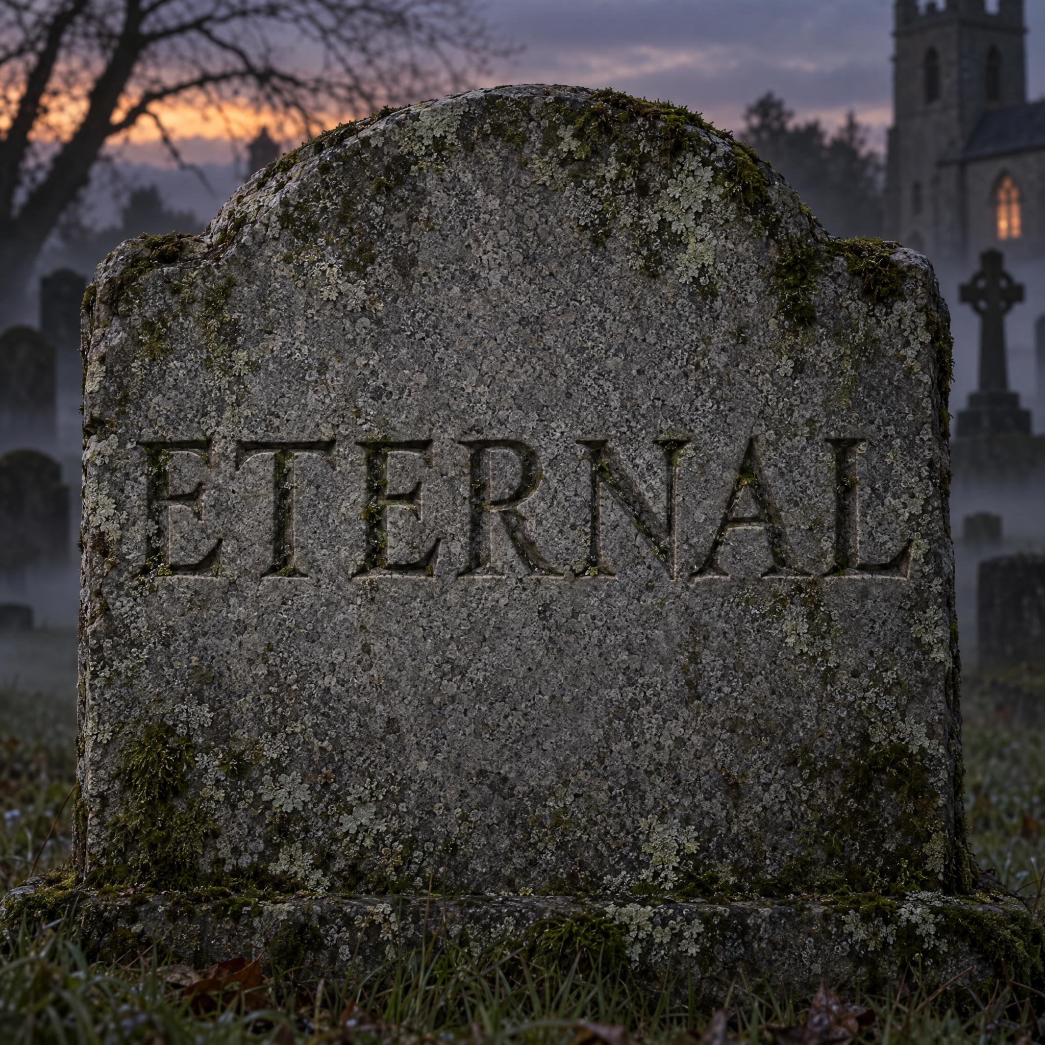
“The stone has fine grain, chipped edges and patches of green moss and lichen in the cuts.” — Tombstone Font
Every gothic style has a neighbour the model drifts into. A vampire title drifts into dripping blood, so its prompt rules that out; for running blood, use Blood Font instead.
“Never dripping or splattered.” — Vampire Font
Fog, dusk, candlelight, a black poster. The setting finishes the mood, so the letters don't have to carry it alone.
“The headstone stands in an old churchyard at dusk, with low fog over the grass.” — Tombstone Font
Gothic covers everything from a medieval church book to a death metal shirt. Pick by where the word will be seen.
Death Metal Font draws the spiky, symmetrical logo of extreme metal; Modern Gothic Font cuts the old broken letters clean and sharp, so they print well on a shirt.
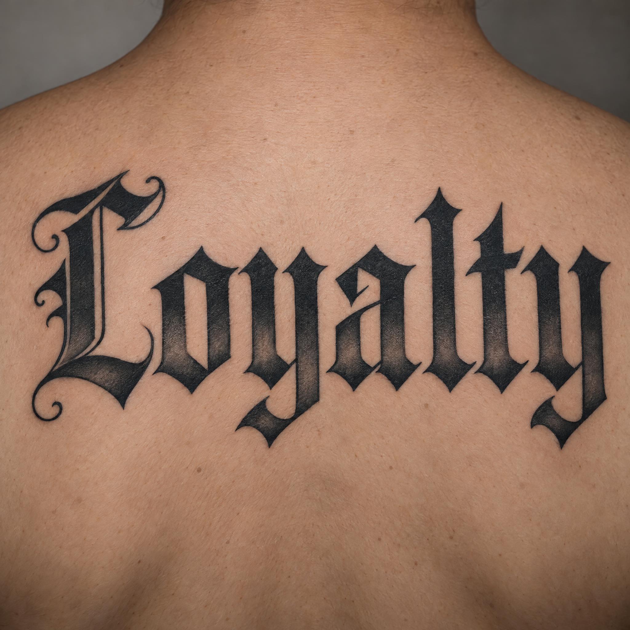
Cyber Sigilism Font turns the thin, thorny linework of cybersigilism tattoos into readable letters; Old English Tattoo is the classic black-and-grey name script. More scripts for skin are on the tattoo fonts page.
Vampire Font for a Dracula-style poster, Blood Font for gore, Tombstone Font for a carved epitaph. For more, see Halloween fonts and scary fonts.
Witch Font writes like a spellbook, Illuminated Letters paints a gold first letter like a medieval manuscript, and Textura Font sets the word in the strict type of the Gutenberg Bible.
Fraktur Font and Gothic Calligraphy are historical blackletter hands. If you came for the letters people call Old English, that page is written for names, shirts and tattoos.
Type your word in the box next to the prompt at the top, copy it and paste it into any image app, or press Generate on FontVibe to try five models in one place. Every style below works the same way from its own page.
| You want | Try | Why |
|---|---|---|
| A metal band logo | Death Metal Font | Spikes, thorns, symmetry |
| A streetwear logo | Modern Gothic Font | Sharp, clean, solid black |
| A horror film title | Vampire Font | Fang-like serifs, blood red |
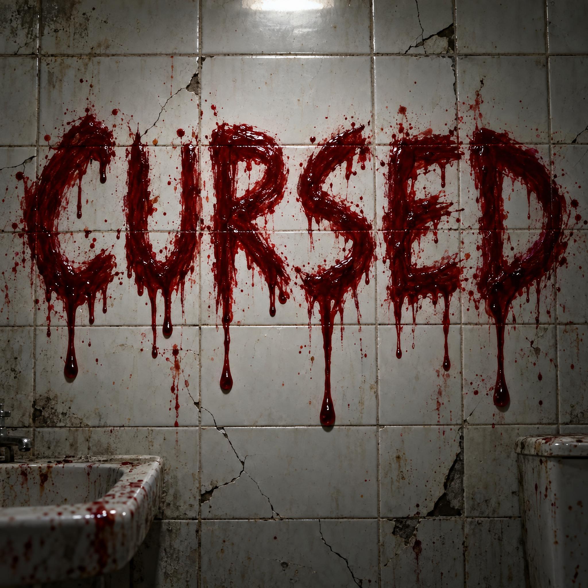
| Gore and drips | Blood Font | Wet blood running down |
| An epitaph or haunted house sign | Tombstone Font | Chiselled into mossy granite |
| A spellbook or potion label | Witch Font | Crooked purple ink, stars and moons |
| A tattoo-style word | Cyber Sigilism Font | Needle-thin, thorny lines |
| A medieval first letter | Illuminated Letters | Gold leaf and vines |
Gothic began as an insult. Renaissance writers blamed the Gothic tribes' sack of Rome in 410 for the end of the classical world, and the word came to mean barbaric. Raphael first applied it to medieval art in a letter to Pope Leo X around 1518, and Giorgio Vasari, who from 1530 called Gothic art a "monstrous and barbarous" disorder, made it stick. The label spread to everything northern and medieval, from pointed cathedrals to the scribes' dense book hands, which is why blackletter is still popularly called Gothic.
Then the insult became a mood. In 1764 Horace Walpole published The Castle of Otranto, later subtitled A Gothic Story, the first work to be labelled Gothic fiction: ruined castles, secrets and dread. The genre moved from novels to film, and both the literary and the cinematic Gothic fed what came next.
The music came last. In the late 1970s gothic rock grew out of British post-punk bands such as Siouxsie and the Banshees, Joy Division, Bauhaus and the Cure, and in February 1981 the music paper Sounds ran a piece called "The Face of Punk Gothique". In the early 1980s clubs such as the F Club and the Batcave turned it into a subculture: black clothes, dark makeup, and a taste for German Expressionism and horror films from Universal Monsters to Hammer. That long history is why a gothic font today can be a medieval page, a vampire poster or a spiky band logo.
Sources: Wikipedia — Gothic art · Wikipedia — Gothic architecture · Wikipedia — Gothic fiction · Wikipedia — Goth subculture · Wikipedia — Blackletter
Clean, razor-sharp broken letters for logos and shirts.
The strict, picket-fence type of the first printed Bibles.
German broken script with bent curves and an ornate capital.
Written by hand with a broad-edge dip pen, still wet.
Bold black-and-grey name lettering for skin.
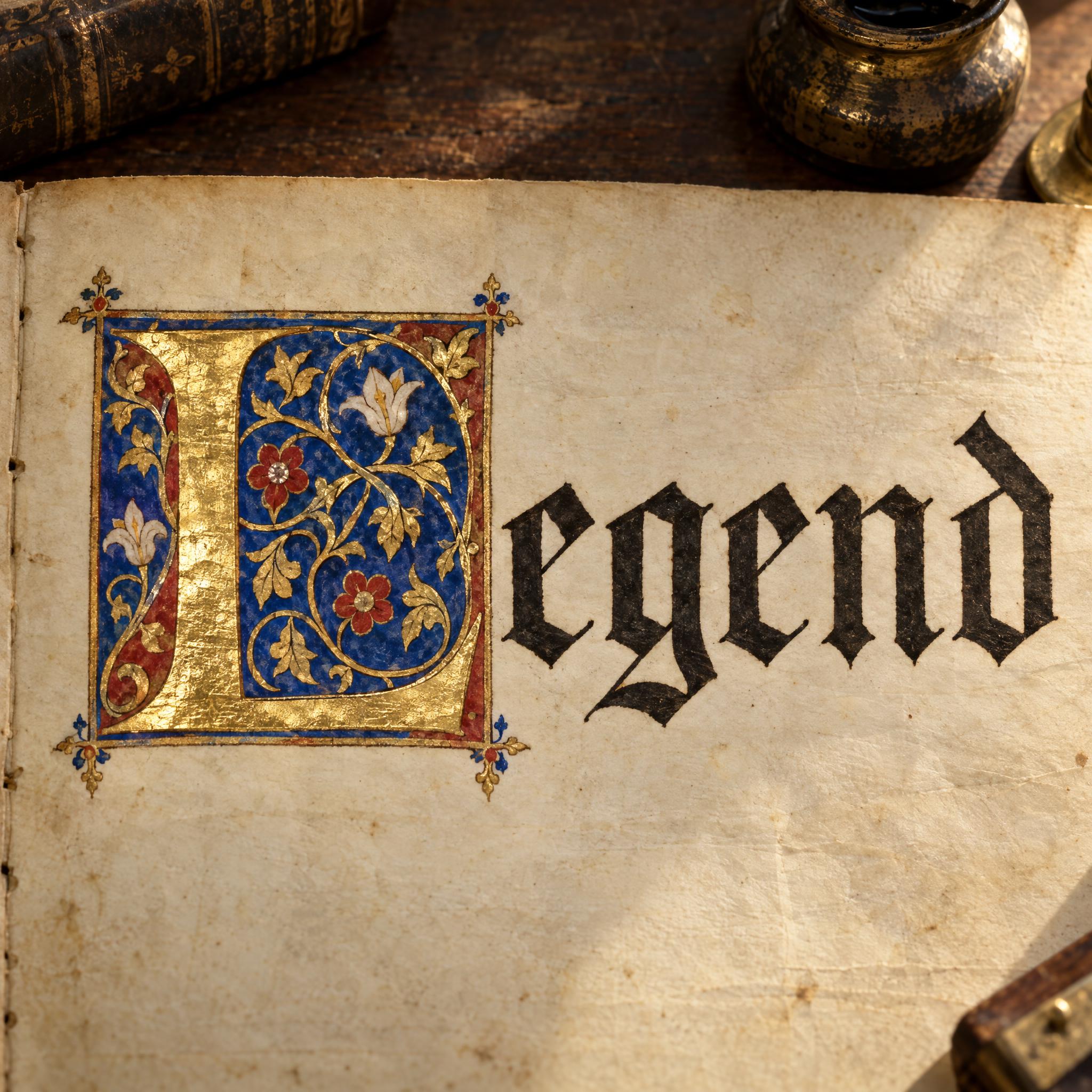
A gold-leaf first letter wrapped in painted vines.
Blood-red capitals with fang-like serifs.
Crooked purple spellbook ink with stars and moons.
Roman capitals chiselled into mossy granite.
Crimson letters with wet blood running down.
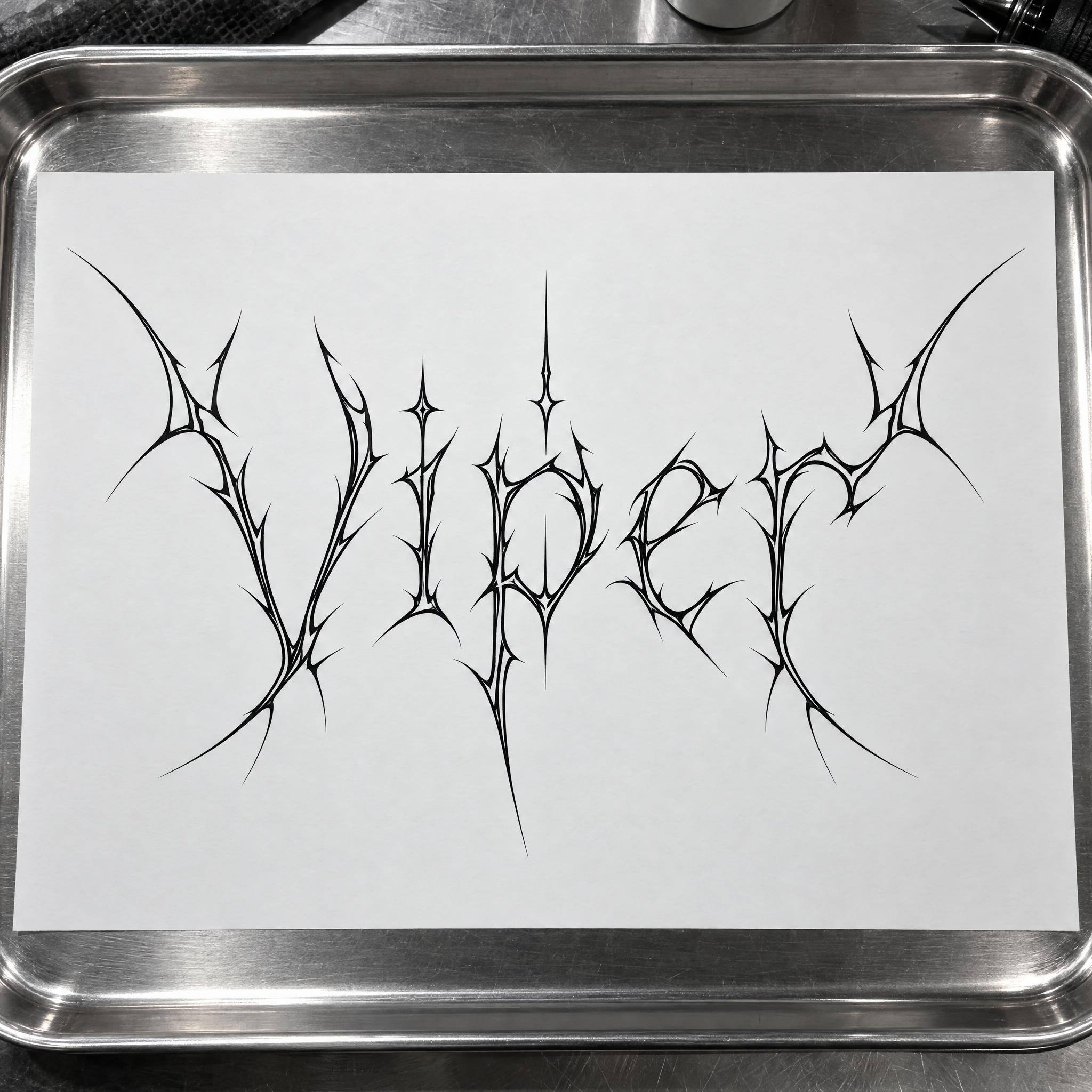
A symmetrical tangle of thorns around the word.
Needle-thin, thorny tattoo lines shaped into letters.
A gothic font is lettering with a dark, medieval or macabre feel. Historically the word means blackletter, the broken script of medieval books; today it also covers vampire titles, witchy handwriting, carved tombstones and spiky metal logos. Each style on this page is an AI prompt that draws your own word.
This page works as one. Type your word in the box at the top, copy the prompt and paste it into ChatGPT, Gemini, Grok or Seedream, or press Generate on FontVibe to make it right away and compare models.
They overlap. Blackletter is the type historians' name for the medieval broken script; Old English is the popular name for the same letters on names, shirts and tattoos; gothic is the widest of the three and takes in the whole dark look, horror and goth included.
The word was borrowed twice. Gothic type is named after the Gothic script, but some sans-serif typefaces are also called Gothic, and the two have nothing in common. This page is about the dark, medieval kind.
No. They are prompts, not .ttf or .otf files. You get your word as a finished image, with the spikes, gold leaf, moss or blood drawn around your exact letters, which an installed font can't do.
The comparison on this page counts how often each model spelled the word right on the first try across these styles and seven languages. Whichever you use, check every letter: spikes and flourishes can hide a mistake.
Copying the prompts on AIFont is free. What you may do with the image depends on the terms of the app that generated it, so check that app's rules before you print or sell.