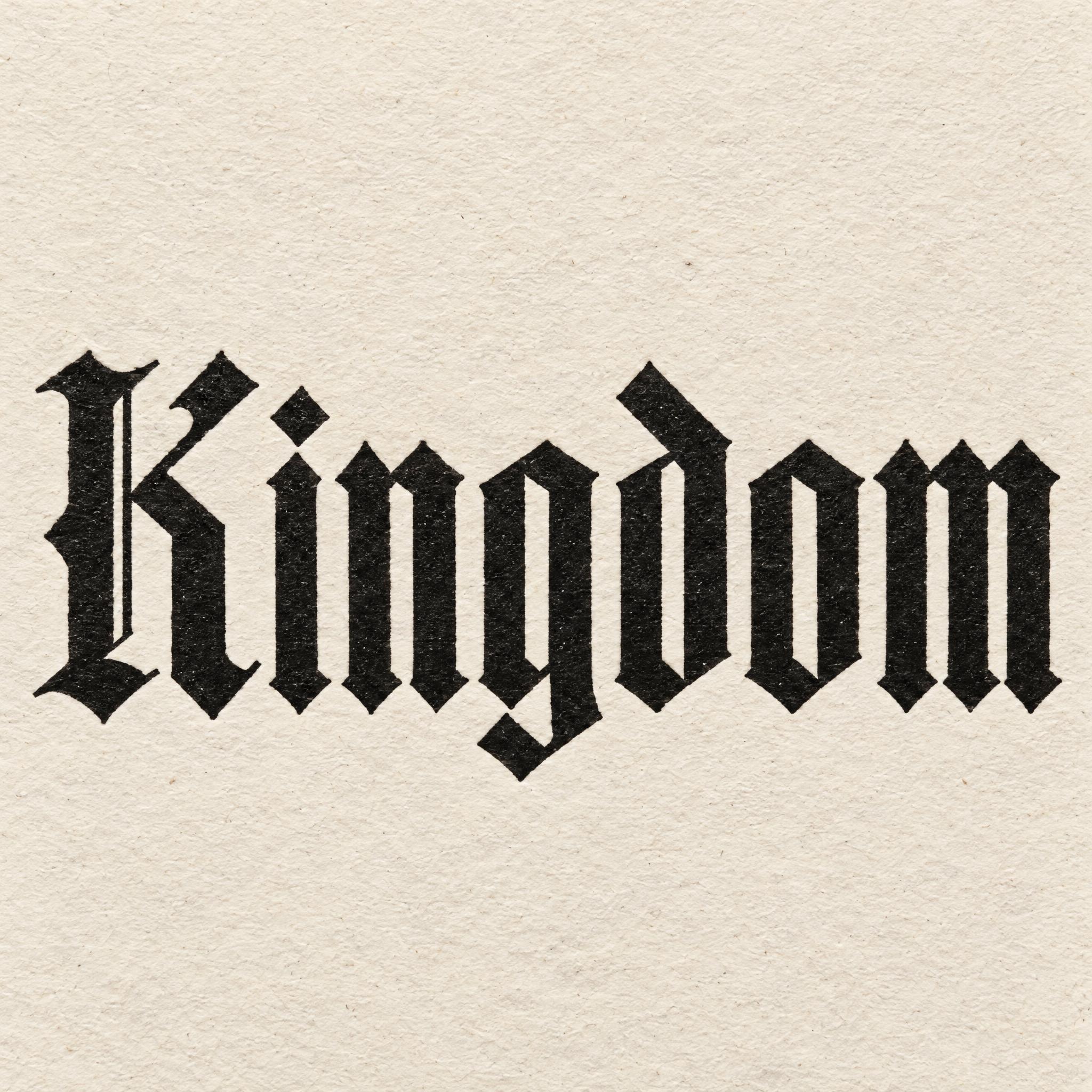
Every blackletter font on this page is a copy-ready AI prompt: textura, Fraktur, broad-nib Gothic calligraphy and modern sharpened blackletter. These are prompts, not font files: type your word, copy, and paste into ChatGPT or Gemini, or generate it right away on FontVibe.
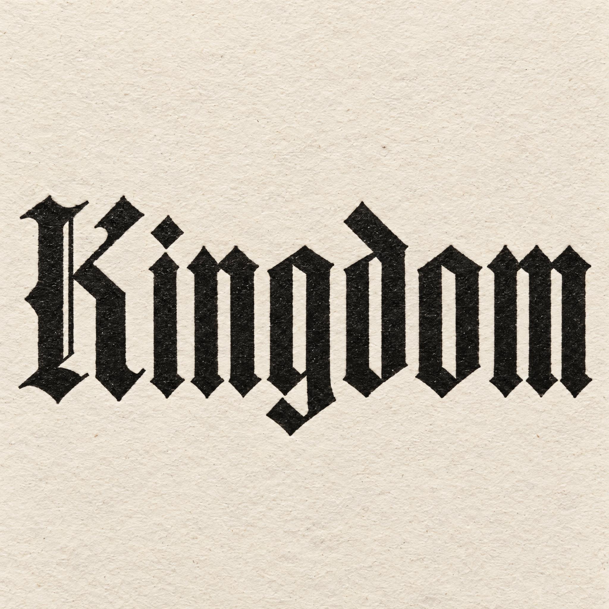
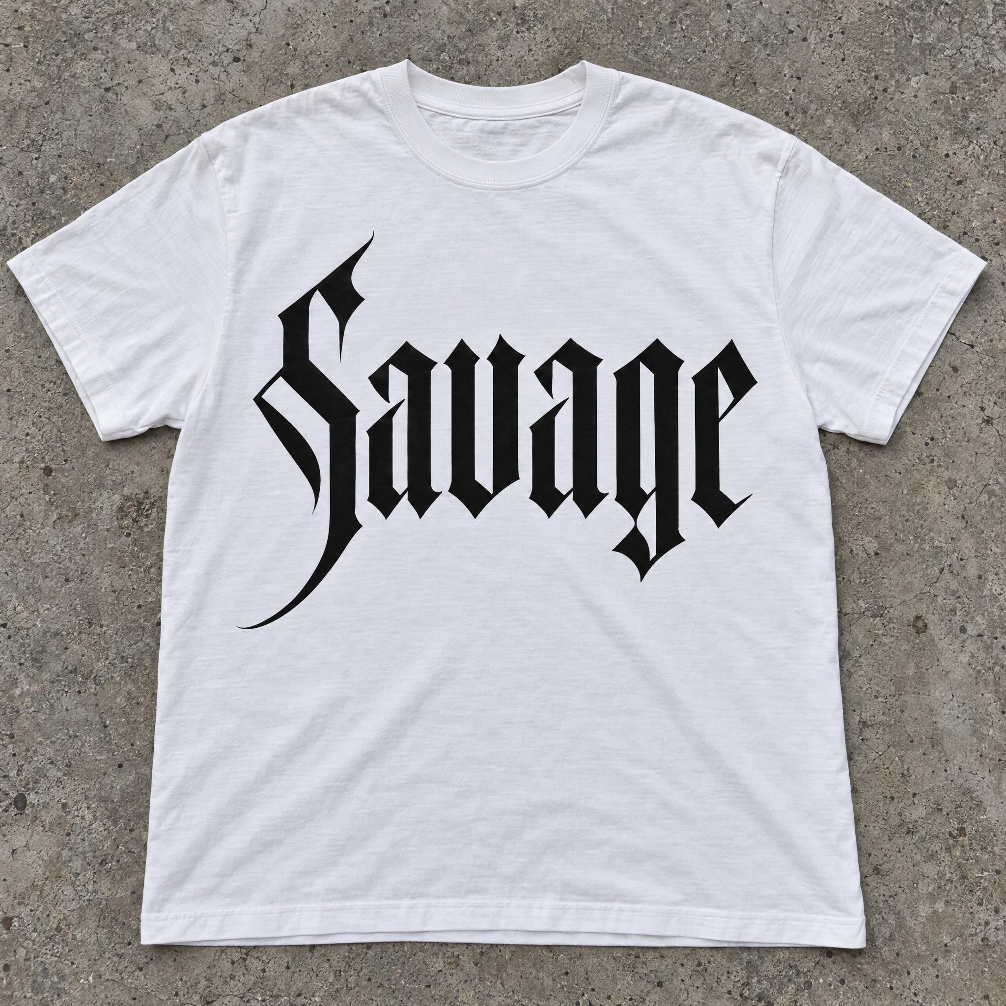
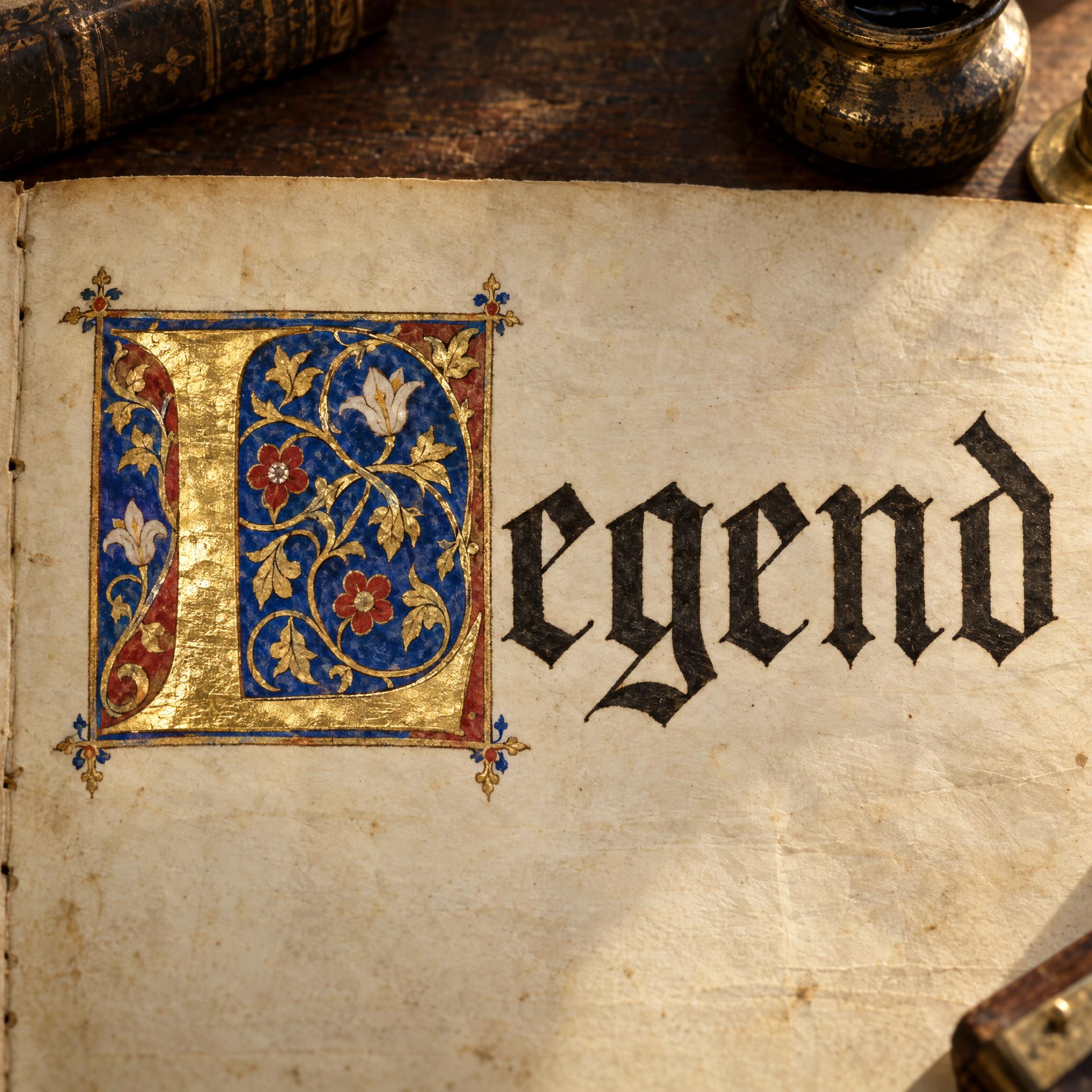
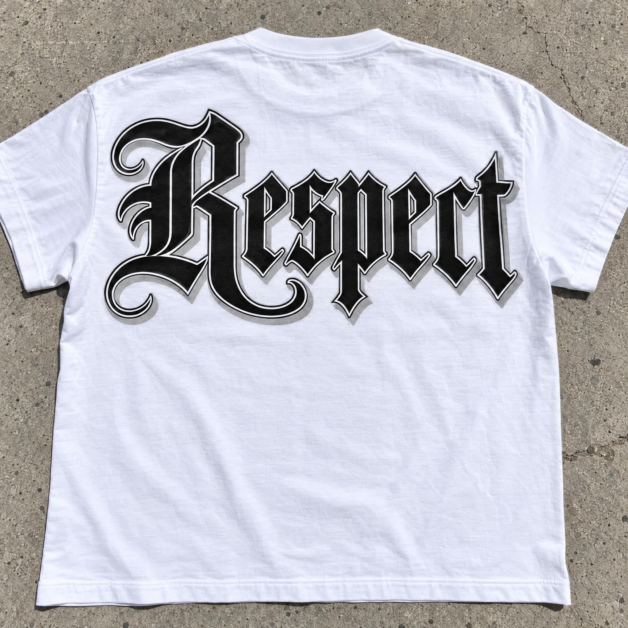
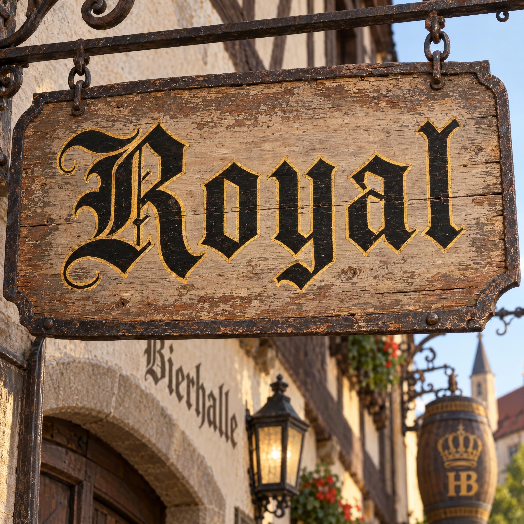
Type your word, copy the full prompt and paste it into ChatGPT, Gemini or any image model.
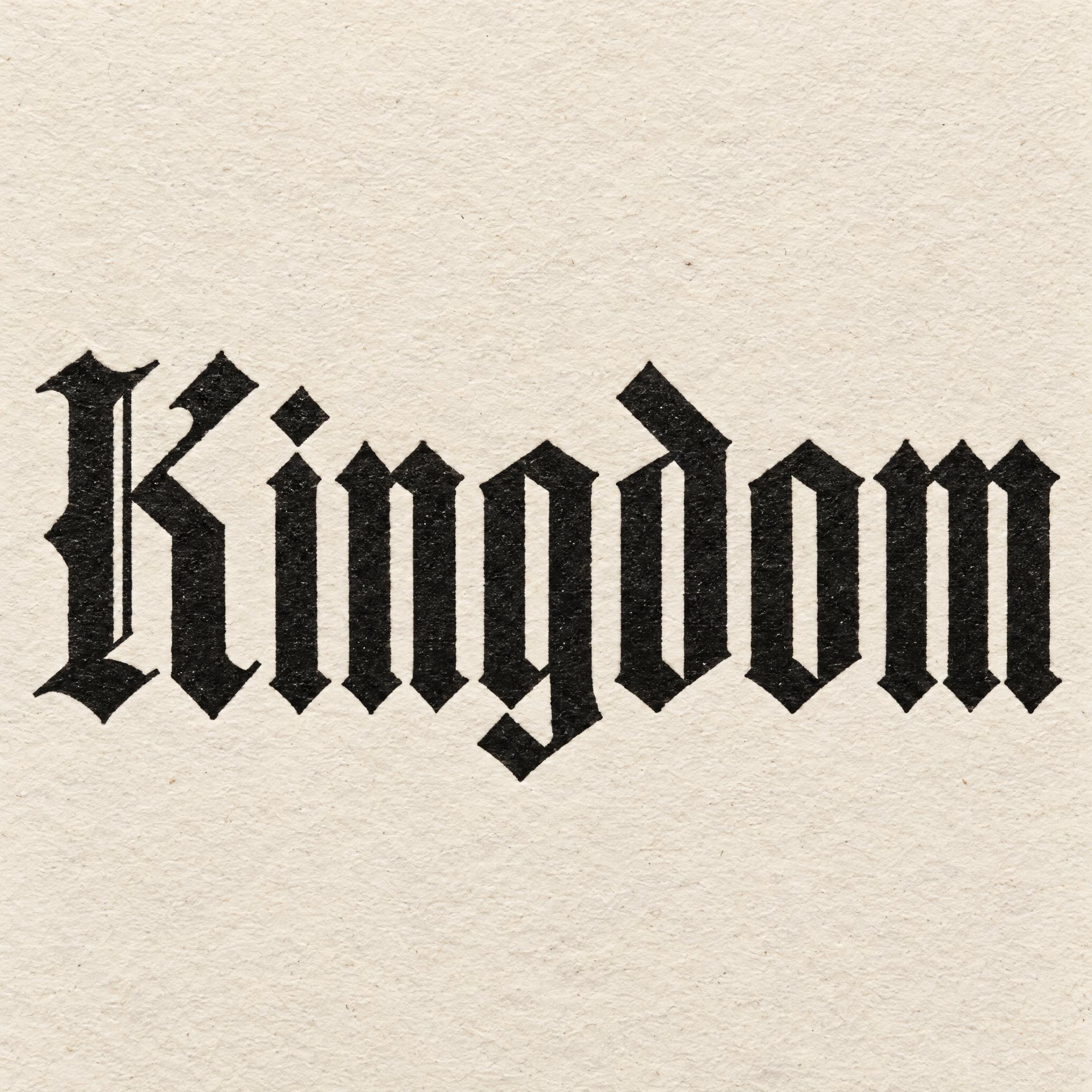
TextWrite the word "Kingdom". Spell it exactly as written, without adding or changing any letter.
Font designTextura blackletter, the classic Gothic book type printed from metal type: narrow upright letters built from straight vertical strokes of equal weight, set close and evenly like a picket fence, with small diamond-shaped feet and angled, broken tops, and almost no round curves. The first letter is a solid Gothic capital with a simple inner hairline. The letters are solid black. The ink is crisp and evenly printed, with sharp edges and a faint letterpress impression in the paper. Like a page from a Gutenberg Bible.
SceneThe word is printed on a cream letterpress poster, seen straight on, in soft daylight. The word is centered, spans most of the width and reads clearly.
Open one for the prompt and real results on each image model.
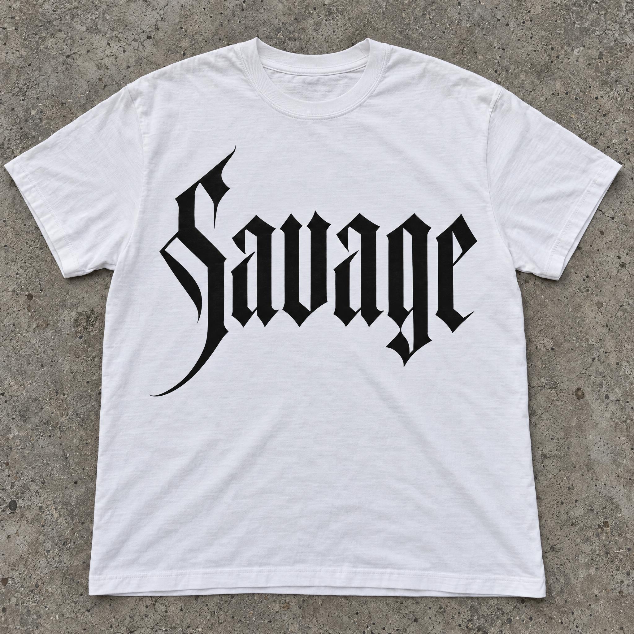
Tested October 2026. First attempts from our test ledger: 257 images, 7 fonts, 7 languages, each one checked by eye.
How to read it: 42 / 51 means 51 images tested and 42 spelled the word right on the first try; the percentage is that share. The Latin, Chinese / Japanese and Arabic columns split the same count by the script of the word.
| Model | Right first time | Latin | Chinese / Japanese | Arabic | Most common issue |
|---|---|---|---|---|---|
| GPT Imagegpt-image-2.5-sunburst · xhigh | 100% 51 / 51 | 100% 28 / 28 | 100% 14 / 14 | 100% 9 / 9 | Text in the background |
| Nano Bananagemini-nano-banana-2.1 | 100% 51 / 51 | 100% 28 / 28 | 100% 14 / 14 | 100% 9 / 9 | None recorded |
| Seedreamdola-seedream-5-0-pro-260628 | 82% 42 / 51 | 100% 28 / 28 | 86% 12 / 14 | 22% 2 / 9 | Unreadable letters |
| Grok Imaginegrok-imagine-image-2.0 · medium | 83% 43 / 52 | 96% 27 / 28 | 80% 12 / 15 | 44% 4 / 9 | Style drifted |
| Qwen-Imageqwen-image-3.0-pro | 60% 31 / 52 | 86% 24 / 28 | 47% 7 / 15 | 0% 0 / 9 | Extra words added |
How we test: images are made through FontVibe with each model’s API, sending the prompt as is; we count only each model’s first image for every font and language and check the spelling by eye. Apps such as ChatGPT may rewrite prompts, so results there can differ. For the full data, email [email protected].
Image models know the word blackletter but draw a generic mix of everything. These layers pin down which blackletter you mean, one sentence each. The examples are quoted word for word from the prompts of the fonts on this page.
Say which blackletter it is and how it is built. Textura is straight strokes of one weight, packed close, with diamond feet: a model that reads only "Gothic" will pick anything from Fraktur to a horror title.
“Textura blackletter, the classic Gothic book type printed from metal type: narrow upright letters built from straight vertical strokes of equal weight, set close and evenly like a picket fence, with small diamond-shaped feet and angled, broken tops, and almost no round curves.” — Textura Font
The real difference between the classes is what happens to round letters. Textura has almost none; Fraktur keeps them but breaks them into angled pieces; rotunda keeps them round. Write that down in plain words.
“Fraktur, the German blackletter typeface: upright letters whose round curves are broken into short angled segments, so every bowl looks bent rather than round, with thick vertical strokes and hairline-thin joins.” — Fraktur Font
The same skeleton looks different written and printed. A broad-edge pen leaves thick and thin by direction and a hairline exit; metal type leaves even, crisp edges. Name the tool and the model follows it.
“Gothic calligraphy written by hand with a broad-edge dip pen: blackletter letters with thick strokes where the nib pulls straight down and hairline-thin strokes where it moves sideways, every stroke made at the same steady pen angle, leaving small diamond-shaped corners.” — Gothic Calligraphy
Blackletter capitals are where the classes show off: Fraktur's trunk-like stroke, textura's solid block. Describe the first letter separately, so the lowercase stays plain and readable.
“The capital first letter is wide and ornate, with a curling trunk-like stroke on its left side and a few fine spurs.” — Fraktur Font
Ink on letterpress paper, gold outline on a painted sign, wet ink from a dip pen: one sentence on the finish decides whether the word looks printed, painted or written.
“The ink is crisp and evenly printed, with sharp edges and a faint letterpress impression in the paper.” — Textura Font
Rule out the version the model drifts to. For a clean modern cut that is the aged, ornate medieval look.
“Never an aged, ornate medieval blackletter with faded ink.” — Modern Gothic Font
End with one thing everyone has seen. A Gutenberg page, a beer label and a streetwear logo are three very different blackletters.
“Like a page from a Gutenberg Bible.” — Textura Font
Blackletter has its own typesetting rules, different from roman type. They matter when you use these letters for more than a single word.
Blackletter never grew a companion italic the way roman type did. Typesetters spaced the letters out instead (German Sperrung), and bold for emphasis is foreign to the style.
Sources: Wikipedia — Blackletter
When a word is letterspaced, the pairs ch, ck and tz stay joined as one unit. A spaced-out blackletter word with those pairs broken apart looks wrong to anyone who reads it.
Sources: Wikipedia — Blackletter
In blackletter text, words from other languages, especially Latin and the Romance languages, were set in roman type (Antiqua). Loanwords that had become part of the language stayed in blackletter.
Sources: Wikipedia — Blackletter
Besides the basic 26 letters, Fraktur usually has the long s (ſ), the Eszett in its ſʒ form, umlauts, an r rotunda in some faces, and many ligatures. Leave them out of a prompt unless you want the historical look.
Sources: Wikipedia — Fraktur
Unicode does have blackletter characters, but they are mathematical symbols, with no punctuation or the other characters running text needs. For a word that really looks like blackletter, an image is the reliable way.
Sources: Wikipedia — Blackletter
| You want | Try | Why |
|---|---|---|
| A book, certificate or label | Textura Font | Strict, upright, the Gutenberg look |
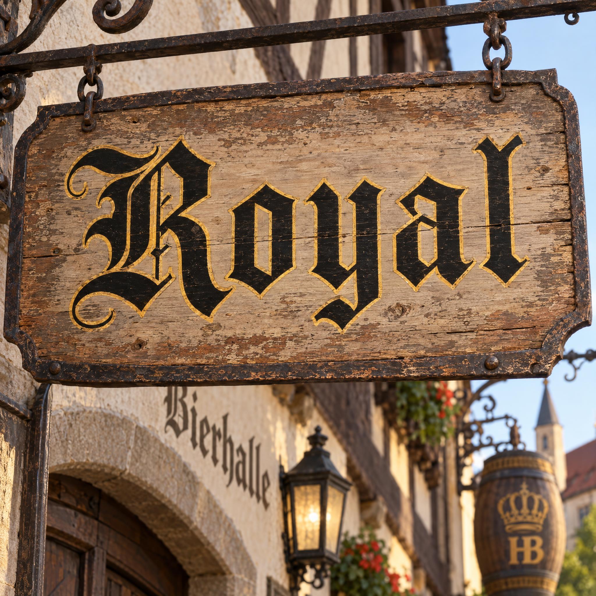
| A German beer-hall sign | Fraktur Font | Broken curves, ornate capital |
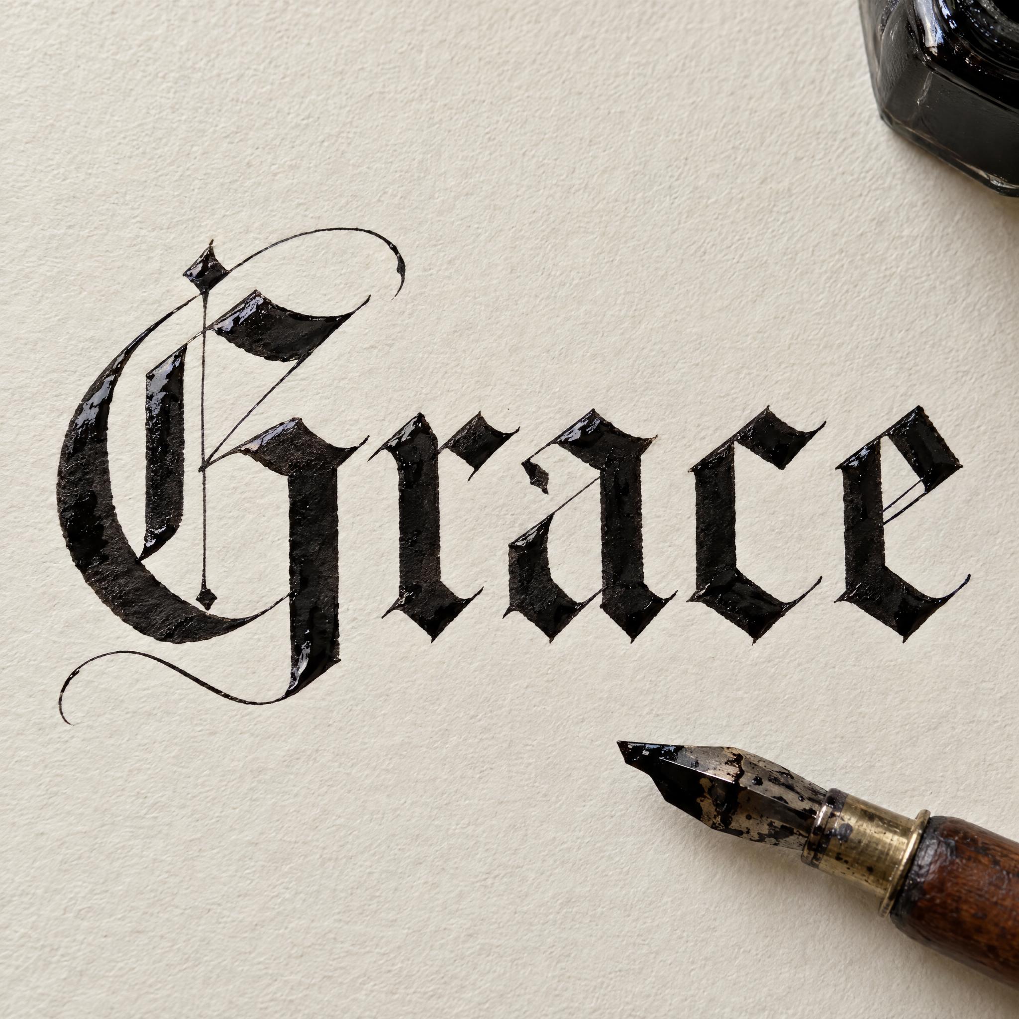
| Something handwritten | Gothic Calligraphy | Broad-nib pen, wet ink |
| A logo or streetwear print | Modern Gothic Font | Sharp, clean, vector-crisp |
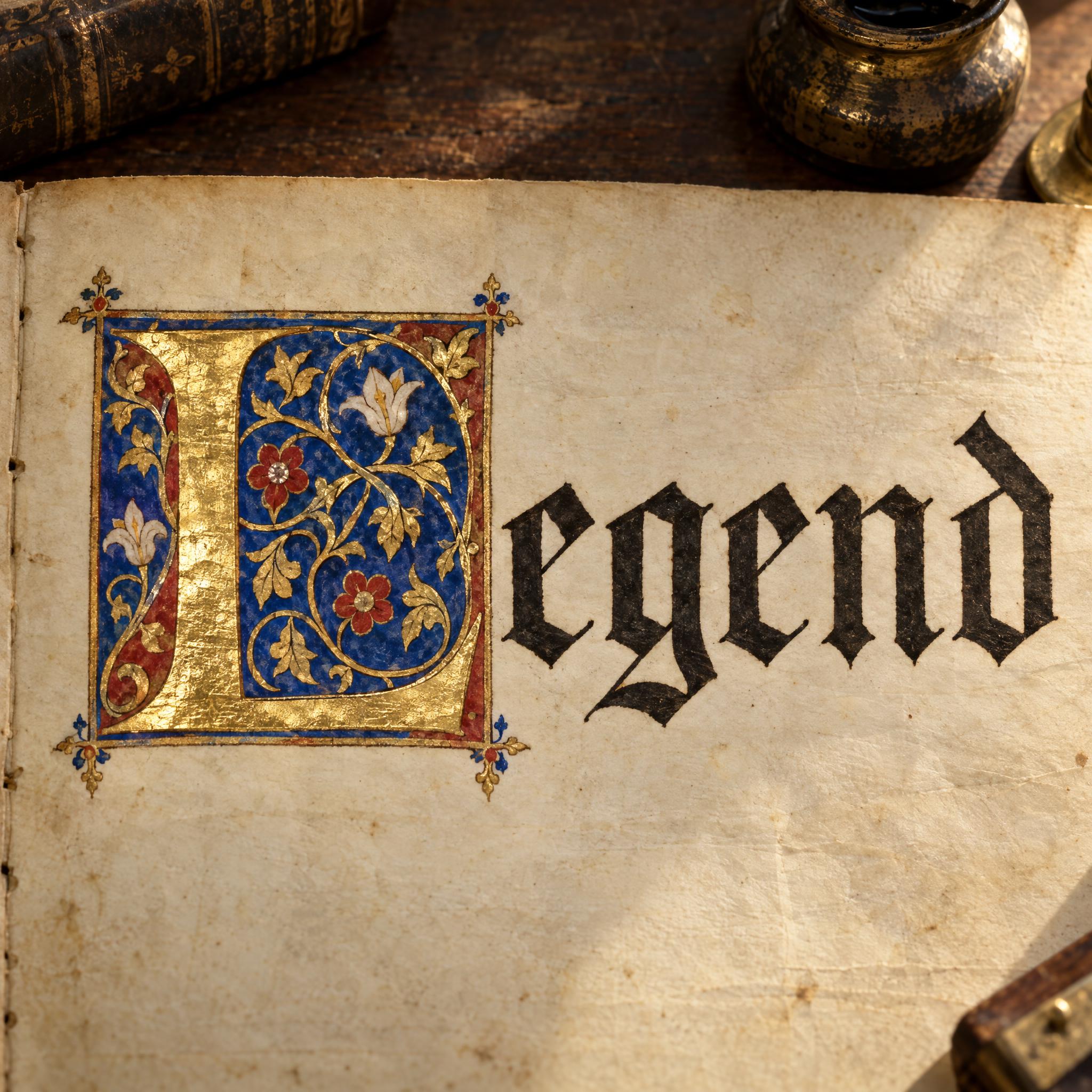
| A drop cap for a page | Illuminated Letters | Gold and vines on the first letter |
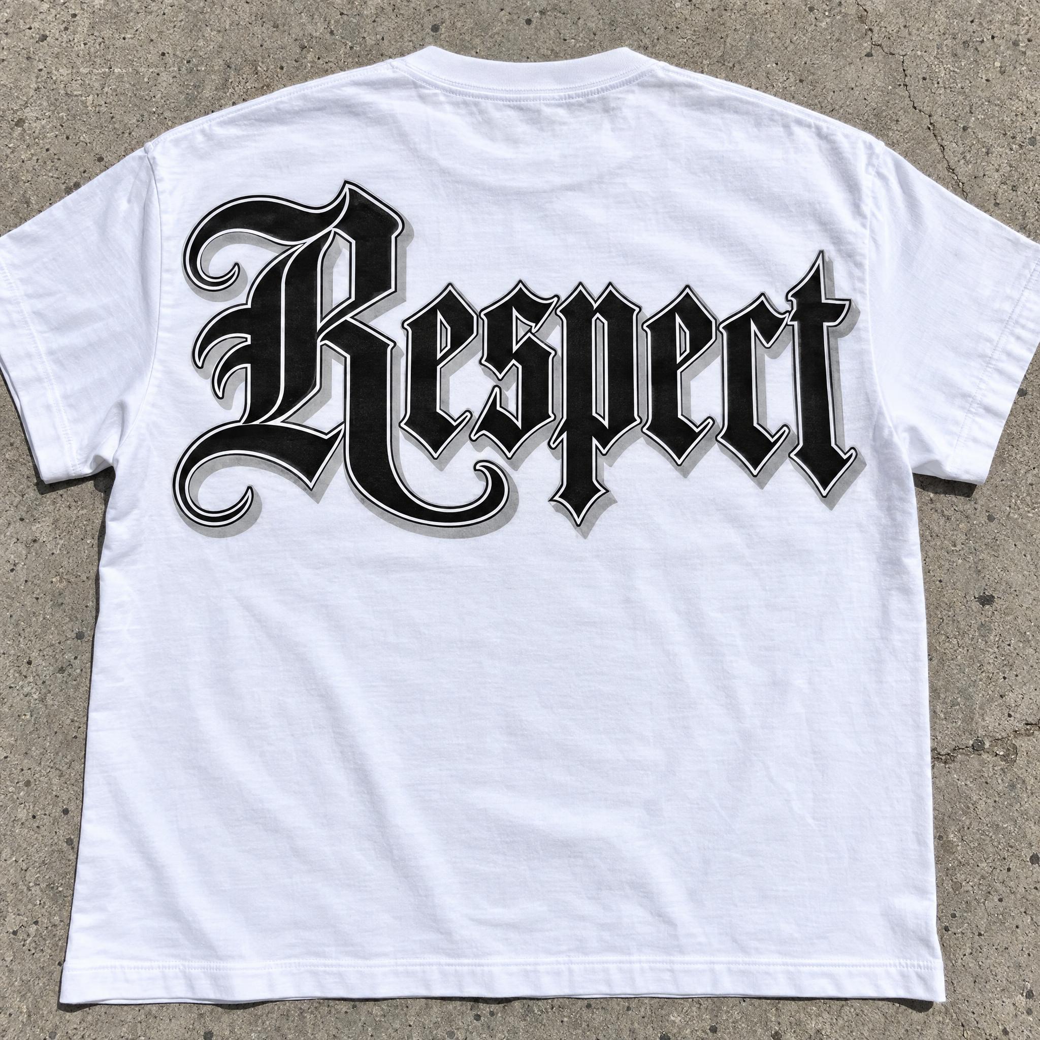
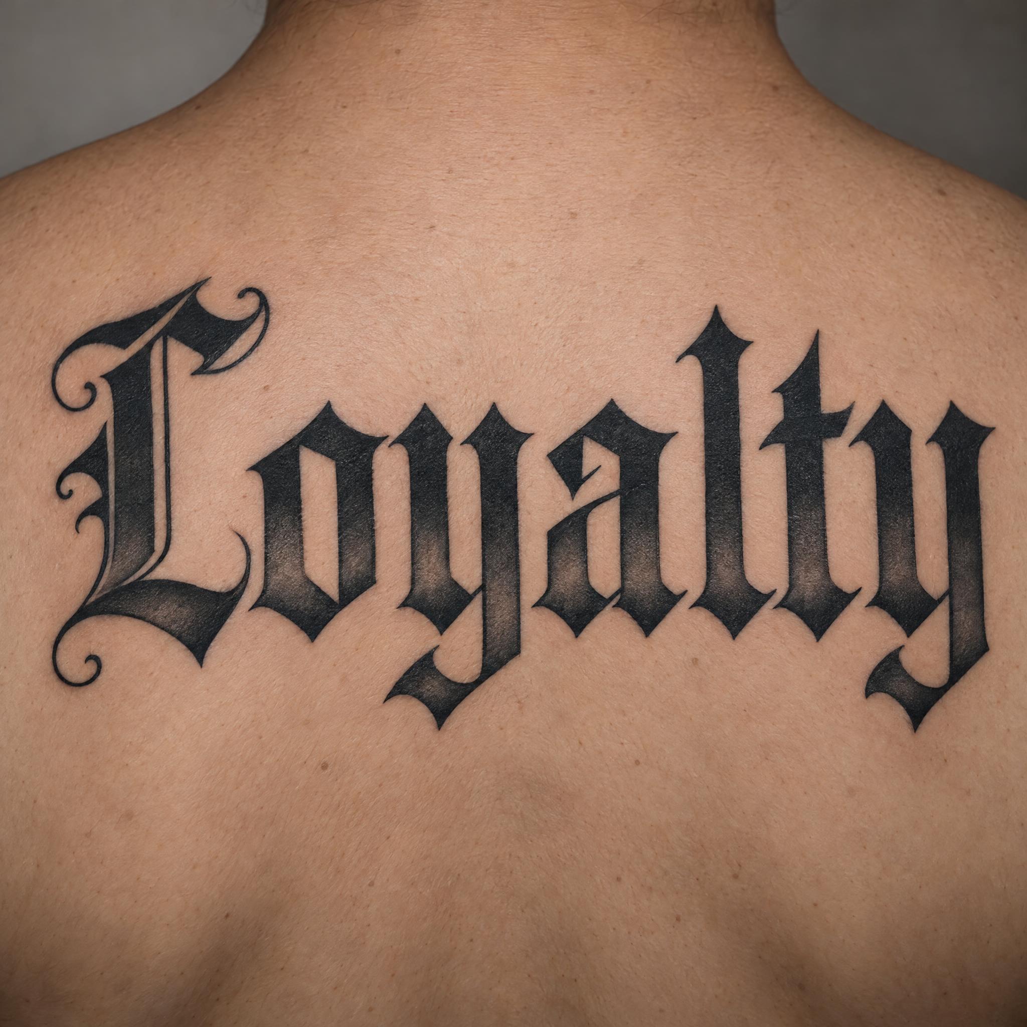
| A name tattoo | Old English Tattoo | Heavy, black-and-grey shading |
| West Coast style | Gangster Font | Chunky letters, big swinging capital |
Blackletter began as handwriting. From the end of the 12th century, scribes compressed the round Carolingian minuscule, by way of Protogothic, into tall, narrow letters with square shapes: the Gothic book hand called textualis or textura, from the Latin texo, to weave, because a page of it looked woven. The name blackletter set these heavy hands apart from the thinner "white letter" humanist scripts. Palaeographers still grade textualis by how its short strokes end, from prescissa, cut off flat at the baseline, through quadrata to rotunda.
Type followed the pen. Gutenberg cut a textualis for his 42-line Bible of 1455; Italy wrote a round blackletter, rotunda, whose usual form was the littera bononiensis of the University of Bologna; and the looser bastarda hands of France, the Netherlands and Germany carried business and everyday writing in the 14th and 15th centuries. In Germany, Schwabacher dominated printing from about 1480 to 1530, the type of Martin Luther's works, until Fraktur became the most common German blackletter by the mid-16th century. The German classification DIN 16518 files blackletter as a group of its own, split into Gotisch, Rundgotisch, Schwabacher, Fraktur and Fraktur variants.
Elsewhere, roman type won: by about 1590 most presses had switched. Germany held on, and the choice became political. On 4 May 1911 the Reichstag narrowly rejected, 85 to 82, a proposal to make roman type official. In the 1930s, blackletter-grotesque hybrids such as Tannenberg became the most popular types of Nazi Germany, yet on 3 January 1941 an edict signed by Martin Bormann banned blackletter type altogether. Since then blackletter has been a display letter: nameplates, labels, album covers and Old English font tattoos.
Sources: Wikipedia — Blackletter · Wikipedia — Rotunda (script) · Wikipedia — Bastarda · TypeOff — Blackletter Resources · Wikipedia — Antiqua–Fraktur dispute · Wikipedia — Fraktur
The strictest class: straight, even strokes packed like a fence, diamond feet.
The round Italian blackletter: curves kept round, letters biting into each other but not broken.
Rounder German type of the Reformation; its o is round on both sides with angled joins.
The German classic: curves broken into angled pieces, capitals built from c- and s-shaped strokes.
Everyday blackletter of business papers and vernacular books, some forms semi-cursive.
Textura written by hand with a broad-edge pen.
The broken skeleton cut clean and sharp for logos.
A gilded capital opening a line of Gothic book script.
Heavy, upright letters shaded in black and grey for skin.
Chunky letters with a big swinging capital, from West Coast streets.
A blackletter font is a typeface based on the Gothic book hands of medieval Europe: narrow, heavy letters whose curves are straightened or broken into angles. Textura, rotunda, Schwabacher and Fraktur are its main classes. Each style on this page is an AI prompt that draws your word in one of them.
Mostly, yes. Blackletter is the type historian's word; it is popularly called Gothic, and in English sometimes Old English, although it has nothing to do with the Old English language. For tattoos, names and shirts see Old English font; for the darker goth look see Gothic font.
Textura is built from straight strokes with almost no curves. Fraktur keeps the curves but breaks them into short angled pieces, and its capitals are wider and more ornate. Compare Textura Font and Fraktur Font on this page.
An edict signed by Martin Bormann on 3 January 1941 banned blackletter type and later Kurrent handwriting, falsely calling the letters Jewish in origin. Schools taught only "normal" roman script from the 1941/42 school year.
No. They are prompts, not .ttf or .otf files. You get your word as a finished image, with capitals, joins and shading drawn for your exact letters.
The comparison on this page counts how often each model spelled the word right on the first try across these styles and seven languages. Whichever you use, check letters that look alike in blackletter, such as n and u.