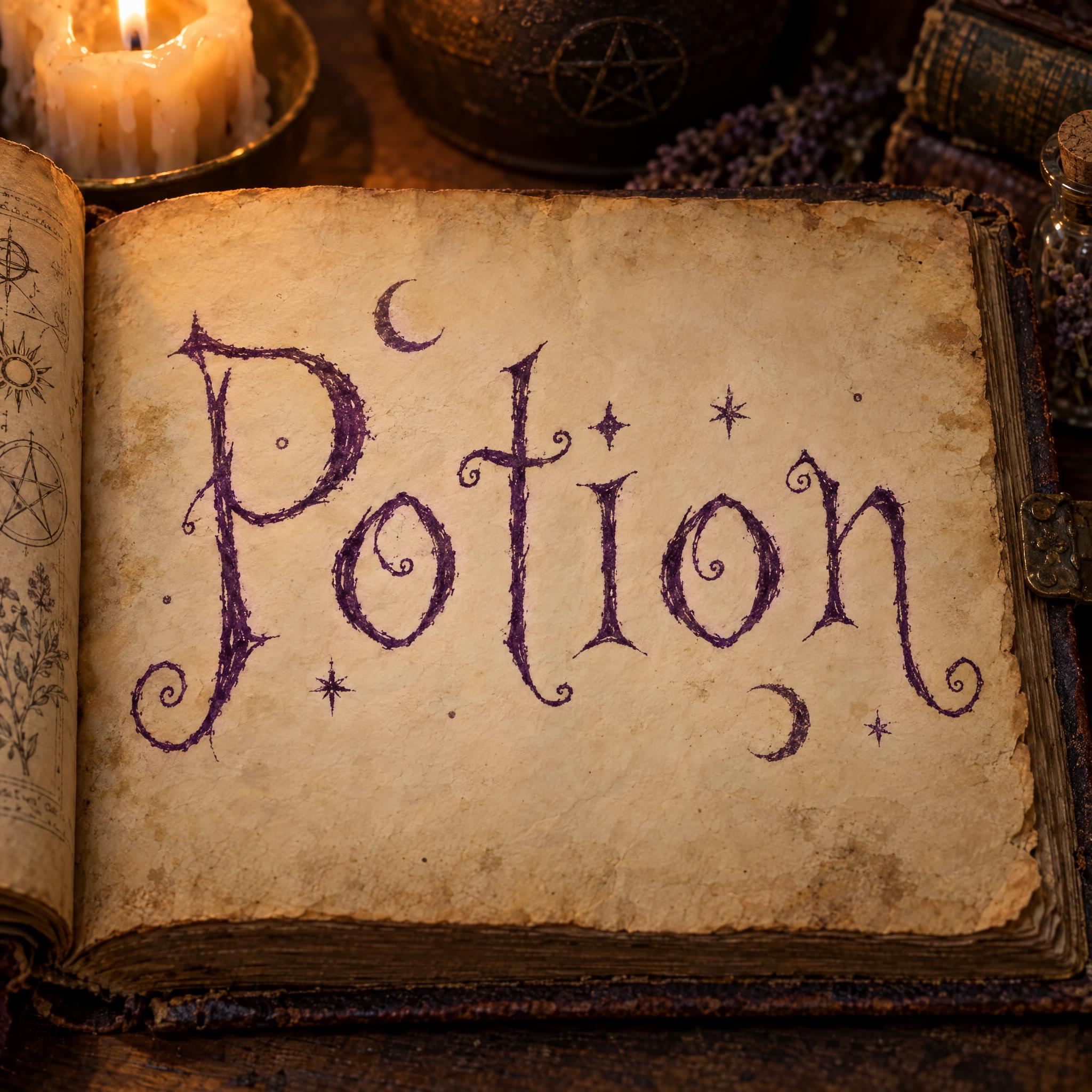
Spindly hand-inked letters in deep purple, each leaning its own way, with pointed serifs and ends that curl into hooks and spirals.
TextWrite the word "Potion". Spell it exactly as written, without adding or changing any letter.
Font designWitch lettering: spindly, hand-inked letters that lean at slightly different angles, with long thin stems, pointed serifs and strokes that curl into small hooks and spirals at the ends, like the handwriting in an old spellbook; every letter reads at a glance. The letters are deep purple ink. A few tiny stars and crescent moons float between the letters, never touching them. The ink has a slightly rough, dry-quill edge. Like the title page of a witch's spellbook.
SceneThe word is written on aged parchment in an open spellbook, lit by candlelight. The word is centered, spans most of the width and reads clearly.
119 words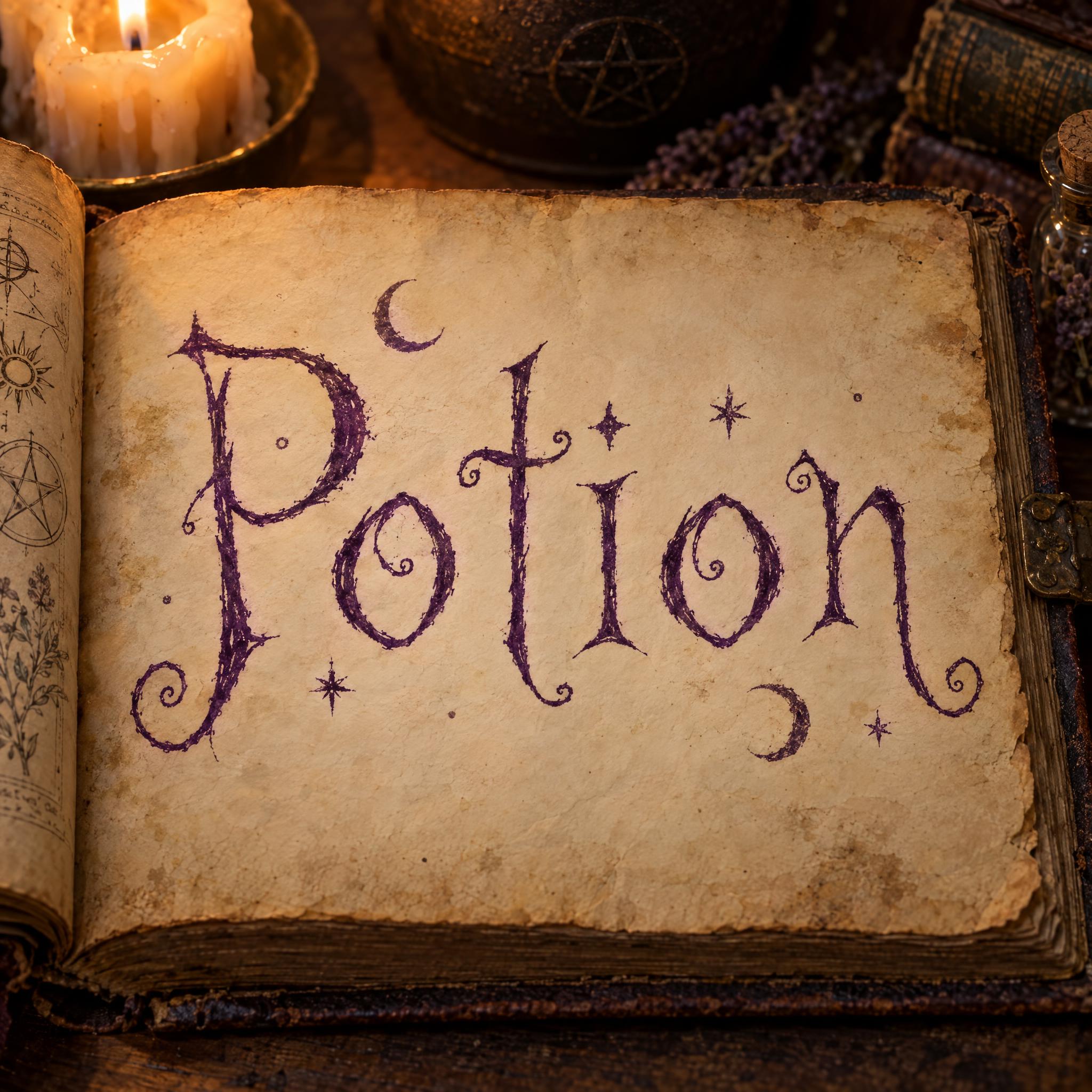
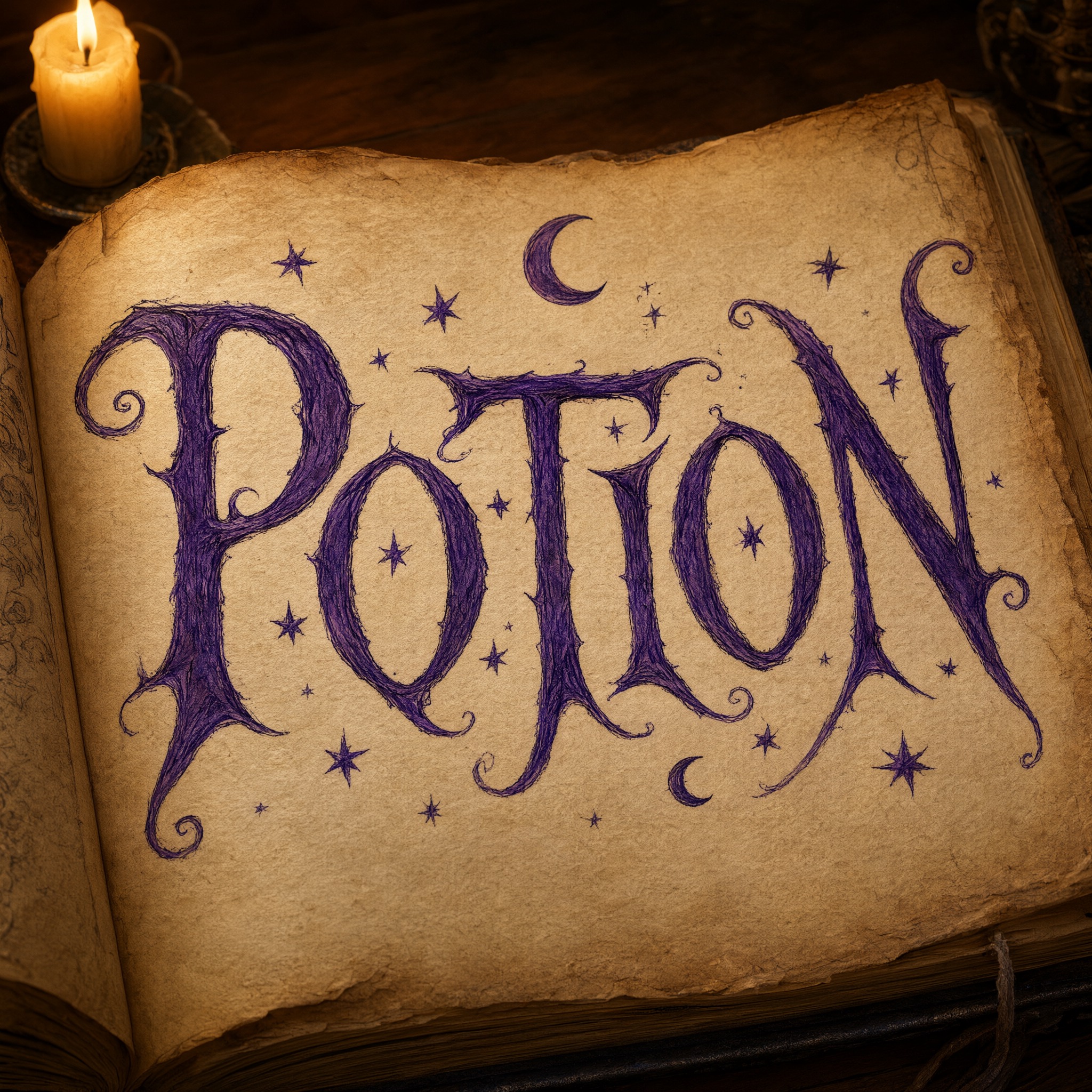
One prompt pasted into each image model as-is. These are the unedited results, so you can pick the model that suits you.
The thinnest, most spidery ink, with sketched symbols in the margins.
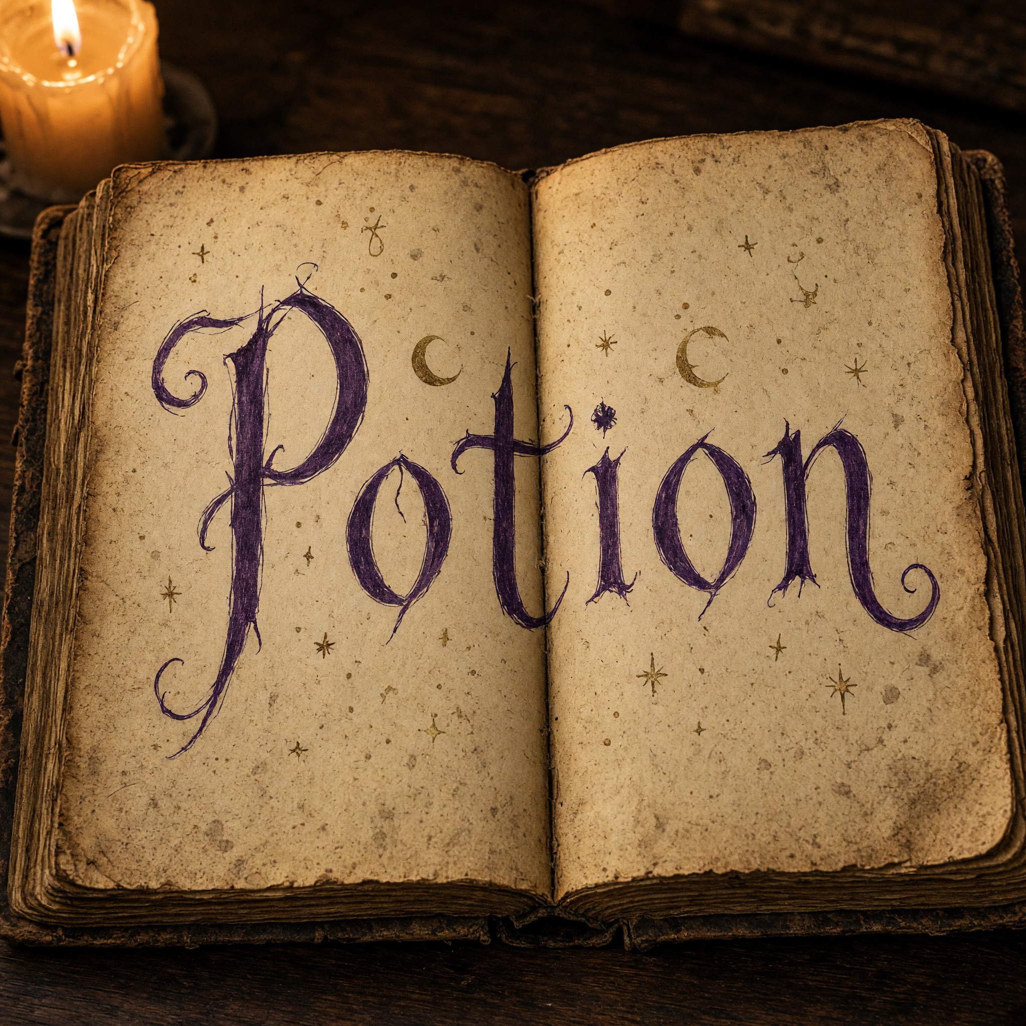
Darker indigo letters with sharp hooks, spread across both pages.
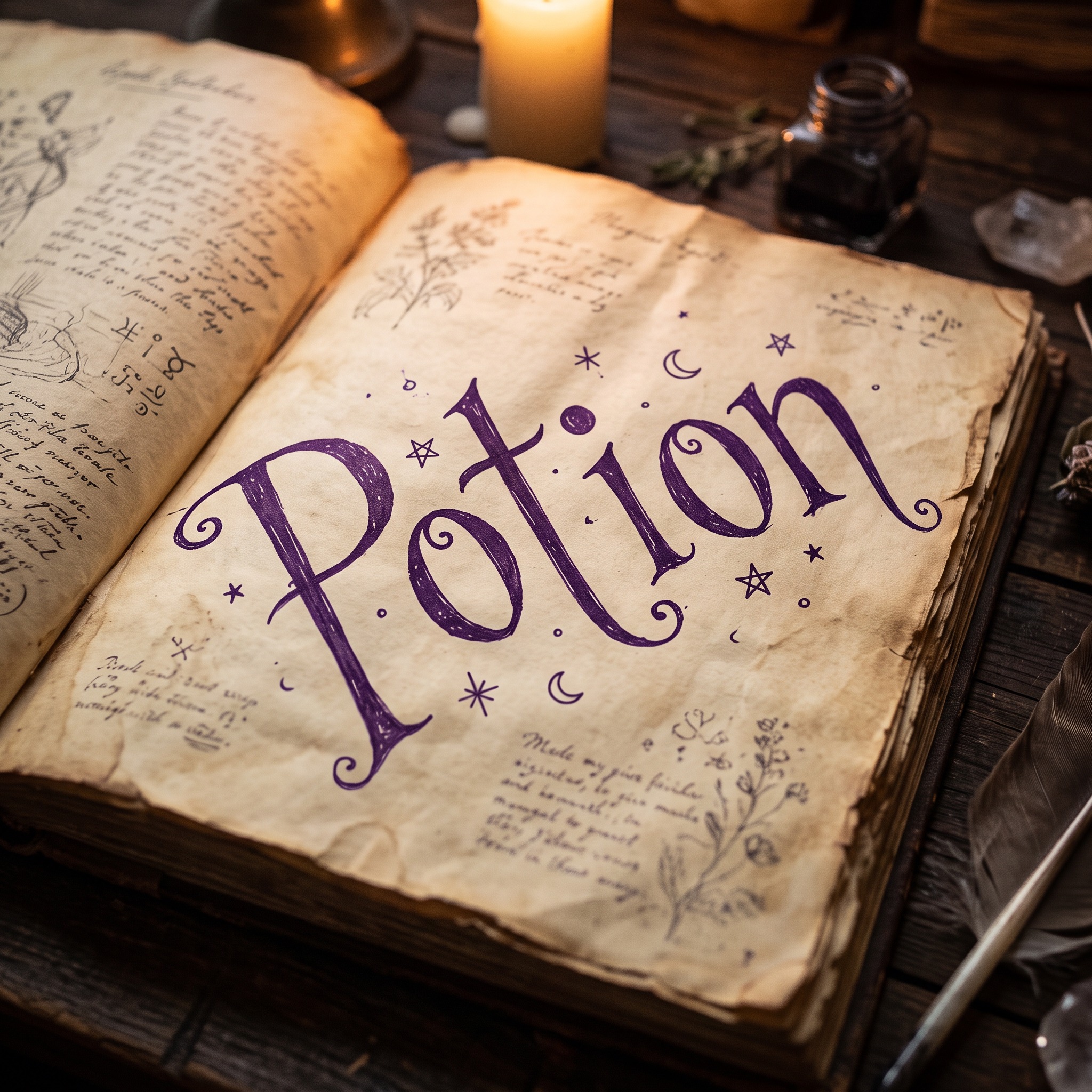
The boldest, most saturated purple, ringed with stars and moons.
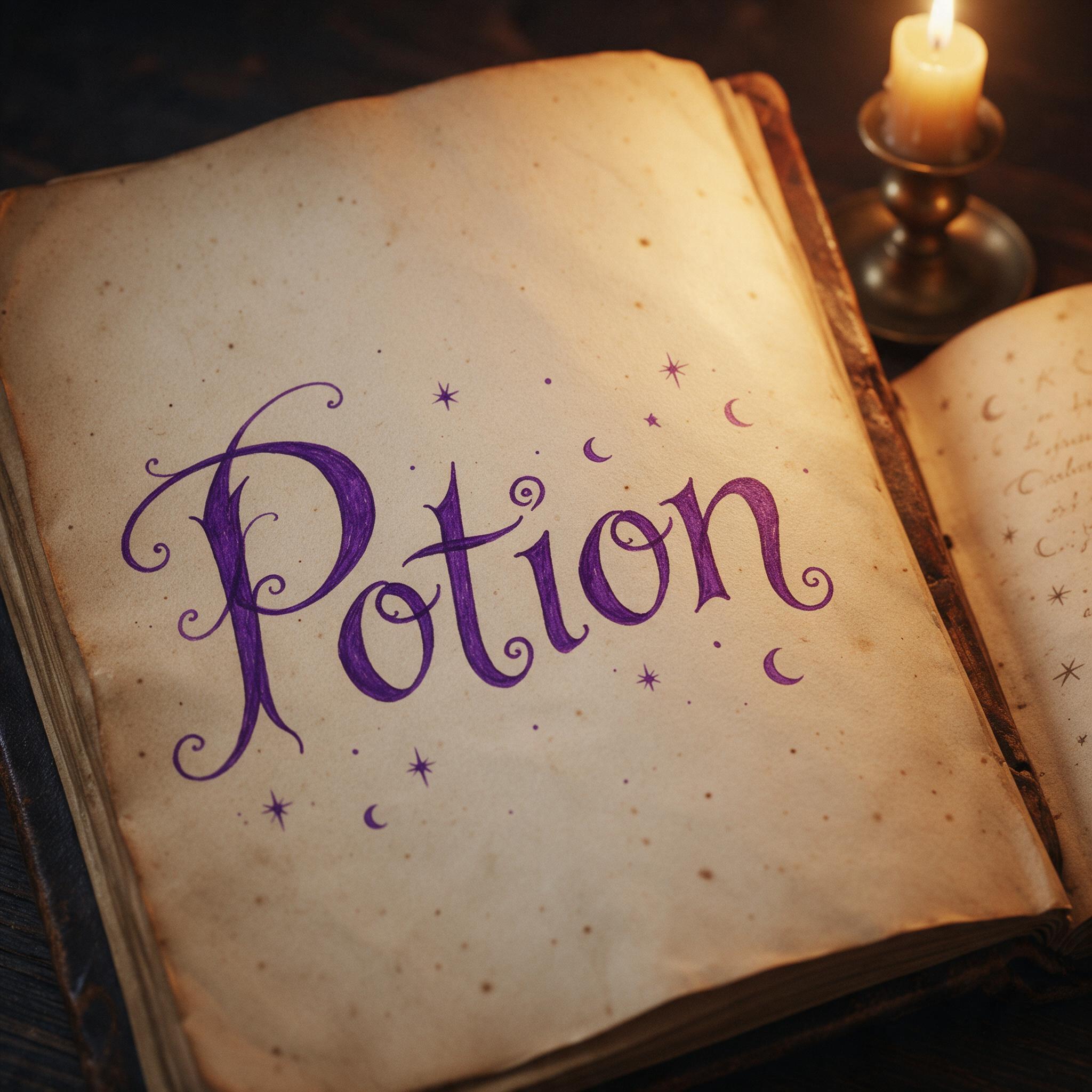
Bright violet with curly swashes and stars.
Wrote the word in all capitals, with scratchy, dense strokes. Wrote POTION in all capitals instead of Potion, and did the same on the second try. Failed twice.
The button opens FontVibe in DIY mode with this prompt filled in as it is. Type your word, pick a model and generate. GPT Image, Nano Banana, Seedream, Grok and Qwen are all in one account, so you can see how each one tilts and curls the letters without opening five apps. Every account gets free credits each month with no card needed, and you can export a transparent PNG to put the lettering on your own invitation, label or cover.
Layers in the order the prompt states them. Change one layer and the rest keeps working.
Every AIFont prompt opens with the same text part. "Spell it exactly as written, without adding or changing any letter" comes first, so the model settles the letters before it starts tilting them and curling their ends.
"Witch lettering" tells the model which kind of lettering to reach for before any detail: spellbook handwriting, not a clean printed typeface.
"spindly, hand-inked letters that lean at slightly different angles" is the heart of the look: each letter tilts its own way, so the word looks written by hand rather than set in type. "pointed serifs and strokes that curl into small hooks and spirals at the ends" adds the spellbook flourishes, and "every letter reads at a glance" keeps the curls from turning the word into a scribble.
"The letters are deep purple ink." is the colour sentence. It stands on its own, so you can change the ink without touching the letter shapes.
"A few tiny stars and crescent moons float between the letters, never touching them" adds the night-sky charm. "never touching them" is the one negative in the font design: a star stuck to a stroke can look like part of the letter.
"The ink has a slightly rough, dry-quill edge" stops the strokes from looking like clean digital outlines; the slightly broken edge is what makes it read as ink from a dipped pen.
"Like the title page of a witch's spellbook" gives the model one familiar object to copy, so the size, the flourishes and the old-book feel come out together.
"The word is written on aged parchment in an open spellbook, lit by candlelight" says spellbook at a glance, and "The word is centered, spans most of the width and reads clearly" keeps the word the star. Swap the spellbook for your own invitation, label or cover; the letters stay the same.
Small edits that stay on-style. Change one thing at a time.
Type it in the box next to Prompt above and copy again. One short word, a name or a potion name keeps every crooked letter large enough for its curls to show.
Swap "The letters are deep purple ink." for "The letters are black ink.", "The letters are emerald green ink." or "The letters are gold ink." Gold stands out best on dark paper.
Replace "written on aged parchment in an open spellbook, lit by candlelight" with "written on a black Halloween party invitation", "written on a cream label on an amber candle jar" or "written on the cover of a dark leather-bound book".
The prompt sets no frame size. Pick the ratio in your app, or add "Wide 16:9 image." or "Tall 4:5 image." at the end.
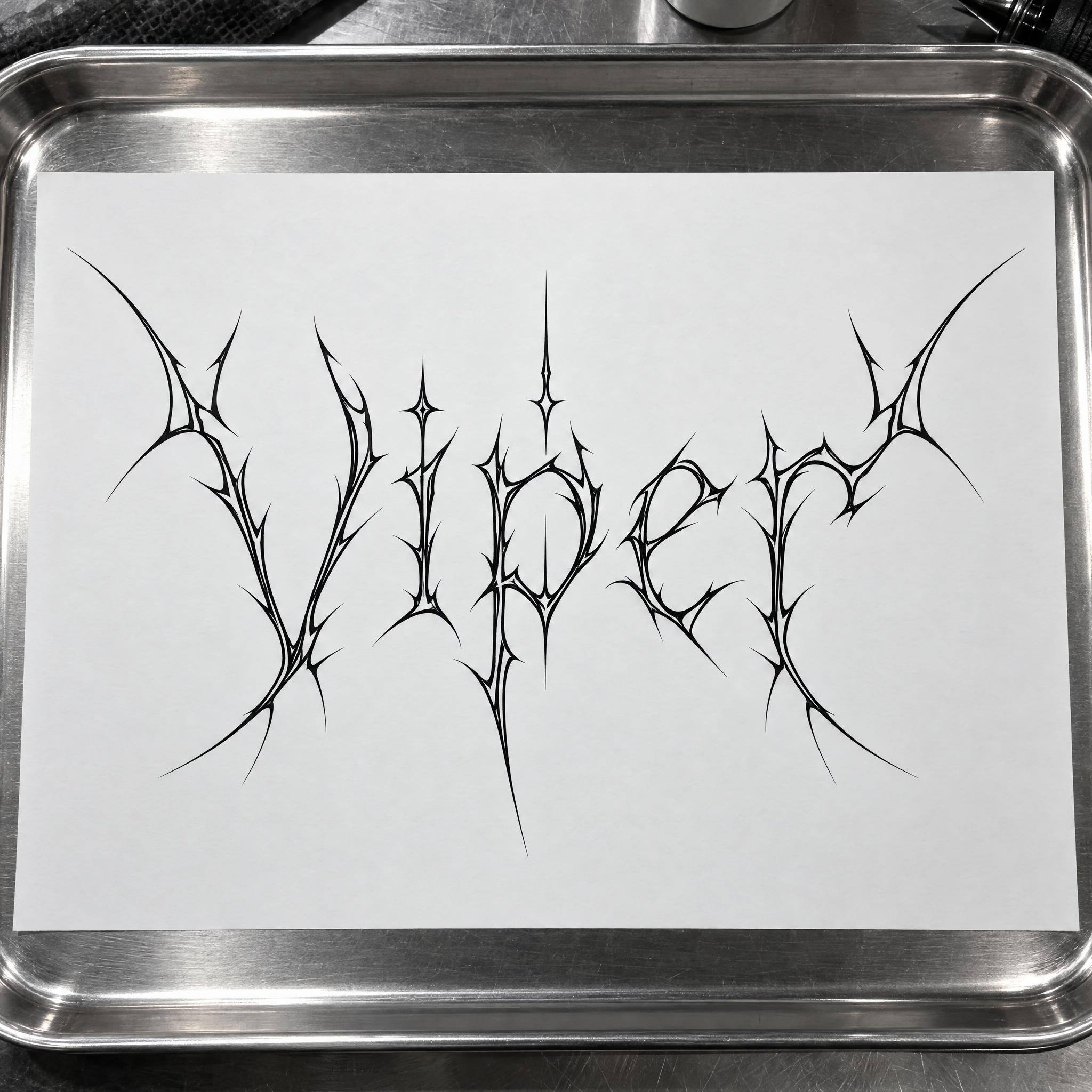
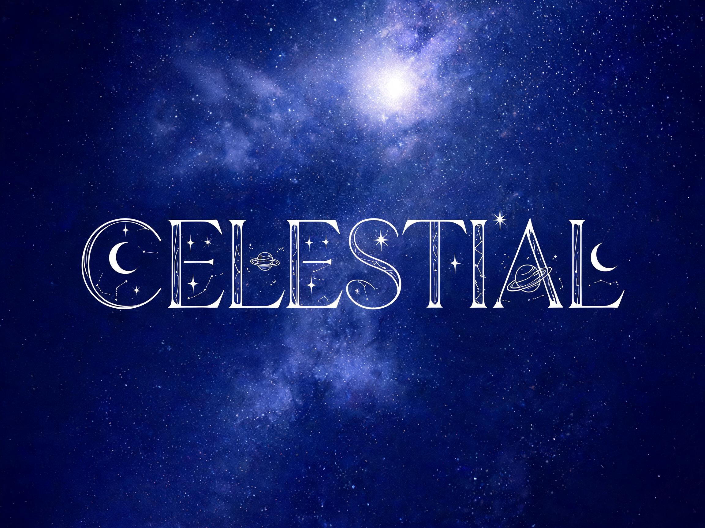
AI fonts that share the most tags with Witch Font.
 Premium
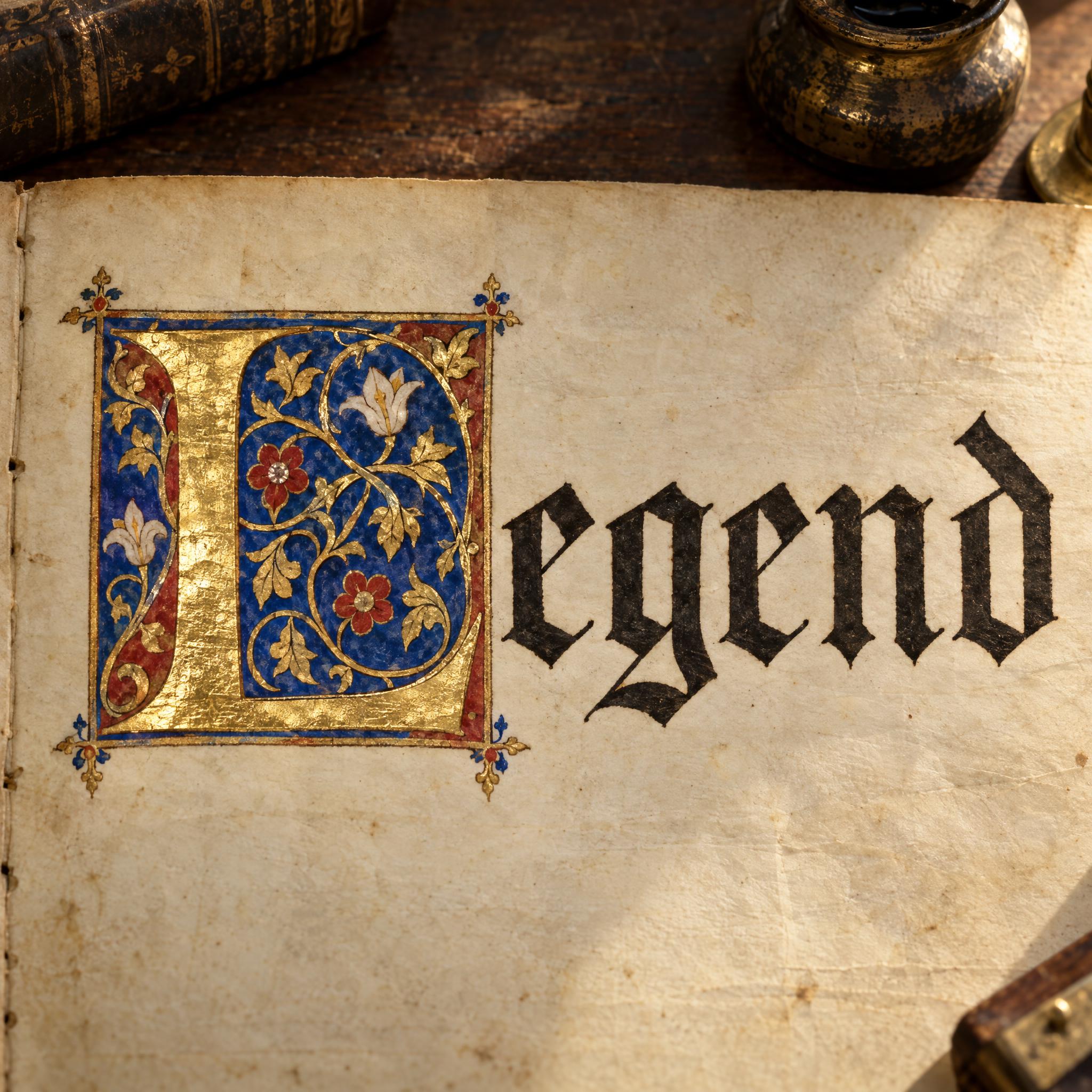
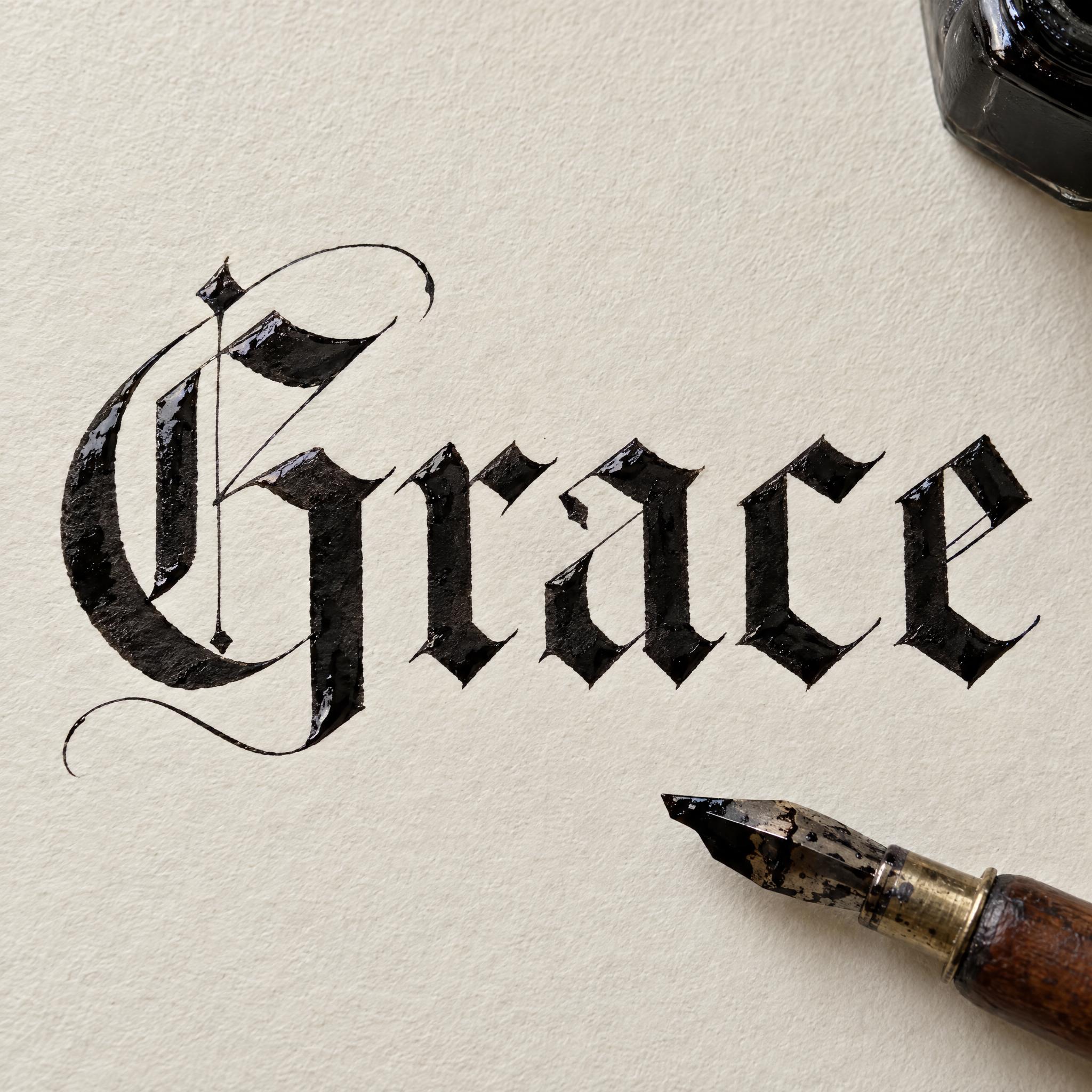
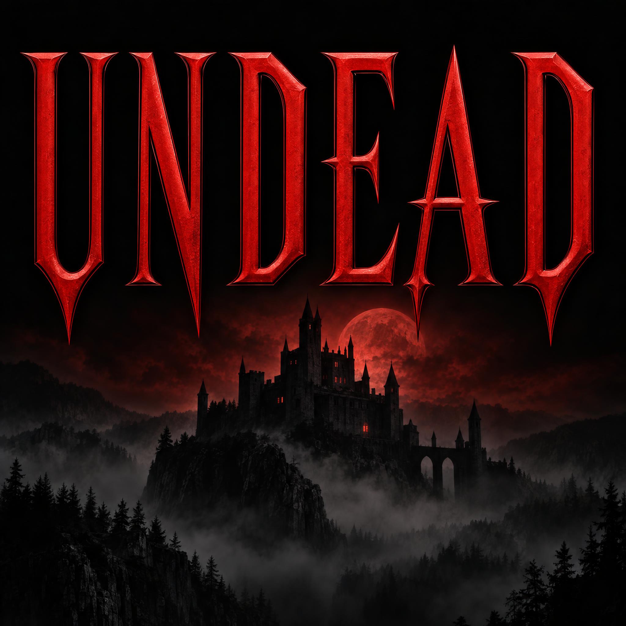
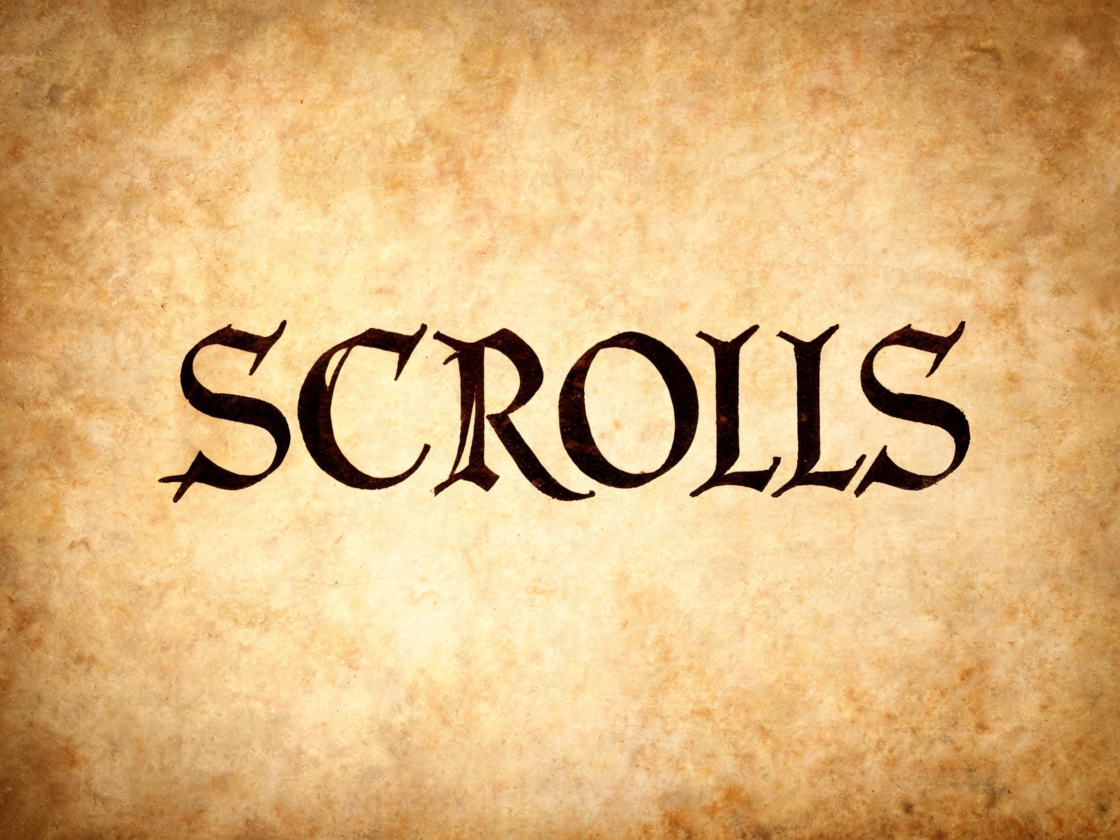
AI fonts for a second line, a logo lock-up or a poster footer.
Witch Font writes your word the way it might be inked into an old spellbook: thin, spindly letters drawn by hand, each leaning at a slightly different angle, with pointed serifs and stroke ends that curl into small hooks and spirals. The ink is deep purple with a dry, slightly rough quill edge, and a few tiny stars and crescent moons float near the letters.
Type your word in the box above the prompt, copy it, and paste it into ChatGPT, Gemini, Grok, Qwen or Seedream. The prompt has three parts: the text, the font design and the scene. The font design is what makes the crooked spellbook handwriting; the scene is yours to change. Every image on this page was made by pasting the prompt unchanged into each model, and nothing was retouched.
As a hand-written Halloween font it suits invitations and party signs; it also fits witchy shop and candle labels, fantasy book covers and tarot or moon-phase posts.
Details from the original render. Every one of them is named in the prompt.
Thin, spindly letters, each leaning at its own slightly different angle.
Pointed serifs, and stroke ends that curl into small hooks and spirals.
Purple ink with a dry, slightly rough quill edge.
A few tiny stars and moons float near the letters without touching them.
Pulled from the render. Handy when you build the rest of the design around the word.
Where this AI font earns its keep.
The look borrows from grimoires: books of magic with instructions for making talismans and amulets, casting spells and divination. The word most likely comes from the Old French grammaire, 'grammar'. Even after printing arrived, handwritten grimoires stayed highly valued, because people believed they held magical power of their own, and they went on being produced. The Key of Solomon began as a 15th-century Greek text, the Magical Treatise of Solomon, was translated into Latin and Italian in the 16th century, and was still popular enough in 1599 to be listed among the Church's prohibited books. When Wicca appeared publicly in the 1940s, Gerald Gardner introduced the Book of Shadows as a Wiccan grimoire.
The witch joined Halloween much later. Halloween cards began in the United States in the 1890s, and from about 1900 to 1915 the country had a Halloween postcard craze; many of the more than 3,000 cards of that era showed witches, pumpkins and goblins. L. Frank Baum's 1900 novel The Wonderful Wizard of Oz was illustrated with the Wicked Witch of the West in a tall conical hat, and the 1939 film kept the hat. Today witches sit beside skeletons, ghosts and cobwebs in Halloween decorations. Witch Font takes the handwritten spellbook side rather than the cartoon hat: crooked inked letters, a few stars and moons, and purple ink.
Sources: Wikipedia — Grimoire · Wikipedia — Halloween card · Wikipedia — Witch hat · Wikipedia — Halloween · Wikipedia — Theban alphabet
The Magical Treatise of Solomon is written in Greek; translated in the 16th century, it becomes the Key of Solomon.
Halloween postcards boom in the United States; many show witches, pumpkins and goblins.
The film of The Wizard of Oz keeps the Wicked Witch's tall conical hat from the 1900 book's illustrations.
GPT Image, Nano Banana, Seedream and Grok spelled the word right in every language here, Seedream needing a second try in Japanese. GPT Image has the thinnest, most spidery ink, Nano Banana the boldest purple, and Seedream the brightest violet. Qwen is the weak one for this font: it wrote the English word in all capitals twice, swapped a kana in Japanese twice, and added or changed letters in Arabic twice. Compare them side by side above.
Vampire Font is a symmetric, blood-red film title: sharp letters standing straight and even, like a horror movie poster. Witch Font is crooked handwriting in deep purple ink: every letter leans its own way, the ends curl into hooks and spirals, and it looks inked by hand in a spellbook.
No. Searches for the witch alphabet usually mean the Theban alphabet, also called the witches' alphabet: a separate set of symbols, one for each letter of the Latin alphabet, first published in 1518. This prompt writes your word in ordinary letters in a witchy hand, so anyone can read it.
Yes. It suits Halloween party invitations, door signs, potion bottle labels and costume party posts. For a darker look, change the ink to "The letters are black ink."; for playful lettering for a kids' party, Halloween Bubble Letters is the friendlier choice.
In Japanese, a small mark beside a kana can read as a voicing mark and change the sound; in Arabic, dots above and below a letter decide which letter it is. So those two prompts float the stars and moons around the outside of the whole word and keep the space between the letters clear. In English a tiny star between two letters does not change either of them, so it can sit there.
Type it in the box next to the prompt and copy the full prompt again. Short words keep each letter large enough for the hooks and spirals to show.
Change only "The letters are deep purple ink.", for example to "The letters are emerald green ink."
Pick the ratio in your app if it has one. If not, add "Wide 16:9 image." or "Tall 4:5 image." at the end of the prompt.
No. It is a prompt that makes a picture of your word in witchy hand-inked letters with an AI image model, so there is nothing to install and any word works.
Copying the prompt is free. Whether the image costs anything depends on the app you paste it into, and what you may do with the image depends on that app's terms.