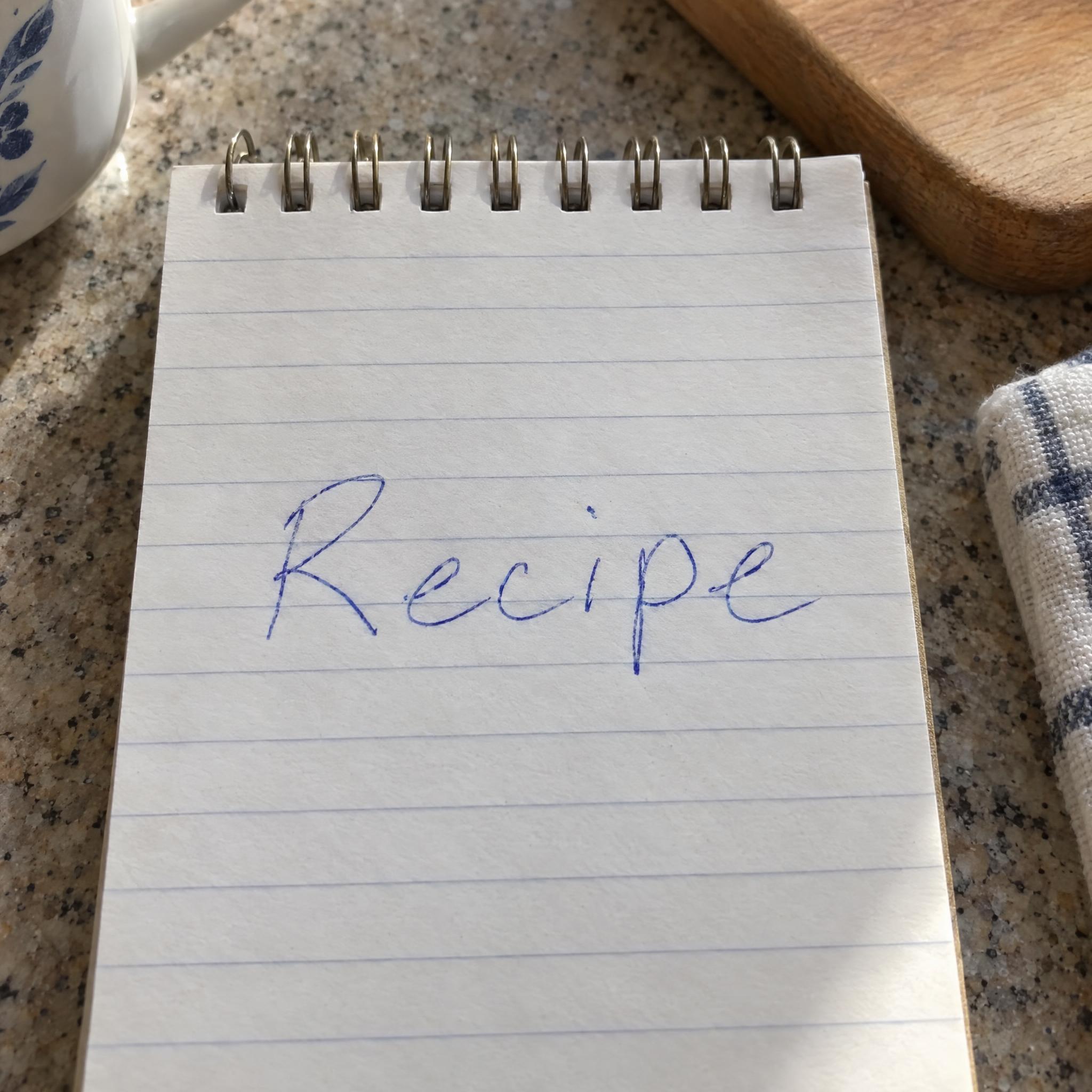
Handwriting fonts as copy-ready AI prompts: a real ballpoint note, a messy scrawl, bold marker capitals, café chalk and a child's crayon letters. Pick the kind of handwriting you want, type your word, copy, and paste into ChatGPT or Gemini, or generate it right away on FontVibe. These are image prompts, not font files.
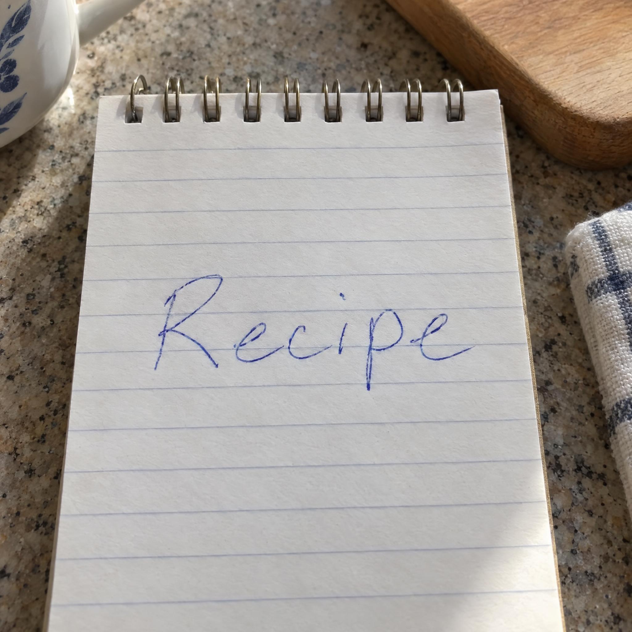
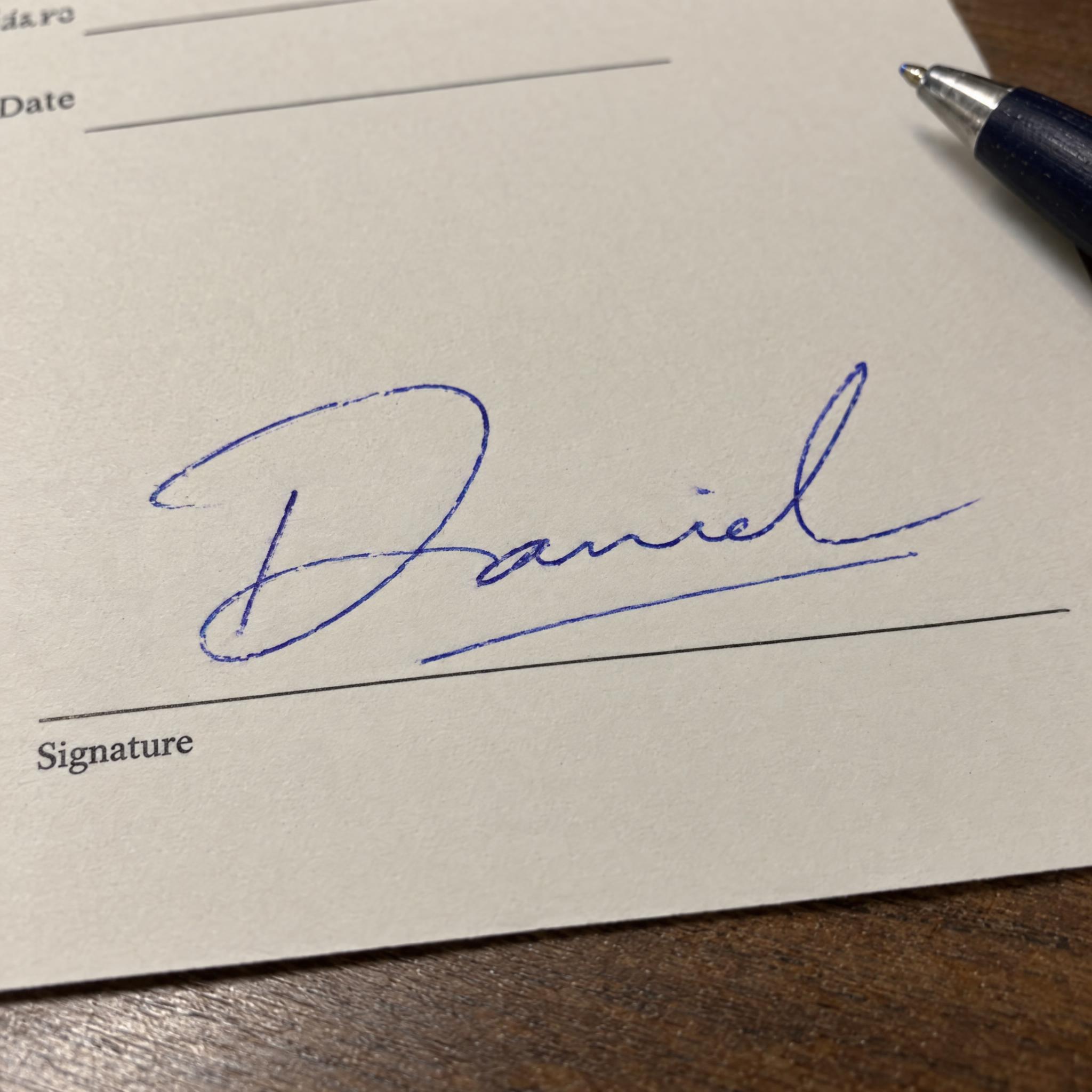
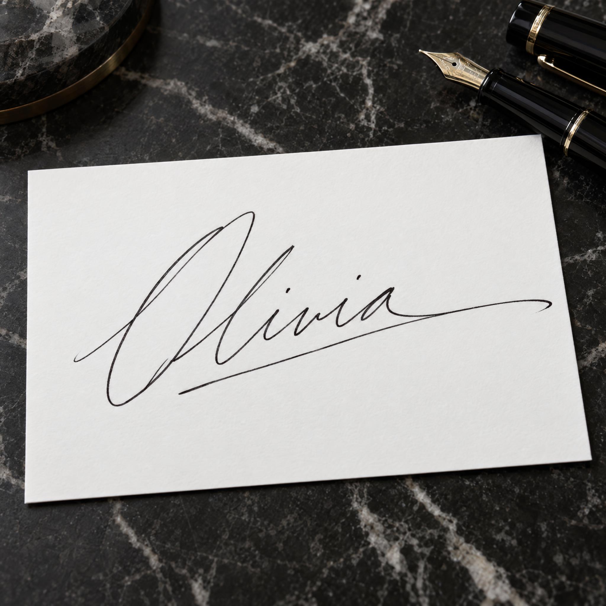
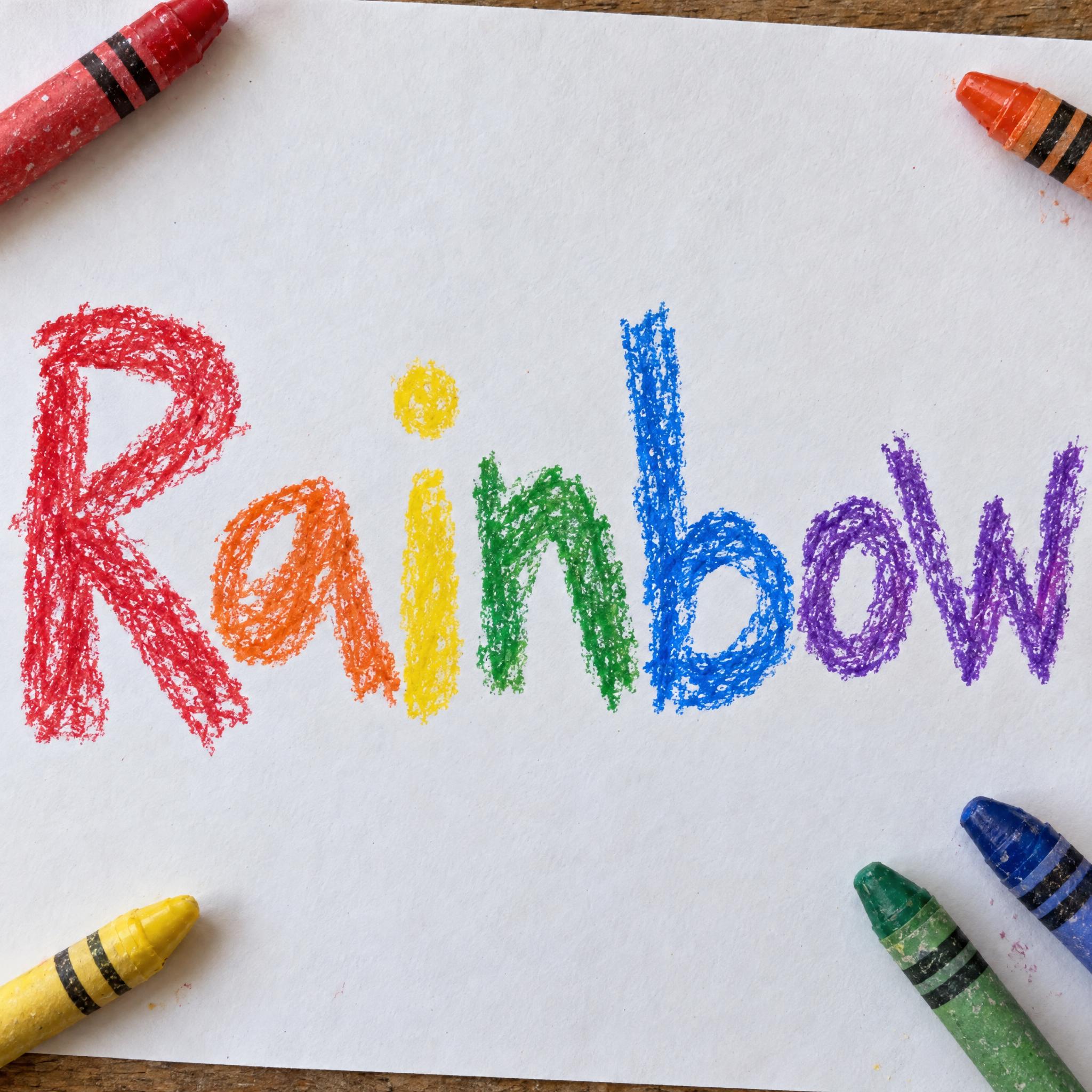
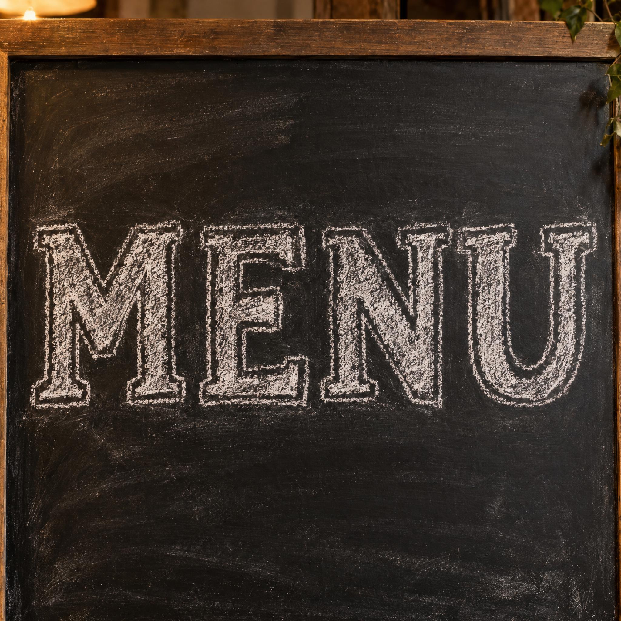
Type your word, copy the full prompt and paste it into ChatGPT, Gemini or any image model.
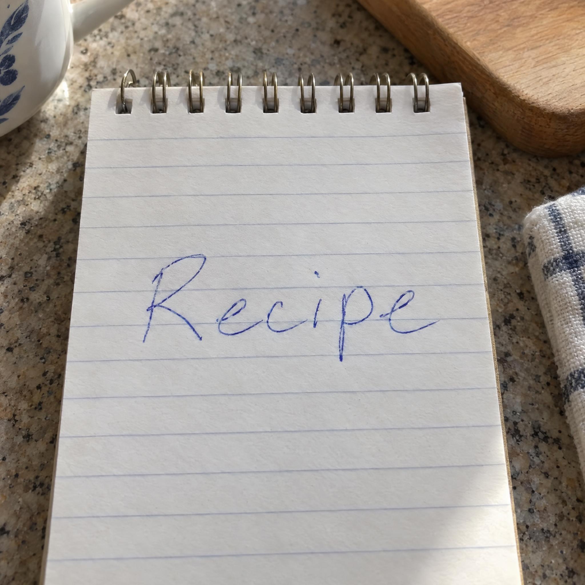
TextWrite the word "Recipe". Spell it exactly as written, without adding or changing any letter.
Font designRealistic handwriting: everyday print handwriting written quickly with a ballpoint pen, mostly separate lowercase letters with a few natural joins, a slight forward lean, and letters that vary a little in size and spacing the way real handwriting does; every letter reads at a glance. The ink is ballpoint blue. The line is thin and even, slightly darker where the pen pressed harder at the start of a stroke. Never a neat computer font with identical repeated letters. Like a note jotted on a kitchen notepad.
SceneThe word is written on a small notepad on a kitchen counter, in morning light. The word is centered, spans most of the width and reads clearly.
Open one for the prompt and real results on each image model.
Tested October 2026. First attempts from our test ledger: 324 images, 9 fonts, 7 languages, each one checked by eye.
How to read it: 62 / 65 means 65 images tested and 62 spelled the word right on the first try; the percentage is that share. The Latin, Chinese / Japanese and Arabic columns split the same count by the script of the word.
| Model | Right first time | Latin | Chinese / Japanese | Arabic | Most common issue |
|---|---|---|---|---|---|
| GPT Imagegpt-image-2.5-sunburst · xhigh | 95% 62 / 65 | 100% 36 / 36 | 89% 17 / 19 | 90% 9 / 10 | Unreadable letters |
| Nano Bananagemini-nano-banana-2.1 | 98% 63 / 64 | 100% 36 / 36 | 100% 18 / 18 | 90% 9 / 10 | Extra letter |
| Seedreamdola-seedream-5-0-pro-260628 | 89% 58 / 65 | 100% 36 / 36 | 89% 17 / 19 | 50% 5 / 10 | Extra letter |
| Grok Imaginegrok-imagine-image-2.0 · medium | 94% 61 / 65 | 97% 35 / 36 | 95% 18 / 19 | 80% 8 / 10 | Extra letter |
| Qwen-Imageqwen-image-3.0-pro | 71% 46 / 65 | 83% 30 / 36 | 79% 15 / 19 | 10% 1 / 10 | Extra words added |
How we test: images are made through FontVibe with each model’s API, sending the prompt as is; we count only each model’s first image for every font and language and check the spelling by eye. Apps such as ChatGPT may rewrite prompts, so results there can differ. For the full data, email [email protected].
Every handwriting prompt on this page is built from the same layers, one sentence each. The examples are quoted word for word from the prompts of the fonts on this page.
Handwriting is shaped by what it was written with and how fast. The first sentence says who is writing, in what hurry, and with which pen. A ballpoint note, a felt-tip scrawl and a child's crayon letters all start from this line.
“Realistic handwriting: everyday print handwriting written quickly with a ballpoint pen, mostly separate lowercase letters with a few natural joins, a slight forward lean, and letters that vary a little in size and spacing the way real handwriting does; every letter reads at a glance.” — Realistic Handwriting Font
Real handwriting never repeats a letter exactly. Say how the letters differ: size, slant, distance from the line. Without this sentence most models drift back to a tidy hand that looks typed.
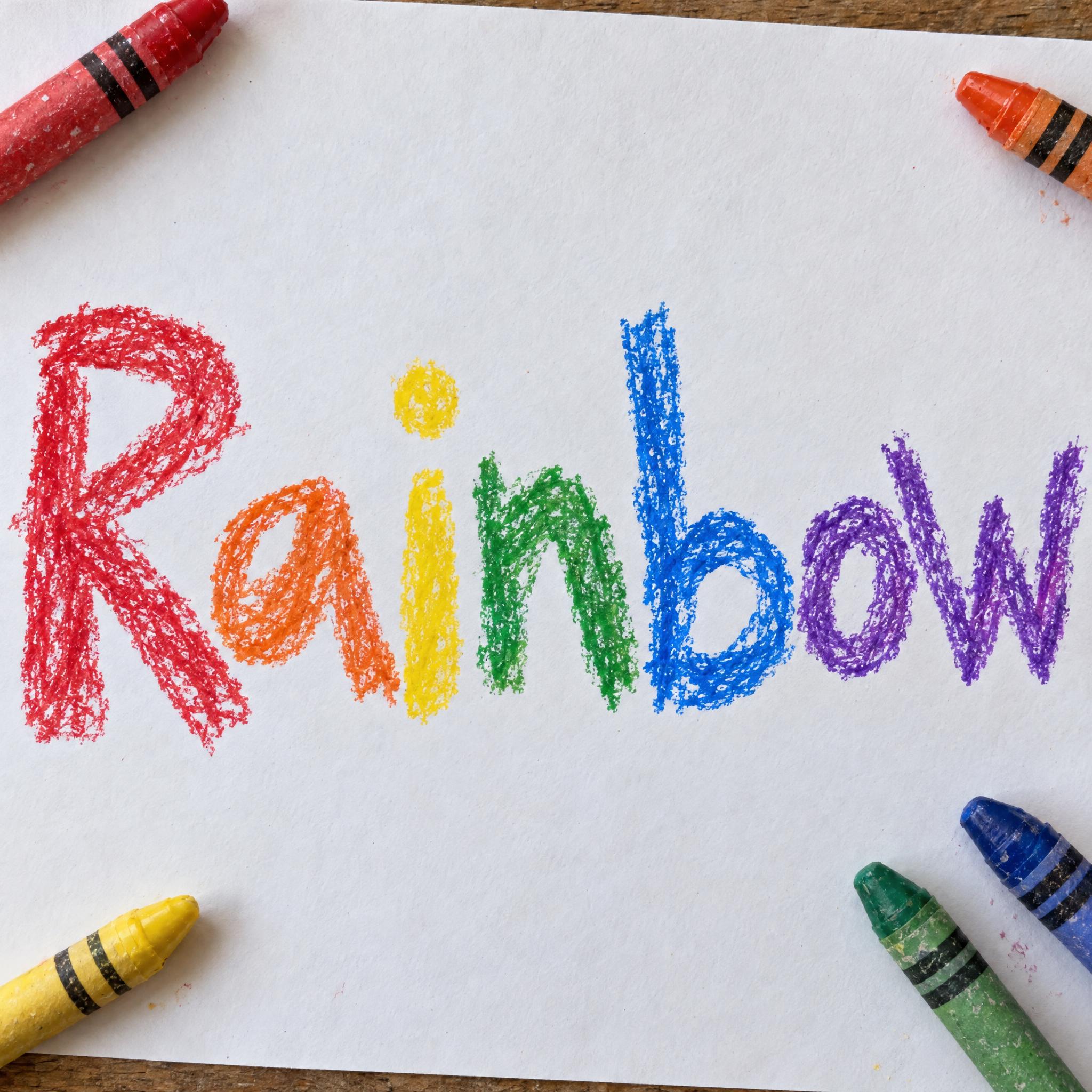
“Crayon lettering: wobbly letters drawn by a young child with wax crayons, mixed capitals and lowercase, uneven in size and wandering off the baseline, with a few letters a little too big; every letter reads at a glance.” — Crayon Font
A ballpoint darkens where it was pressed, a marker soaks into the paper, chalk breaks up on the board. One sentence about the line is what makes the word look written with that tool.
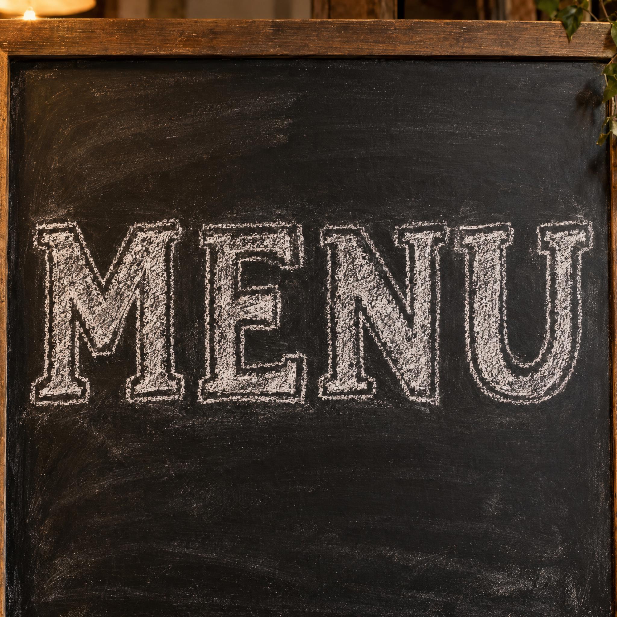
“The strokes are dry and grainy, broken and powdery where the chalk skipped over the board, with faint smudges of chalk dust around the letters.” — Chalk Font
Keep colour in one short sentence, so you can switch blue ballpoint to black ink or red marker without touching the handwriting.
“The ink is ballpoint blue.” — Realistic Handwriting Font
The mistake models make most often is a neat handwriting typeface with every letter the same. Rule it out in one short sentence.
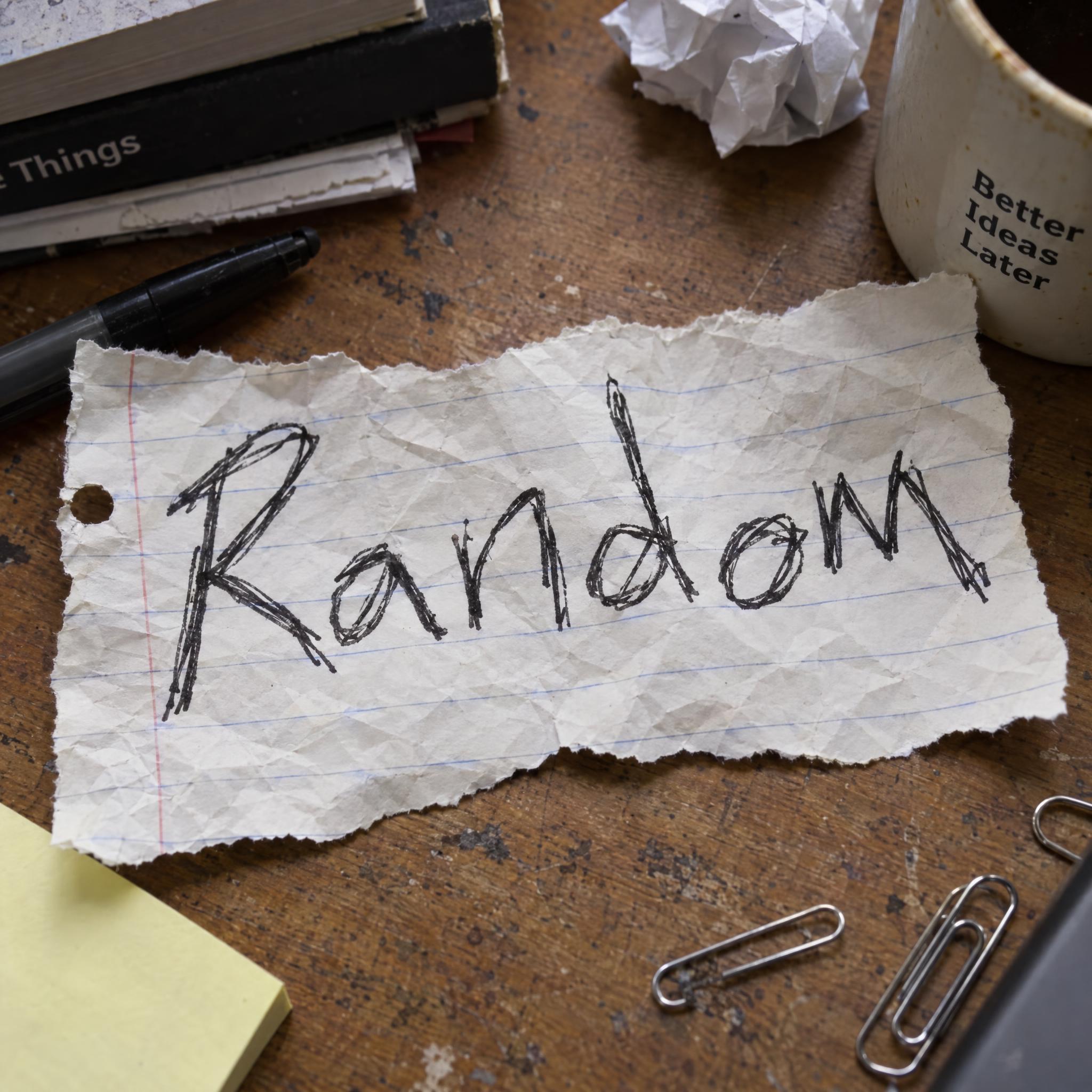
“Never a tidy, even handwriting font.” — Messy Handwriting Font
A one-line comparison tells the model how much care went into the writing: a note jotted in a second, a sign written for the whole street, a drawing for the fridge.
“Like a note jotted on a kitchen notepad.” — Realistic Handwriting Font
Handwriting looks real on the surface it was written on: a notepad, a scrap of lined paper, poster paper, a blackboard. Change this sentence to move the word and leave the handwriting sentences alone.
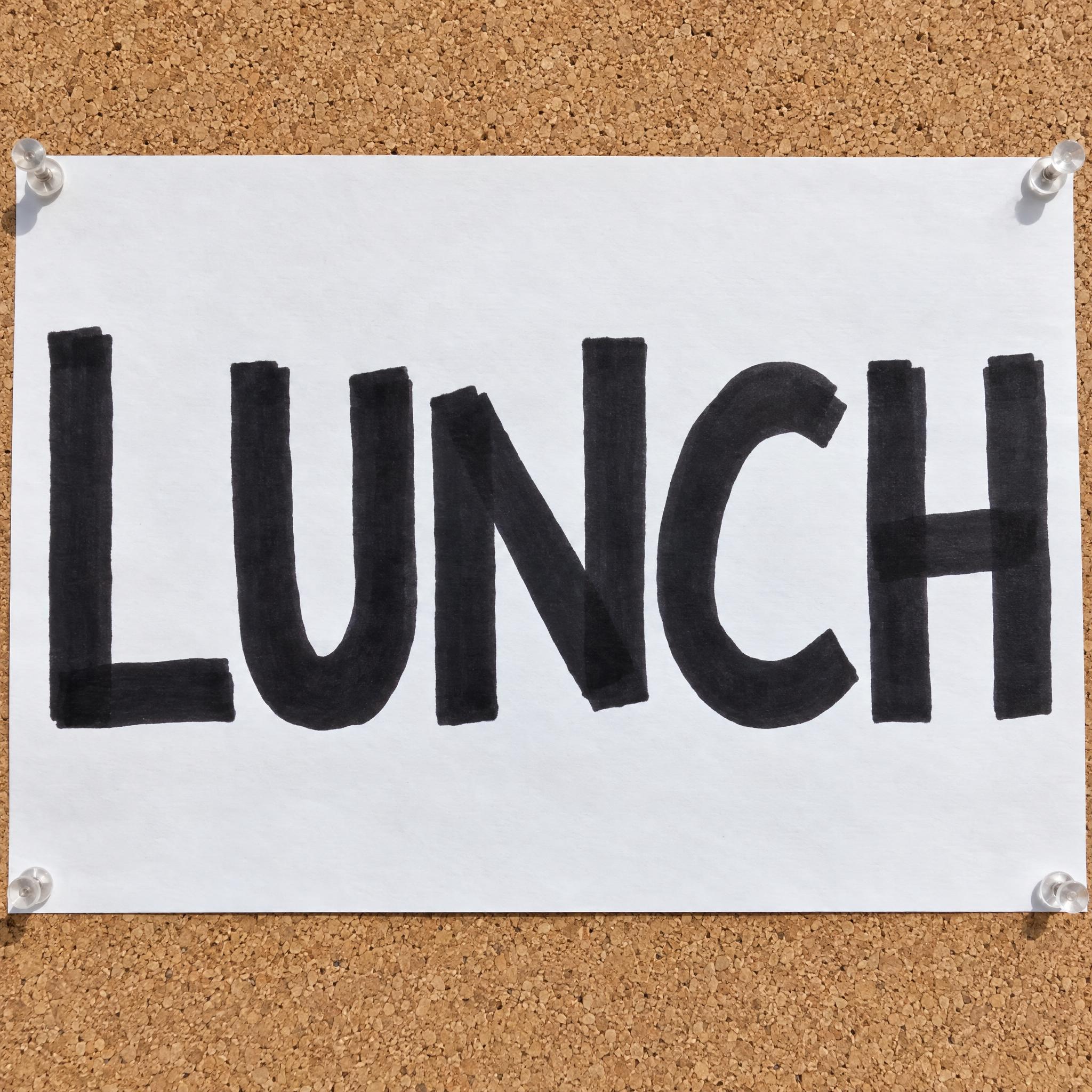
“The word is written large on white poster paper pinned to a corkboard, in bright daylight.” — Marker Font
Search for handwriting fonts and the results are a mix: neat notes, cute rounded letters, scrawls, marker signs, chalkboards, children's crayon letters and signature-style script. They are different hands for different jobs.
A font file stores one shape per letter, so every e in a word is the same e, and the eye notices. Type designers know this: the OpenType standard registers a Randomize feature that swaps in alternate letter shapes to emulate the irregularity and variety of handwritten text. Even then, each letter can only rotate through the few alternates the designer drew.
Sources: Microsoft Learn — Registered features, p-t (OpenType 1.9.1)
An image model draws the whole word as one picture, so no two letters have to match. The prompts on this page ask for letters that vary a little in size and spacing, for the marks a real pen leaves, and they rule out a neat computer font. The result reads as a note someone wrote, not text someone typed.
Ballpoint ink is a paste that needs more pressure to come out than fountain-pen ink, so a ballpoint line is thin and even and darker where a stroke starts: that is Realistic Handwriting Font. A felt tip is fast and scratchy (Messy Handwriting Font), a chisel-tip marker gives one heavy width with square ends (Marker Font), chalk is dry and broken (Chalk Font) and wax crayon is grainy and bright (Crayon Font).
Sources: Wikipedia — Ballpoint pen
Handwriting tells the reader that a person wrote this. Use it for notes and recipe cards in mockups, menu boards and daily specials, shop-window signs and event posters, journal and planner headings, and children's party invitations, classroom labels and worksheets.
No. These are image prompts: they describe a kind of handwriting, not one person's hand, so the result will not match your writing. If you want your own handwriting as a font file you can type with, you need a service that builds a font from samples of your letters; Calligraphr is one that turns handwriting into a font.
Sources: Calligraphr — Transform your handwriting or calligraphy into a font
| You want | Try | Written with |
|---|---|---|
| A believable handwritten note | Realistic Handwriting Font | Blue ballpoint |
| A rushed, scrawled reminder | Messy Handwriting Font | Black felt tip |
| A bold shop or event sign | Marker Font | Chisel-tip marker |
| A café menu or specials board | Chalk Font | White chalk |
| Kids' parties and classrooms | Crayon Font | Wax crayons |
| Cute, bouncy joined letters | Cute Cursive Font | Thin even pen |
| Joined school handwriting | School Cursive | Pencil |
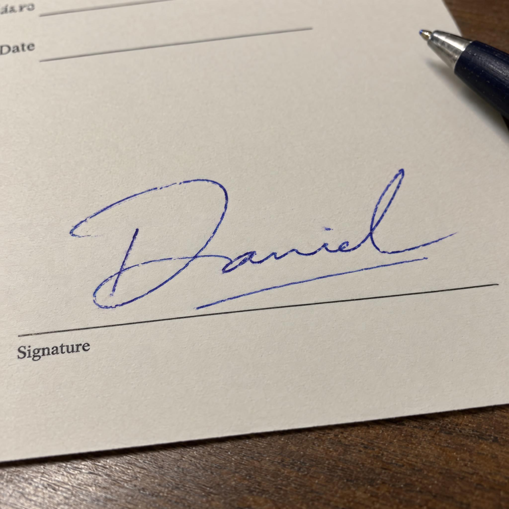
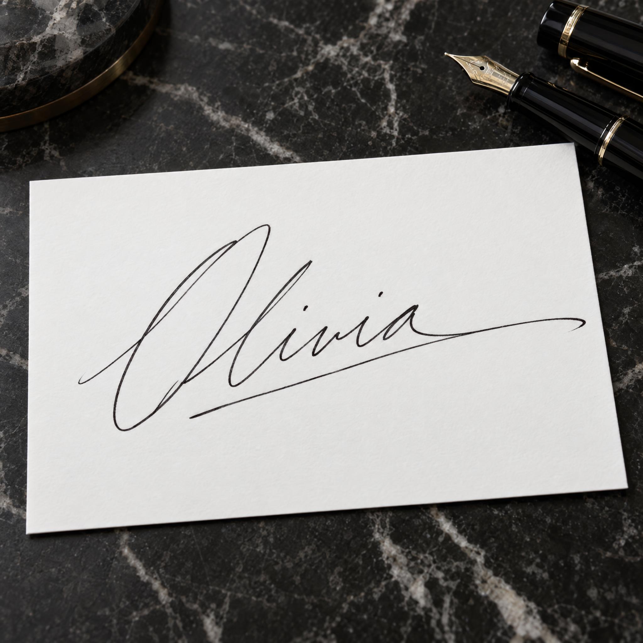
| A real-looking signature | Handwritten Signature | Blue ballpoint |
Handwriting has always looked like the tool that made it. Quill pens were the instrument of choice in medieval Europe and went into decline after the steel dip pen was invented in Britain in the early 1800s. In Birmingham, John Mitchell started to mass-produce pens with metal nibs in 1822, and by 1830 the Mitchells, Joseph Gillott and Josiah Mason were the city's major makers. The pencil ran alongside: a large deposit of graphite was found in Borrowdale, England, in 1565 (some sources say as early as 1500), and in 1795 Nicolas-Jacques Conté found a way to mix powdered graphite with clay.
The 20th century put ink in every pocket. Fountain pens, developed in the very late 19th century, slowly displaced the dip pen, and the ballpoint, invented by László Bíró in 1938, is often blamed for finishing it off. Felt tips followed: Sidney Rosenthal's Magic Marker in 1953, Pentel's fibre-tipped Sign Pen in 1963 and the Sharpie, the first pen-style permanent marker, in 1964. Each pen brought its own handwriting: the thin blue line of a ballpoint note, the scratchy felt-tip scrawl, the heavy marker sign. Classrooms added two more: chalk on a blackboard, first attested in the United States in a mathematics course on 21 September 1801, and the wax crayon, which Crayola first sold eight to a box, for a nickel, in 1903.
Type followed handwriting onto the screen. In 1994 Microsoft designer Vincent Connare made Comic Sans, based on the lettering of comic books in his office such as The Dark Knight Returns and Watchmen, because Times New Roman looked too formal in the cartoon speech bubbles of Microsoft Bob. A font still repeats each letter exactly, which is why OpenType registers a Randomize feature to emulate the irregularity of handwriting with alternate shapes. An image prompt starts from the other end: it draws every letter fresh, so the handwriting on this page varies the way a real hand does.
Sources: Wikipedia — Quill · Wikipedia — Dip pen · Wikipedia — Pencil · Wikipedia — Marker pen · Wikipedia — Pentel · Wikipedia — Sharpie (marker) · Wikipedia — Blackboard · Crayola — What were the original eight (8) colors in the 1903 box of Crayola Crayons? · Wikipedia — Comic Sans · Microsoft Learn — Registered features, p-t (OpenType 1.9.1)
Everyday print handwriting in blue ballpoint.
Hasty felt-tip letters, each a different size.
Bold capitals from a chisel-tip permanent marker.
White chalk capitals on a café blackboard.
A young child's wobbly letters in bright wax crayon.
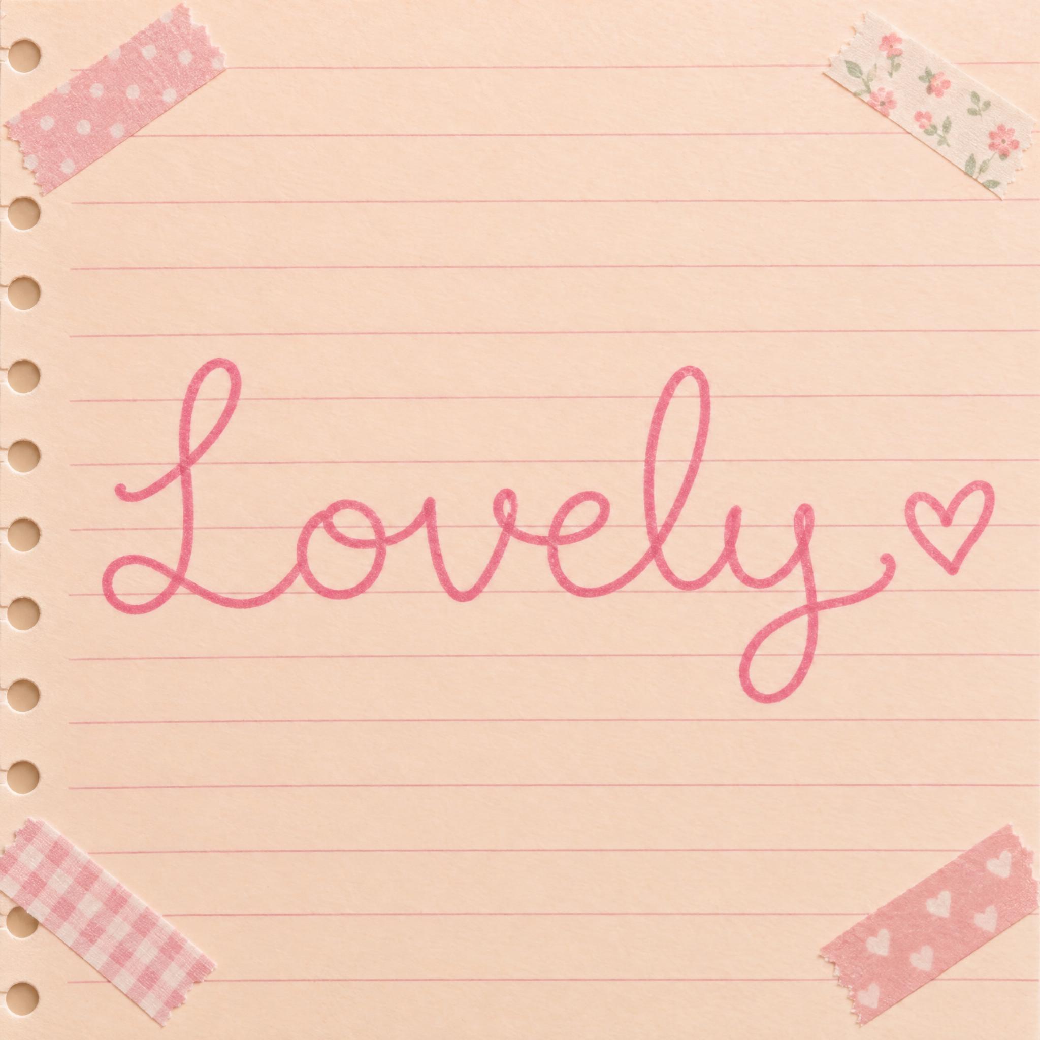
Bouncy joined letters with a heart at the end.
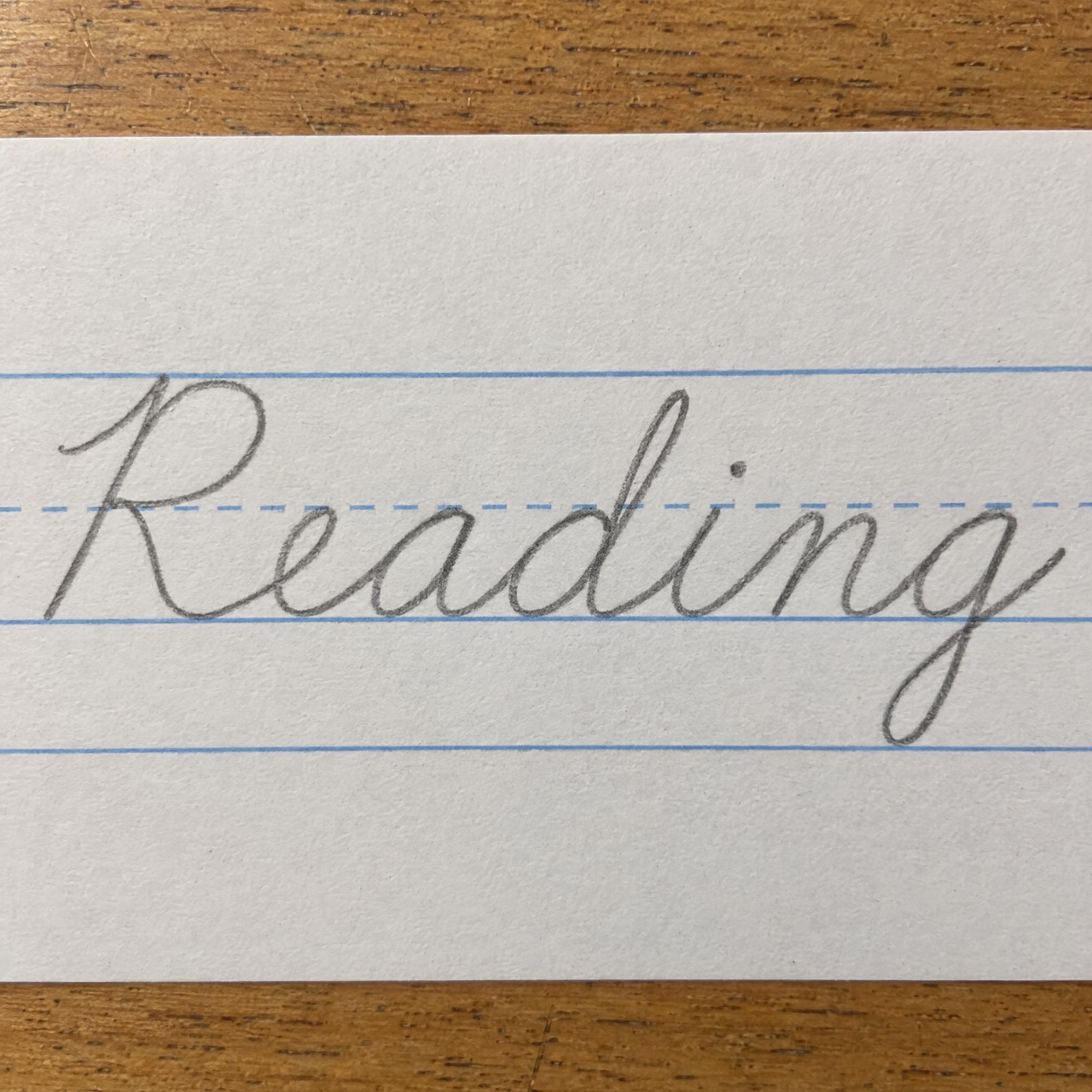
Connected handwriting, from school charts to retro scripts.
Names written the way people sign them.
Smooth brush pen lettering with thick and thin strokes.
Lettering that looks written by hand rather than typed: notes, scrawls, marker signs, chalkboards and children's letters. On AIFont each one is an AI prompt that draws your own word in that hand, with letters that vary the way real writing does.
It works as one for images. Type your word in the box at the top, copy the prompt and paste it into ChatGPT, Gemini, Grok, Seedream or Qwen, or press Generate on FontVibe to make it right away and compare models. The result is a picture of your word, not a font you install.
No. These prompts draw a believable hand, not yours. To type in your own handwriting you need a font file made from samples of your letters, which services such as Calligraphr build. Use this page when you want a handwritten look for a word or name as an image.
No. They are prompts, not .ttf or .otf files. You get your word as a finished image in which no two letters are quite the same, which an installed font can't do.
Realistic Handwriting Font: everyday print in blue ballpoint, uneven in size and spacing like a real note. For a rushed look, use Messy Handwriting Font.
Copying the prompts on AIFont is free. What you may do with the image depends on the terms of the app that generated it, so check that app's rules before you print or sell.