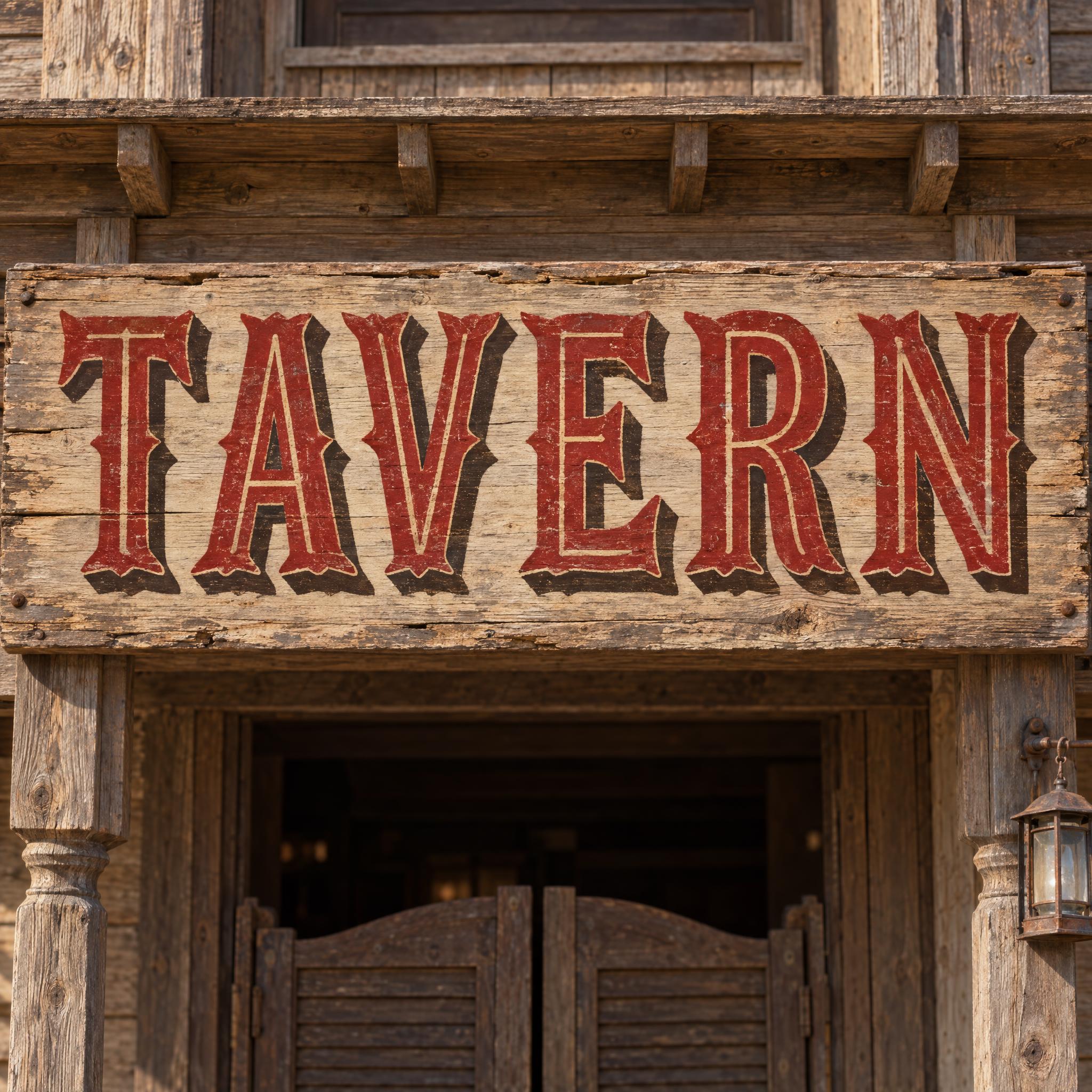
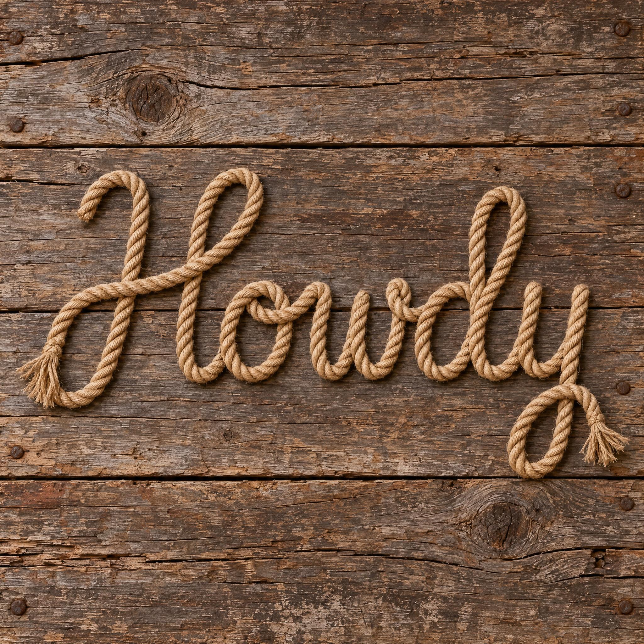
Western fonts as copy-ready AI prompts, in the three looks people mean by cowboy lettering: heavy wood type on a worn wanted poster, ornamental Tuscan letters on a painted saloon sign, and a word spelled out in lasso rope. These are prompts, not font files: type your word, copy, and paste into ChatGPT or Gemini, or generate it right away on FontVibe.

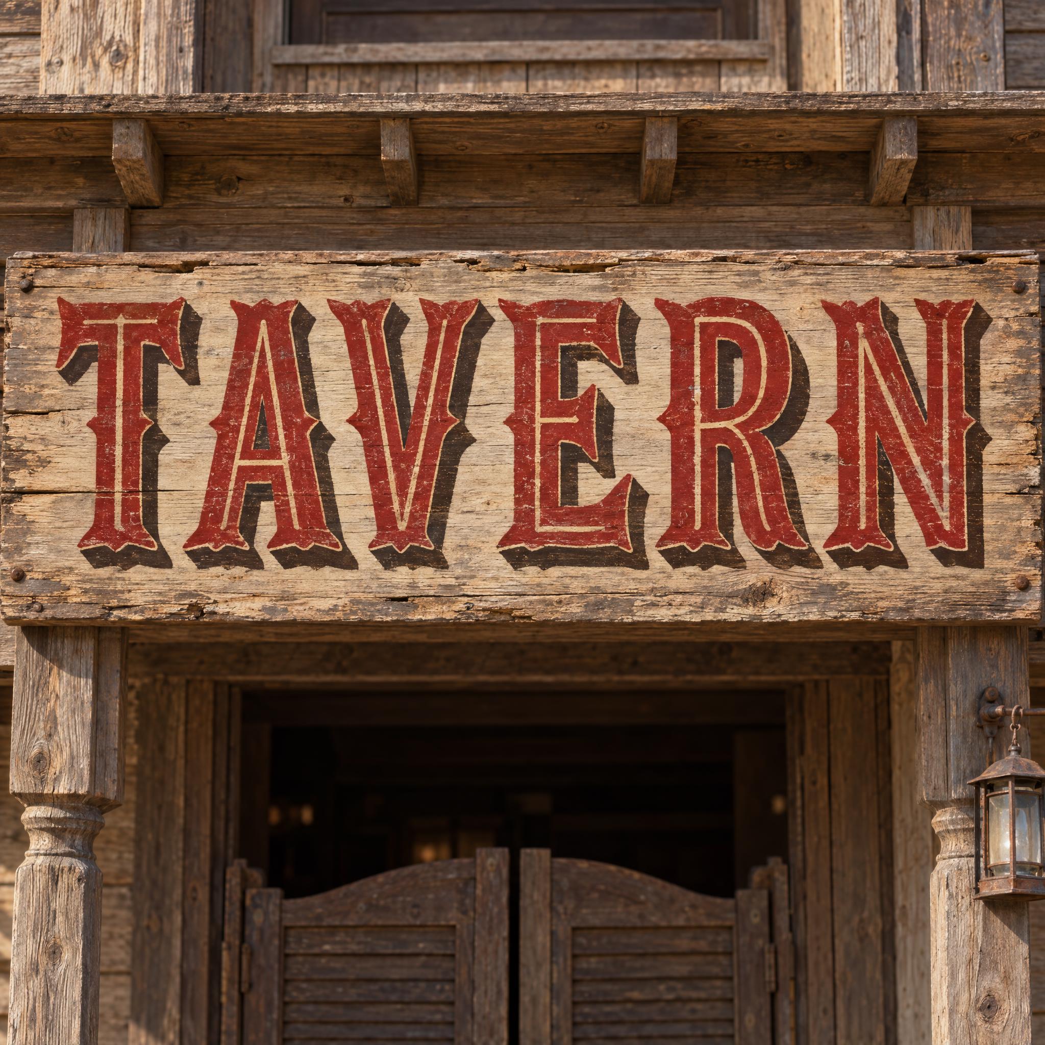
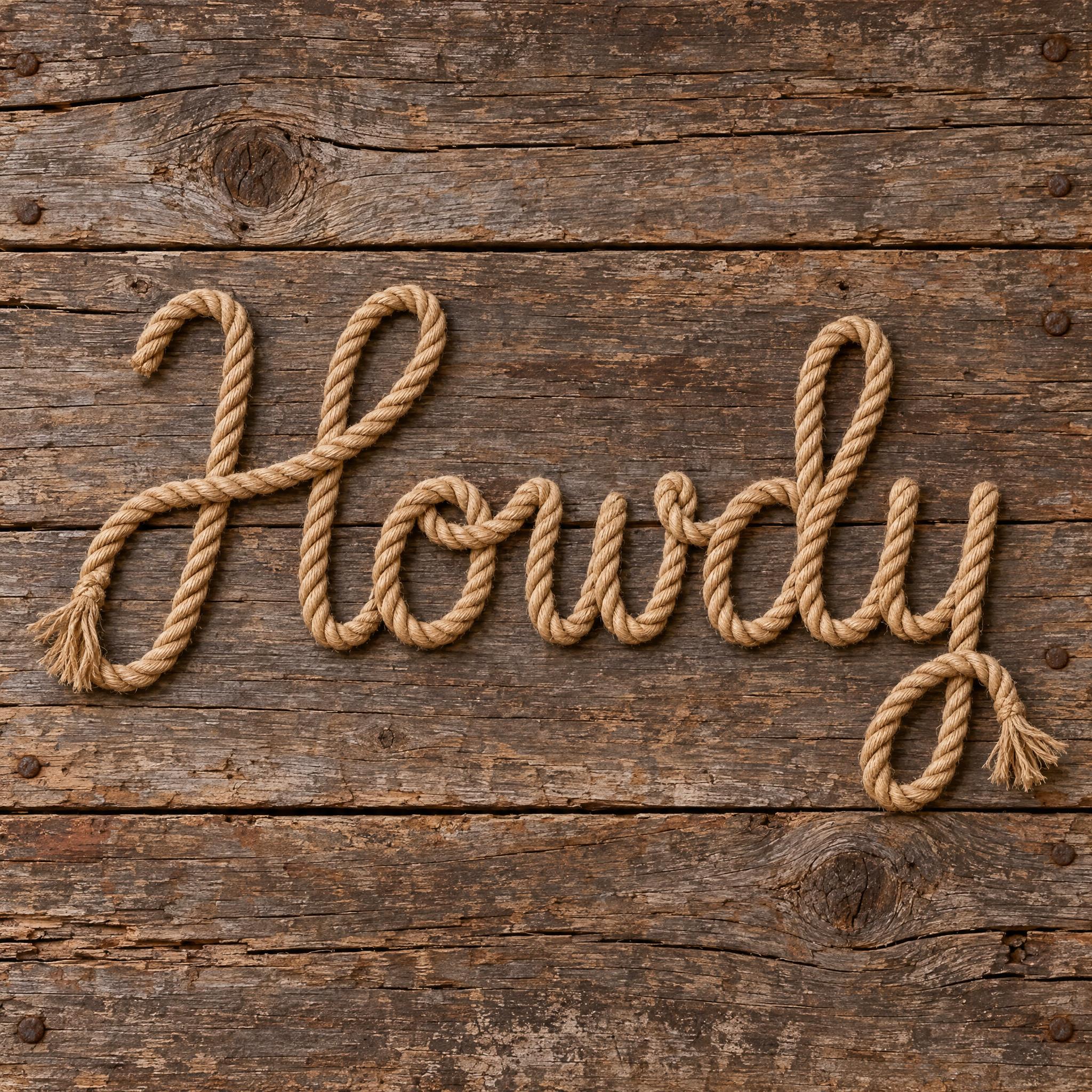
Type your word, copy the full prompt and paste it into ChatGPT, Gemini or any image model.

TextWrite the word "WANTED". Spell it exactly as written, without adding or changing any letter.
Font designWanted-poster lettering: heavy wood-type capitals with thick slab serifs, like nineteenth-century Clarendon poster type, set tight and slightly condensed, every letter reads at a glance. The letters are printed in ink pressed into the paper, with uneven coverage, small worn gaps and rough edges where the old wooden blocks have chipped. Every letter is dark brown-black ink. Like the headline on an Old West wanted poster.
ScenePrinted on a yellowed poster nailed to a plank wall, with no other text; the word is centered, fills most of the width and reads clearly.
Open one for the prompt and real results on each image model.
Tested November 2026. First attempts from our test ledger: 110 images, 3 fonts, 7 languages, each one checked by eye.
How to read it: 17 / 22 means 22 images tested and 17 spelled the word right on the first try; the percentage is that share. The Latin, Chinese / Japanese and Arabic columns split the same count by the script of the word.
| Model | Right first time | Latin | Chinese / Japanese | Arabic | Most common issue |
|---|---|---|---|---|---|
| GPT Imagegpt-image-2.5-sunburst · xhigh | 100% 22 / 22 | 100% 12 / 12 | 100% 6 / 6 | 100% 4 / 4 | None recorded |
| Nano Bananagemini-nano-banana-2.1 | 100% 22 / 22 | 100% 12 / 12 | 100% 6 / 6 | 100% 4 / 4 | None recorded |
| Seedreamdola-seedream-5-0-pro-260628 | 77% 17 / 22 | 92% 11 / 12 | 100% 6 / 6 | 0% 0 / 4 | Style drifted |
| Grok Imaginegrok-imagine-image-2.0 · medium | 95% 21 / 22 | 100% 12 / 12 | 100% 6 / 6 | 75% 3 / 4 | Wrong dots or accents |
| Qwen-Imageqwen-image-3.0-pro | 77% 17 / 22 | 83% 10 / 12 | 83% 5 / 6 | 50% 2 / 4 | Style drifted |
How we test: images are made through FontVibe with each model’s API, sending the prompt as is; we count only each model’s first image for every font and language and check the spelling by eye. Apps such as ChatGPT may rewrite prompts, so results there can differ. For the full data, email [email protected].
Western is not one letterform but a family that grew out of nineteenth-century printing and sign painting. A good western prompt picks one branch and builds it in layers: the letter skeleton, the material or surface treatment, one colour sentence, a real object to point at, and a scene from the Old West. The examples are quoted word for word from the prompts of the fonts on this page.
The three western looks have different bones: heavy slab serifs for a poster, split Tuscan serifs for a sign, a joined script for rope. Name the type itself, because Clarendon or Tuscan tells a model far more than the word western.
“Wanted-poster lettering: heavy wood-type capitals with thick slab serifs, like nineteenth-century Clarendon poster type, set tight and slightly condensed, every letter reads at a glance.” — Wanted Poster Font
Western display type is full of small details. Say exactly where they sit, so every model draws the same ones instead of inventing its own flourishes.
“Saloon lettering: bold Tuscan wood-type capitals, where every stroke ends in a forked, pointed serif and each upright has a small spur at its middle, every letter reads at a glance.” — Saloon Font
Old western lettering was printed, painted or tied, never drawn on a screen. One sentence about the process does more for the look than any adjective: ink pressed into paper, paint on a board, a real rope.
“The letters are printed in ink pressed into the paper, with uneven coverage, small worn gaps and rough edges where the old wooden blocks have chipped.” — Wanted Poster Font
If the letters are made of something, describe what makes that material read: for rope, the twist and an even thickness, or models will draw a brown line.
“The rope shows clear spiral twists along its whole length and stays the same thickness everywhere; at the start and the end of the word its strands fray into a short tassel.” — Rope Font
Western palettes are narrow: brown-black ink, deep red with cream, natural tan. Keep colour in its own short sentence so you can change it without touching the letters.
“Every letter is deep red, with a cream centre line and a dark brown shadow.” — Saloon Font
End the style with something the model has seen many times: the headline of a wanted poster, a saloon sign, a lasso. It pulls the whole image toward the right century.
“Like the headline on an Old West wanted poster.” — Wanted Poster Font
A plank wall, a saloon front or barn boards finishes the look. Add with no other text: western scenes invite extra lines such as DEAD OR ALIVE or EST. 1880, and extra words come out misspelled.
“Printed on a yellowed poster nailed to a plank wall, with no other text; the word is centered, fills most of the width and reads clearly.” — Wanted Poster Font
Western lettering is nineteenth-century commercial type that the movies froze in place. Large metal type was heavy and expensive, so poster headlines were set in wood type. Darius Wells mechanised its production in the 1820s and published his first known catalogue in New York in 1828; William Leavenworth's pantograph of 1834 let one pattern be copied again and again, and by the end of the century J. E. Hamilton's company in Two Rivers, Wisconsin, founded in 1880, dominated American wood type.
Three families from that trade make up the western look. Clarendon, released by Robert Besley's Fann Street Foundry in London in 1845, gave the heavy slab serif most associated with wanted posters. Ornamental faces sold as Tuscan had pointed, split serifs. And reverse-contrast type, first shown by the Caslon foundry around 1821 as Italian and combined with Clarendon serifs as French Clarendon from 1854, became so tied to wild-west printing and circus bills that one was nicknamed the circus letter.
The objects did the rest. Wanted posters, put up in post offices and public places, were printed in black and white for a long time. Saloons and stores hung painted boards. And the cowboy's working rope, the lasso, from the Spanish lazo, had been used to rope cattle from horseback since the vaqueros of the sixteenth and seventeenth centuries. Western films and shows reused all three, which is why western font today means a poster, a sign or a rope rather than one typeface.
Sources: Wikipedia — Wood type · Wikipedia — Clarendon (typeface) · Wikipedia — Reverse-contrast typeface · Wikipedia — Wanted poster · Wikipedia — Lasso
Heavy slab-serif wood type in worn, chipped brown-black ink.
Tuscan forked serifs with a cream centre line and a drop shadow.
A joined script made from one twisted lasso rope.
Flowing cowboy script painted on leather or wood. Coming later.
A western font is lettering that looks like the American Old West: heavy wood type from wanted posters, ornamental Tuscan letters from saloon signs, or rope tied into words. On this page each style is an AI prompt that draws your own word in that look.
Yes. People search for cowboy, wild west, rodeo and western fonts and mean the same family, so this page covers all of them.
Wanted Poster Font: heavy Clarendon-style slab serifs printed in worn ink. It makes the headline only; add the photo, name and reward in an editor.
Saloon Font. Its forked serifs, centre line and shadow are the sign-painter look, and the scene can be switched to a bottle label or a menu.
No. They are prompts that make a picture of your word with an AI image model, not font files. If you need to type long text, look for a western font file; these are for a finished headline, sign or logo as an image.