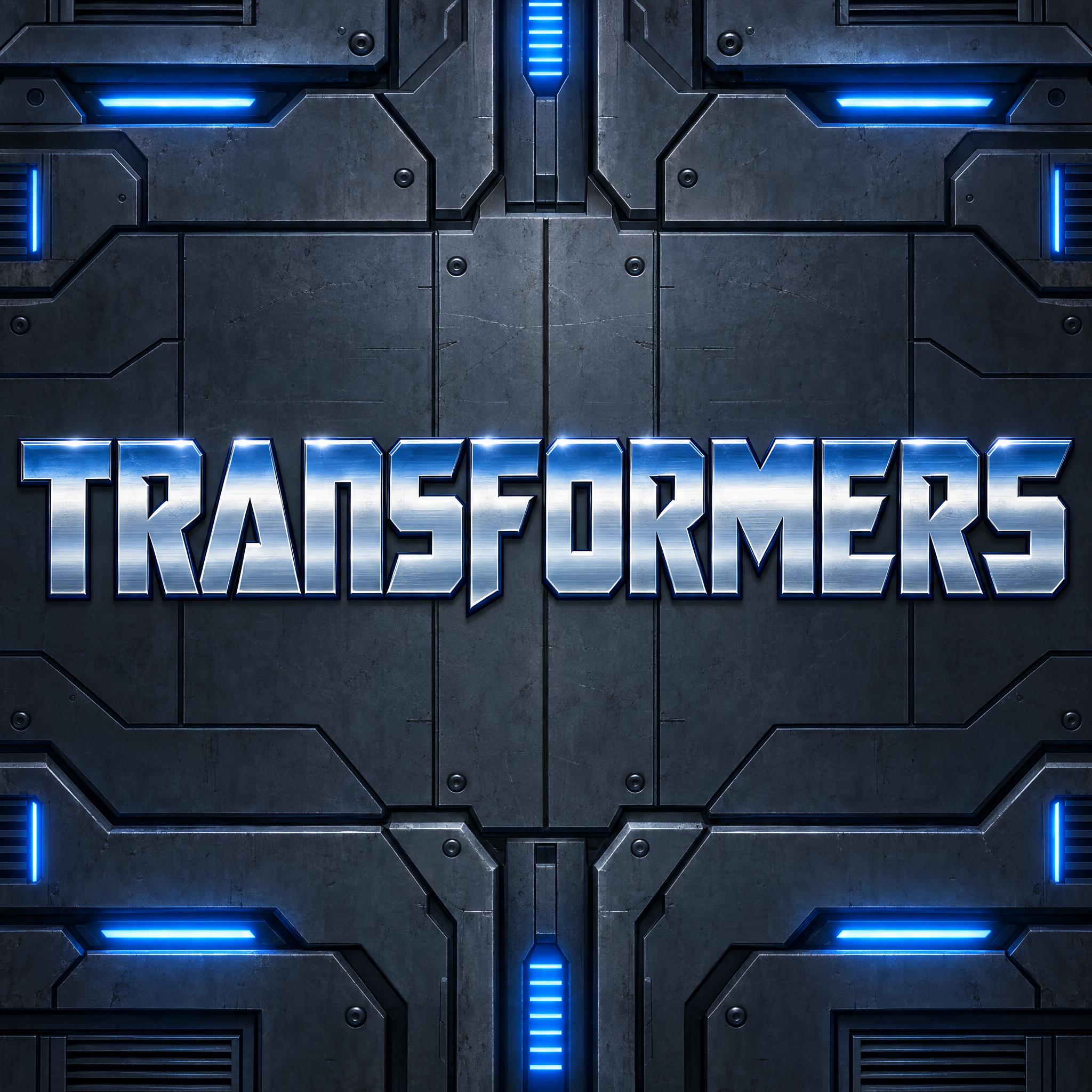
Heavy, wide, squared-off capitals cut with small notches like machine parts, in polished chrome banded from steel blue to silver.
TextWrite the word "TRANSFORMERS". Spell it exactly as written, without adding or changing any letter.
Font designRobot cartoon title lettering: heavy, wide, squared-off capital letters built from straight blocks and sharp angles, with small angular notches and narrow gaps cut into the strokes, so each letter looks assembled from machine parts. The letters are tightly spaced on a level baseline. Each letter is polished chrome, banded from steel blue at the top through bright silver to pale blue-grey at the bottom, with a crisp white glint along the top edge. Each letter has a thin dark navy outline.
SceneOver a dark metal panel wall lit by glowing blue lights; the title is centered, spans most of the width, reads clearly and is the only text in the image.
127 words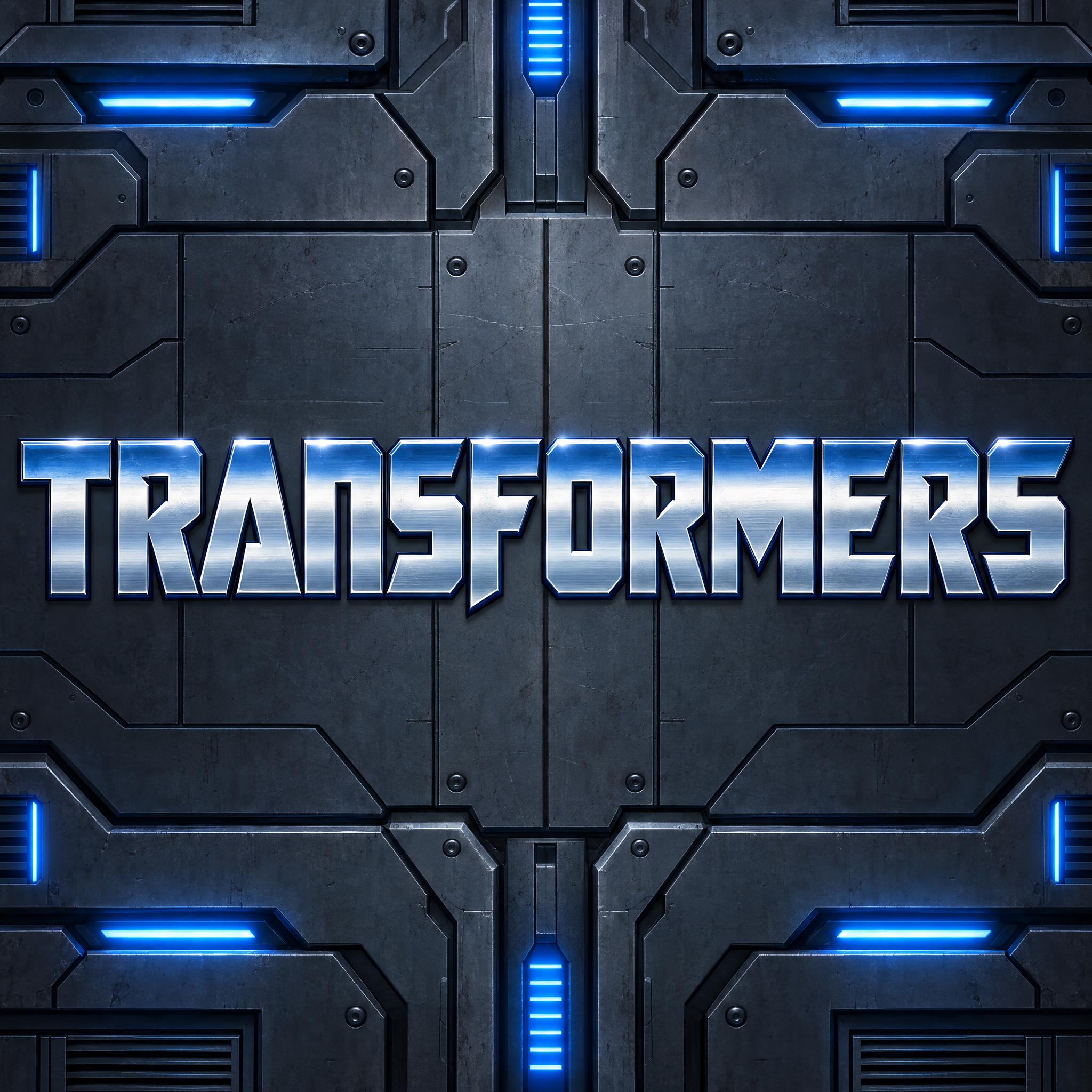
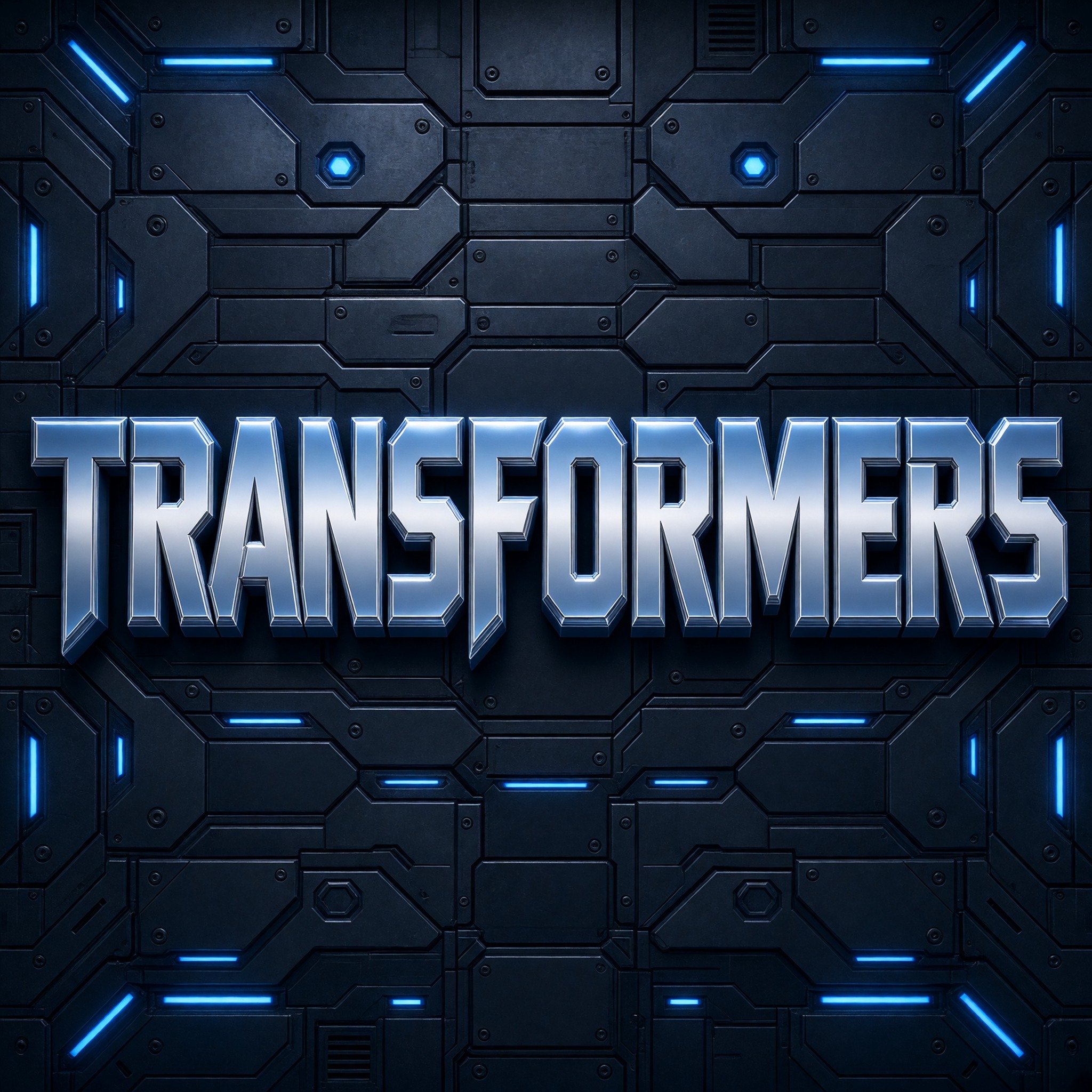
One prompt pasted into each image model as-is. These are the unedited results, so you can pick the model that suits you.
The closest to the classic title: clear steel-blue-to-silver bands, notches in every letter and an F that dips below the line.
The biggest letters with the deepest bevel, on a hexagon-panel wall.
Taller, narrower letters with crack-like notches, a lens flare and blue sparks behind.
Chrome that fades almost to white at the top, between rows of glowing panel lights.
Smaller letters on a plain dark wall, with a more saturated blue in the chrome.
The button opens FontVibe in DIY mode with this prompt already in it, unchanged. Type your words, pick a model and generate. GPT Image, Nano Banana, Seedream, Grok and Qwen are all in one account, so you can see which one draws the notches and the blue-to-silver bands best without signing up to five apps. Every account gets free credits each month with no card needed, and you can export a transparent PNG to drop the title onto an invitation or a toy box label.
Layers in the order the prompt states them. Change one layer and the rest keeps working.
Every AIFont prompt opens with the same text part. "Spell it exactly as written, without adding or changing any letter" matters here because the notches cut letters into parts: an F with a gap can look like two pieces, and a long word such as TRANSFORMERS gives models room to drop a letter.
"Robot cartoon title lettering" points the model at the title of an animated robot show without naming one, so the result stays clean and bright instead of turning into a scratched, battle-damaged movie logo.
"heavy, wide, squared-off capital letters built from straight blocks and sharp angles" sets the frame: no curves, so an O becomes a rounded-off box and an S a run of straight segments. Narrow letters here would read as a sci-fi poster.
"with small angular notches and narrow gaps cut into the strokes, so each letter looks assembled from machine parts" is what turns a block letter into a robot letter. Leave it out and you get plain chrome capitals. Too many cuts and the word stops reading, which is why the prompt says small and narrow.
"The letters are tightly spaced on a level baseline" keeps the word as one solid bar, the way a toy package logo sits. Loose spacing makes it look like a game menu.
"Each letter is polished chrome, banded from steel blue at the top through bright silver to pale blue-grey at the bottom" is the colour line and the material in one: chrome, but tinted in horizontal bands. Change the three colours to recolour it and keep the word chrome.
"with a crisp white glint along the top edge" puts one bright line of light along every letter's top edge. It makes the metal look polished rather than painted grey.
"Each letter has a thin dark navy outline" separates tightly packed letters from each other and from a dark background. Black also works; navy keeps it in the blue family.
"Over a dark metal panel wall lit by glowing blue lights" sets the stage; "is the only text in the image" stops models adding faction badges or extra words around the title. Swap this part for your own use.
Small edits that stay on-style. Change one thing at a time.
Type them in the box next to Prompt above and copy again. The title is one line, so a single word or a short name works best, such as a child's name or ROBOT PARTY. Long words still work; they just get smaller to fit the width.
Swap "Each letter is polished chrome, banded from steel blue at the top through bright silver to pale blue-grey at the bottom" for "Each letter is polished chrome, banded from deep red at the top through bright silver to pale grey at the bottom", "Each letter is polished chrome, banded from purple at the top through bright silver to pale lilac at the bottom" or "Each letter is polished chrome, banded from gold at the top through bright silver to pale cream at the bottom".
Replace "Over a dark metal panel wall lit by glowing blue lights" with "Printed on a birthday party invitation card", "On the lid of a toy storage box" or "Over a city skyline at night with searchlights".
The prompt sets no frame size. Pick the ratio in your app, or add "Wide 16:9 image." or "Tall 4:5 image." at the end. A one-line title like this suits 16:9 especially well, for a banner or a video thumbnail.
AI fonts that share the most tags with Transformers Font.
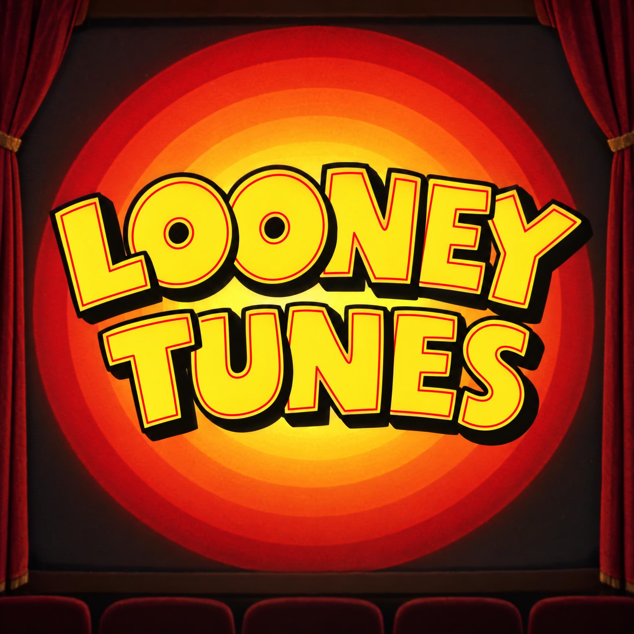
AI fonts for a second line, a logo lock-up or a poster footer.
Transformers Font draws your words like the title of a robot cartoon. The capitals are heavy, wide and squared off, built from straight blocks and sharp angles, and small angular notches and narrow gaps are cut into the strokes, so every letter looks bolted together from machine parts. They sit tight together on a level baseline. Each letter is polished chrome in horizontal bands, steel blue at the top, bright silver in the middle and pale blue-grey at the bottom, with a crisp white glint along the top edge and a thin dark navy outline.
Type your words in the box above the prompt, copy it and paste it into ChatGPT, Gemini, Grok, Qwen or Seedream. The prompt has three parts: the text, the font design and the scene. The font design makes the blocky notched letters and the blue-to-silver chrome; the scene hangs the title on a dark metal panel wall lit by blue lights, and you can swap it for your own. Every image on this page is what each model returned from the unchanged prompt, with no retouching.
Use it for a robot-themed birthday invitation, a toy box label, a fan title card or a gaming video thumbnail. The prompt describes how this kind of cartoon title is drawn and does not copy the official logo. The name and the logo belong to Hasbro, so keep what you make for parties, fan projects and personal use, not for products you sell.
Details from the original render. Every one of them is named in the prompt.
Wide, squared-off capitals built from straight blocks and sharp angles.
Small angular notches and narrow gaps cut into the strokes.
Polished chrome banded from steel blue through silver to blue-grey.
A crisp white glint along each letter's top edge, with a navy outline.
Pulled from the render. Handy when you build the rest of the design around the word.
Transformers began in 1984 as a toy line. Hasbro took transforming robot toys from Takara's Diaclone and Micro Change lines, which its product developer Henry Orenstein had found at the 1983 Tokyo Toy Fair, and rebranded them for Western markets. Hasbro had already launched G.I. Joe as a package of toys, a Marvel comic and a cartoon, and it repeated the plan: Jay Bacal came up with the name Transformers, and Marvel's editor-in-chief Jim Shooter sketched the war between the Autobots and the Decepticons. The animated series, made by Marvel Productions and Sunbow Productions with Japan's Toei Animation, aired from September 17, 1984, to November 11, 1987.
The title had to sell toys on a shelf, and the lettering does the job of the product: chunky letters that look bolted together, finished in metal. TFWiki's logo archive shows how it moved on. The packaging read The Transformers from 1984 to 1986, and the 1989 redesign dropped the article to read simply Transformers. The classic logo carried the franchise until a new one arrived in 2014.
The prompt keeps what makes that title recognisable on any words: heavy squared-off capitals cut with small notches, packed tight, in chrome banded from steel blue to silver with a white glint. It does not copy the logo. The name and the logo belong to Hasbro, so what you make is for parties, fan projects and personal posts, not merchandise.
Sources: Wikipedia — Transformers · Wikipedia — The Transformers (TV series) · TFWiki — Logo
Hasbro's Henry Orenstein finds Takara's Diaclone and MicroChange robots at the Tokyo Toy Fair.
The Transformers toy line launches, and the animated series premieres on September 17.
The classic Transformers logo is replaced by a new franchise logo.
All five spelled TRANSFORMERS correctly and drew blocky chrome letters. GPT Image comes closest to the classic title, with the clearest steel-blue-to-silver bands and machine-part notches. Qwen tints the chrome a different blue. In Chinese, three of the models left out most of the notches. Compare them side by side above.
No. The prompt describes how this kind of robot cartoon title is drawn: heavy squared-off capitals cut like machine parts, in blue-to-silver chrome. It is not the official artwork and does not copy the logo. The name and the logo belong to Hasbro (Takara Tomy in Japan), so use what you make for a party, a fan project or a personal post, not for shirts, stickers or prints you sell.
Yes. Type them in the box next to Prompt and copy again. Nothing in the prompt depends on particular letters: the notches, the chrome bands and the white glint work on any word. A name, ROBOT PARTY or a game title all work.
No. It is a prompt that makes a picture of your words with an AI image model, so there is no .ttf file and you cannot type with it. It works like a Transformers font generator that hands you a finished image.
Silver Letters is also wide, squared-off block capitals, but in mirror-polished stainless steel with steep bevels and hard black-and-white reflections, and the letters are solid. This one is cartoon chrome tinted in blue-to-silver bands, and its strokes are cut with small notches so each letter looks built from parts. For wide chrome with a neon glow instead, see Cyber Y2K Font.
Change only the chrome line, for example to "Each letter is polished chrome, banded from deep red at the top through bright silver to pale grey at the bottom". The notches, the glint and the outline stay the same.
Pick the ratio in your app if it has one. If not, add "Wide 16:9 image." or "Tall 4:5 image." at the end of the prompt.
Copying the prompt is free. Whether the image costs anything depends on the app you paste it into, and what you may do with the image depends on that app's terms.