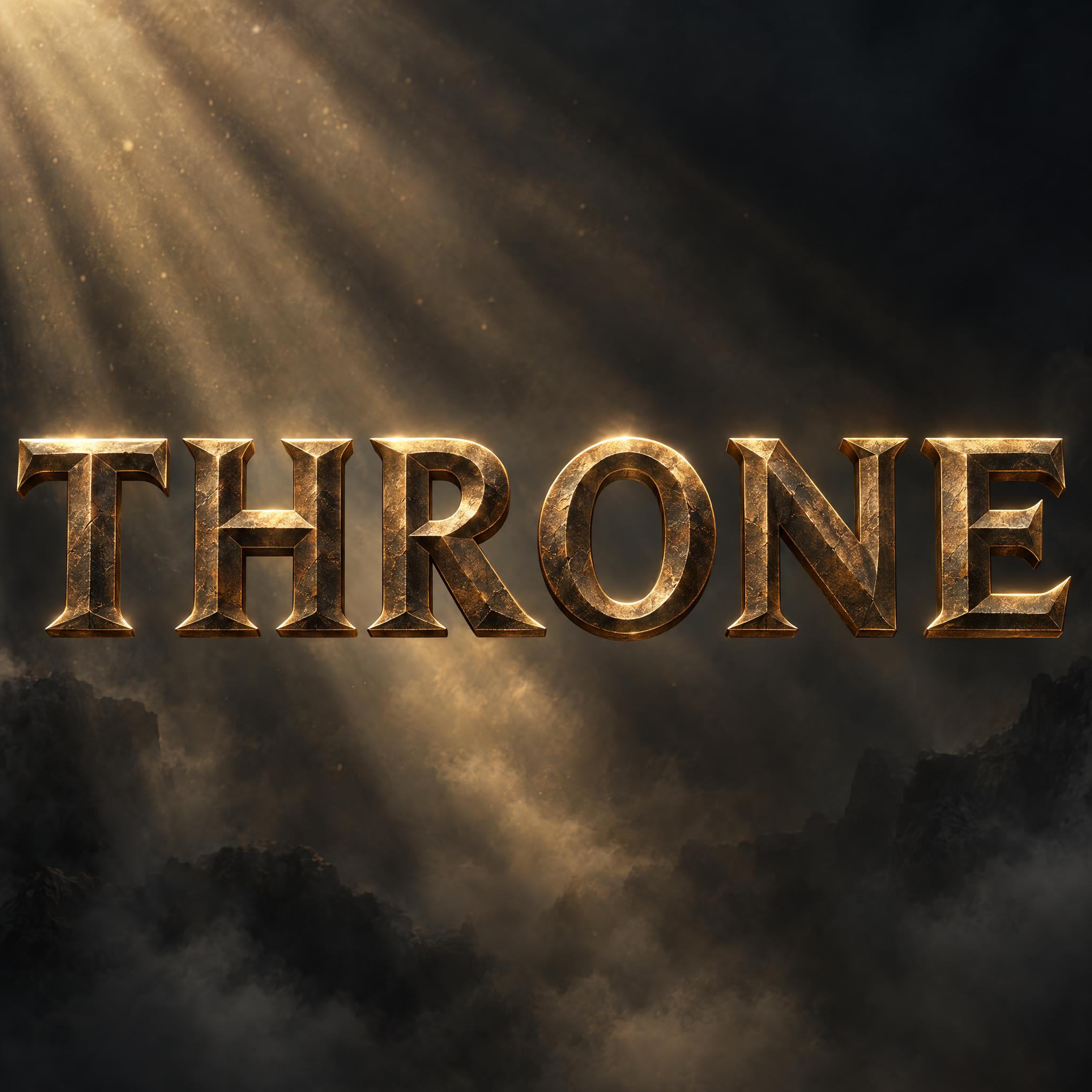
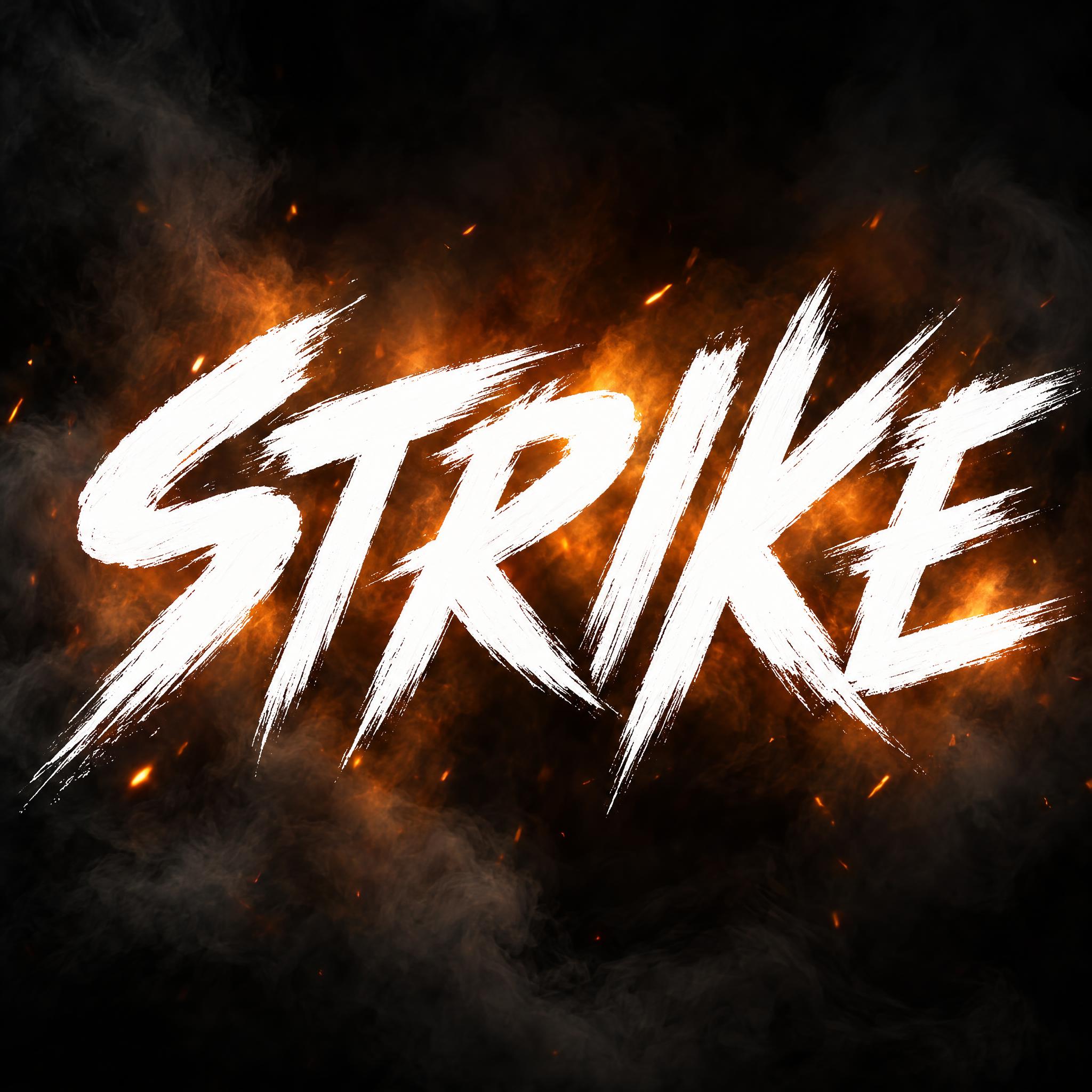
Movie fonts as copy-ready AI prompts: an epic poster title in Roman capitals, a hollow space-opera outline, an adventure title in steep perspective, a chunky animated logo and fan styles of dozens of famous film titles. These are prompts, not font files: type your word, copy, and paste into ChatGPT or Gemini.
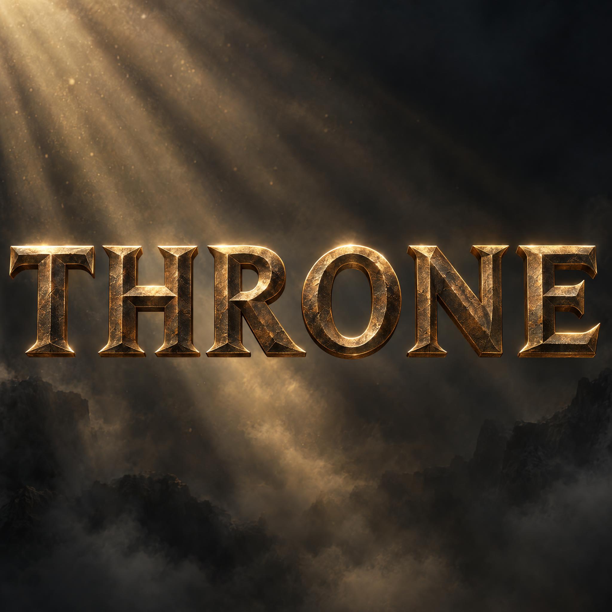
Type your word, copy the full prompt and paste it into ChatGPT, Gemini or any image model.
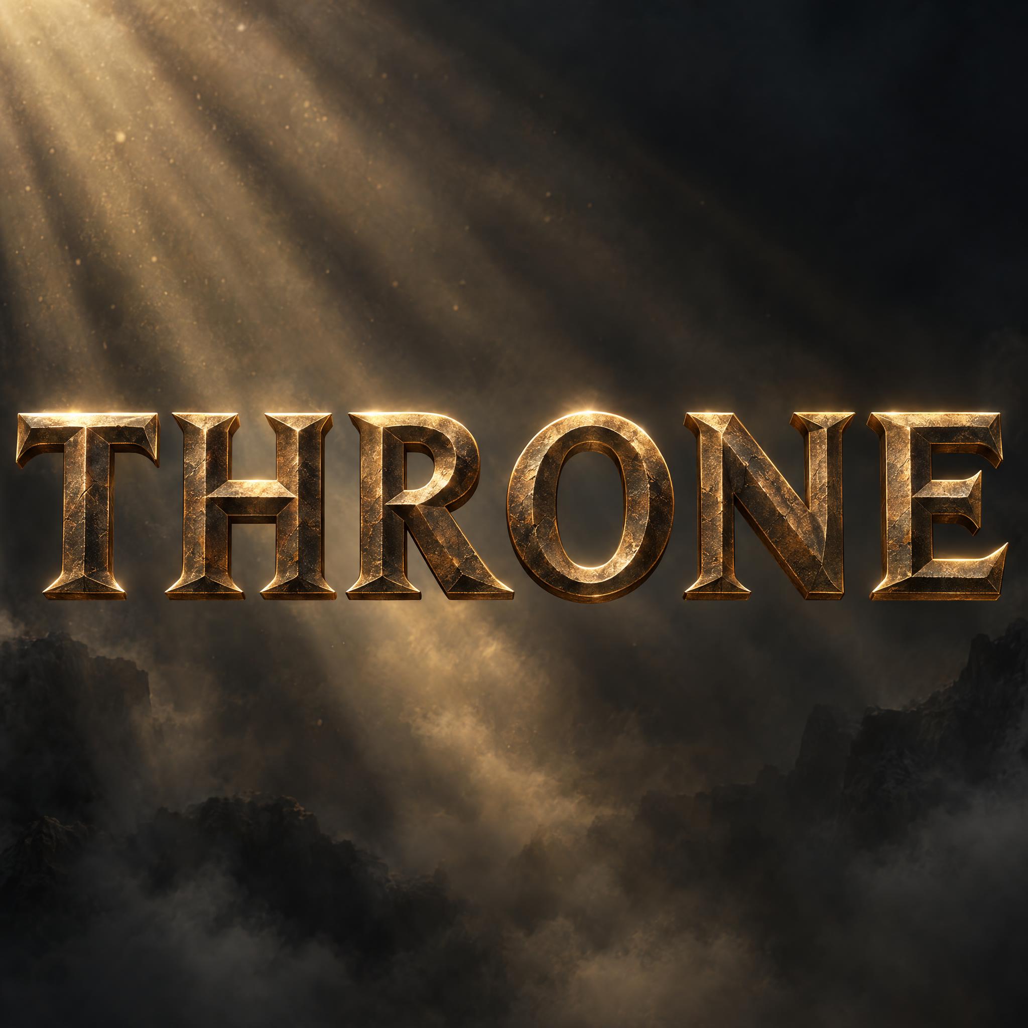
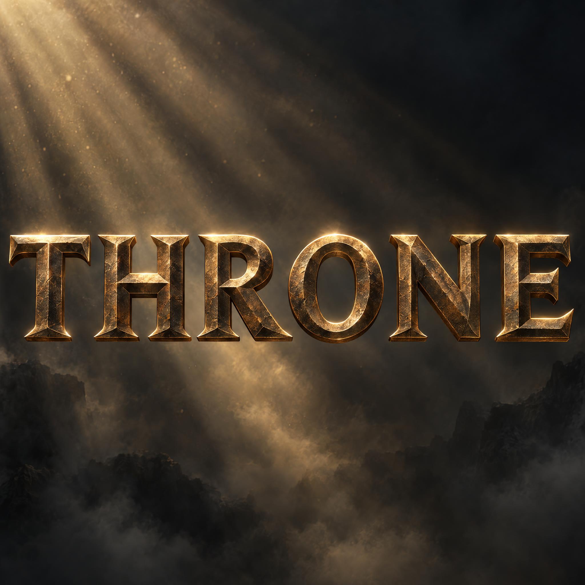
TextWrite the word "THRONE". Spell it exactly as written, without adding or changing any letter.
Font designEpic movie poster title lettering: wide classical Roman capital letters with sharp wedge serifs and moderate thick-and-thin strokes, widely spaced on one line; every letter reads at a glance. Every stroke is chiselled into two angled faces that meet in a sharp ridge down its middle. Each letter is a thick, solid metal block standing on its own, not carved into a wall. Every letter is dark antique bronze, turning warm gold along the lit ridges. A thin, bright rim of light traces the top and outer edges of every letter. Faint scratches and worn spots cover the metal. Like the title on a historical epic poster.
SceneFloating over a dark, misty backdrop with dusty light beams slanting behind the word; the word is centered, spans most of the width, reads clearly and is the only text in the image.
Open one for the prompt and real results on each image model.
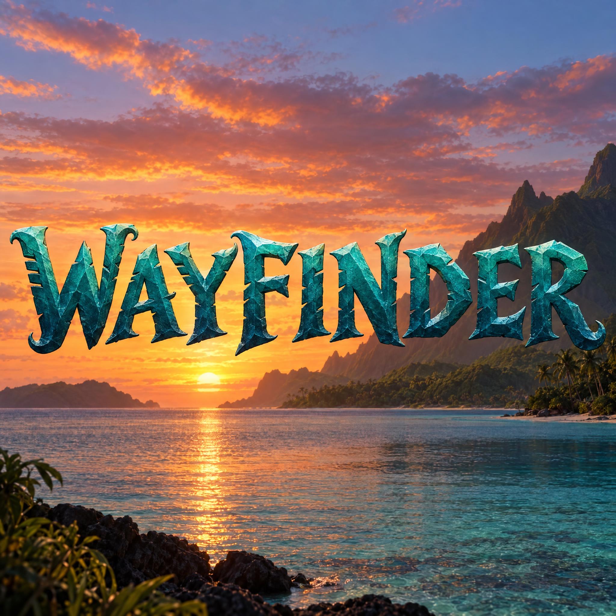
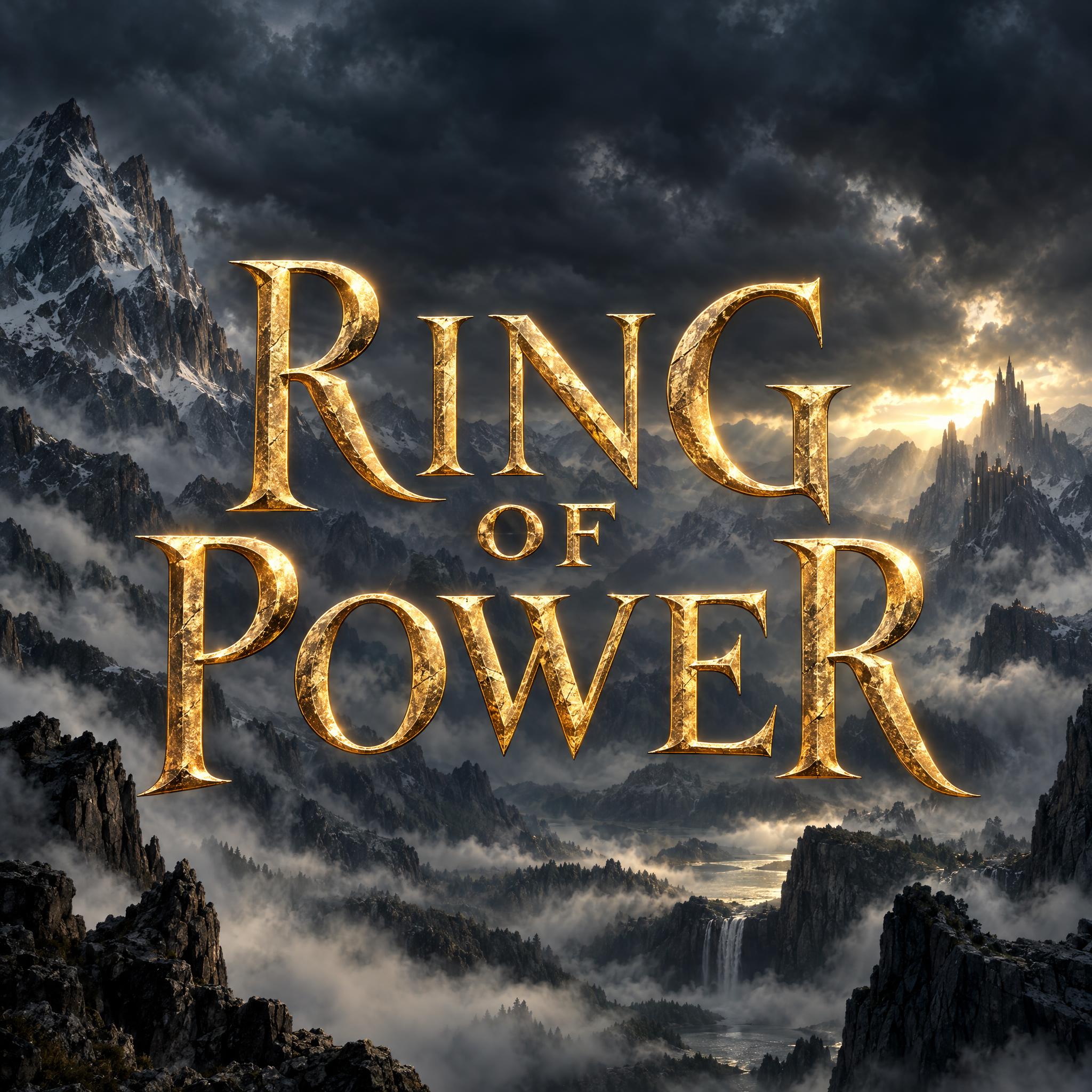
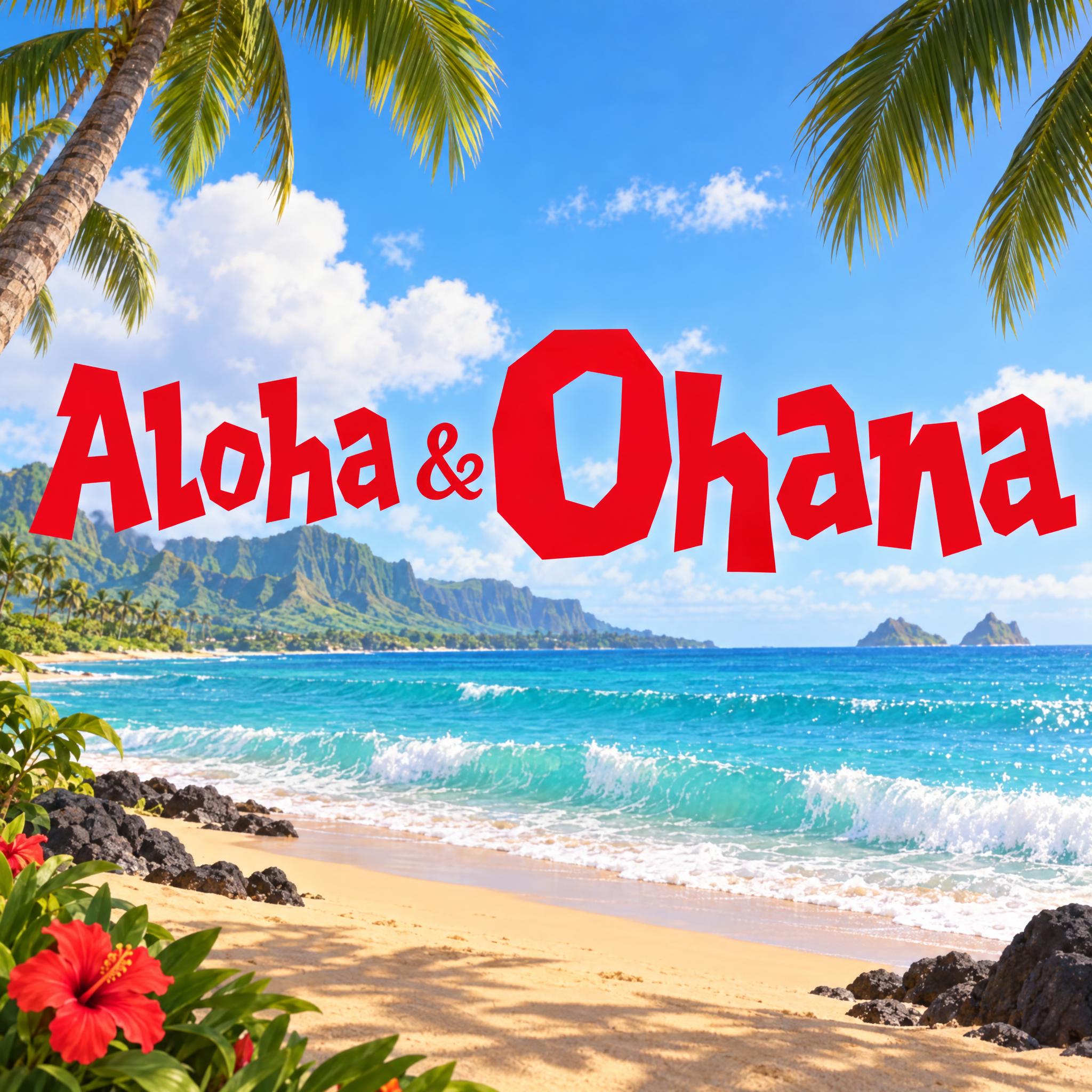
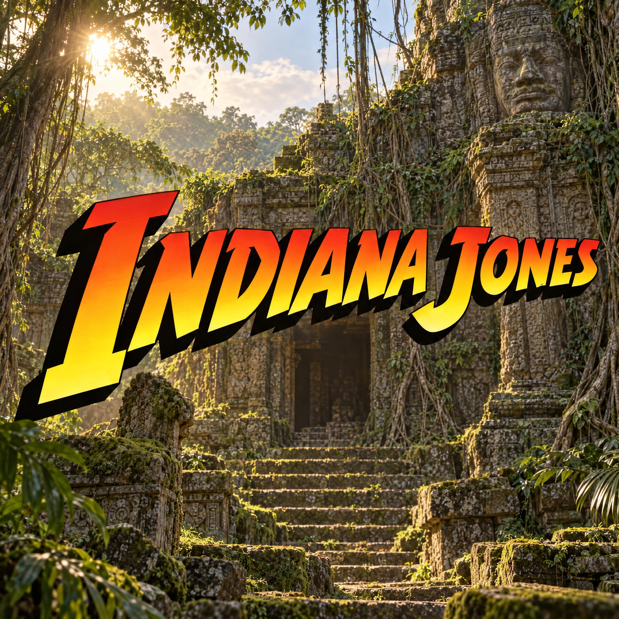
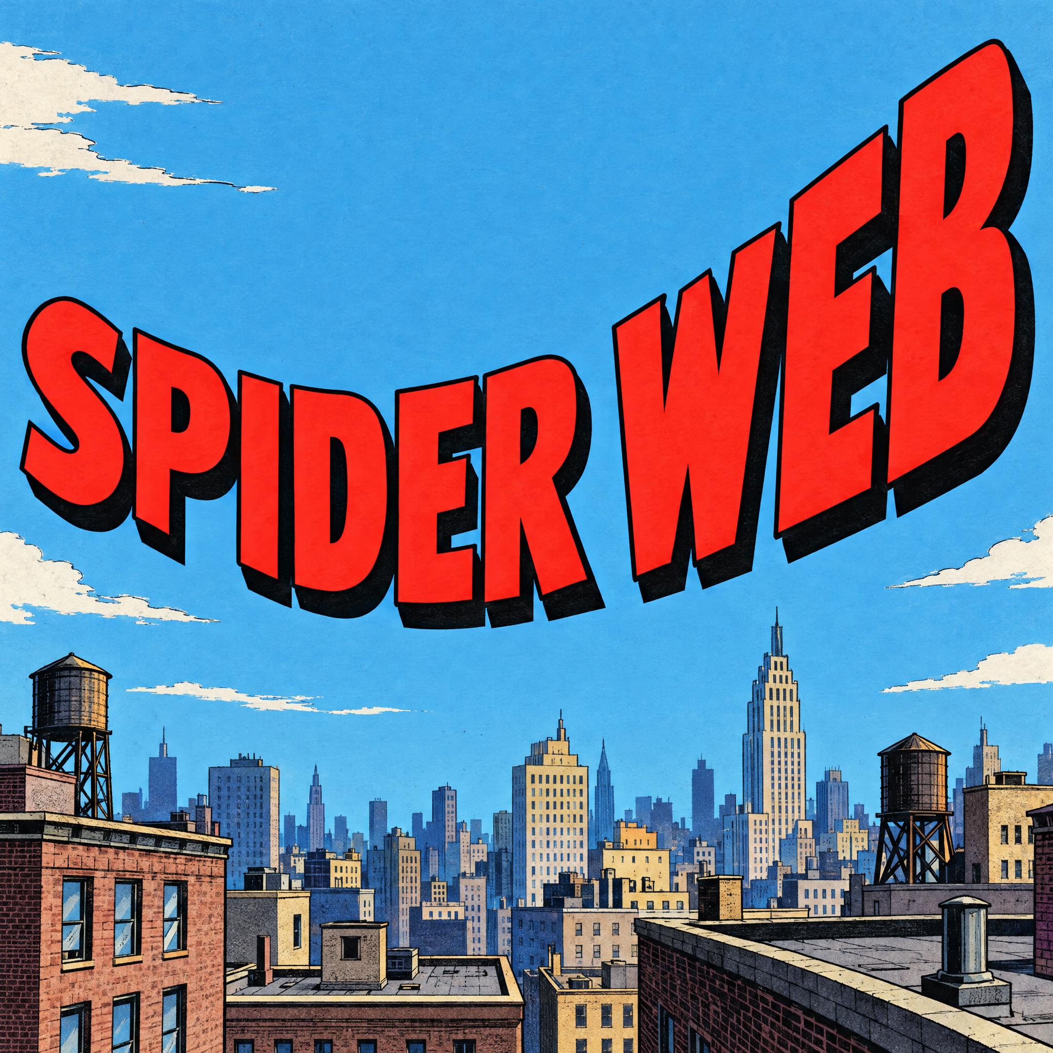
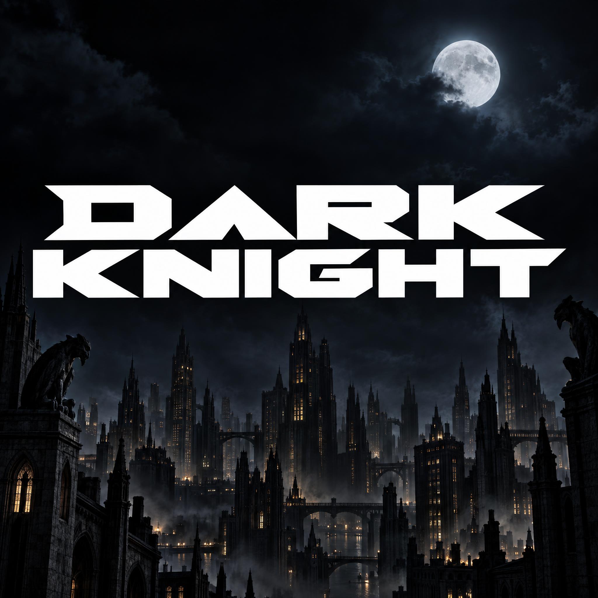
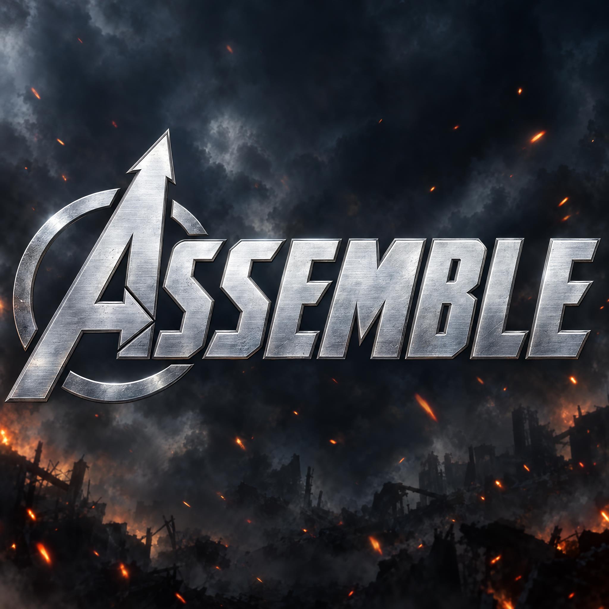
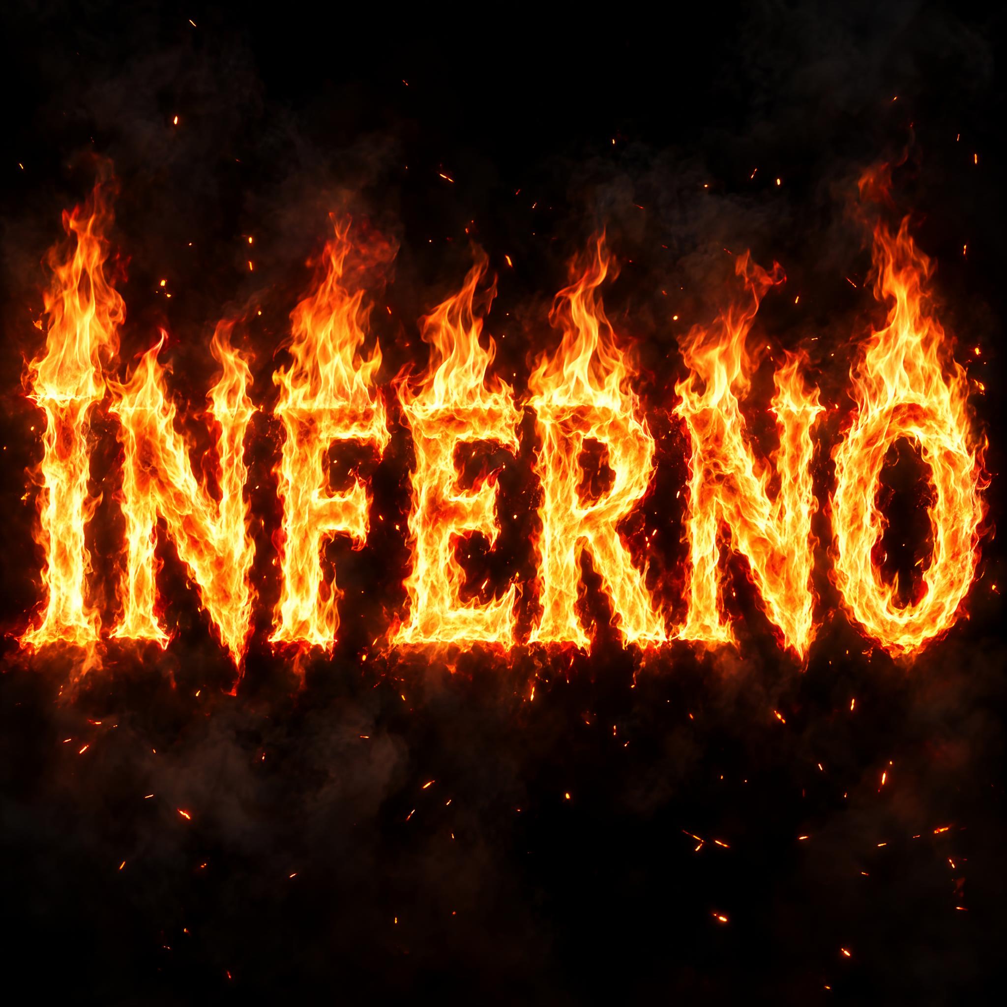
Tested October – November 2026. First attempts from our test ledger: 562 images, 20 fonts, 7 languages, each one checked by eye.
How to read it: 110 / 113 means 113 images tested and 110 spelled the word right on the first try; the percentage is that share. The Latin, Chinese / Japanese and Arabic columns split the same count by the script of the word.
| Model | Right first time | Latin | Chinese / Japanese | Arabic | Most common issue |
|---|---|---|---|---|---|
| GPT Imagegpt-image-2.5-sunburst · xhigh | 97% 110 / 113 | 100% 81 / 81 | 100% 22 / 22 | 70% 7 / 10 | Missing letter |
| Nano Bananagemini-nano-banana-2.1 | 89% 102 / 114 | 90% 73 / 81 | 91% 20 / 22 | 82% 9 / 11 | Style drifted |
| Seedreamdola-seedream-5-0-pro-260628 | 81% 87 / 108 | 83% 64 / 77 | 82% 18 / 22 | 56% 5 / 9 | Extra words added |
| Grok Imaginegrok-imagine-image-2.0 · medium | 84% 96 / 114 | 86% 70 / 81 | 77% 17 / 22 | 82% 9 / 11 | Letters out of order |
| Qwen-Imageqwen-image-3.0-pro | 68% 77 / 113 | 78% 63 / 81 | 59% 13 / 22 | 10% 1 / 10 | Extra words added |
How we test: images are made through FontVibe with each model’s API, sending the prompt as is; we count only each model’s first image for every font and language and check the spelling by eye. Apps such as ChatGPT may rewrite prompts, so results there can differ. For the full data, email [email protected].
A film title tells you the genre before you read the word. The prompts on this page build one in a fixed order: the genre, the letter shapes, one big gesture, the material, then the backdrop. The examples are quoted word for word from the prompts of the fonts on this page.
Every prompt here opens by saying what kind of film the title belongs to. Space opera, adventure, epic fantasy or an animated toy film each pull the model toward a different set of shapes before any detail is read.
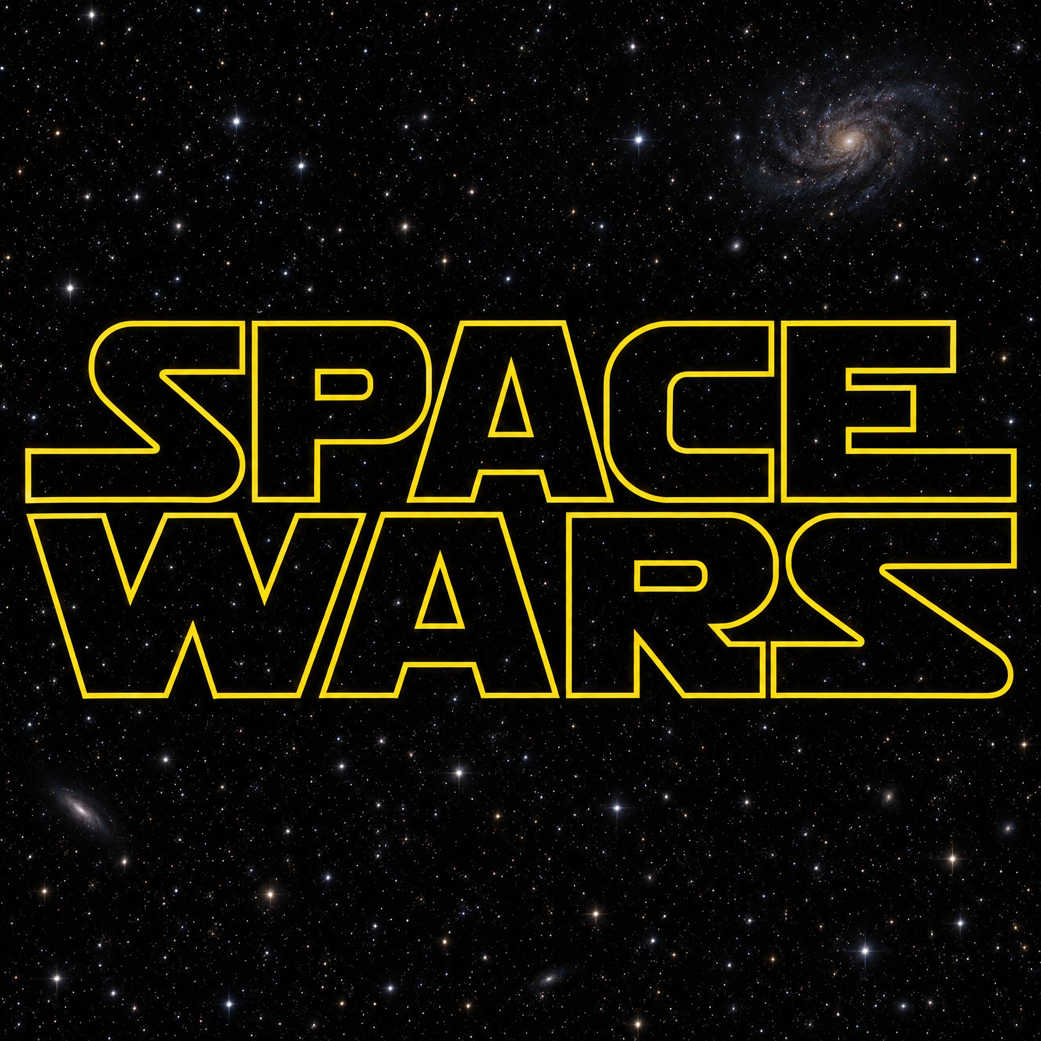
“Space opera movie title lettering on two lines” — Star Wars Font
Famous titles usually break the rules once: one giant first letter, a stroke that runs off as an arrow, a line that shrinks into the distance. Pick one and say exactly where it happens.
“The first letter is huge, much taller than the rest, its stroke dropping far below the baseline.” — Indiana Jones Font
Film titles often have several words. Say which words get their own line and what happens to the small words, or the model sets everything in one long row.
“With several words, each main word sits on its own centered line, and short little words between them are set small on a line of their own.” — Lord of the Rings Font
A thin outline over a dark sky reads as space; heavy solid letters with a shadow read as action. Say which, and what shows through.
“The letters are hollow: only a thin golden yellow outline is drawn, and the insides show the background.” — Star Wars Font
Steel, gold, fire or plastic tells the viewer the genre and the budget. A closing sentence that names the kind of poster ties the material to the right film.
“Like the title on a blockbuster superhero movie poster.” — Avengers Font
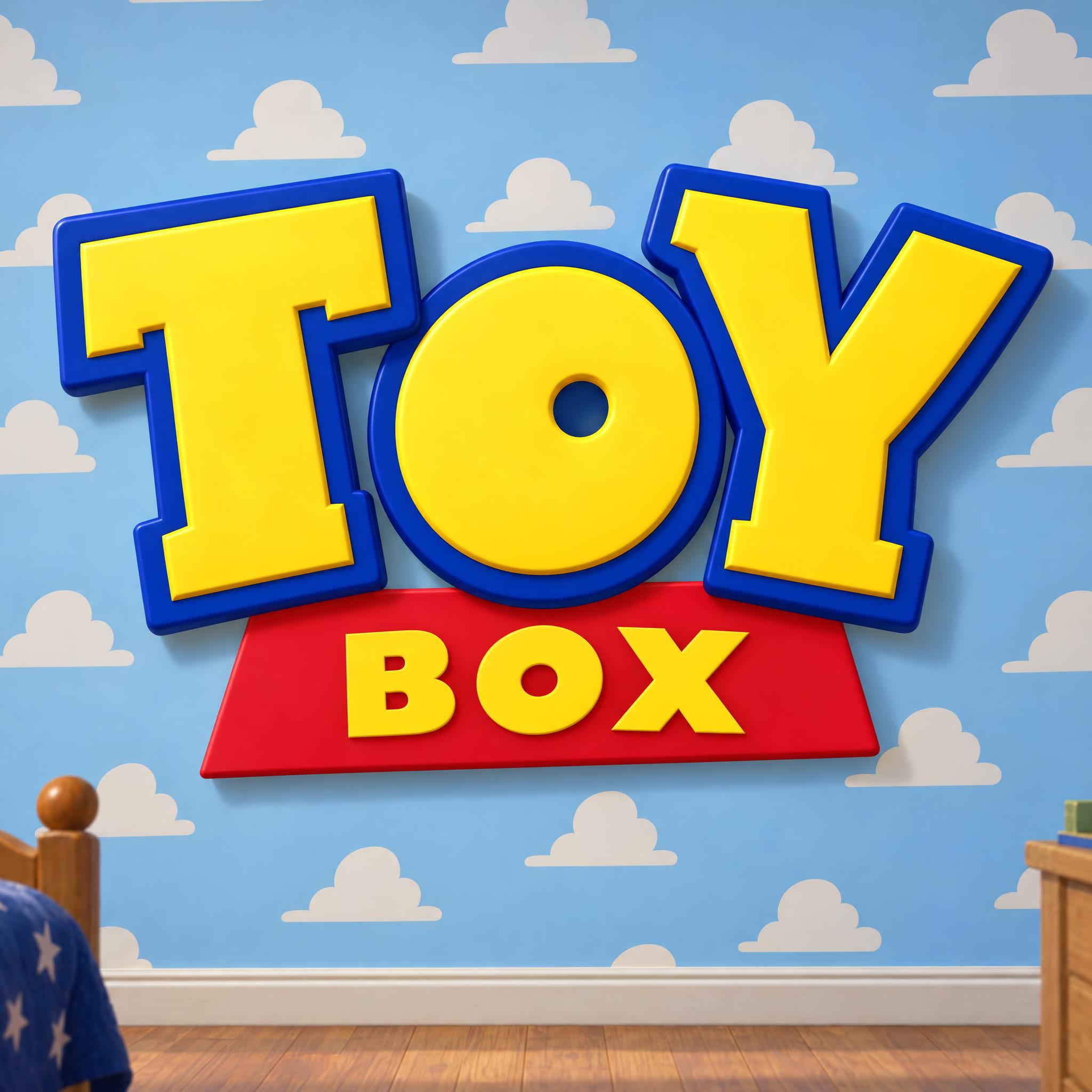
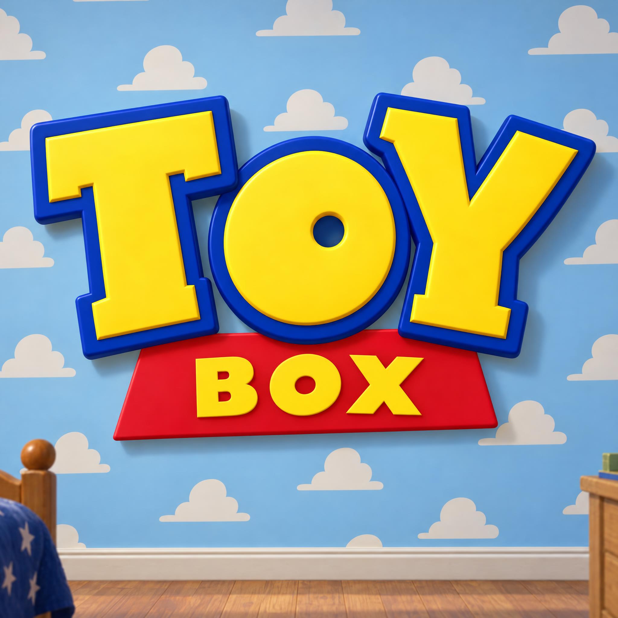
Titles of animated films are chunky and playful: heavy letters tilted different ways, a banner, a bright colour with a thick outline. Straight, even letters look like a live-action film.
“very heavy, chunky slab-serif capitals, each letter tilted a different way” — Toy Story Font
The background does the job of the poster art: jungle ruins for adventure, a starfield for space, a stormy sky for an epic. Swap it for a plain background when you need a cut-out title.
“Over sunlit jungle temple ruins with mossy steps and hanging vines” — Indiana Jones Font
People who search for movie fonts usually want one of a handful of looks, and each one belongs to a kind of film. Start from the genre, then pick the style.
Historical and fantasy epics lean on Roman capitals. The typeface Trajan, designed by Carol Twombly for Adobe in 1989, is based on Roman square capitals and is well known for appearing on many film posters. Movie Poster Font is our prompt for that epic poster look.
Sources: Wikipedia — Trajan (typeface)
Squarish letters read as the future. Eurostile, a geometric sans-serif designed by Aldo Novarese in 1962, is one of the most popular fonts in science-fiction television. For film titles, try Star Wars Font, Tron Font or Matrix Font; for more looks of the future, see futuristic font.
Sources: Wikipedia — Eurostile
The list of names at the bottom of a poster, the billing block, is usually set in a highly condensed typeface, by convention at 15 to 35 percent of the height of the title letters. The prompts here draw the title only; add the credits yourself in a design tool.
Sources: Wikipedia — Credits (Billing block)
The film styles on this page describe the look of famous titles so it works on your own words; none of them is a studio font, and the names and logos belong to their owners. Keep the results to parties, fan art and your own videos.
| You are making | Try | What you get |
|---|---|---|
| An epic or historical film poster | Movie Poster Font | Roman serif capitals in the manner of epic posters |
| A space adventure title | Star Wars Font | Hollow gold outline capitals on two lines |
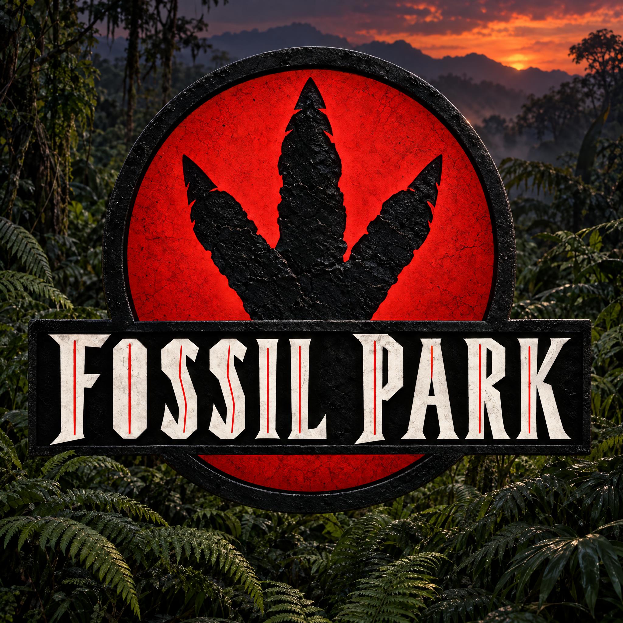
| An adventure or treasure-hunt title | Indiana Jones Font | A giant first letter, red to yellow, in steep perspective |
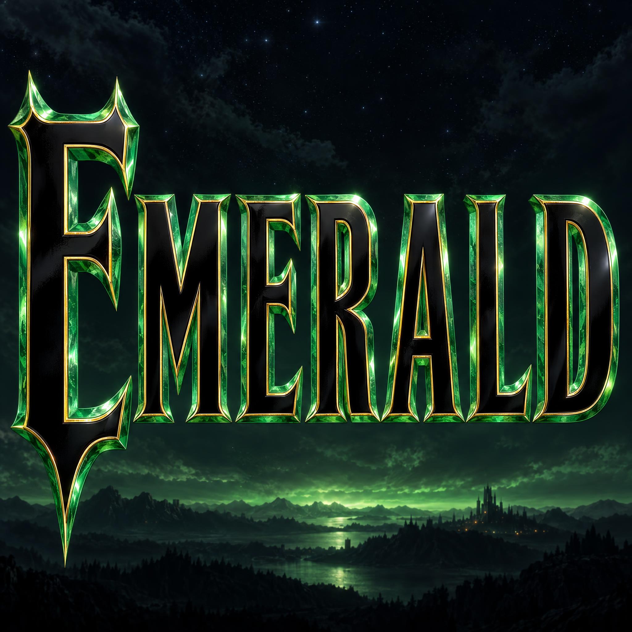
| A fantasy epic | Lord of the Rings Font | Tall gold wedge serifs with raised first and last letters |
| A superhero team title | Avengers Font | Brushed steel capitals with an arrow and a ring |
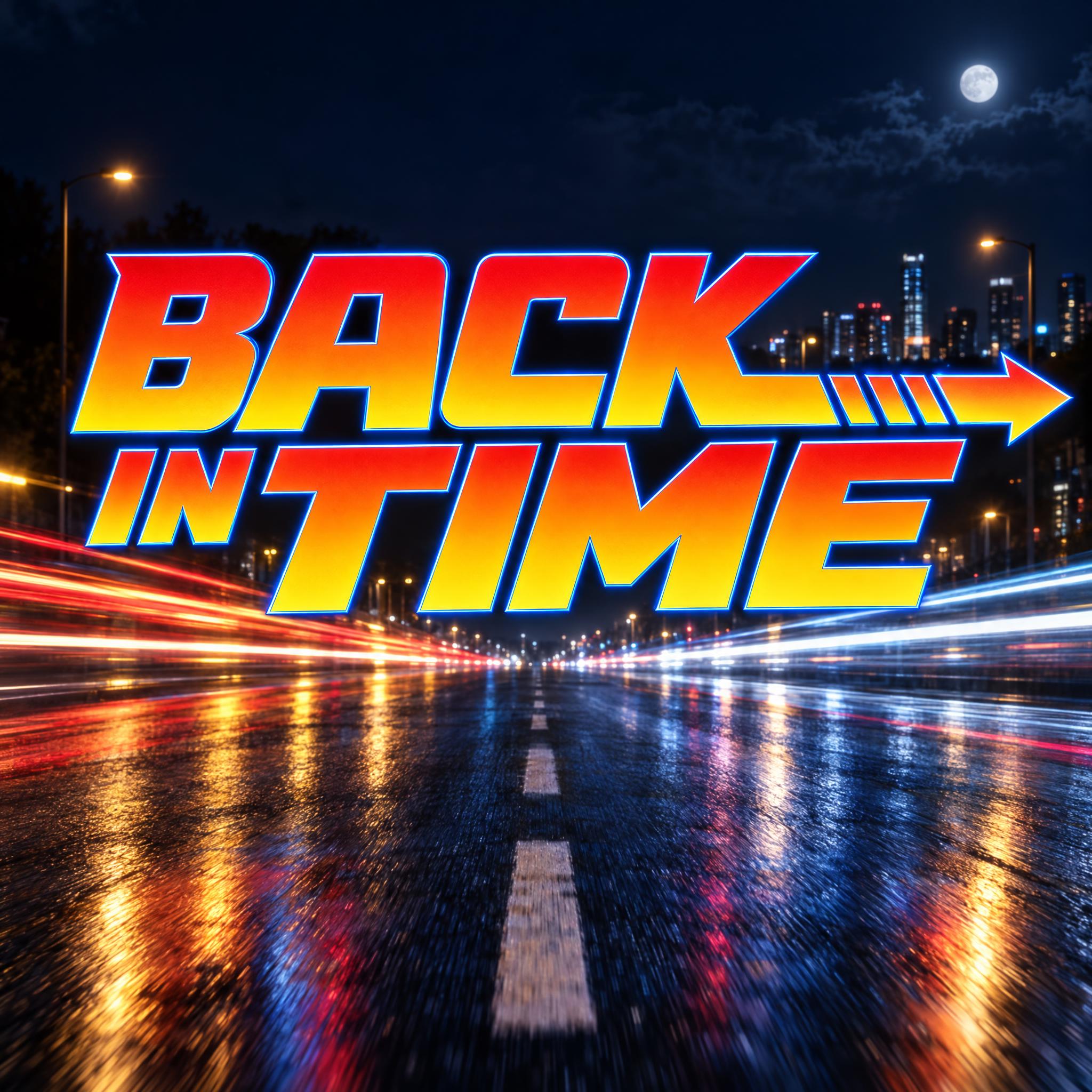
| A retro time-travel title | Back to the Future Font | Red-to-yellow italics with an arrow and a blue outline |
| An animated movie party | Toy Story Font | Chunky tilted yellow letters over a red banner |
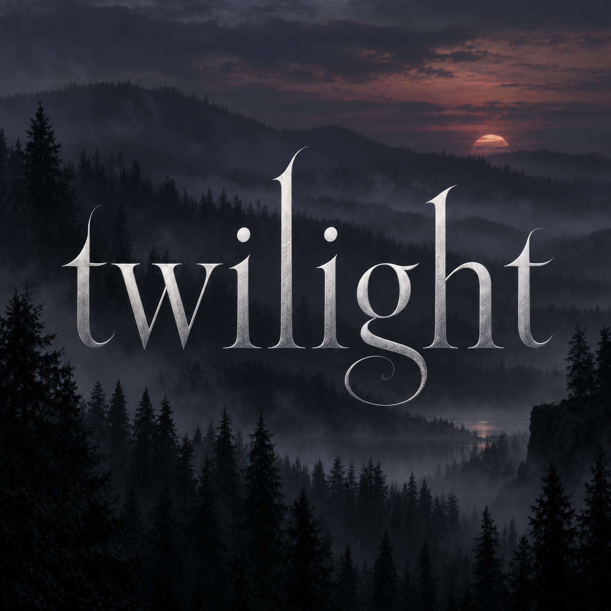
| A gothic romance title | Twilight Font | Slender silver lowercase serifs with hairline swirls |
| A hacker or cyber thriller title | Matrix Font | Green blade-cut wedge serifs over falling code |
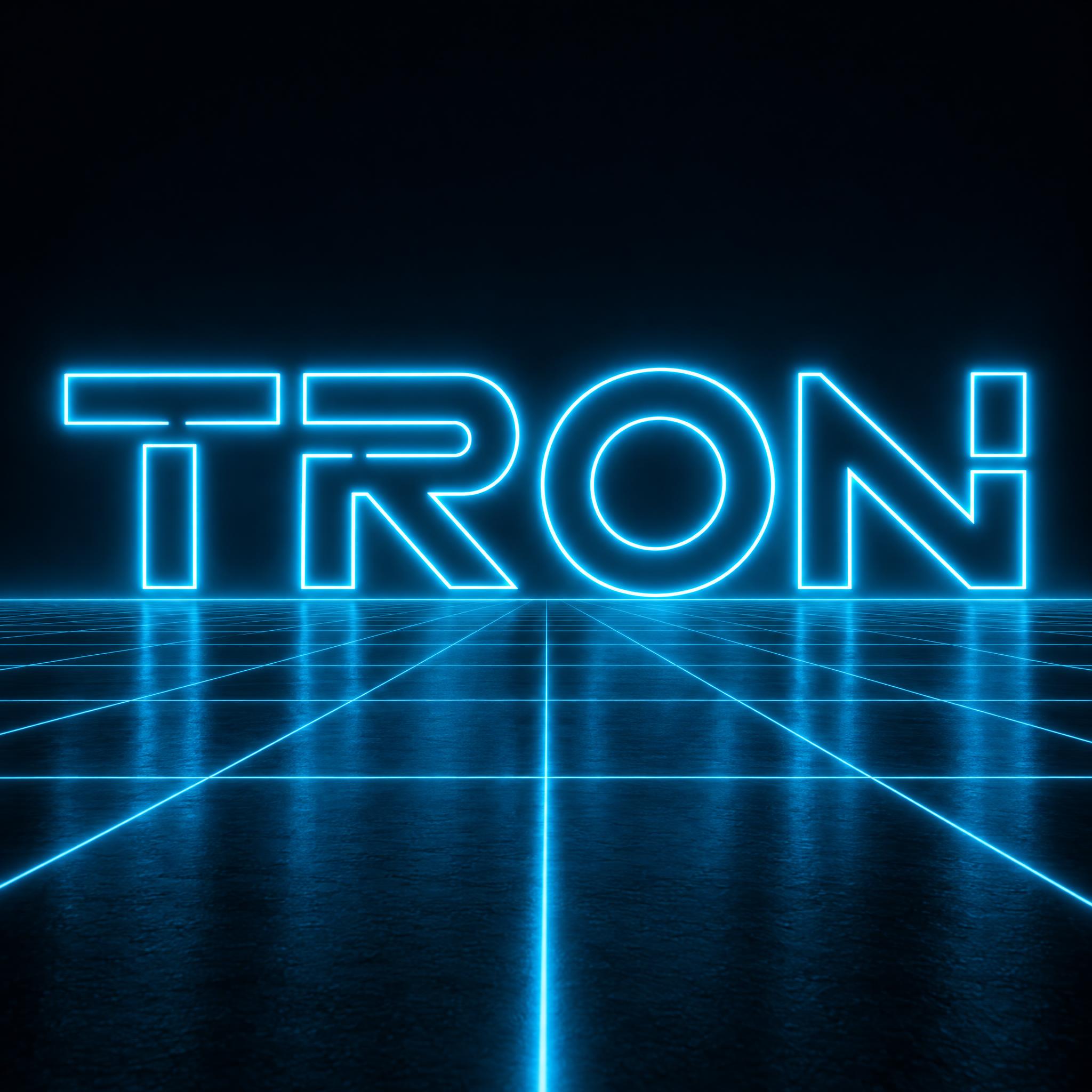
| A neon sci-fi title | Tron Font | Glowing cyan neon outline lettering |
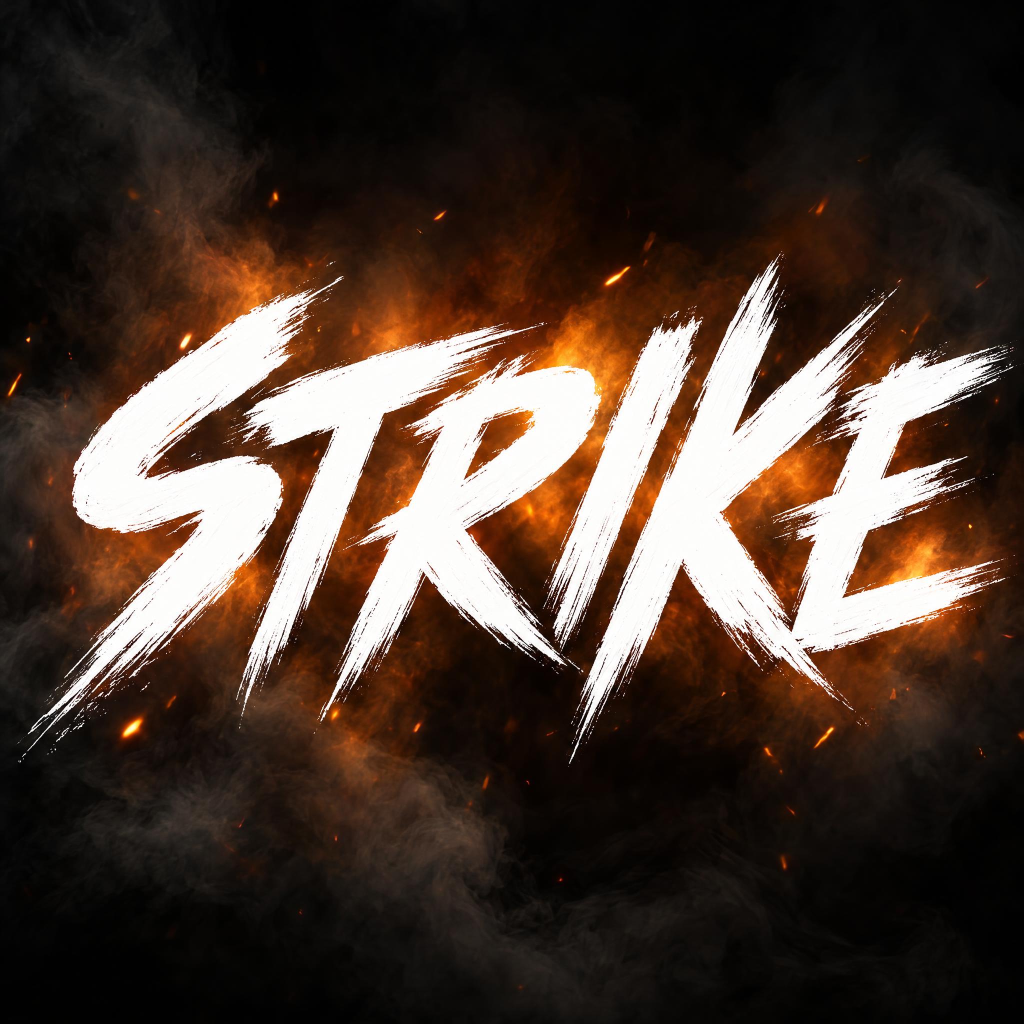
| A martial arts or action title | Action Movie Brush | White brush capitals slashed on at speed |
| A trailer title on fire | Fire Text | Capitals made of real flame |
Film titles began as cards. In silent films, simple title cards began and ended the presentation, and intertitles carried dialogue and plot in between; they often had Art Nouveau motifs. As talkies became popular, intertitles went out of common use, but the title at the start stayed.
In the 1950s the title became part of the show. Before Saul Bass, titles were generally static and separate from the movie; for The Man with the Golden Arm (1955) he made an animated, white on black paper cut-out arm, and with John Whitney he helped invent a new kind of kinetic typography for Hitchcock films such as Vertigo. Since the late 1950s, title sequences have been a showcase for contemporary design, and a title sequence will at some point badge the film with a typographic logo.
Posters set the other habits. The inscription at the base of Trajan's Column, dedicated in Rome in 113 AD, is perhaps the most famous example of Roman square capitals; the Trajan typeface of 1989 is based on it and became a fixture of film posters, while the credits underneath are squeezed into a condensed billing block. Genres added looks of their own: Eurostile's squarish letters in science fiction, and for noir, the label French critic Nino Frank first applied to Hollywood films in 1946, a low-key, black-and-white style with dramatic shadows.
The prompts here do not install a font. Each one describes the shapes, material and setting of a title look so an image model draws your own word that way, and each font page tells the story of its own film.
Sources: Wikipedia — Intertitle · Wikipedia — Title sequence · Wikipedia — Saul Bass · Wikipedia — Trajan's Column · Wikipedia — Trajan (typeface) · Wikipedia — Credits (Billing block) · Wikipedia — Eurostile · Wikipedia — Film noir
Roman serif capitals in the manner of historical epic posters.
Very wide, flat-topped capitals drawn as a thin gold outline on two lines.
Heavy italic wedge serifs that shrink into the distance behind one giant letter.
Tall burnished-gold wedge serifs whose first and last letters stand taller.
Forward-leaning brushed steel capitals with an arrow and a broken ring.
Wide red-to-yellow italics with a long arrow and speed lines.
Chunky tilted yellow slab serifs above a small red banner.
Spiky, uneven orange letters for a dark holiday tale.
Slender pale silver lowercase serifs over a misty forest.
Wide-spaced green wedge serifs sliced as if by a blade, over digital rain.
Wide hollow letters traced by one glowing cyan tube over a grid.
White brush capitals slashed on at full speed, like a martial arts title.
Dripping, scratched and rotting letters, with a page of their own.
Lettering that looks like a film title: an epic poster title, a space-opera outline, a chunky animated logo or the title of one particular film. On this page each one is an AI prompt that draws your own word in that style.
Many epic and drama posters use Roman serif capitals; the typeface Trajan is well known for appearing on many film posters. The credits at the bottom are usually a highly condensed typeface. For the title look, try Movie Poster Font.
Yes, for your own party, fan art or video. The film styles are fan prompts and the names and logos belong to their owners, so do not put them on products you sell. Movie Poster Font and Action Movie Brush copy no film's title.
Big gestures, such as a giant first letter or a stretched last stroke, are where models most often change letters. Keep titles short, check the first and last letters, and generate again if one is off.
No. They are prompts that make a picture of your word with an AI image model, not font files. You get a finished title as an image for a poster, a thumbnail or an invitation.