Fantasy fonts as copy-ready AI prompts: green elvish script on parchment, a gold fairy tale book title, epic film and game titles, a Celtic manuscript hand, Viking runestone cuts and an illuminated capital. These are prompts, not font files: type your word, copy, and paste into ChatGPT or Gemini.
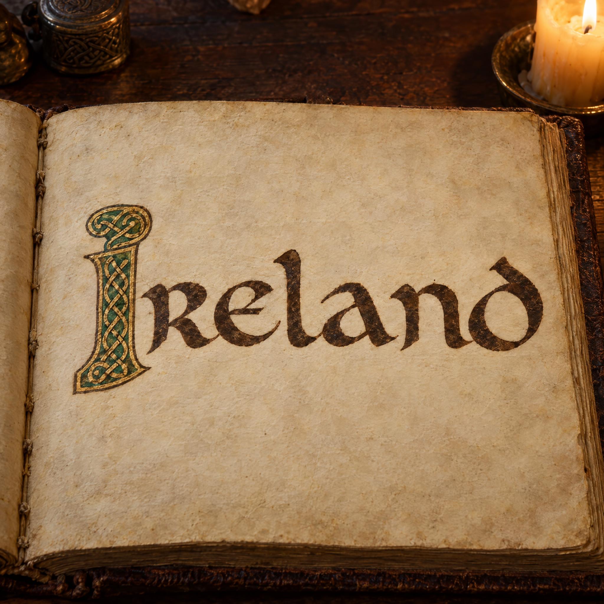
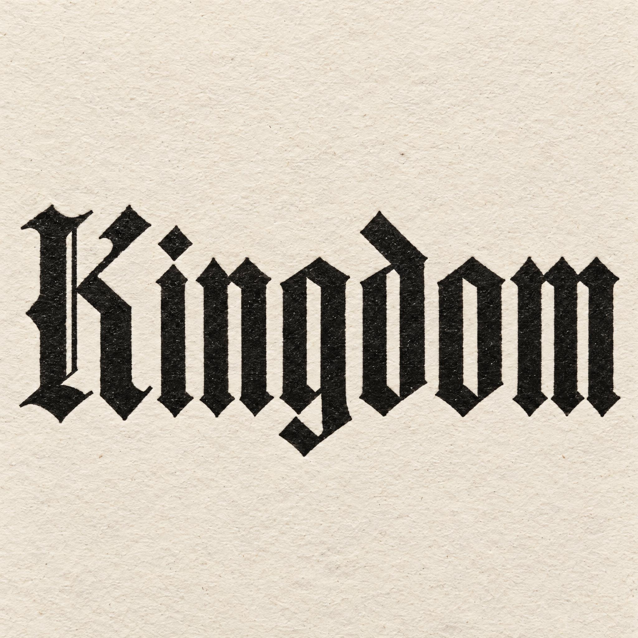
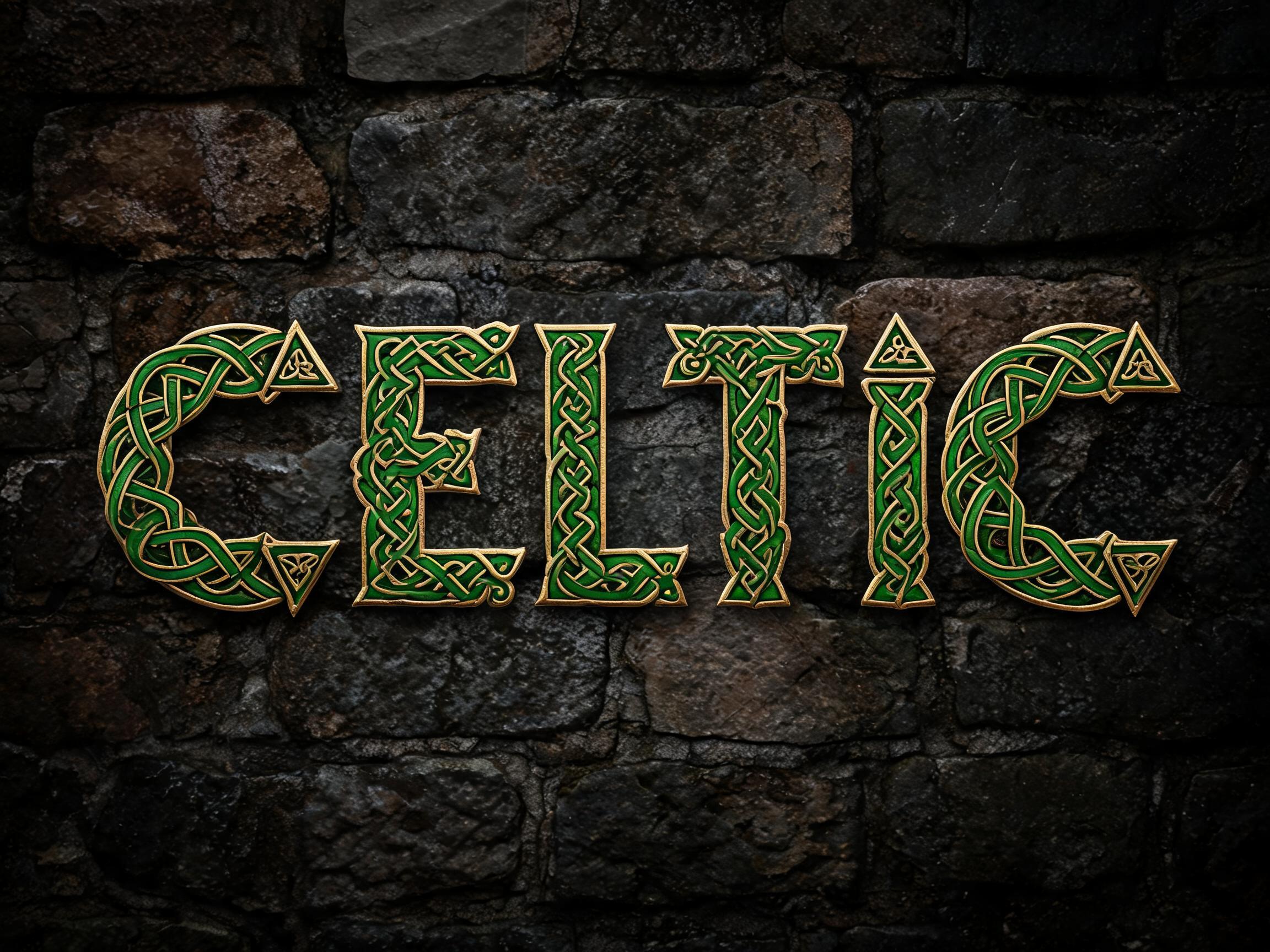
Type your word, copy the full prompt and paste it into ChatGPT, Gemini or any image model.
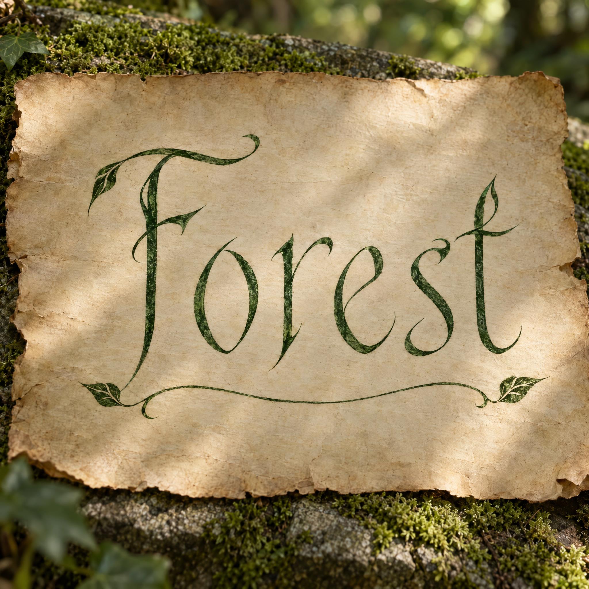
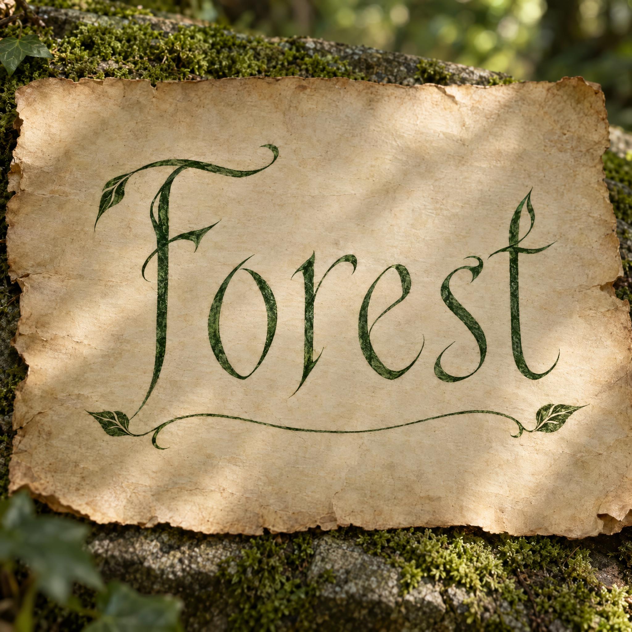
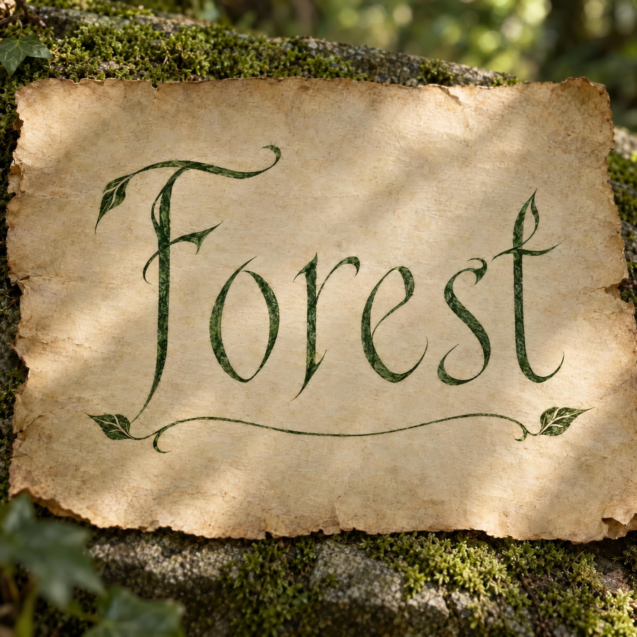
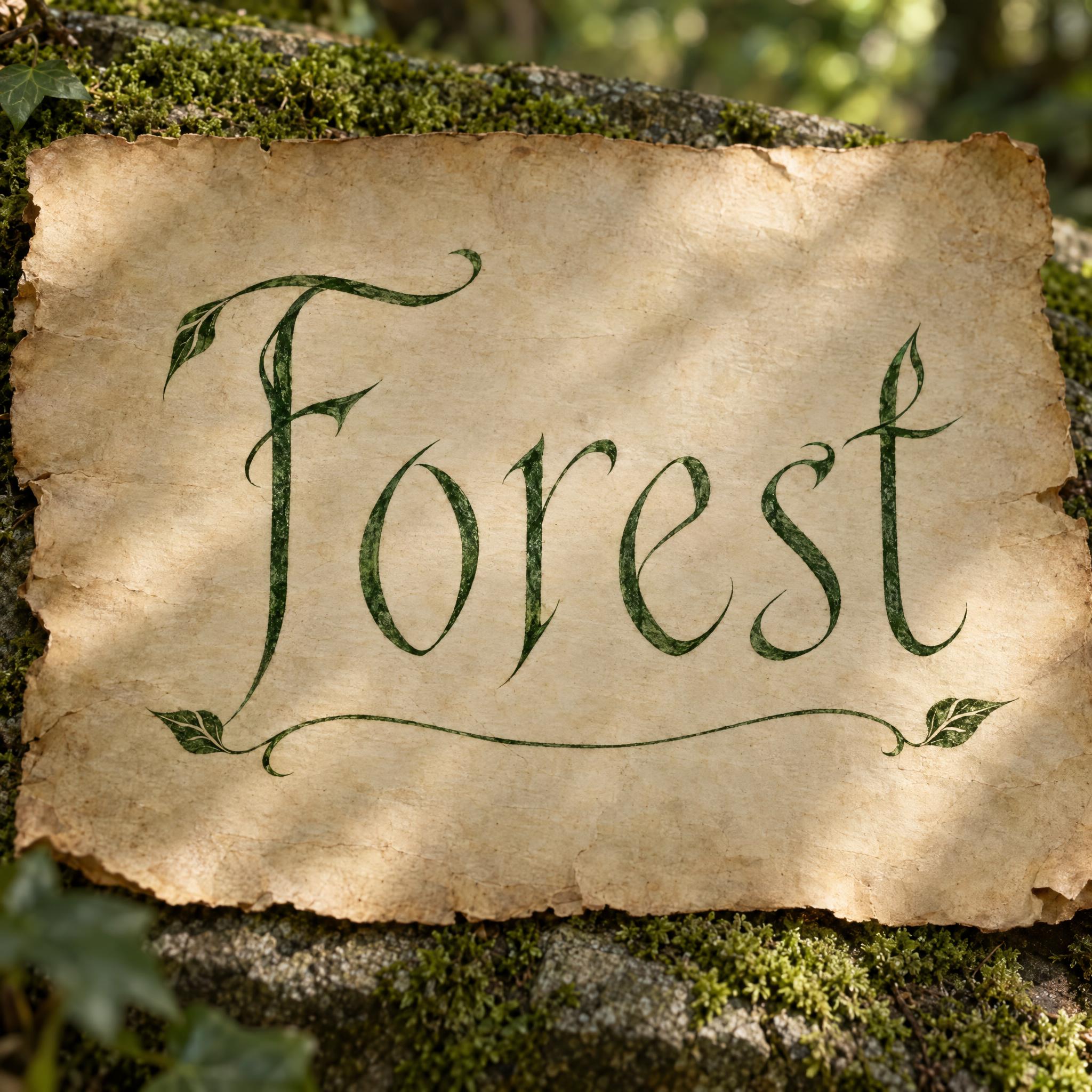
TextWrite the word "Forest". Spell it exactly as written, without adding or changing any letter.
Font designElvish lettering: tall, slender Latin letters written with a fine pointed nib in the style of fantasy elven script, a capital first letter then lowercase, each keeping its normal Latin shape; every letter reads at a glance. Curved strokes sweep like growing vine tendrils, horizontal strokes stay short, and the tops of the tall stems end in small hooks and slim pointed peaks. Every letter is deep forest-green ink. A thin flourish line with a small leaf at each end runs beneath the word, clear of the letters. The ink has a faint sheen, slightly soaked into the parchment. Like an inscription in an old elven book of lore.
SceneWritten on a sheet of aged parchment lying on mossy stone, in soft, dappled green forest light, with no other text; the word is centered, fills most of the width and reads clearly.
Open one for the prompt and real results on each image model.
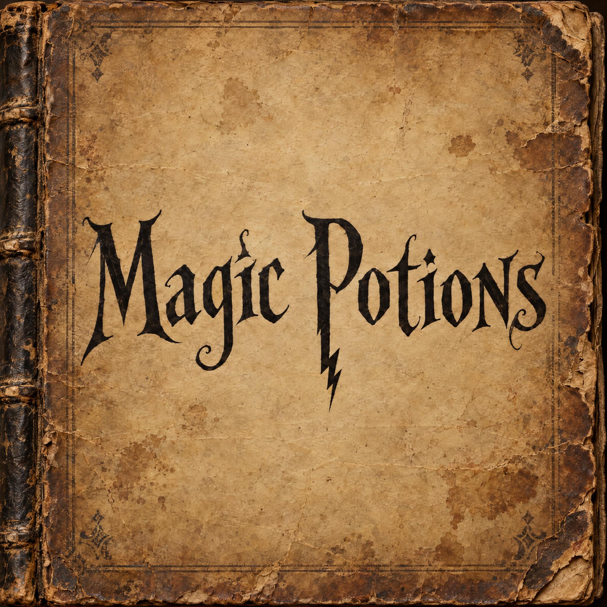
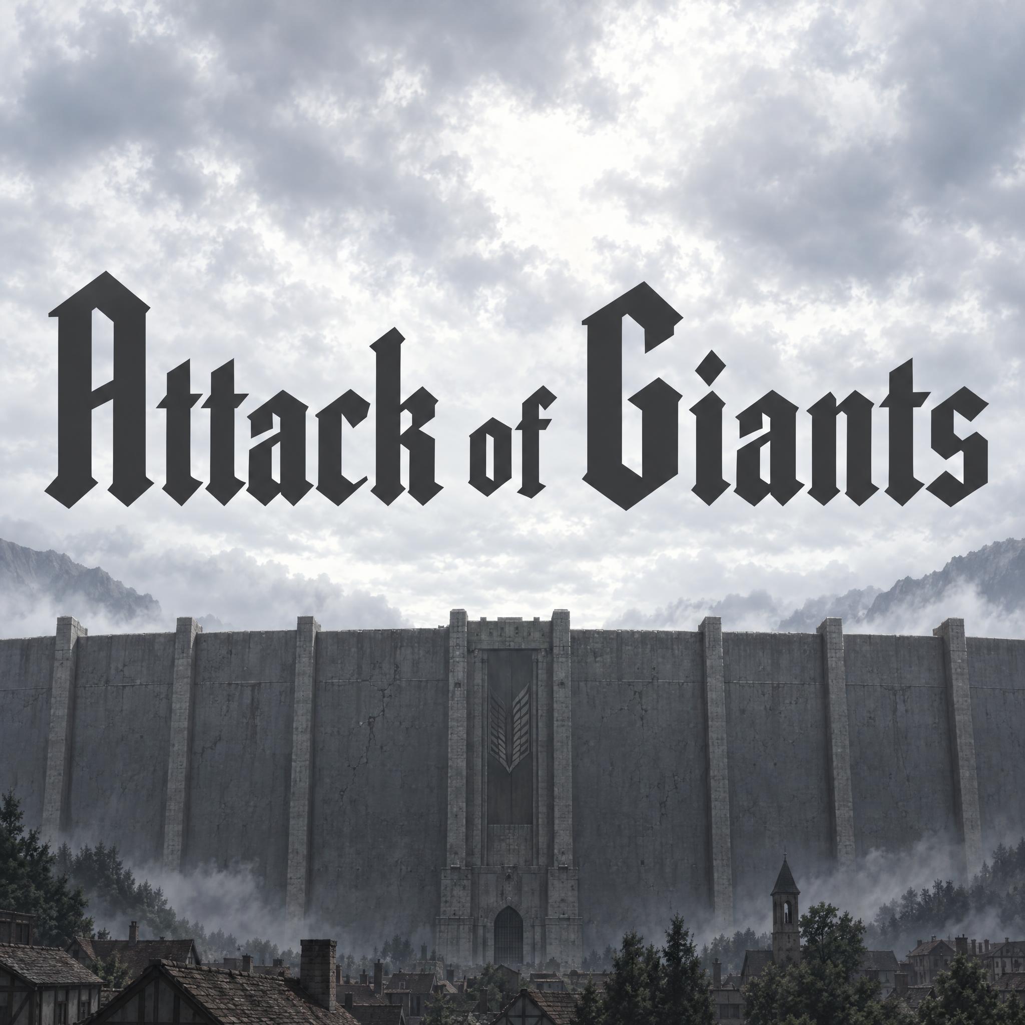
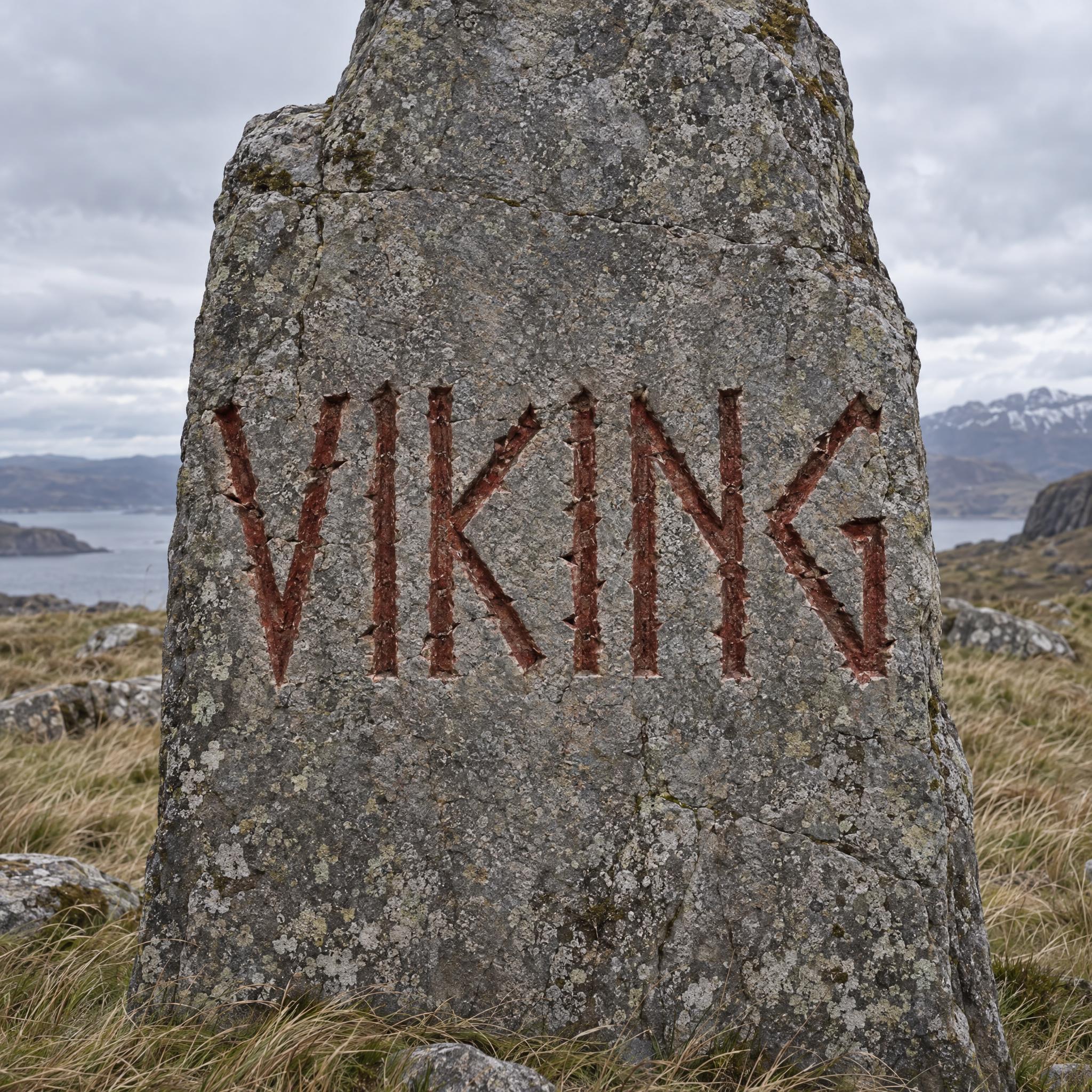
Tested October – November 2026. First attempts from our test ledger: 427 images, 12 fonts, 7 languages, each one checked by eye.
How to read it: 82 / 87 means 87 images tested and 82 spelled the word right on the first try; the percentage is that share. The Latin, Chinese / Japanese and Arabic columns split the same count by the script of the word.
| Model | Right first time | Latin | Chinese / Japanese | Arabic | Most common issue |
|---|---|---|---|---|---|
| GPT Imagegpt-image-2.5-sunburst · xhigh | 94% 82 / 87 | 98% 47 / 48 | 96% 24 / 25 | 79% 11 / 14 | Unreadable letters |
| Nano Bananagemini-nano-banana-2.1 | 99% 84 / 85 | 98% 47 / 48 | 100% 24 / 24 | 100% 13 / 13 | Style drifted |
| Seedreamdola-seedream-5-0-pro-260628 | 86% 72 / 84 | 96% 46 / 48 | 84% 21 / 25 | 45% 5 / 11 | Unreadable letters |
| Grok Imaginegrok-imagine-image-2.0 · medium | 93% 80 / 86 | 98% 47 / 48 | 92% 23 / 25 | 77% 10 / 13 | Extra letter |
| Qwen-Imageqwen-image-3.0-pro | 67% 57 / 85 | 83% 40 / 48 | 64% 16 / 25 | 8% 1 / 12 | Extra words added |
How we test: images are made through FontVibe with each model’s API, sending the prompt as is; we count only each model’s first image for every font and language and check the spelling by eye. Apps such as ChatGPT may rewrite prompts, so results there can differ. For the full data, email [email protected].
A fantasy look is an imagined history laid over ordinary letters: which pen or chisel made them, what they were written on, and one detail from that world. The examples are quoted word for word from the prompts of the fonts on this page.
Elvish and runic looks tempt models to swap in invented symbols, and then nobody can read the word. Borrow the habit of the script and keep the alphabet.
“a capital first letter then lowercase, each keeping its normal Latin shape; every letter reads at a glance.” — Elvish Font
Elven writing is tall stems and arching curves. Describe how the strokes move, not just the mood.
“Curved strokes sweep like growing vine tendrils, horizontal strokes stay short, and the tops of the tall stems end in small hooks and slim pointed peaks.” — Elvish Font
A storybook title gets its charm from a few curls. Put them on the first and last letters and keep the middle plain, or the word turns into a tangle.
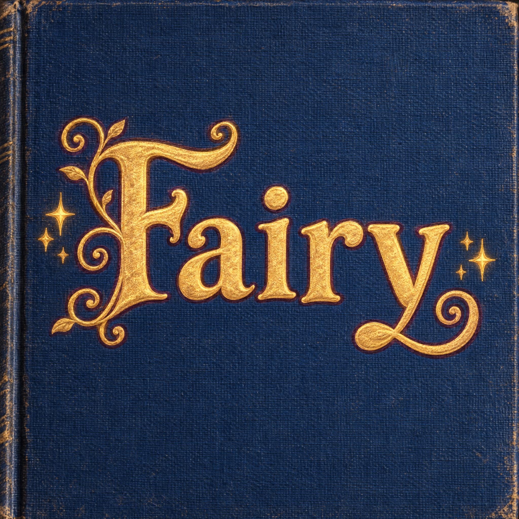
“Curling tendrils ending in small spirals wrap around the capital, the last letter ends in one more spiral curl, and the letters between stay plain on a gently bouncing baseline.” — Fairy Tale Font
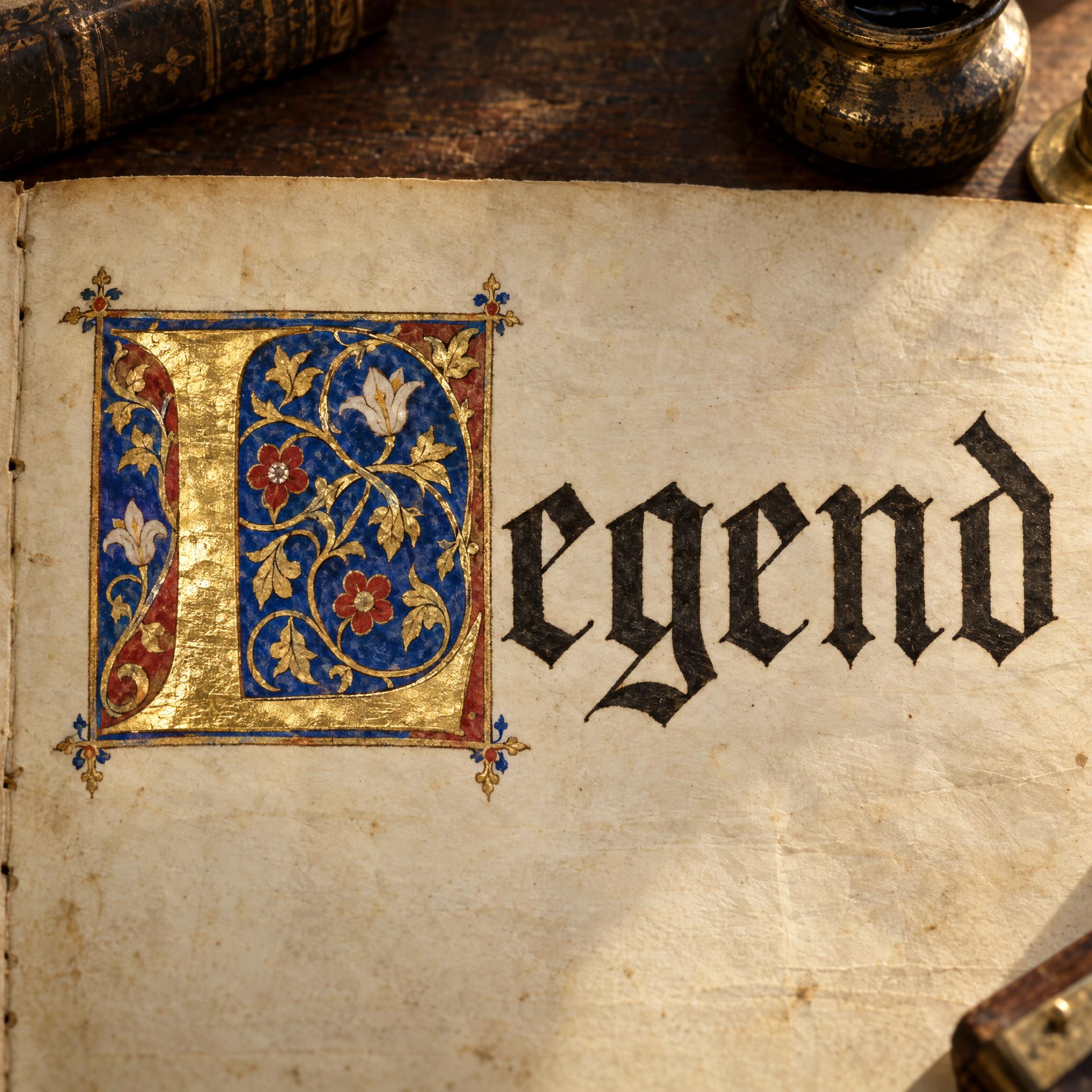
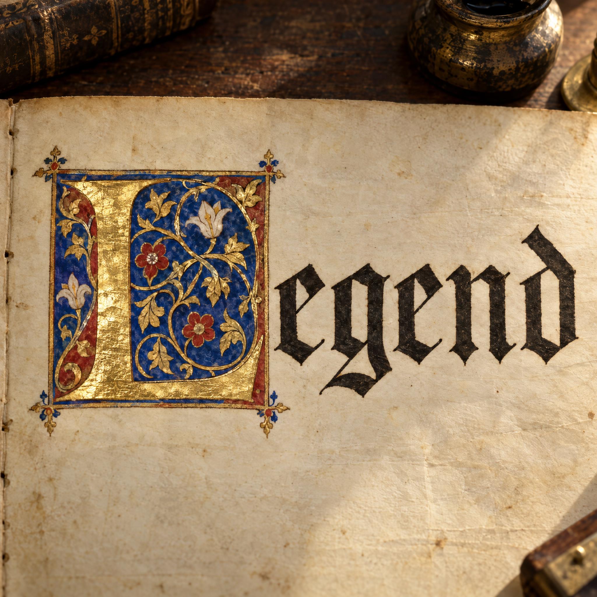
An illuminated page has one painted, gilded capital and plain script after it. Say so, or the model gilds every letter.
“The rest of the word follows in smaller plain Gothic book script on the same line, each letter readable.” — Illuminated Letters
Runes were cut, not written, so they have no round strokes. Say what happens to the round letters.
“with no round curves, so O becomes a pointed diamond and S a sharp zigzag.” — Viking Font
Epic film and game titles usually make one element bigger: a first letter, a small row above a big word, an ampersand. Name it.
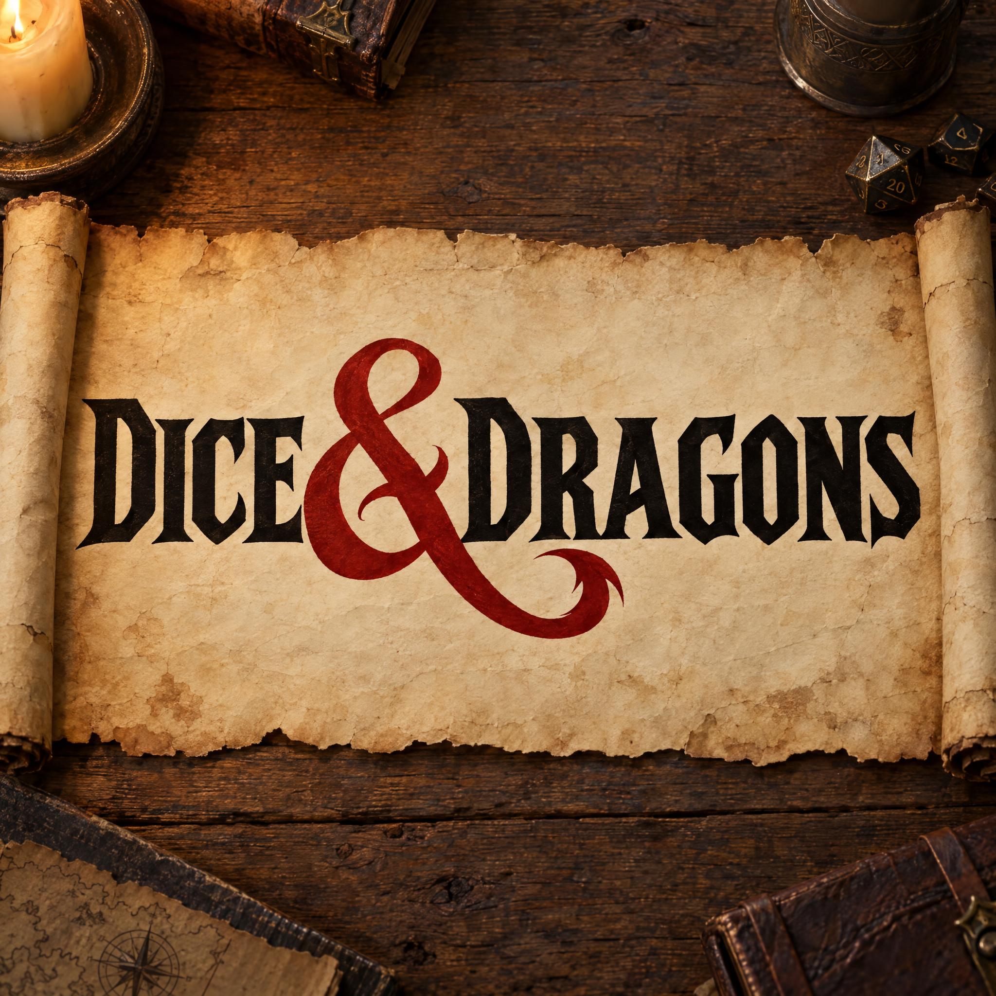
“With two words joined by an ampersand, the ampersand is much larger than the letters” — D&D Font
Parchment, a cloth book cover, a runestone or vellum tells the viewer which world this is before they read the word. Change the scene sentence for a plain background when you need a cut-out.
“Written on a sheet of aged parchment lying on mossy stone, in soft, dappled green forest light, with no other text; the word is centered, fills most of the width and reads clearly.” — Elvish Font
Searches for fantasy fonts mix invented scripts, storybook titles, film and game logos and plain medieval blackletter. These points help you pick the one you mean.
Many results for fantasy fonts are blackletter, the dark broken book script used in Western Europe from about the late 12th to the 17th century. It reads as medieval rather than magical. For that look, go to gothic font or Old English font; this page keeps one example, Textura Font.
Sources: Wikipedia — Blackletter
Elvish Font is pen and ink on parchment, Fairy Tale Font is gold stamped on a cloth cover, Viking Font is cut into stone and Illuminated Letters are paint and gold leaf. Decide the material first; it says more about the world than the letter shapes do.
Tengwar and runes are real writing systems with letters of their own. The prompts here borrow how they look and keep Latin letters, so the word is spelled right; for a translation or a transliteration, use a specialist tool.
Lord of the Rings Font, Game of Thrones Font, Zelda Font, D&D Font and Harry Potter Font describe the look of those titles so it works on your own words; none of them is an official font. The names and logos belong to their owners, so keep the results to your own campaign, party or fan art, not merchandise.
| You are making | Try | What you get |
|---|---|---|
| A map label, a spell book or an elven name | Elvish Font | Tall green pen letters on parchment |
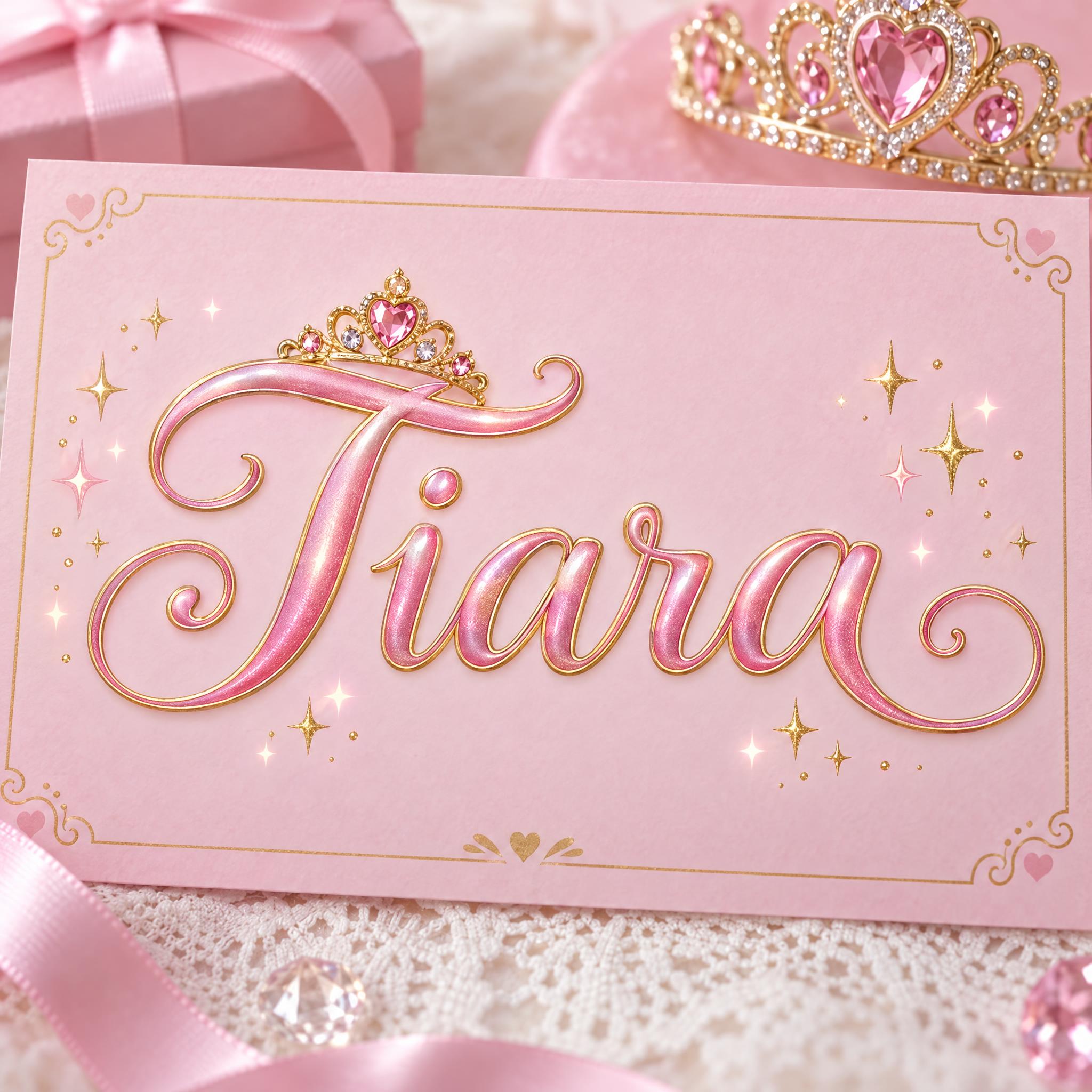
| A storybook cover or a bedtime-story title | Fairy Tale Font | A gold storybook title with spiral tendrils and sparkles |
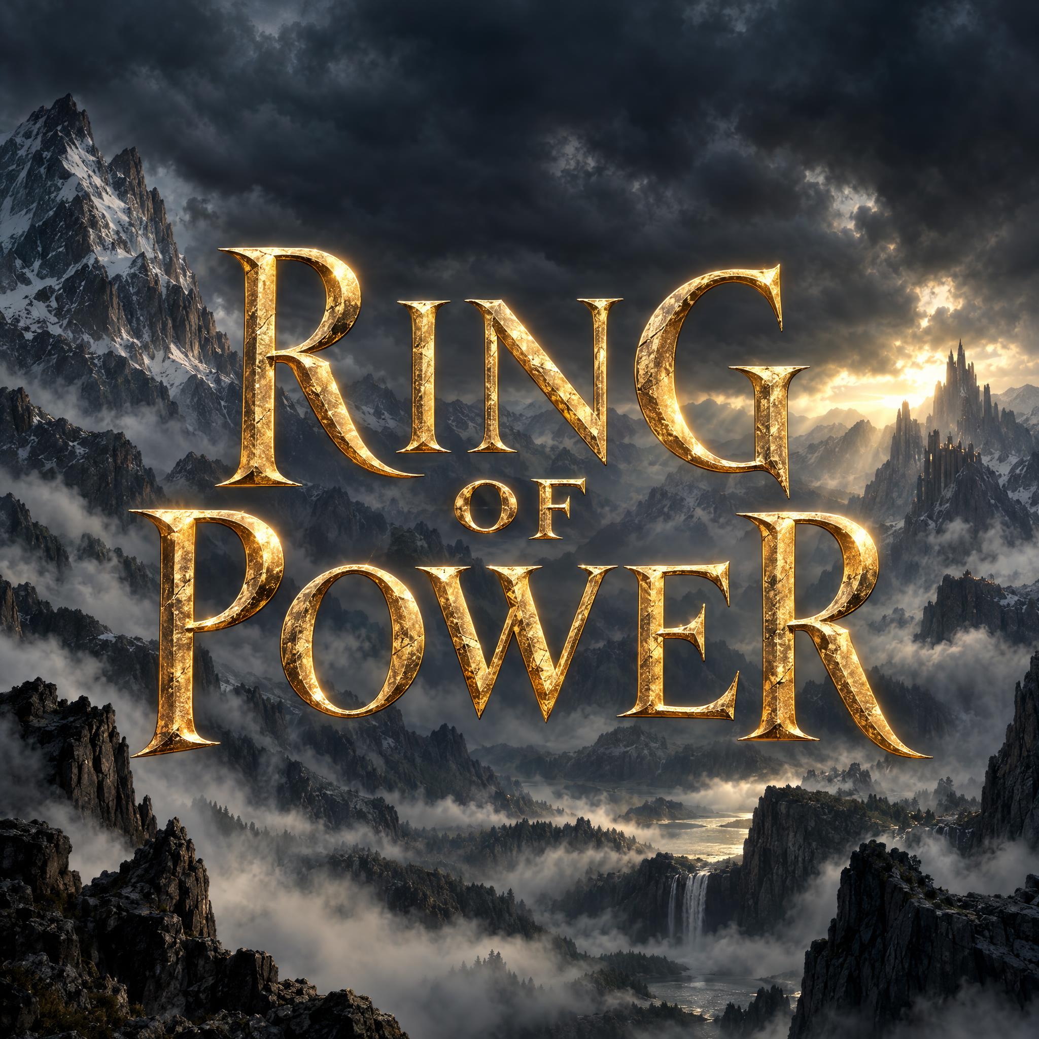
| An epic title for a novel, a campaign or a video | Lord of the Rings Font | Tall gold wedge-serif capitals with raised first and last letters |
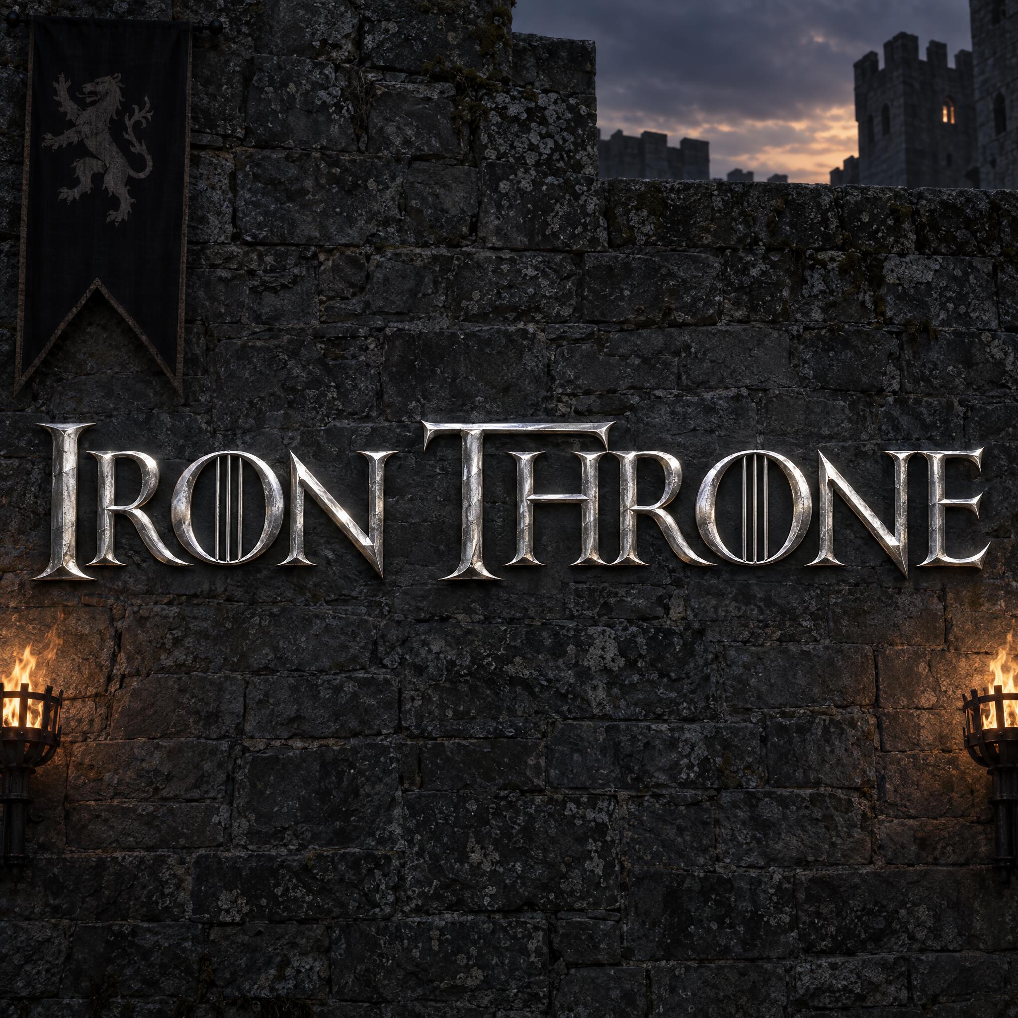
| A dark, regal title for a kingdom or a house | Game of Thrones Font | Wide-spaced silver serif capitals |
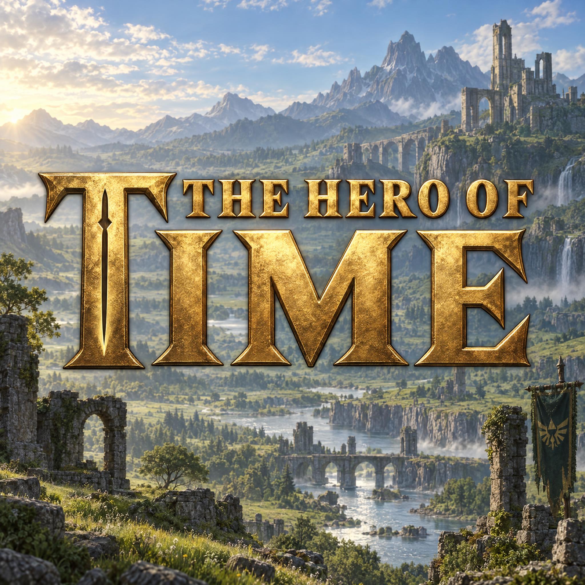
| An adventure or quest title | Zelda Font | Heavy bronze-gold wedge serifs, a small row over a big word |
| A tabletop campaign or a game-night poster | D&D Font | Black serif capitals with a big red ampersand |
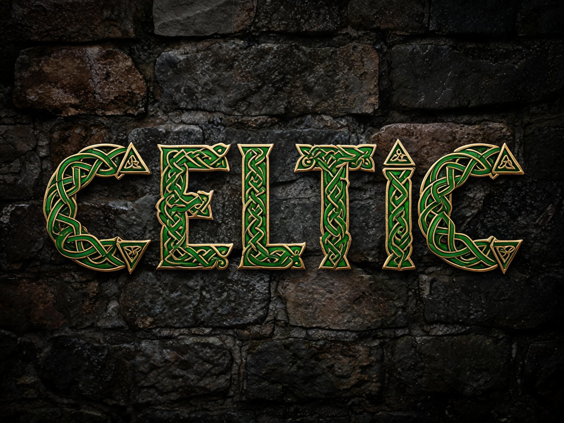
| A druid's book or a Celtic name | Celtic Font | A round uncial hand with one knotwork capital |
| A Norse quest or a dwarven hall | Viking Font | Straight-cut rusty red letters on a runestone |
| The first page of a chronicle or a scroll | Illuminated Letters | A gilded capital panel and plain Gothic script |
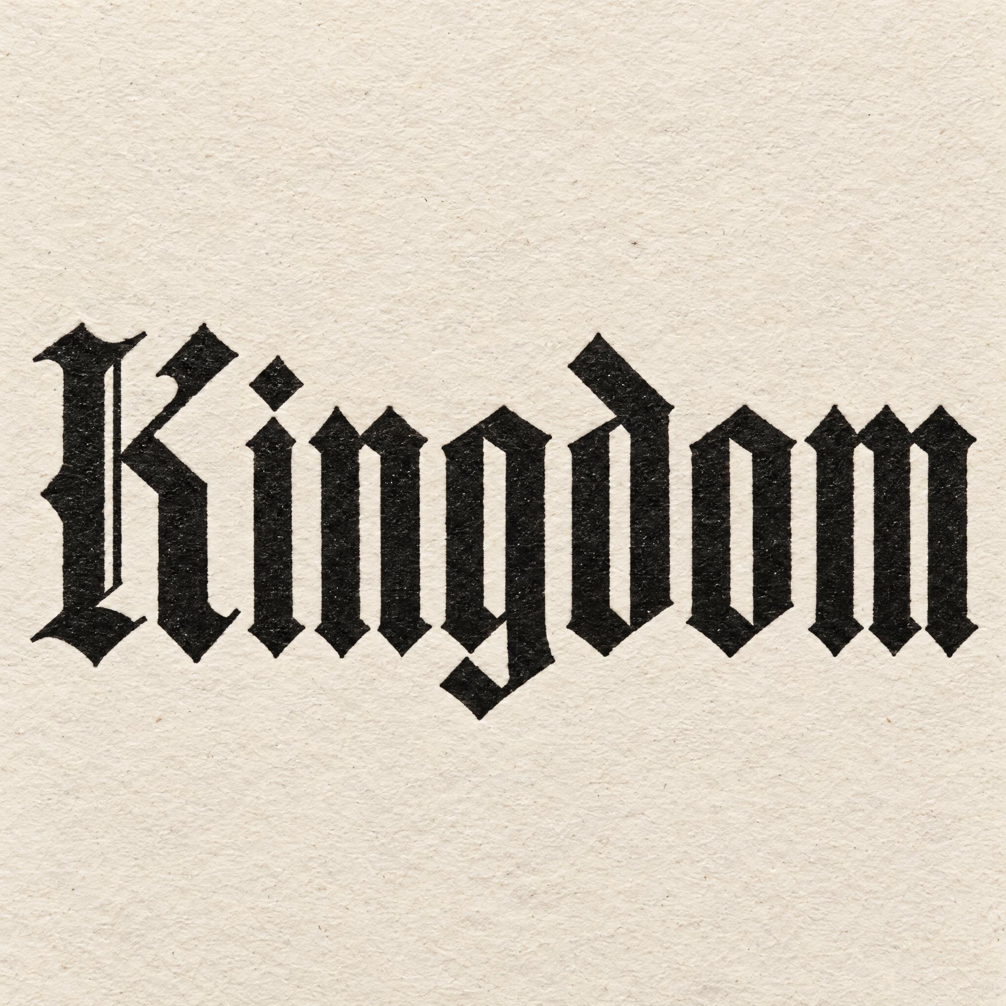
| A kingdom's banner or a royal decree | Textura Font | Narrow, upright blackletter |
The fantasy look grew out of a Victorian taste for the Middle Ages. William Morris, whose writing helped to establish the modern fantasy genre, wrote prose romances such as The Well at the World's End (1896); his works are described as the first to be set in an entirely invented world. In 1891 he founded the Kelmscott Press, and for it he drew three typefaces, Golden, Troy and Chaucer. Troy was what he called a semi-Gothic type, designed with special regard to legibility.
J. R. R. Tolkien took the habit further. He considered much of his work to have been inspired by an early reading of Morris, and names such as Gandolf already appear in The Well at the World's End. When The Hobbit was published in 1937, the publishers asked Tolkien to design the dust jacket himself; the runic inscription around its edges is a phonetic transliteration of English, and he wanted moon-letter runes on the back of Thror's map so they could be seen when held up to the light.
Games brought the look to a new audience. Dungeons & Dragons was first published in 1974, and The Legend of Zelda came out in Japan in 1986. Since then fantasy lettering has mostly meant titles, on a book cover, a film poster or a game screen, built from older material: blackletter, uncial hands and runestones. That is why this page mixes invented styles with real medieval ones.
Each font page tells its own branch: the Tengwar behind Elvish Font, Andrew Lang's fairy books behind Fairy Tale Font, the Book of Kells behind Celtic Font, runestones behind Viking Font, and the films and games behind the fan styles.
Sources: Wikipedia — William Morris · Wikipedia — Kelmscott Press · Wikipedia — The Hobbit · Wikipedia — Dungeons & Dragons · Wikipedia — The Legend of Zelda
Tall, slender pen letters with vine-like curves and pointed tops, in green ink on parchment.
A plump storybook title in warm gold, with spiral tendrils and sparkles at the ends.
Tall gold wedge-serif capitals whose first and last letters stand taller.
Wide-spaced serif capitals in bevelled silver, with bars through the O.
Heavy bronze-gold wedge serifs, a small row above one big word.
Tight black serif capitals and a large red calligraphic ampersand.
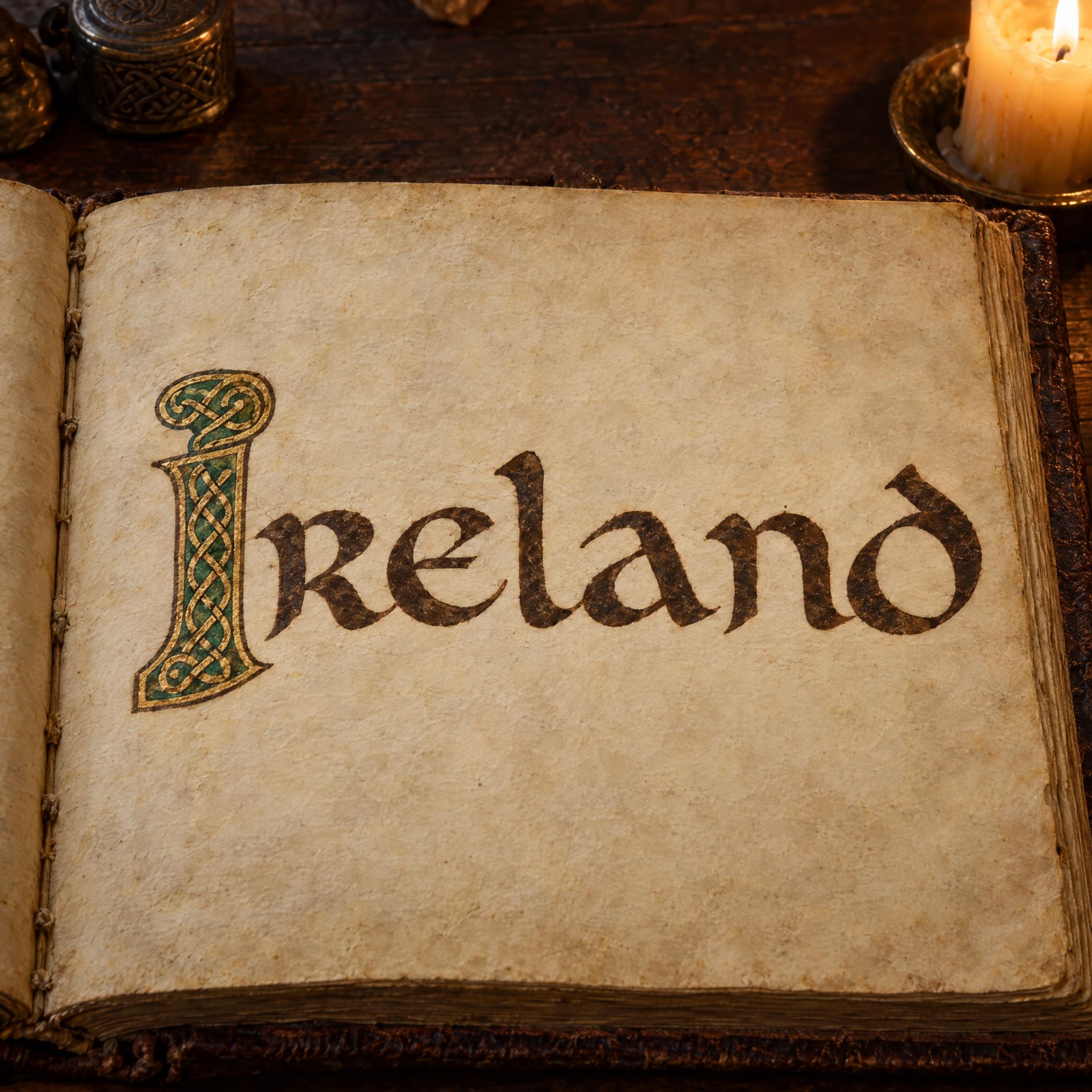
The round uncial hand of Irish manuscripts with one knotwork capital.
Rune-style letters with no curves, cut into a runestone and painted red.
One gilded, painted capital in a panel, then plain Gothic script.
The narrow, woven-looking blackletter of medieval books.
The dark broken script of old books, with its own pages for every variety.
Lettering that looks as if it came from an imagined world: elven script, a storybook title, an epic film or game title, or a medieval manuscript hand. On this page each one is an AI prompt that draws your own word in that style.
Elvish Font: tall green letters written with a fine nib, curves like vine tendrils and pointed tops, on parchment. It keeps Latin letters, so the word is spelled right. For a gold epic title, see Lord of the Rings Font.
Not quite. A medieval font usually means blackletter, a real book script; fantasy lettering borrows it but also uses invented and storybook styles. For blackletter alone, see Old English font.
Yes, for your own campaign, party or fan art. The film and game styles are fan prompts and the names and logos belong to their owners, so do not put them on products you sell. Elvish Font, Fairy Tale Font, Celtic Font and Viking Font copy no one's title.
No. They are prompts that make a picture of your word with an AI image model, not font files. They are for a finished title, map label or poster as an image.