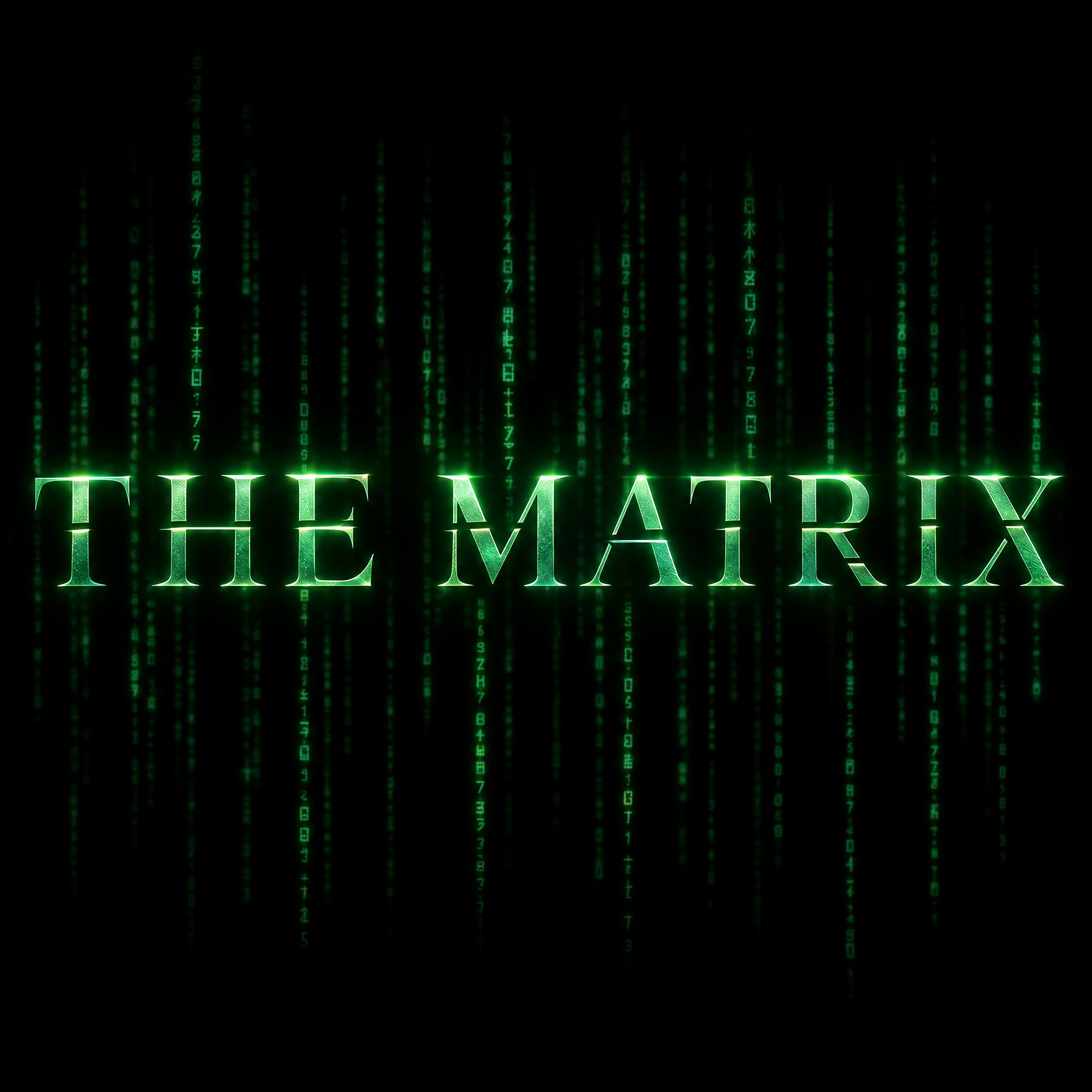
Widely spaced, thin wedge-serif capitals sliced by narrow blade cuts, in polished emerald-to-teal metal with green code falling behind.
TextWrite the word "THE MATRIX". Spell it exactly as written, without adding or changing any letter.
Font designSci-fi movie title lettering: widely spaced capitals with crisp wedge serifs and thin, sharp strokes, the horizontal bars and some diagonals sliced by narrow gaps as if cut by a blade. Each letter has a polished metallic face with a faint bevel and a sharp light streak along its top edge. The letters are cold emerald green shading to dark teal, with a soft green glow around them. Behind the word, faint columns of tiny glowing green characters fall straight down like digital rain, always dimmer than the title.
SceneIn front of a pitch-black background, lit only by its own green glow; centered, spanning most of the width, reading clearly, the only word.
129 words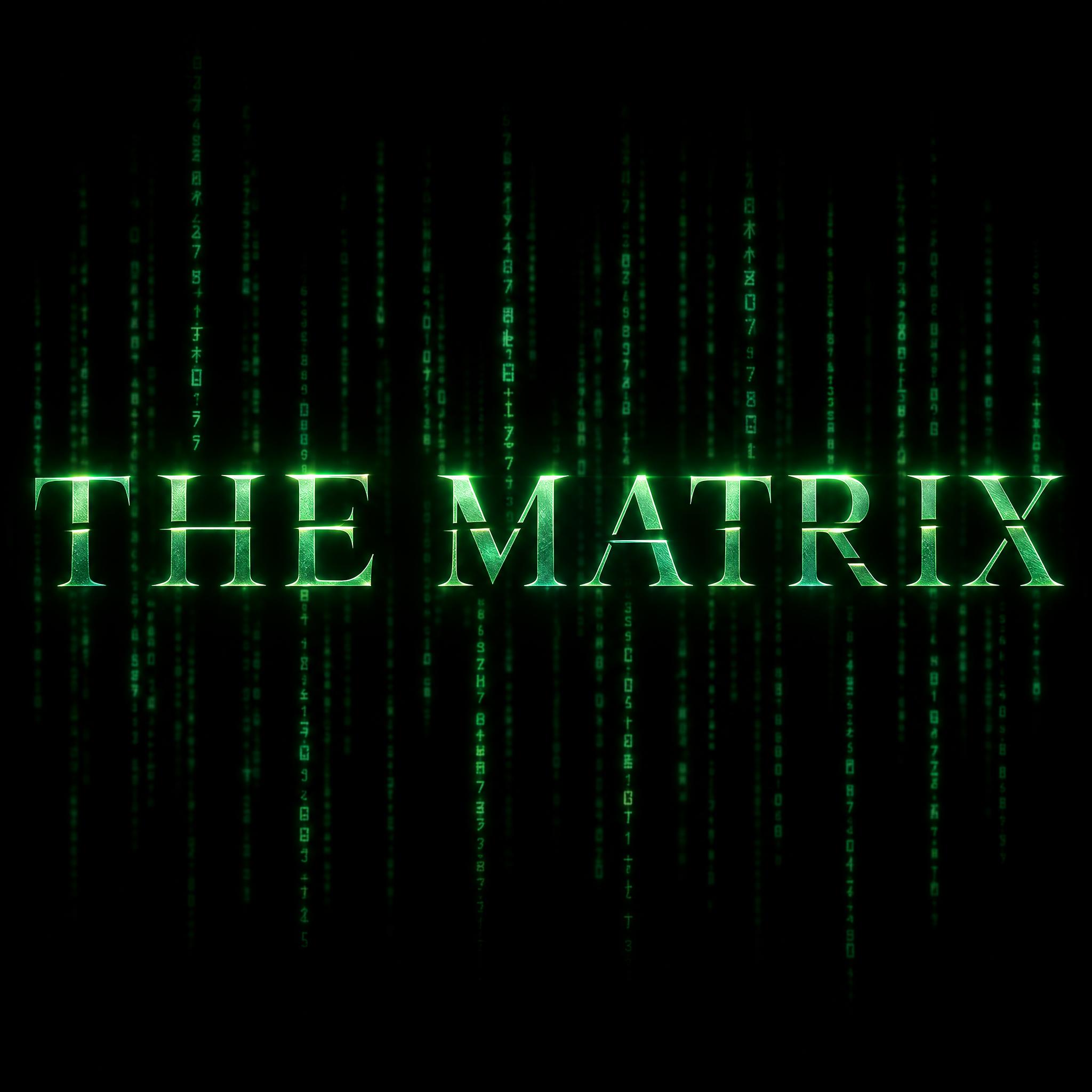
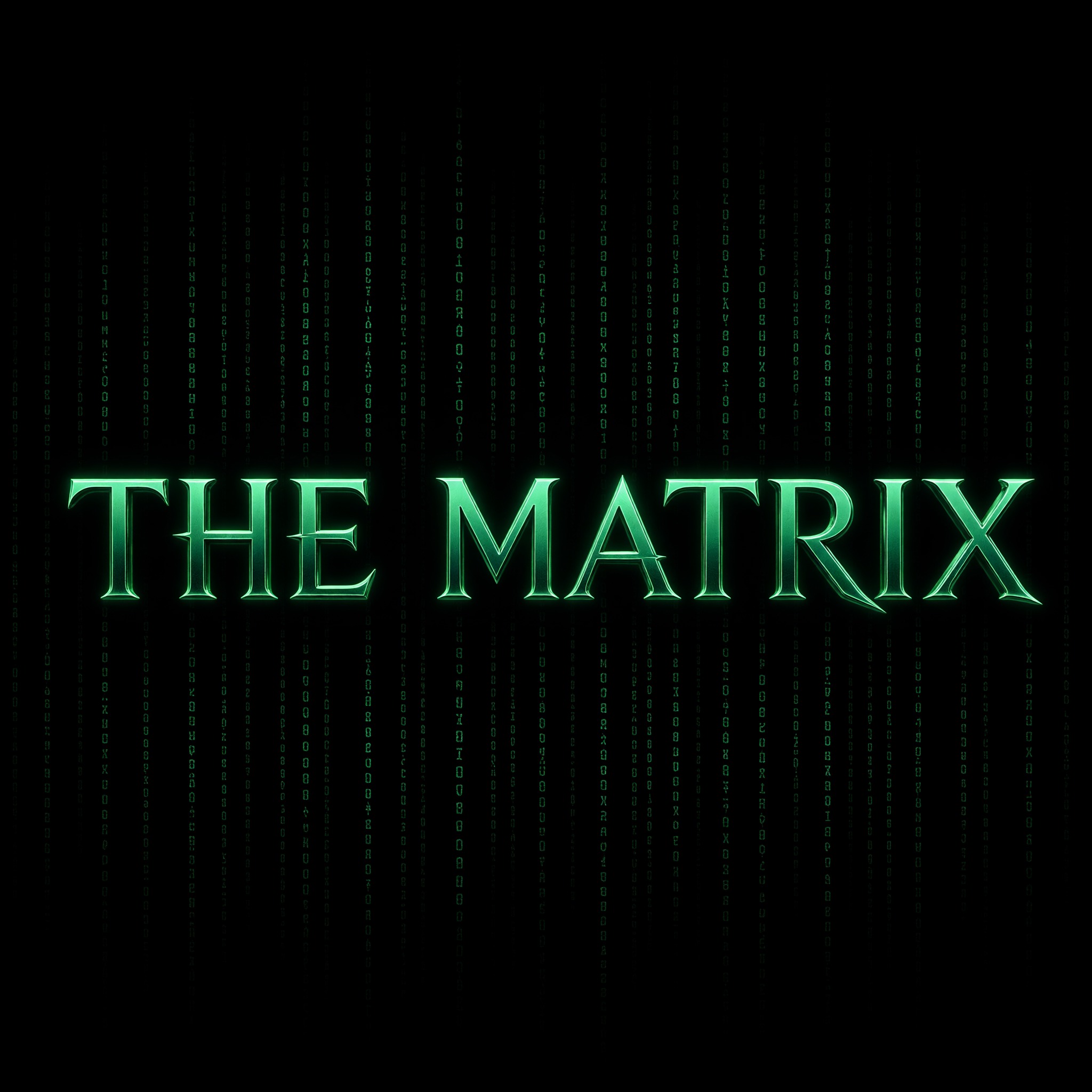
One prompt pasted into each image model as-is. These are the unedited results, so you can pick the model that suits you.
Thin, widely spaced serifs with clear blade cuts and the densest code rain behind.
Clean, wide teal letters with fine cuts and the faintest code rain. The second try; the first had no cuts.
The strongest metal bevel, with a blue-steel edge on bright green faces. The second try; the first had no cuts.
Heavier, rounder serifs with scratch-like cuts and a soft green glow around the title.
THE in small spaced letters above a big MATRIX, like the film's title; the serifs pull into long points.
The button opens FontVibe in DIY mode with this prompt already in it, unchanged. Type your words, pick a model and generate. GPT Image, Nano Banana, Seedream, Grok and Qwen are all in one account, so you can see which one keeps the blade cuts and the code rain dim, without signing up to five apps. Every account gets free credits each month with no card needed, and you can export a transparent PNG to lay the title over your own thumbnail.
Layers in the order the prompt states them. Change one layer and the rest keeps working.
Every AIFont prompt opens with the same text part. "Spell it exactly as written, without adding or changing any letter" matters here because the design cuts gaps into strokes and puts tiny characters behind the word: without it, a model may let the cuts turn one letter into two or pull a character from the rain into the title.
"Sci-fi movie title lettering:" points the model at the cold, sleek titles of late-90s sci-fi without naming the film, so the look holds on any words.
"widely spaced capitals with crisp wedge serifs and thin, sharp strokes" is the skeleton: a refined serif rather than a techy sans, with plenty of air between letters. Lose the serifs and it turns into a generic sci-fi font.
"the horizontal bars and some diagonals sliced by narrow gaps as if cut by a blade" is the detail people remember. The cuts run through crossbars and diagonals, which is why the A and the X look sliced. Without it you have an ordinary film-poster serif.
"Each letter has a polished metallic face with a faint bevel and a sharp light streak along its top edge." gives each letter a hard, polished surface with a bright top edge, so it reads as metal under screen light rather than flat green text.
"The letters are cold emerald green shading to dark teal, with a soft green glow around them." is the colour line. Change it to recolour the metal and the glow; the cuts and serifs stay. Change the rain sentence to match.
"Behind the word, faint columns of tiny glowing green characters fall straight down like digital rain, always dimmer than the title." adds the digital rain as a background layer. "always dimmer than the title" keeps it from swallowing the word. The tiny characters are meant to be there; they are not extra text.
"In front of a pitch-black background, lit only by its own green glow" stops models adding other lights or a room; "the only word" stops them adding a tagline. Swap this part for your own use.
Small edits that stay on-style. Change one thing at a time.
Type them in the box next to Prompt above and copy again. One or two words in capitals work best; letters with crossbars and diagonals, such as A, E, M and X, show the blade cuts. The example uses the full film title THE MATRIX; the Spanish, Portuguese and German pages use MATRIX, the title the film was released under there.
Swap "The letters are cold emerald green shading to dark teal, with a soft green glow around them." for "The letters are cold silver shading to steel blue, with a soft blue glow around them.", "The letters are deep red shading to dark crimson, with a soft red glow around them." or "The letters are bright gold shading to deep amber, with a soft gold glow around them.".
If you change the colour, change "tiny glowing green characters" in the rain sentence too, for example to "Behind the word, faint columns of tiny glowing blue characters fall straight down like digital rain, always dimmer than the title.".
Replace "In front of a pitch-black background, lit only by its own green glow" with "On a black poster background", "On a dark computer monitor in a dim room" or "On a plain dark grey background".
The prompt sets no frame size. Pick the ratio in your app, or add "Wide 16:9 image." or "Tall 2:3 image." at the end. Thumbnails suit 16:9; a phone wallpaper suits 2:3.
AI fonts that share the most tags with Matrix Font.
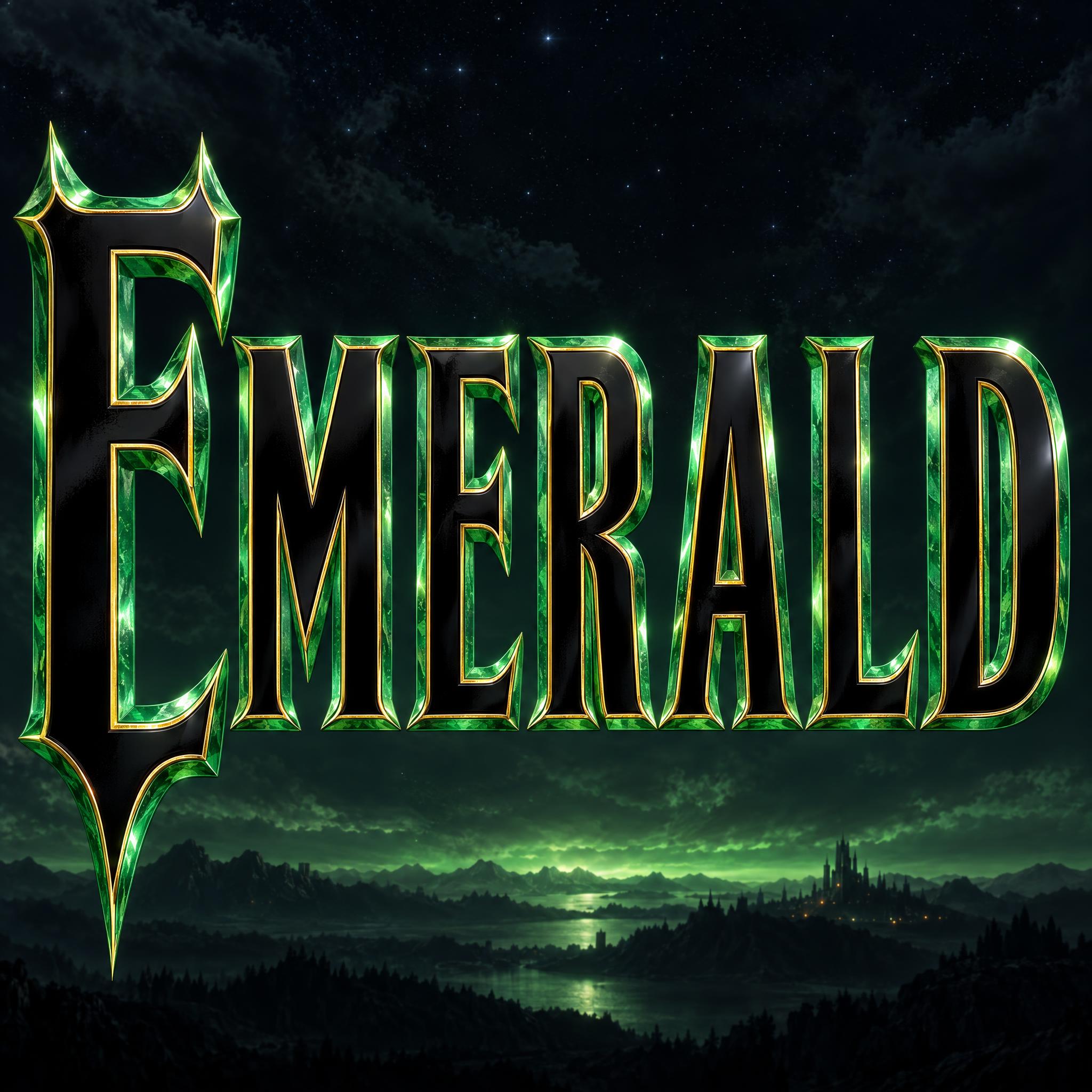
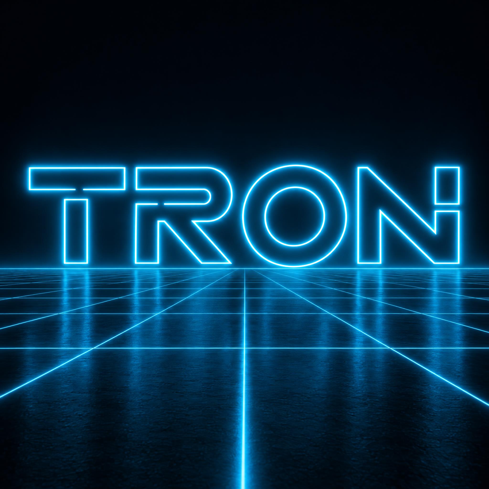
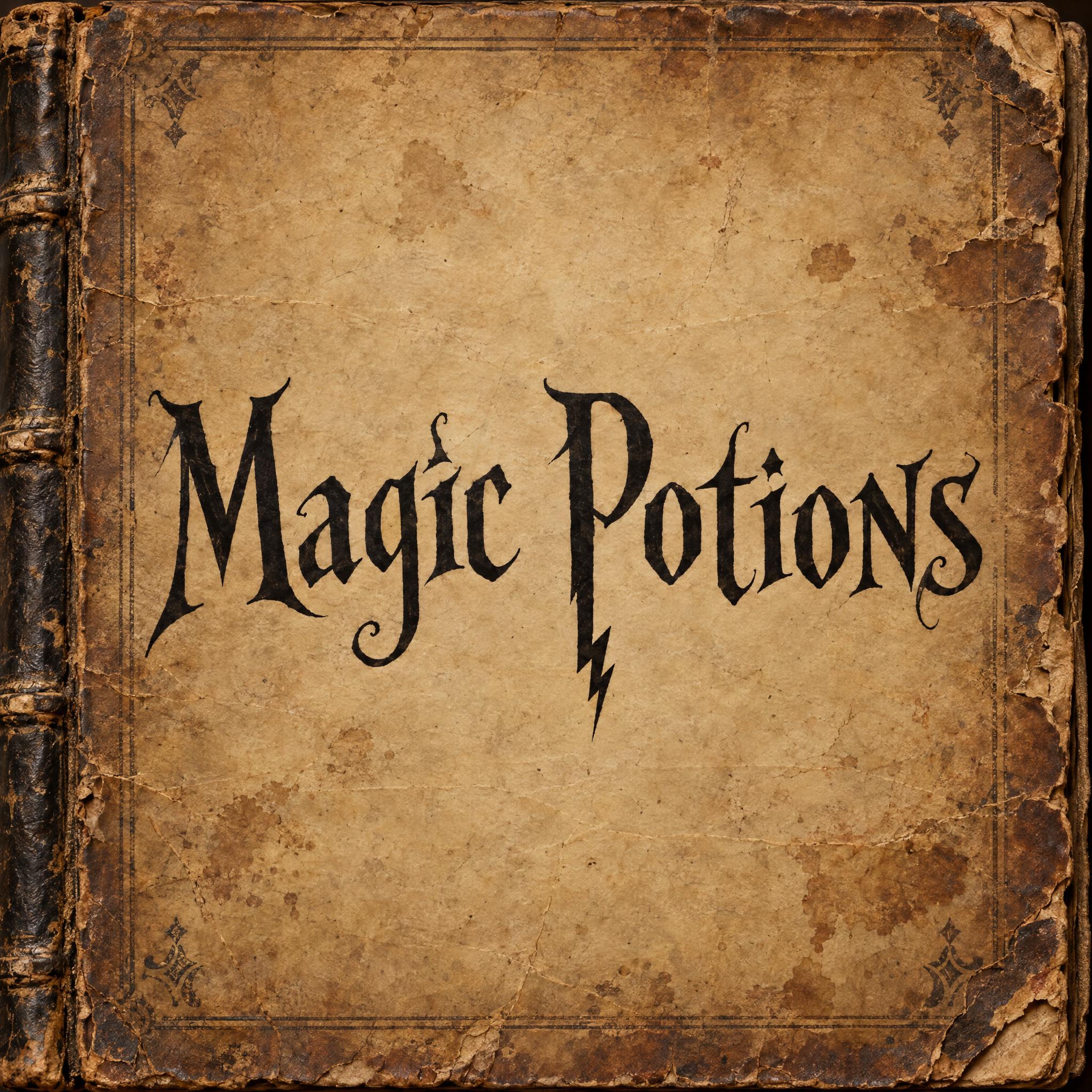
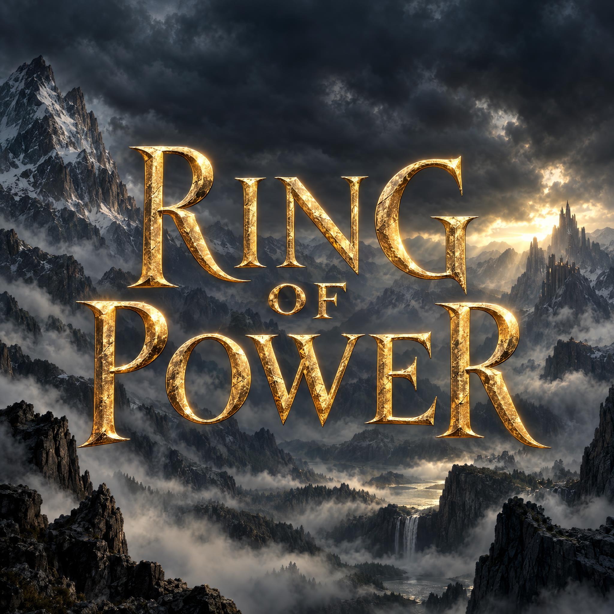
AI fonts for a second line, a logo lock-up or a poster footer.
Matrix Font sets your words like the green title of the 1999 sci-fi film. The capitals are widely spaced, with crisp wedge serifs and thin, sharp strokes, and the horizontal bars and some diagonals are sliced by narrow gaps as if a blade went through them. Each letter has a polished metal face with a faint bevel and a sharp streak of light along the top. The colour runs from cold emerald to dark teal with a soft green glow, and behind the word faint columns of tiny green characters fall straight down like digital rain, always dimmer than the title.
Type your words in the box above the prompt, copy it and paste it into ChatGPT, Gemini, Grok, Qwen or Seedream. The prompt has three parts: the text, the font design and the scene. The font design makes the cut serif capitals, the green metal and the falling code; the scene keeps everything on pitch black, lit only by the letters' own glow, and you can swap it for your own. Every image on this page is what each model returned from the unchanged prompt, with no retouching.
Use it for a YouTube thumbnail about coding or simulation theory, a sci-fi movie-night poster, a channel logo or a desktop wallpaper. The prompt describes how this kind of title is drawn and does not copy the official logo. The name and the logo belong to Warner Bros., so keep what you make for fan projects and personal posts, not for products you sell.
Details from the original render. Every one of them is named in the prompt.
Thin, sharp, widely spaced capitals with crisp triangular serifs.
Crossbars and some diagonals sliced by narrow gaps.
Emerald-to-teal metal face with a faint bevel and a bright top streak.
Faint columns of tiny green characters fall behind the title, always dimmer.
Pulled from the render. Handy when you build the rest of the design around the word.
Where this AI font earns its keep.
The Wachowskis' The Matrix opened in US cinemas on 31 March 1999. Wikipedia notes that scenes inside the Matrix were given a bias toward green, the tint of early monochrome computer monitors, while scenes in the real world lean blue. That green is also how most fans picture the title.
The falling code, now usually called digital rain, uses a custom typeface designed by Simon Whiteley: mirrored half-width kana mixed with Latin letters and numerals. Whiteley has credited the design to his wife, who is from Japan. No official version of the typeface has been released, so the fonts and screensavers online are imitations. Lynne Cartwright supervised the opening title sequence at Animal Logic, and Wikipedia points out its resemblance to the opening credits of Ghost in the Shell (1995). The later films in the franchise open with the same rain.
The prompt keeps the spaced wedge serifs, the blade cuts, the green metal and the rain behind, so the look carries over to any word. It does not copy the logo, which belongs to Warner Bros.
Sources: Wikipedia — The Matrix · Wikipedia — Matrix digital rain
The anime film's opening credits, a strong influence, look much like the later digital rain.
The film opens in the US on 31 March, with Matrix scenes tinted green like old monitors.
Simon Whiteley's custom typeface of mirrored kana, letters and numerals fills the falling code.
In our tests GPT Image came closest: thin spaced serifs, clear blade cuts and faint code rain behind. Nano Banana adds the strongest metal bevel, and on the Spanish, Portuguese and German pages it joins the M to the A and the T to the R, like the film's own title. Seedream draws heavier strokes, and Qwen gives the serifs long pointed tips; in German it drew a plain sans-serif instead. Grok left out the blade cuts on every first try, so its images here are second tries. Check the notes under each image, and compare them side by side above.
Both. All five models drew the title in our tests, so the example uses it. For your own words, type them in the box next to Prompt and copy again. Words with A, E, M or X show the blade cuts best.
That is the digital rain, and it is meant to be there: "Behind the word, faint columns of tiny glowing green characters fall straight down like digital rain, always dimmer than the title.". It sits behind the title and stays dimmer, so it reads as background, not as extra text. To drop it, delete that sentence.
No. The prompt describes how this kind of sci-fi title is drawn: cut wedge-serif capitals in green metal with code rain. It is not the official artwork and it does not copy the logo. The name and the logo belong to Warner Bros., so use what you make for a fan project or a personal post, not for shirts, stickers or prints you sell.
Wikipedia says the falling code uses a custom typeface designed by Simon Whiteley, made of mirrored half-width kana plus Latin letters and numerals, and that no official version has been released; the fonts and screensavers you find are imitations. This page uses no font file: it is a prompt that draws the title and the rain as a picture, a kind of matrix code font generator.
No. It is a prompt that makes a picture of your words with an AI image model, so there is no .ttf file and you cannot type matrix text with it. You get a finished image of your word in the style.
Glitch Font breaks letters with sideways offsets and red-blue colour fringes. This one keeps clean, refined serifs and only slices thin gaps through them, with the code falling behind. For a louder, slanted neon tech look, see Cyberpunk Font.
Change "The letters are cold emerald green shading to dark teal, with a soft green glow around them.", for example to "The letters are cold silver shading to steel blue, with a soft blue glow around them.", and change the colour word in the rain sentence to match.
Pick the ratio in your app if it has one. If not, add "Wide 16:9 image." or "Tall 2:3 image." at the end of the prompt.
Copying the prompt is free. Whether the image costs anything depends on the app you paste it into, and what you may do with the image depends on that app's terms.