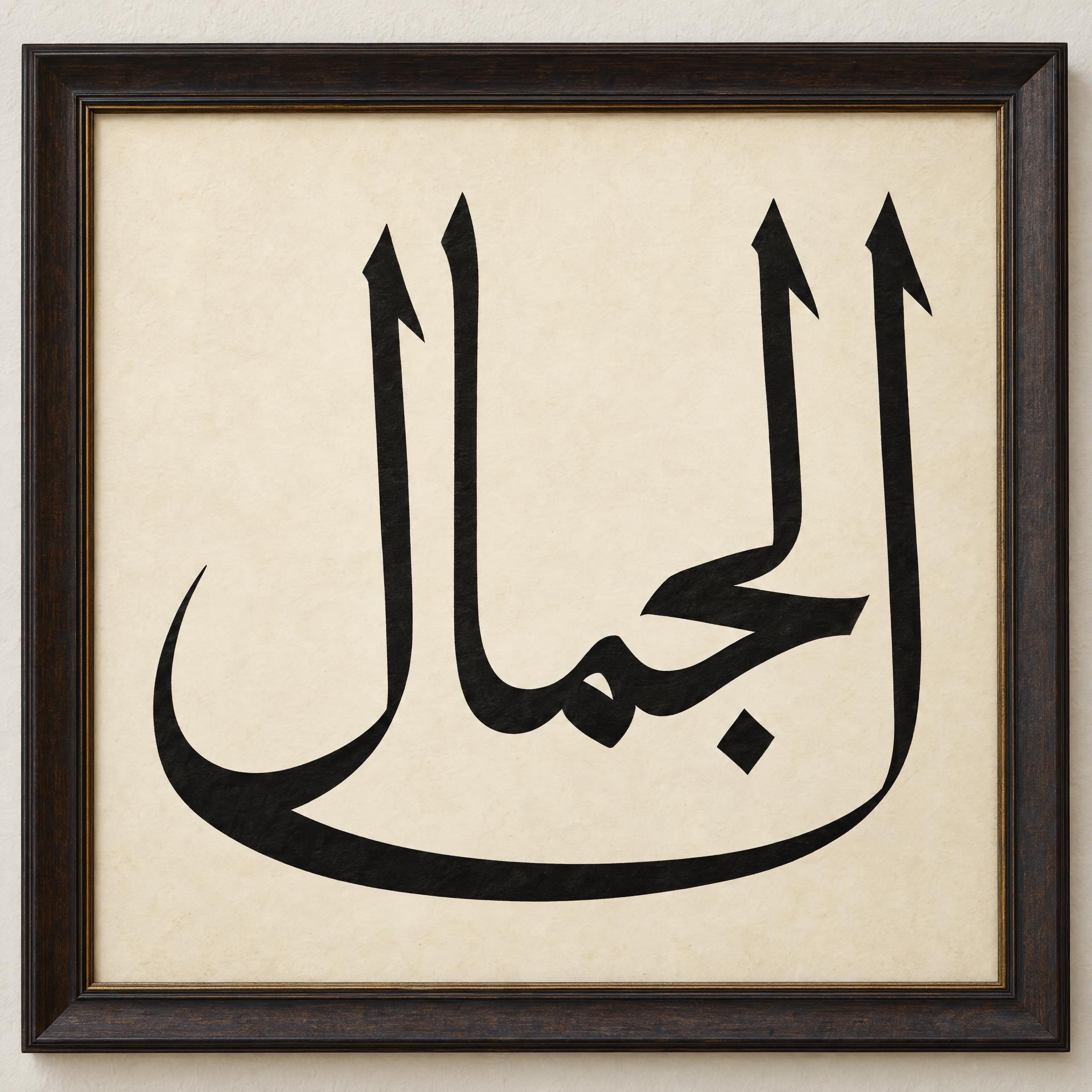
Arabic calligraphy as copy-ready AI prompts, one for each classic script: angular Kufic on parchment, round and upright Naskh, monumental Thuluth with towering strokes, climbing Ottoman Diwani, quick everyday Ruq'ah and hanging Persian Nastaliq, plus gold Ramadan lettering in Latin letters. Paste in the Arabic word you want, copy, and use the prompt in ChatGPT or Gemini.
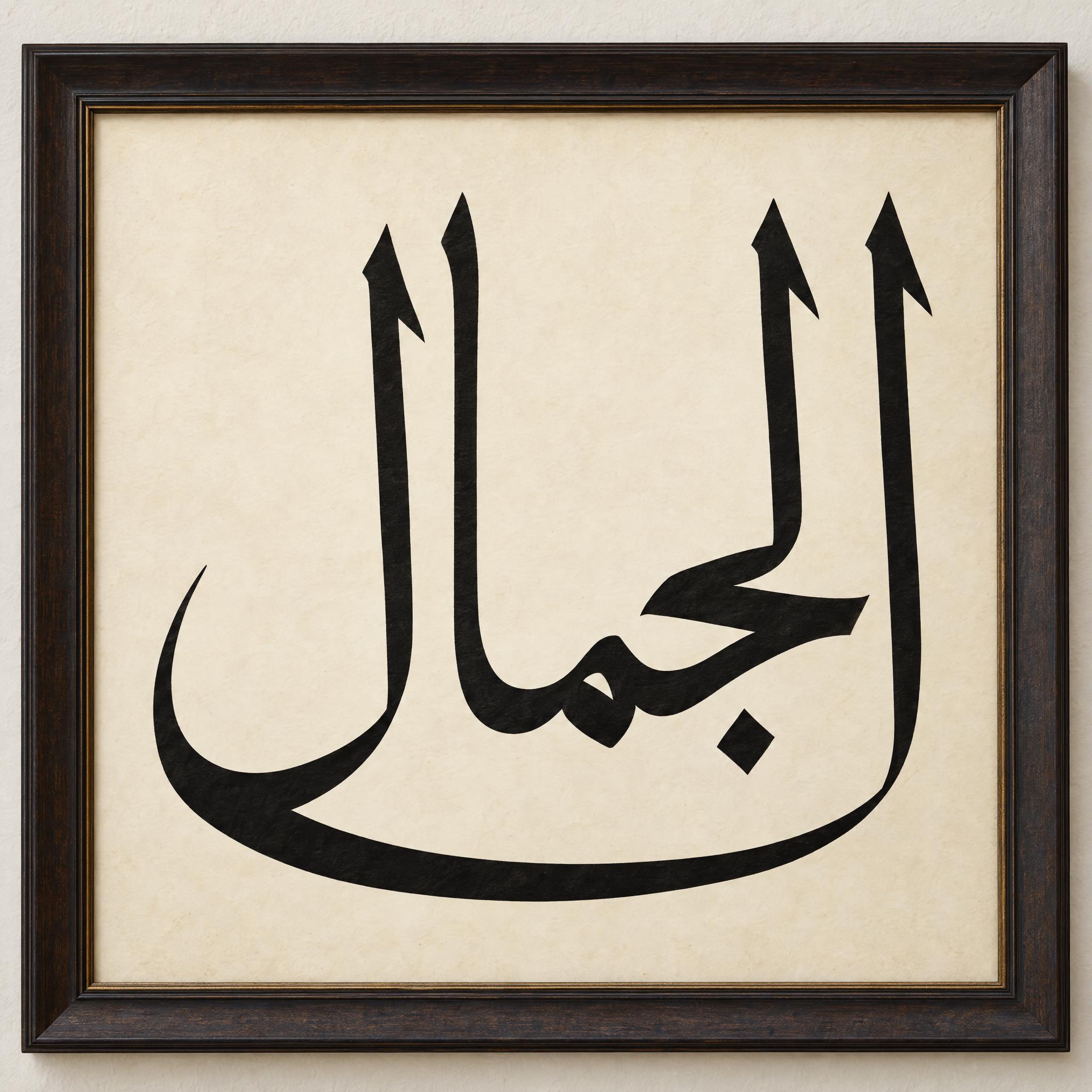
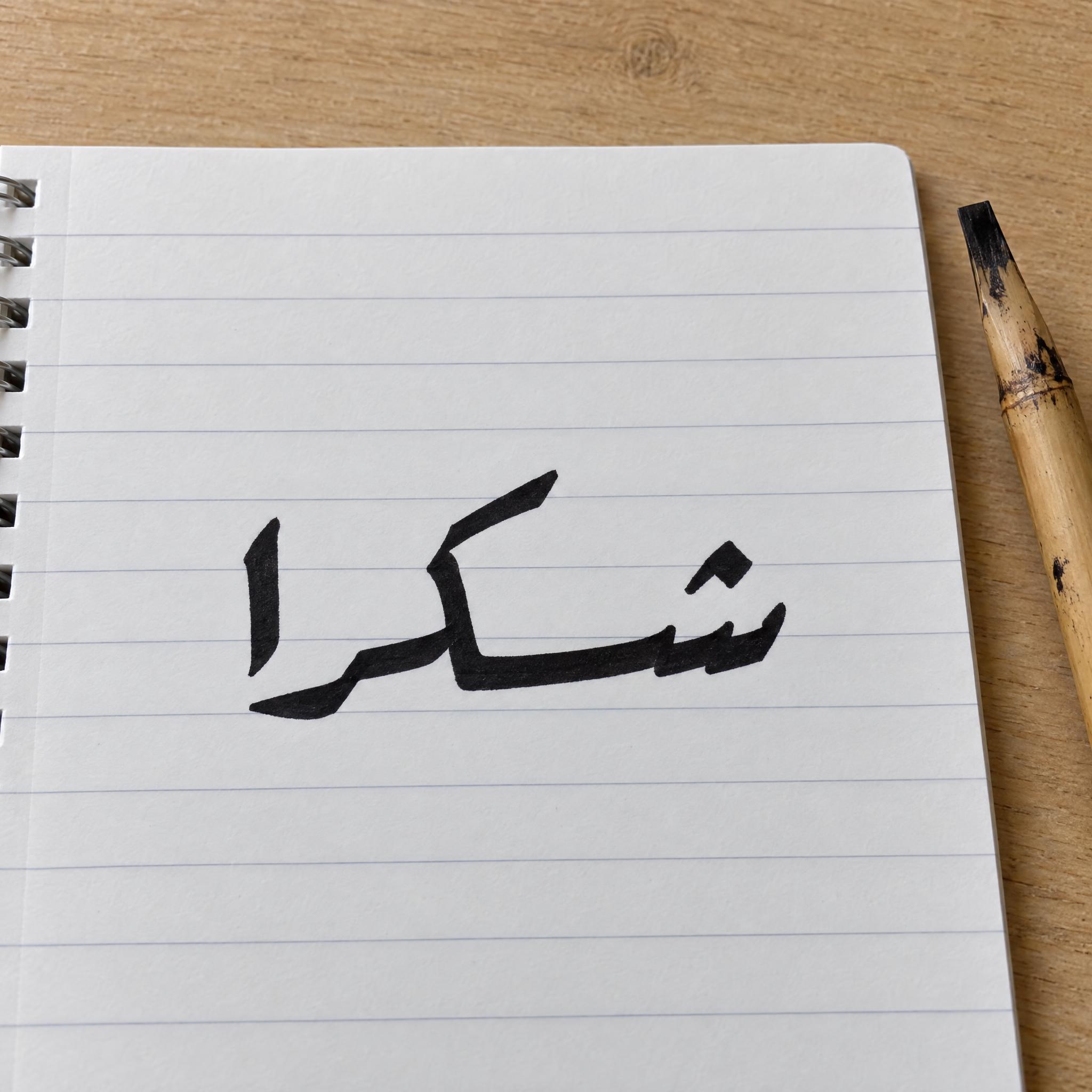
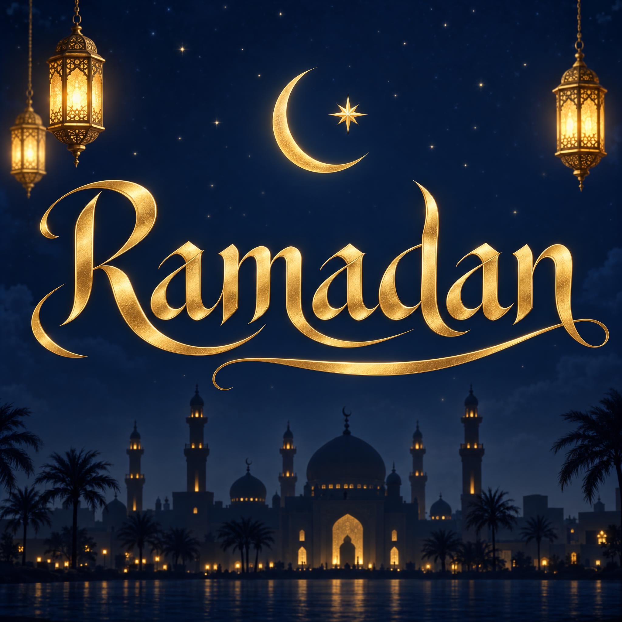
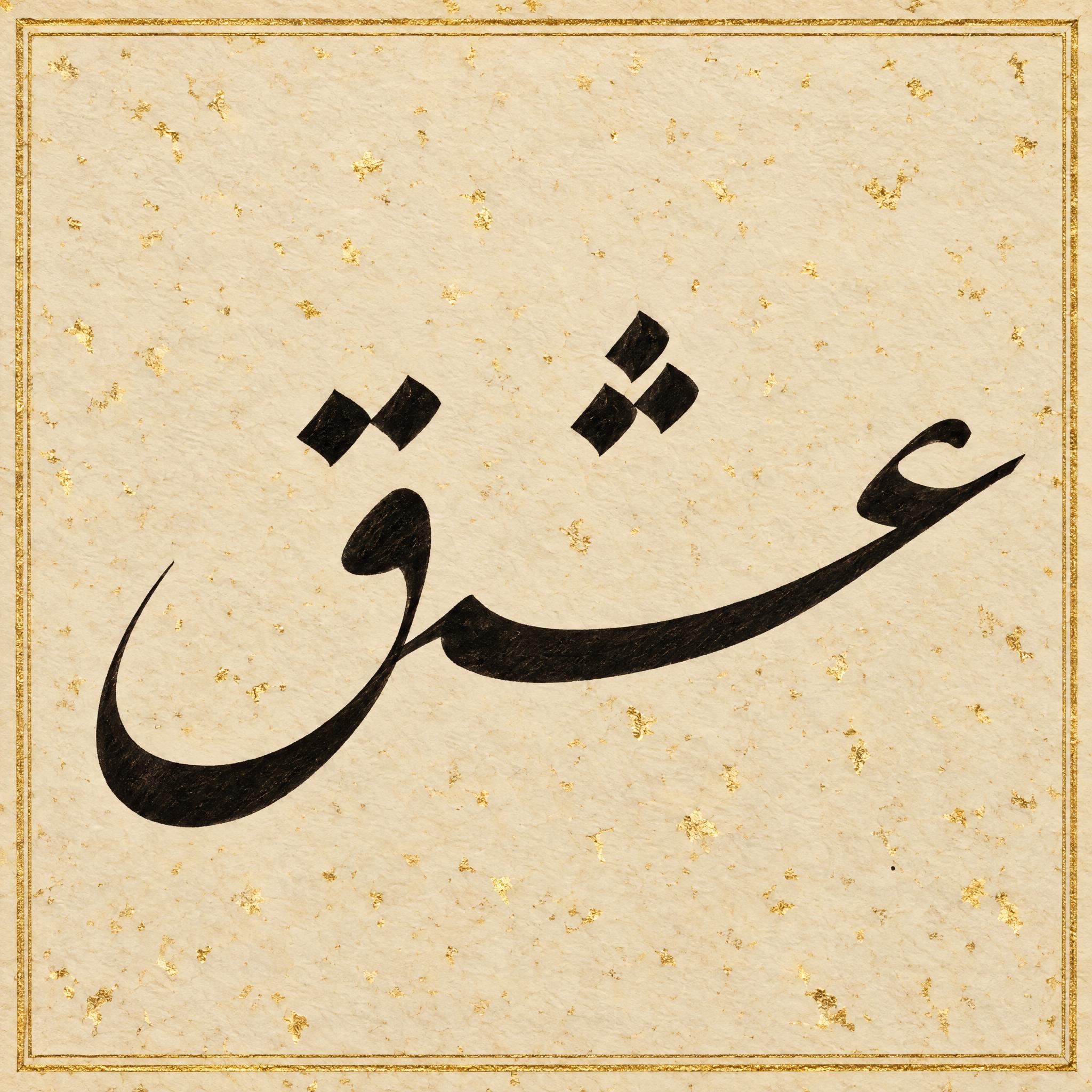
Type your word, copy the full prompt and paste it into ChatGPT, Gemini or any image model.
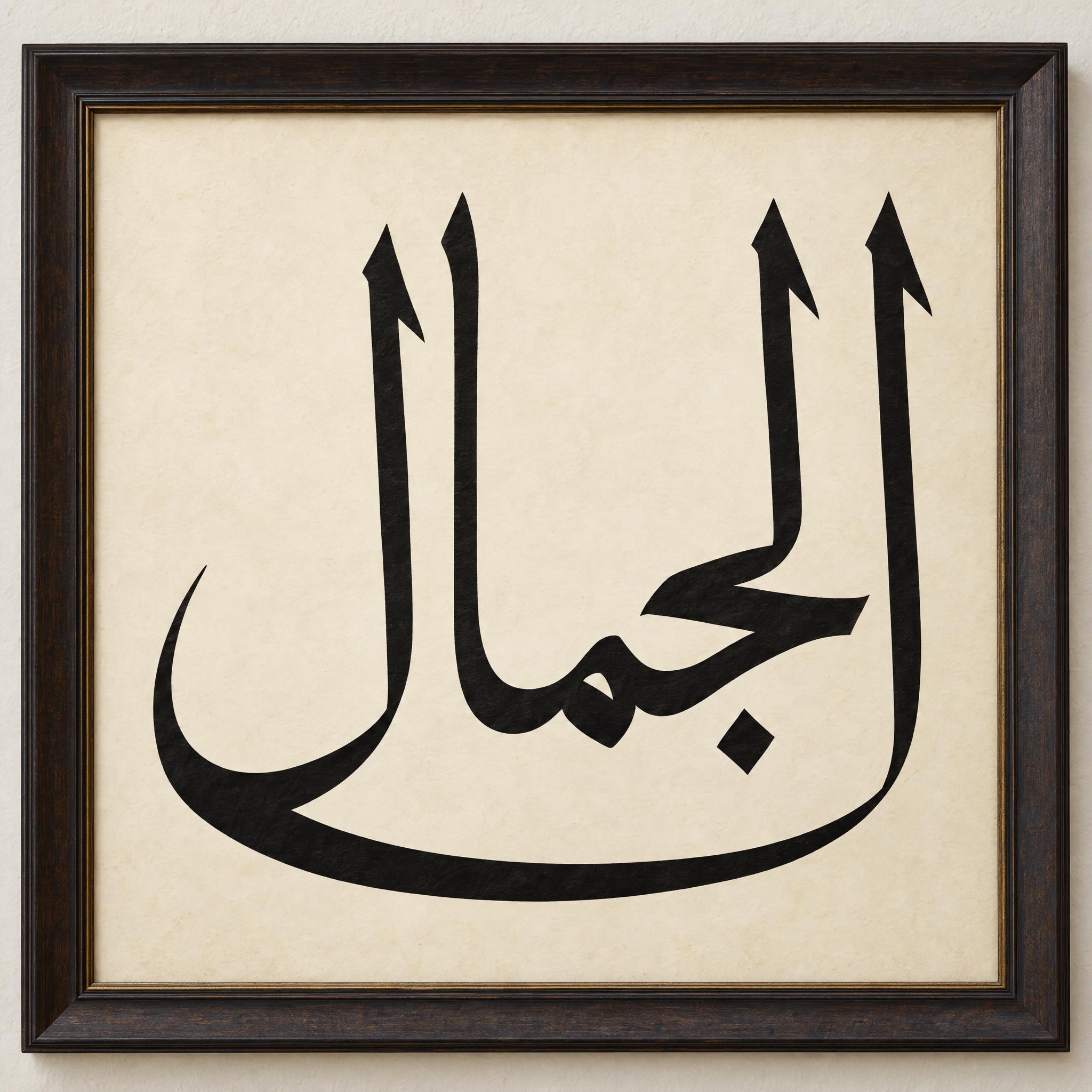
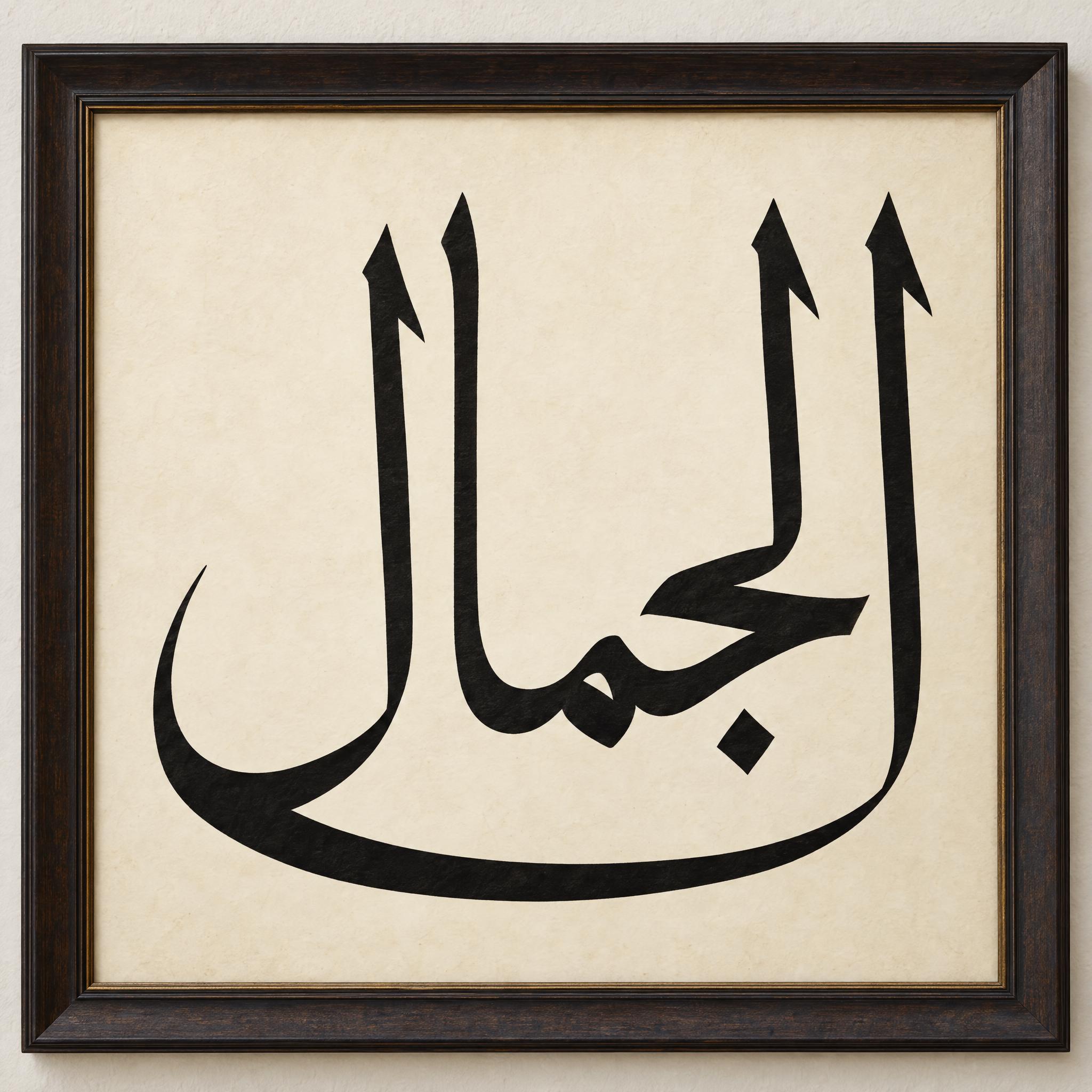
TextWrite the Arabic word "الجمال". Spell it exactly as written, in connected Arabic letters from right to left, without adding or changing any letter.
Font designArabic Thuluth calligraphy written with a broad reed pen: a large, monumental word arranged on two levels, part of the word lifted and written above the rest, so the whole word forms a compact block taller than it is wide. Straight vertical strokes stand about three times the height of the other letters, each topped with a small slanted wedge. The final letter sweeps out in a long, deep curve that runs back beneath the letters before it. Every letter keeps its standard Thuluth shape and the word reads clearly. Strokes swell thick on curves and taper thin on joins. Each dot is a small diamond mark of the pen nib, only where the spelling needs it, with no extra dots or marks. Deep black ink with crisp edges. Like a framed Thuluth calligraphy panel.
SceneOn ivory burnished paper in a dark wooden frame on a pale wall, no other text; the word centered, filling most of the space.
Open one for the prompt and real results on each image model.
Tested November 2026. First attempts from our test ledger: 221 images, 7 fonts, 7 languages, each one checked by eye.
How to read it: 40 / 46 means 46 images tested and 40 spelled the word right on the first try; the percentage is that share. The Latin, Chinese / Japanese and Arabic columns split the same count by the script of the word.
| Model | Right first time | Latin | Chinese / Japanese | Arabic | Most common issue |
|---|---|---|---|---|---|
| GPT Imagegpt-image-2.5-sunburst · xhigh | 87% 40 / 46 | 92% 24 / 26 | 77% 10 / 13 | 86% 6 / 7 | Wrong letter |
| Nano Bananagemini-nano-banana-2.1 | 91% 39 / 43 | 92% 22 / 24 | 85% 11 / 13 | 100% 6 / 6 | Word split apart |
| Seedreamdola-seedream-5-0-pro-260628 | 22% 10 / 45 | 29% 8 / 28 | 0% 0 / 10 | 29% 2 / 7 | Extra letter |
| Grok Imaginegrok-imagine-image-2.0 · medium | 36% 15 / 42 | 48% 12 / 25 | 8% 1 / 13 | 50% 2 / 4 | Extra words added |
| Qwen-Imageqwen-image-3.0-pro | 7% 3 / 45 | 12% 3 / 25 | 0% 0 / 13 | 0% 0 / 7 | Extra words added |
How we test: images are made through FontVibe with each model’s API, sending the prompt as is; we count only each model’s first image for every font and language and check the spelling by eye. Apps such as ChatGPT may rewrite prompts, so results there can differ. For the full data, email [email protected].
Every script draws the same 28 letters in a different way, so a good prompt names one script and then describes what a reader can see: where the letters sit, which stroke stands out, how the dots are written. The examples are quoted word for word from the prompts of the fonts on this page.
Arabic runs from right to left in joined letters, and one extra dot can turn a letter into another. Say both, and forbid added letters.
“in connected Arabic letters from right to left, without adding or changing any letter” — Naskh Font
Naskh, Ruq'ah and Kufic sit on one straight line; Diwani climbs and Nastaliq hangs. The line decides the silhouette, so name it first.
“medium-sized, rounded, upright letters that sit evenly on one straight baseline” — Naskh Font
Thuluth is recognised by verticals that tower over the rest of the word. Say how much taller, not just tall, or you get a bold book hand.
“Straight vertical strokes stand about three times the height of the other letters, each topped with a small slanted wedge.” — Thuluth Font
Nastaliq hangs down to the left, Diwani climbs up to the left. The two are easy to confuse, so name the corners the word runs between.
“each joined group of letters slopes diagonally downward from upper right to lower left, as if suspended from a line” — Nastaliq Font
The more a script bends, the easier it is for a model to repeat or drop a letter. Ask for each letter once, and keep the curve moderate.
“each letter stays distinct and appears exactly once, so a native reader recognizes the word at a glance” — Diwani Font
Dots are what tell many Arabic letters apart. Ruq'ah joins them into dashes and carets, the other scripts keep the small diamond of the pen nib. Name the form and rule out extras.
“As in Ruq'ah, two dots are joined into one short dash and three dots into a small caret, with no dots or marks beyond what the spelling needs.” — Ruqah Font
Kufic is the script of the earliest Qurans, copied on parchment. Brown, slightly faded ink makes the word look that old; a framed Thuluth panel wants crisp black.
“Dark brown ink, slightly faded at the edges.” — Kufic Font
Six scripts cover most of what you see in Arabic and Islamic calligraphy. Look at the baseline first, then the tallest stroke, then the dots.
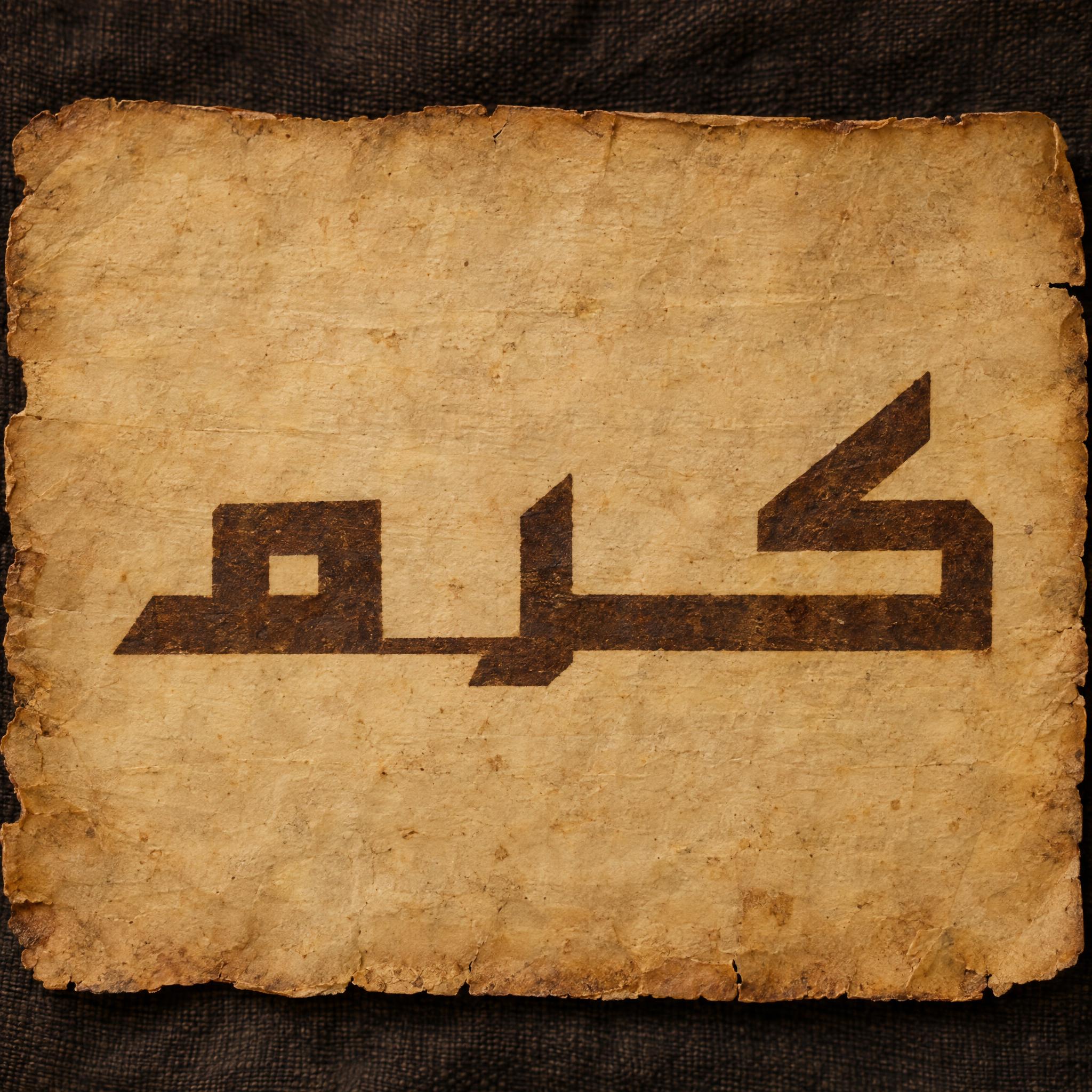
Kufic is characterized by angular, rectilinear letterforms and a horizontal orientation. Kufic Font stretches the horizontals, keeps the verticals short and turns round letters square: the look for anything that should feel early and austere.
Sources: Wikipedia — Kufic
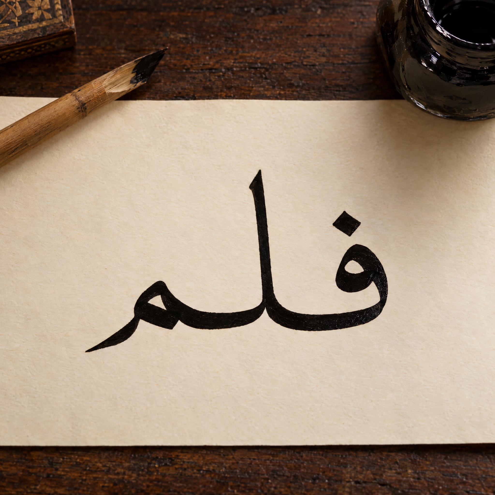
Naskh was used for administrative documents and for copying books, including the Quran, and it is the style used by default on screens today. Naskh Font keeps every letter upright on one line: the easiest script to read.
Sources: Wikipedia — Naskh (script)
Thuluth is the script of surah headings and mosque inscriptions. Thuluth Font lifts the verticals about three times above the other letters and sweeps the last letter back under the word, the look of a framed panel.
Sources: Wikipedia — Thuluth
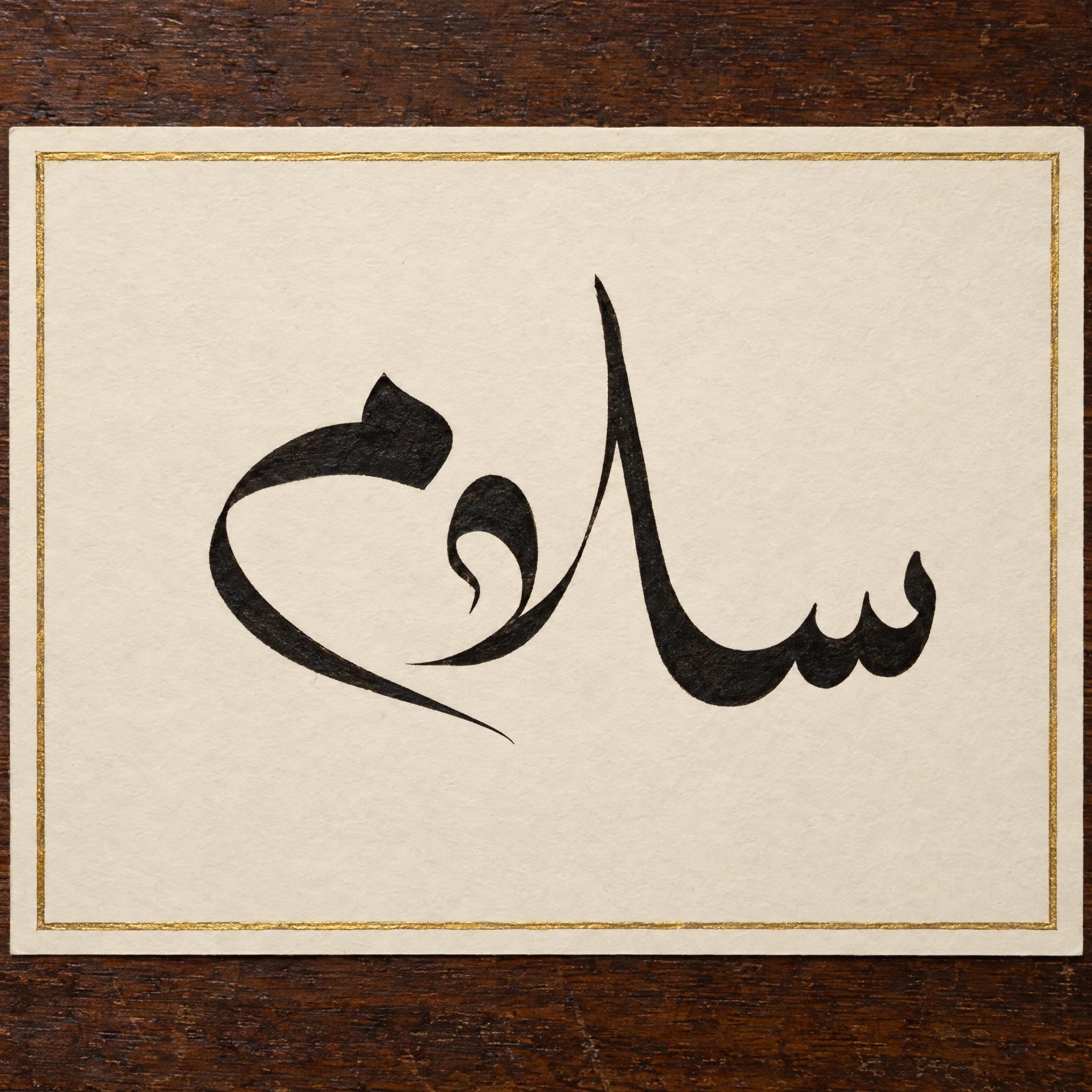
Diwani was the Ottoman chancery script, used for royal decrees, and its intertwined letters are hard to read or write. Diwani Font keeps the climb and the curls but asks for every letter to stay distinct.
Sources: Wikipedia — Diwani
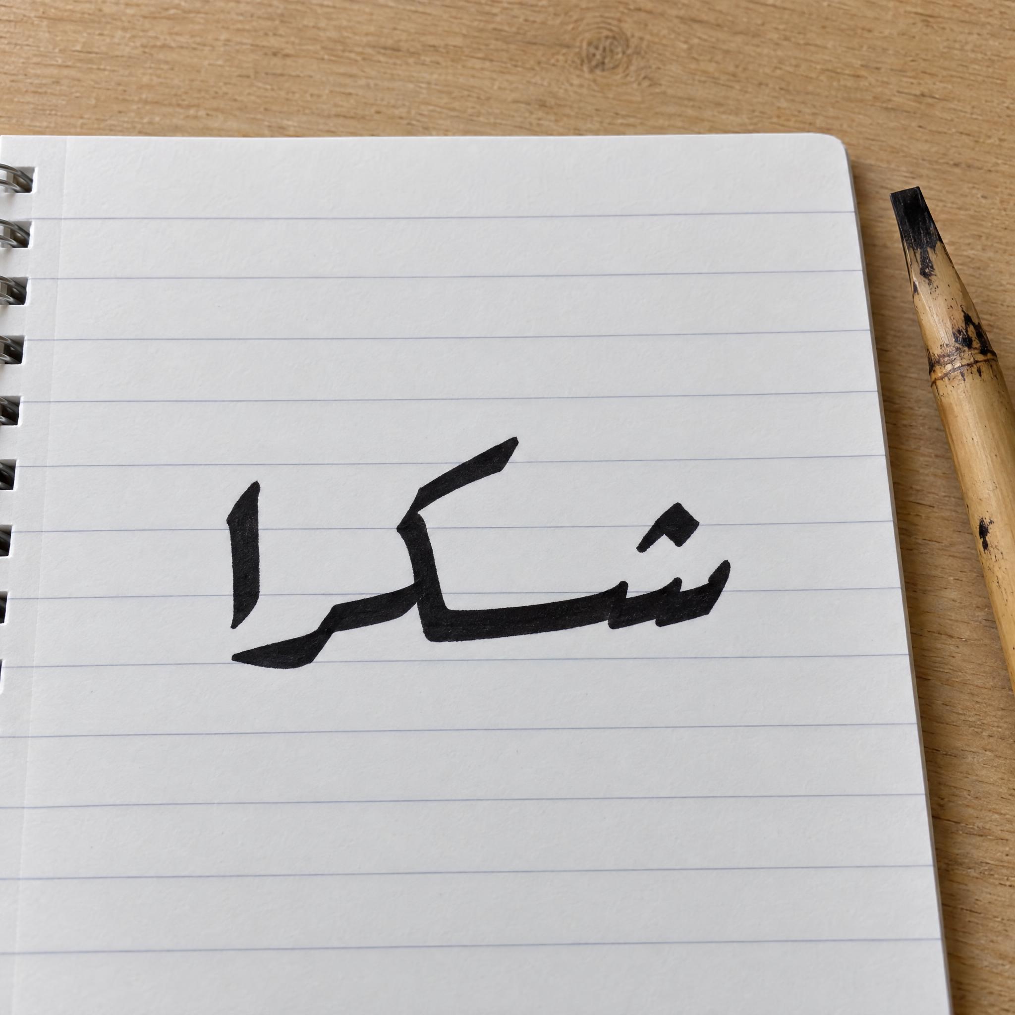
Ruq'ah is the most common handwriting in the Arabic script, built from short straight lines and simple curves. Ruqah Font writes it fast and plain, with two dots joined into a dash.
Sources: Wikipedia — Ruq'ah script
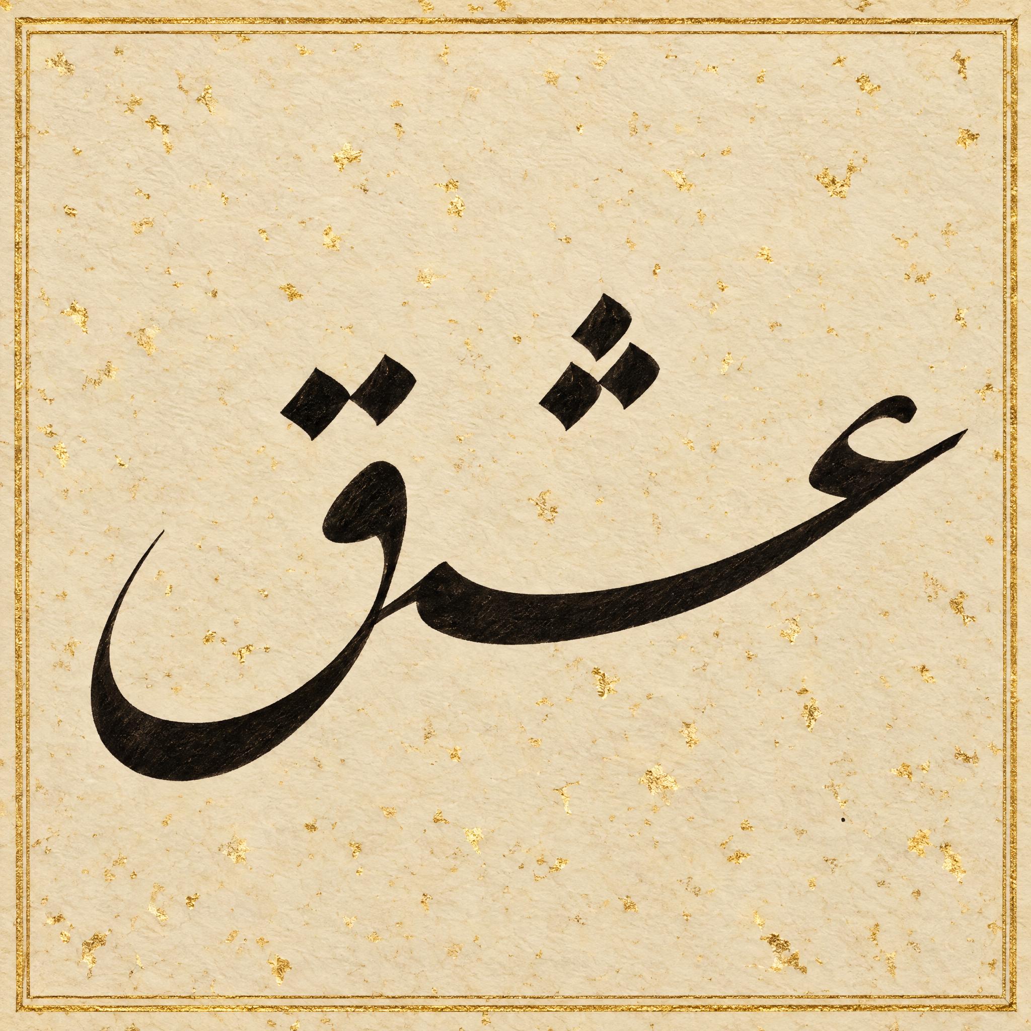
Nastaliq was developed for Persian poetry and is the usual script for Urdu. In Nastaliq Font each joined group of letters hangs down to the left, with long, shallow bowls. It is the most popular style of Persian calligraphy.
Sources: Wikipedia — Nastaliq
Each script lives in the shapes of Arabic letters: the wedge sits on the alif, the deep tail on a final letter, the joined dots on ش. Latin letters have none of those parts, so a Thuluth A could only hint at the style. That is why the six script prompts write Arabic on every language page, and Ramadan Font is the one made for Latin letters.
An Arabic font has to draw each of the 28 letters in up to four forms, depending on where the letter sits in a word, and join them all. These are image prompts, not .ttf files. To type long Arabic text, install a font; for a title, a wall piece or a gift, a prompt gives you real calligraphy on the one or two words you need.
Sources: Wikipedia — Arabic alphabet
The development of Arabic calligraphy is strongly tied to the Quran, though it is also widely used in secular art. The samples here use everyday words such as pen, beauty, peace and coffee, because a model can still miss a letter, and a misspelt verse or name of God offends readers in a way a misspelt coffee does not. If you write religious text, have someone who reads Arabic check every letter first.
Sources: Wikipedia — Islamic calligraphy
| You want | Try | Why |
|---|---|---|
| A framed wall piece | Thuluth Font | Towering verticals and a deep sweeping tail |
| A book cover or a clear title | Naskh Font | Round, upright, the easiest to read |
| Something that looks centuries old | Kufic Font | Angular and stretched, brown ink on parchment |
| An elegant invitation or signature | Diwani Font | The word curls and climbs to the left |
| A note or a sign in everyday Arabic | Ruqah Font | Short and quick, dots joined into dashes |
| A line of poetry | Nastaliq Font | Each word hangs down to the left |
| A Ramadan card in Latin letters | Ramadan Font | Gilded Latin letters with Arabic-style tails, a crescent and lanterns |
Kufic is the oldest of the calligraphic Arabic scripts, named after the city of Kufa in southern Iraq. Until about the 11th century it was the main script used to copy the Quran, and the earliest surviving copies, written on parchment, date from the 8th to the 10th century. Over time a series of flowing, curved scripts came to surpass Kufic in religious, government and private use.
Those scripts were put on a measured footing in Abbasid Baghdad. Ibn Muqla (885/886–940), three times vizier, related every letter to three measures: the dot, the height of the alif, and a circle whose diameter is that height. The dot is the rhomboid mark the reed nib leaves, and the alif is drawn as a set number of dots that depends on the script. Ibn Muqla is credited with Thuluth and five other styles; Ibn al-Bawwab, who died in Baghdad around 1022, perfected the proportioned style. The tool behind it is the qalam, a cut, dried reed whose tip is cut at an angle chosen for the script.
Later empires added scripts of their own. Diwani developed under the early Ottomans, was named after the Ottoman divan and reached its height under Süleyman the Magnificent (1520–1566), when it was used for royal decrees. Ruq'ah was standardised in the 19th century by the Ottoman calligraphers Mumtaz Efendi and Mustafa Izzet Efendi, and every literate Ottoman was expected to write it. In Iran, Nastaliq is attributed to Mir Ali Tabrizi, who lived in Tabriz in the 14th century and died around 1420; it was made for Persian poetry and only later used for prose.
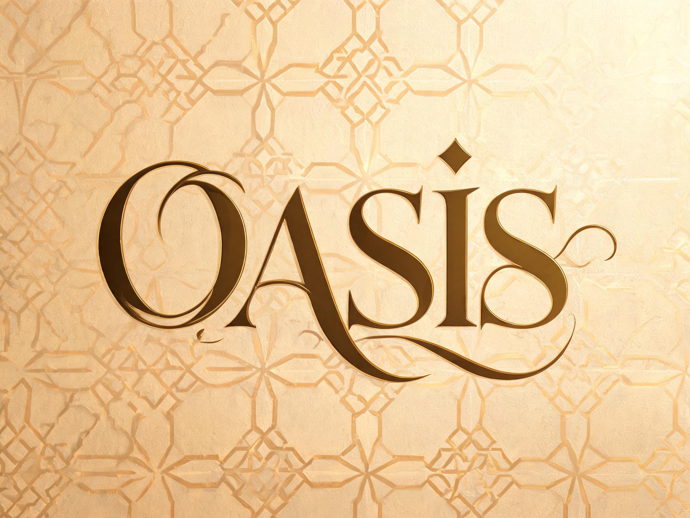
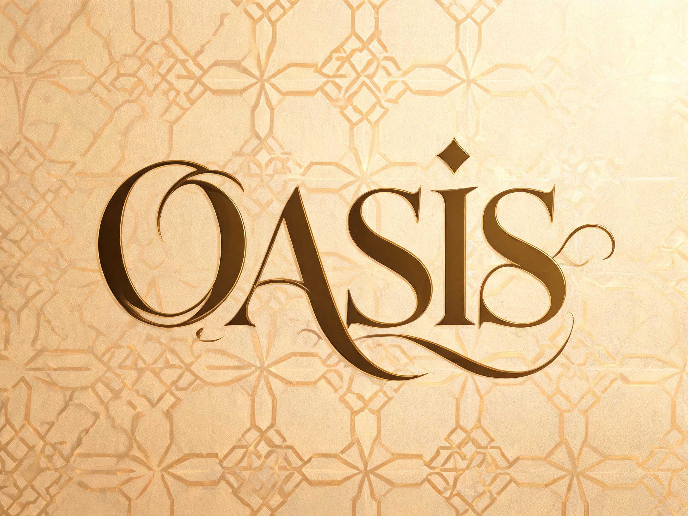
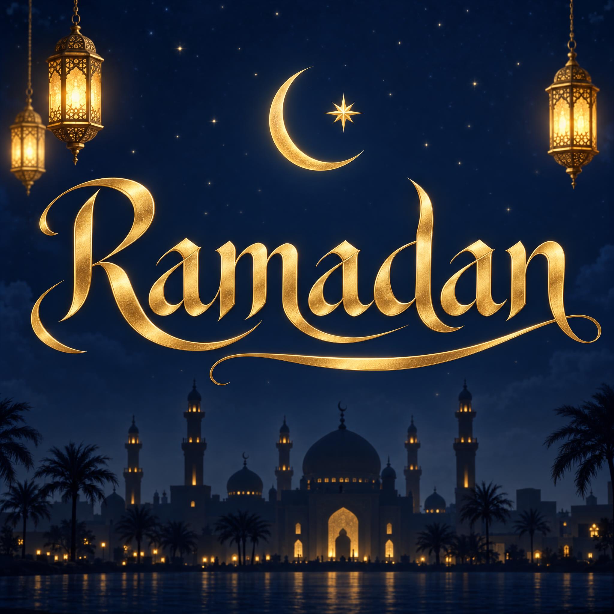
Calligraphy is also part of Ramadan. Common greetings during the month are Ramadan mubarak, blessed Ramadan, and Ramadan kareem, generous Ramadan, and in some countries lights called fanous are strung across the streets. Ramadan Font brings that card to Latin letters: a gold word with Arabic-style tails, a crescent and a star above it, lanterns on a midnight-blue sky.
Sources: Wikipedia — Kufic · Asian Art Museum — The History of Islamic Calligraphy · Wikipedia — Ibn Muqla · Wikipedia — Ibn al-Bawwab · Wikipedia — Qalam · Wikipedia — Diwani · Wikipedia — Ruq'ah script · Wikipedia — Nastaliq · Wikipedia — Mir Ali Tabrizi · Wikipedia — Ramadan
Angular and stretched, from the earliest Quran manuscripts.
Round, upright letters on one line, the book hand.
Monumental, with towering verticals and deep tails.
The Ottoman court script: the word curls and climbs.
Quick everyday handwriting, dots joined into dashes.
The hanging Persian hand of poetry manuscripts.
Gold Latin letters with Arabic tails, crescent and lanterns.
Letters built on a grid like a maze. Coming later.
Kufic, Naskh, Thuluth, Diwani, Ruq'ah and Nastaliq. Kufic is angular, Naskh is the round book hand, Thuluth has towering strokes and deep tails, Diwani curls and climbs, Ruq'ah is quick everyday handwriting and Nastaliq hangs down to the left.
Close: each style is a prompt you paste into an image app such as ChatGPT or Gemini, with your word inside. The app draws the calligraphy; the prompt tells it which script, which strokes and what paper.
No. Each style is a prompt that draws an image of the word you paste, not a .ttf or .otf file. For long text you need an installed font; for a title, a sign or a framed piece, the image gives you calligraphy no font file has.
Yes, if you paste it in Arabic letters. The prompts don't translate or transliterate, so get the spelling from someone who reads Arabic first. To keep your name in Latin letters with an Arabic feel, use Ramadan Font and change the word.
Naskh, then Ruq'ah. Naskh Font keeps every letter in its standard form on one line; Diwani and dense Thuluth are the hardest for most readers.
Usually, but not always: a model can add a dot, drop a letter or repeat one. Look at every letter, and have someone who reads Arabic check it before you print, frame or engrave it.