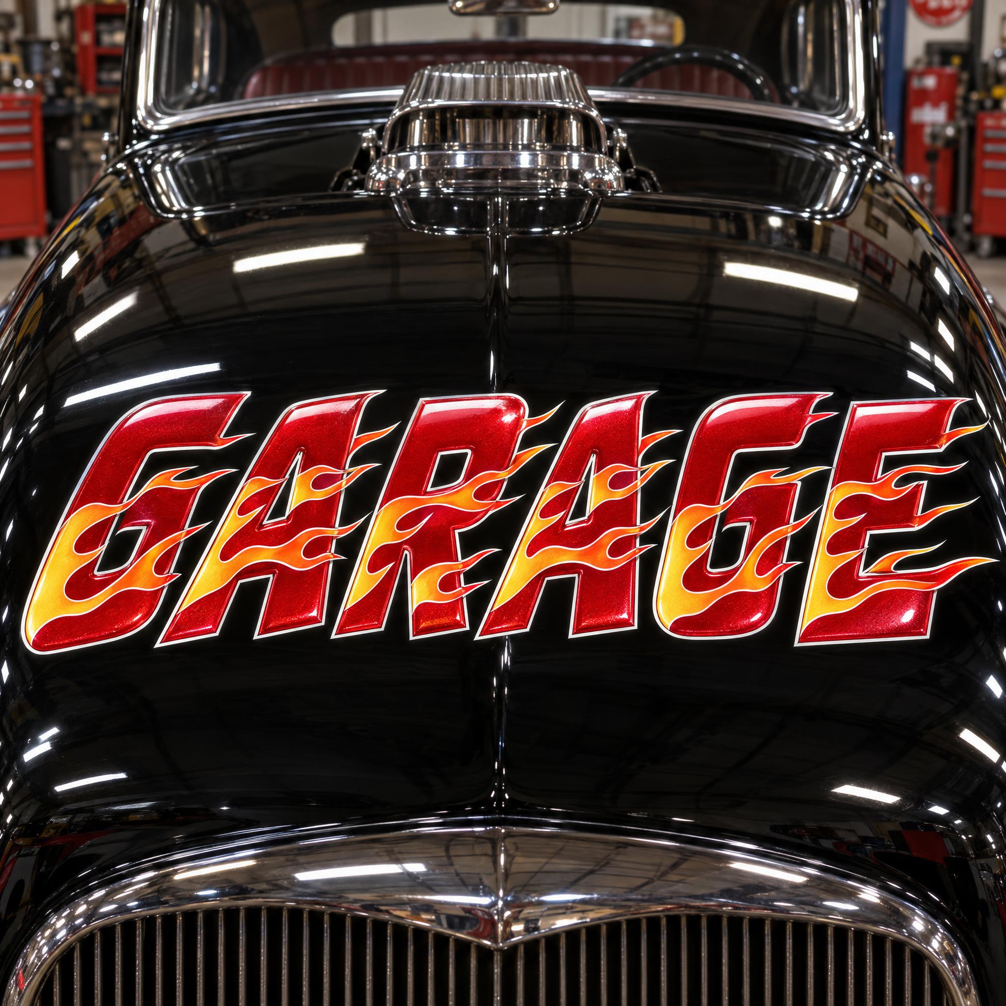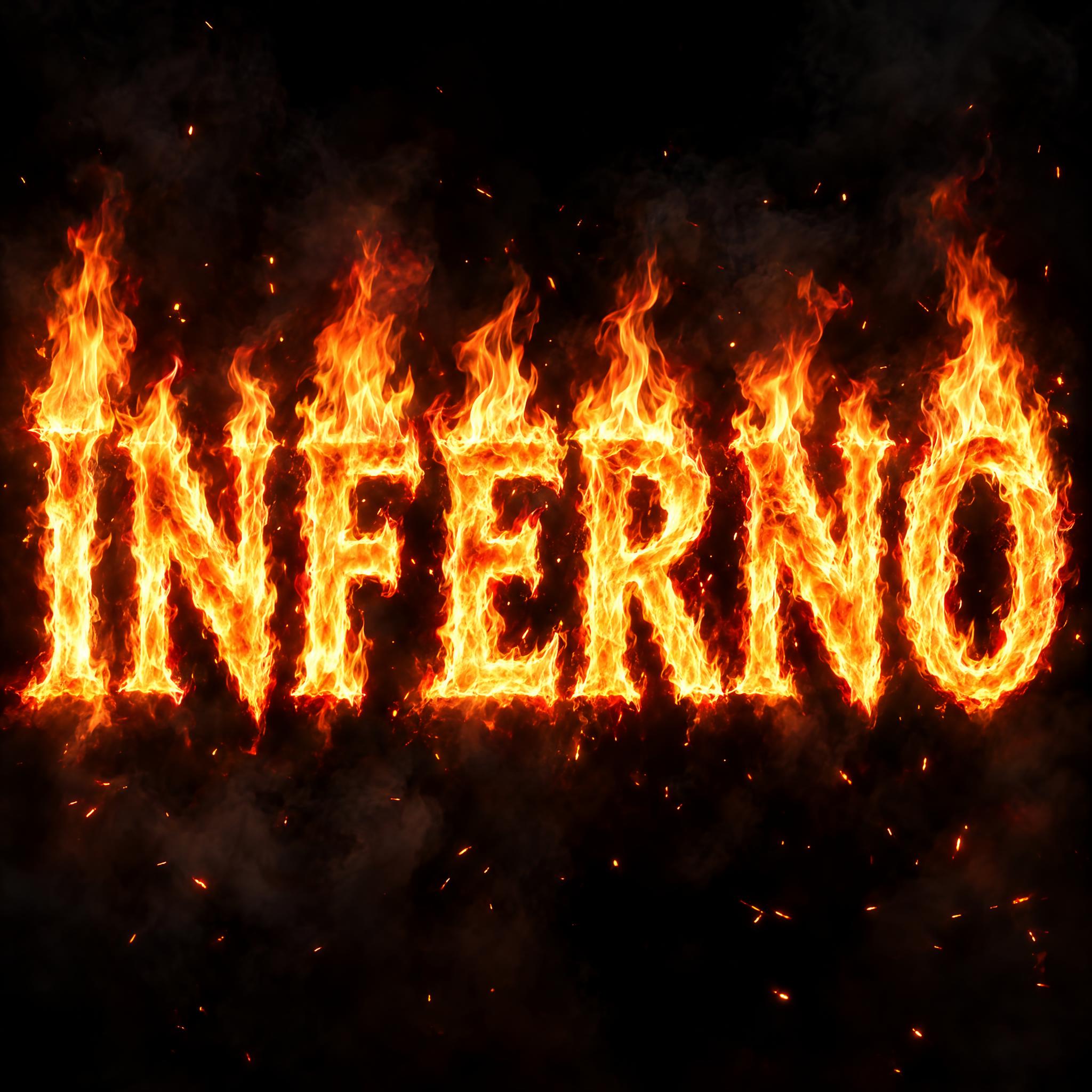
Fire fonts as copy-ready AI prompts, in the five looks people mean by fire letters: cartoon flame tongues like a sticker, realistic burning text, hot rod flames painted on a car, cracked lava rock and white smoke. These are prompts, not font files: type your word, copy, and paste into ChatGPT or Gemini, or generate it right away on FontVibe.
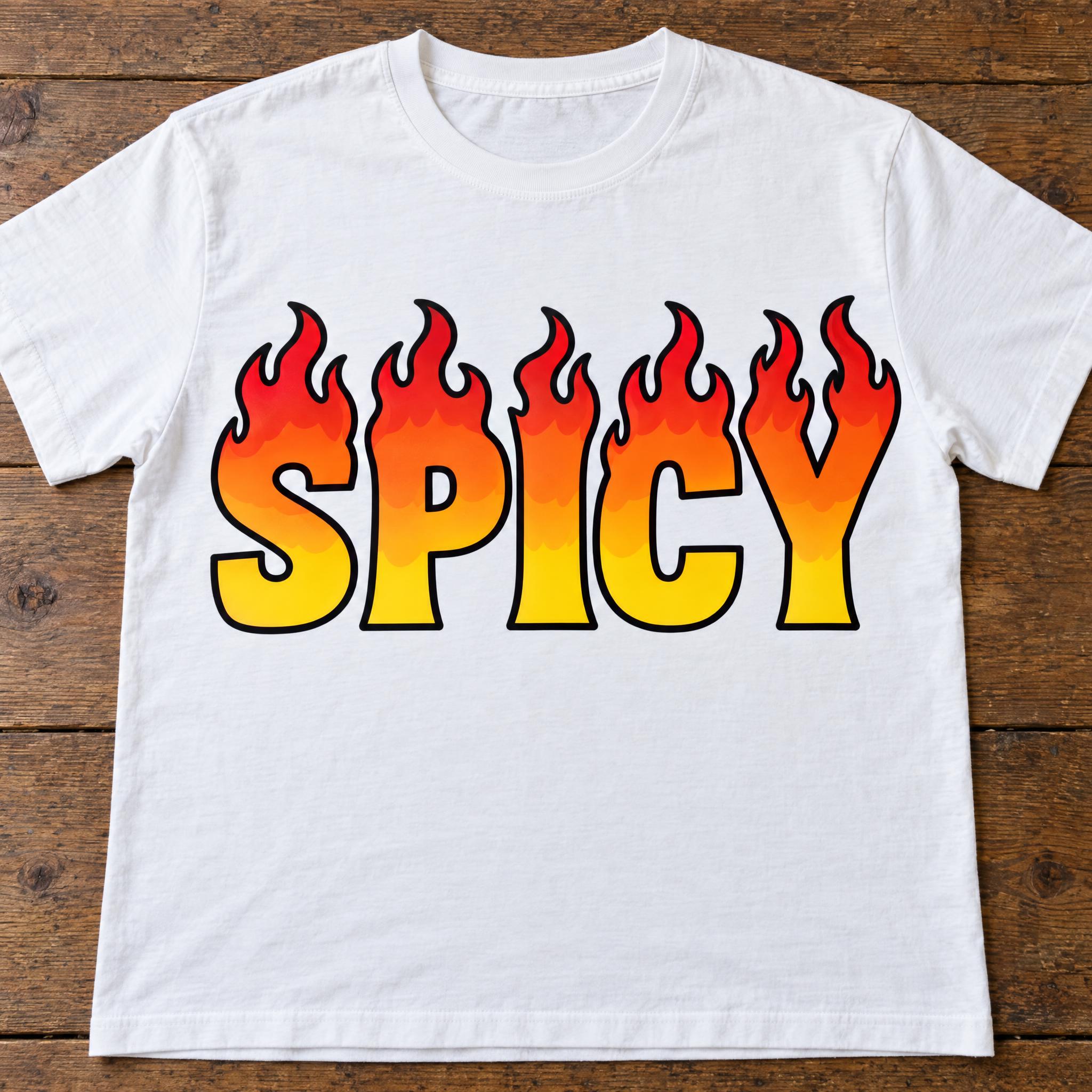
Type your word, copy the full prompt and paste it into ChatGPT, Gemini or any image model.
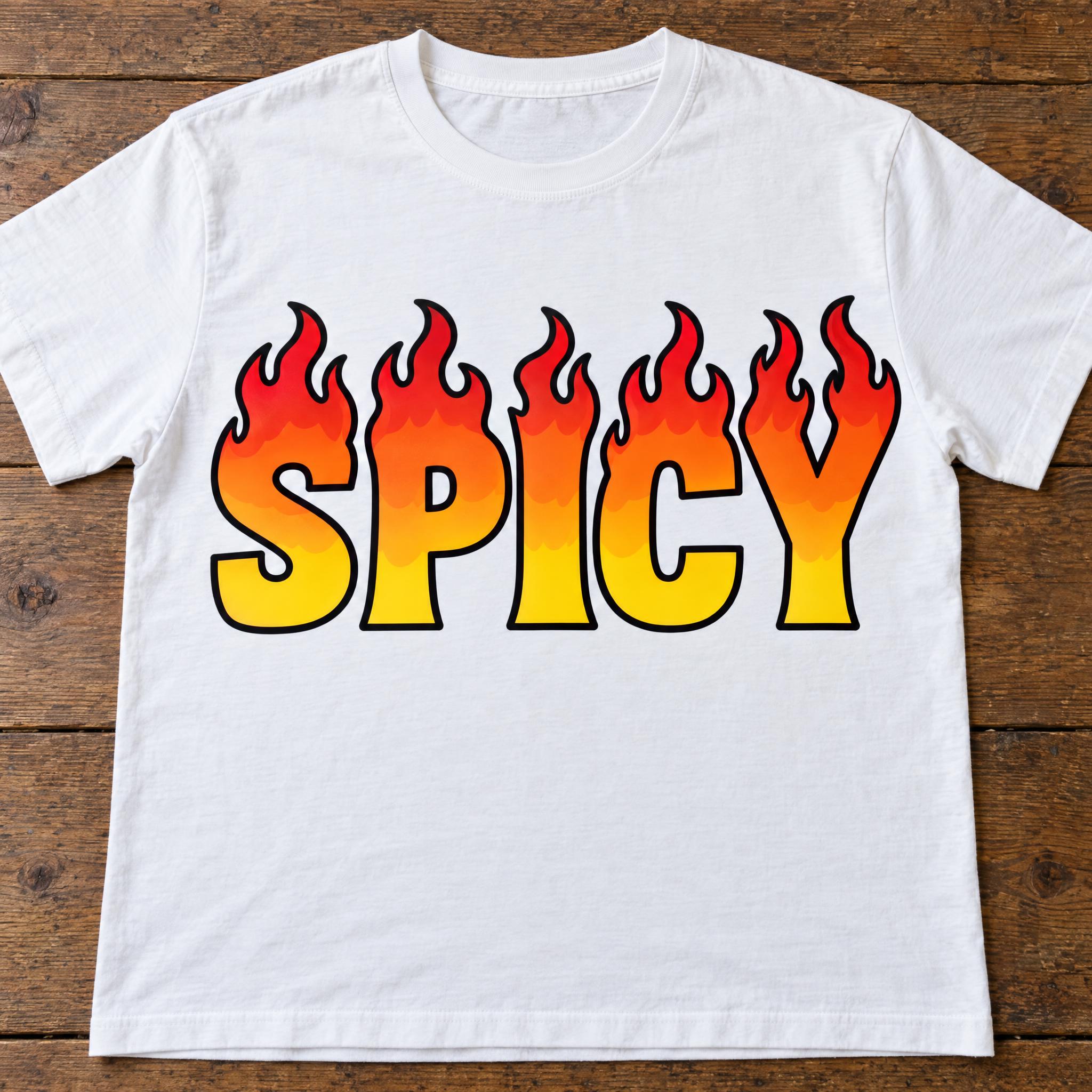
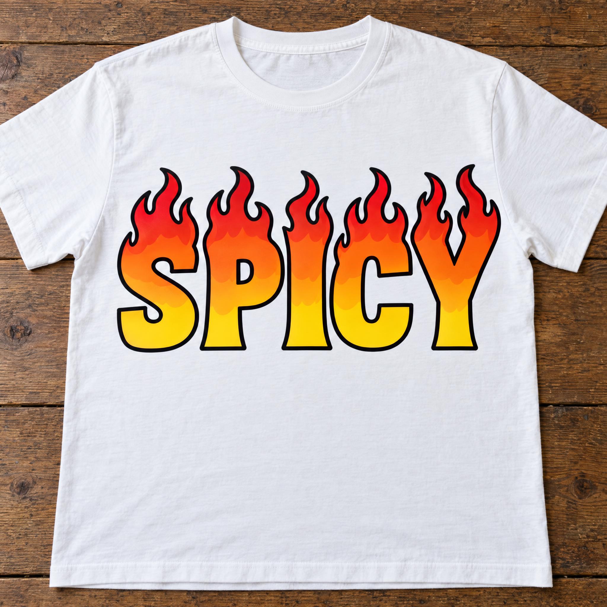
TextWrite the word "SPICY". Spell it exactly as written, without adding or changing any letter.
Font designFlame lettering: heavy, bold capital letters with a solid, flat-bottomed base, every letter reads at a glance. The top of every letter grows into two or three cartoon flame tongues that curl and flick upward to sharp points, while the lower part keeps its plain letter shape. Every letter is yellow at the base, shading through orange to red at the flame tips. Each letter, flames included, has one thick black outline. The colour is flat, in smooth bands like a vinyl sticker, with no realistic fire or glow. Like a classic flame decal.
ScenePrinted large on the front of a plain white T-shirt laid flat on a wooden table; the word is the only print, centered, filling most of the width and reading clearly.
Open one for the prompt and real results on each image model.
Tested November 2026. First attempts from our test ledger: 184 images, 5 fonts, 7 languages, each one checked by eye.
How to read it: 36 / 37 means 37 images tested and 36 spelled the word right on the first try; the percentage is that share. The Latin, Chinese / Japanese and Arabic columns split the same count by the script of the word.
| Model | Right first time | Latin | Chinese / Japanese | Arabic | Most common issue |
|---|---|---|---|---|---|
| GPT Imagegpt-image-2.5-sunburst · xhigh | 97% 36 / 37 | 100% 21 / 21 | 91% 10 / 11 | 100% 5 / 5 | Wrong letter |
| Nano Bananagemini-nano-banana-2.1 | 92% 34 / 37 | 95% 20 / 21 | 91% 10 / 11 | 80% 4 / 5 | Style drifted |
| Seedreamdola-seedream-5-0-pro-260628 | 83% 30 / 36 | 86% 18 / 21 | 91% 10 / 11 | 50% 2 / 4 | Style drifted |
| Grok Imaginegrok-imagine-image-2.0 · medium | 95% 35 / 37 | 90% 19 / 21 | 100% 11 / 11 | 100% 5 / 5 | Style drifted |
| Qwen-Imageqwen-image-3.0-pro | 84% 31 / 37 | 90% 19 / 21 | 82% 9 / 11 | 60% 3 / 5 | Style drifted |
How we test: images are made through FontVibe with each model’s API, sending the prompt as is; we count only each model’s first image for every font and language and check the spelling by eye. Apps such as ChatGPT may rewrite prompts, so results there can differ. For the full data, email [email protected].
Fire is an effect, not a letterform, so a fire prompt has two jobs: keep the word readable and make the fire believable. Build it in layers: which kind of fire, how the letter survives it, the colour of the heat, where the flames point, one sentence that rules out the nearest wrong look, a real object and a background. The examples are quoted word for word from the prompts of the fonts on this page.
Flat cartoon flames and photographic fire are different pictures, and models drift between them. Say which one in the first sentences: for a sticker, describe the shape of the flames; for a burning title, say the letters are made of real fire.
“The top of every letter grows into two or three cartoon flame tongues that curl and flick upward to sharp points, while the lower part keeps its plain letter shape.” — Flame Font
Cracks, flames and wisps all try to eat the letter. Say what the effect is allowed to do and that the letter shape stays, or a crack turns into an extra stroke.
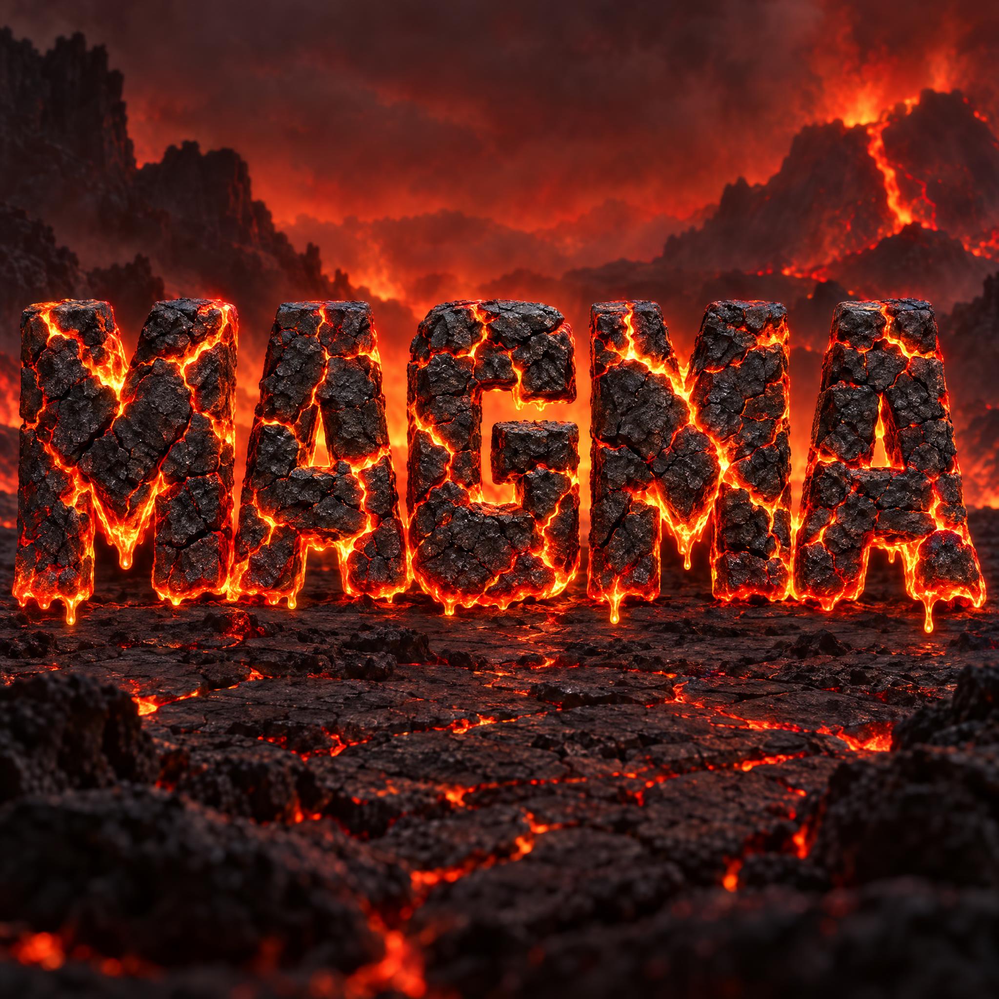
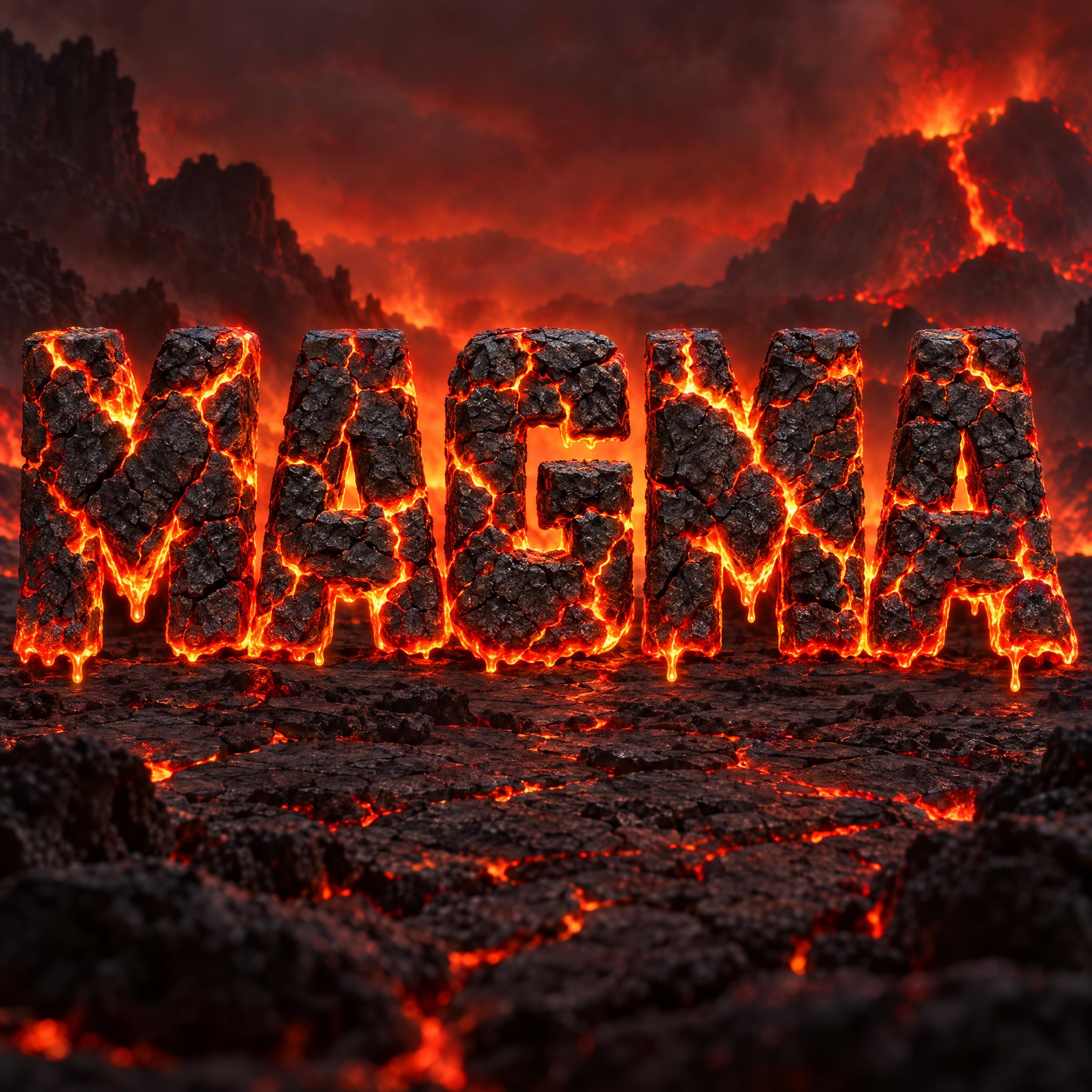
“The surface of every letter is a crust of black volcanic rock split into irregular plates by a network of cracks; the cracks never change the letter shape.” — Lava Font
Real fire is hottest and palest at the core and reddest at the edges. Write the colours in that order, from the inside out, and the fire reads as hot instead of painted.
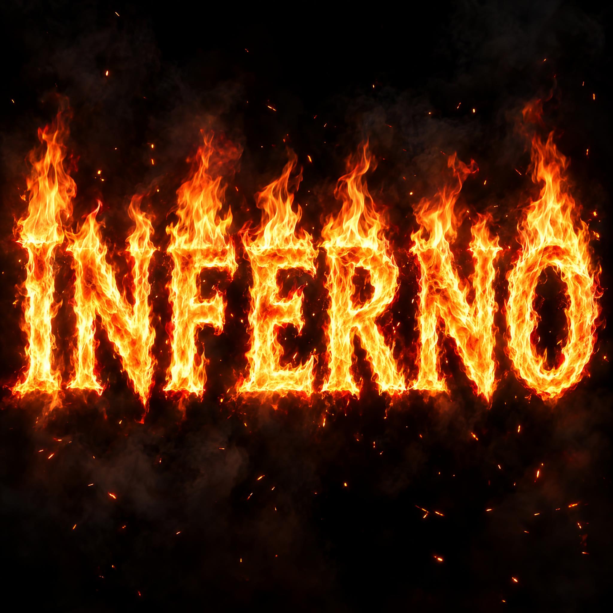
“The core of every stroke is white-hot yellow, shading outward to orange and deep red at the flickering edges.” — Fire Text
Flames rising from the top of a letter and flames sweeping back along a car are two different styles. Give the direction, and where the tips end.
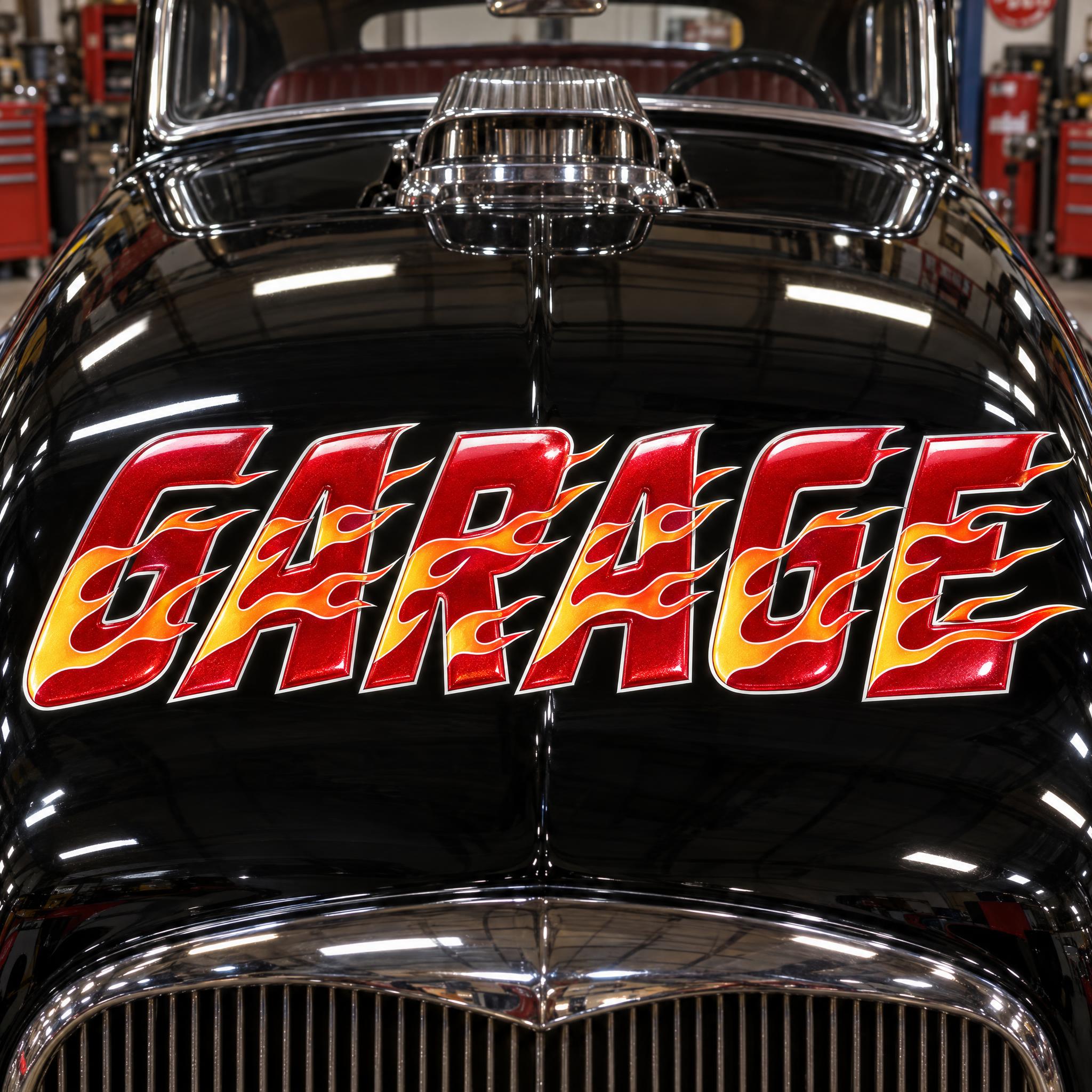
“Classic hot rod flames are painted across the face of the letters: long, pointed licks that sweep straight back, against the lean, with their tips trailing past the back edge.” — Hot Rod Font
Each style has one neighbour it slides into: flat flames turn realistic, smoke turns into fluffy clouds. One short negative sentence aimed at that neighbour is enough; more of them confuse the model.
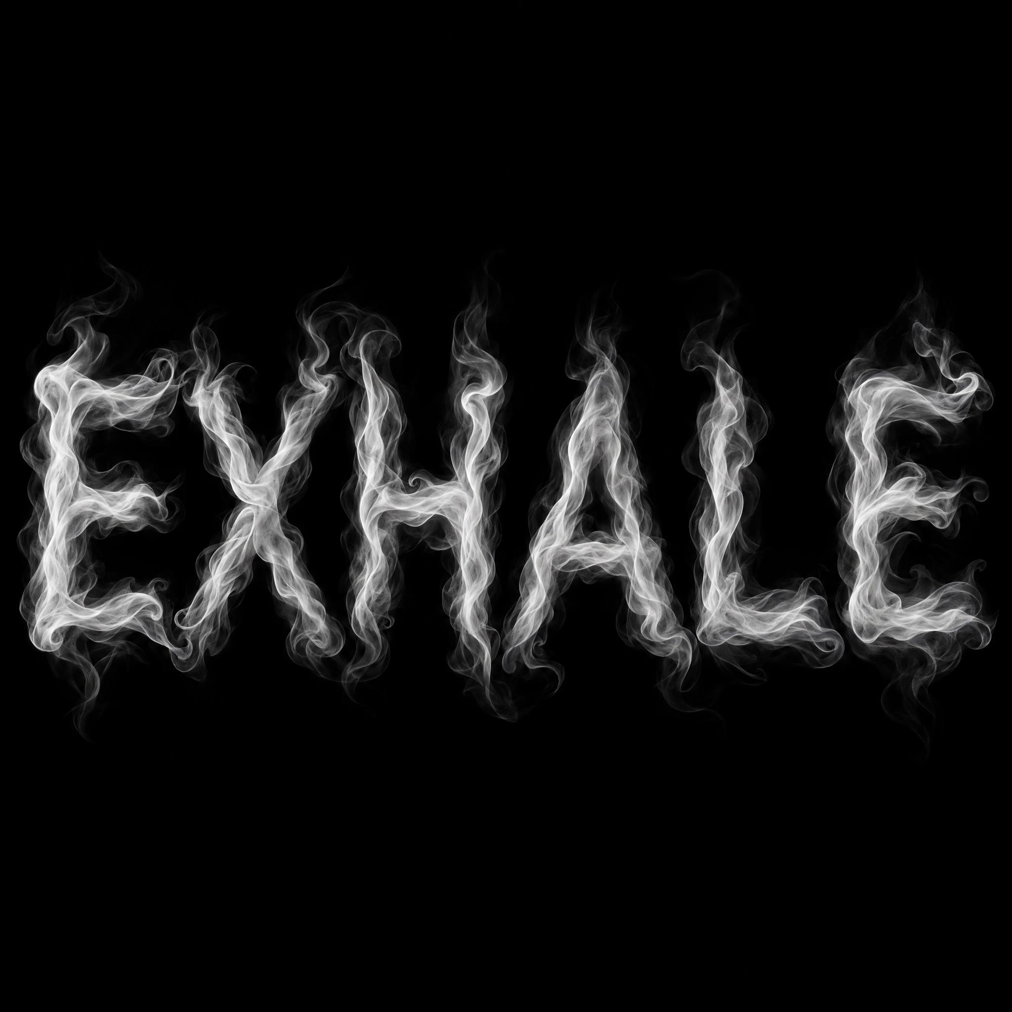
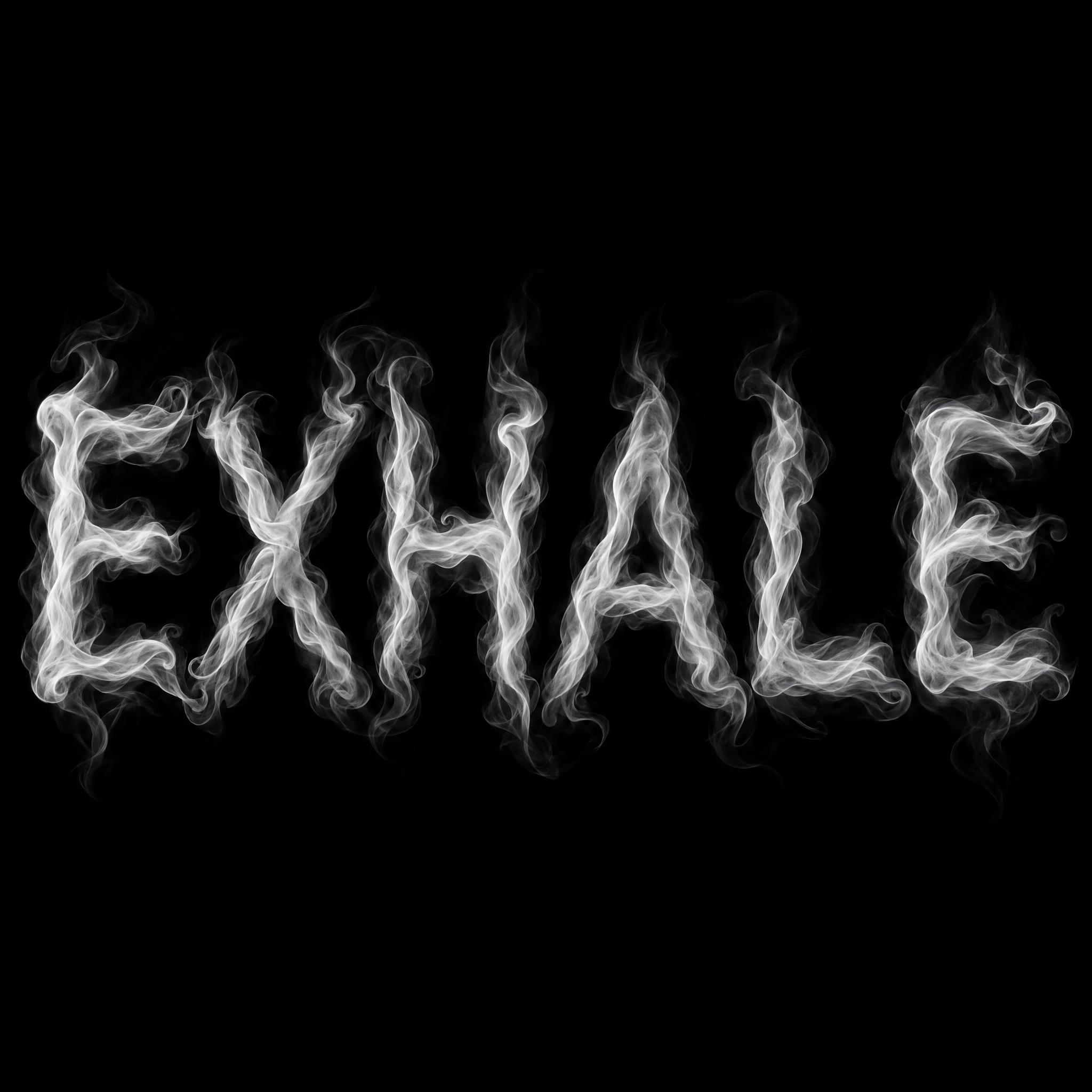
“It is thin, silky smoke, not puffy like clouds.” — Smoke Font
End the style with something the model has seen many times: a flame decal, a movie trailer title, the name on a 1950s hot rod. It settles the finish in a few words.
“Like a classic flame decal.” — Flame Font
Glowing styles (burning text, lava, smoke) need darkness around them to glow; flat flames with a black outline sit best on a light surface. Add with no other text when the scene is a poster or a title, because those invite a subtitle.
“Burning against a black night sky, with a little drifting smoke and scattered sparks, with no other text; the word is centered, fills most of the width and reads clearly.” — Fire Text
Fire lettering borrows the look of real fire, so it starts with how fire looks. In a flame, colour roughly follows temperature: the cooler parts are red, turning orange, yellow and white towards the hottest parts, and the yellow comes from tiny soot particles glowing in the heat. Colour is only a rough guide to temperature, but it is the one the eye uses, which is why a believable burning word has a pale core and red, flickering edges.
The flat, painted flame comes from American car culture. Hot rods first appeared in the late 1930s in southern California, raced on dry lake beds northeast of Los Angeles. Flame paint jobs were first seen in the 1940s and popularised in the 1950s, put on hot rods to give the impression of speed and power even when standing still; early ones were hand-masked and sprayed in red, yellow and orange lacquer over a black or dark base. The thin lines around them belong to the same scene: Von Dutch and Ed Roth are widely recognised as originators of modern pinstriping. Hot Rod Font keeps that layout.
Lava and smoke sit next to fire because they come from the same heat. Most molten lava is about 800 to 1,200 °C; exposed to air it quickly grows a solid crust, and a cooling flow shrinks and fractures, the look of Lava Font. Smoke has written words for a century: at the Epsom Derby in 1922, RAF Captain Cyril Turner wrote Daily Mail in the sky above the track, the first recorded use of skywriting for advertising, with oil injected into a hot exhaust to make dense white smoke. Smoke Font draws that white smoke close up.
Sources: Wikipedia — Flame · Wikipedia — Hot rod · Kustomrama — Flame Paint Job · Wikipedia — Pinstriping · Wikipedia — Lava · Wikipedia — Skywriting
Flat flame tongues growing from the top of each letter, yellow to red, with a thick black outline.
Letters made of real fire with a white-hot core, like a movie title.
Forward-leaning candy-red letters with classic flames sweeping back and a white pinstripe.
Black volcanic crust with molten lava glowing through the cracks.
Letters made of thin white smoke on black, with wisps at the edges.
Lettering for fire trucks, station signs and firefighter shirts. Coming later.
Round, puffy smoke clouds shaped into letters. Coming later.
A fire font is lettering that looks like it is on fire or made of heat: cartoon flames on the letters, real burning text, hot rod flames, glowing lava or smoke. On this page each style is an AI prompt that draws your own word in that look.
Flame Font is flat and graphic: flame tongues on top of each letter, smooth colour bands and a black outline, good for T-shirts and stickers. Fire Text is photographic: the letters are made of real fire on a dark background, good for thumbnails and titles.
Hot Rod Font. It paints classic flames across forward-leaning letters with a white pinstripe, the way names were painted on 1950s hot rods.
People looking for fire letters often want the neighbours too: glowing Lava Font for volcano and game titles, and Smoke Font for album covers and thriller posters. Both come from the same heat.
No. They are prompts that make a picture of your word with an AI image model, not font files. Fire and smoke are effects no font file can hold; these are for a finished title, logo or print as an image.