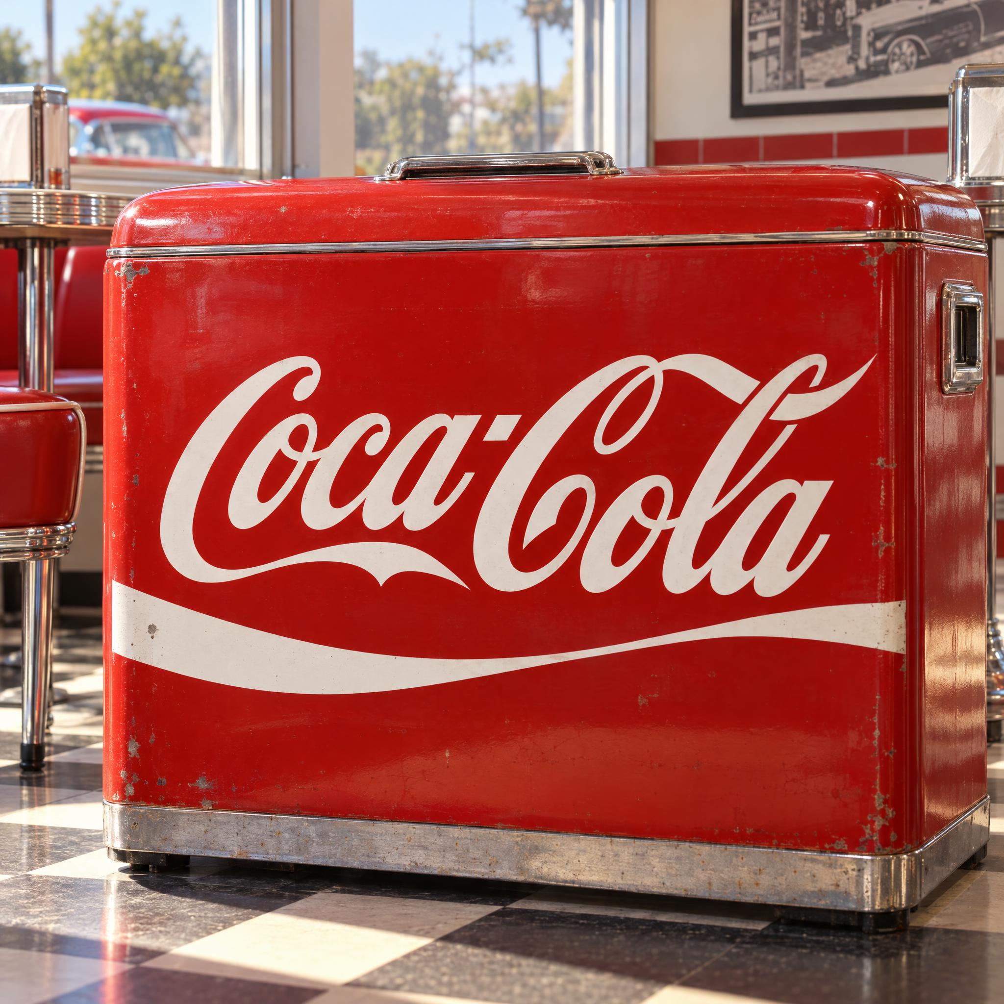
A flowing white Spencerian script with strong thick-thin contrast, huge looping capitals and a first-letter tail that sweeps under the whole word.
TextWrite the word "Coca-Cola". Spell it exactly as written, without adding or changing any letter.
Font designVintage soda brand script: a flowing Spencerian script in mixed case with strong thick-thin contrast, joined letters and a firm right slant. The capital letters are huge, with big looping swashes that curl over and tuck under the lowercase letters beside them. The tail of the first capital sweeps out under the whole word in one long, smooth swash. The letters are white on a solid bright red background, and a single white wavy ribbon stripe runs under the word.
SceneOn a red vintage soda cooler in a sunny old diner; the word is centered, spans most of the width, reads clearly and is the only text.
122 words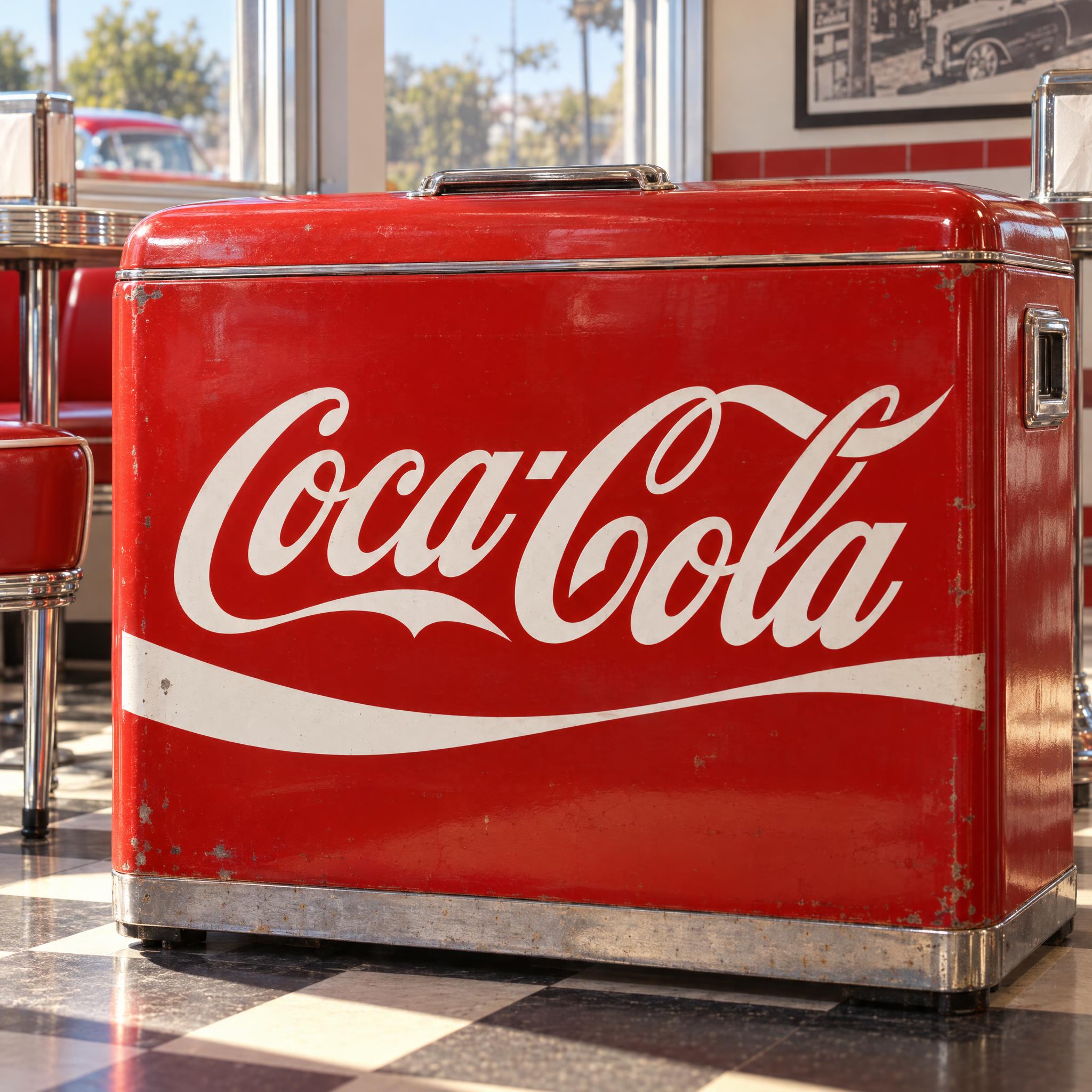
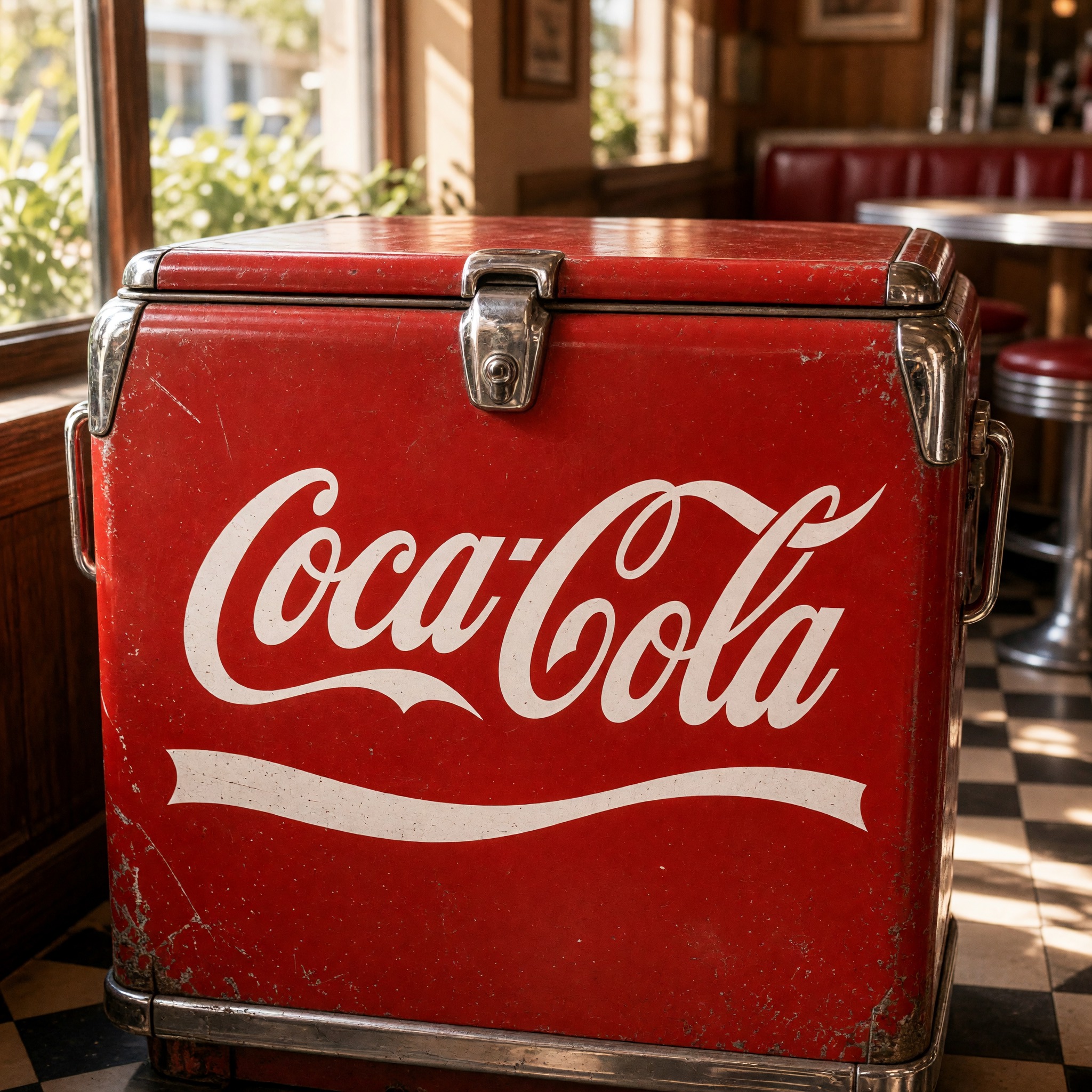
One prompt pasted into each image model as-is. These are the unedited results, so you can pick the model that suits you.
A classic red cooler by a sunny diner window; the ribbon runs almost straight.
Worn, chipped paint and a thin ribbon, like a well-used old cooler.
Smaller lettering on a cooler in a busy diner, with a slightly scuffed ribbon.
Close-up with crisp, glossy strokes and a deep curving ribbon.
The cleanest, most even strokes, with the ribbon tucked close under the word.
The button opens FontVibe in DIY mode with this prompt already in it, unchanged. Type your word, pick a model and generate. GPT Image, Nano Banana, Seedream, Grok and Qwen are all in one account, so you can see which one loops the capitals and sweeps the tail under the word without tangling the letters, without signing up to five apps. Every account gets free credits each month with no card needed, and you can export a transparent PNG to put the script on your own label or party sign.
Layers in the order the prompt states them. Change one layer and the rest keeps working.
Every AIFont prompt opens with the same text part. "Spell it exactly as written, without adding or changing any letter" matters in a joined script: when every letter runs into the next, a model can easily merge two letters or add an extra loop that reads as one.
"Vintage soda brand script:" points the model at the hand-lettered names on old drink signs and bottles, without naming a brand. It brings a bold, cheerful script rather than a delicate wedding hand.
"a flowing Spencerian script in mixed case with strong thick-thin contrast, joined letters and a firm right slant" sets the hand. Spencerian names the 19th-century American penmanship this kind of logo grew from; "strong thick-thin contrast" makes it heavy enough to read from across a room.
"The capital letters are huge, with big looping swashes that curl over and tuck under the lowercase letters beside them." is what makes a name look like a logo rather than handwriting. A word with two capitals, such as Coca-Cola, gets two sets of loops.
"The tail of the first capital sweeps out under the whole word in one long, smooth swash." ties the word together from underneath. It hangs on the first capital, so any word that starts with a capital letter gets it; in lowercase there is no tail.
"The letters are white on a solid bright red background, and a single white wavy ribbon stripe runs under the word." is the only colour line. It holds the red, the white and the ribbon, so you can recolour or drop the ribbon in one place.
"On a red vintage soda cooler in a sunny old diner" sets the stage; "is the only text" matters here because a diner invites signs, menus and price boards in the background. Swap this part for your own use.
Small edits that stay on-style. Change one thing at a time.
Type it in the box next to Prompt above and copy again. Start it with a capital so the tail has somewhere to come from; a name with a second capital, like Mary-Jane, gets a second set of loops.
Swap "The letters are white on a solid bright red background, and a single white wavy ribbon stripe runs under the word." for "The letters are white on a solid deep navy background, and a single white wavy ribbon stripe runs under the word.", "The letters are red on a solid cream background, and a single red wavy ribbon stripe runs under the word." or "The letters are white on a solid emerald green background, and a single white wavy ribbon stripe runs under the word."
If the ribbon fights with your design, replace the colour line with "The letters are white on a solid bright red background." The first-letter tail still sweeps under the word.
Replace "On a red vintage soda cooler in a sunny old diner" with "On a glass soda bottle label on a picnic table", "On a red enamel sign on a brick wall" or "On a lemonade stand banner on a summer street".
The prompt sets no frame size. Pick the ratio in your app, or add "Wide 16:9 image." or "Tall 4:5 image." at the end. A party banner suits 16:9; a bottle label or invitation suits 4:5.
AI fonts that share the most tags with Coca-Cola Font.
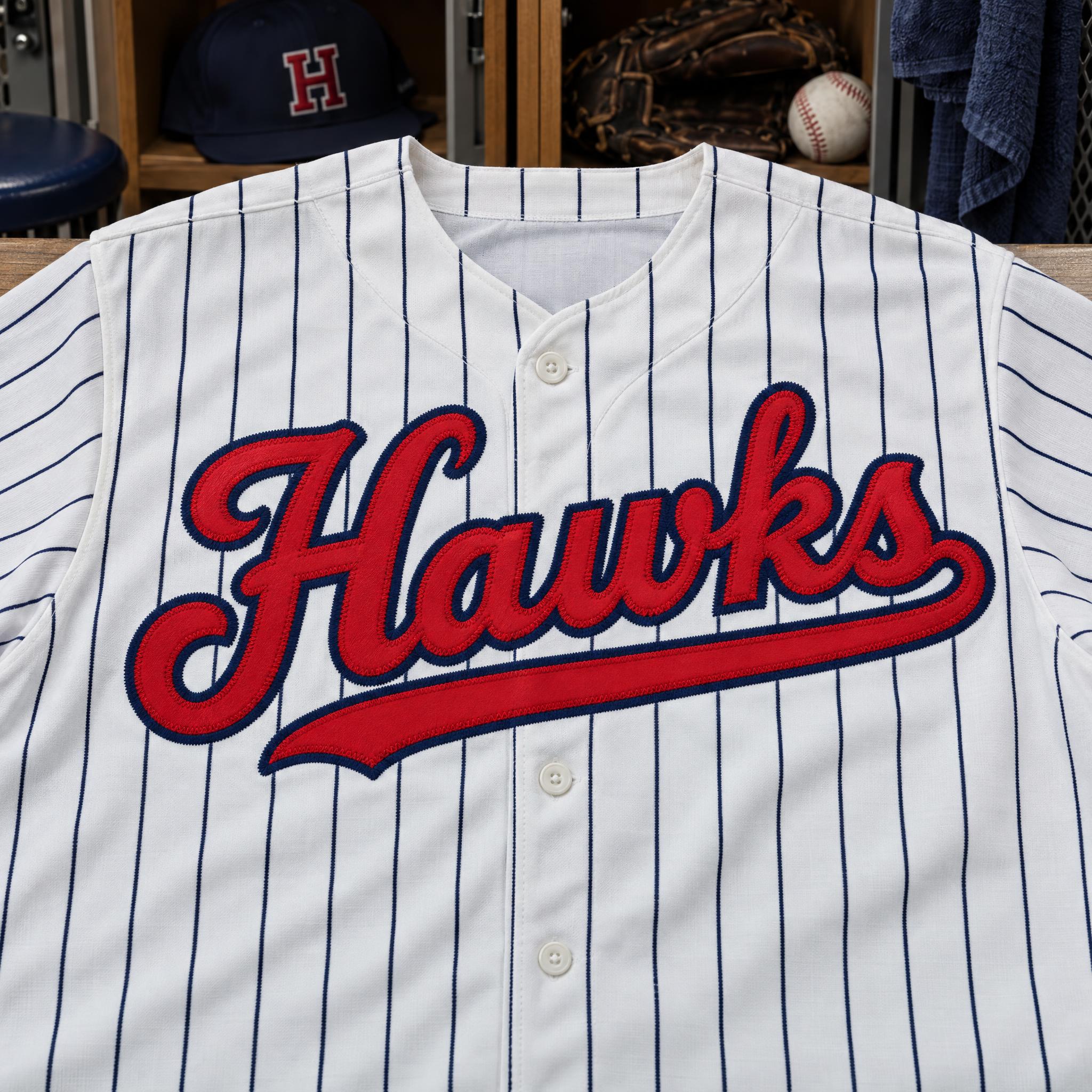
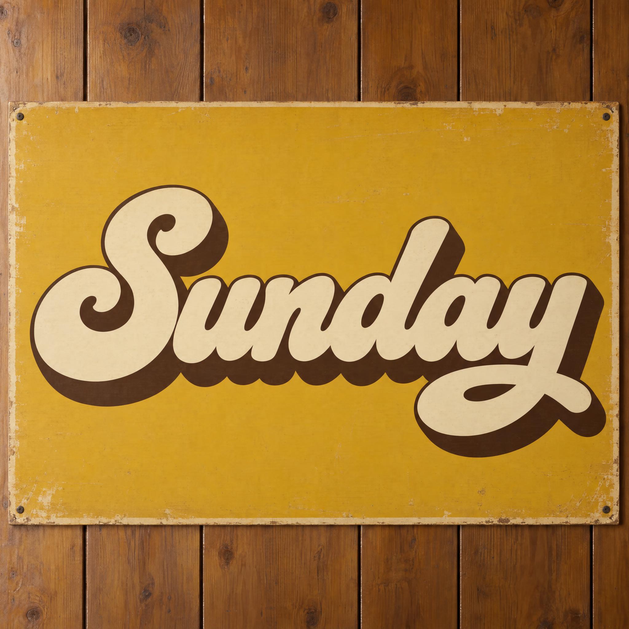
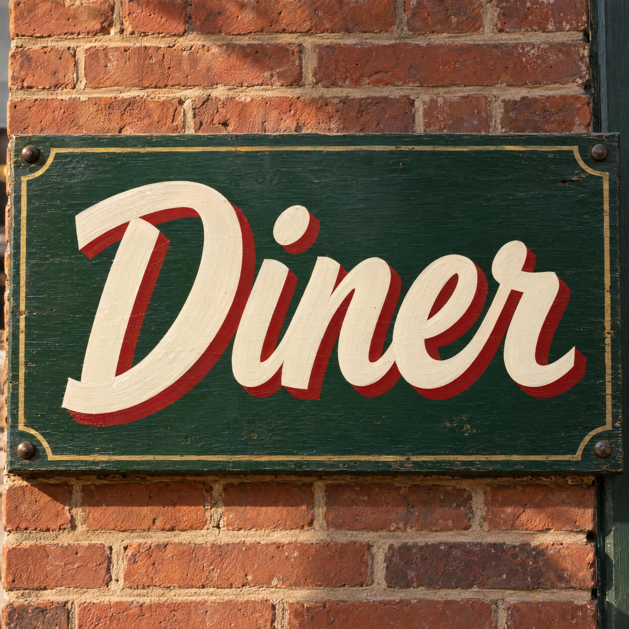
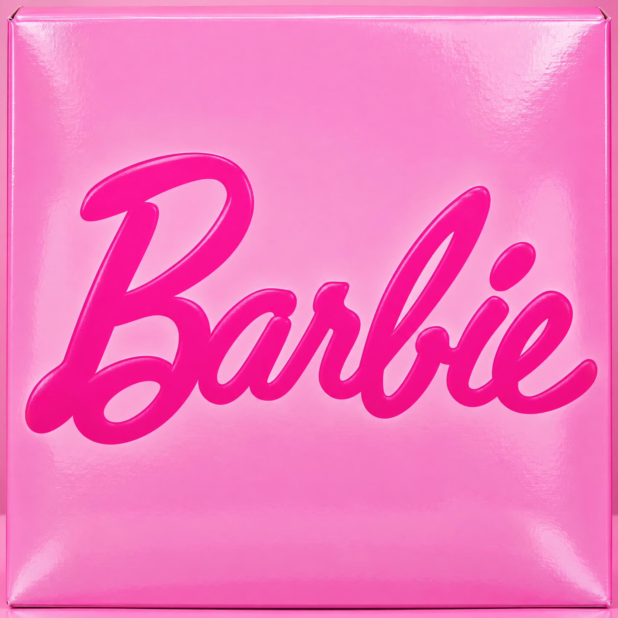
AI fonts for a second line, a logo lock-up or a poster footer.
Coca-Cola Font writes your word the way the classic soda script does: a flowing Spencerian hand in mixed case, with strong thick-thin contrast, joined letters and a firm right slant. The capitals are huge, and their big looping swashes curl over and tuck under the letters beside them. The tail of the first capital keeps going and sweeps under the whole word in one long, smooth stroke. The letters are white on solid bright red, with a single white wavy ribbon running underneath.
Type your word in the box above the prompt, copy it and paste it into ChatGPT, Gemini, Grok, Qwen or Seedream. The prompt has three parts: the text, the font design and the scene. The font design makes the script, the big capitals, the sweeping tail and the red and white with the ribbon; the scene paints the word on a vintage soda cooler in an old diner, and you can swap it for your own. Every image on this page is what each model returned from the unchanged prompt, with no retouching.
Use it for a diner-themed party sign, a label for homemade soda or lemonade, a vintage-style invitation or a name on a retro poster. The prompt describes how this kind of script is drawn and does not copy the official logo. The name and the logo belong to The Coca-Cola Company, so keep what you make for parties, fan projects and personal use, not for products you sell.
Details from the original render. Every one of them is named in the prompt.
Huge capitals whose swashes curl over and tuck under their neighbours.
The first capital's tail runs under the whole word.
A joined, right-slanted Spencerian hand with strong contrast.
White letters on solid red with one white wavy ribbon.
Pulled from the render. Handy when you build the rest of the design around the word.
The script was chosen for how it would look in print. According to The Coca-Cola Company's own trademark chronology, when John S. Pemberton created the drink in 1886, his partner and bookkeeper Frank M. Robinson suggested the name, thinking that "the two Cs would look well in advertising". Robinson then wrote it out in an adaptation of the elaborate Spencerian script, and the others at Pemberton's company adopted it by unanimous consent.
The long tail on the first C was put to work early. In the chronology's first entry, covering 1887 to the 1890s, the words Trade mark are written inside the tail of the C in Coca. The white wave came much later: in 1969 the company introduced the Arden Square with the Dynamic Ribbon Device, commonly called the wave, and in 2003 the ribbon was enhanced in the logo for the Coca-Cola... Real campaign.
The prompt keeps the parts that survived all those versions: a heavy Spencerian hand, oversized looping capitals, a first-letter tail that underlines the word, white on red and one white ribbon. It does not copy the logo. The name and the logo belong to The Coca-Cola Company, so what you make is for parties, fan projects and personal posts, not merchandise.
Sources: The Coca-Cola Company — Coke Lore: Trademark Chronology
Frank M. Robinson suggests the name, because the two Cs would look well in advertising, and writes it in a Spencerian script.
From 1887 into the 1890s, the words Trade mark sit inside the tail of the first C.
The Arden Square with the Dynamic Ribbon Device, the white wave, is introduced.
All five spelled Coca-Cola with both capitals and the hyphen. GPT Image and Qwen draw the cleanest thick-thin strokes; Seedream goes in close with a deep curving ribbon, Grok wears the paint down, and Nano Banana sets the word smaller. In Japanese and Chinese all five wrote the name correctly too; in Arabic, Seedream added letters and Qwen slipped into Latin letters on both tries, so those two images carry a note. Compare them side by side above.
Both. Coca-Cola went through in our tests, so the example shows it; Japanese, Chinese and Arabic use the local names コカコーラ, 可口可乐 and كوكا كولا, and you can type Coca-Cola there too. For your own word, type it in the box next to Prompt and copy again. Some apps may refuse a brand name; if one does, try another app.
No. The prompt describes how this kind of soda script is drawn: a bold Spencerian hand, huge looping capitals, a long tail and white on red. It is not the official artwork. The name and the logo belong to The Coca-Cola Company, so use what you make for a party, a fan project or a personal post, not for shirts, packaging or products you sell.
No. It is a prompt that makes a picture of your word with an AI image model, so there is no .ttf file and you cannot type with it. It works like a Coca-Cola font generator that hands you a finished image of Coca-Cola letters.
They come from the same handwriting. Spencerian Script is the penmanship itself: thin, light strokes in dark ink on paper, like a copybook page. This one is the logo version of that hand: much heavier contrast, oversized capitals, a tail that underlines the word, and white letters on solid red with a ribbon.
Yes, but the long tail hangs on the first capital, so an all-lowercase word has no tail. Capitalise the first letter to get it; the script, the contrast and the red and white still carry the look either way.
Change only "The letters are white on a solid bright red background, and a single white wavy ribbon stripe runs under the word.", for example to "The letters are white on a solid deep navy background, and a single white wavy ribbon stripe runs under the word." Keep the letters and the ribbon the same colour so they still read as one logo.
Pick the ratio in your app if it has one. If not, add "Wide 16:9 image." or "Tall 4:5 image." at the end of the prompt.
Copying the prompt is free. Whether the image costs anything depends on the app you paste it into, and what you may do with the image depends on that app's terms.