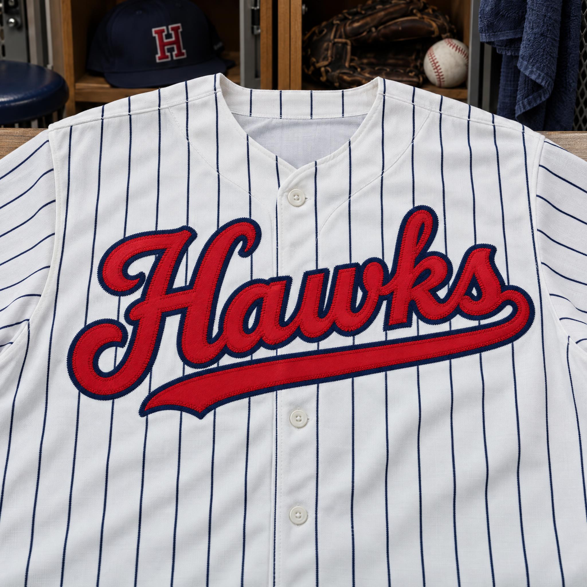
Bold stitched team script that rises to the right and finishes with a long tail swept back under the word.
TextWrite the word "Hawks". Spell it exactly as written, without adding or changing any letter.
Font designBaseball team script: a bold connected script with thick, even strokes rising slightly from left to right, a capital that starts with a big looped entry stroke, and a long tail swash from the last letter that sweeps back underneath the whole word; every letter reads at a glance. The letters are tackle-twill fabric stitched onto the shirt, every edge finished with a tight zigzag stitch. The letters are red with a navy outline. Never a thin, pen-drawn calligraphy. Like the script across the chest of a vintage baseball jersey.
SceneThe word is stitched across the chest of a white pinstriped baseball jersey laid flat in a clubhouse. The word is centered, spans most of the width and reads clearly.
135 words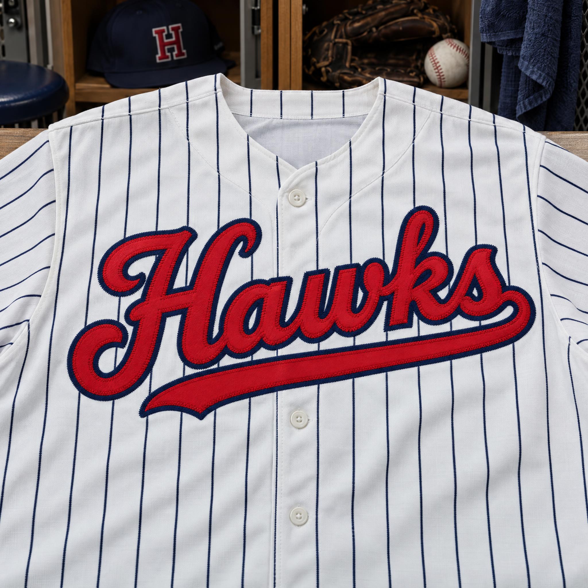
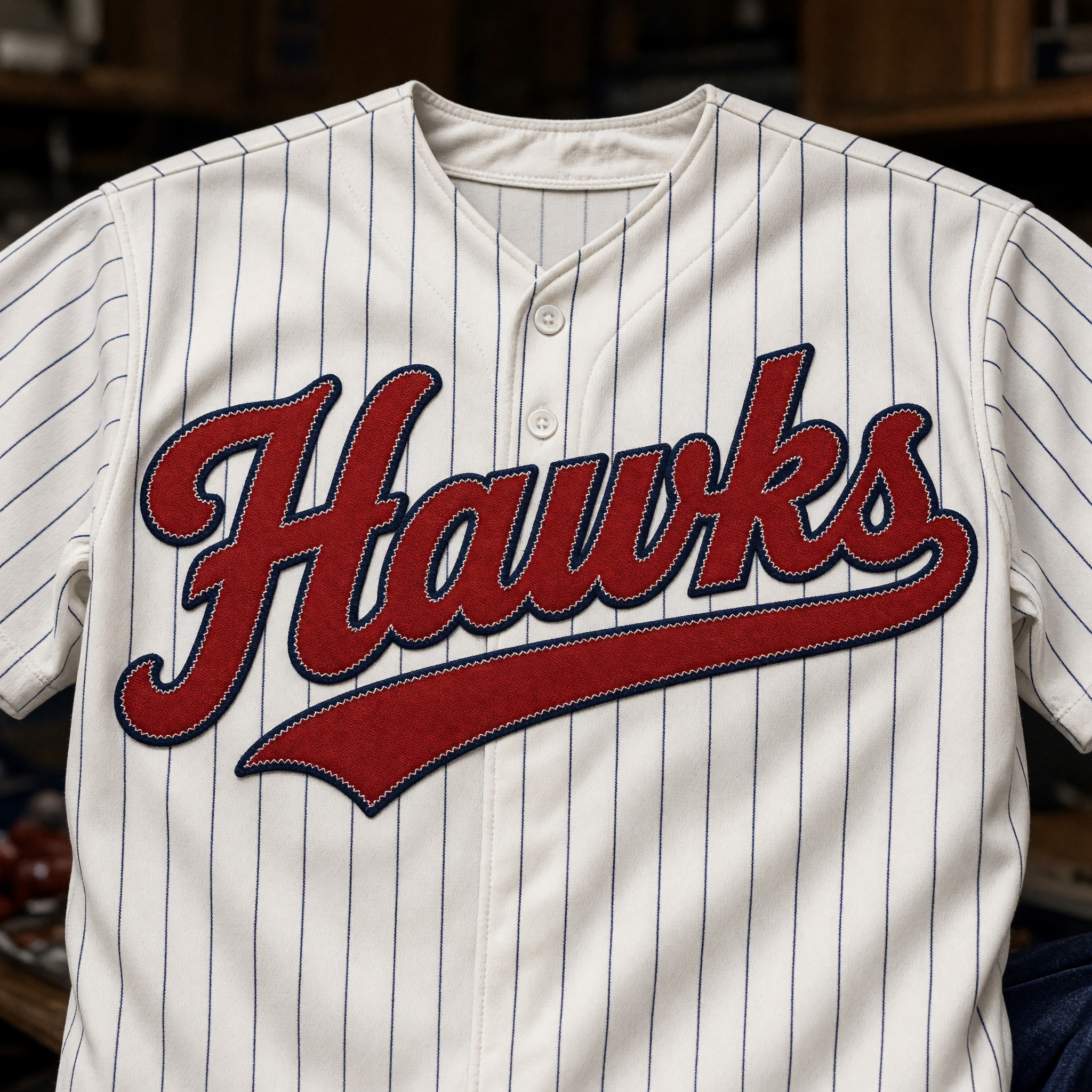
One prompt pasted into each image model as-is. These are the unedited results, so you can pick the model that suits you.
Tight crop of the chest with a cap and glove behind; the cleanest, most even tail.
Darker brick red, with the twill weave clearly visible.
The tail flares wide and is cut in two by the button placket.
Cream jersey with a navy V-neck and a long, slim tail.
Jersey on a hanger, the tallest letters, and a tail that ends in a fork.
The button opens FontVibe in DIY mode with this prompt filled in as it is. Type your team name, pick a model and generate. GPT Image, Nano Banana, Seedream, Grok and Qwen are all in one account, so you can see which one draws the cleanest tail under your word without opening five apps. Every account gets free credits each month with no card needed, and you can export a transparent PNG to drop the script onto your own jersey mockup or T-shirt.
Layers in the order the prompt states them. Change one layer and the rest keeps working.
Every AIFont prompt opens with the same text part. "Spell it exactly as written, without adding or changing any letter" comes first because a joined script is where models most often drop or double a letter, and a team name has to be exact.
"Baseball team script" tells the model which family of script this is: the team name on a uniform, not a wedding script or a signature.
"a bold connected script with thick, even strokes rising slightly from left to right" sets the weight and the upward lean that make these scripts look in motion. "a capital that starts with a big looped entry stroke" gives the first letter its flourish. "every letter reads at a glance" keeps the joins from turning the name into a ribbon.
"a long tail swash from the last letter that sweeps back underneath the whole word" is what turns a script into a baseball script. Without it you get a bold cursive; with it you get the underline every fan recognises.
"The letters are tackle-twill fabric stitched onto the shirt" makes each letter a cut piece of fabric with a slight sheen and real thickness, which is how jersey lettering is actually made.
"every edge finished with a tight zigzag stitch" adds the stitch line that sells it as sewn. Delete it and the letters can turn into a flat print.
"The letters are red with a navy outline." is the colour sentence, on its own so you can switch to your team's colours by changing just this line.
"Never a thin, pen-drawn calligraphy." is the only negative. Asked for script, models like to reach for a fine pen hand with hairlines; this keeps the strokes thick enough to cut from fabric.
"Like the script across the chest of a vintage baseball jersey." gives every model the same picture: a throwback home shirt with the team name across the front.
"The word is stitched across the chest of a white pinstriped baseball jersey laid flat in a clubhouse." shows where this script lives. "The word is centered, spans most of the width and reads clearly." keeps the name the star. Change this part for your own use: a grey road jersey, a cap, a stadium banner.
Small edits that stay on-style. Change one thing at a time.
Type it in the box next to Prompt above and copy again. One word of four to eight letters gives the tail room to sweep; two words make the script smaller and the tail harder to place.
Swap "The letters are red with a navy outline." for "The letters are royal blue with a white outline.", "The letters are navy with a red outline." or "The letters are orange with a black outline."
Replace "The word is stitched across the chest of a white pinstriped baseball jersey laid flat in a clubhouse." with "The word is stitched across the chest of a grey road baseball jersey on a hanger.", "The word is printed across the front of a vintage cream T-shirt on a wooden table." or "The word is painted on a green outfield wall in afternoon sun."
The prompt sets no frame size. A wordmark or banner wants 16:9, a phone wallpaper or poster 3:4; pick it in your app, or add "Wide 16:9 image." or "Tall 3:4 image." at the end.
AI fonts that share the most tags with Baseball Font.
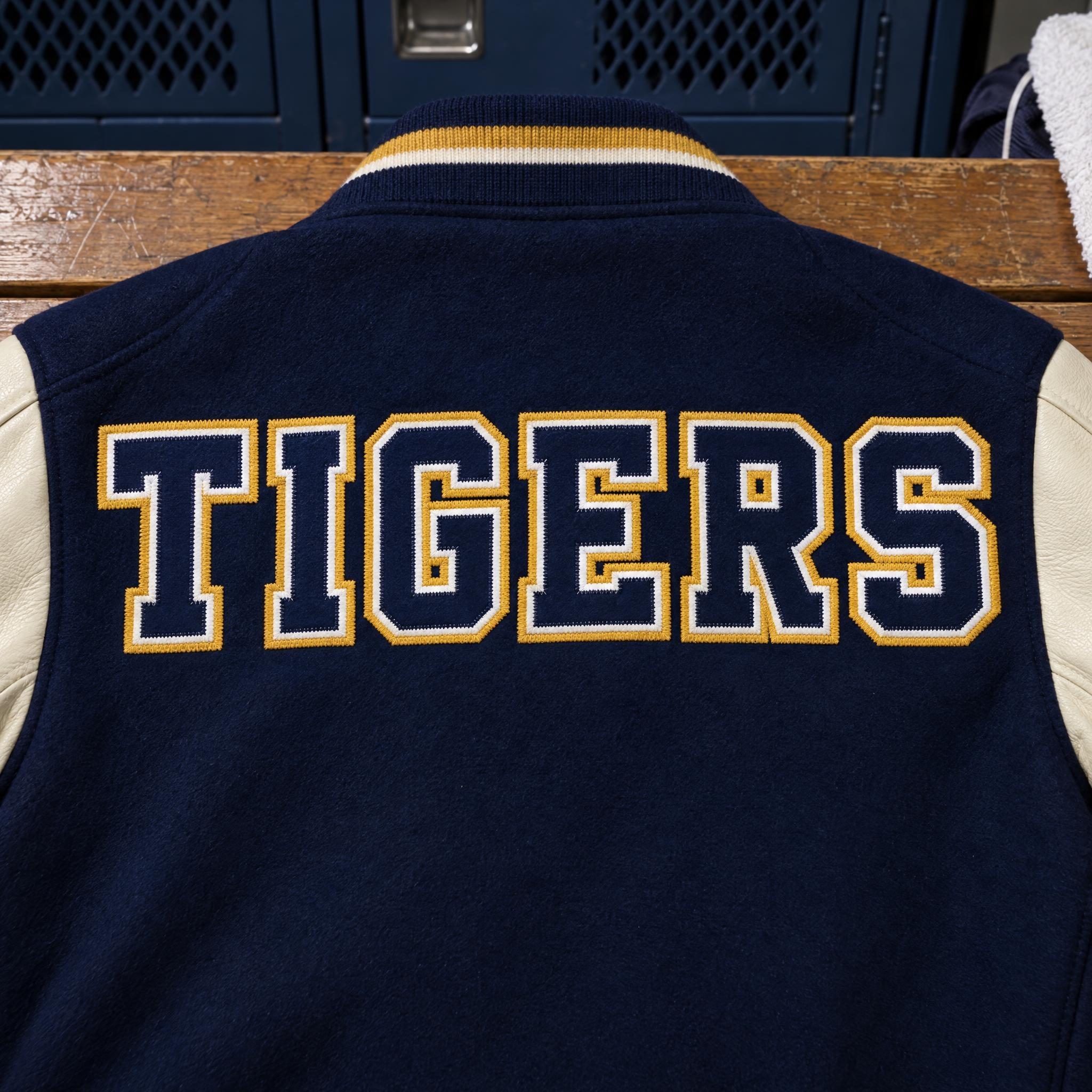
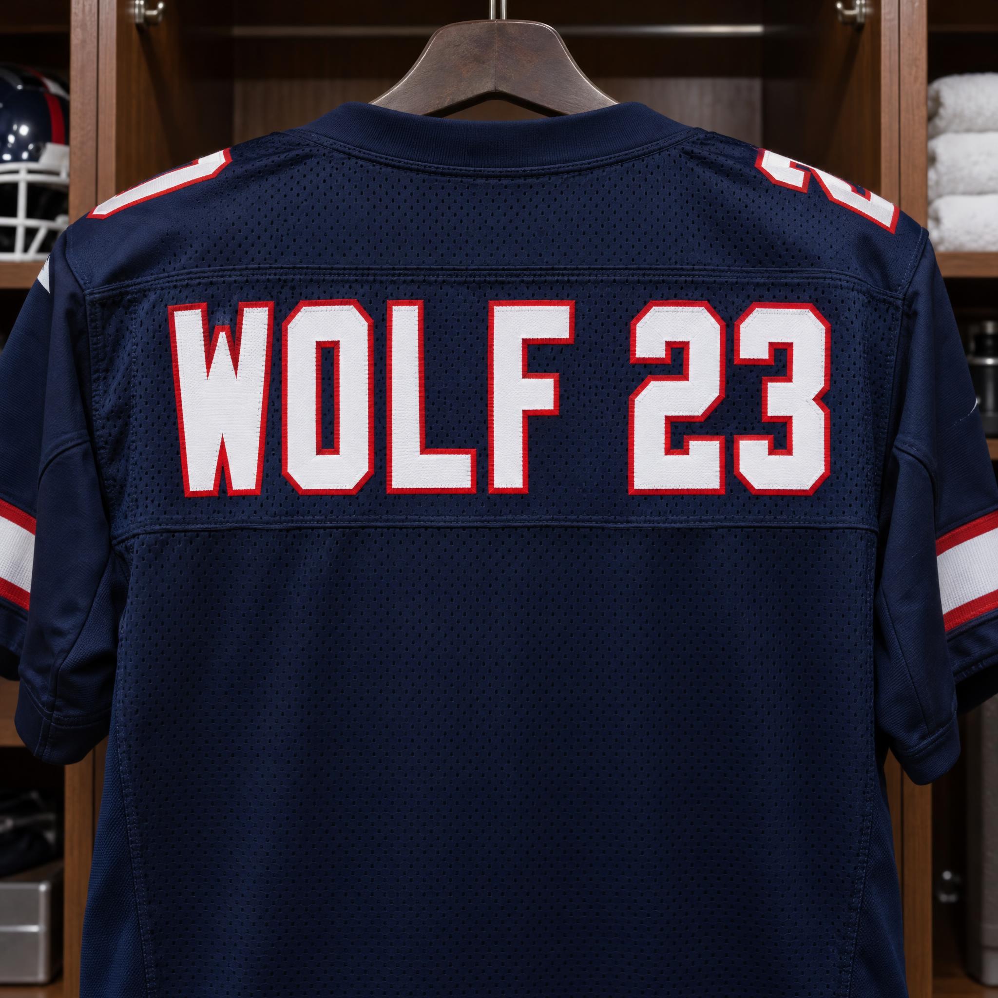
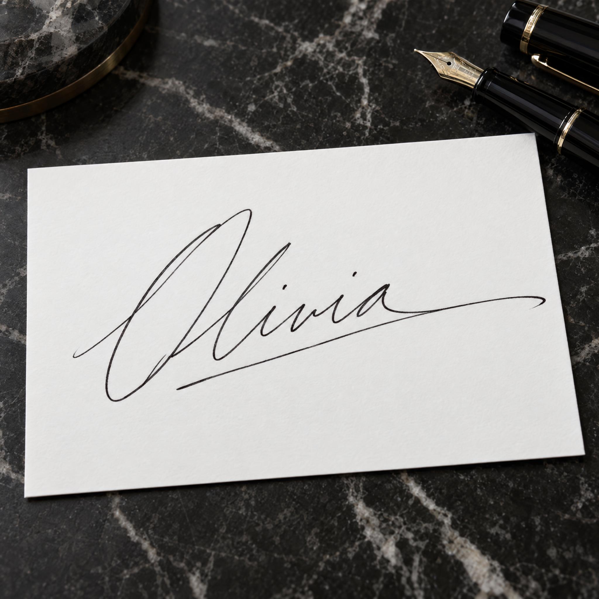
AI fonts for a second line, a logo lock-up or a poster footer.
Baseball Font writes your word the way a team name sits across the chest of a classic baseball jersey: a bold, joined script with thick, even strokes, a big looped capital, and a long tail that leaves the last letter and sweeps back underneath the whole word. The letters are red tackle twill sewn on with a tight zigzag edge and a navy outline, so it reads as a uniform patch, not as ink. It is the Dodgers-and-Cubs style of script, not a copy of any team's wordmark.
Type your word in the box above the prompt, copy it and paste it into ChatGPT, Gemini, Grok, Qwen or Seedream. The prompt has three parts: the text, the font design and the scene. The font design makes the stitched team script; the scene lays it on a pinstriped jersey and is yours to change. Every image on this page came from pasting the prompt unchanged into each model, with nothing retouched.
Use it for team jerseys and wordmarks, fan T-shirts and merch, season posters, or a softball, Little League or company-league team name that should look like the big leagues.
Details from the original render. Every one of them is named in the prompt.
Even, heavy strokes that join every letter and climb slightly to the right.
A long swash leaves the last letter and runs back under the whole word.
The first letter starts with a big looped entry stroke.
Red twill letters with a navy outline and a tight zigzag edge.
Pulled from the render. Handy when you build the rest of the design around the word.
Where this AI font earns its keep.
For most of the early game, team names went on the shirt as plain block or serif letters. Script arrived in the early 1930s, as clubs borrowed the flowing look of the cursive shop signs and car badges of the day, and it turned out to suit baseball: one joined word reads as a single team rather than a row of separate letters.
The Brooklyn Dodgers made it a tradition. Larry MacPhail took over the club in January 1938 and reworked its look, and that year the team wore a blue "Dodgers" script with an underscore beneath it, a mark it used through 1944 and that the franchise still builds on. That underline, drawn out of the last letter and swept back under the word, is the tail. The designer Thomas O'Grady calls it the exclamation point of the classic American team scripts, and in 2025 he counted nine Major League clubs still using it.
This prompt is built from those habits rather than from any one club: a thick, even script that climbs slightly to the right, a looped capital, the long tail, and lettering cut from twill and sewn on. Change the colour sentence and the same script can wear any team's colours.
Sources: Sports Branding — Episode 8. Flip the Script · Todd Radom — 12,000 Games in Dodger Blue · SportsLogos.net — Brooklyn Dodgers Primary Logo 1938
Script lettering begins to appear on baseball uniforms, borrowing from cursive signage and car logos.
Under Larry MacPhail the Dodgers adopt a blue script with an underscore, used on their primary mark through 1944.
A survey of team identities finds nine MLB clubs using the classic under-tail beneath their script.
In English, Spanish, Portuguese, German, Japanese and Chinese all five models wrote the word correctly as red stitched script with a tail. GPT Image gives the crispest letters and the cleanest tail; Nano Banana often lets the button placket cut the tail in two; Grok goes to a darker brick red with visible twill; Qwen draws the tallest letters. In Arabic, Nano Banana, Grok and Qwen wrote it right, Seedream got it on the second try, and GPT Image's tail may read as an extra letter; some Arabic verdicts are disputed until native speakers check them. Compare them side by side above.
No. It is the general style those teams made famous, a thick joined script with a tail under the word, not a copy of any club's wordmark, and the models draw their own letters each time. Team logos are trademarks, so for anything you sell, use your own team name rather than a pro club's.
Varsity Font is block capitals with square serifs and two outlines, the letters on the back of a letterman jacket. Baseball Font is joined script with a tail, the name across the chest of a jersey. Both are cut from twill and stitched on, so they pair well on one shirt.
Type it in the box next to Prompt above, then copy the full prompt. Check the tail in the result: it should start from the last letter and run under the word, not end up as a separate line above it.
Change only "The letters are red with a navy outline.", for example to "The letters are royal blue with a white outline." for a Dodgers-style blue.
Pick the ratio in your app if it has one. If not, add "Wide 16:9 image." or "Tall 3:4 image." at the end of the prompt.
No. It is a prompt that makes a picture of your word as a stitched baseball script with an AI image model, so there is nothing to install and you cannot type with it in a word processor.
Copying the prompt is free. Whether the image costs anything depends on the app you paste it into, and what you may do with the image depends on that app's terms.