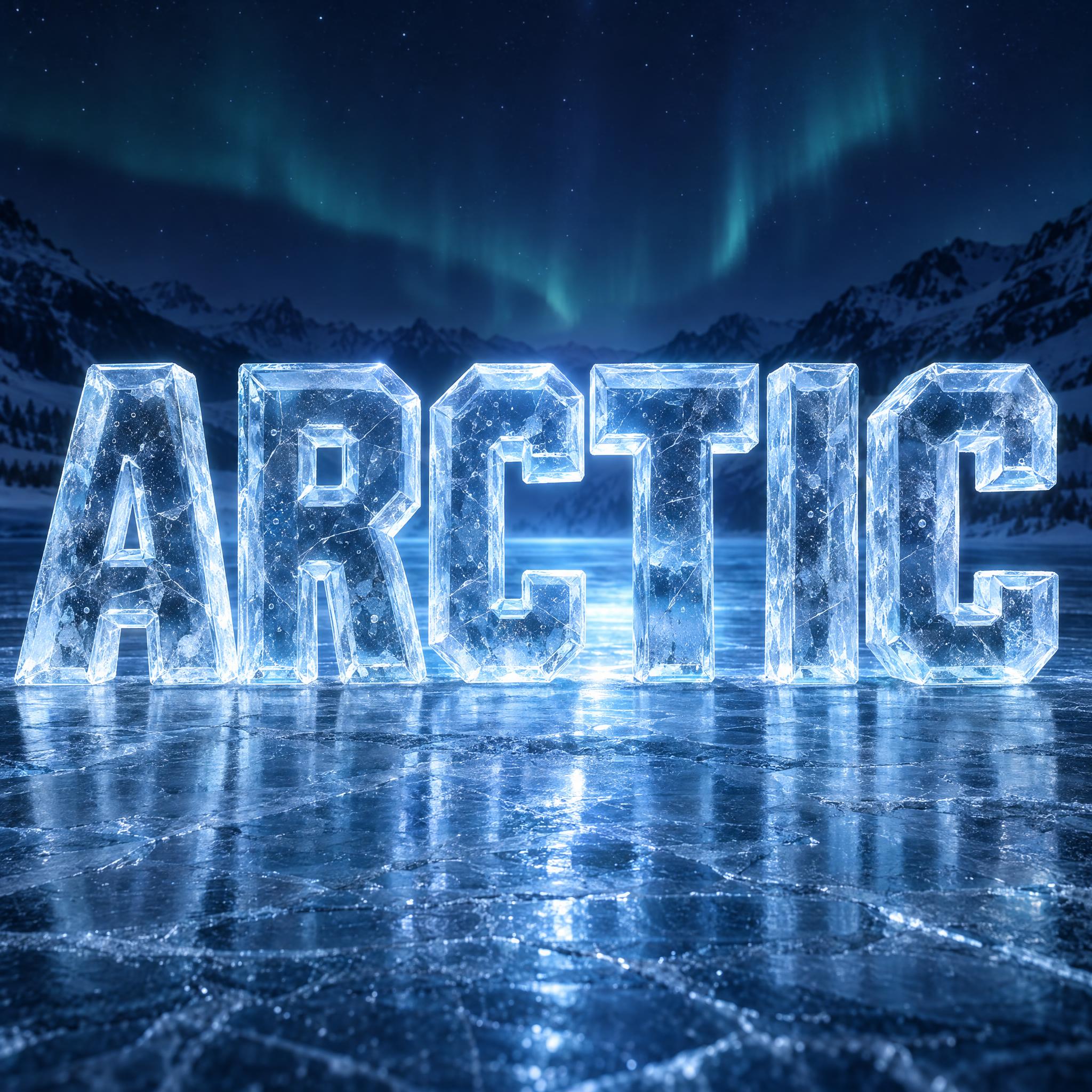
Chunky capital letters carved from blocks of clear, pale blue ice, with bevelled edges, light passing through and tiny bubbles frozen inside.
TextWrite the word "ARCTIC". Spell it exactly as written, without adding or changing any letter.
Font designIce block lettering: bold, chunky capital letters with simple, straight-sided shapes, every letter reads at a glance. Each letter is carved from one solid block of clear ice, with real thickness and bevelled edges cut along its front face. The ice is see-through: light passes through every letter and bends at the bevels, and fine cracks and tiny trapped air bubbles show deep inside. Every letter is clear ice with a pale blue tint, turning frosty white along its edges and corners. No snow on top and no icicles hanging below. Like a carved ice sculpture sign.
SceneStanding on a sheet of ice on a winter night, cold blue light shining through the letters from behind; the word is centered, fills most of the width and reads clearly.
143 words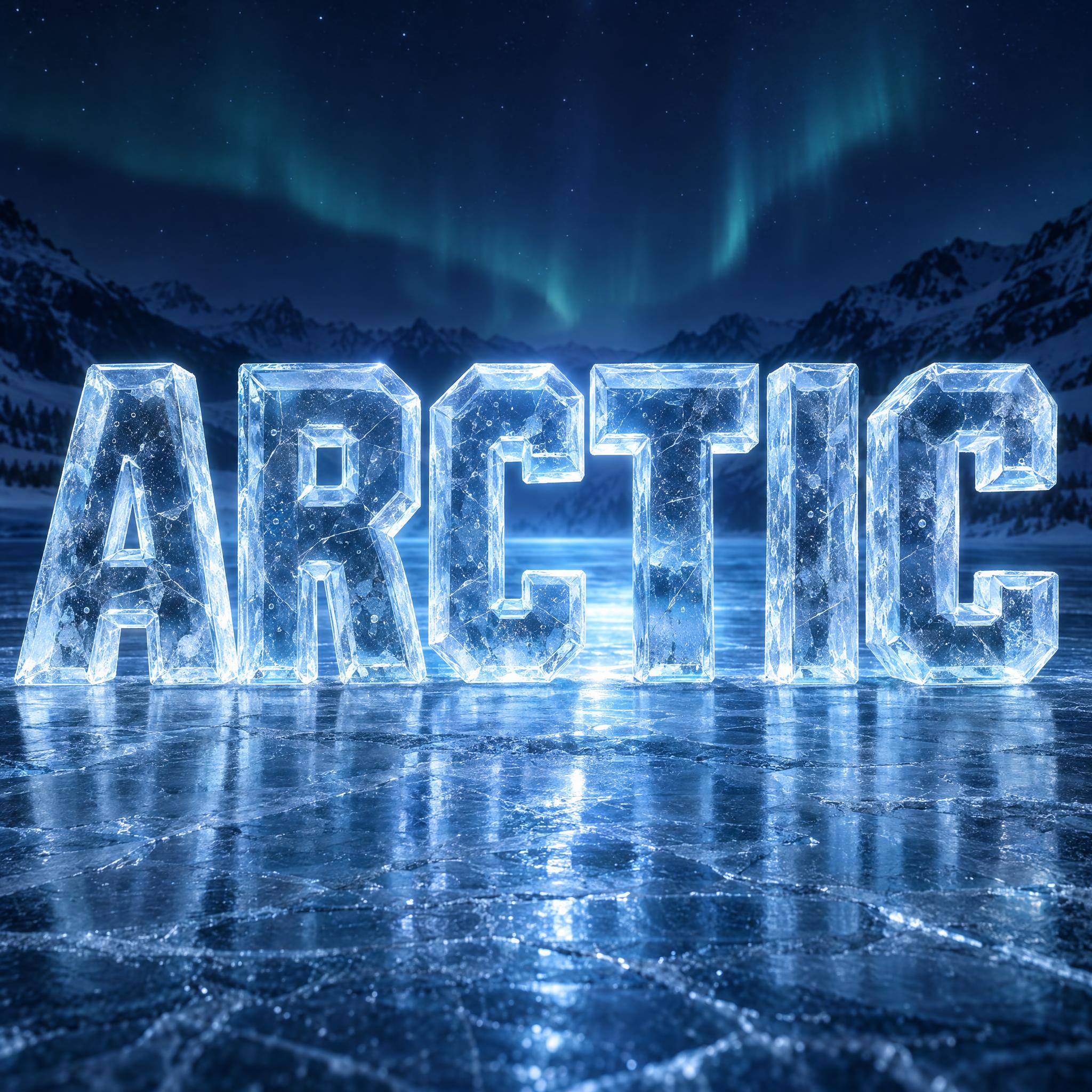
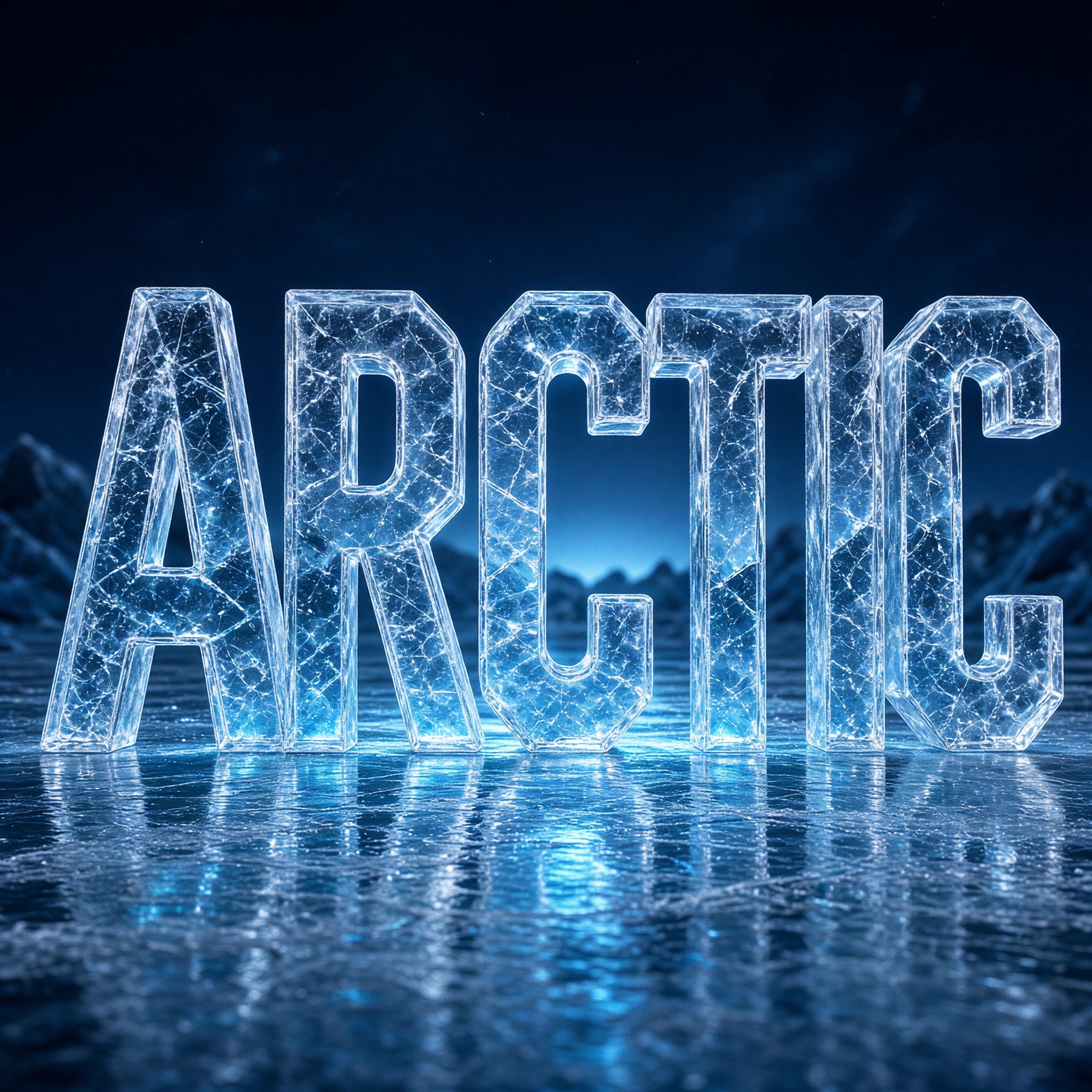
One prompt pasted into each image model as-is. These are the unedited results, so you can pick the model that suits you.
Faceted blocks packed with cracks and bubbles, mirrored in a frozen lake under a green aurora.
Cracks drawn as a fine glowing web across every letter, with a strong reflection.
Thick slabs set at an angle and lit teal from inside, on dark cracked ice.
The clearest, smoothest ice with only a few cracks, aurora glowing behind.
Tall letters with frosted white rims and dense crazing, on a snowy ice field.
The button opens FontVibe in DIY mode with this prompt already in it, unchanged. Type your word, pick a model and generate. GPT Image, Nano Banana, Seedream, Grok and Qwen are all in one account, so you can see which one keeps the ice clearest and the bubbles inside the letters, and which one sneaks in snow anyway, without signing up to five apps. Every account gets free credits each month with no card needed, and you can export a transparent PNG to put the ice word on your own poster or banner.
Layers in the order the prompt states them. Change one layer and the rest keeps working.
Every AIFont prompt opens with the same text part. "Spell it exactly as written, without adding or changing any letter" matters more than usual here: in see-through letters a crack or a bevel line can pass for an extra stroke, and a model may read it into the word and turn an F into an E.
"Ice block lettering:" says what the letters are made of and how: solid blocks of ice, not frost on a surface and not a cluster of crystals.
"bold, chunky capital letters with simple, straight-sided shapes, every letter reads at a glance" picks shapes that could really be cut from a block with a saw and a chisel. Thin strokes and curly details would disappear once the letters turn transparent.
"Each letter is carved from one solid block of clear ice, with real thickness and bevelled edges cut along its front face." gives the light something to travel through. A flat letter has nothing for light to pass into, and the bevels are where it catches and bends.
"The ice is see-through: light passes through every letter and bends at the bevels, and fine cracks and tiny trapped air bubbles show deep inside." is the core of this font. Perfectly clear ice with no flaws looks like glass or acrylic; the cracks and bubbles tell the eye it is frozen water. Deep inside keeps them from sitting on the surface like specks of dirt.
"Every letter is clear ice with a pale blue tint, turning frosty white along its edges and corners." is the sentence to change. Keep the words clear ice and change only the tint, the way ice sculptures are lit or dyed in colour.
"No snow on top and no icicles hanging below." is the one thing the prompt rules out. Ask a model for winter lettering and it likes to add a snow cap and a fringe of icicles, which turns this into a different font.
"Like a carved ice sculpture sign." gives every model the same picture: a word cut from ice to stand outdoors at a winter festival, not an ice cube from the freezer.
"Standing on a sheet of ice on a winter night, cold blue light shining through the letters from behind" sets the place and lights the ice from the back, which is how clear ice shows off its depth. "the word is centered, fills most of the width and reads clearly" keeps the word the hero. Change this part for your own use: a bar counter, a frozen lake by day, a plain background.
Small edits that stay on-style. Change one thing at a time.
Type it in the box next to Prompt above and copy again. One short word in capitals works best: COOL, WINTER, a name. Every letter is its own block of ice, so a long word makes each block thin and the bubbles hard to see.
Swap "Every letter is clear ice with a pale blue tint, turning frosty white along its edges and corners." for "Every letter is clear ice with a pale pink tint, turning frosty white along its edges and corners.", "Every letter is clear ice with a pale mint green tint, turning frosty white along its edges and corners." or "Every letter is perfectly clear, colourless ice, turning frosty white along its edges and corners."
Replace "Standing on a sheet of ice on a winter night, cold blue light shining through the letters from behind" with "Standing on a dark bar counter, warm amber light shining through the letters from behind", "Standing on a frozen lake on a bright, clear winter morning" or "Standing on a plain dark blue background". A warm light behind clear ice makes it glow amber; daylight makes it look colder and sharper.
The prompt sets no frame size. A row of ice blocks suits 16:9: pick it in your app or add "Wide 16:9 image." at the end, or "Tall 3:4 image." for a poster.
AI fonts that share the most tags with Ice Font.
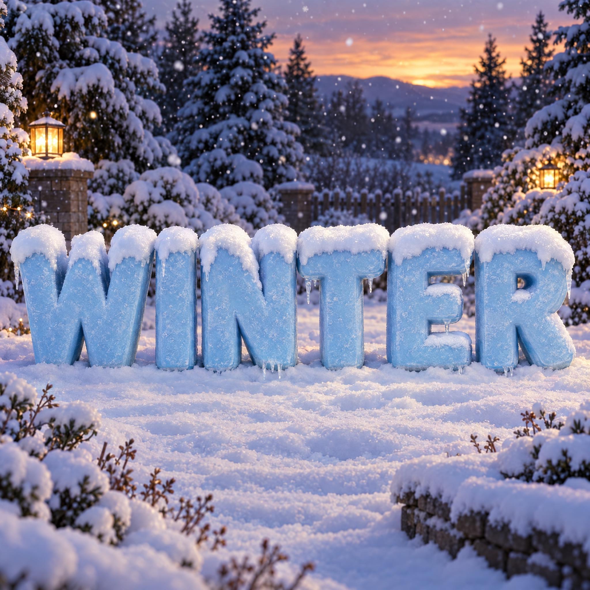

AI fonts for a second line, a logo lock-up or a poster footer.
Ice Font carves your word out of clear ice, the way a sculptor cuts a sign for a winter festival. The letters are bold, chunky capitals with simple, straight sides, and each one is a thick solid block with bevelled edges cut along its front. You can see through them: light passes through every letter and bends at the bevels, while fine cracks and tiny air bubbles sit deep inside, which is what makes it read as ice and not glass. The ice is clear with a pale blue tint and turns frosty white at the edges and corners. There is no snow on it and no icicles; for that look, see Snow Font.
Type your word in the box above the prompt, copy it and paste it into ChatGPT, Gemini, Grok, Qwen or Seedream. The prompt has three parts: the text, the font design and the scene. The font design makes the ice blocks, the bevels, the cracks and the bubbles; the scene stands the word on a sheet of ice on a winter night with cold blue light behind it, and you can swap it for your own. Every image on this page is what each model returned from the unchanged prompt, with no retouching.
Use it for winter festival and event posters, ice rink and hockey graphics, winter sale banners, and ads for cold drinks and iced coffee.
Details from the original render. Every one of them is named in the prompt.
Bold capitals with simple, straight sides, easy to read at a glance.
Each letter is a thick block of ice with bevels cut along the front.
Light passes through every letter and bends at the bevels.
Fine cracks and tiny air bubbles trapped deep in the ice.
Pulled from the render. Handy when you build the rest of the design around the word.
Words and figures carved from ice are what Harbin is known for. In this city in China's far northeast, a winter ice lantern show and garden party began in 1963. It stopped for years during the Cultural Revolution, then came back as an annual event in Zhaolin Park, announced on 5 January 1985. Today it is described as the largest ice and snow festival in the world.
The ice comes straight out of the river. Blocks are cut from the frozen surface of the Songhua River with swing saws, and in the Ice and Snow World park, first opened in 1999, full-size buildings are stacked from blocks two to three feet thick. Carvers then shape them with chisels, ice picks and saws, and at night coloured lights shine through the sculptures.
Clarity is the carver's real problem. Cloudy ice comes from tiny bits of trapped air that bind to impurities as water freezes, so clear ice depends on how it freezes, not only on how clean the water is. Carving blocks are frozen while the water keeps circulating, and some festival blocks use deionised water to come out as clear as glass. This prompt asks for that kind of block but keeps a few flaws on purpose: fine cracks and small bubbles deep inside are what make clear ice look like ice and not glass, and the light from behind is how an ice festival shows it off.
Sources: Wikipedia — Harbin International Ice and Snow Sculpture Festival · Wikipedia — Ice sculpture
Harbin's winter ice lantern show and garden party begins.
Wikipedia — Harbin International Ice and Snow Sculpture Festival
An annual event in Zhaolin Park is announced on 5 January, after a break during the Cultural Revolution.
Wikipedia — Harbin International Ice and Snow Sculpture Festival
The first Ice and Snow World opens, with buildings made of Songhua River ice.
Wikipedia — Harbin International Ice and Snow Sculpture Festival
In English all five models wrote ARCTIC correctly as see-through blocks of ice with bevels. GPT Image packs in the most cracks and bubbles; Seedream gives the clearest, smoothest ice; Grok draws the cracks as a glowing web; Nano Banana makes the thickest slabs. The usual slip is snow: Qwen tends to stand the word in a snowfield and in Japanese hung icicles under it, and Nano Banana in Portuguese dusted snow on top. In Arabic, Qwen dropped a required dot in both tries. Compare them side by side above.
No. Many people who search for a frozen font want the title lettering from Disney's Frozen films. This page is not that logo or a copy of it: it is plain block lettering carved from clear ice, with no film styling, so it works for any winter word.
Snow Font puts snow on solid ice-blue letters: a fluffy cap on top and short icicles below. Ice Font is the ice itself: see-through blocks with bevels, cracks and bubbles, and the prompt rules out snow and icicles. Snow Font feels cosy and Christmassy; this one is colder and cleaner, for an ice bar, a skating rink or a winter festival.
Yes, with rewritten prompts, and the bubbles are the reason. A small round bubble floating at a letter's corner can be read as a mark: an accent in Spanish, Portuguese or German, a dakuten or handakuten in Japanese, a dot in Chinese or Arabic. So every language except English says the bubbles stay inside the strokes. The Chinese prompt also asks for space between strokes so a character does not freeze into one slab, and the Arabic one carves the whole joined word from a single block and allows dots only where the spelling has them.
Type it in the box next to Prompt above, then copy the full prompt. Check that no crack or bevel line has turned into an extra stroke, for example a short bar that makes an F look like an E.
Change only "Every letter is clear ice with a pale blue tint, turning frosty white along its edges and corners.", for example to "Every letter is clear ice with a pale pink tint, turning frosty white along its edges and corners." Keep it clear ice so the light still passes through.
Pick the ratio in your app if it has one. If not, add "Wide 16:9 image." or "Tall 3:4 image." at the end of the prompt.
No. It is a prompt that makes a picture of your word as letters carved from ice with an AI image model, so there is nothing to install and you cannot type with it.
Copying the prompt is free. Whether the image costs anything depends on the app you paste it into, and what you may do with the image depends on that app's terms.