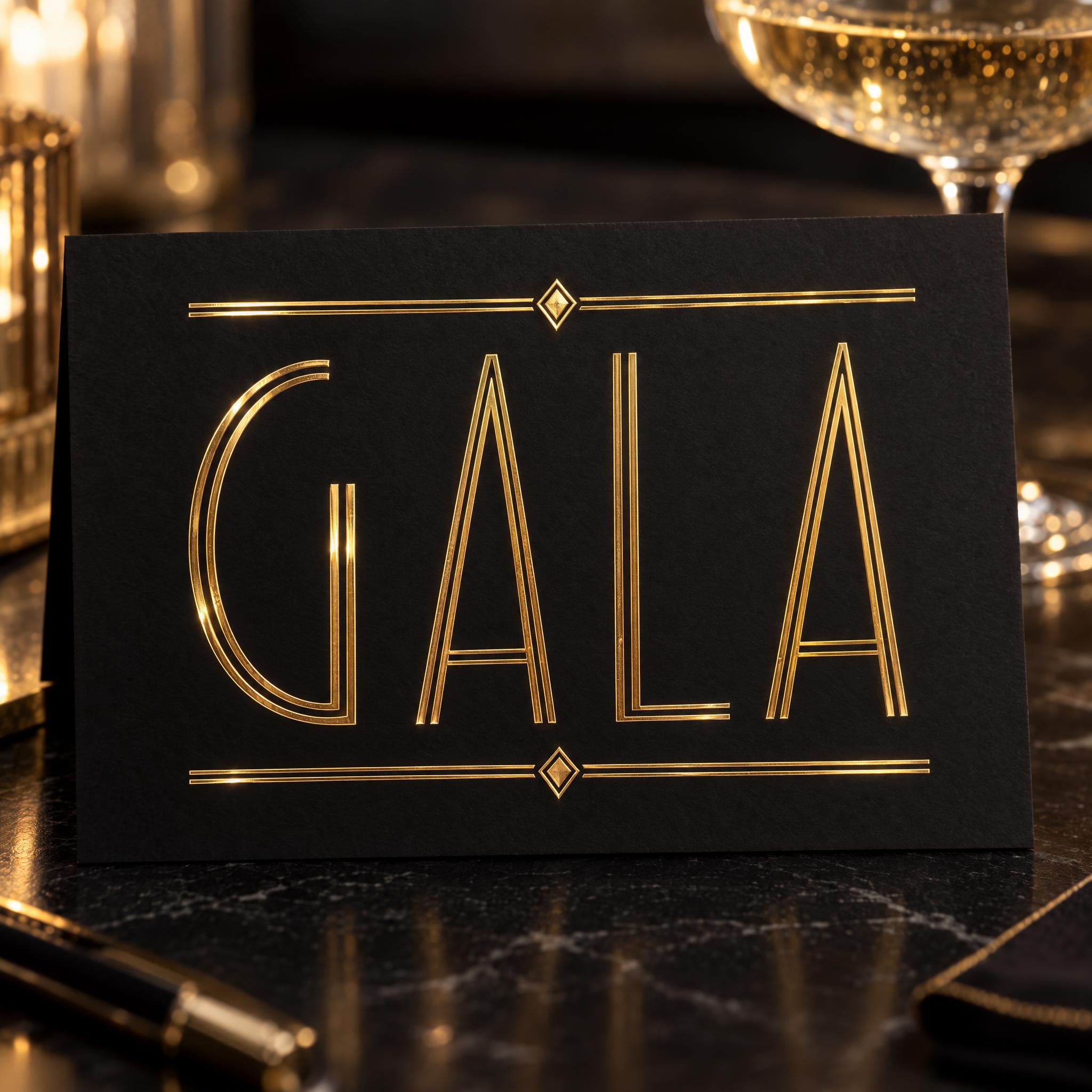
Tall, narrow Art Deco capitals of straight lines and perfect circles, every stroke drawn as two fine parallel lines in polished gold.
TextWrite the word "GALA". Spell it exactly as written, without adding or changing any letter.
Font designGatsby lettering: tall, narrow Art Deco capitals built only from straight lines and perfect circles, with crossbars set very high or very low; every letter reads at a glance. Every stroke is drawn as two thin parallel lines with a narrow gap between them, and all lines share the same fine weight, with no thick strokes. Every line, including the ornaments, is polished metallic gold. Exactly two ornaments: a thin straight rule above the word and an identical one below it, each with one small diamond at its centre. The gold has a smooth, mirror-like shine. Like the lettering on a 1920s Gatsby party invitation.
ScenePrinted on a black invitation card on a dark table, a champagne coupe blurred behind; the word is centered, fills most of the width and reads clearly.
147 words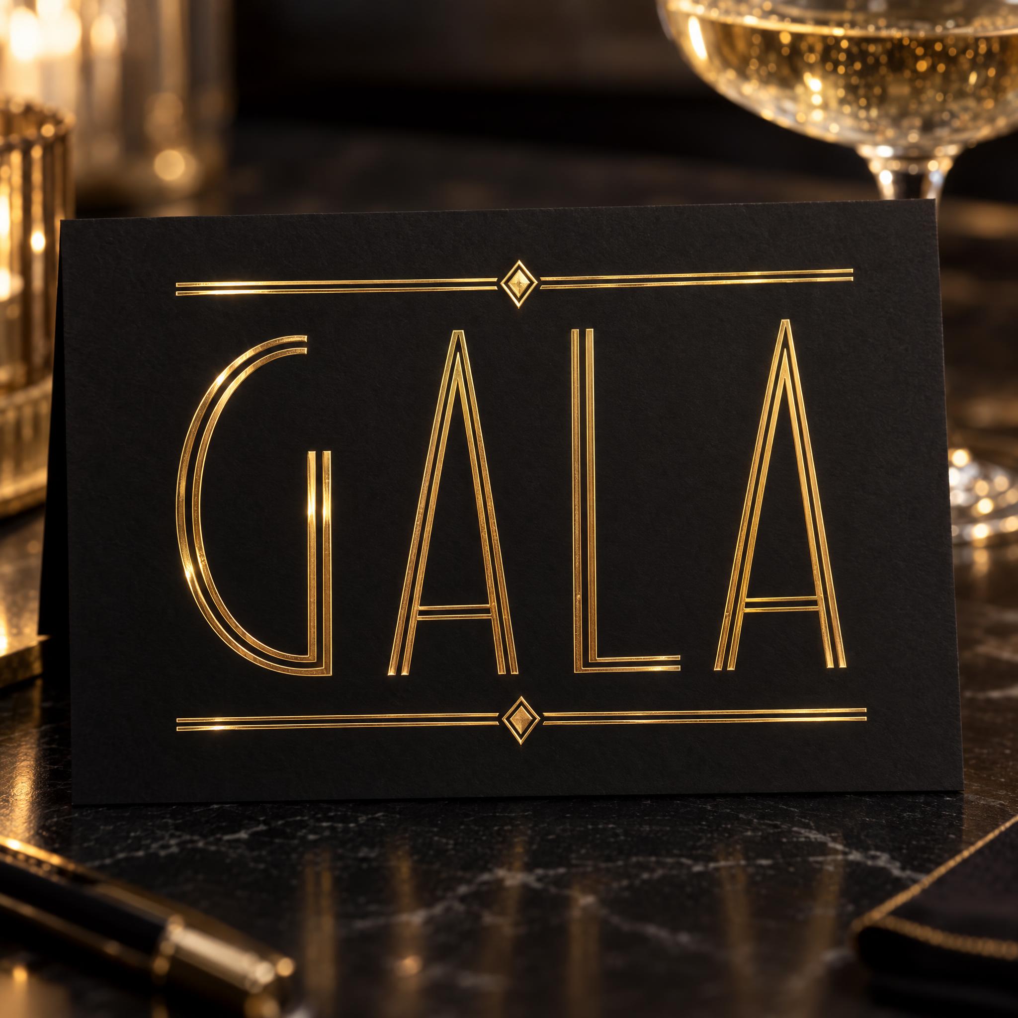
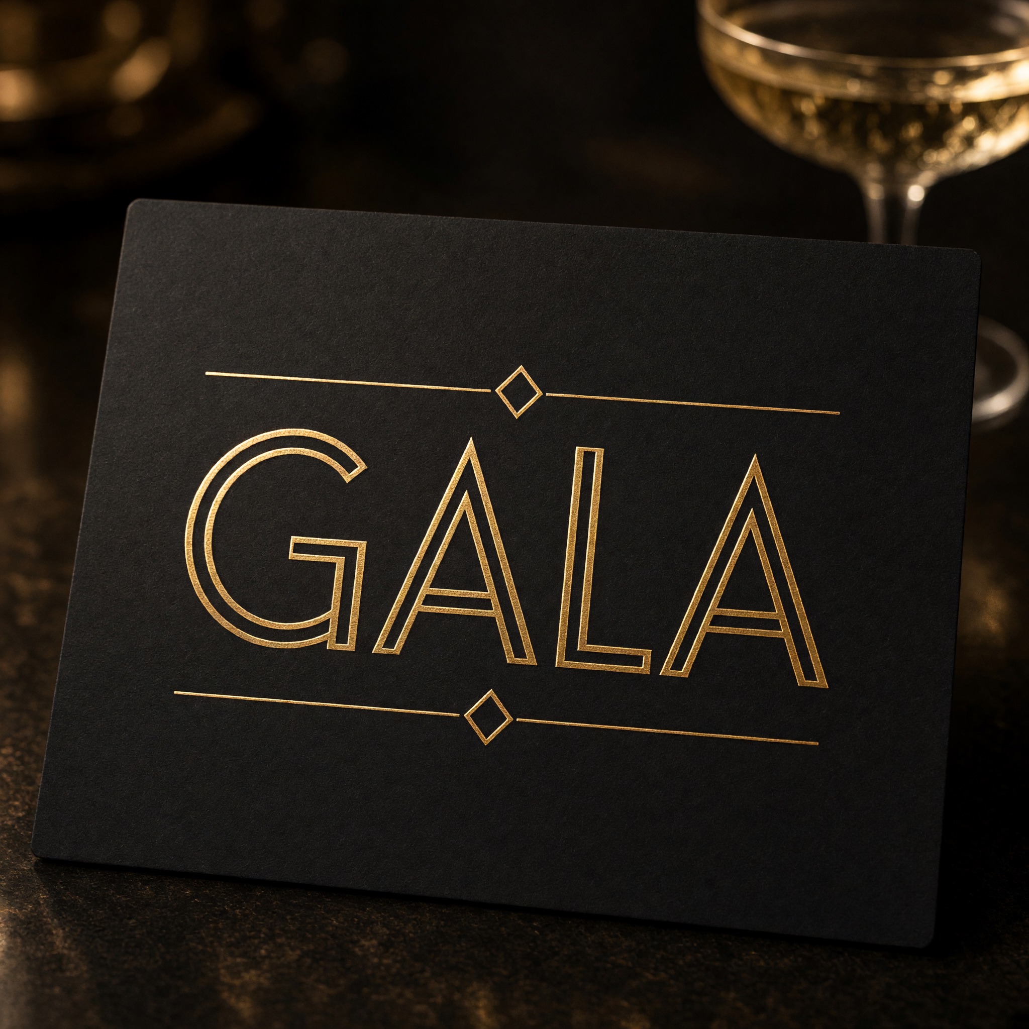
One prompt pasted into each image model as-is. These are the unedited results, so you can pick the model that suits you.
Tall, narrow capitals in clean double gold lines, with low crossbars on the A.
Even double lines on rounder, wider letters, with large hollow diamonds.
Wider letters; the right leg of each A and the L stem are one thick gold line beside a thin one.
Card set at an angle; a full circle runs through the last A and some strokes are single solid lines.
The tallest, most stretched letters, double lines throughout, card shot straight on.
The button opens FontVibe in DIY mode with this prompt already in it, unchanged. Type your party theme or the couple's names, pick a model and generate. GPT Image, Nano Banana, Seedream, Grok and Qwen are all in one account, so you can see which one keeps every stroke as two clean gold lines without signing up to five apps. Every account gets free credits each month with no card needed, and you can export a transparent PNG to drop the gold lettering onto your own invitation or menu.
Layers in the order the prompt states them. Change one layer and the rest keeps working.
Every AIFont prompt opens with the same text part. "Spell it exactly as written, without adding or changing any letter" matters here because each letter is only a few thin lines: drop one and an E becomes an F, or a crossbar moved too far turns an A into something else.
"Gatsby lettering:" tells the model which 1920s style you mean: the gold, geometric party look, not a jazz-club script or a plain old serif.
"tall, narrow Art Deco capitals built only from straight lines and perfect circles" is the skeleton: an O is a true circle, an M and a W are straight strokes. "with crossbars set very high or very low" adds the period detail you notice at once, an A or E whose bar sits near the top or bottom. "every letter reads at a glance" keeps that quirk from making letters hard to read.
"Every stroke is drawn as two thin parallel lines with a narrow gap between them" is what makes this Gatsby rather than any Art Deco letter: each stroke is an open outline, like two gold wires laid side by side. "with no thick strokes" is the prompt's one negative. Ask for tall Art Deco capitals without it and models often reach for heavy poster letters, fat verticals next to hairlines, which is a different look.
"Every line, including the ornaments, is polished metallic gold." is the only colour line. It names the ornaments too, so the rules never come out a different colour from the letters. Change it on its own: silver for a winter gala, rose gold for a wedding.
"Exactly two ornaments: a thin straight rule above the word and an identical one below it, each with one small diamond at its centre." frames the word like the header of an invitation. Giving the exact number and place stops models from crowding the card with fans, sunbursts and corner brackets that compete with the word.
"The gold has a smooth, mirror-like shine." makes the lines read as polished metal or foil instead of flat yellow ink.
"Like the lettering on a 1920s Gatsby party invitation." gives every model the same picture to aim for: printed, gold, formal.
"Printed on a black invitation card on a dark table, a champagne coupe blurred behind" supplies the black that makes thin gold lines stand out, and shows what this lettering is for; "the word is centered, fills most of the width and reads clearly" keeps the word the star. Swap this part for your own use, but keep the background dark if you want black and gold.
Small edits that stay on-style. Change one thing at a time.
Type it in the box next to Prompt above and copy again. Short words in capitals suit the tall letters best: GALA, a couple's names, a bar name or the theme of the night.
Swap "Every line, including the ornaments, is polished metallic gold." for "Every line, including the ornaments, is polished metallic silver.", "Every line, including the ornaments, is polished rose gold." or "Every line, including the ornaments, is deep black." With black lines, change the scene to a cream or white card.
Replace "Exactly two ornaments: a thin straight rule above the word and an identical one below it, each with one small diamond at its centre." with "Exactly one ornament: a thin straight rule below the word, with one small diamond at its centre." for a quieter header, or with "Exactly two ornaments: a small fan of thin rays above the word and an identical one below it." for more Art Deco flourish.
Replace "Printed on a black invitation card on a dark table, a champagne coupe blurred behind" with "Printed on a black cocktail menu cover on a marble bar", "Printed on a black wedding place card beside a white rose" or "Printed on the lid of a black gift box under soft light".
The prompt sets no frame size. Pick the ratio in your app, or add "Wide 16:9 image." or "Tall 4:5 image." at the end. A party banner suits 16:9; an invitation suits 4:5.
AI fonts that share the most tags with Gatsby Font.
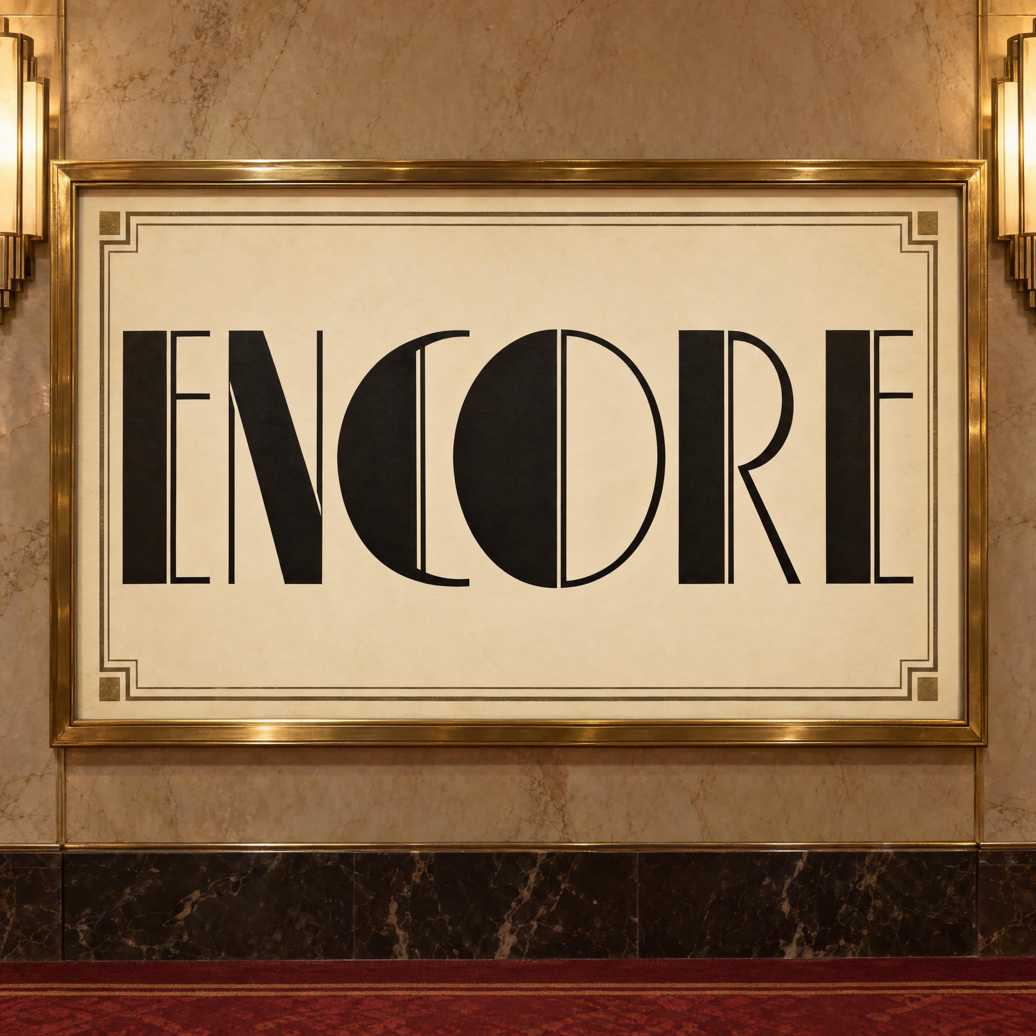
AI fonts for a second line, a logo lock-up or a poster footer.
Gatsby Font writes your word the way a 1920s party invitation would: tall, narrow Art Deco capitals built only from straight lines and perfect circles, with crossbars pushed very high or very low. Every stroke is two thin parallel lines with a narrow gap between them, all the same fine weight, so the letters look drawn in gold wire rather than inked. A thin rule with a small diamond sits above the word and another below it, and the gold has a smooth, mirror-like shine.
Type your word in the box above the prompt, copy it and paste it into ChatGPT, Gemini, Grok, Qwen or Seedream. The prompt has three parts: the text, the font design and the scene. The font design makes the geometric letters, the double lines, the gold and the two ornaments; the scene prints the word on a black invitation card with a champagne glass behind it, and you can swap it for your own. Keep the background dark if you want the black-and-gold look. Every image on this page is what each model returned from the unchanged prompt, with no retouching.
Use it for Gatsby and Roaring 20s party invitations, New Year's Eve and gala nights, Art Deco wedding stationery, cocktail bar menus and signs, and labels for champagne, spirits or perfume.
Details from the original render. Every one of them is named in the prompt.
Every stroke is two thin parallel gold lines with a narrow gap.
Tall, narrow capitals built only from straight lines and perfect circles.
Crossbars set near the top or the bottom of the letter.
A thin rule with a small diamond above and below the word.
Pulled from the render. Handy when you build the rest of the design around the word.
F. Scott Fitzgerald's The Great Gatsby was published by Charles Scribner's Sons on 10 April 1925. Set in the Jazz Age on Long Island, it follows the narrator Nick Carraway and his neighbour, the mysterious millionaire Jay Gatsby; Nick first meets him because one morning a formal invitation to a party at Gatsby's mansion arrives. The book sold fewer than 20,000 copies by October, but its first-edition jacket, Francis Cugat's Celestial Eyes, was already drawn in an Art Deco style. The style itself took its name from the Paris exhibition of modern decorative arts held that same year.
The gold-and-black picture most people now have of a Gatsby party comes largely from Baz Luhrmann's 2013 film, released in the US on 10 May 2013 and chosen to open the Cannes Film Festival five days later. Its designer, Catherine Martin, said the team dressed Gatsby's mansion in gilded opulence that blended establishment taste with Art Deco, and she credited 1920s silent films such as Sunrise (1927) and Speedy (1928) for its high-gloss Art Deco look. The film won both Oscars it was nominated for: production design and costume design.
This prompt copies no poster or title card from the book or the film. It keeps the parts of that look that work on a single word: tall capitals made of straight lines and circles, every stroke drawn as a pair of fine gold lines, two small diamond rules, and black behind, the way the header of a 1920s party invitation might be printed.
Sources: Wikipedia — The Great Gatsby · Wikipedia — The Great Gatsby (2013 film) · Wikipedia — Catherine Martin (designer) · Wikipedia — Art Deco
Charles Scribner's Sons publish The Great Gatsby on 10 April; Francis Cugat's jacket, Celestial Eyes, is in an Art Deco style.
Paris holds the International Exhibition of Modern Decorative and Industrial Arts, which gives Art Deco its name.
Baz Luhrmann's The Great Gatsby is released in the US on 10 May and opens the 66th Cannes Film Festival on 15 May.
At the 86th Academy Awards Catherine Martin wins Best Costume Design and, with set decorator Beverley Dunn, Best Production Design.
In English all five models wrote GALA correctly in gold on a black card. GPT Image and Qwen are closest to the design: tall, narrow letters with every stroke in two thin lines. Nano Banana tends to make a few strokes thick and solid, Seedream and Grok sometimes draw three lines instead of two, and Seedream put a circle through the last A. In other languages, Qwen in Japanese twice wrote ギャツビー, a word from inside the prompt, instead of the requested word, and in Arabic drew solid calligraphy instead of double lines. Compare them side by side above.
No. It is a prompt that makes a picture of your word in gold Art Deco lettering with an AI image model. There is no font file to install. If you need to set long text in this style, look for an Art Deco display font file; this page is for when you want the finished gold header as an image.
No. It does not copy the titles or posters of the 2013 film, or any one typeface. It asks for the parts that make the look: tall geometric capitals, every stroke as a double gold line, and black behind. That is enough for a Great Gatsby font on a themed invitation without copying anyone's artwork.
Broadway Font is the heavy 1920s poster letter: fat vertical strokes next to hairlines, in solid black ink. This one has no thick strokes at all; every line is the same fine gold double line. Use Broadway for a bold theatre-style title, and this one for an elegant invitation or label.
Type it in the box next to the prompt and copy the full prompt again. Short words in capitals keep the double lines big enough to see; long sentences make the strokes so thin they blur together.
Change only "Every line, including the ornaments, is polished metallic gold.", for example to "Every line, including the ornaments, is polished metallic silver."
Pick the ratio in your app if it has one. If not, add "Wide 16:9 image." or "Tall 4:5 image." at the end of the prompt.
Replace the scene with a plain dark one, for example "The word is on a plain black background.", and remove the background in any editor. Or use the FontVibe button above: it can export a transparent PNG.
Copying the prompt is free. Whether the image costs anything depends on the app you paste it into, and what you may do with the image depends on that app's terms.