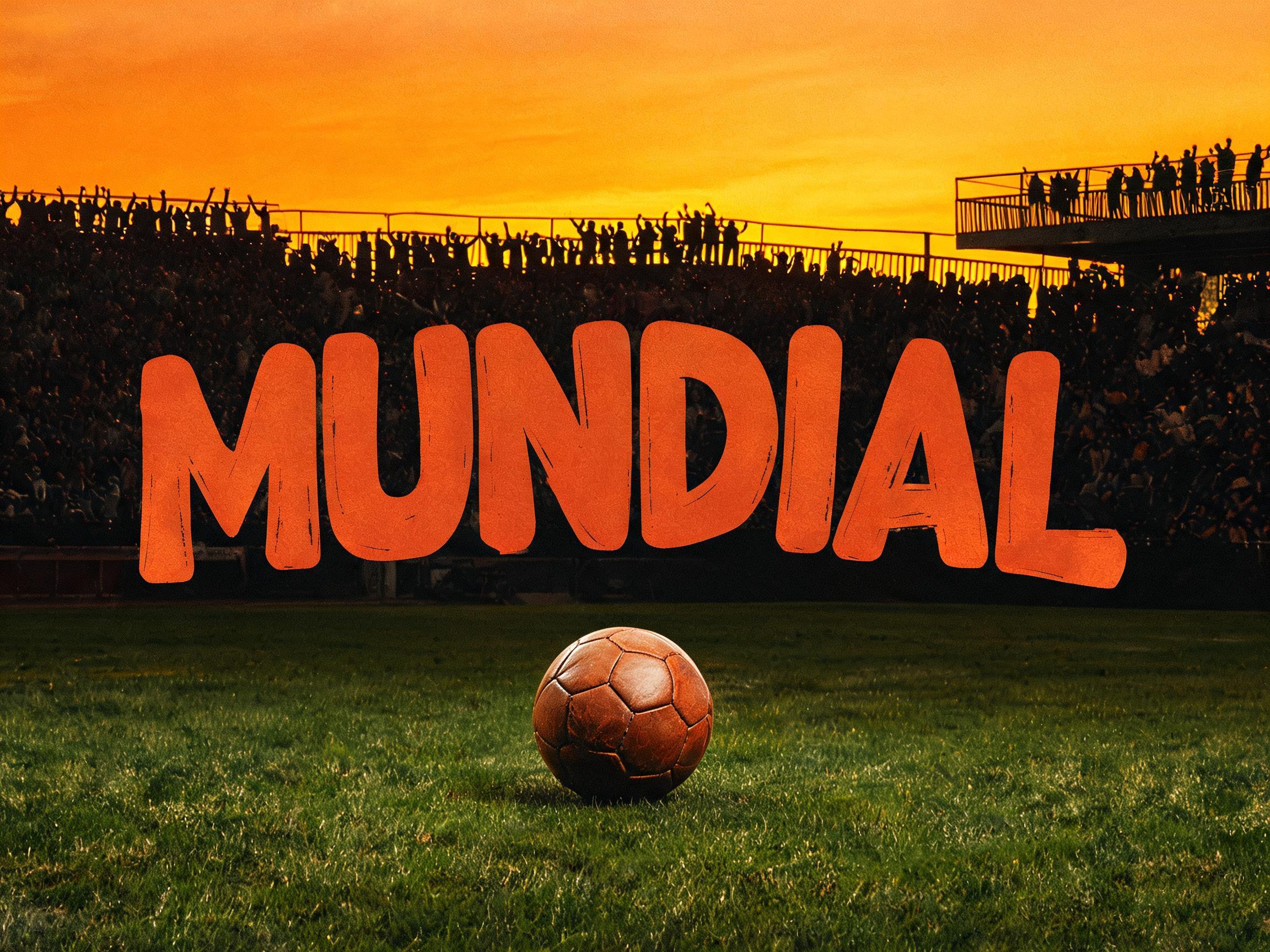
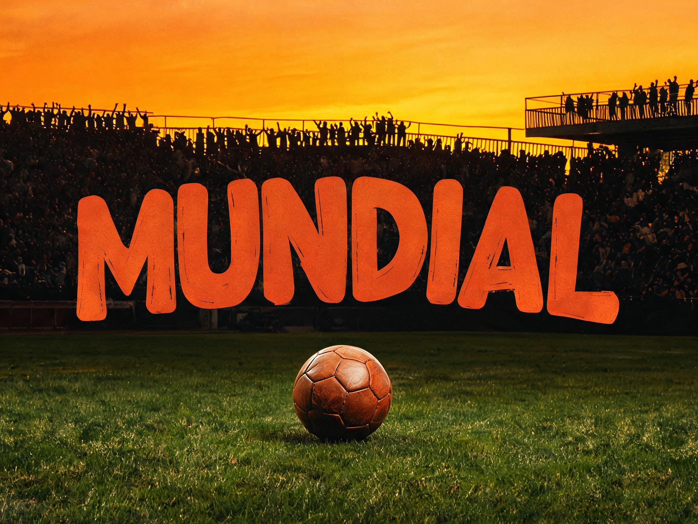
1970 Mexico / 1978 Argentina World Cup poster typography — warm vintage organic bold display letterforms
✦プロンプト
このAIフォントにはまだ日本語版がありません。以下は英語のプロンプトと、それで生成した画像です。
rendered in retro 1970s-1980s World Cup poster display letterforms — inspired by the official typography of the 1970 Mexico World Cup and 1978 Argentina World Cup. VINTAGE ORGANIC QUALITY: very slightly irregular stroke widths, letterform curves that feel drawn rather than mathematically generated, terminals with a subtle organic flare at stroke ends — the warmth of hand-drawn lettering for screen printing. BOLD and commanding, designed for large-format poster visibility. CONDENSED TO MEDIUM proportions. WARM RETRO CHARACTER: subtle curvature in what might be straight strokes in a modern font, very slight baseline irregularity suggesting hand lettering, the ink texture of offset lithographic printing on vintage paper. Reference: FIFA World Cup Mexico 1970 official poster typography / 1978 Argentina WC poster lettering / Avery Dennison Premier League retro font — THE WARMTH AND SLIGHT IMPERFECTION OF VINTAGE FOOTBALL PRINTING.137 語


 プレミアム

 プレミアム