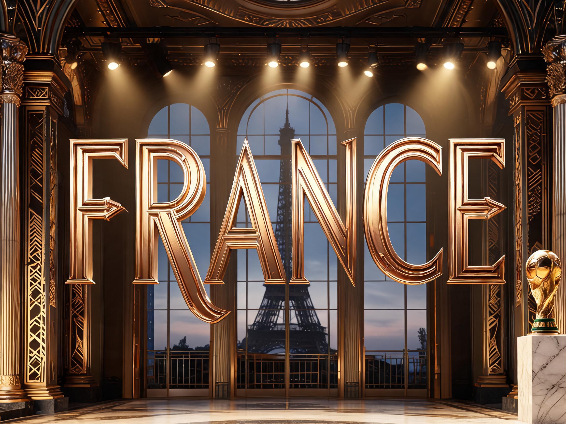
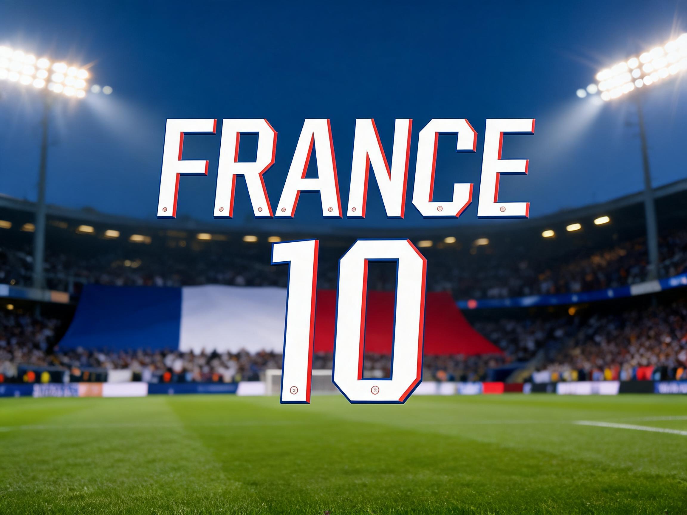
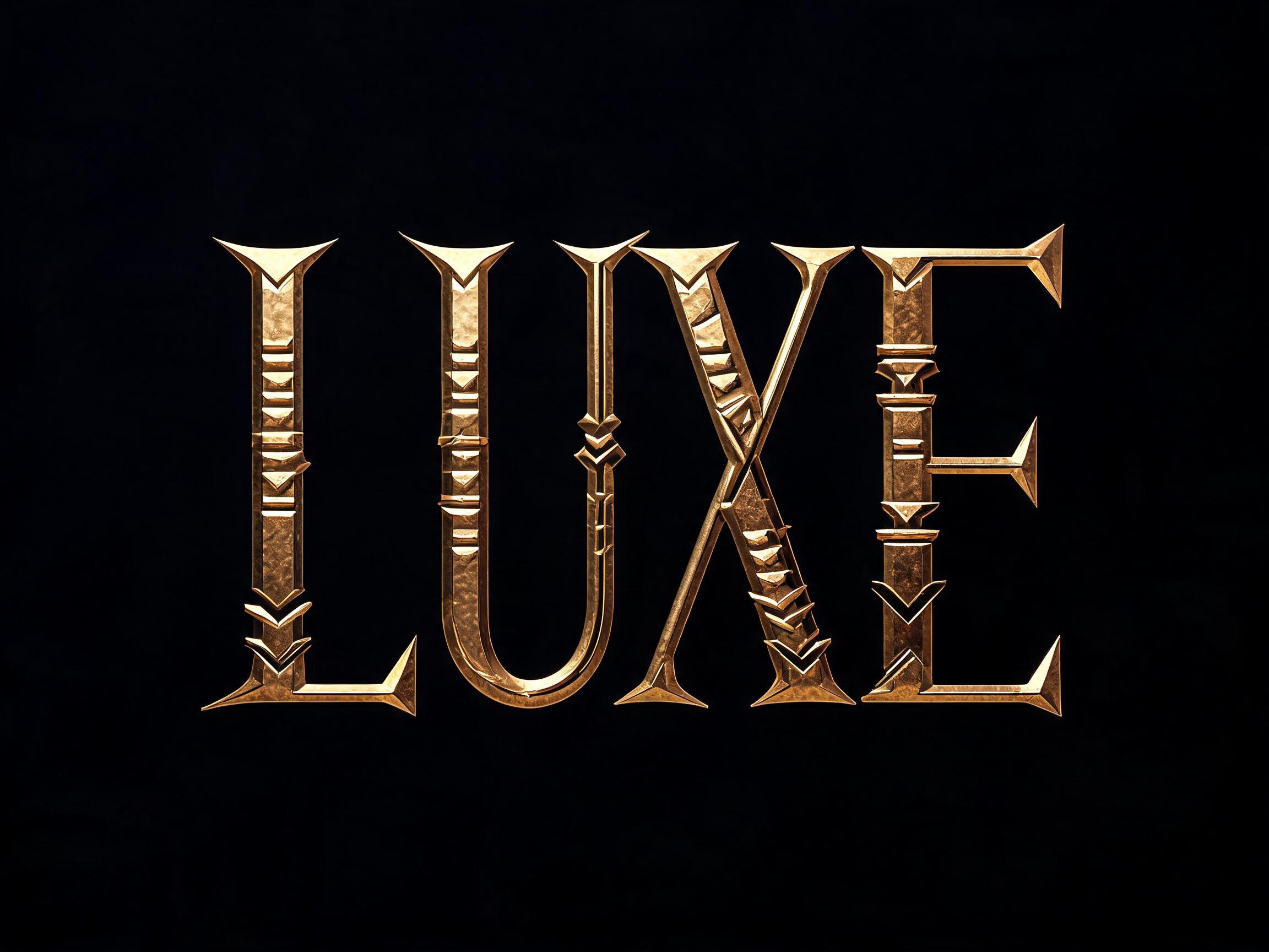
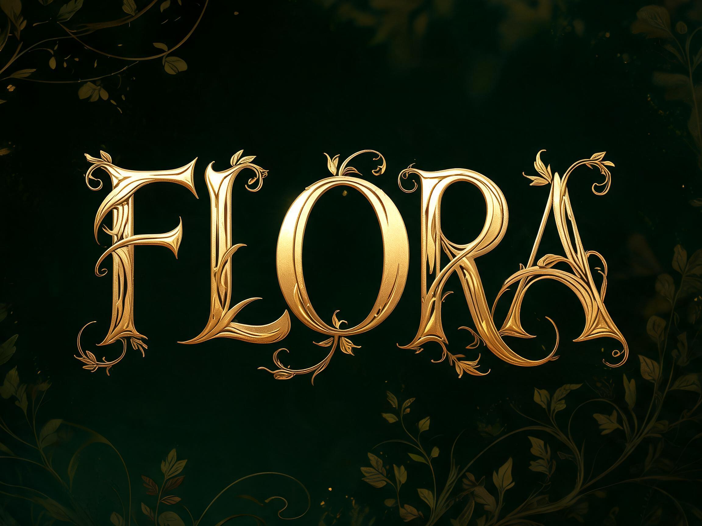
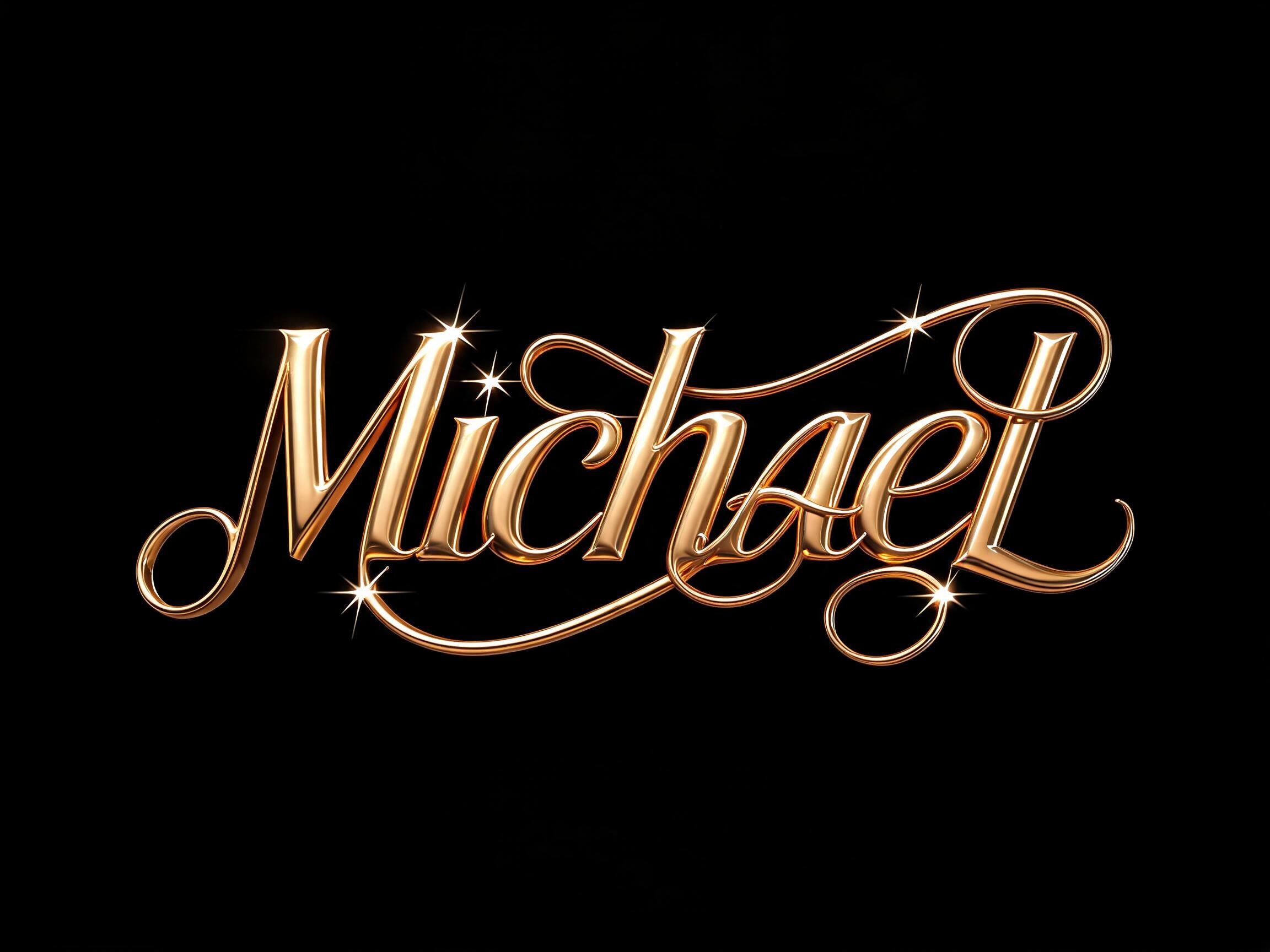
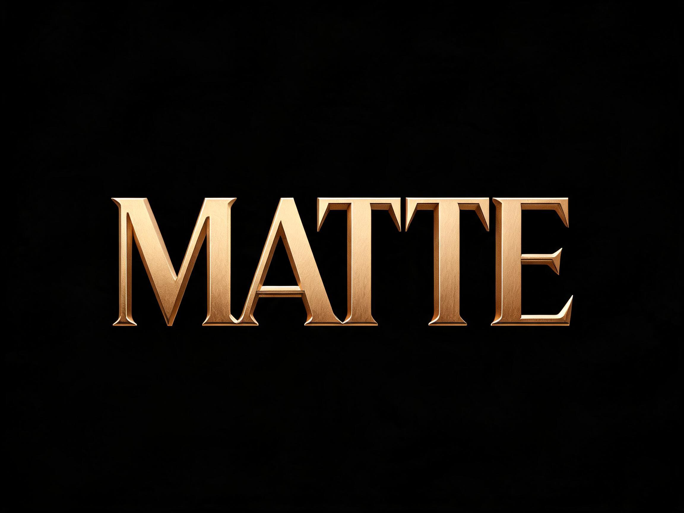
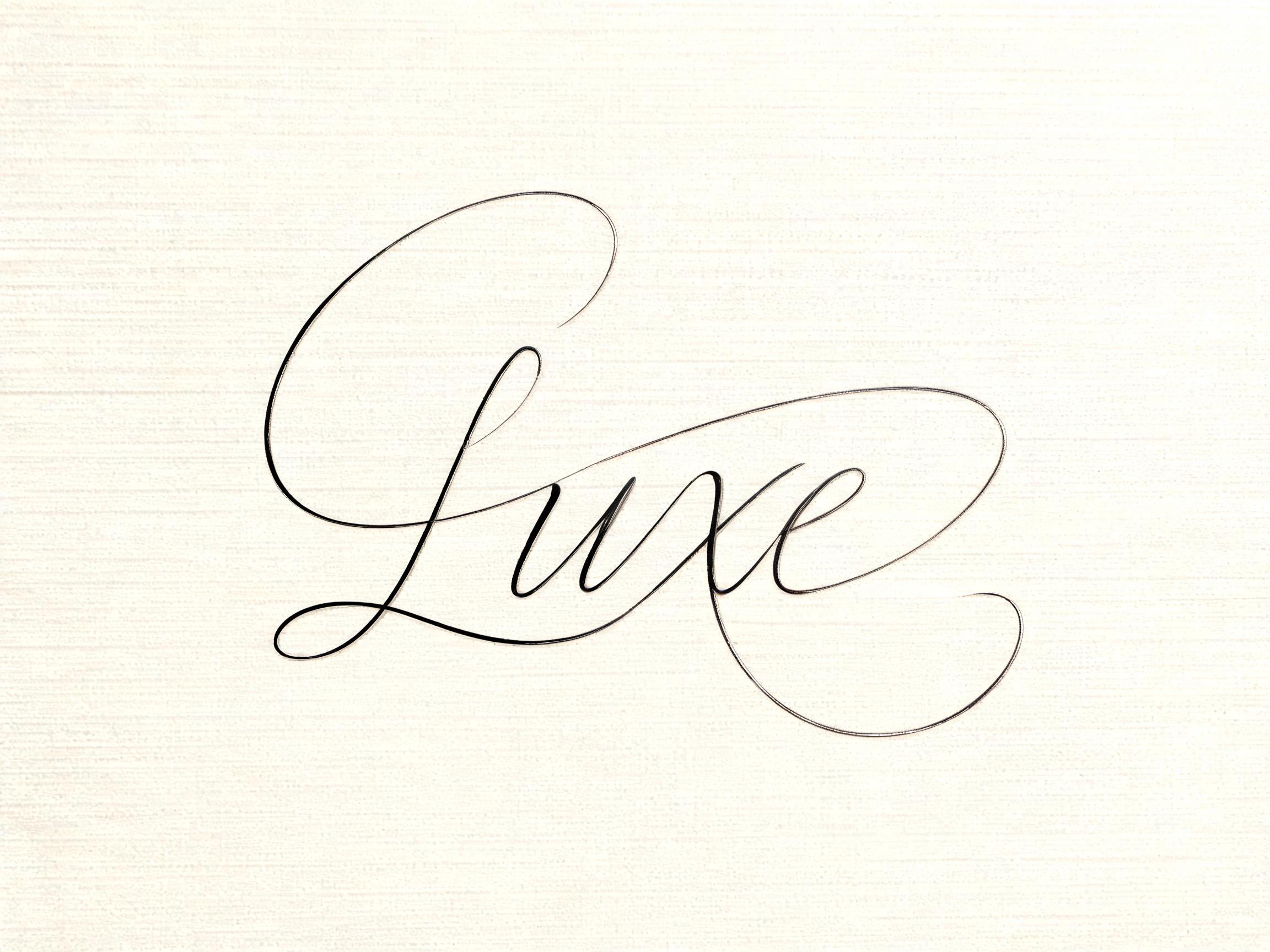
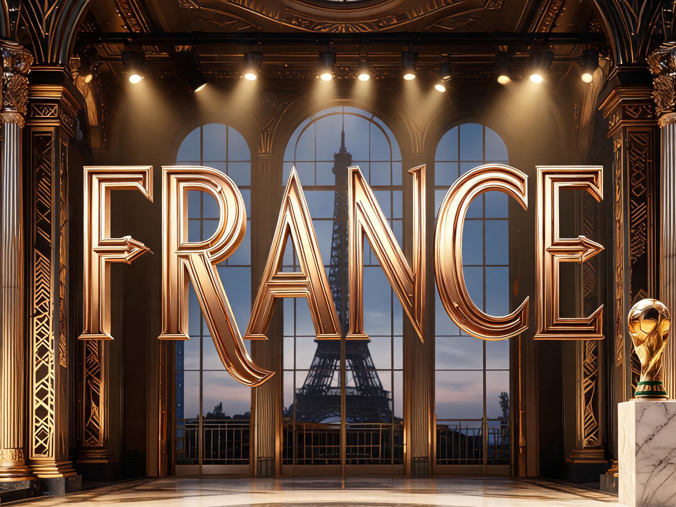
France WC2026 Art Deco gold-bronze football font — Parisian elegance meets championship typography
✦プロンプト
このAIフォントにはまだ日本語版がありません。以下は英語のプロンプトと、それで生成した画像です。
rendered in France WC2026 Art Deco football kit display letterforms — Nike's away kit typography for Les Bleus, combining 1920s-30s Parisian Art Deco lettering with championship football authority. ART DECO CHARACTERISTICS: tall and elegant proportions (height 3-4x width), dramatic thick-to-thin stroke contrast (thick verticals, very thin horizontals), subtle geometric decorative details at key letterform junctions. METALLIC RELIEF: letterforms have warm gold-bronze metallic surface quality with subtle depth suggesting dimensionality — Art Deco architectural lettering quality. Reference: Nike France WC2026 away kit font / 1920s Art Deco Parisian display lettering (Bifur, Broadway) — SPORTING AUTHORITY with FRENCH ART DECO GOLD-BRONZE ELEGANCE.100 語