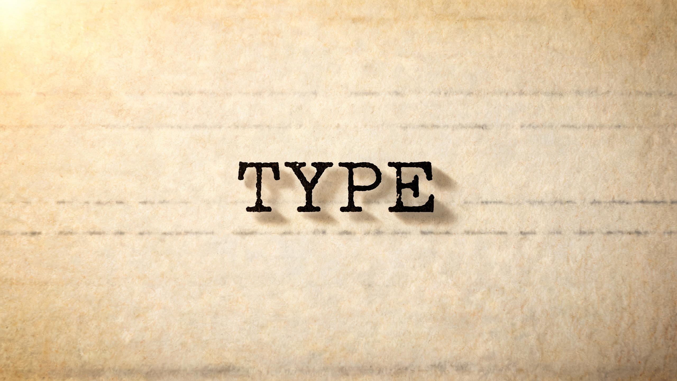
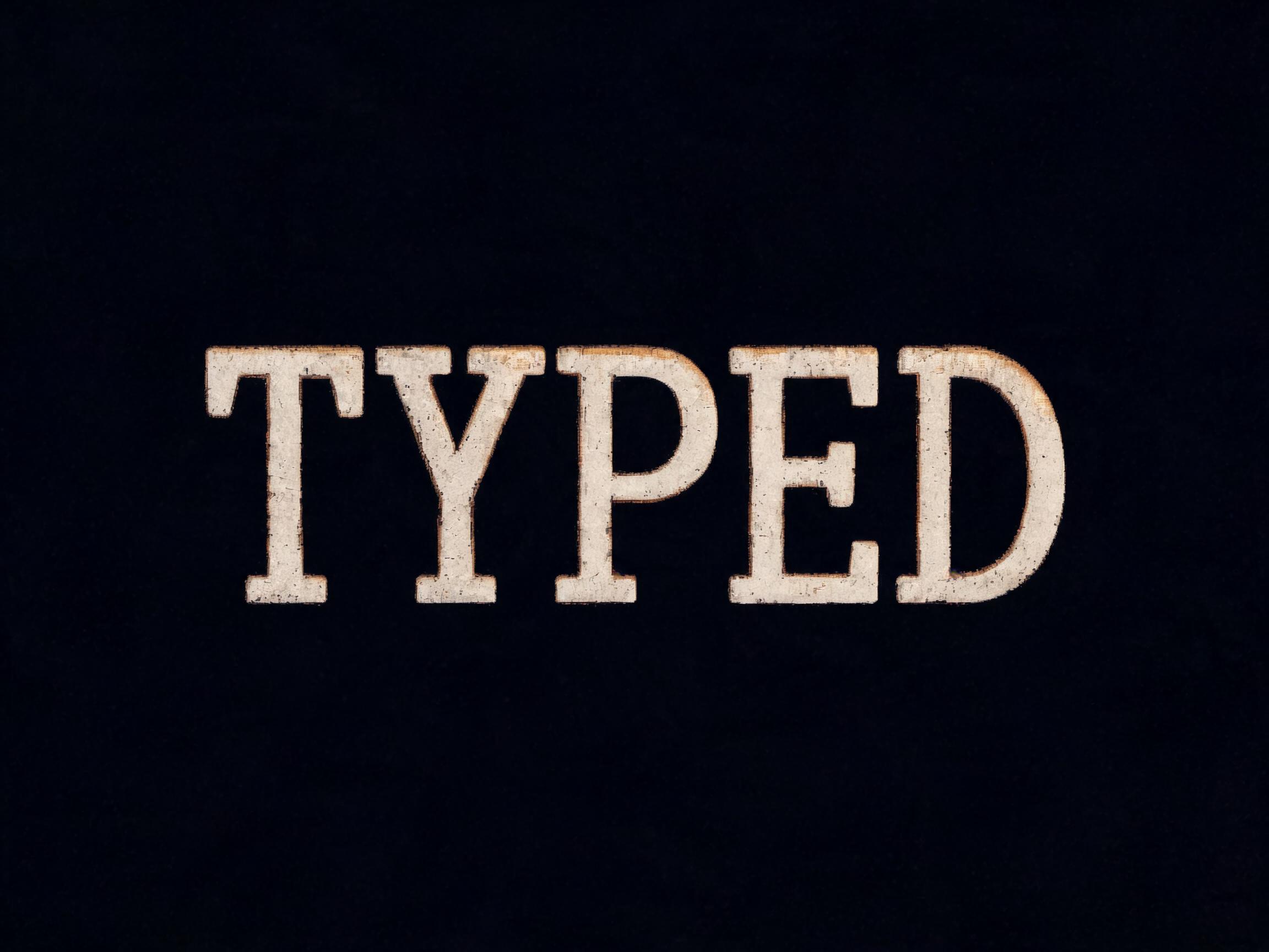
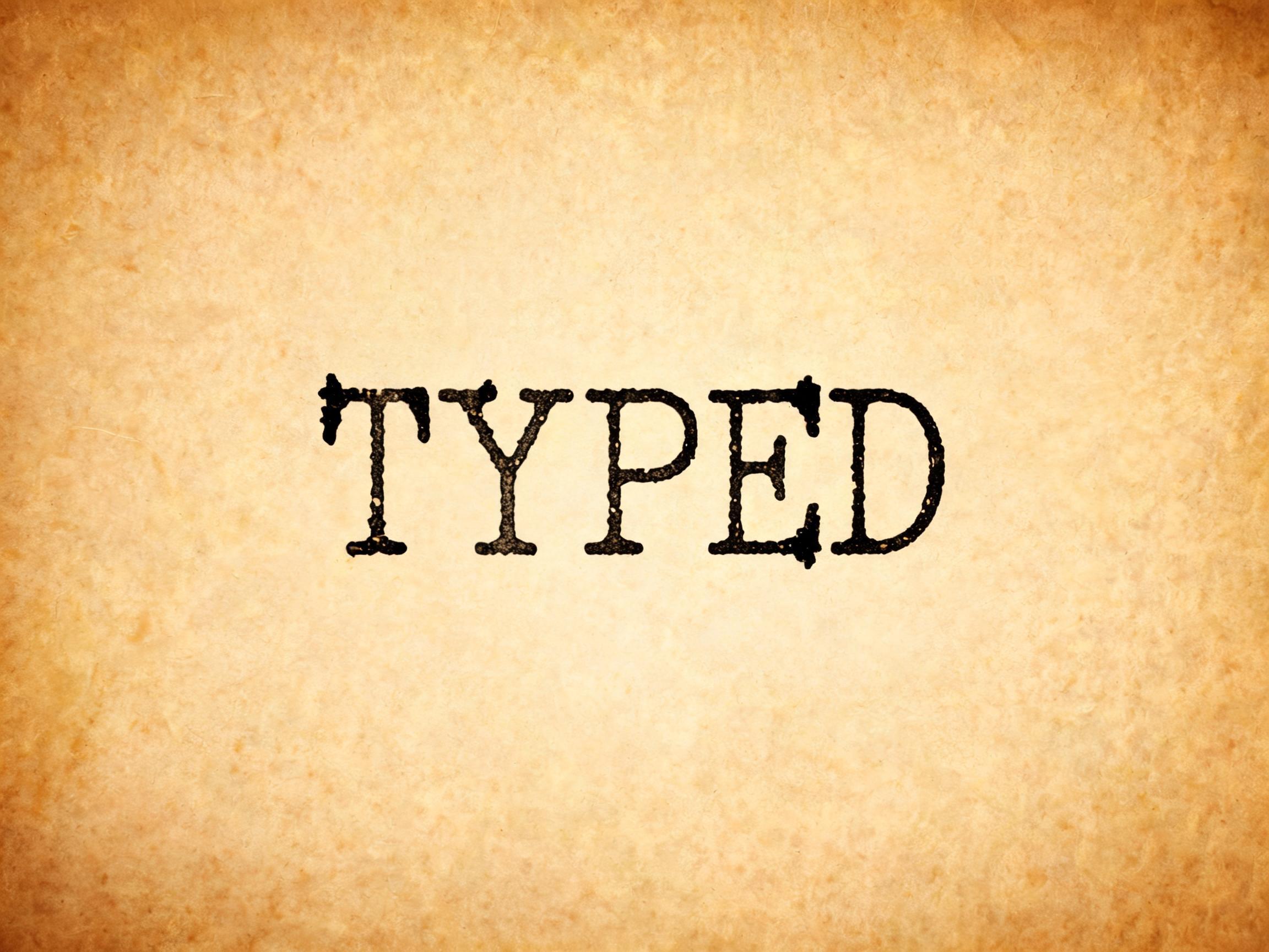
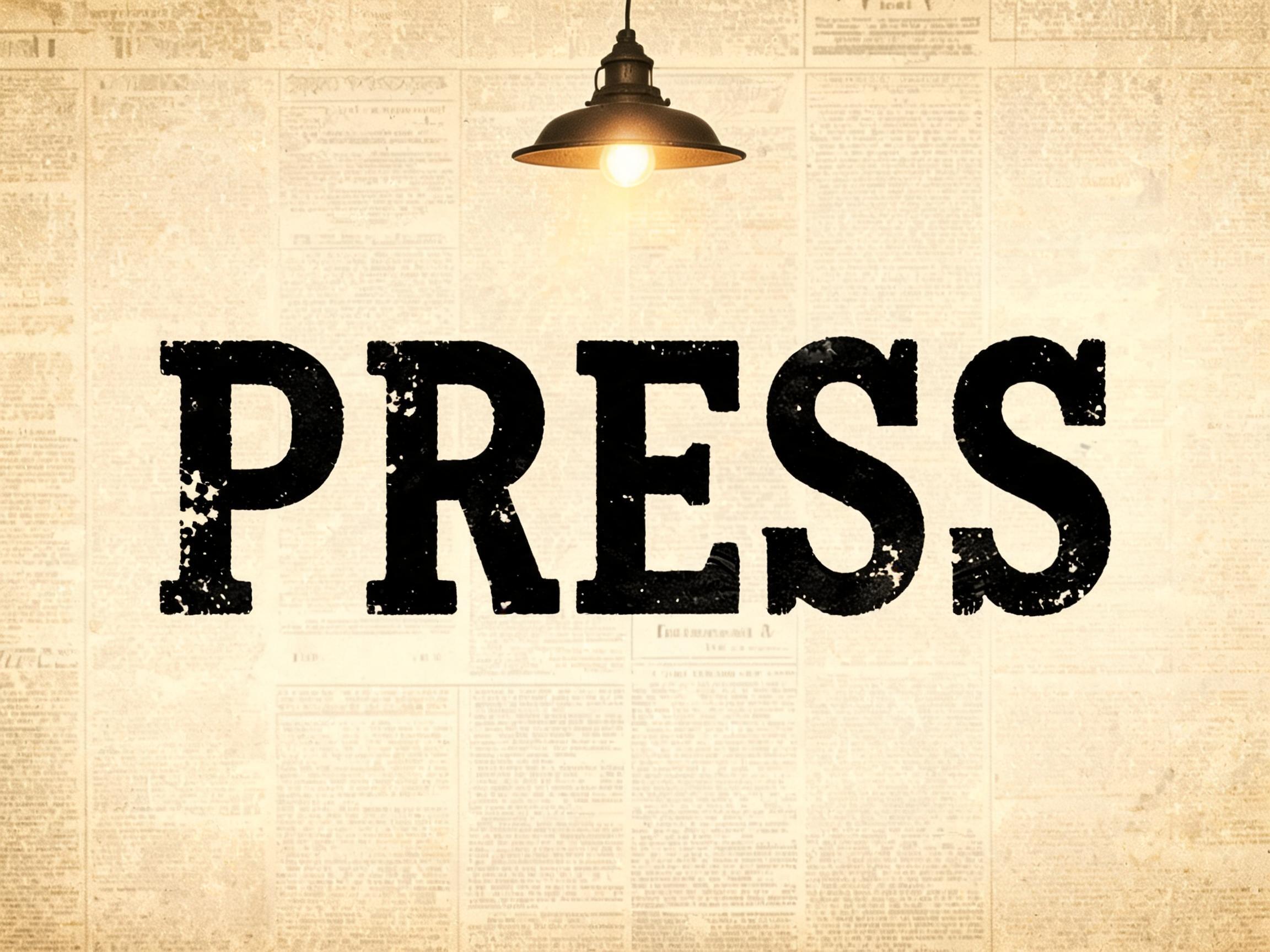
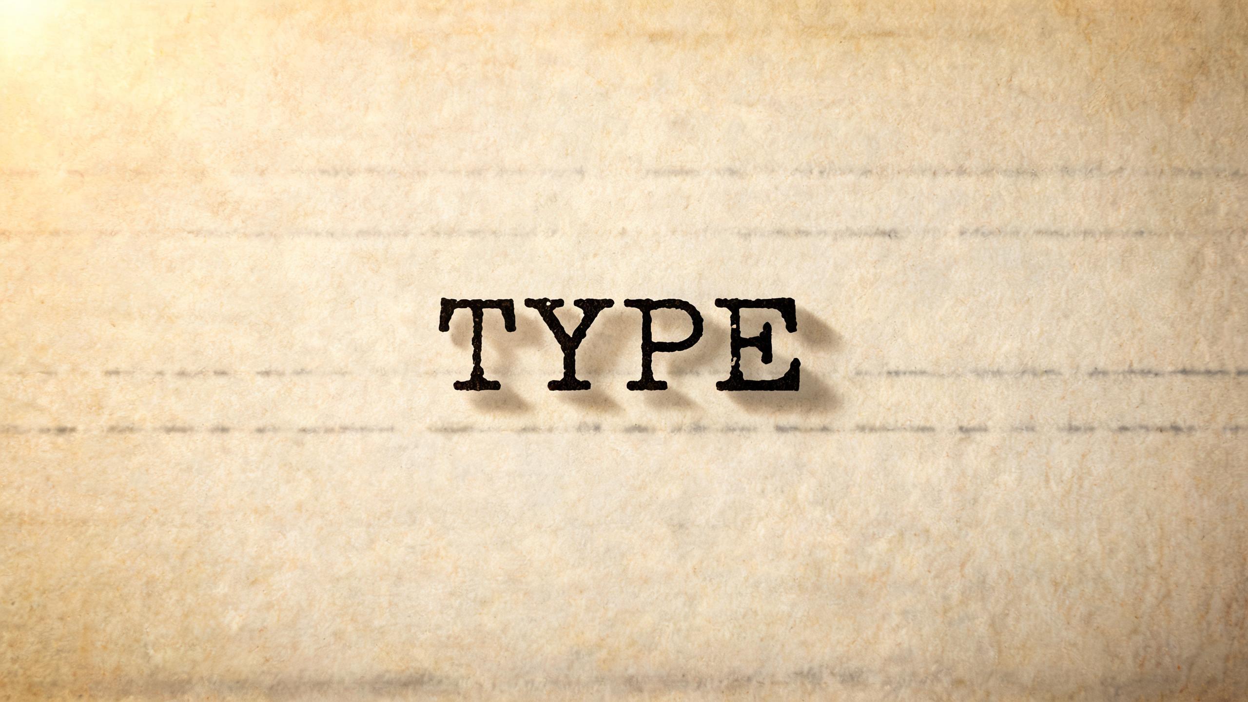
rendered in monospace typewriter letterforms with slab serifs on all stroke terminals, strict fixed-pitch equal spacing, visible mechanical imperfections in stroke alignment, ink ribbon impression variation causing slight weight irregularity, character crowding in narrow letters. The imperfect ink impression absorbs light unevenly — heavier ink areas darken while thin passages show paper white beneath, recreating authentic mechanical printing. The typographic language of mid-century correspondence, noir detective fiction typography, and vintage documentary titles — imperfect, mechanical, nostalgically human.77 語