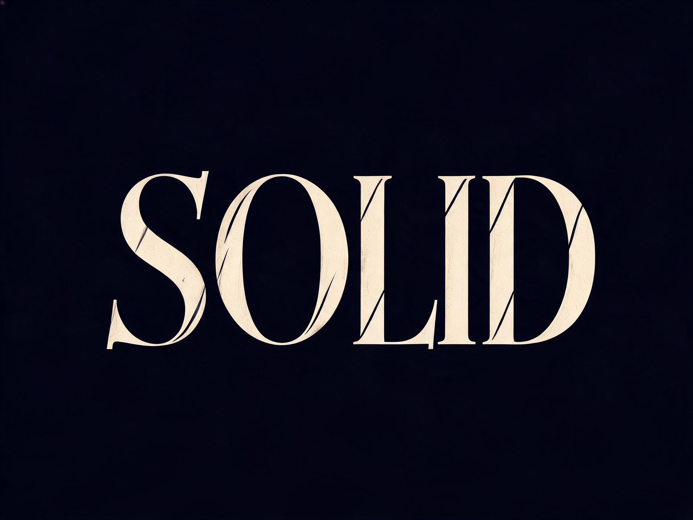
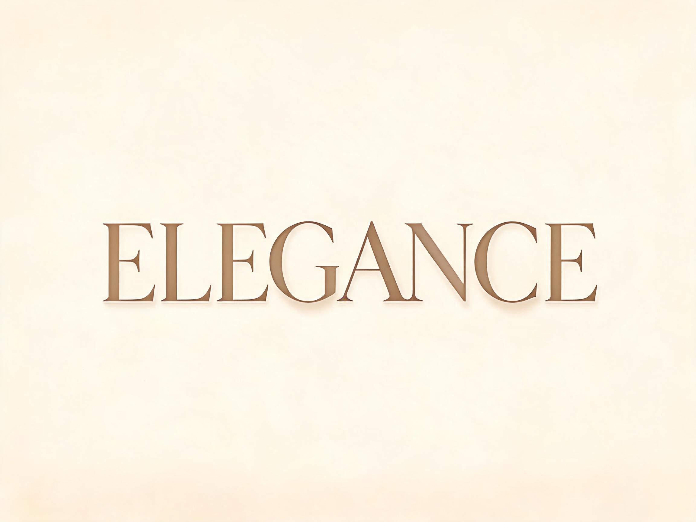
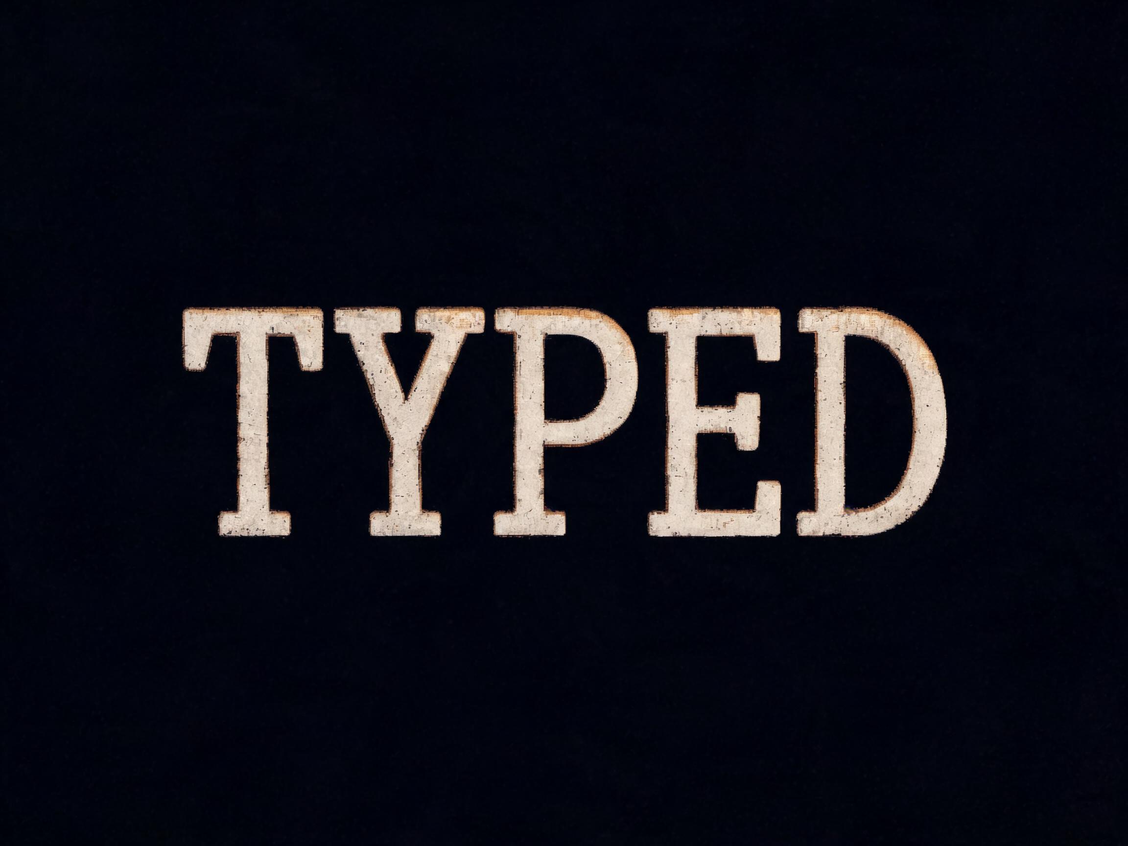
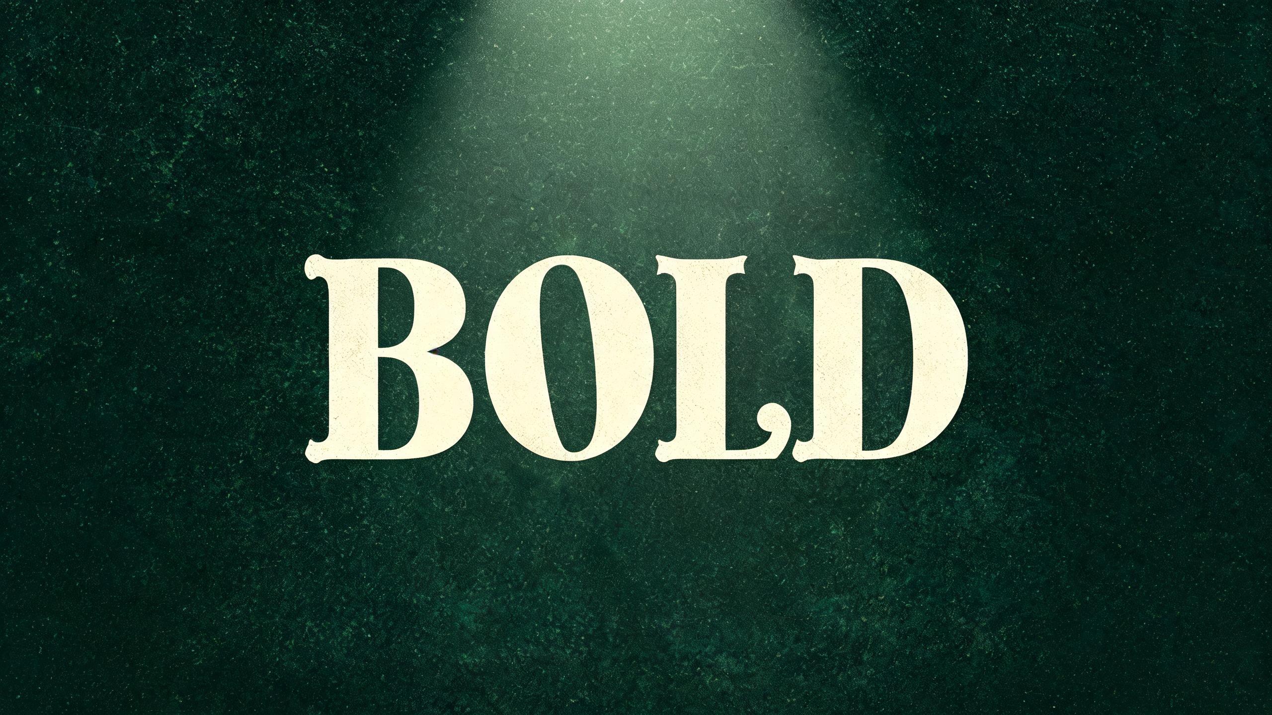
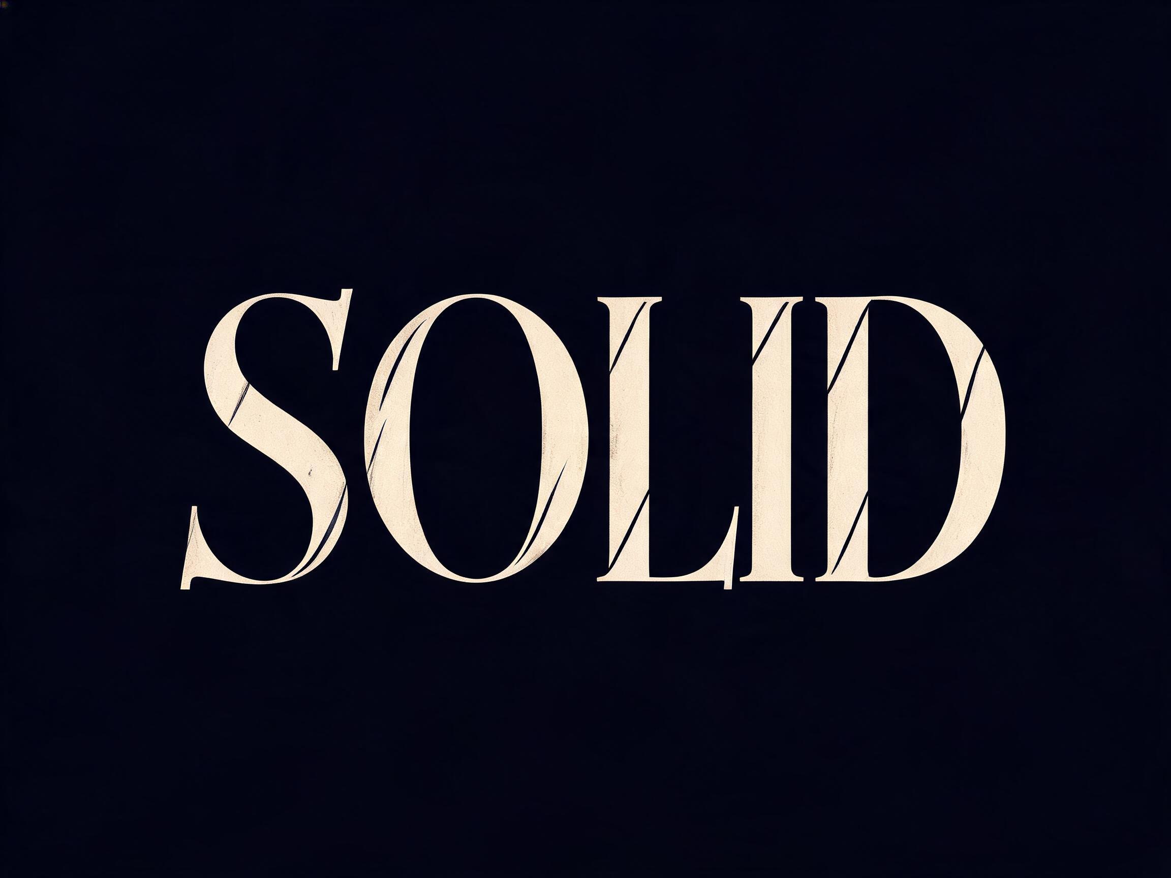
rendered in old-style humanist serif letterforms with diagonal optical axis stress from the held broad-nib pen angle, bracketed serifs with gentle curve transitions, moderate thick-thin contrast, moderate x-height. Entry strokes carry visible calligraphic angle — the forms remember the hand that made them. Warm diffuse light reveals the diagonal axis as gentle tonal shift between thick and thin strokes. The typographic language of Renaissance scholarship: readable, warm, and quietly alive.70 語