本文へスキップ
AIFont
ホームAIフォントシーン別スタイル別用途雰囲気
AIFont
AIFont
ホームAIフォントシーン別スタイル別用途雰囲気
AIFont

プロンプトひとつで文字をデザインできるAIフォント。コピーして画像生成AIに貼り付け、好きな文字に差し替えるだけ。

プロンプトより画像がほしいなら、FontVibe がそのまま生成します。

さがす

  • すべてのAIフォント
  • スタイル別
  • シーン別
  • 用途
  • 雰囲気

人気のスタイル

  • 高級感
  • レトロ
  • 近未来
  • ヴィンテージ
  • クラシック

人気のシーン

  • ゲーム
  • スポーツ
  • テクノロジー
  • 映画
  • ウェディング
© 2026 AIFont · aifont.ai · Funovate Technology のプロダクトプライバシーポリシー · 利用規約 · 運営者情報 · お問い合わせ
AIFont›AIフォント›Agency Extended Black
  • 1モデルで実測
  • 無修正の実測画像
  • 無料・商用利用可

Agency Extended Black

An ultra-heavy extended display typeface with maximum horizontal expansion, pure monotone stroke construction, and architecturally squared…

✦プロンプト

このAIフォントにはまだ日本語版がありません。以下は英語のプロンプトと、それで生成した画像です。
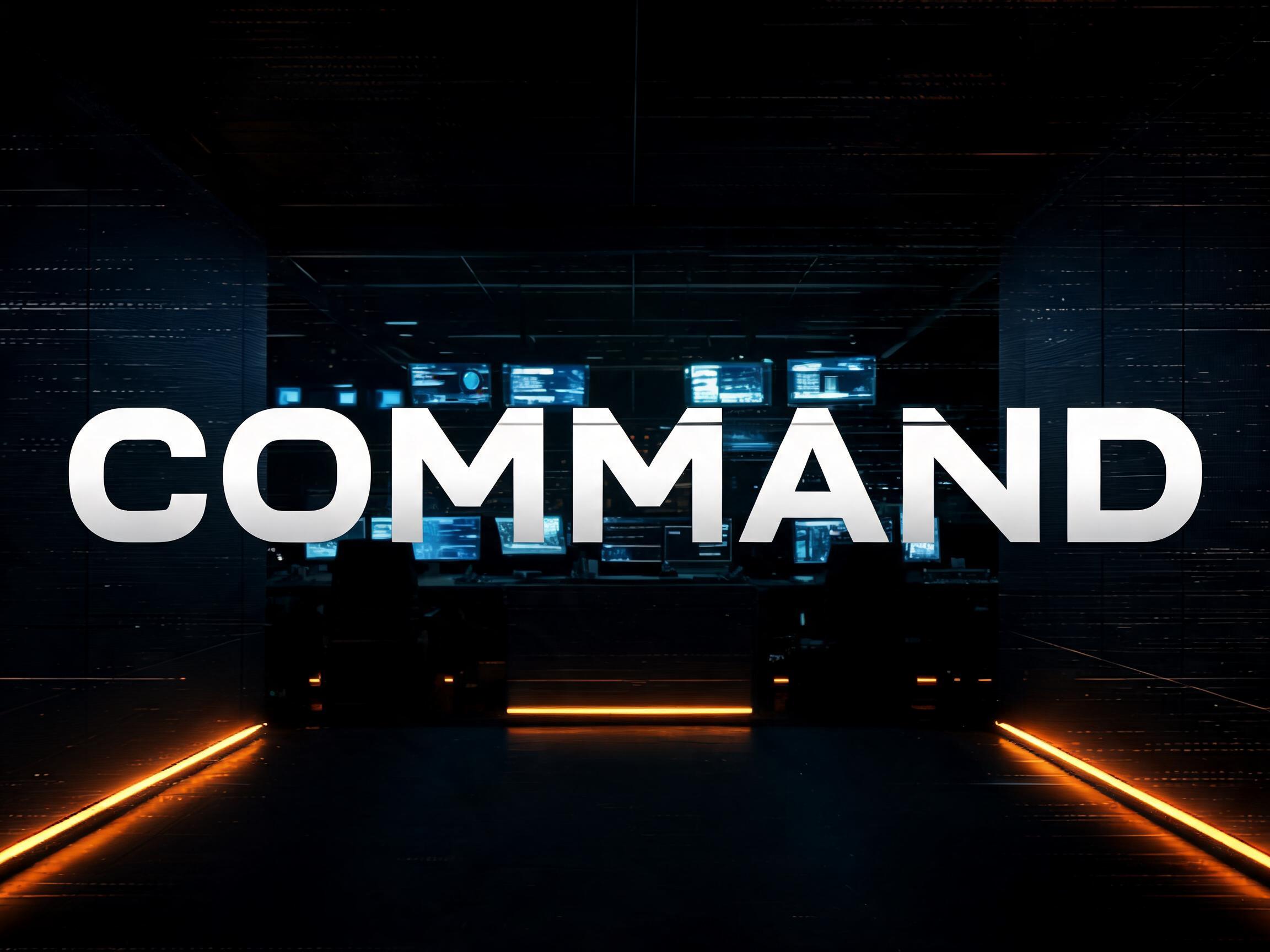
rendered in ultra-heavy extended display sans-serif letterforms with extreme horizontal expansion — letter width significantly exceeds height at a ratio of approximately 1.3 to 1, producing the dominant wide-set blocky silhouette of American blockbuster and military title typography. Stroke weight is maximum black throughout with strict uniform monotone construction — zero thick-thin contrast, pure geometric mass at every point. Letter forms are architecturally squared with sharply truncated flat terminals that function as structural load-bearing terminations rather than decorative details. Apertures are tightly compressed; counter spaces are reduced to precise minimum geometric voids. Cap height is moderate with a high x-height ratio, reinforcing the horizontal dominance of the letterforms. The silhouette of every word becomes a solid architectural form occupying the full horizontal span of the composition — a typographic wall. The typographic language of superhero franchise title cards, military force branding, blockbuster key art, stadium jumbotron graphics, and any context where a single word must register as an overwhelming physical force.161 語
FontVibeで生成ChatGPT、Gemini などの画像生成AIに貼り付けて、好きな文字に差し替えてください。
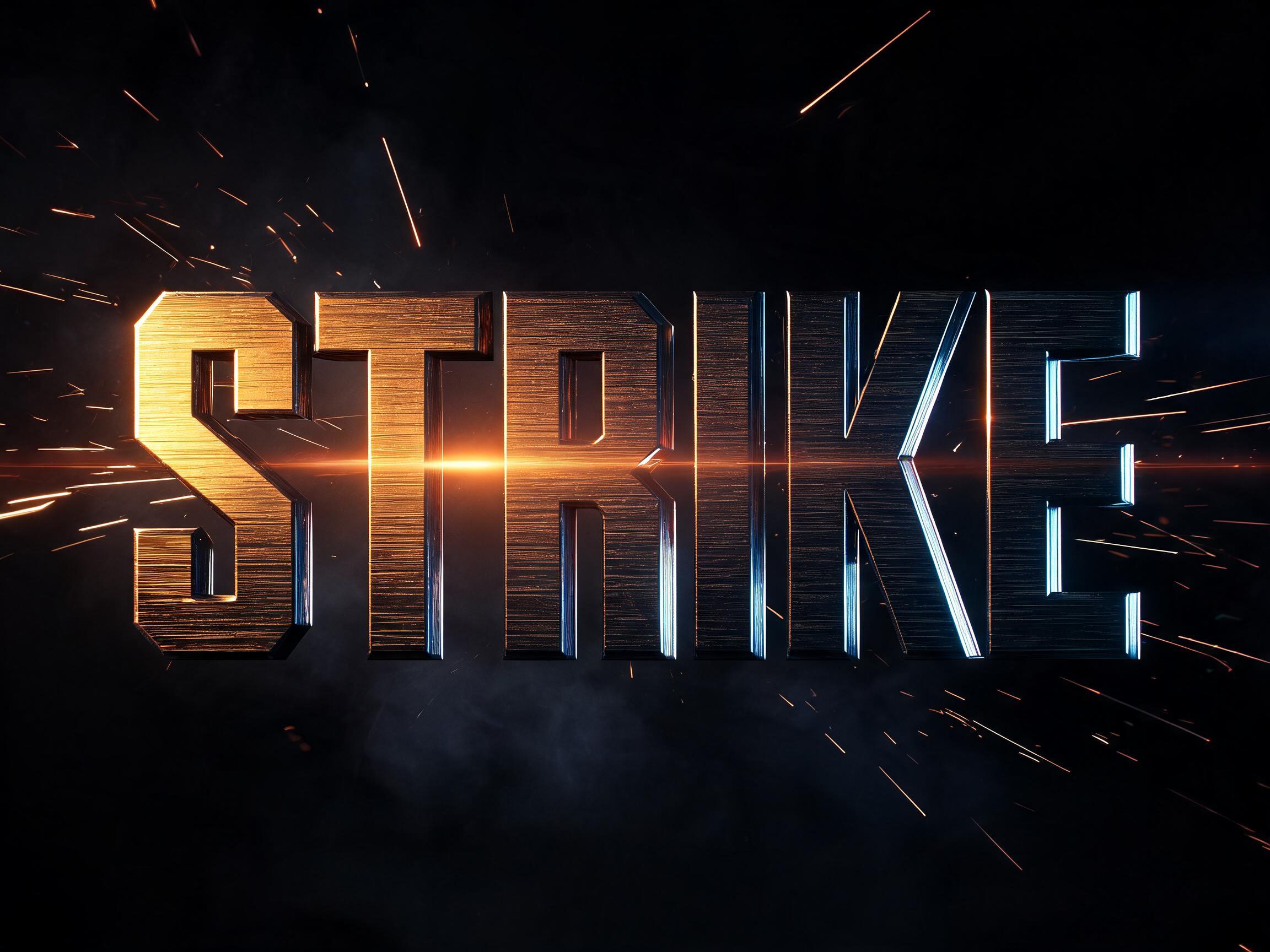
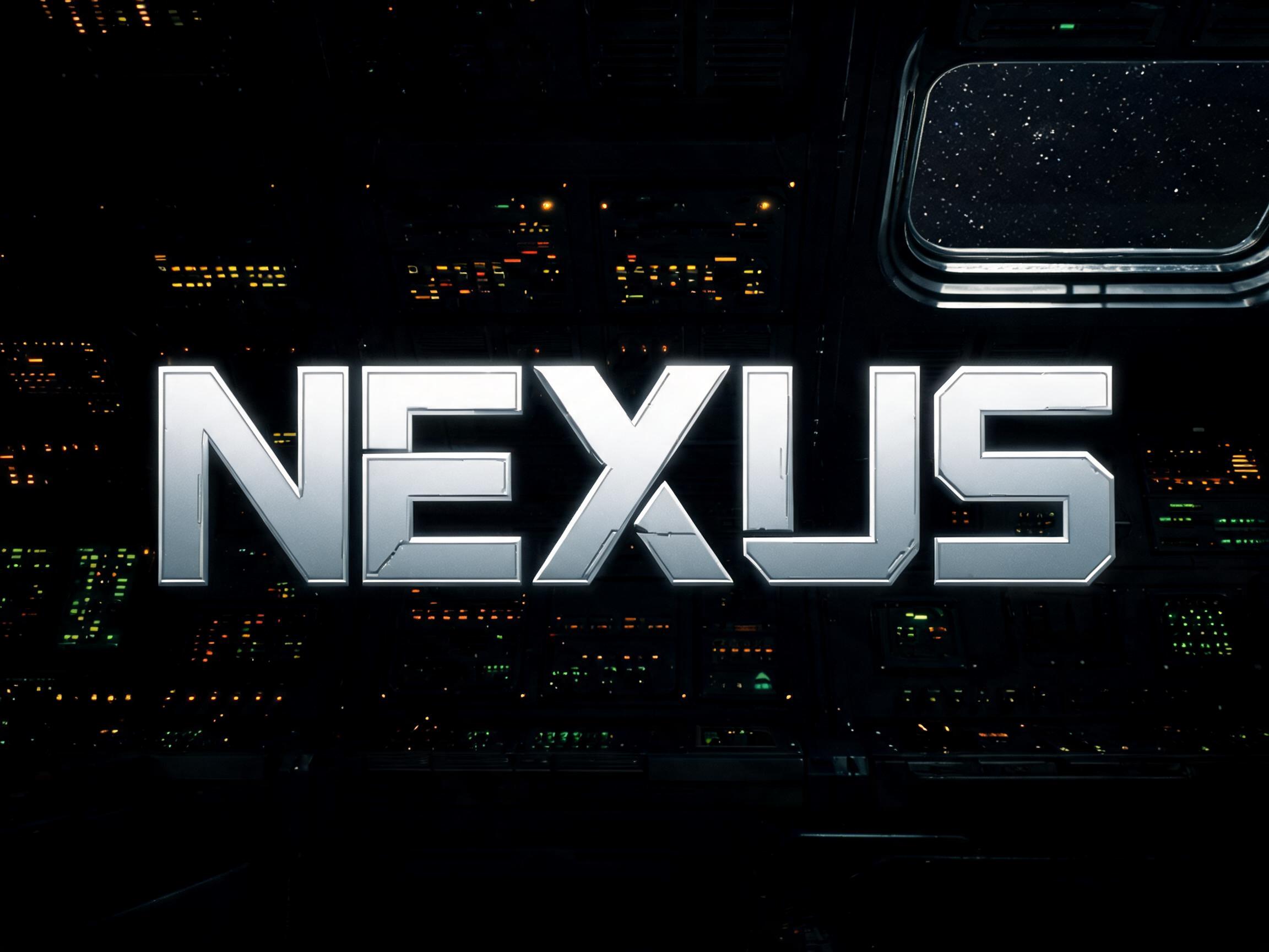
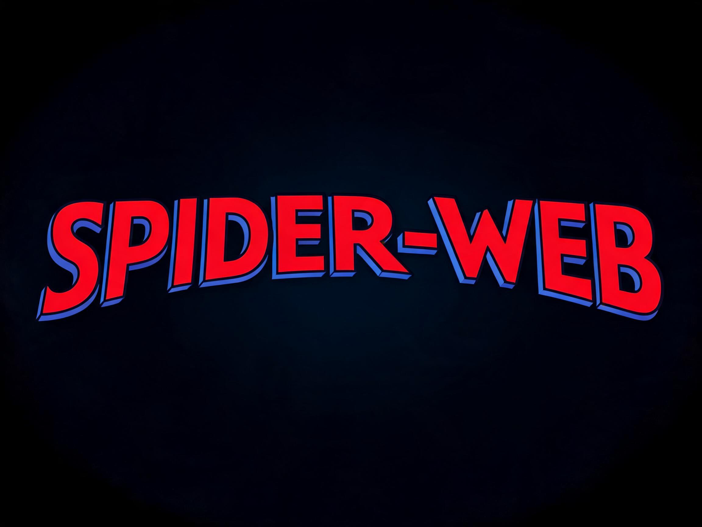
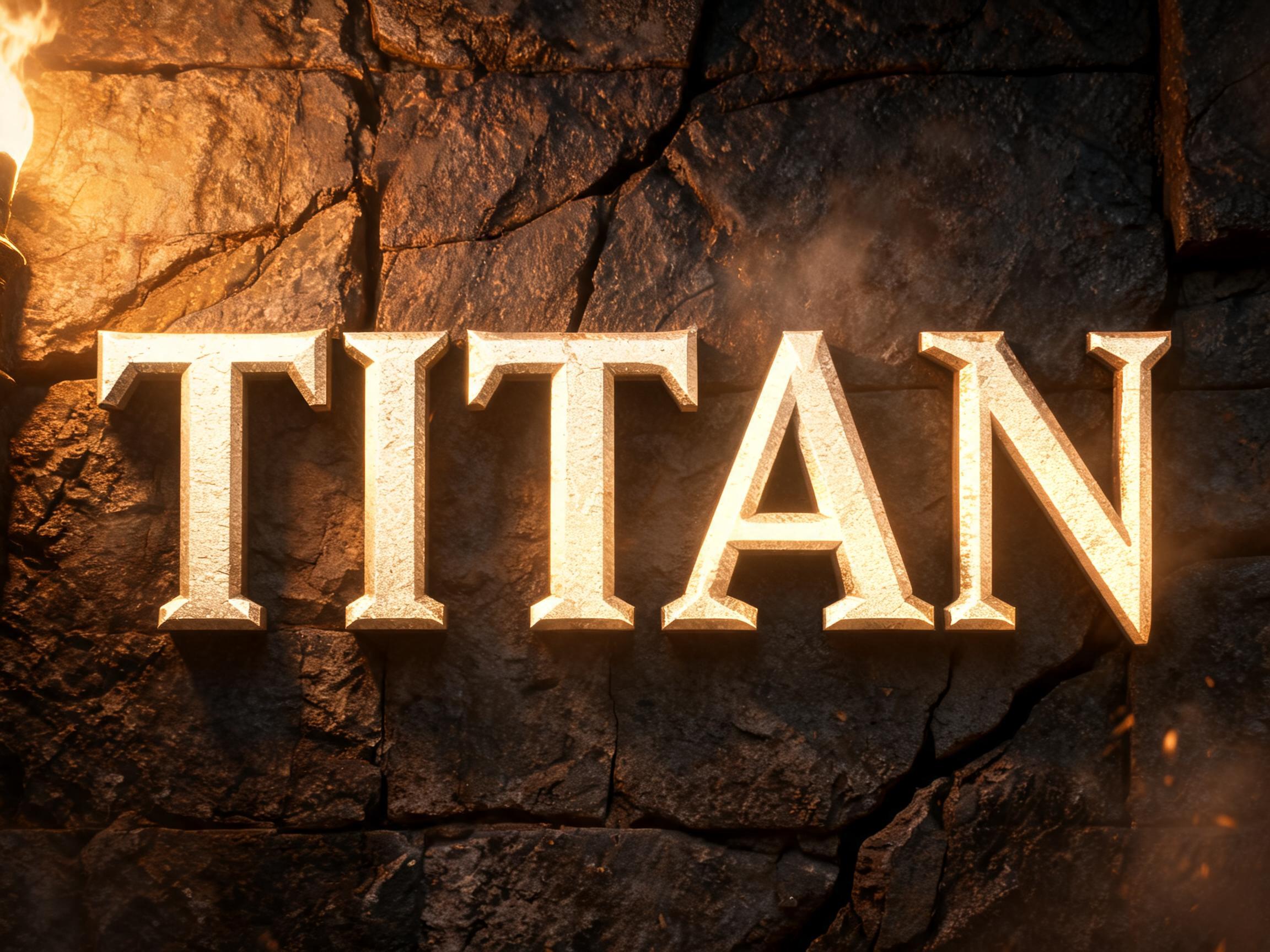
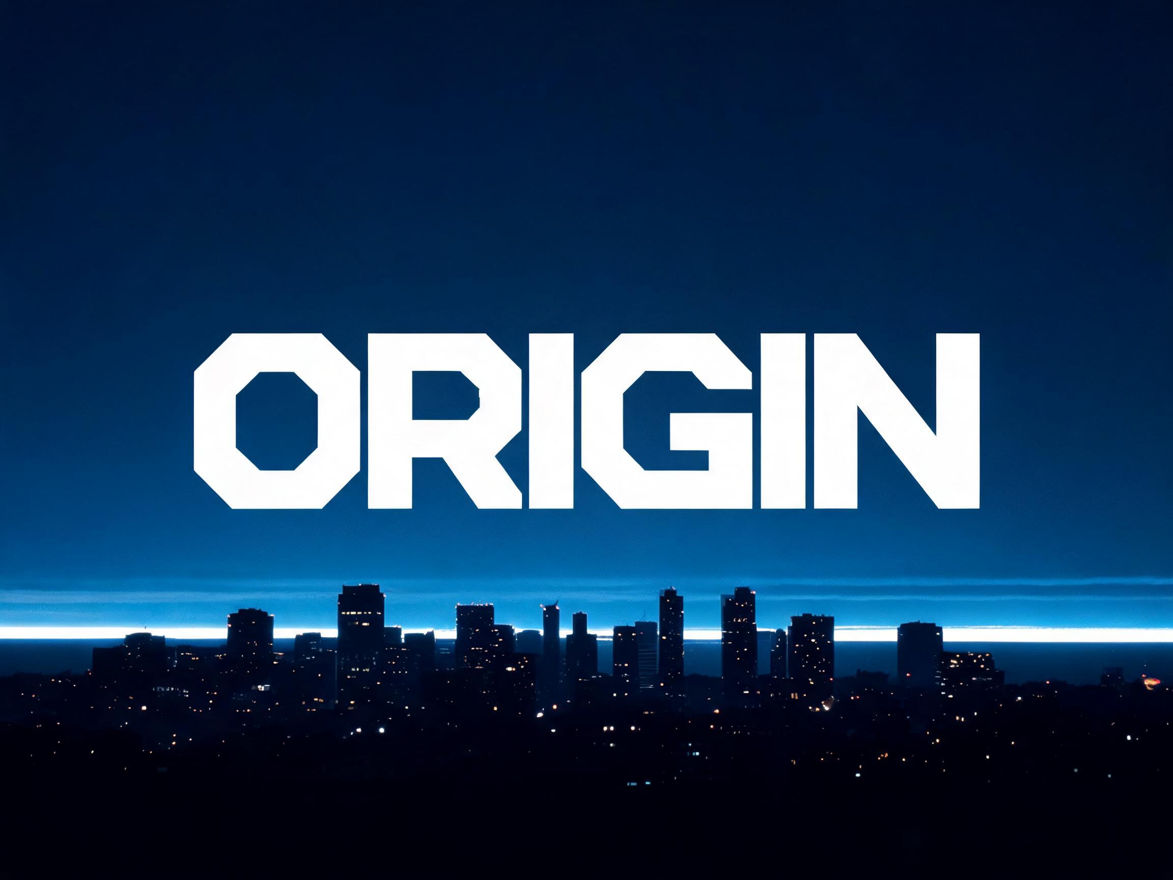
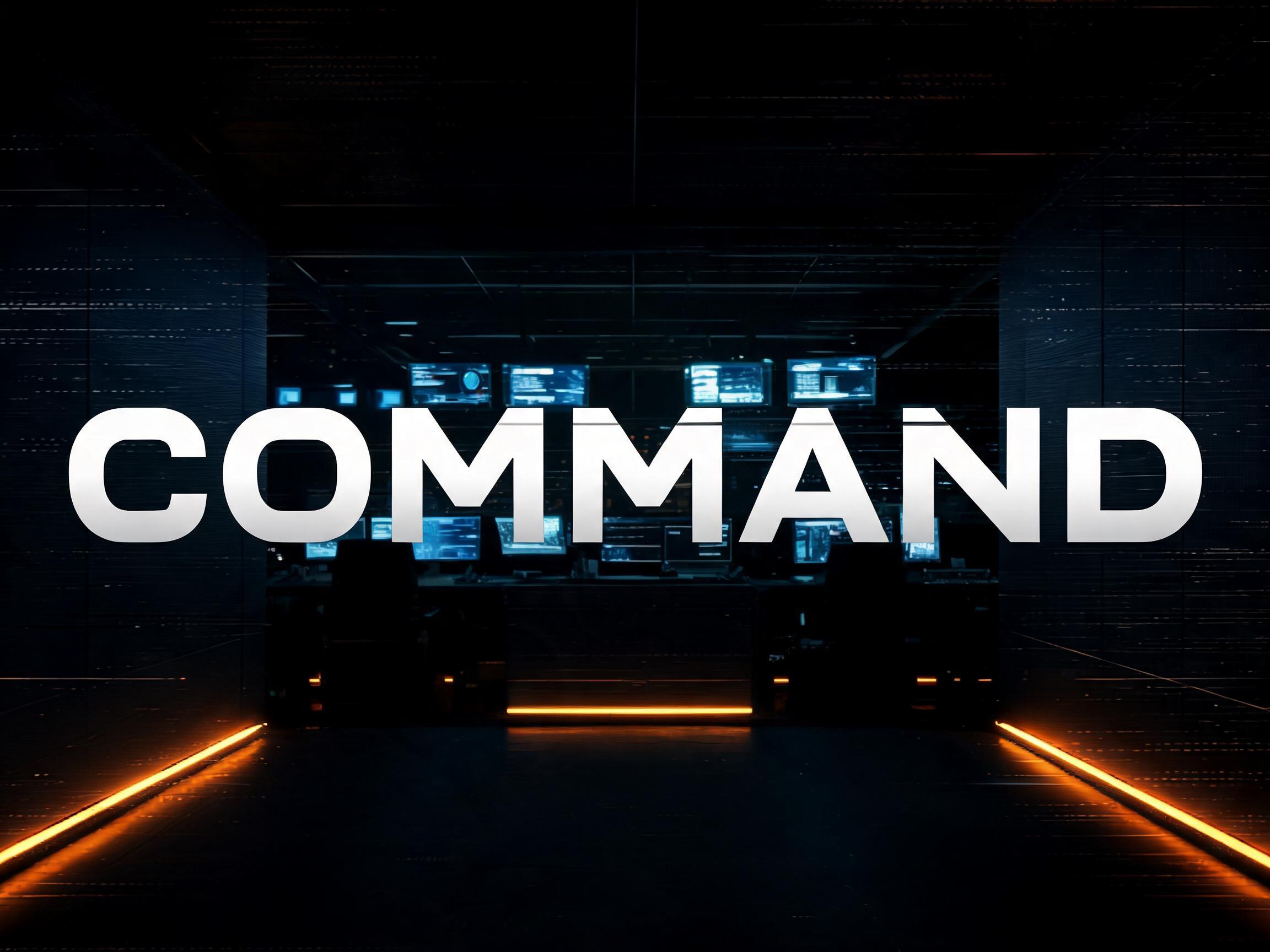
GPT Image で生成した Agency Extended Black AIフォント:文字「Agency Extended Black」

GPT Image

GPT Image で生成した Agency Extended Black AIフォント:文字「Agency Extended Black」
GPT Image
広告

似ているAIフォント

Agency Extended Black と共通タグが多いAIフォント。
すべてのAIフォントを見る→
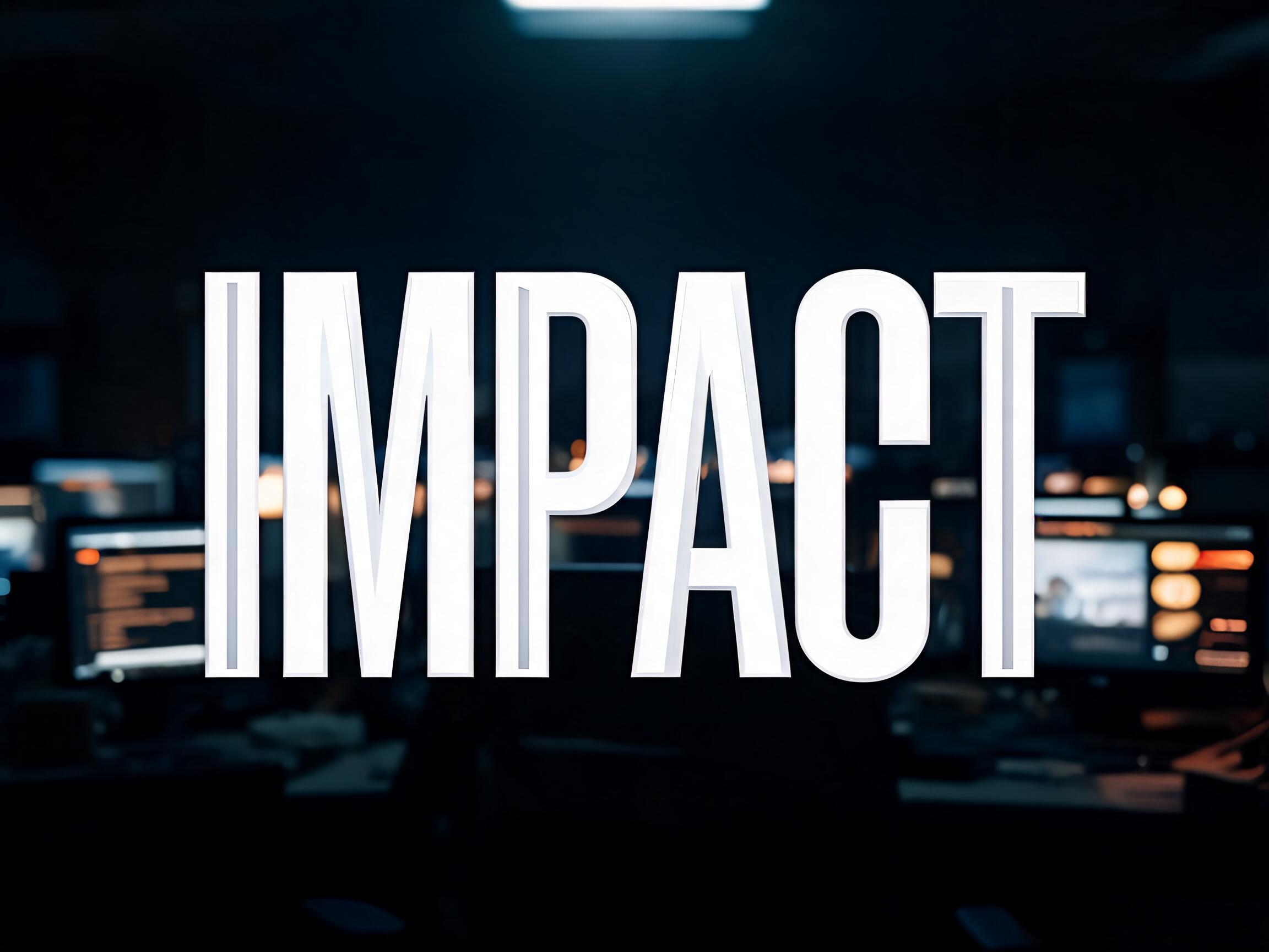
Condensed Impact AIフォントの見本画像✦プレミアム
Condensed Impact
Brushed Steel AIフォントの見本画像✦プレミアム
Brushed Steel
ヘアライン金属 · リムライト · シネマティック
Eurostile Extended AIフォントの見本画像
Eurostile Extended
近未来 · インダストリアル · sf風
Comic Masthead Hero AIフォントの見本画像✦プレミアム
Comic Masthead Hero
アウトライン · ベベル · 分割塗り
広告
Slab Impact Heavy AIフォントの見本画像
Slab Impact Heavy
セリフ · スラブセリフ · ヴィクトリア朝風
Cinematic Modern AIフォントの見本画像
Cinematic Modern
サンセリフ · 高級感 · シネマティック

相性のいい組み合わせ

2行目の文字、ロゴの組み合わせ、ポスターのフッターに使えるAIフォント。

Brushed Steel AIフォントの見本画像✦プレミアム
Brushed Steel
ヘアライン金属 · リムライト · シネマティック
Chrome Battle Worn AIフォントの見本画像✦プレミアム
Chrome Battle Worn
クローム · メタリック · ダメージ加工
Cinematic Rush Script AIフォントの見本画像✦プレミアム
Cinematic Rush Script
スクリプト体 · 筆文字
Condensed Impact AIフォントの見本画像✦プレミアム
Condensed Impact
広告

Agency Extended Black AIフォントについて

An ultra-heavy extended display typeface with maximum horizontal expansion, pure monotone stroke construction, and architecturally squared terminals. The typographic language of superhero franchise titles, military campaign branding, and blockbuster key art — a single word becomes a physical wall of presence.

タグ

シーン
ゲームスポーツ映画ミリタリー
作ったもの
ポスタータイトルカードキービジュアルビルボード
イベント
トーナメント
テイスト
シネマティック
ムード
エネルギッシュパワフル激しい威厳
字形の特徴
極太ワイドスクエア
カラー
モノクローム
テーマ
スーパーヒーロー
フォントの雰囲気
シネマティックメタリックステンシル

よくある質問

What is the Agency Extended Black font?

Agency Extended Black is an ultra-heavy extended display face: maximum horizontal expansion, pure monotone strokes and architecturally squared terminals. It is the language of superhero-franchise titles, military-campaign branding and blockbuster key art — a single word becomes a physical wall of presence.

Can I download Agency Extended Black?

There is no installable file. You type your text and the generator sets the wide, heavy letters fitted to your actual shapes, and returns a high-resolution image.

Where does this style work best?

Film and franchise titles, gaming and esports, sports and military-style branding, event and campaign key art, poster headlines, bold identities. Use it big and short — it wants to dominate.

Can I use it for commercial work?

Yes. Generated images may be used commercially, including titles, packaging and video. No licence or attribution is required.

Why does an extended, extra-wide heavy face read as so powerful?

Because breadth and weight together signal stability, mass and importance, the same way they do in architecture and in a human stance. A very wide, very heavy letter takes up a lot of horizontal space and sits on a broad, low, grounded base — like a wide-stanced figure braced and immovable, or the broad facade of a monumental building. We instinctively read a wide, weighty form as more stable and imposing than a narrow one: it looks harder to push over, more substantial, more permanent. A normal-width bold letter is strong; stretch it out to maximum extension while keeping the heavy weight and it stops reading as a word and starts reading as a solid barrier — a wall of type. That is why franchise and military branding reach for extended blacks for a hero title: the proportions themselves communicate force and permanence before you have read a single letter, turning one short word into a monument.

What fonts look similar?

For a squared machine-console extended face, see Eurostile Extended Bold. For a heavy geometric display at normal width, try Bold Geo Sans.