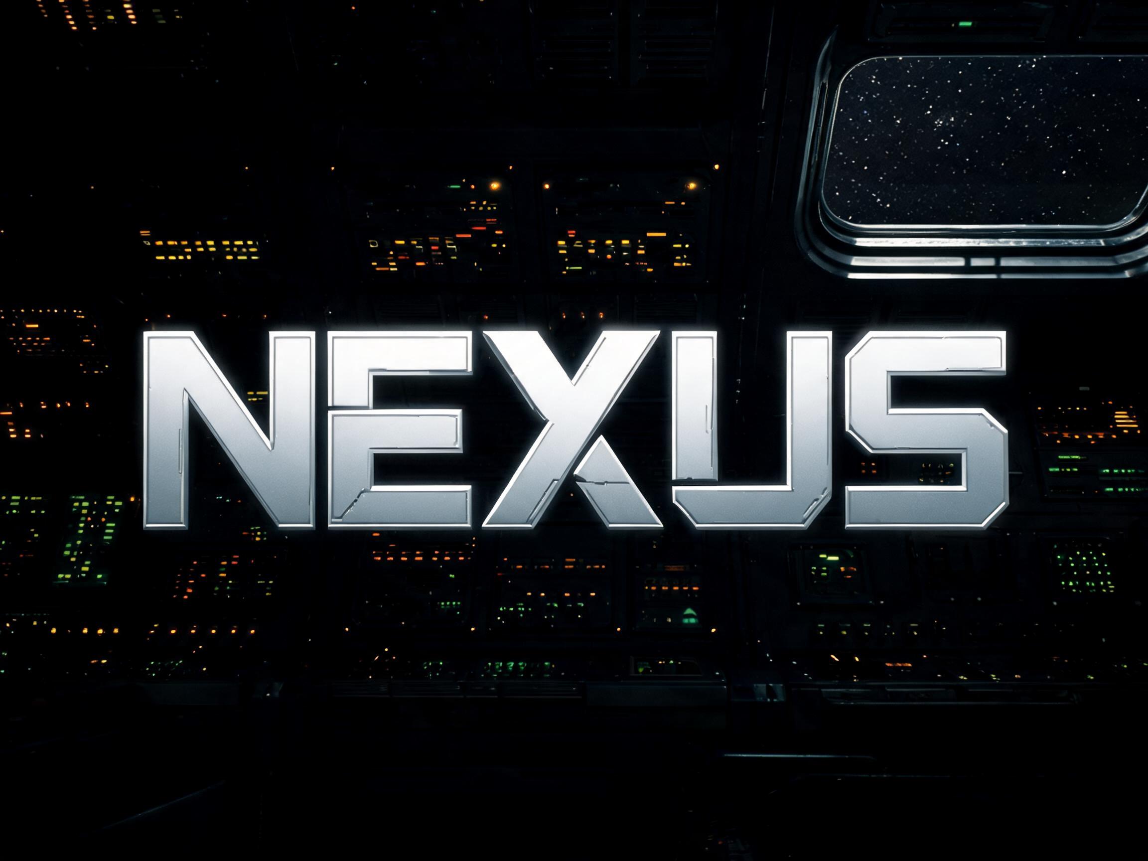
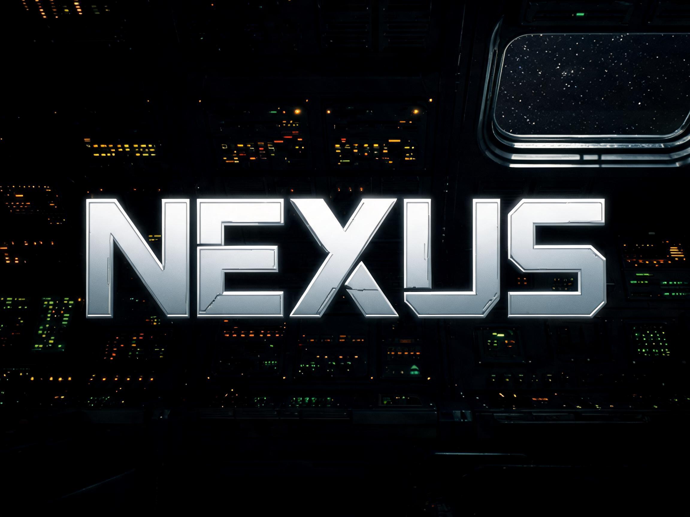
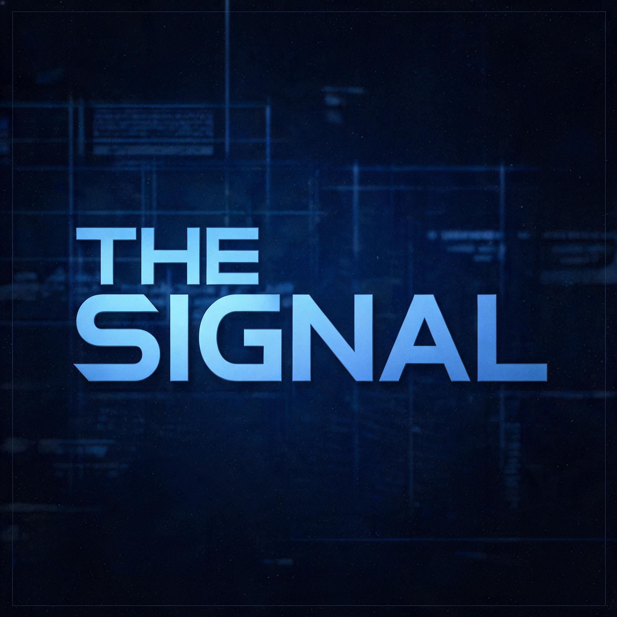
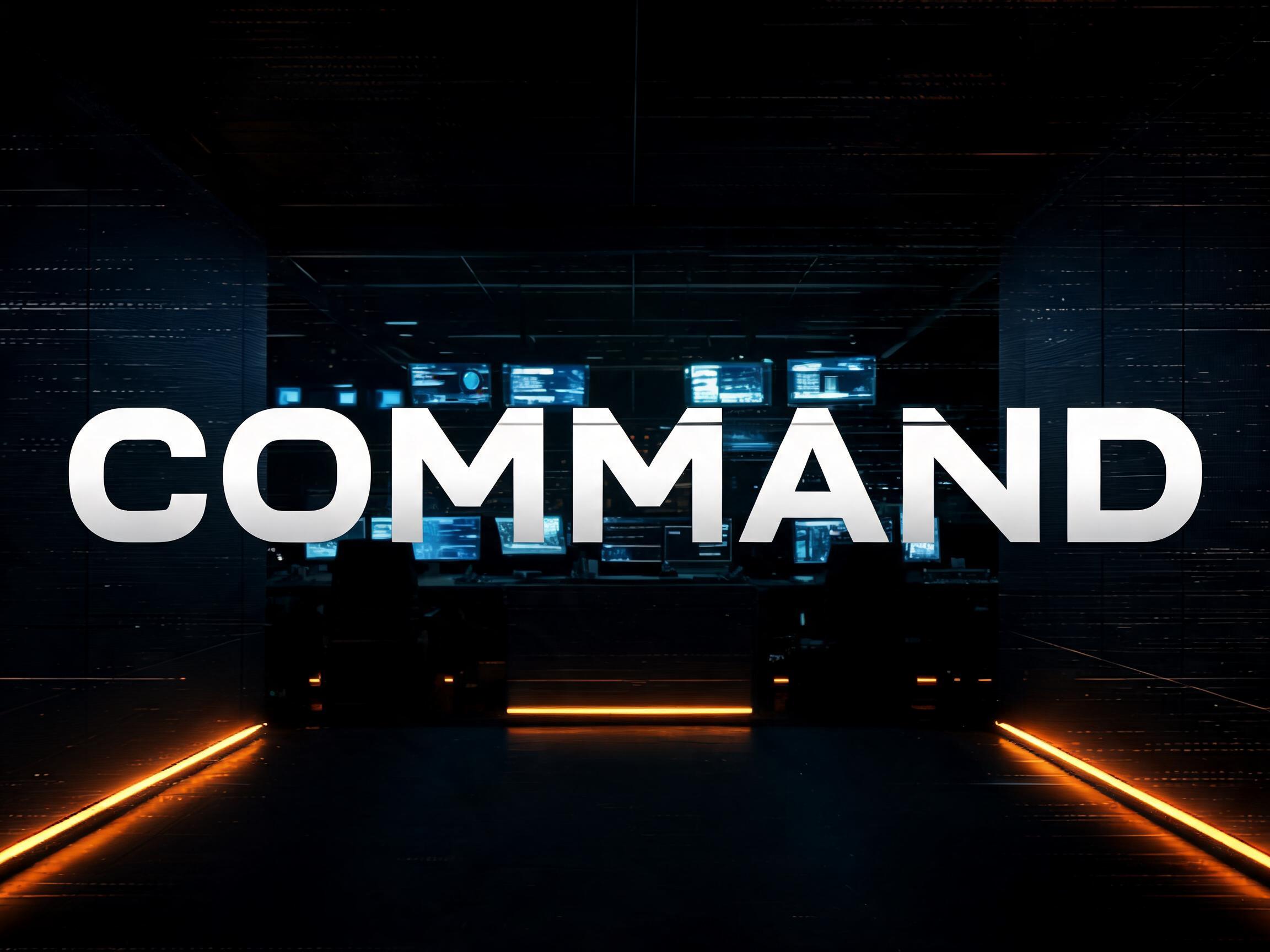
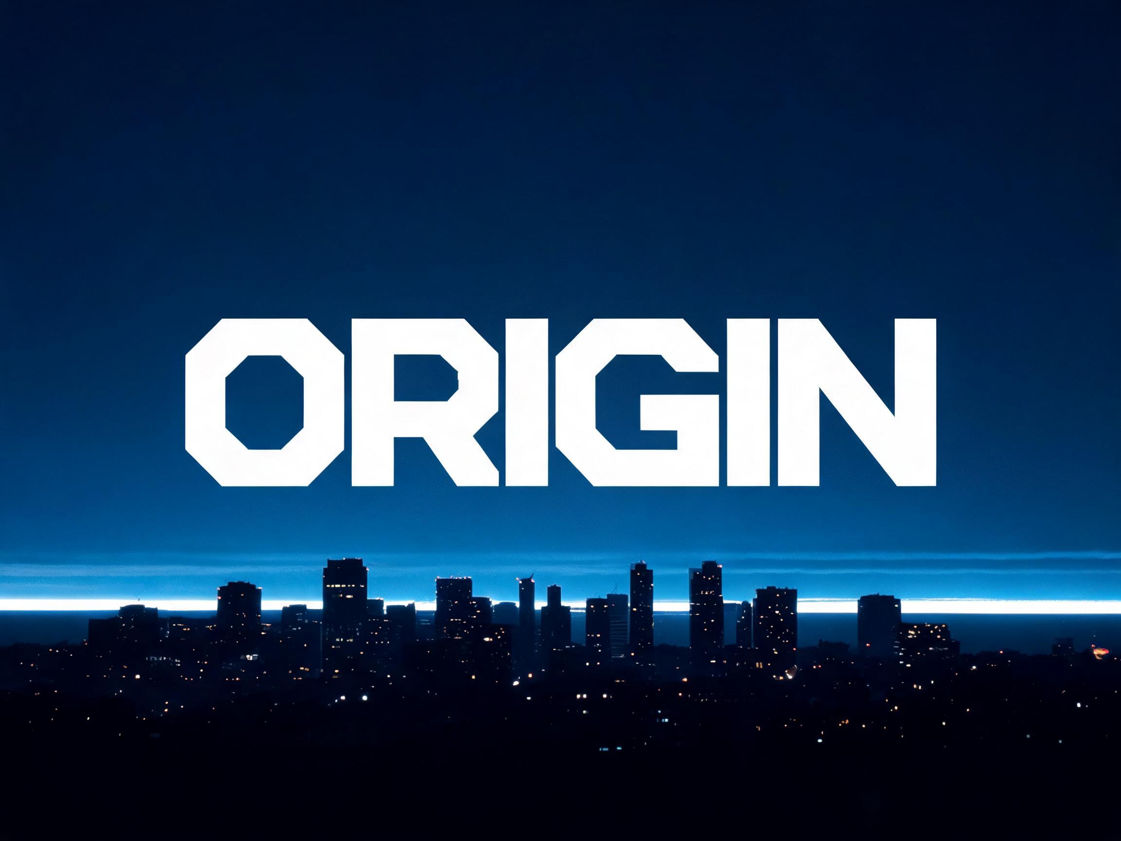
A wide-proportion extended display typeface with squared geometric construction, uniform stroke weight, and industrial machine precision.
✦プロンプト
このAIフォントにはまだ日本語版がありません。以下は英語のプロンプトと、それで生成した画像です。
rendered in wide-proportion extended display letterforms with squared geometric construction — letter width approaches or exceeds height, creating the characteristic horizontal-dominant silhouette of industrial machine type. Stroke weight is uniformly heavy to bold with minimal thick-thin variation, producing a monotone mechanical rhythm. Corners are sharply squared with precise 90-degree terminals, no roundness permitted at letter junctions. Interior counters and apertures form rectangular or superelliptical geometric cutouts with exact structural symmetry — each void is engineered, not organic. The superellipse-inspired letter shapes — neither purely circular nor purely rectangular — give an inhuman precision to every curve. Crossbars sit at mathematical midpoints, ear structures are minimally stubbed, and descenders are close-cropped for maximum compactness. The typographic language of military operations displays, spacecraft instrument panels, mission briefing titles, aerospace corporate identity, and hard science fiction institutional branding — engineered for absolute legibility under conditions of extreme technical authority.146 語
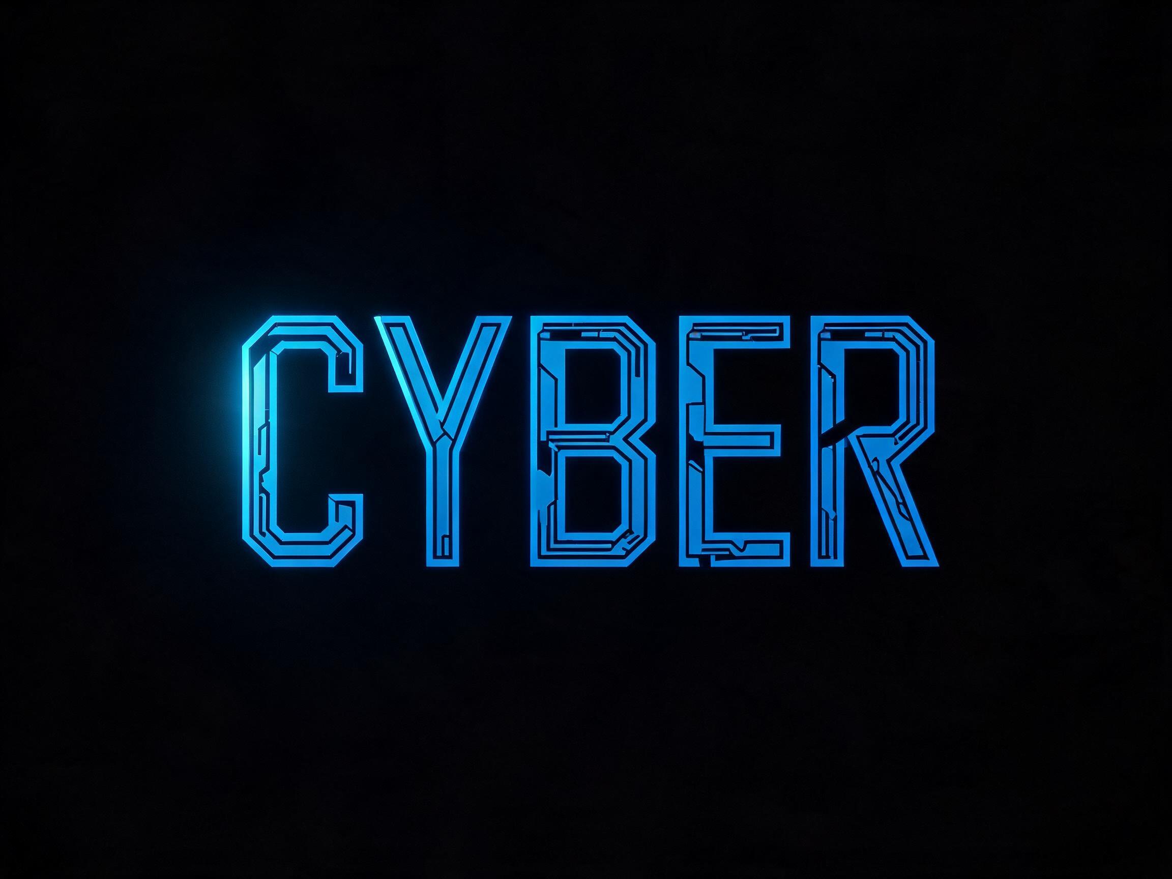
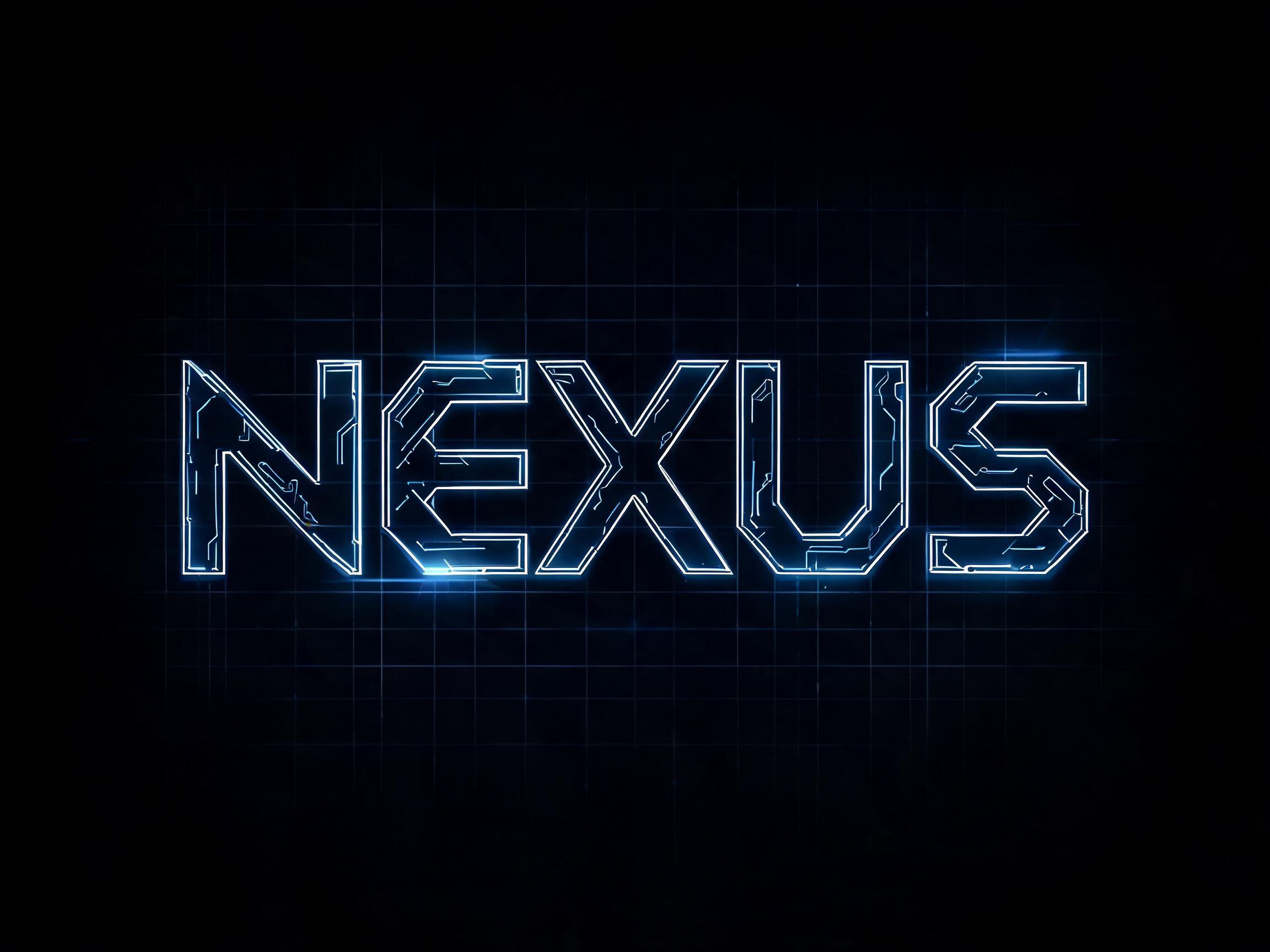
A wide-proportion extended display typeface with squared geometric construction, uniform stroke weight, and industrial machine precision. Inspired by the iconic superellipse letterforms of aerospace and hard sci-fi cinema typography — built for mission briefings, spacecraft title sequences, and any context demanding engineered authority at a glance.

 プレミアム
 プレミアム