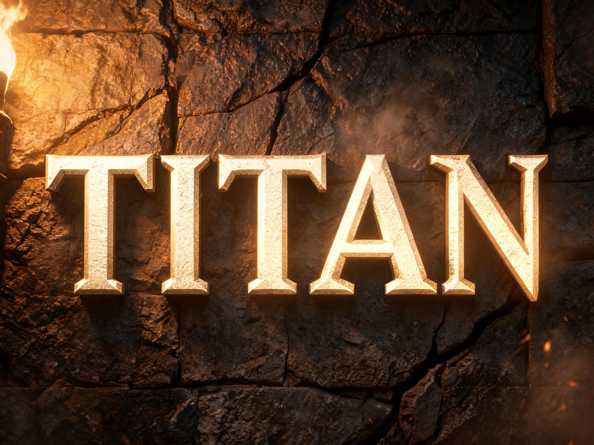
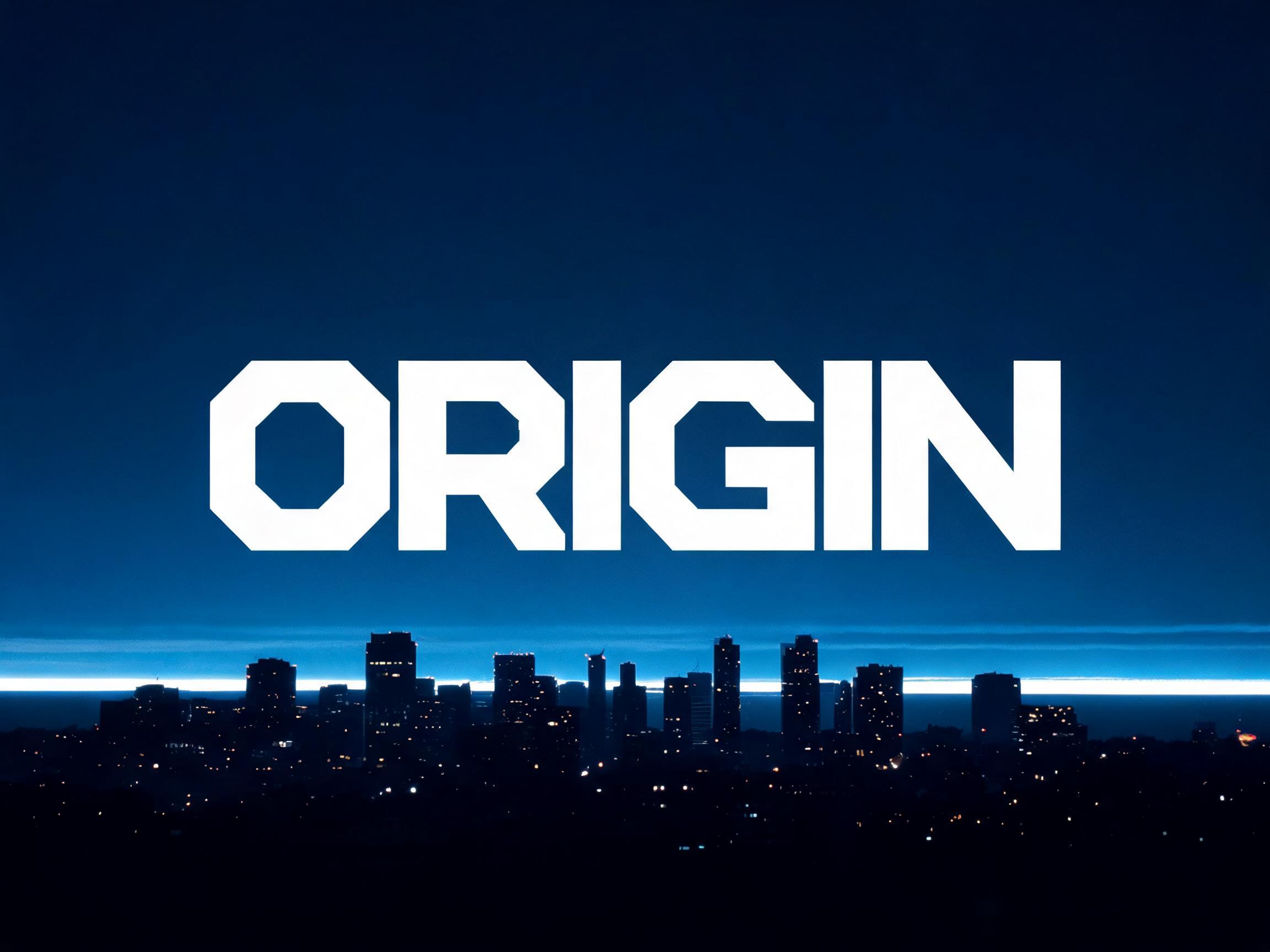
A massive slab serif display typeface with maximum stroke weight, thick rectangular bracketed serifs, and architectural structural…
✦プロンプト
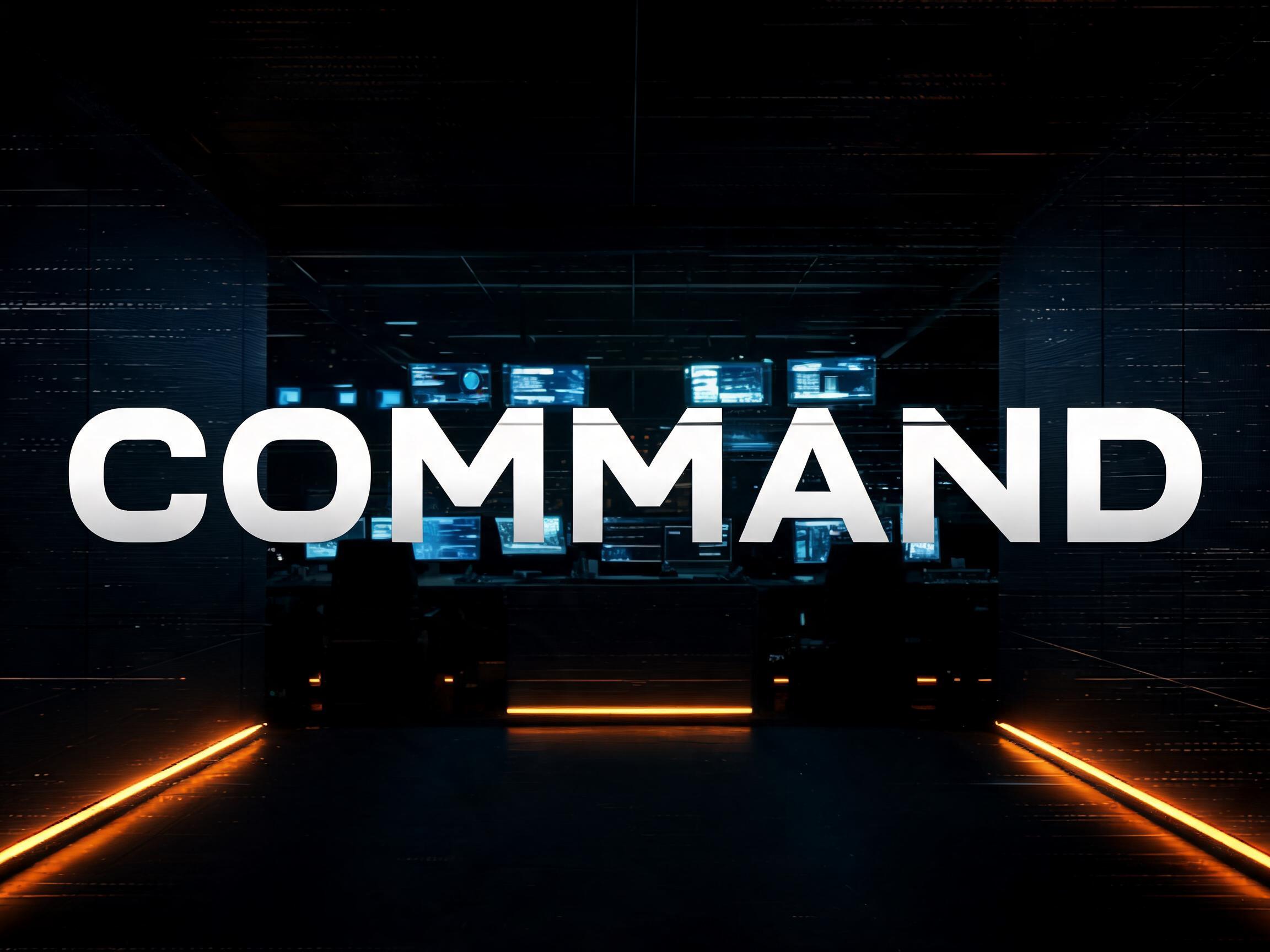
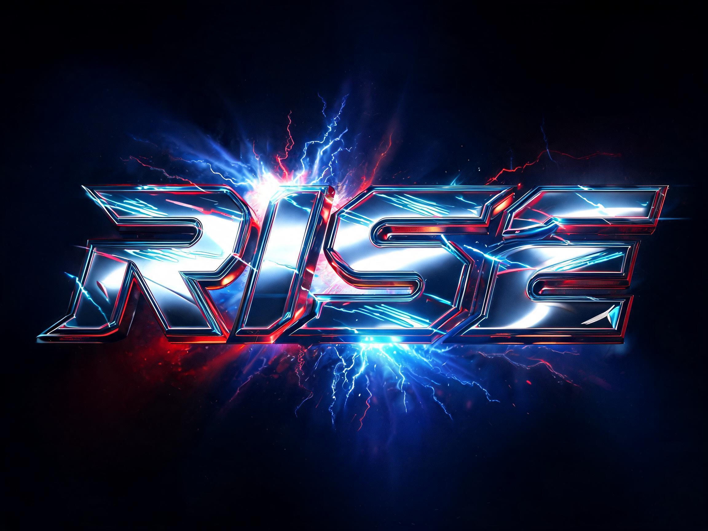
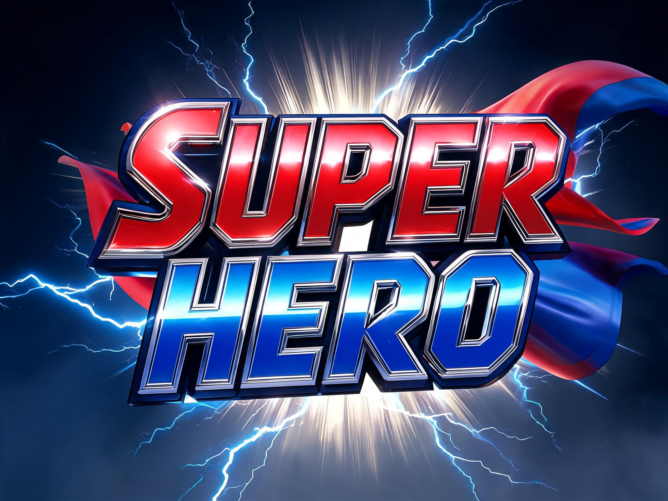
このAIフォントにはまだ日本語版がありません。以下は英語のプロンプトと、それで生成した画像です。
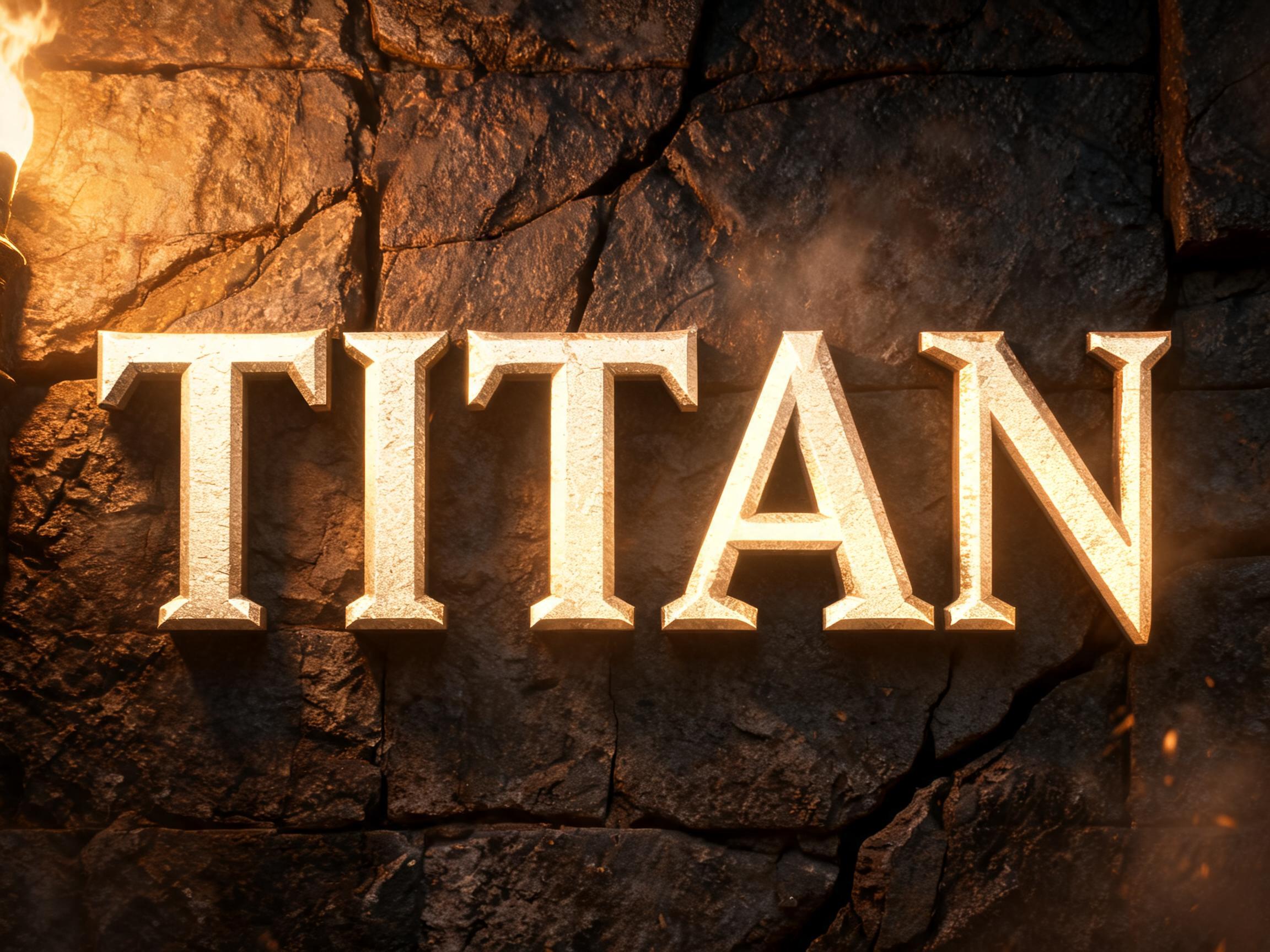
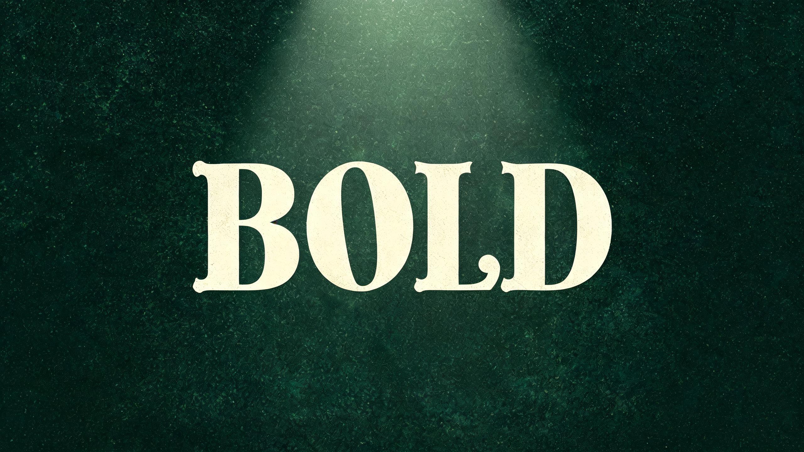
rendered in massive slab serif display letterforms with maximum visual weight and squared structural authority — stroke width is consistently heavy black throughout with very low thick-thin contrast, giving each letter an architectural solidity that reads as physical mass rather than typographic mark. The defining structural feature: thick rectangular bracketed serifs with substantial block mass, functioning as structural load-bearing terminations rather than decorative elements; these slab terminations create emphatic horizontal grid lines at both the baseline and cap-height, locking every letterform into an immovable muscular grid. Letter proportions are moderately wide with full rectangular counter spaces — the bowls of B, D, P, R and the interior of O are clean geometric voids. Cap height is tall with a generous x-height ratio. Crossbars are thick and centrally positioned, reinforcing the structural rhythm. The cumulative effect is typographic muscle — a physical weight pressing down from above, the letterform as load-bearing column. The typographic language of Victorian broadside printing, superhero franchise title design, sports championship graphics, and any visual context demanding immovable structural dominance with historical gravitas.176 語
A massive slab serif display typeface with maximum stroke weight, thick rectangular bracketed serifs, and architectural structural authority. The typographic language of superhero franchise titles, Victorian broadsides, and sports championship graphics — where every letterform is a load-bearing column, pressing down with immovable historical weight.

 プレミアム
 プレミアム
 プレミアム
 プレミアム