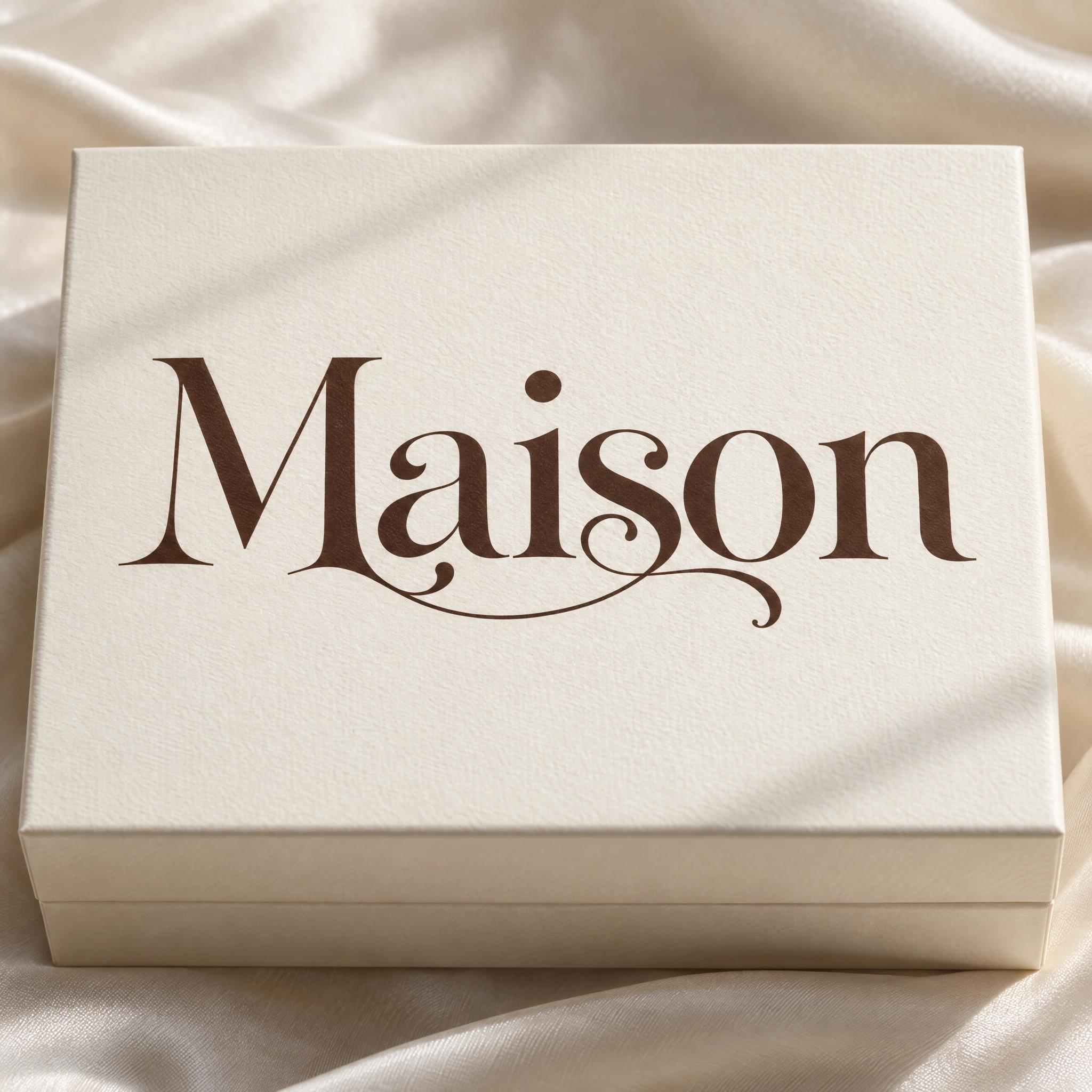
深浓缩咖啡棕的高反差展示衬线体,首字母大写、其余小写,一个字尾抽成长长的发丝花饰,相邻两个字母由一道卷曲的连字连在一起。
这款字体的提示词和实测图用的是英文版,下面是英文提示词和它的实测图。
文字Write the word "Maison". Spell it exactly as written, without adding or changing any letter.
字体设计Ligature serif lettering: a refined, high-contrast display serif with a capital first letter and lowercase after it, heavy curved strokes, hairline-thin joins and small, sharp serifs; every letter reads at a glance. Some letters use decorative alternates: a tail or terminal stretches into a long hairline swash that curls beneath the neighbouring letters, and two neighbouring letters are linked by one curling hairline ligature. Every letter is deep espresso brown. The ink is flat and smooth, with crisp edges. Each letter stands upright, never a joined cursive script. Like the wordmark of a boutique perfume house.
场景Printed on the lid of a cream perfume box resting on pale silk, in soft window light, with no other text; the word is centered, fills most of the width and reads clearly.
144 词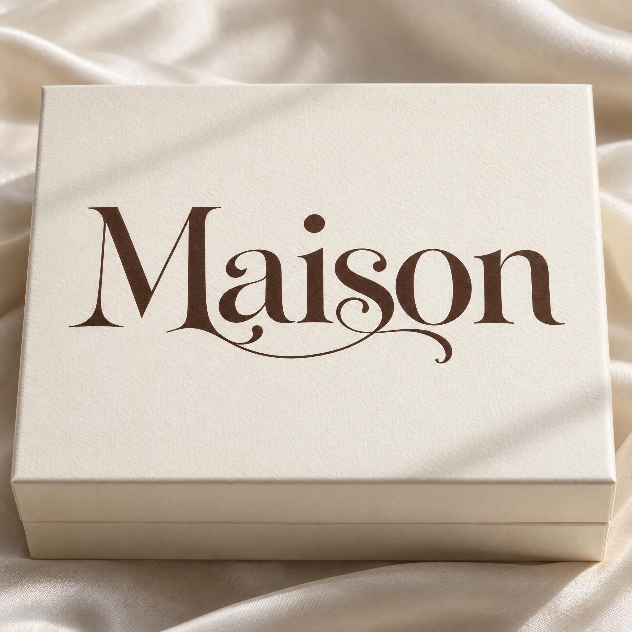
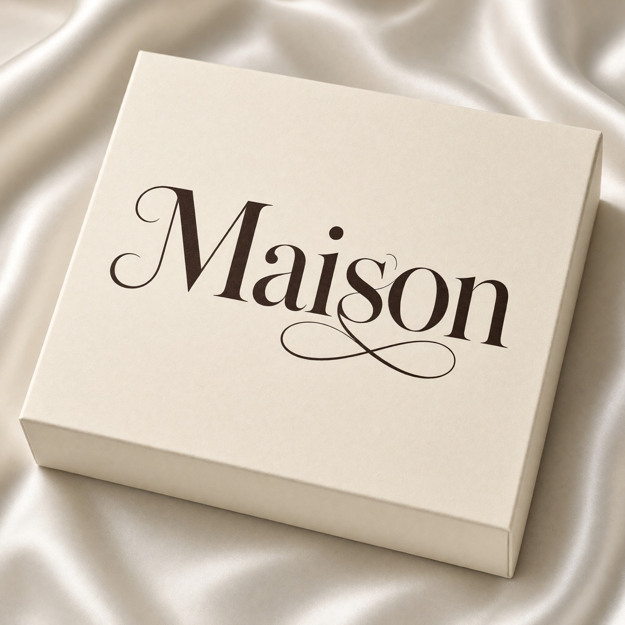
同一段提示词原样粘进各家模型,图都没修过,挑适合你的那家。
花式替换最全:M 的脚卷起来,一个小圈把 i 和 s 连上,一道长长的发丝花饰从词尾下方走过、在 n 后面打卷。奶油色丝绸上的盒子,有柔和的窗影。
M 以一道卷曲的起笔开头,i 和 s 下面挂着一个像无穷符号的大双圈;盒子斜放在起皱的丝绸上。
笔画偏粗的棕色;a 和 i 上方绕过一道发丝卷,s 往下甩出一条长花饰,又折回 o 和 n 底下。
最细、字身最窄:针一样的发丝线,M 的左腿甩出一道长尾,i 和 s 在基线处用一个小圈连起来。窄长的盒子上落着一条条窗影。
字最朴素,只有一道花饰:s 往下在词底打一个圈。盒子斜放,字距略紧。
点按钮会打开 FontVibe 的 DIY 模式,这段提示词原样带过去。输入名字、选一个模型就能生成。GPT Image、Nano Banana、Seedream、Grok、Qwen 都在同一个账号里,不用分别注册五个应用,就能比出哪家能把花饰和连字放在你想要的位置。每个账号每月都有免费积分,不用绑卡,还能导出透明底 PNG,直接放进包装样机或名片里。
按提示词的叙述顺序分层。改其中一层,其余照常工作。
AIFont 的提示词都用同一段文字开头。「Spell it exactly as written, without adding or changing any letter」在这里特别要紧:花饰和连字正是模型最容易出错的地方,拉长的字尾会把一个字母变成另一个,连接线也可能被看成多出来的一个字母。
「Ligature serif lettering:」告诉模型要画的是带连字和替换字形的印刷字,不是手写,也不是普通的书籍衬线。
「a refined, high-contrast display serif with a capital first letter and lowercase after it, heavy curved strokes, hairline-thin joins and small, sharp serifs」是基础字形。粗弧笔和发丝连接之间的落差,让花饰看起来贵气而不是乱画;大写后面跟小写,字尾才有地方伸展。「every letter reads at a glance」保证满是细线也读得出来。
「Some letters use decorative alternates: a tail or terminal stretches into a long hairline swash that curls beneath the neighbouring letters, and two neighbouring letters are linked by one curling hairline ligature.」是这款字的核心。只要两个明确的动作,一道长花饰加一对连字,看起来就是设计过的字标;要得更多,整个词就缠成一团。花饰卷在字母下方,是因为卷在上方的细线容易被读成重音符号。
「Every letter is deep espresso brown.」在奶油色包装上比黑色更柔和、更暖。换墨色只改这一句。
「The ink is flat and smooth, with crisp edges.」让发丝线保持锐利。不写这一句,有的模型会加烫金、光泽或压印,最细的线最先糊掉。
「Each letter stands upright, never a joined cursive script.」是唯一的否定句。卷曲这么多,模型的第一反应是写成流畅的连笔书法;这一句让每个字母各自站着,只有花饰和连字把字连起来。
「Like the wordmark of a boutique perfume house.」给模型一个整体参照:克制、昂贵、为品牌名而做。
「Printed on the lid of a cream perfume box resting on pale silk, in soft window light, with no other text」把字放在它最常出现的地方,「the word is centered, fills most of the width and reads clearly」让字保持主角。这一段可以换成你自己的用途。
不跑偏的小改动,一次只改一处。
在上面 Prompt 旁的输入框里输入,再复制一次。最合适的是 5 到 8 个字母的英文品牌名:够长,放得下一道花饰和一个连字;又不会长到字变小。a、g、n、r、s、y 这类带尾巴的字母,正好给花饰一个起点。这款字是给拉丁字母用的,请写英文或拼音,不要写汉字。
把「Every letter is deep espresso brown.」换成「Every letter is soft black.」,做酒标换成「Every letter is deep burgundy.」,做礼盒换成「Every letter is warm champagne gold.」。
把「Some letters use decorative alternates: a tail or terminal stretches into a long hairline swash that curls beneath the neighbouring letters, and two neighbouring letters are linked by one curling hairline ligature.」换成「Some letters use decorative alternates: the tail of the last letter stretches into a long hairline swash that curls back beneath the whole word, and two neighbouring letters are linked by one curling hairline ligature.」,花饰就从最后一个字母甩出来;换成「One letter uses a decorative alternate: its tail stretches into a short hairline swash that curls beneath the next letter.」,就是只有一道短花饰的低调字标。
把「Printed on the lid of a cream perfume box resting on pale silk, in soft window light, with no other text」换成「Printed on a cream business card lying on pale linen, in soft window light, with no other text」、「Printed on the label of a frosted glass candle jar on a marble shelf, in soft window light, with no other text」或「Printed on a white wedding invitation beside dried flowers, in soft window light, with no other text」。
提示词里没有写画幅。在应用里选比例,或者在末尾加上「Wide 16:9 image.」或「Tall 4:5 image.」。店铺横幅适合 16:9,商品图或手机发图适合 4:5。
与 花式连字衬线体 共享最多标签的 AI 字体。
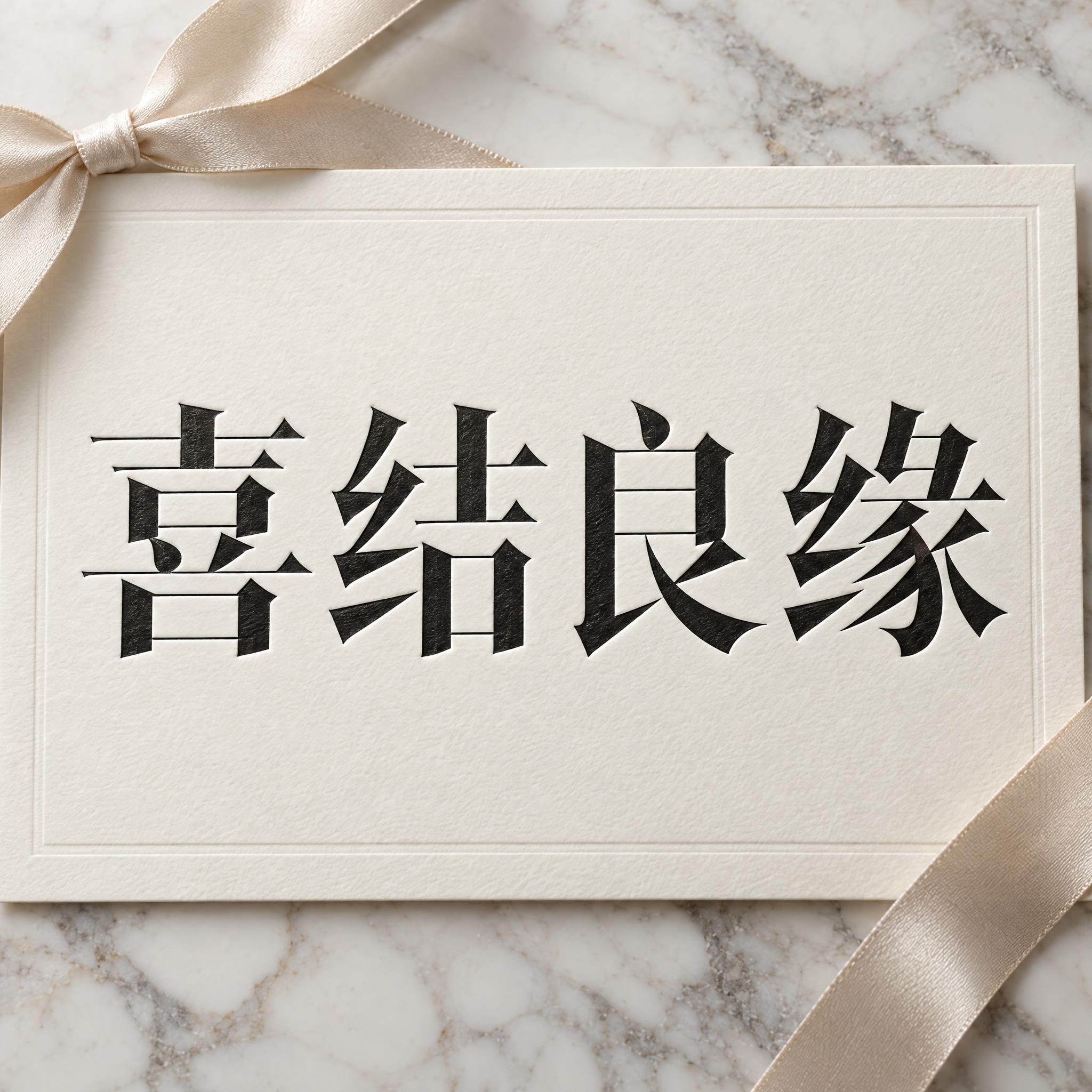
用于第二行文字、logo 组合或海报页脚的 AI 字体。
花式连字衬线体把你的字写成精品香水盒上那种讲究的展示衬线:首字母大写、其余小写,粗壮的弧笔对着发丝一样细的连接,衬线小而尖。有几个字母换成花式替换字形:一个字尾拉成长长的发丝花饰,卷到后面几个字母底下;相邻两个字母由一道卷曲的发丝连字连起来。字母本身始终直立、彼此分开,颜色是平涂的深浓缩咖啡棕。
在上面提示词旁的输入框里填上你的字,复制后粘进 ChatGPT、Gemini、Grok、Qwen 或 Seedream。提示词分三段:文字、字体设计、场景。字体设计段负责衬线、花饰、连字和棕色墨;场景段把字印在丝绸上一只奶油色香水盒的盒盖上,可以换成你自己的用途。连字和花饰只在拉丁字母的衬线体上成立,所以中文页放的是英文版的提示词和图。每张图都是各家拿原样的提示词跑出来的,没有修过。
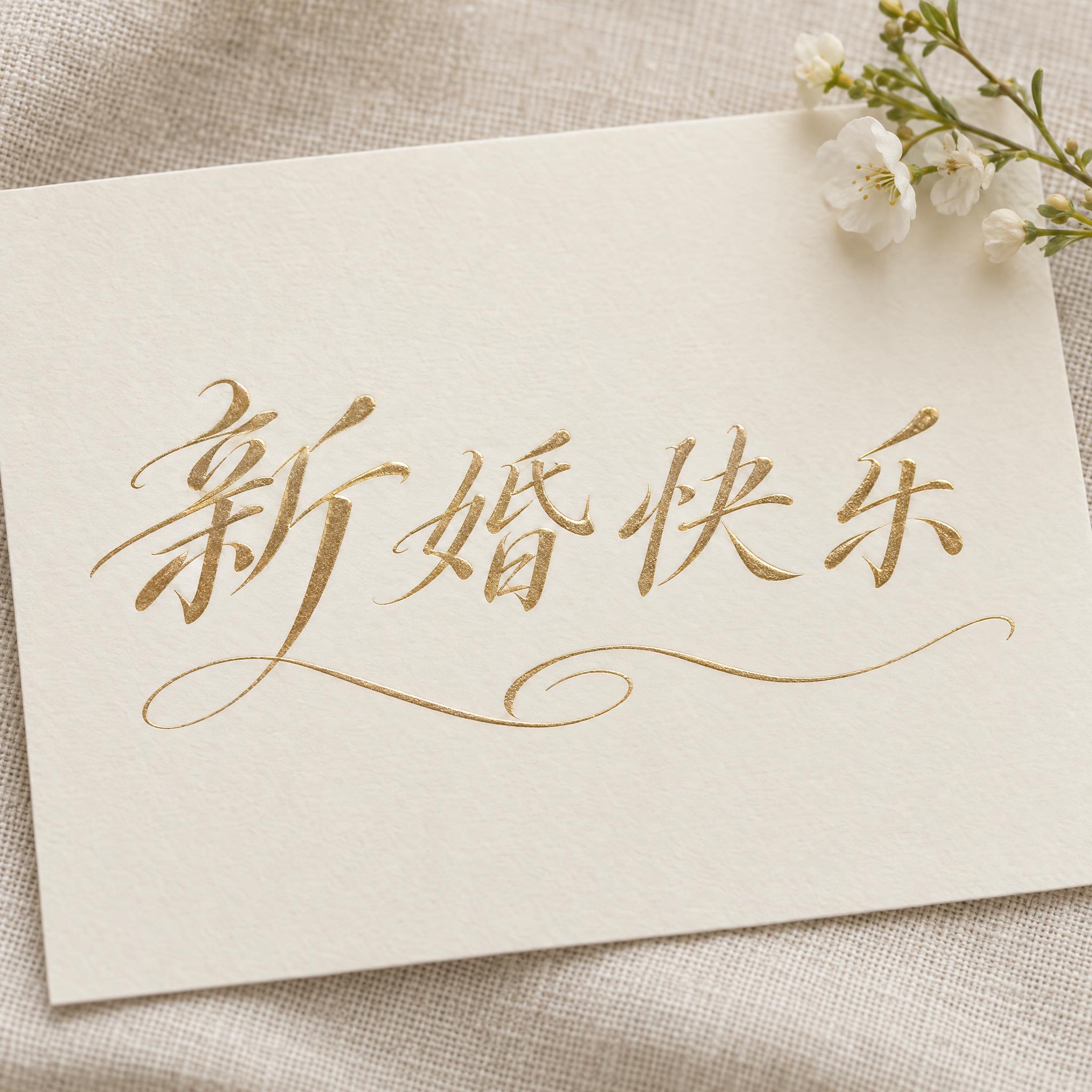
适合做精品店和美妆品牌的名字、香水和香薰蜡烛包装、商品标签、名片和婚礼字母徽章。更多高级感字体见合集页,做请柬可以看婚礼字体。
原始效果图里的细节,每一处都写在提示词里。
粗弧笔、发丝细连接、小而尖的衬线。
首字母大写,其余小写。
一个字尾拉成发丝花饰,卷到后面字母的下方。
相邻两个字母由一道卷曲的发丝线连起来。
连字就是把两个或更多字母画成一个形状,它最早是为了省事。中世纪用拉丁文抄书的抄写员把字母连起来写得更快,大约 9 到 10 世纪,修道院是这些新写法的主要来源。最有名的幸存者是 & 号:它来自手写拉丁字母 e 和 t 的连字。约 1450 年活字印刷出现,最早的活字照着手写体做,把大量连字和额外的字母一起带了进来。
到了 20 世纪,大部分连字又被清掉了。1961 年 IBM Selectric 电动打字机开始量产,1970 年代便宜的照相排字机大多不用连字,早期的桌面排版软件也没办法替换。OpenType 格式把连字作为设计师可以打开的功能找了回来,其中就有任意连字,也就是只在想要效果的地方才用的装饰性组合。
1996 年 Emigre 发行的 Mrs Eaves(祖扎娜·利奇科设计)就是这条路走到的地方。它是 Baskerville 的复刻,以 Baskerville 的助手、后来成为他妻子的萨拉·伊夫斯命名,最出名的就是连字:OpenType 版收了 213 个,从 18 世纪的 ct、st 到历史上没有先例的组合,好让设计师排出有冲击力的标题。它后来用在 WordPress 的字标和企鹅经典丛书封面的书名上。连字本来就是做 logo 的常用手法,品牌衬线为什么偏爱它,我们的理解很简单:连在一起的一对字母或拉长的字尾,看起来是为这个名字专门画的,而不是打出来的。这段提示词要的正是这个:一个直立的高反差衬线,加一道花饰和一个连字。
本页放的英文版图里,五家都把 Maison 写对了,字母也都直立。GPT Image 的替换字形最全:M 的脚卷起来、一个小圈连着 i 和 s、词尾下方一道长花饰。Nano Banana 和 Grok 的花饰最大胆,Grok 在中间底下画了一个双圈;Seedream 线条最细、最像时装杂志;Qwen 最朴素,只有一个圈。上面几张可以直接对比。
这款字靠的是把相邻两个拉丁字母用一根线连起来的连字,加上把字尾拉长的花饰。汉字每个字都有固定的笔画,和旁边的字连上就会读成别的字,也没有可以拉长的字尾,硬写只会变成模仿英文的样子,所以直接放英文版的提示词和图。输入框里的字可以随便换。
不是。这是一段提示词,用 AI 生图模型把你的字画成这种风格的图片,没有字体文件可装。这一页适合做一个已经画好花饰和连字的名字;更多高级感字体在合集页。
你拿到的是图片,不是字体,所以要看的是这张图怎么用:包括商用在内能做什么,取决于生成它的那个应用的条款。做 logo 要注意,结果是应用分辨率下的一张平面位图;很多人会挑一张最满意的,再描成矢量拿去印。每次生成花饰都会有点不同,喜欢的那张记得存好。
可以。提示词只写了「Some letters use decorative alternates」,所以由模型自己挑。直接点名字母,例如「Some letters use decorative alternates: the tail of the last letter stretches into a long hairline swash that curls back beneath the whole word, and two neighbouring letters are linked by one curling hairline ligature.」
在提示词旁的输入框里用英文或拼音输入,再复制整段提示词。带 a、g、r、s 这类有尾巴字母的词,花饰起笔最自然。
只改「Every letter is deep espresso brown.」,比如换成「Every letter is deep burgundy.」
应用里有比例选项就直接选。没有的话,在提示词末尾加上「Wide 16:9 image.」或「Tall 4:5 image.」。
把场景换成纯色的,比如「The word is on a plain light grey background.」,再用任意修图工具去掉背景。或者用上面的 FontVibe 按钮,可以直接导出透明 PNG。
复制提示词不要钱。出图要不要钱取决于你粘贴进去的那个应用,图片能怎么用也看那个应用的条款。