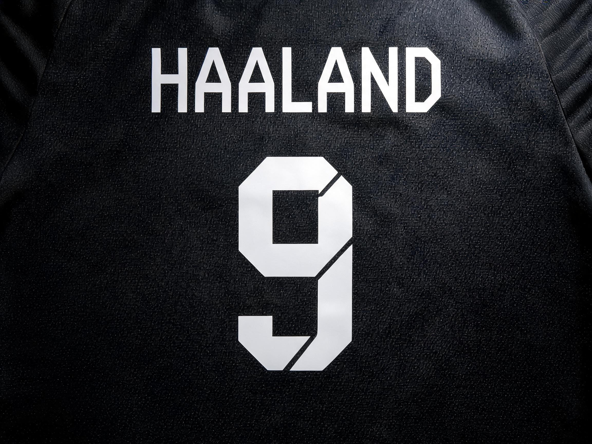
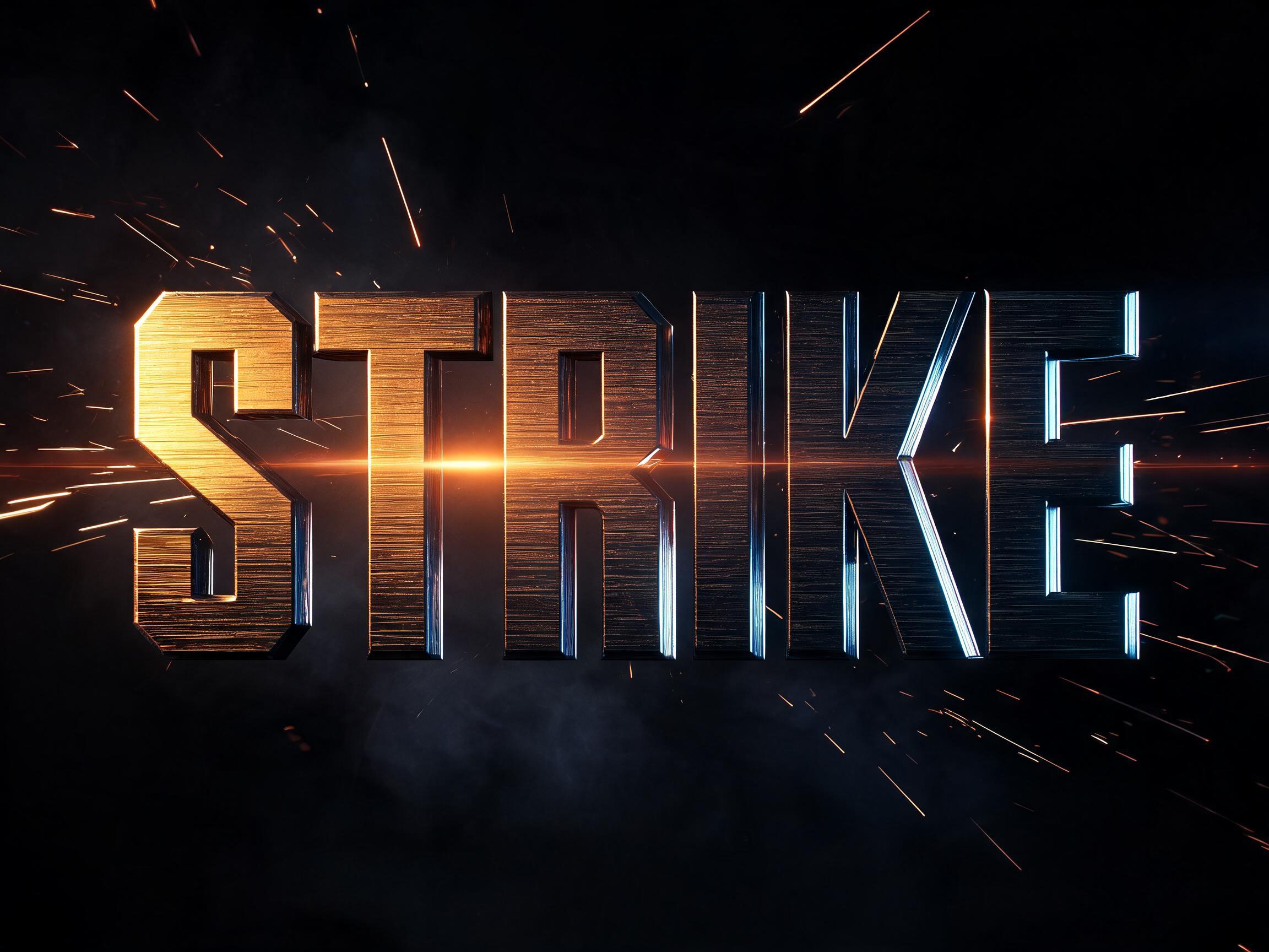
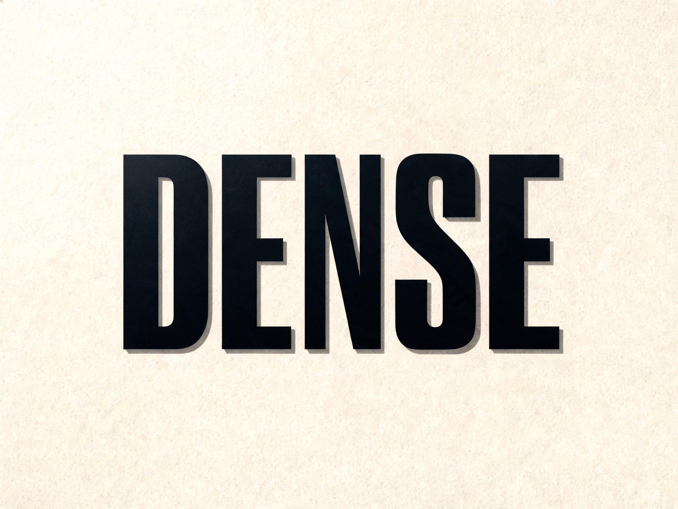
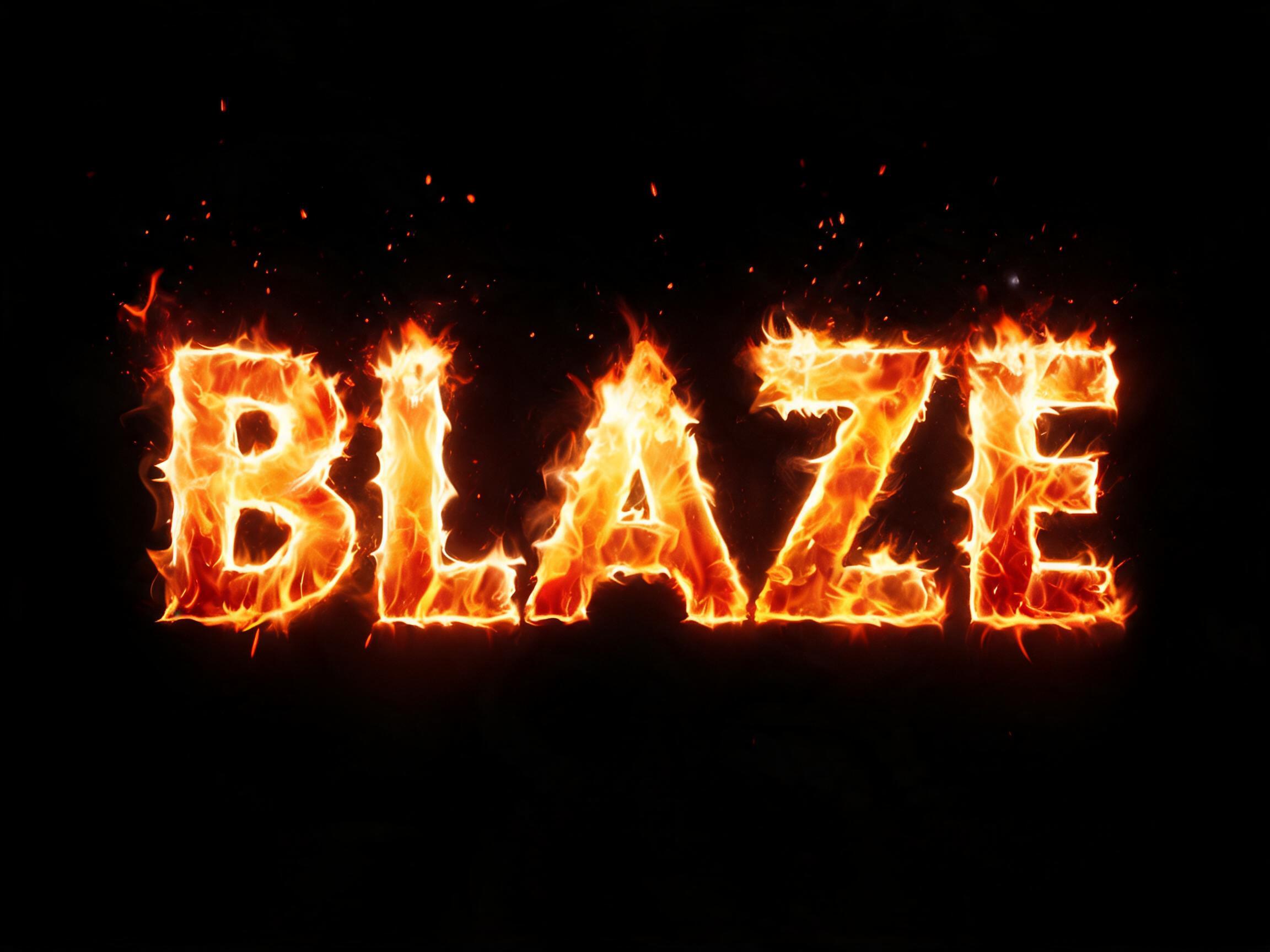
Norway WC2026 football font — Elder Futhark Norse runic geometry applied to football numbers
✦البرومبت
لا تتوفر لهذا الخط نسخة بلغة العربية بعد. أدناه البرومبت الإنجليزي والصور التي أنتجها.
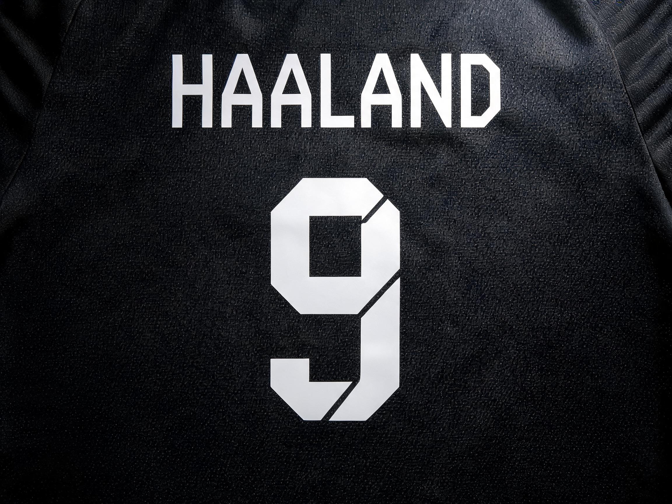
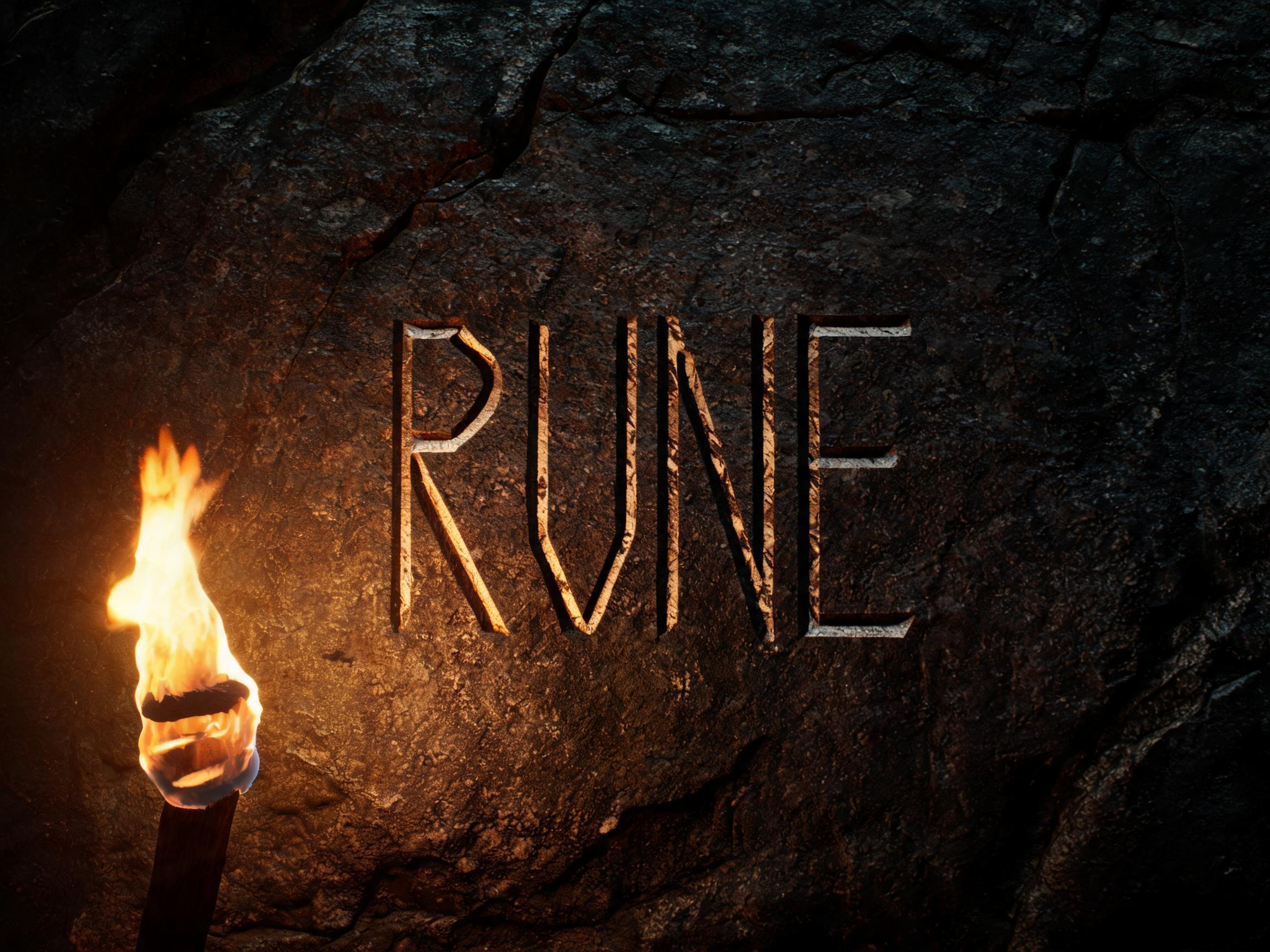
rendered in Norway WC2026 runic-inspired football display letterforms — CLEAN GEOMETRIC construction. The design principle: every curved stroke is rebuilt using ONLY straight horizontal, vertical, and 45-degree diagonal line segments. Specific: the letter O becomes a bold angular hexagon or rectangle; S becomes connected horizontal steps; C becomes a U-shape with sharp right-angle corners; curved letters are approximated by clean polygon shapes. The result is a BOLD, CLEAN, GEOMETRIC football font — NOT gothic, NOT horror, NOT decorative. ABSOLUTELY NO spikes, NO thorns, NO serifs, NO jagged edges, NO ornamental elements of any kind. The letters are THICK, SOLID, FLAT — the same clean stark geometry as the numbers on Norway's WC2026 black jersey: the digit 9 is formed from two straight-line angular strokes meeting at a precise point; the digit 8 is two stacked angular diamond shapes; the digit 1 is a simple bold rectangle. WHITE or light-colored letterforms on dark background — the exact look of Haaland's jersey numbers. The aesthetic: precision-cut, stark, geometric — like runes simplified to their most legible minimum for football stadium visibility. Reference: Norway WC2026 blackout jersey numbers (Haaland #9, squad numbers 8, 14, 17) — CLEAN BOLD ANGULAR GEOMETRY, readable from the top tier of a stadium.205 كلمة
أنشئ على FontVibeالصقه في ChatGPT أو Gemini أو أي نموذج لتوليد الصور، وضع كلمتك مكان الكلمة.
GPT Image
GPT Image
إعلان
خطوط مشابهة
خطوط تشترك مع Norway Runic Football في أكبر عدد من الوسوم.

 مميّز
 مميّز
 مميّز
 مميّز
 مميّز