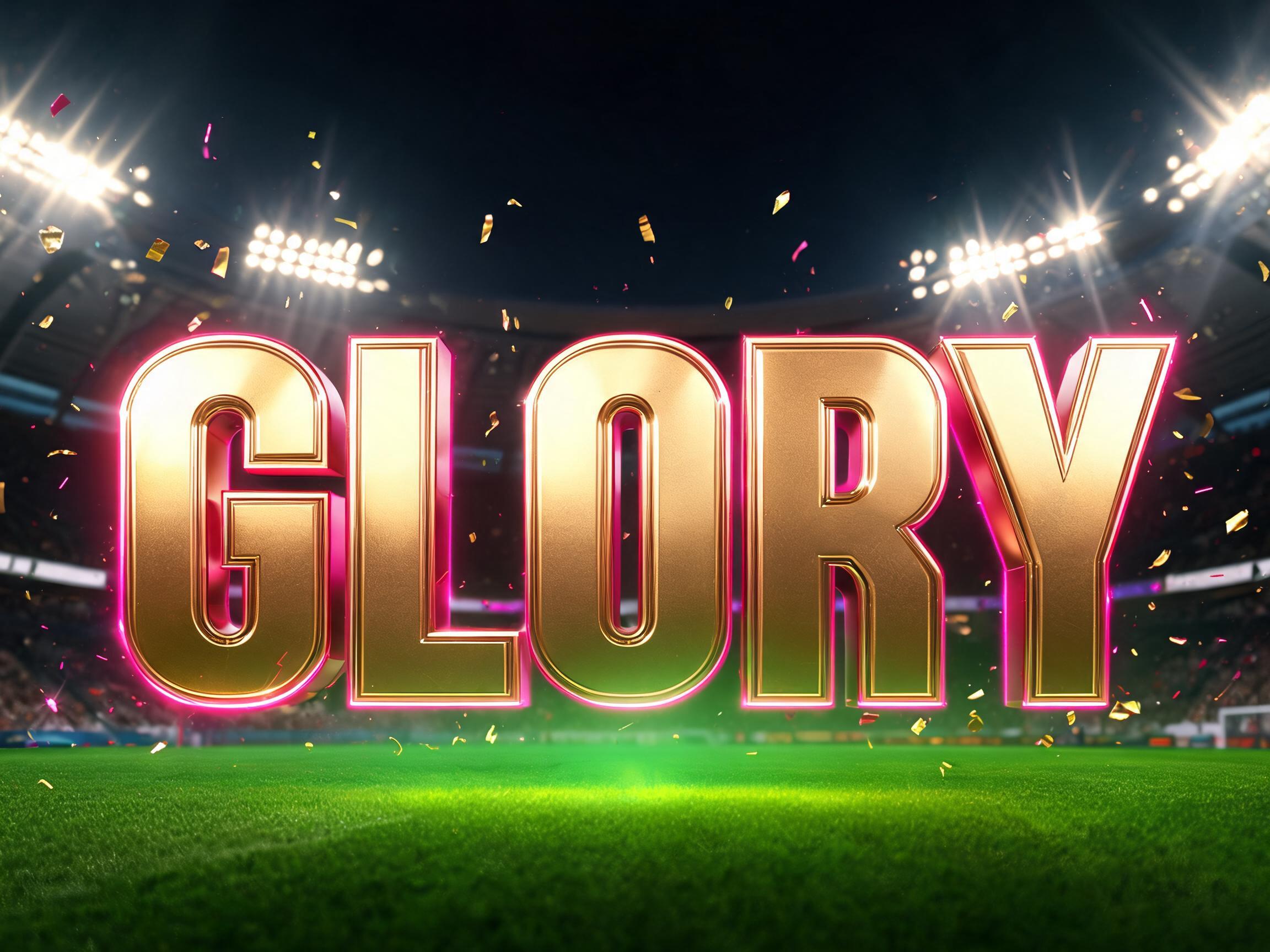
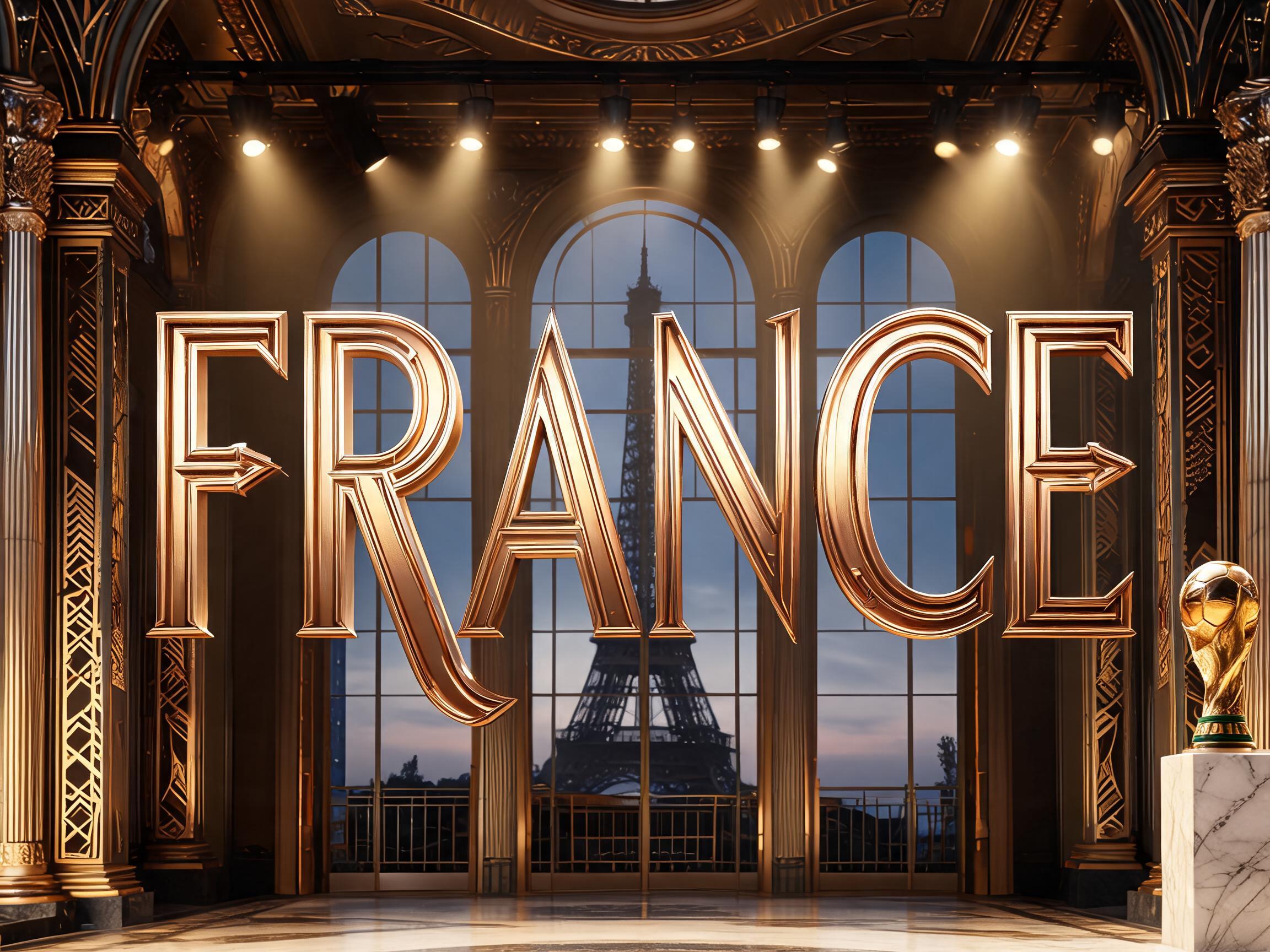
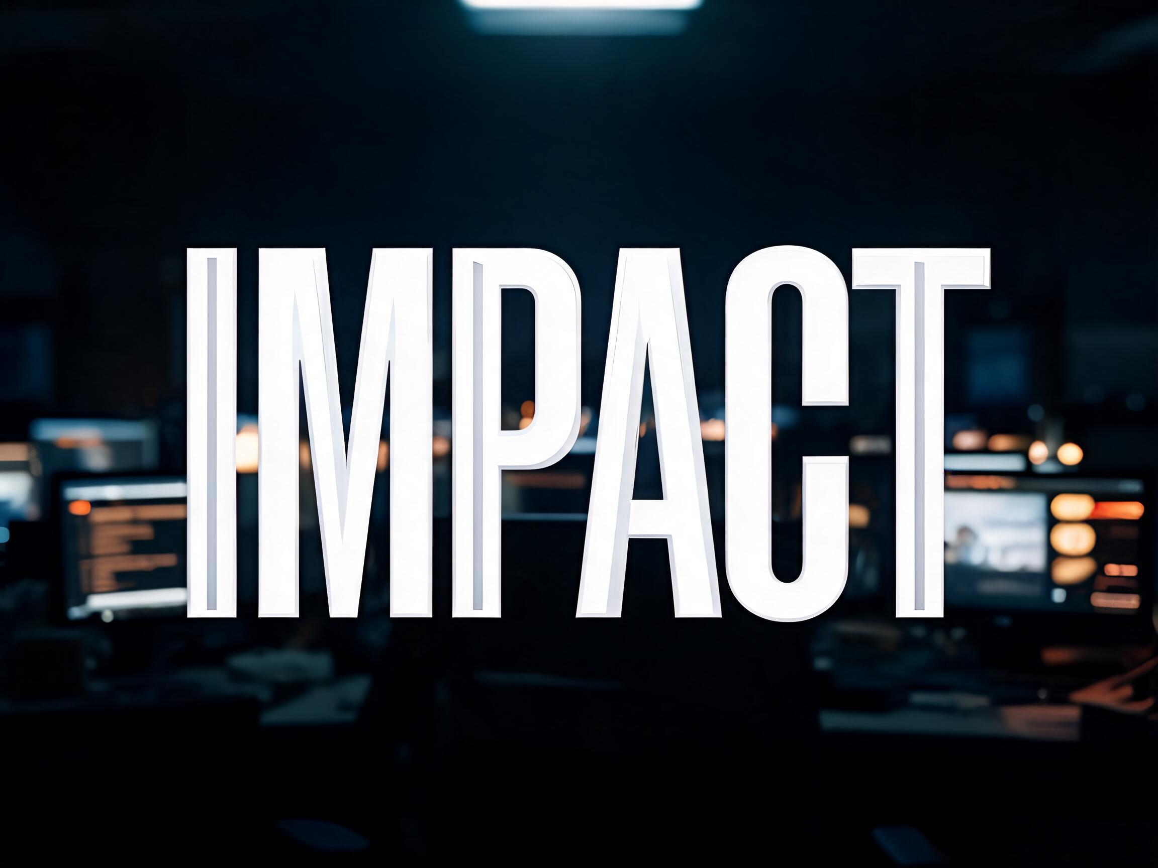
WC2026 ultra-condensed geometric black display font — the championship tournament typography aesthetic
✦البرومبت
لا تتوفر لهذا الخط نسخة بلغة العربية بعد. أدناه البرومبت الإنجليزي والصور التي أنتجها.
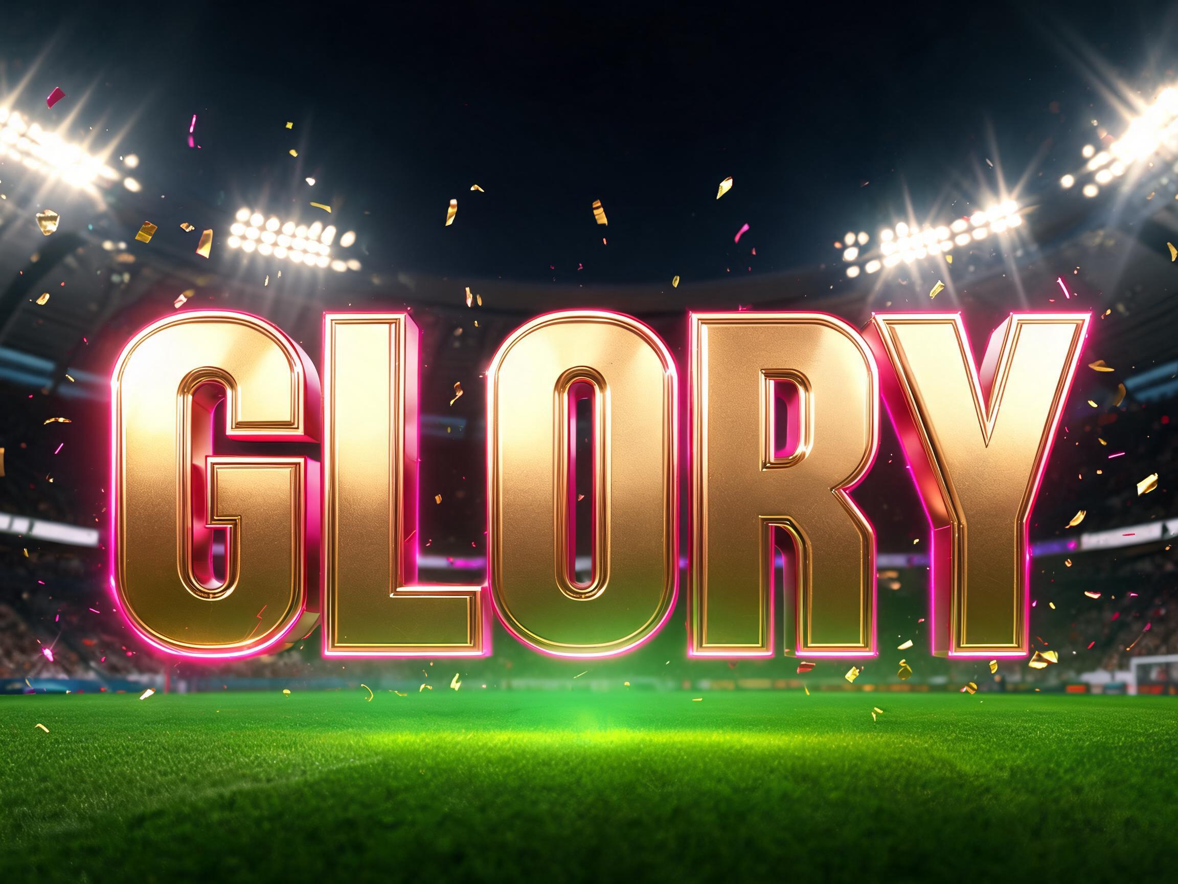
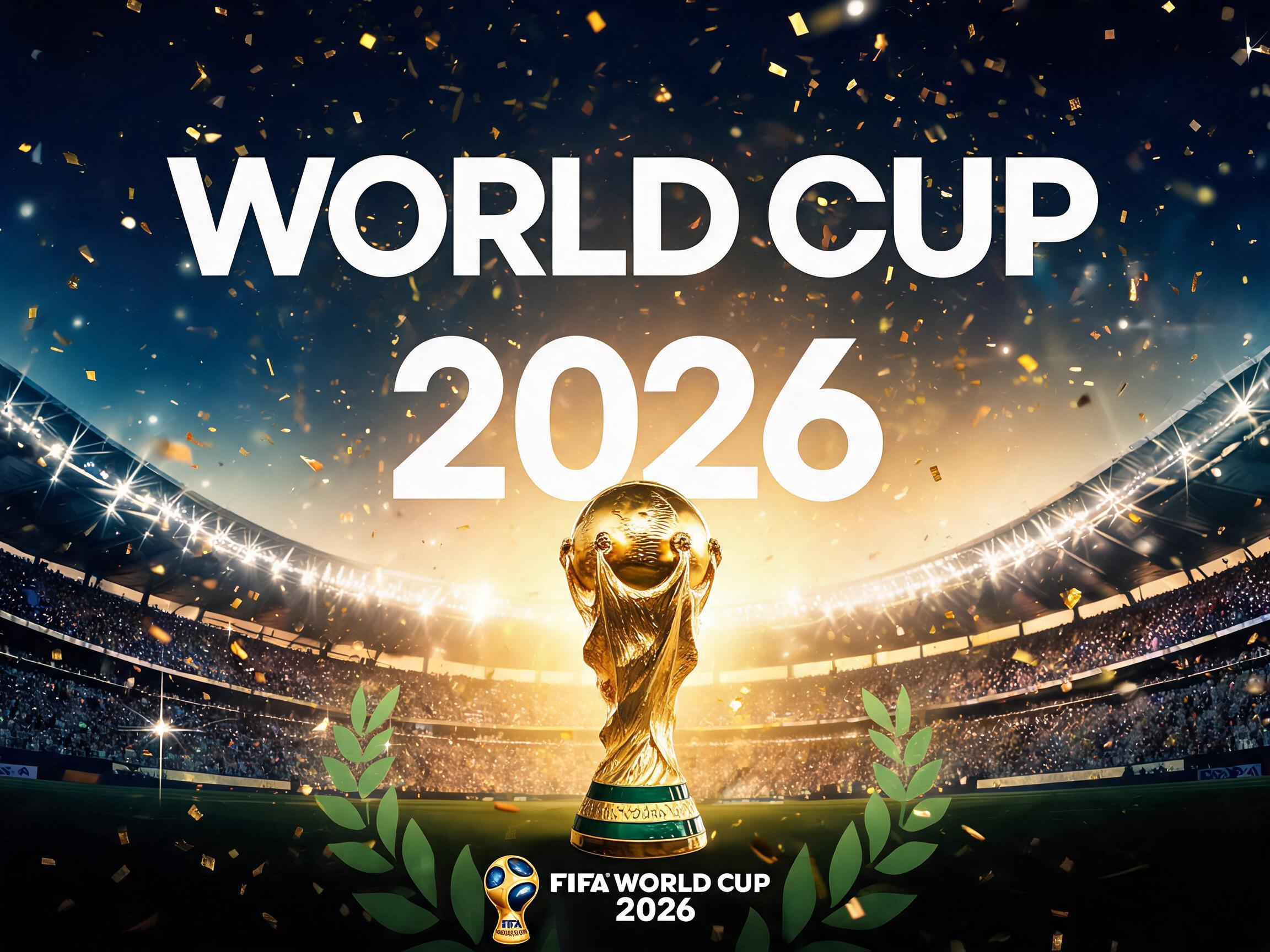
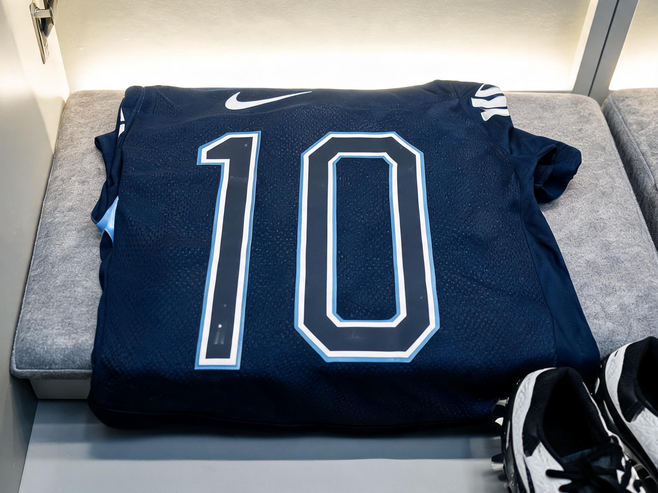
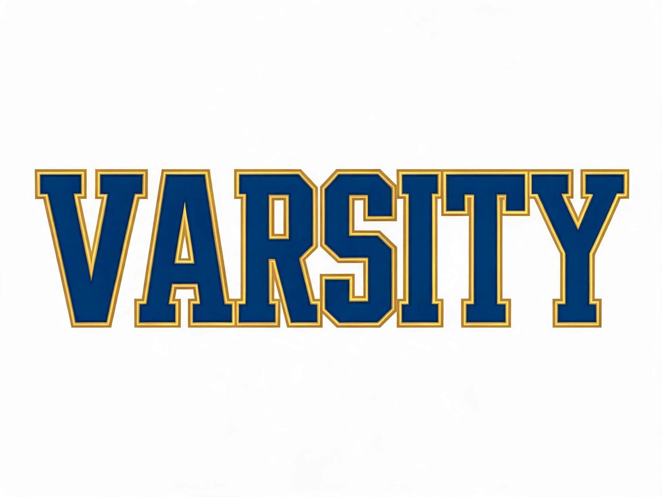
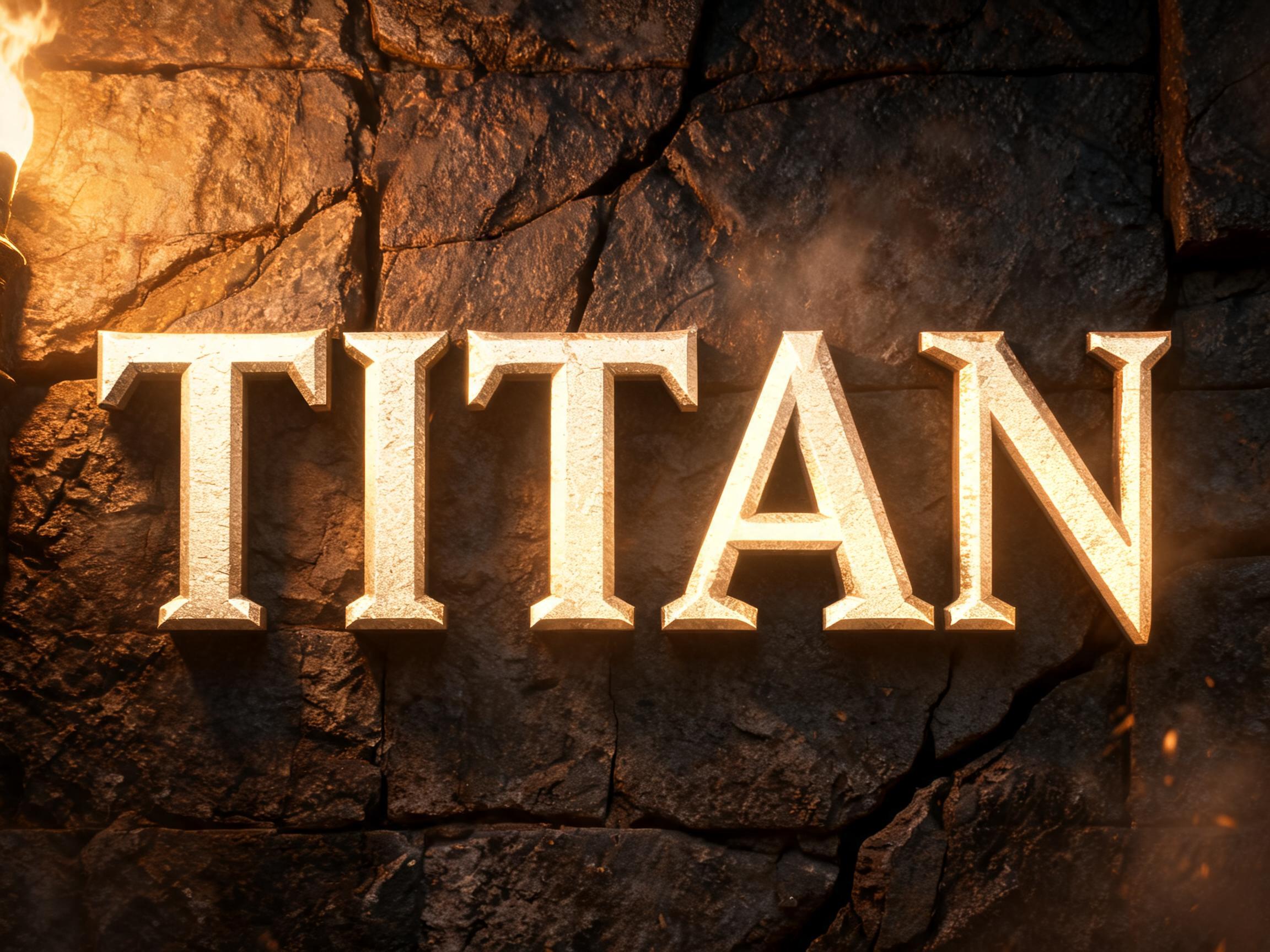
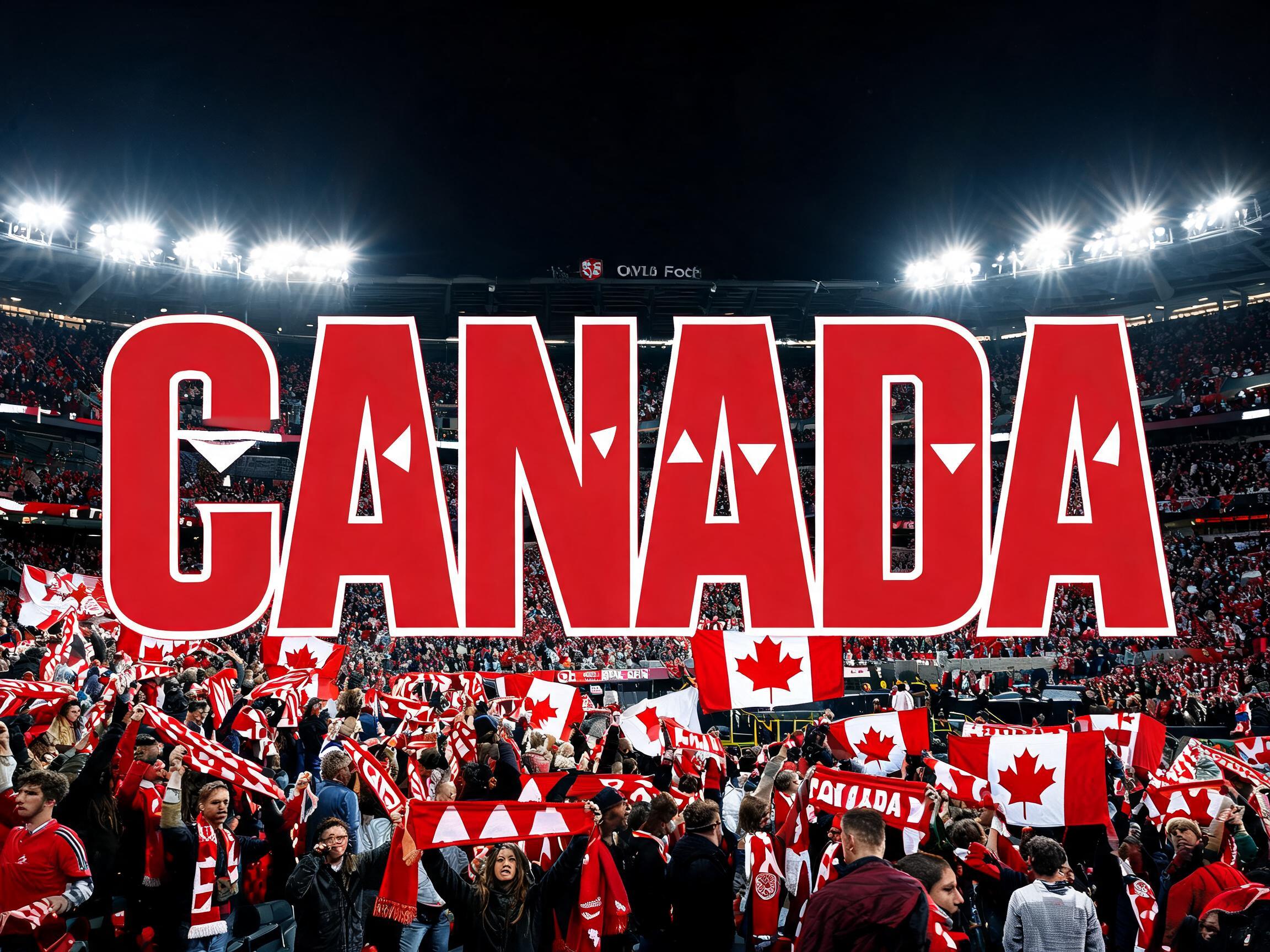
FIFA World Cup 2026 championship typography — bold condensed geometric sans-serif carrying the full energy of the tournament. FontVibe signature: traditional fonts show shapes; this delivers the material and light of the stadium itself. LETTERFORM: condensed black-weight geometric sans-serif. Each letter is 40–50% as wide as it is tall — clearly narrower than standard, creating strong vertical rhythm. Strokes are Ultra Black weight: massively thick, filling the full available width. Geometric construction, perfectly upright, zero italic lean. Flat perpendicular terminals. Extremely tight letter-spacing — letterforms stand shoulder-to-shoulder like players in a defensive wall. No calligraphicsoft glossy letters with a smooth gradient and bright highlights on a clean studio background even light from above with a faint shadow under each letter premium polished look spell the word exactly as written and keep the letters evenly spaced soft glossy letters with a smooth gradient and bright highlights on a clean studio background even light from above with a faint shadow under each letter premium polished look spell the word exactly as written and keep the letters evenly spaced soft glossy letters with a smooth gradient and bright highlights on a clean studio background even light from above with a faint shadow under each letter premium polished look spell the word exactly as written and keep the letters evenly spaced soft glossy letters with a smooth gradient and bright highlights on a clean studio background even light from above with a faint shadow under each letter premium polished look spell the word exactly as written and keep the letters evenly spaced soft glossy letters with a smooth gradient and bright highlights on a clean studio background even light from above with a faint shadow under each letter premium polished look spell the word exactly as written and keep the letters evenly spaced soft glossy letters with a smooth gradient and bright highlights on a clean studio background even light from above with a faint shadow under each letter premium polished look
يظهر الثلث الأول فقط. شاهد إعلانًا قصيرًا لفتح البرومبت كاملًا، ويبقى مفتوحًا على هذا الجهاز.

 مميّز
 مميّز
 مميّز