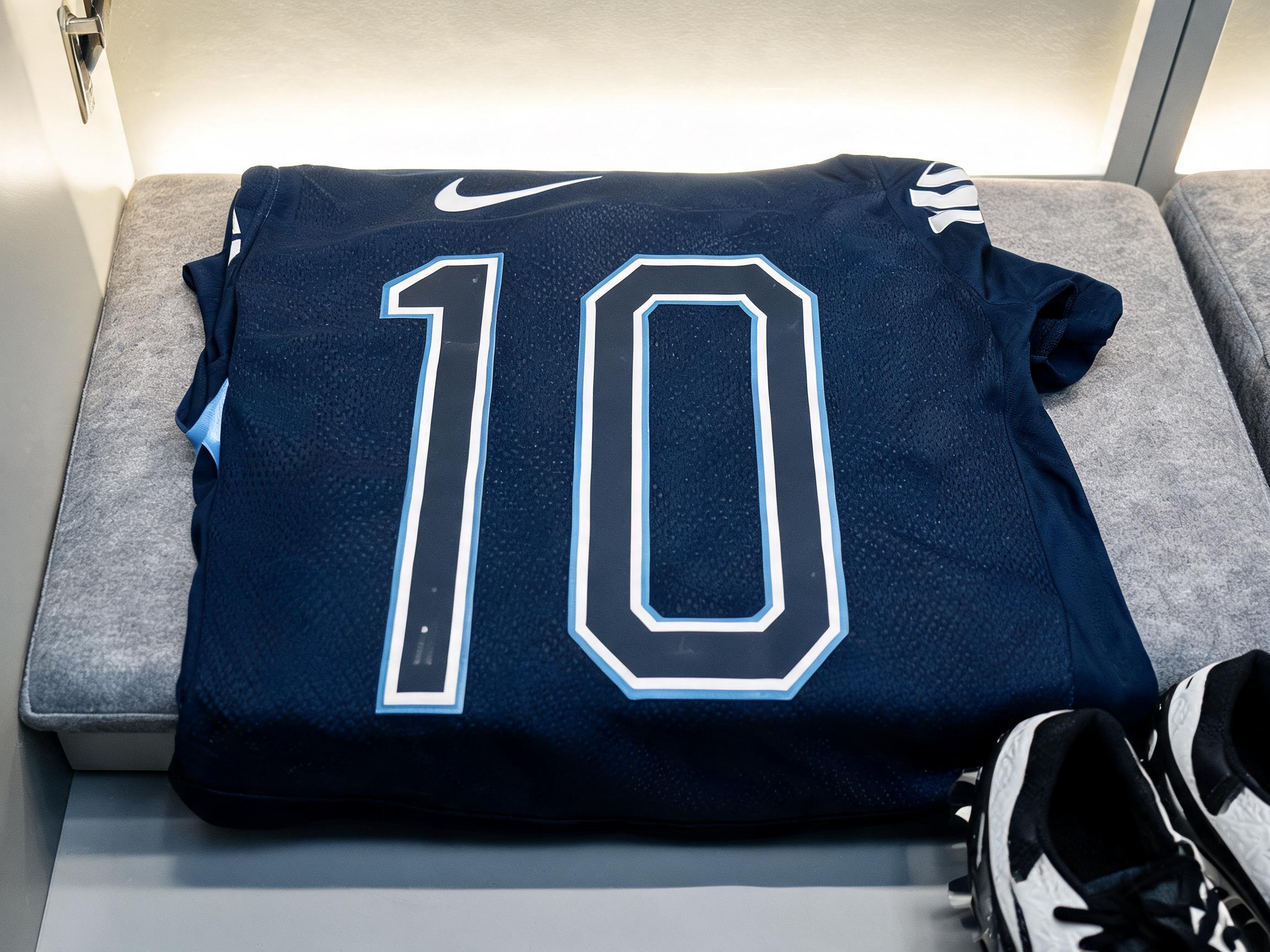
rendered in Canada WC2026 football kit display letterforms — Nike's bespoke typography for the Canadian national team. THE DEFINING FEATURE: each letterform contains a SINGLE DOWNWARD-POINTING EQUILATERAL TRIANGLE cut out of the letter body as negative space — one triangular void pointing downward, like the sharp lower point of a maple leaf. NOT a star shape, NOT a diamond, NOT multiple points — ONE TRIANGLE pointing DOWN, clearly shaped like a maple leaf's central pointed tip. This triangular cutout is most prominent in letters with open counter space: the "A" has a large downward-pointing triangle inside; similar triangular negative space appears in other letters. The triangles point DOWNWARD (vertex at bottom). The base letterforms are TALL AND CONDENSED (height approximately 2.5-3x width), bold weight. Each letterform has a thin white inner outline (jersey double-outline). Deep red letter color with white outline on dark stadium background. Reference: Nike Canada WC2026 home kit typography — ONE DOWNWARD-POINTING TRIANGLE PER LETTER, the maple leaf geometric point encoded as negative space.
粘贴到 ChatGPT、Gemini 或任何生图模型,换上你的字。
GPT Image · 用词:Canada Football KitFontVibe preview reused as the GPT Image result.
Canada Football Kit AI 字体在 GPT Image 上的生成结果:文字 Canada Football Kit


 高级款

 高级款