跳到正文
AIFont
AI 字体场景风格
AIFont
语言
AIFont
AI 字体场景风格
AIFont

用一段提示词就能打出来的 AI 字体。复制、粘贴到任何生图模型、换成你的字。

场景

  • 游戏
  • 电影
  • 体育运动
  • 科技
  • 万圣节
  • 场景

风格

  • 奢华
  • 复古
  • 未来感
  • 古典
  • 经典
  • 风格

关于

  • 全部 AI 字体
  • FontVibe
© 2026 AIFont · aifont.ai · 隐私政策 · 使用条款想直接要图、不想写提示词?FontVibe 帮你生成。
AIFont›AI 字体›Authority Gold Hero
AI 字体

Authority Gold Hero

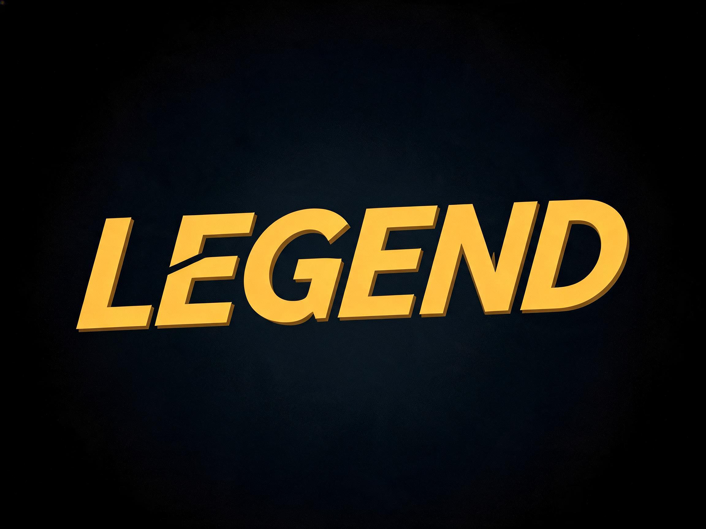
Bold squared modern display lettering cast in rich metallic gold with hard raking highlights and deep amber shadow — a futuristic…
奢华未来感现代
✦提示词155 词 · 1 : 1 · 任何生图模型通用
rendered in bold modern SANS-SERIF display letterforms — completely sans-serif with absolutely NO serifs, in the clean rounded humanist style of PingFang / Hiragino Sans: softly rounded corners and terminals, smooth and soft, with UNIFORM even monoline stroke weight and ZERO thick-thin contrast (no stress, no tapering). The whole word is DYNAMIC and moderately condensed, set with a distinct forward ITALIC slant (oblique lean) and a soaring, diving-forward motion — leaning and swooping forward like a hero mid-flight, energetic and in-motion, never static or upright. Colored in bright warm YELLOW-GOLD, exactly hex #F4C214 (RGB 244,194,20) — smooth, bright and even, with a soft sheen and a thin darker-gold lower edge for subtle depth. CRITICAL: absolutely NO serifs, NO thick-thin contrast; rounded soft EVEN-WEIGHT monoline sans (PingFang-like); distinctly ITALIC forward-slanted with soaring in-flight dynamic energy; bright yellow-gold #F4C214. Visual anchors: bold rounded humanist sans-serif gold movie-subtitle, italic soaring in-flight gold hero subtitle, PingFang-style even-weight gold lettering.
粘贴到 ChatGPT、Gemini 或任何生图模型,换上你的字。
Authority Gold Hero AI 字体在 GPT Image 上的生成结果:文字 Authority Gold Hero

GPT Image · 用词:Authority Gold HeroFontVibe preview reused as the GPT Image result.

Authority Gold Hero AI 字体在 GPT Image 上的生成结果:文字 Authority Gold Hero

相似的 AI 字体

与 Authority Gold Hero 共享最多标签的 AI 字体。

相似的 AI 字体→
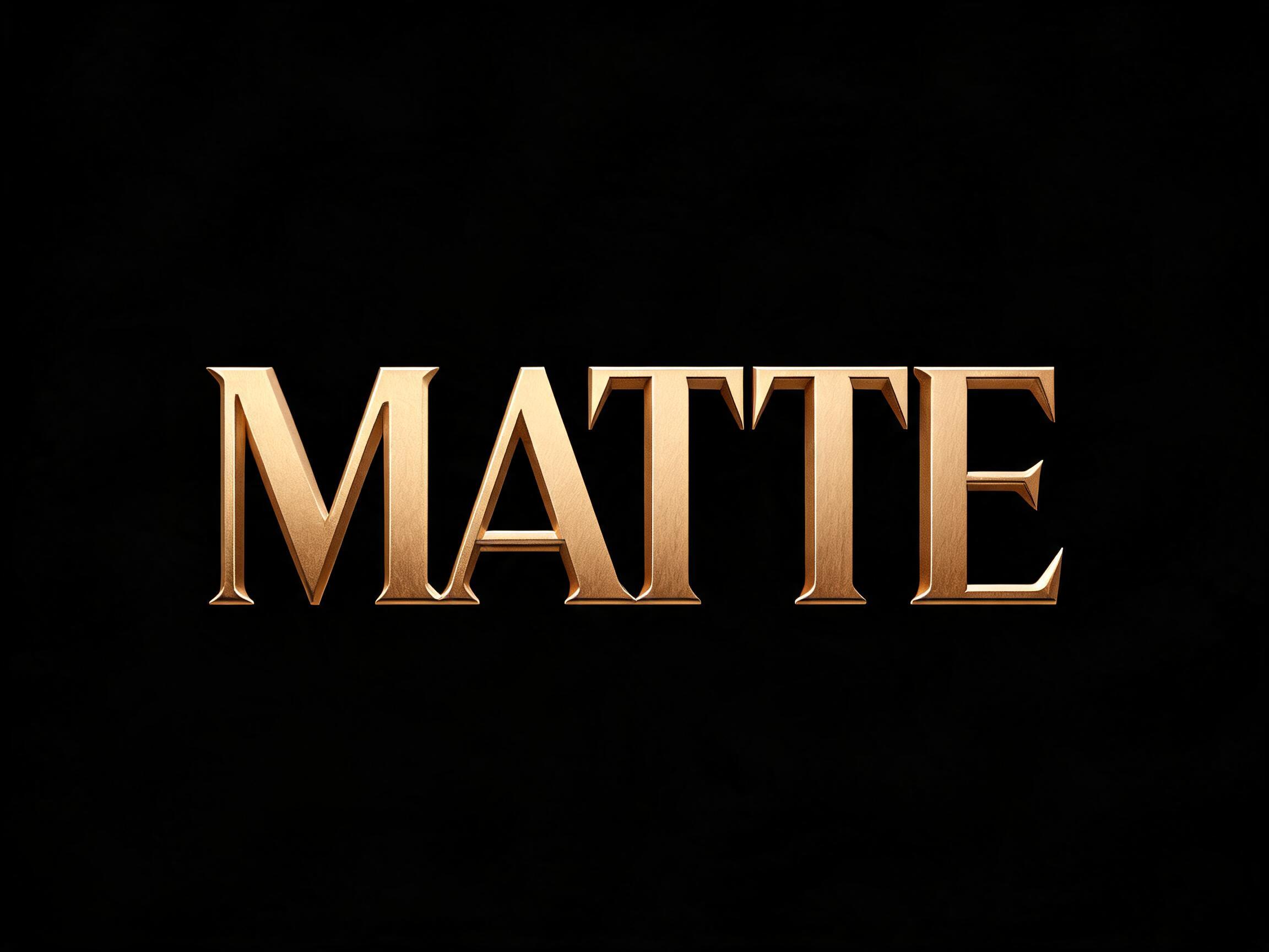
Matte Gold AI 字体效果图
Matte Gold
极简 · 奢华 · 现代
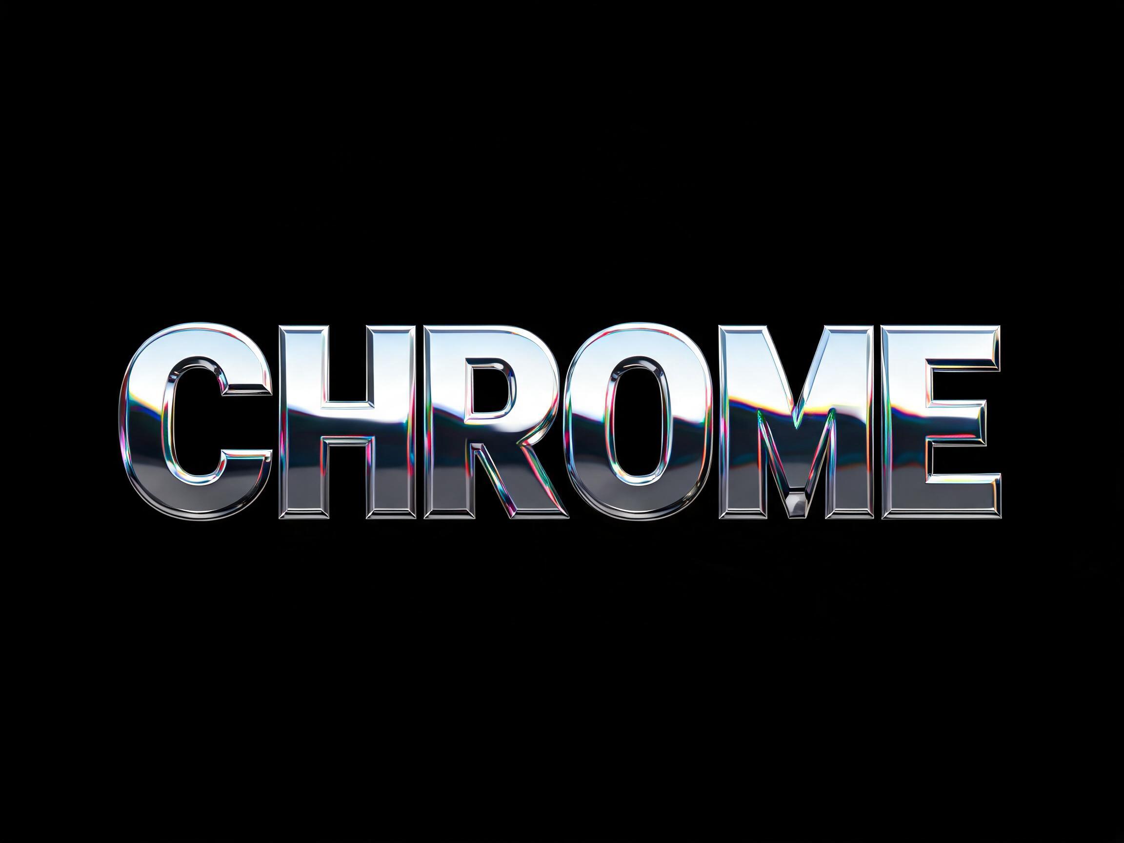
Chrome Display AI 字体效果图✦高级款
Chrome Display
奢华 · y2k · 未来感
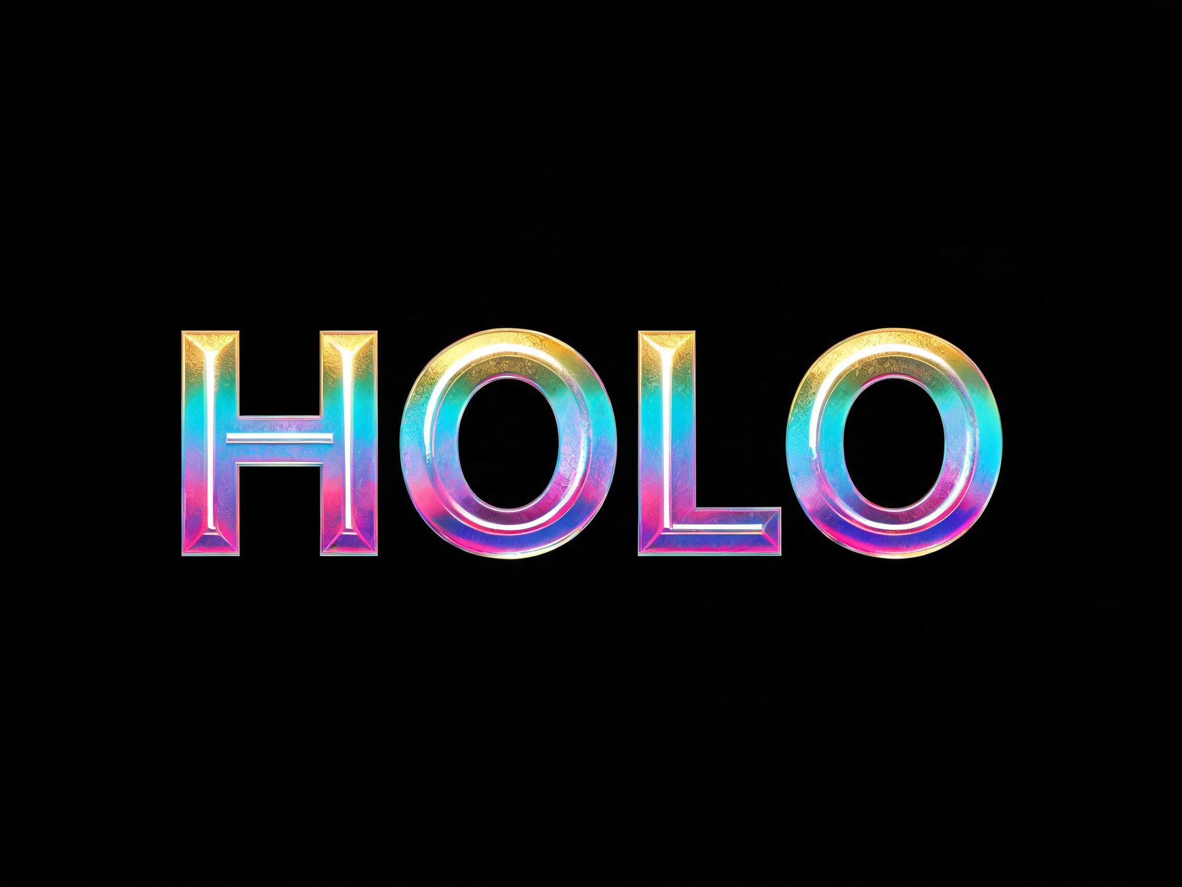
Holographic Foil AI 字体效果图✦高级款
Holographic Foil
奢华 · y2k · 未来感
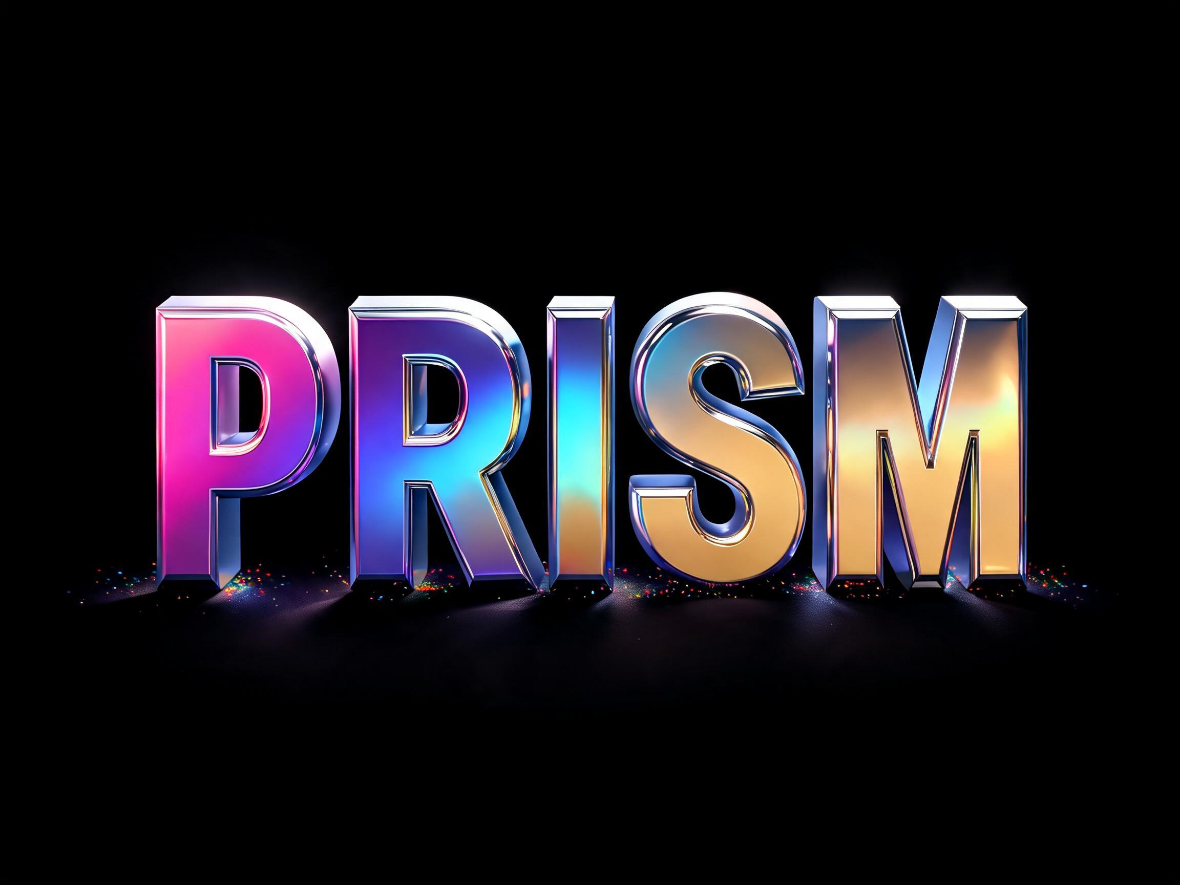
Iridescent 3D Chrome AI 字体效果图
Iridescent 3D Chrome
奢华 · y2k · 未来感
3D 奢华黄金 AI 字体效果图✦高级款
3D 奢华黄金
奢华
Chrome Liquid AI 字体效果图✦高级款
Chrome Liquid
奢华 · 未来感 · 照片级写实

适合搭配

用于第二行文字、logo 组合或海报页脚的 AI 字体。

Matte Gold AI 字体效果图
Matte Gold
极简 · 奢华 · 现代
Medieval Serif AI 字体效果图
Medieval Serif
衬线体 · 书法 · 哥特
3D Beveled AI 字体效果图✦高级款
3D Beveled
奢华
3D Stone AI 字体效果图
3D Stone
经典 · 中世纪 · 远古

关于 Authority Gold Hero AI 字体

Bold squared modern display lettering cast in rich metallic gold with hard raking highlights and deep amber shadow — a futuristic, authoritative hero movie-subtitle face.

标签

奢华未来感现代
跳过写提示词。

在姊妹站 FontVibe 上一键用你自己的字生成 Authority Gold Hero。

去 FontVibe 生成

常见问题

What is the Authority Gold Hero font?

Authority Gold Hero is a bold squared modern display cast in rich metallic gold, with hard raking highlights and deep amber shadow — a futuristic, authoritative hero movie-subtitle face. It reads as powerful, premium and cinematic.

Can I download Authority Gold Hero?

There is no installable file. You type your text and the generator renders the gold letters with the raking highlights fitted to your actual shapes, and returns a high-resolution image.

Where does this style work best?

Film and trailer titles, gaming and esports, premium and luxury branding, award and sports graphics, event key art, poster headlines. Set it large and short on a dark ground.

Can I use it for commercial work?

Yes. Generated images may be used commercially, including titles, packaging and video. No licence or attribution is required.

Why do the hard raking highlights make the gold look so rich and metallic?

Because a low, hard, directional light is what reveals metal as metal. A polished gold surface is a mirror for light: hit it with a sharp light from a steep angle and it throws back a brilliant, concentrated highlight along one edge of each letter, while the opposite side drops into deep amber shadow. That extreme jump from a hot bright streak to a dark warm shadow, all across a curved or bevelled surface, is exactly the signature the eye uses to recognise polished metal — a matte surface would shade gently and evenly, but metal snaps between glare and gloom. Keeping the shadow warm and amber rather than grey is what keeps it reading as gold specifically, not silver or chrome. Flat, soft, even lighting is the enemy here: it makes gold look like dull yellow paint, because it erases the sharp specular contrast that says 'metal.' So the drama of the raking light is not just mood; it is the very thing that makes the gold read as rich, solid and expensive.

What fonts look similar?

For a soft matte-gold restraint, see [Matte Gold](/fonts/matte_gold). For flat hot-stamped gold foil, try [Gold Foil Flat](/fonts/gold_foil_flat).