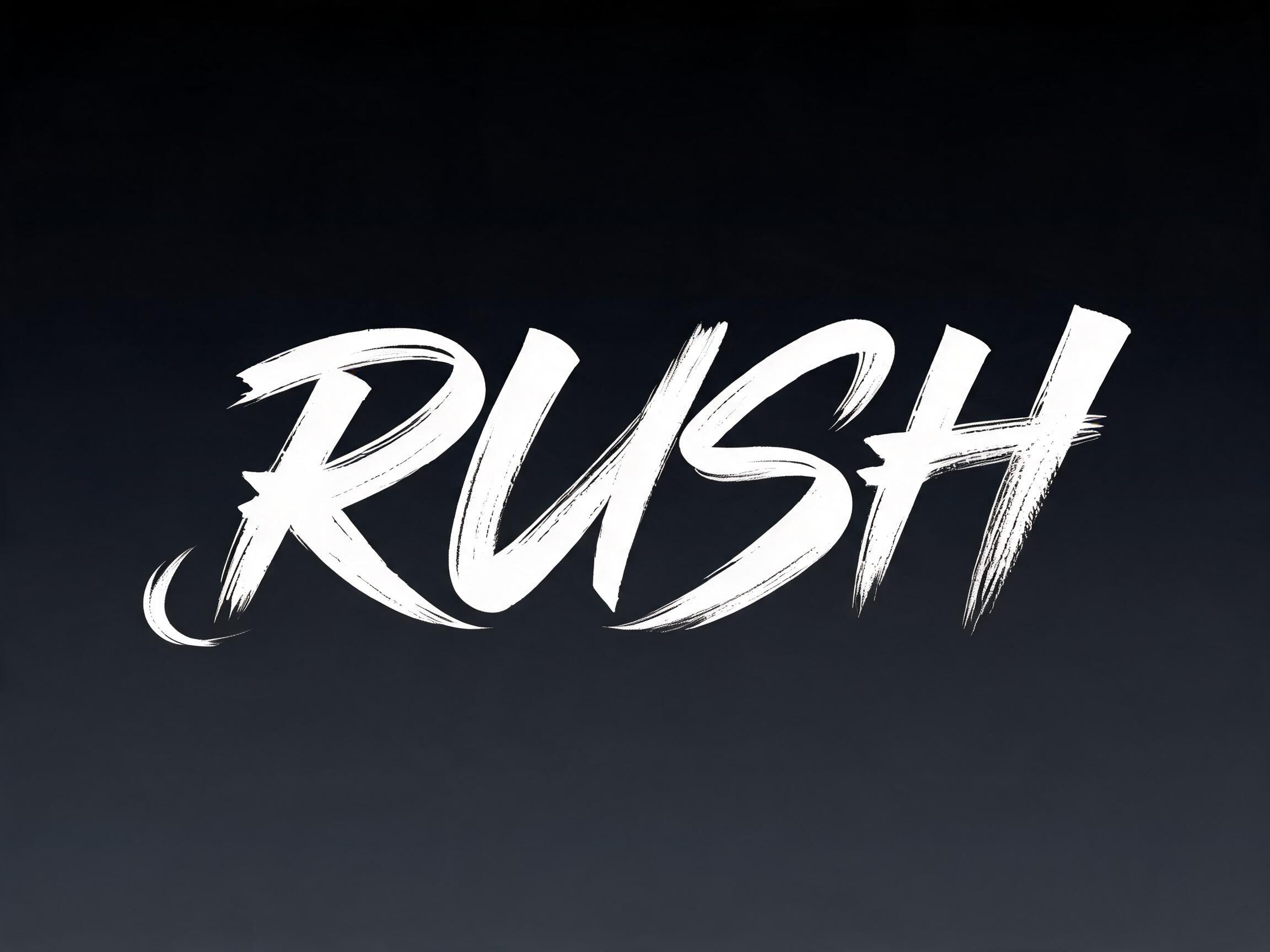
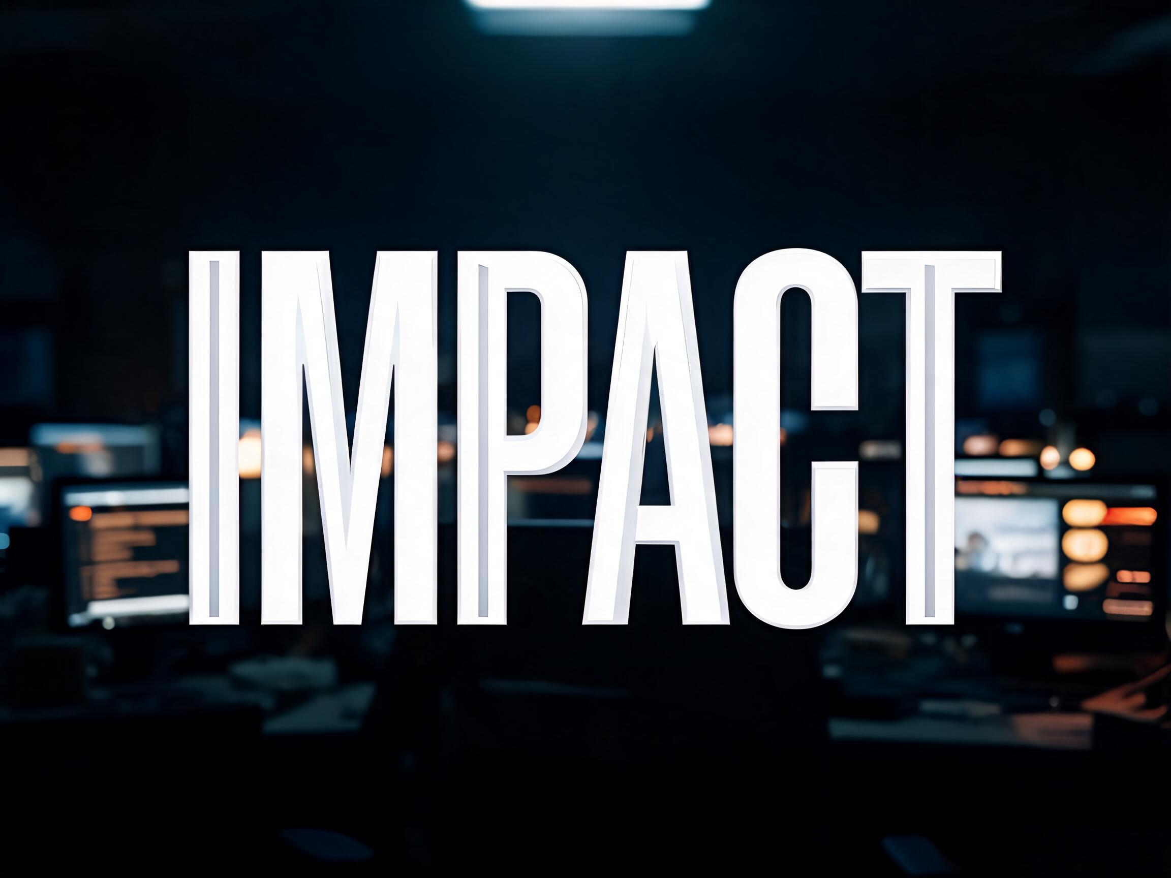
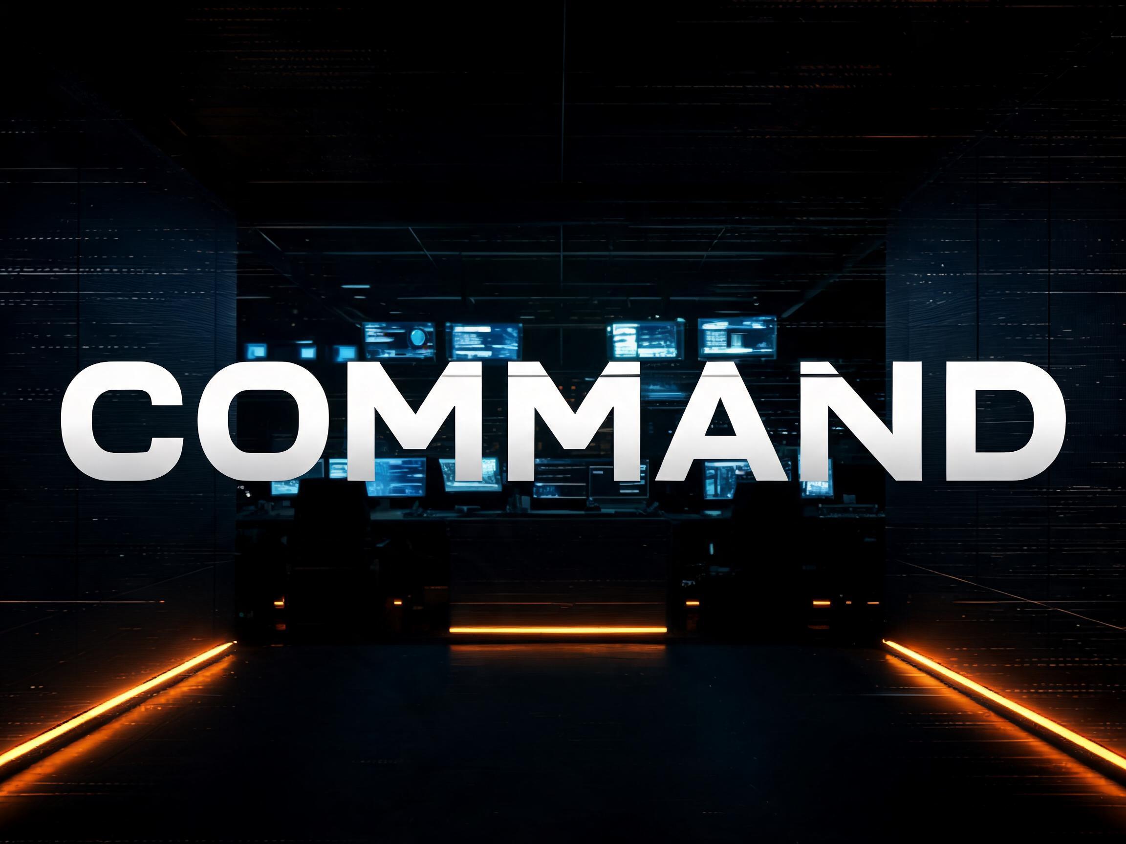
An ultra-heavy extended display typeface with maximum horizontal expansion, pure monotone stroke construction, and architecturally squared…
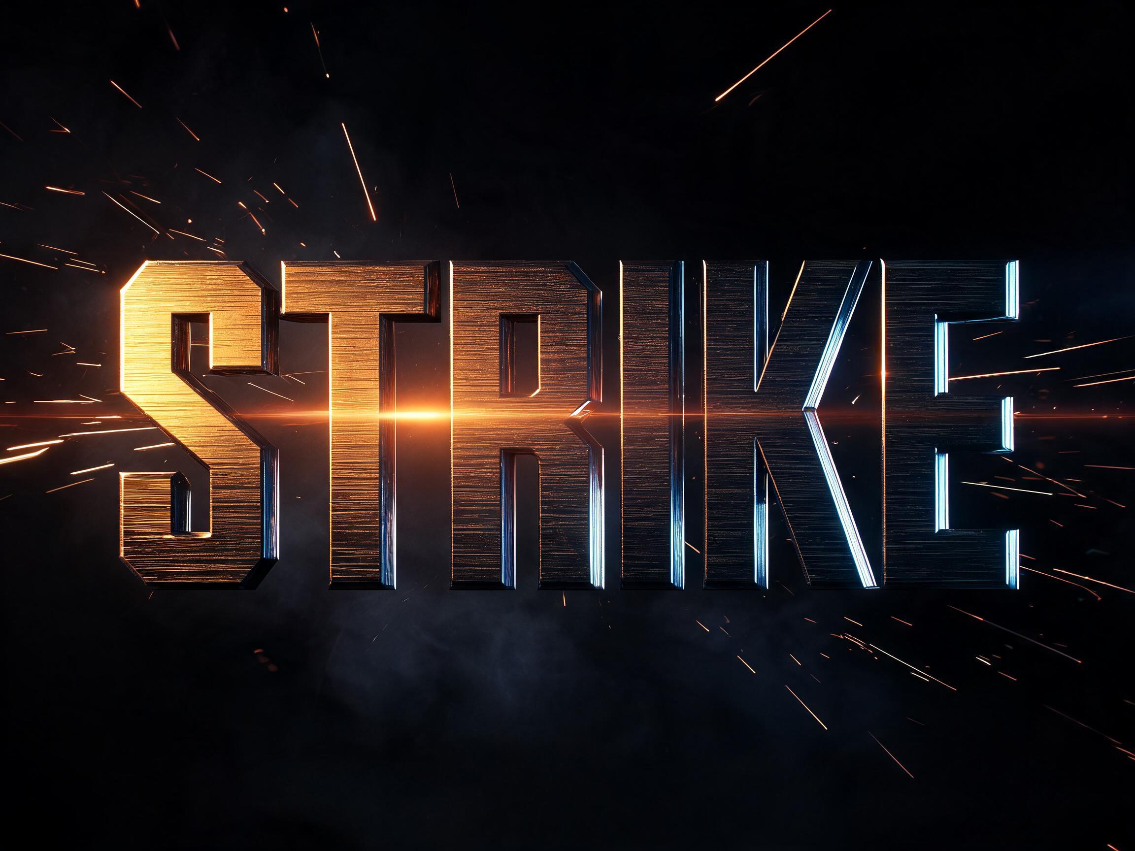
GPT Image · 用词:Agency Extended BlackFontVibe preview reused as the GPT Image result.
Agency Extended Black AI 字体在 GPT Image 上的生成结果:文字 Agency Extended Black与 Agency Extended Black 共享最多标签的 AI 字体。
 高级款
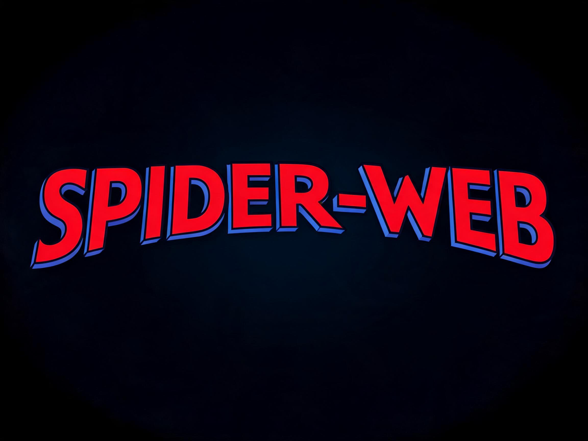 高级款
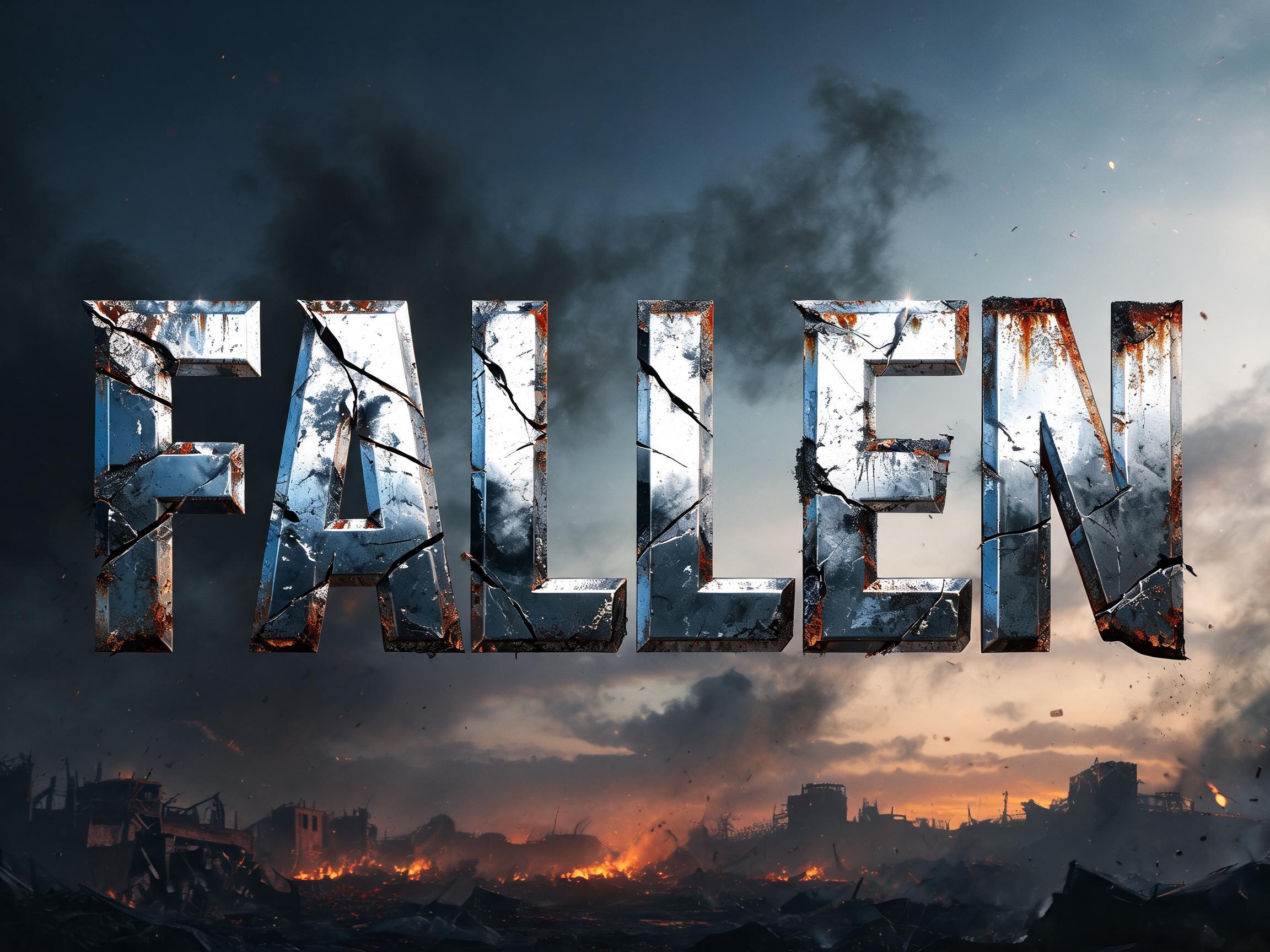 高级款
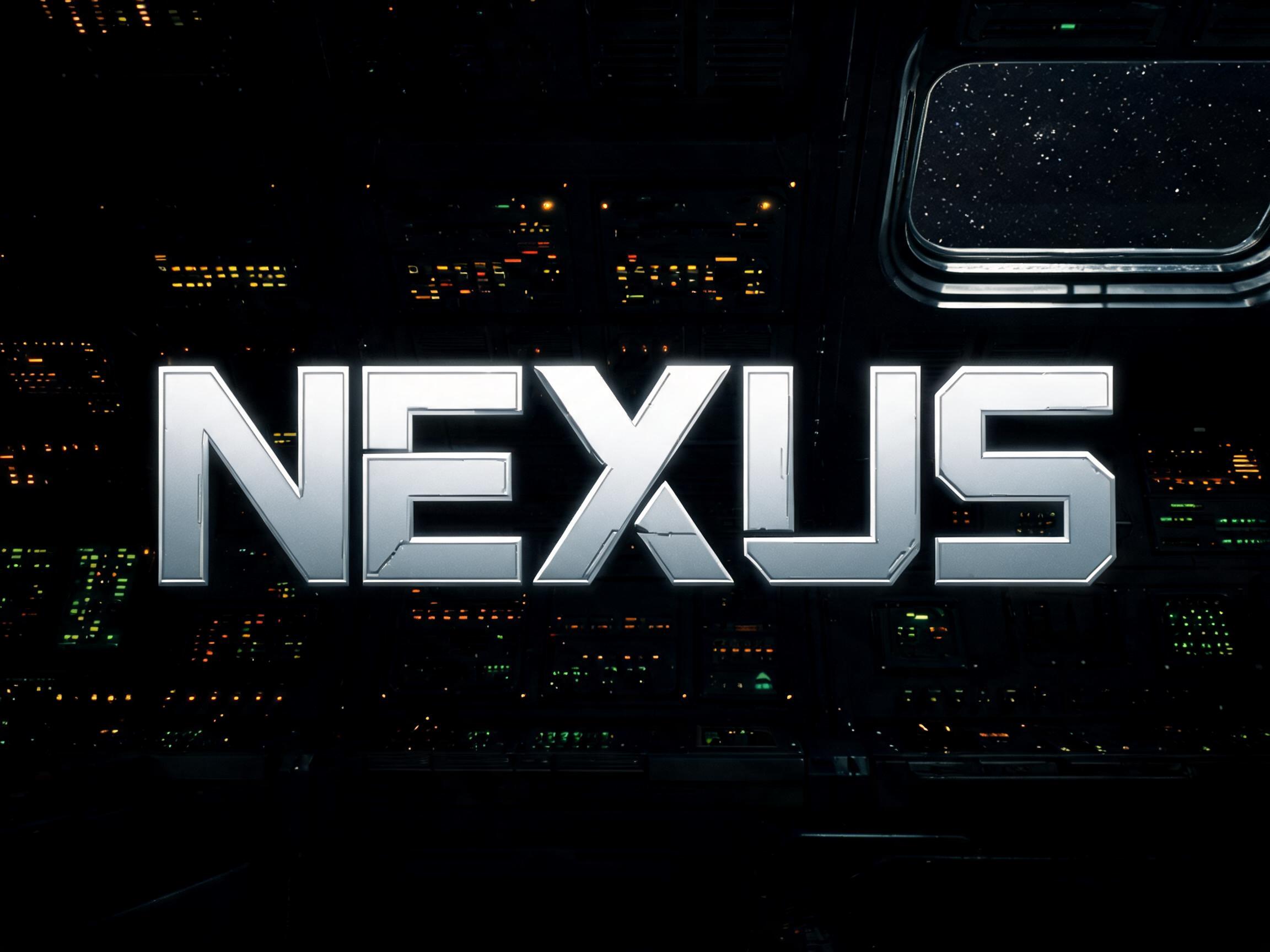
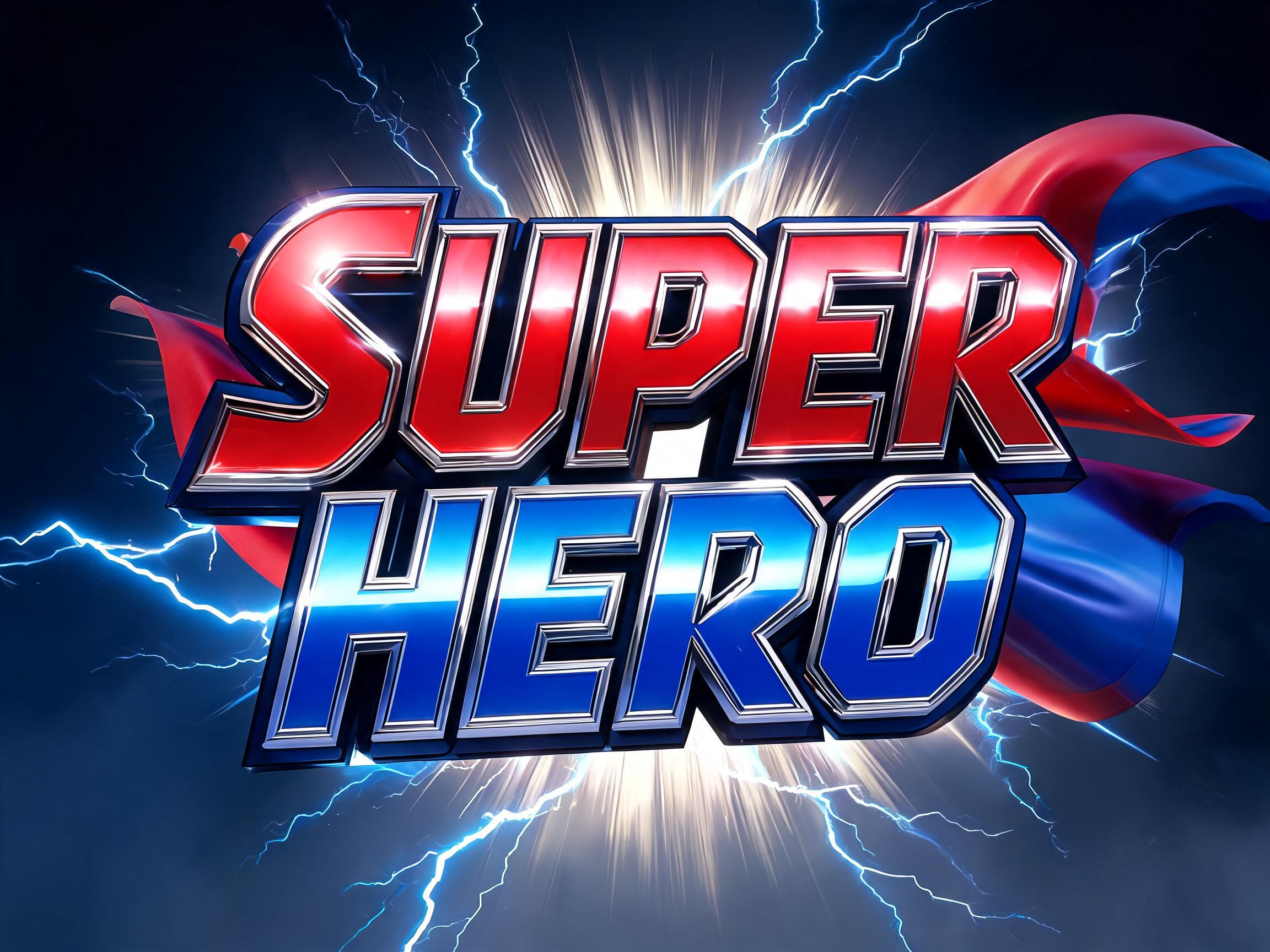 高级款
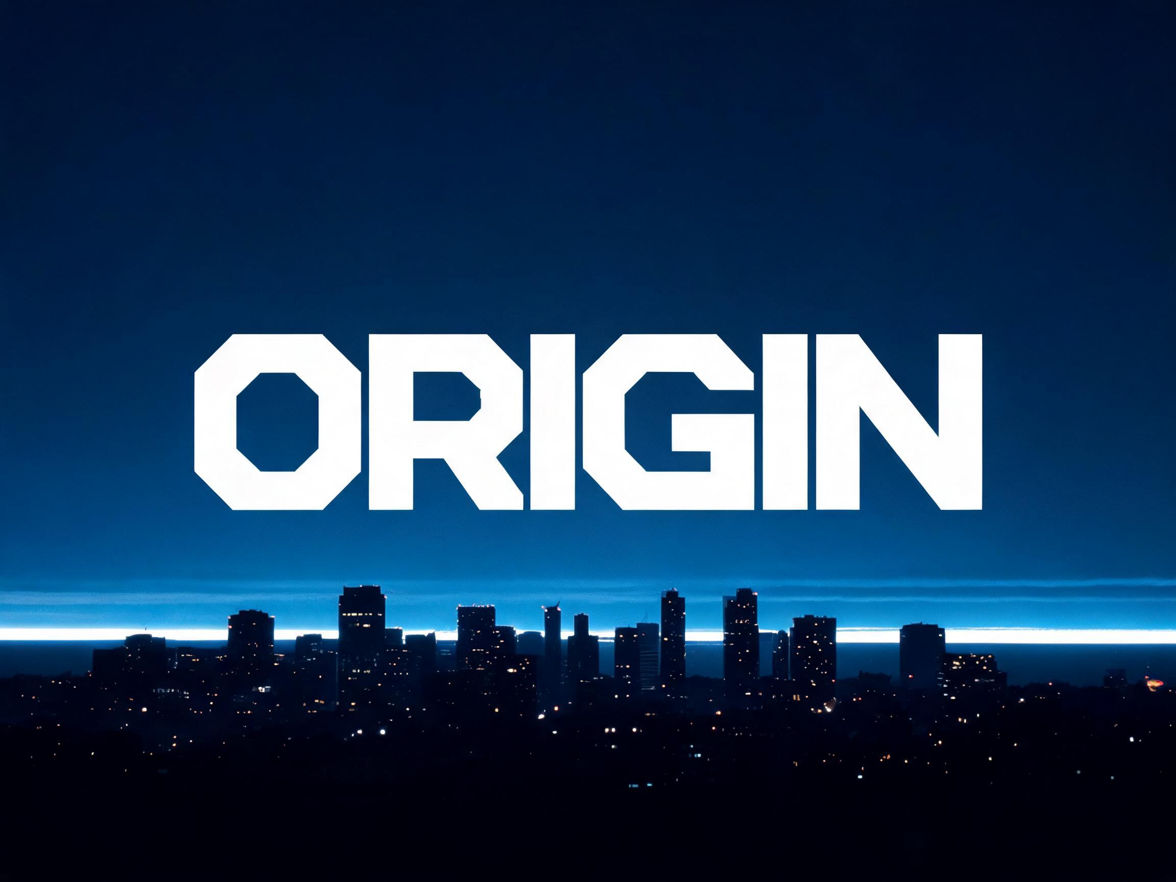
用于第二行文字、logo 组合或海报页脚的 AI 字体。
An ultra-heavy extended display typeface with maximum horizontal expansion, pure monotone stroke construction, and architecturally squared terminals. The typographic language of superhero franchise titles, military campaign branding, and blockbuster key art — a single word becomes a physical wall of presence.
在姊妹站 FontVibe 上一键用你自己的字生成 Agency Extended Black。
Agency Extended Black is an ultra-heavy extended display face: maximum horizontal expansion, pure monotone strokes and architecturally squared terminals. It is the language of superhero-franchise titles, military-campaign branding and blockbuster key art — a single word becomes a physical wall of presence.
There is no installable file. You type your text and the generator sets the wide, heavy letters fitted to your actual shapes, and returns a high-resolution image.
Film and franchise titles, gaming and esports, sports and military-style branding, event and campaign key art, poster headlines, bold identities. Use it big and short — it wants to dominate.
Yes. Generated images may be used commercially, including titles, packaging and video. No licence or attribution is required.
Because breadth and weight together signal stability, mass and importance, the same way they do in architecture and in a human stance. A very wide, very heavy letter takes up a lot of horizontal space and sits on a broad, low, grounded base — like a wide-stanced figure braced and immovable, or the broad facade of a monumental building. We instinctively read a wide, weighty form as more stable and imposing than a narrow one: it looks harder to push over, more substantial, more permanent. A normal-width bold letter is strong; stretch it out to maximum extension while keeping the heavy weight and it stops reading as a word and starts reading as a solid barrier — a wall of type. That is why franchise and military branding reach for extended blacks for a hero title: the proportions themselves communicate force and permanence before you have read a single letter, turning one short word into a monument.
For a squared machine-console extended face, see [Eurostile Extended Bold](/fonts/eurostile_extended_bold). For a heavy geometric display at normal width, try [Bold Geo Sans](/fonts/bold_geo_sans).