Pular para o conteúdo
AIFont
InícioFontes de IATemasEstilosUsosSensações
AIFont
AIFont
InícioFontes de IATemasEstilosUsosSensações
AIFont

Fontes de IA que você cria com um prompt. Copie, cole em qualquer gerador de imagem e troque pela sua palavra.

Quer a imagem pronta, sem prompt? A FontVibe gera para você.

Explorar

  • Todas as fontes de IA
  • Estilos
  • Temas
  • Usos
  • Sensações

Estilos populares

  • Luxo
  • Retrô
  • Futurista
  • Vintage
  • Clássico

Cenas populares

  • Games
  • Esportes
  • Tecnologia
  • Cinema
  • Casamento
© 2026 AIFont · aifont.ai · Um produto da Funovate TechnologyPrivacidade · Termos · Informações legais · Contato
AIFont›Fontes de IA›Racing Slant
  • Testado em 1 modelo
  • Resultados sem retoque
  • Grátis, uso comercial liberado

Racing Slant

A display typeface where every letter is plainly wider than it is tall, so the word reads long and low like a car seen from the side.

✦Prompt

Esta fonte de IA ainda não tem versão em Português. Abaixo estão o prompt em inglês e as imagens que ele gerou.
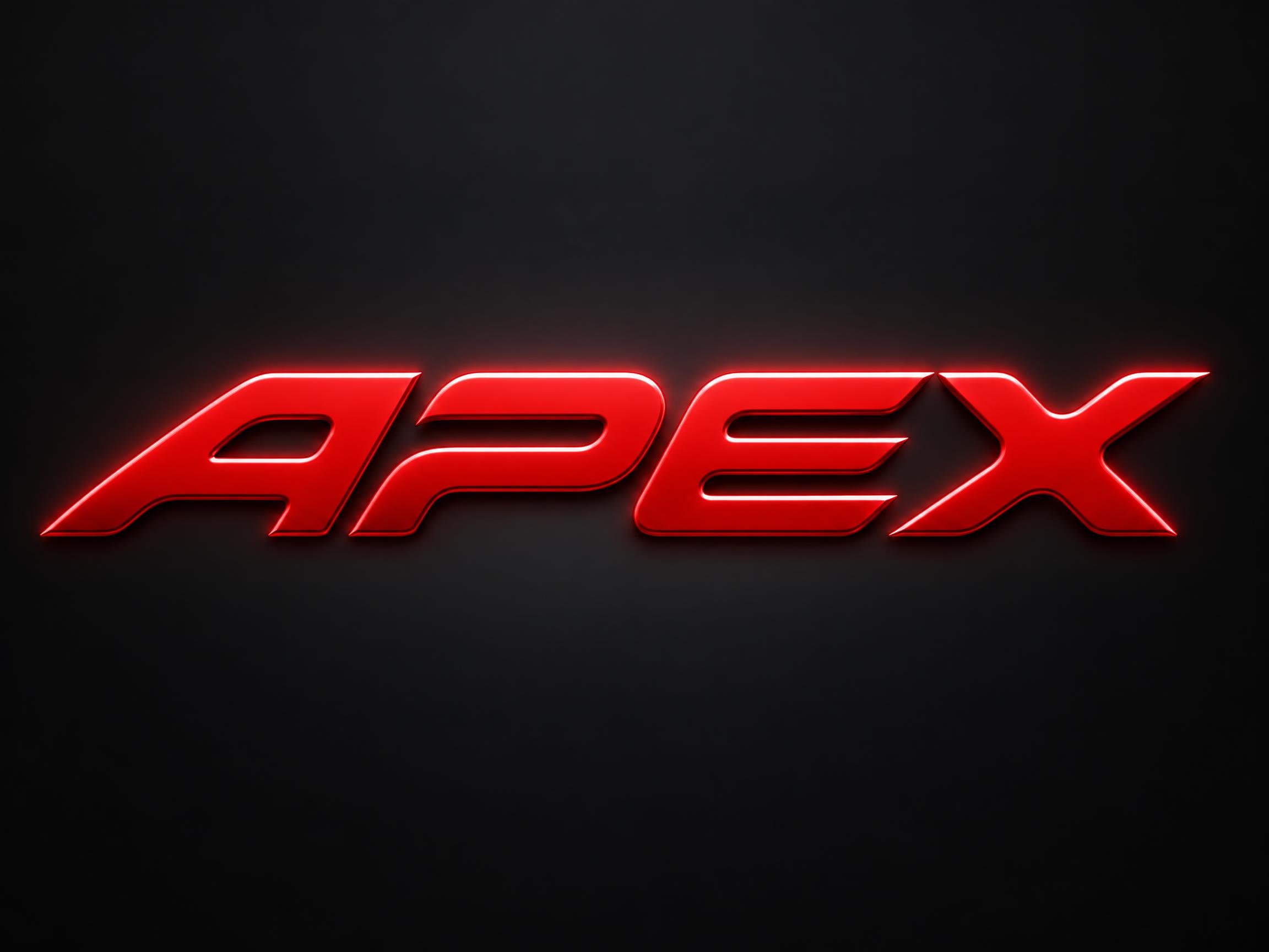
rendered in a display skeleton where each letter is plainly wider than it is tall, so the word reads long and low, like a car seen from the side. Every letter leans, its top sitting well to the right of its foot, and every stroke ends in the same slanted cut, all parallel, each long enough to read as one of the letter's own main edges rather than a small bevel. Every inside corner where two strokes meet is turned in one wide curve with no sharp angle left inside a letter, while the slanted cuts at the stroke ends stay razor-sharp. The letters are formed sheet metal under automotive paint. Each face is one flat plane with a narrow chamfer round its whole edge. Every letter is a closed solid shape, and no gap between letters is shaped into a figure of its own. The chamfer catches a hard line of light along its top edge and goes dark along the bottom, the face holds an even gloss with no reflected detail, and a soft halo sits close around the word. That highlight runs unbroken the full width of the word. Like a race helmet visor strip, a pit board, a sports car's tail badge. Colour follows the scene; with none, one highly saturated face on a much darker surround, the halo the same hue.226 palavras
Gerar no FontVibeCole no ChatGPT, Gemini ou em qualquer gerador de imagem e troque pela sua palavra.
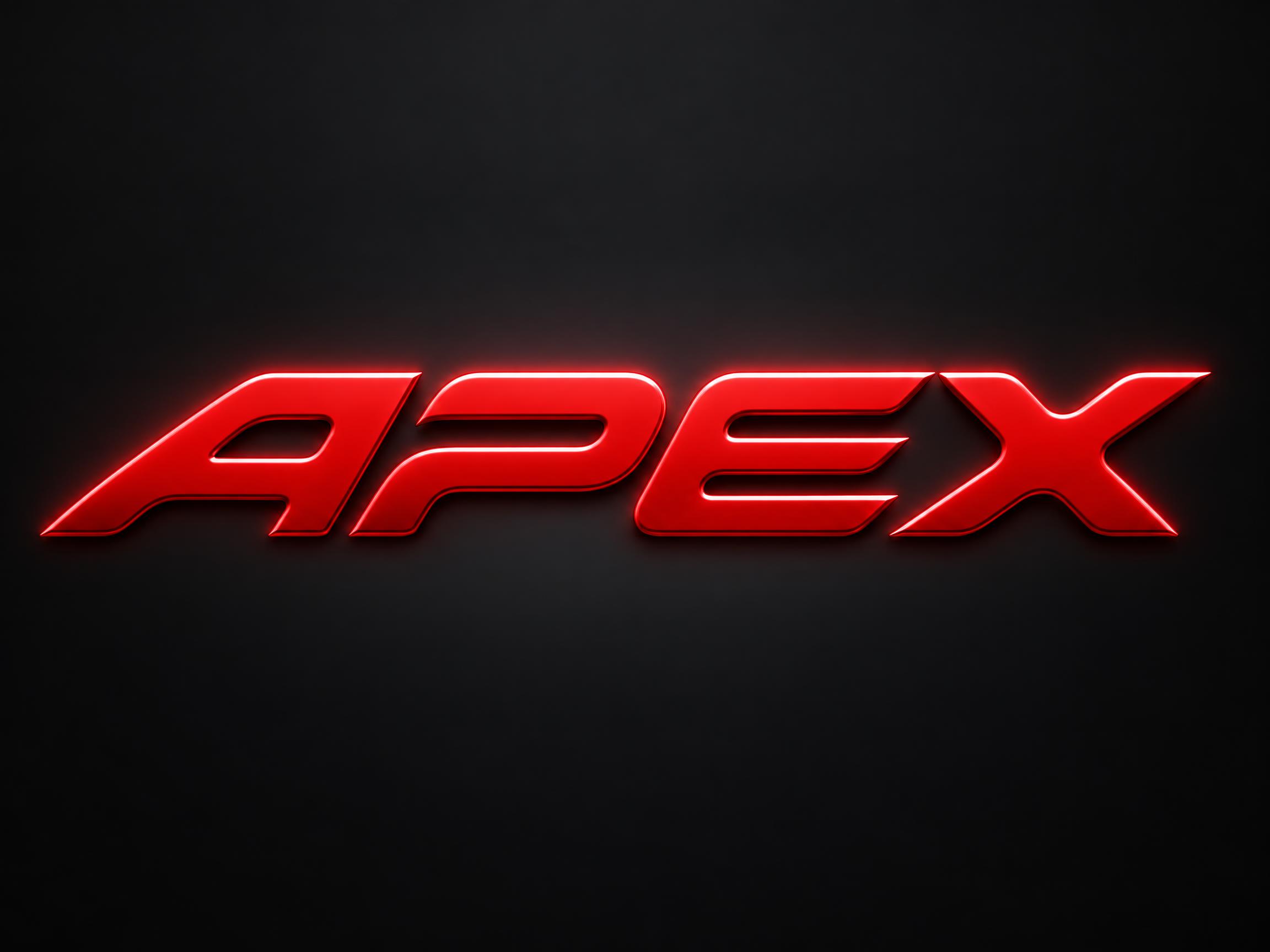
Fonte de IA Racing Slant gerada no GPT Image: a palavra Racing Slant

GPT Image

Fonte de IA Racing Slant gerada no GPT Image: a palavra Racing Slant
GPT Image
Anúncio

Fontes de IA parecidas

Fontes de IA com mais tags em comum com Racing Slant.
Ver todas as fontes de IA→
Imagem de exemplo da fonte de IA Chrome Mirror✦Premium
Chrome Mirror
cromado · metálico · balão
Imagem de exemplo da fonte de IA Esports Gaming
Esports Gaming
plano · contorno · cortes
Imagem de exemplo da fonte de IA Chrome Display✦Premium
Chrome Display
cromado · metálico · holográfico
Imagem de exemplo da fonte de IA Synthwave Chrome✦Premium
Synthwave Chrome
retrô · neon · cromado
Anúncio
Imagem de exemplo da fonte de IA 3D Chrome Bevel✦Premium
3D Chrome Bevel
3d · cromado · metálico
Imagem de exemplo da fonte de IA Authority Gold Hero
Authority Gold Hero
dourado · metálico · luxo

Combina com

Fontes de IA para uma segunda linha, uma composição de logo ou o rodapé de um cartaz.

Imagem de exemplo da fonte de IA 3D Chrome Bevel✦Premium
3D Chrome Bevel
3d · cromado · metálico
Imagem de exemplo da fonte de IA 3D Chrome Shine✦Premium
3D Chrome Shine
3d · cromado · metálico
Imagem de exemplo da fonte de IA Chrome Display✦Premium
Chrome Display
cromado · metálico · holográfico
Imagem de exemplo da fonte de IA Chrome Mirror✦Premium
Chrome Mirror
cromado · metálico · balão
Anúncio

Sobre a fonte de IA Racing Slant

A display typeface where every letter is plainly wider than it is tall, so the word reads long and low like a car seen from the side. Each letter leans, its top well to the right of its foot, and every stroke ends in the same slanted cut, all parallel and long enough to read as a main edge. Inside the letters every corner is turned in one wide curve, while the slanted cuts at the ends stay razor-sharp. The faces are painted sheet metal with a narrow chamfer round each edge.

Tags

Cena
CorridasEncontro de carrosAutomotivo
Formato
PôsterLogotipoBanner do YouTubePintura de veículoMerchandising
Estilo
EsportivoFuturista
Clima
EnérgicoFluido
Efeito
BrilhanteChanfrado
Forma das letras
AfiadoInclinadaEstendida
Cores
Vermelho
Vibe
LimpoGeométrico

Perguntas frequentes

What is the Racing Slant font?

Every letter is plainly wider than it is tall, so the word reads long and low, like a car seen from the side. Each letter leans — its top sits well to the right of its foot — and every stroke ends in the same slanted cut, all of them parallel and long enough to read as one of the letter's own main edges. Inside the letters every corner is turned in one wide curve, while those slanted cuts stay razor-sharp.

Is this the Formula 1 font?

No. Formula 1's typefaces are custom and proprietary, and its logo is a registered trademark — neither is used or reproduced here. Racing Slant is an original design drawn from the general visual language of motorsport lettering: flat proportions, a hard lean, parallel slanted cuts and a painted metal face. It has no connection to, or endorsement from, Formula 1.

How is it different from other sports and racing fonts?

Most fast-looking fonts lean the letters and taper the trailing edges, which reads as athletic rather than automotive. Racing Slant leaves the stroke weight even and puts all the character into the cuts: every stroke ends on the same long diagonal, and those cuts stay sharp even though every corner inside the letter is rounded off. That contrast between sharp ends and soft corners is the signature.

Can I download Racing Slant?

There's no installable font file. You type your text and the generator builds the lettering fitted to your actual wording, then returns a high-resolution image.

Where does this style work best?

Racing team wordmarks, motorsport poster titles, esports racing team logos, YouTube racing channel banners, race event lockups and car meet flyers. Short words work best — the flat wide proportions mean a long word runs off the edge of the frame.

What fonts look similar?

For a tapered athletic italic aimed at sportswear rather than cars, see Sport Italic. For letters machined from plate with hard 45-degree shear faces see Angular Slash Display. For a brushed-metal EV wordmark with letters cut apart see Roadster Style.