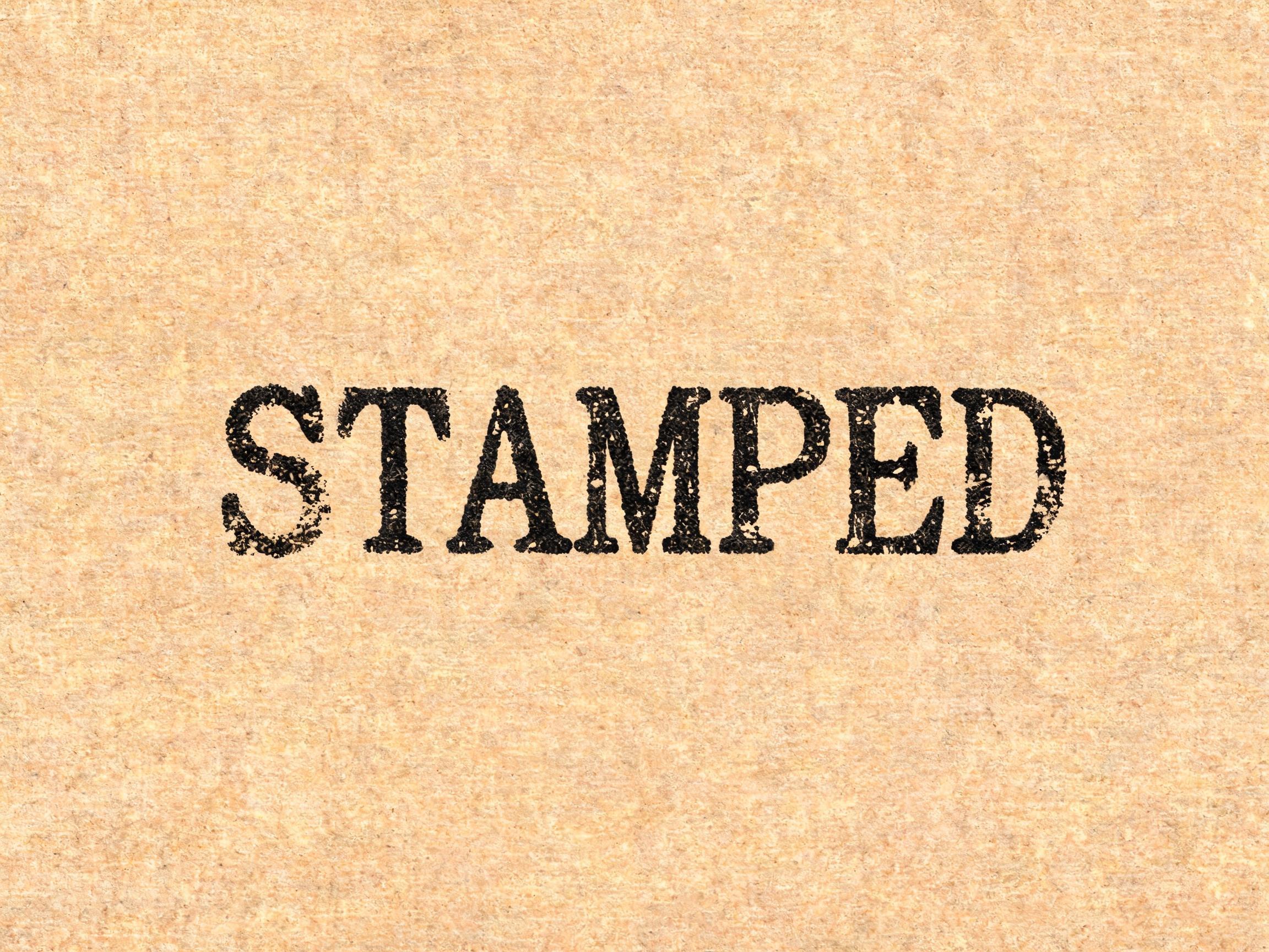
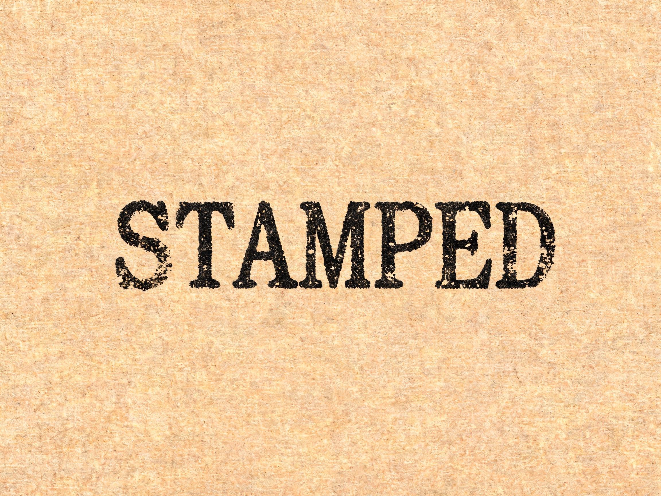
Rubber stamp vintage display font with uneven ink distribution, dry-brush edges, and authentic hand-stamping imperfections.
✦プロンプト
このAIフォントにはまだ日本語版がありません。以下は英語のプロンプトと、それで生成した画像です。
rendered in vintage rubber stamp display letterforms — bold upright serif letters as if stamped with a rubber stamp dipped in thick ink, showing the characteristic imperfections of hand-stamping: uneven ink distribution with heavier density at stroke centers fading to light dry-brush edges where ink ran thin, partial ink voids where stamp surface did not make full contact with paper, and slight impression depth variation suggesting uneven hand pressure. The overall ink application has a matte, slightly granular quality of stamp pad pigment on paper. Letterforms have a condensed, efficient geometry suited to fitting within stamp boundaries — the typographic language of rubber stamp approval marks, vintage notary seals, customs inspection stamps, and 1930s commercial identity — official, worn, authentic, time-stamped.121 語
Rubber stamp vintage display font with uneven ink distribution, dry-brush edges, and authentic hand-stamping imperfections. Classic for brand seals, retro logos, and artisan labels.