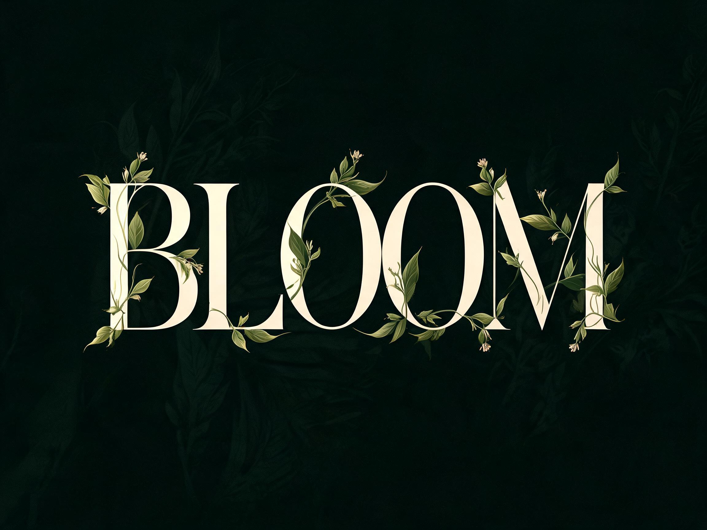
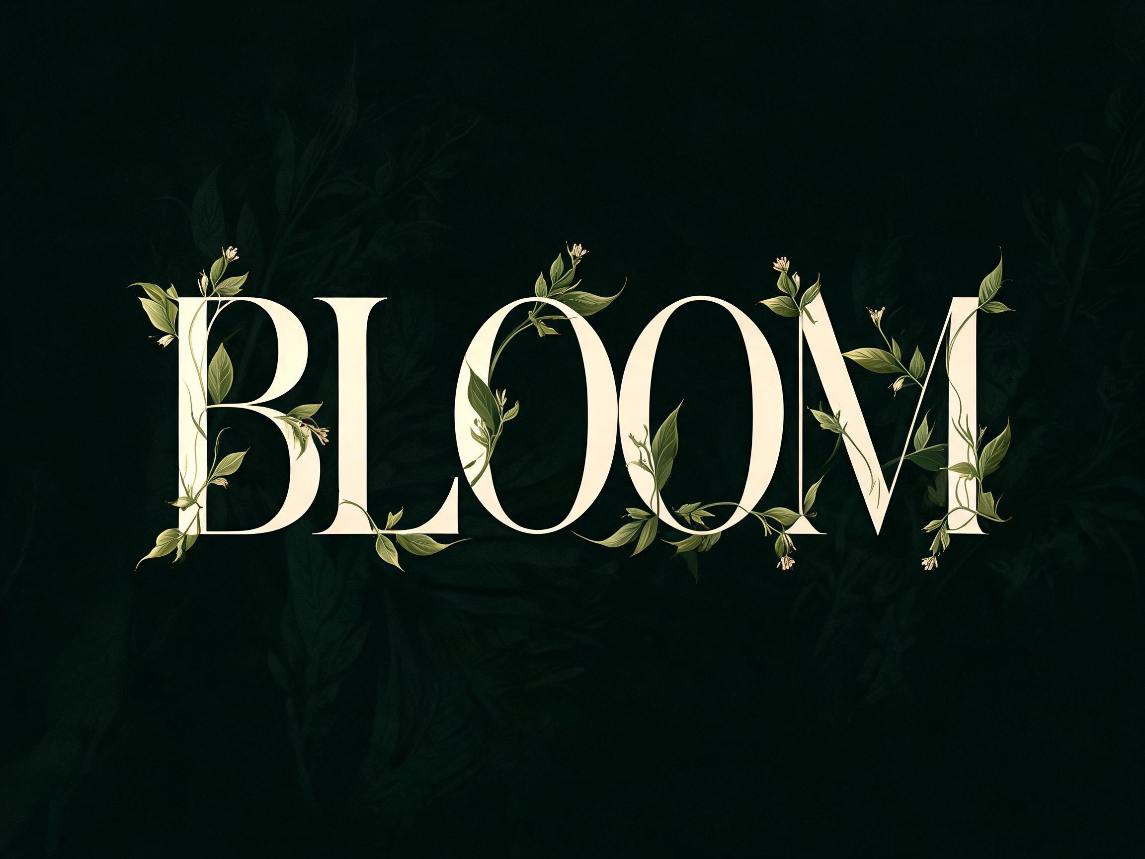
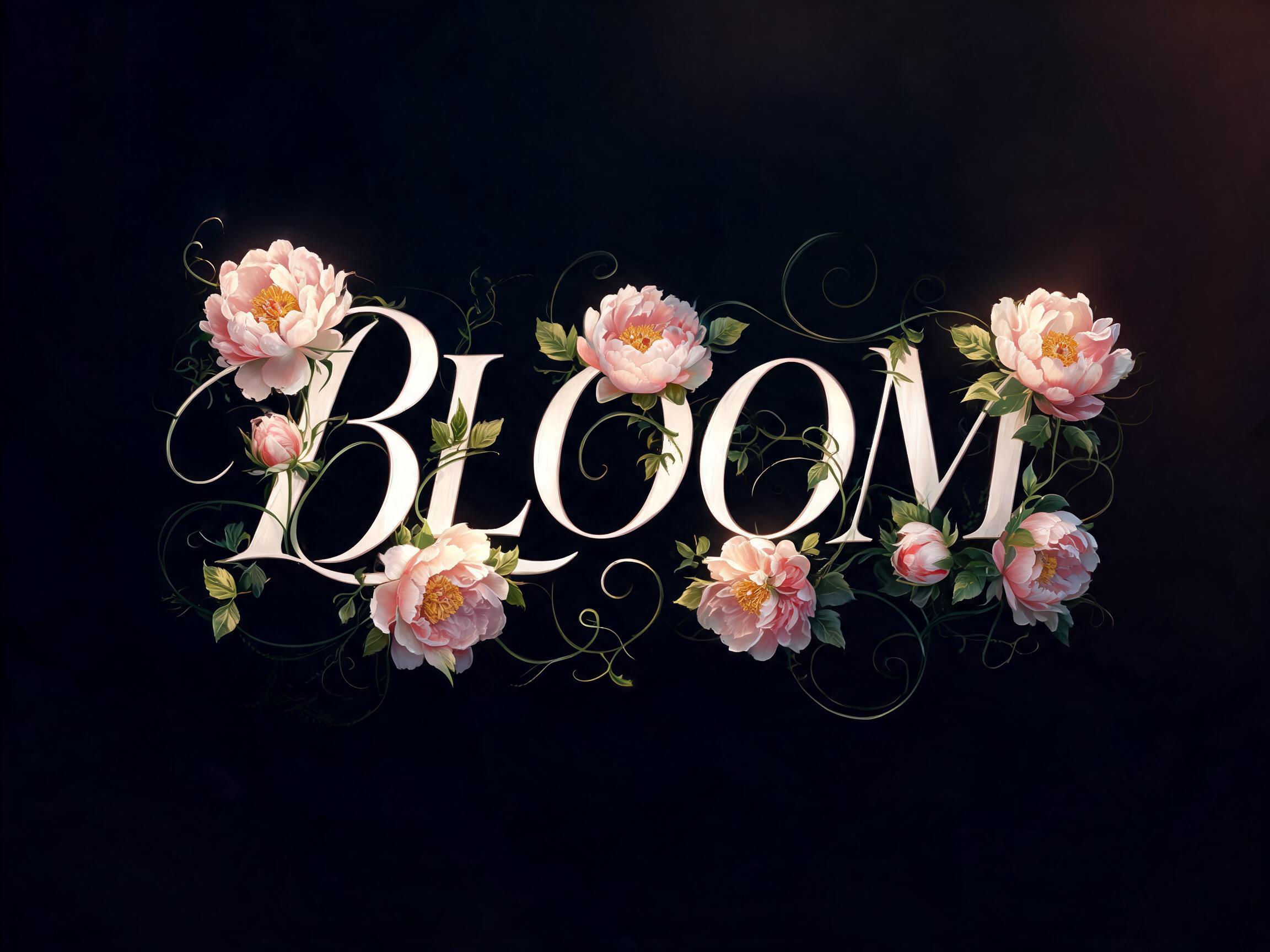
A high-contrast modern serif where every structural terminal hosts botanical detail — serif tips flare into leaf-point forms, finials carry…
✦プロンプト
このAIフォントにはまだ日本語版がありません。以下は英語のプロンプトと、それで生成した画像です。
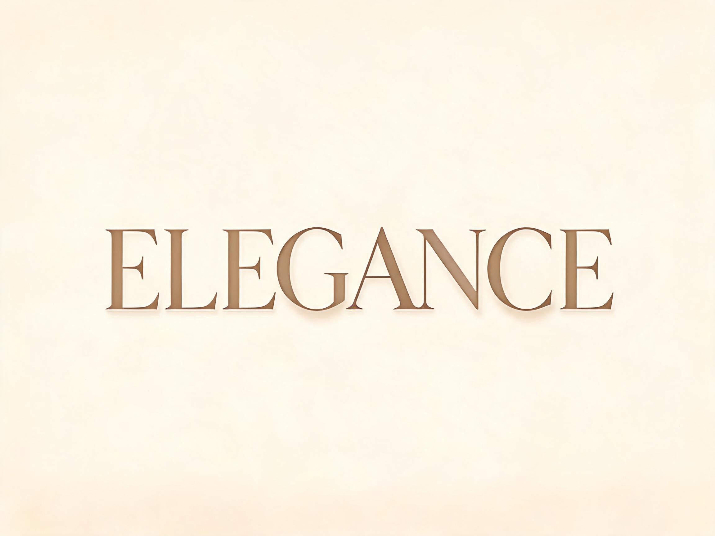
rendered in botanical serif display letterforms where classical high-contrast serif architecture becomes a scaffold for botanical life — hairline-thin horizontal strokes and fine bracket transitions anchor each letterform with typographic precision while the structural terminals host botanical detail: serif tips flare into precise leaf-point forms, finials carry miniature bud growths, and stroke-arm junctions show delicate leaf emergence following natural botanical growth logic. The underlying letterform is strict high-contrast modern serif — thick vertical stems against hairline horizontals, sharp optical axis — maintaining full legibility as the botanical layer enriches rather than obscures. Under directional raking light, thick vertical stems receive full key illumination as luminous planes; botanical details at serif edges catch only razor-thin edge highlights becoming luminous filaments against mid-tone shadows — the chiaroscuro of a Dutch still-life applied to each letterform. The typographic language of 19th-century luxury botanical book titling, William Morris Kelmscott Press decorated initials, Victorian natural history specimen labels, and contemporary premium botanical brand identity — classical, architectural, botanically alive.164 語
A high-contrast modern serif where every structural terminal hosts botanical detail — serif tips flare into leaf-point forms, finials carry bud growths, stroke junctions show leaf emergence. The typographic language of Victorian botanical printing and luxury brand identity.

 プレミアム
 プレミアム