本文へスキップ
AIFont
ホームAIフォントシーン別スタイル別用途雰囲気
AIFont
AIFont
ホームAIフォントシーン別スタイル別用途雰囲気
AIFont

プロンプトひとつで文字をデザインできるAIフォント。コピーして画像生成AIに貼り付け、好きな文字に差し替えるだけ。

プロンプトより画像がほしいなら、FontVibe がそのまま生成します。

さがす

  • すべてのAIフォント
  • スタイル別
  • シーン別
  • 用途
  • 雰囲気

人気のスタイル

  • 高級感
  • レトロ
  • 近未来
  • ヴィンテージ
  • クラシック

人気のシーン

  • ゲーム
  • スポーツ
  • テクノロジー
  • 映画
  • ウェディング
© 2026 AIFont · aifont.ai · Funovate Technology のプロダクトプライバシーポリシー · 利用規約 · 運営者情報 · お問い合わせ
AIFont›AIフォント›Authority Gold Hero
  • 1モデルで実測
  • 無修正の実測画像
  • 無料・商用利用可

Authority Gold Hero

Bold squared modern display lettering cast in rich metallic gold with hard raking highlights and deep amber shadow — a futuristic…

✦プロンプト

このAIフォントにはまだ日本語版がありません。以下は英語のプロンプトと、それで生成した画像です。
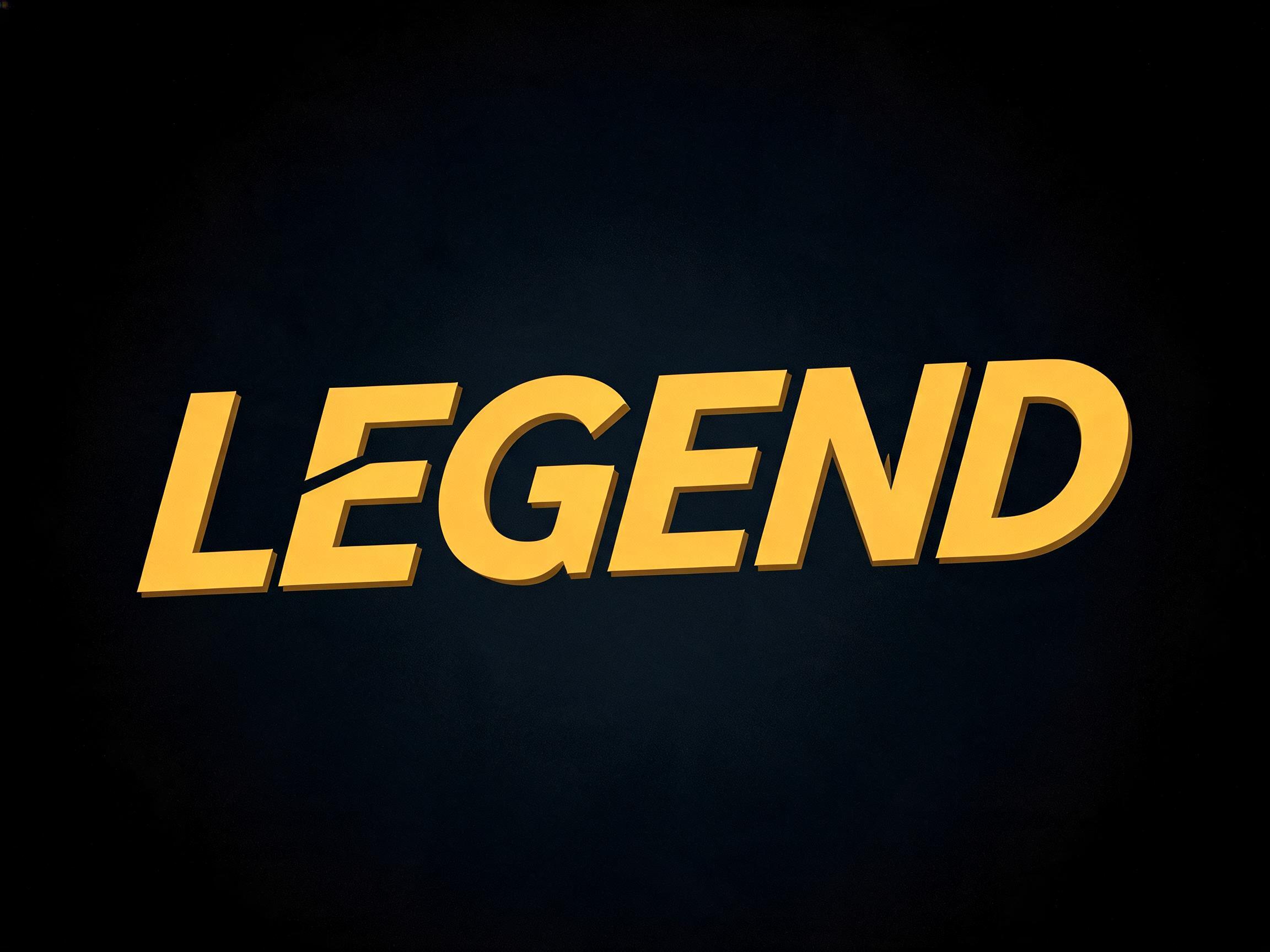
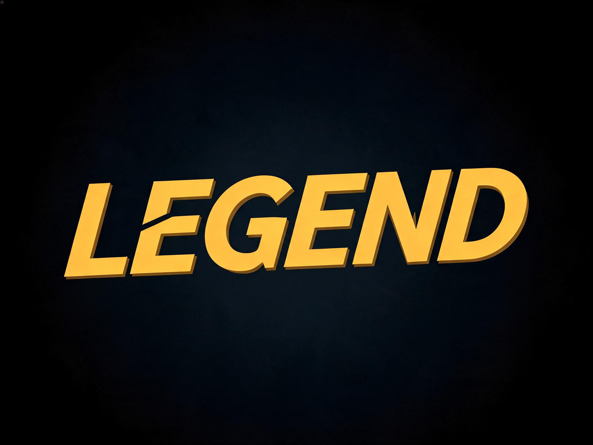
rendered in bold modern SANS-SERIF display letterforms — completely sans-serif with absolutely NO serifs, in the clean rounded humanist style of PingFang / Hiragino Sans: softly rounded corners and terminals, smooth and soft, with UNIFORM even monoline stroke weight and ZERO thick-thin contrast (no stress, no tapering). The whole word is DYNAMIC and moderately condensed, set with a distinct forward ITALIC slant (oblique lean) and a soaring, diving-forward motion — leaning and swooping forward like a hero mid-flight, energetic and in-motion, never static or upright. Colored in bright warm YELLOW-GOLD, exactly hex #F4C214 (RGB 244,194,20) — smooth, bright and even, with a soft sheen and a thin darker-gold lower edge for subtle depth. CRITICAL: absolutely NO serifs, NO thick-thin contrast; rounded soft EVEN-WEIGHT monoline sans (PingFang-like); distinctly ITALIC forward-slanted with soaring in-flight dynamic energy; bright yellow-gold #F4C214. Visual anchors: bold rounded humanist sans-serif gold movie-subtitle, italic soaring in-flight gold hero subtitle, PingFang-style even-weight gold lettering.155 語
FontVibeで生成ChatGPT、Gemini などの画像生成AIに貼り付けて、好きな文字に差し替えてください。
GPT Image で生成した Authority Gold Hero AIフォント:文字「Authority Gold Hero」

GPT Image

GPT Image で生成した Authority Gold Hero AIフォント:文字「Authority Gold Hero」
GPT Image
広告

似ているAIフォント

Authority Gold Hero と共通タグが多いAIフォント。
すべてのAIフォントを見る→
Matte Gold AIフォントの見本画像
Matte Gold
ミニマル · ゴールド · メタリック
Iridescent 3D Chrome AIフォントの見本画像
Iridescent 3D Chrome
3d · クローム · メタリック
3D Gold Luxury AIフォントの見本画像✦プレミアム
3D Gold Luxury
3d · ゴールド · メタリック
Rose Gold Foil AIフォントの見本画像
Rose Gold Foil
ゴールド · 高級感 · グロッシー
広告
3D Chrome Shine AIフォントの見本画像✦プレミアム
3D Chrome Shine
3d · クローム · メタリック
Chrome Mirror AIフォントの見本画像✦プレミアム
Chrome Mirror
クローム · メタリック · バルーン

相性のいい組み合わせ

2行目の文字、ロゴの組み合わせ、ポスターのフッターに使えるAIフォント。

Matte Gold AIフォントの見本画像
Matte Gold
ミニマル · ゴールド · メタリック
Medieval Serif AIフォントの見本画像
Medieval Serif
セリフ · 書道 · グロー
3D Beveled AIフォントの見本画像✦プレミアム
3D Beveled
3d · メタリック · 高級感
3D Stone AIフォントの見本画像
3D Stone
3d · 石 · テクスチャ
広告

Authority Gold Hero AIフォントについて

Bold squared modern display lettering cast in rich metallic gold with hard raking highlights and deep amber shadow — a futuristic, authoritative hero movie-subtitle face.

タグ

作ったもの
タイトルカード
イベント
授賞式
テイスト
高級感近未来モダン
ムード
洗練威厳
エフェクト
ゴールドメタリックグロッシーベベル
字形の特徴
極太スクエアフラットターミナル
フォントの雰囲気
シネマティックラグジュアリーメタリック

よくある質問

What is the Authority Gold Hero font?

Authority Gold Hero is a bold squared modern display cast in rich metallic gold, with hard raking highlights and deep amber shadow — a futuristic, authoritative hero movie-subtitle face. It reads as powerful, premium and cinematic.

Can I download Authority Gold Hero?

There is no installable file. You type your text and the generator renders the gold letters with the raking highlights fitted to your actual shapes, and returns a high-resolution image.

Where does this style work best?

Film and trailer titles, gaming and esports, premium and luxury branding, award and sports graphics, event key art, poster headlines. Set it large and short on a dark ground.

Can I use it for commercial work?

Yes. Generated images may be used commercially, including titles, packaging and video. No licence or attribution is required.

Why do the hard raking highlights make the gold look so rich and metallic?

Because a low, hard, directional light is what reveals metal as metal. A polished gold surface is a mirror for light: hit it with a sharp light from a steep angle and it throws back a brilliant, concentrated highlight along one edge of each letter, while the opposite side drops into deep amber shadow. That extreme jump from a hot bright streak to a dark warm shadow, all across a curved or bevelled surface, is exactly the signature the eye uses to recognise polished metal — a matte surface would shade gently and evenly, but metal snaps between glare and gloom. Keeping the shadow warm and amber rather than grey is what keeps it reading as gold specifically, not silver or chrome. Flat, soft, even lighting is the enemy here: it makes gold look like dull yellow paint, because it erases the sharp specular contrast that says 'metal.' So the drama of the raking light is not just mood; it is the very thing that makes the gold read as rich, solid and expensive.

What fonts look similar?

For a soft matte-gold restraint, see Matte Gold. For flat hot-stamped gold foil, try Gold Foil Flat.