Zum Inhalt springen
AIFont
StartseiteKI-SchriftenAnlässeStileVerwendungStimmung
AIFont
AIFont
StartseiteKI-SchriftenAnlässeStileVerwendungStimmung
AIFont

KI-Schriften, die du per Prompt schreibst. Kopieren, in ein beliebiges Bildmodell einfügen, dein Wort einsetzen.

Lieber gleich das Bild statt des Prompts? FontVibe erstellt es für dich.

Entdecken

  • Alle KI-Schriften
  • Stile
  • Anlässe
  • Verwendung
  • Stimmung

Beliebte Stile

  • Luxuriös
  • Retro
  • Futuristisch
  • Vintage
  • Klassisch

Beliebte Anlässe

  • Gaming
  • Sport
  • Technologie
  • Film
  • Hochzeit
© 2026 AIFont · aifont.ai · Ein Produkt von Funovate TechnologyDatenschutz · Nutzungsbedingungen · Impressum · Kontakt
AIFont›KI-Schriften›Racing Slant
  • In 1 Modell getestet
  • Unbearbeitete Ergebnisse
  • Kostenlos, auch kommerziell

Racing Slant

A display typeface where every letter is plainly wider than it is tall, so the word reads long and low like a car seen from the side.

✦Prompt

Diese KI-Schrift gibt es noch nicht auf Deutsch. Unten siehst du den englischen Prompt und die Bilder, die er erzeugt hat.
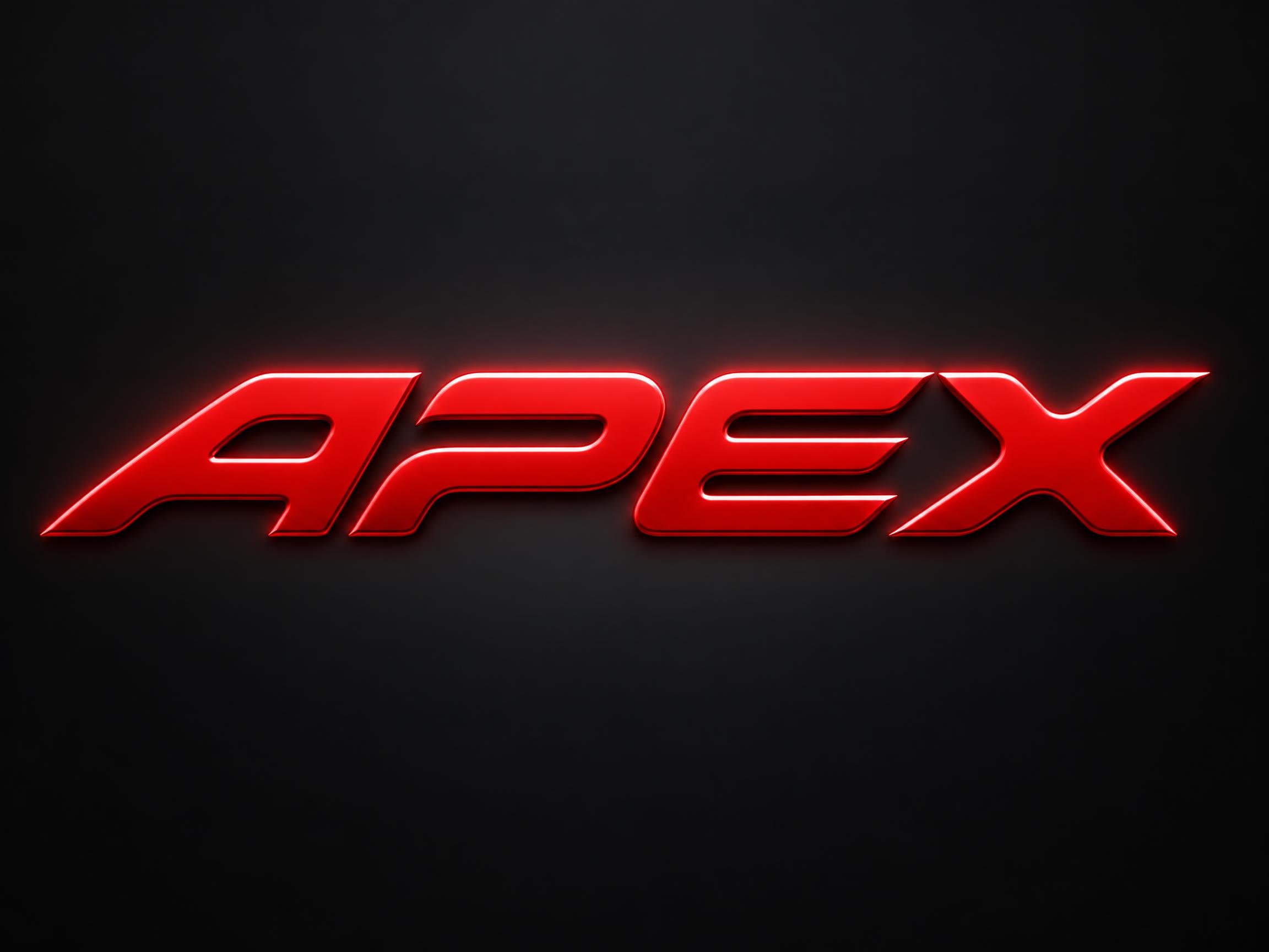
rendered in a display skeleton where each letter is plainly wider than it is tall, so the word reads long and low, like a car seen from the side. Every letter leans, its top sitting well to the right of its foot, and every stroke ends in the same slanted cut, all parallel, each long enough to read as one of the letter's own main edges rather than a small bevel. Every inside corner where two strokes meet is turned in one wide curve with no sharp angle left inside a letter, while the slanted cuts at the stroke ends stay razor-sharp. The letters are formed sheet metal under automotive paint. Each face is one flat plane with a narrow chamfer round its whole edge. Every letter is a closed solid shape, and no gap between letters is shaped into a figure of its own. The chamfer catches a hard line of light along its top edge and goes dark along the bottom, the face holds an even gloss with no reflected detail, and a soft halo sits close around the word. That highlight runs unbroken the full width of the word. Like a race helmet visor strip, a pit board, a sports car's tail badge. Colour follows the scene; with none, one highly saturated face on a much darker surround, the halo the same hue.226 Wörter
Auf FontVibe generierenIn ChatGPT, Gemini oder ein anderes Bildmodell einfügen und dein Wort einsetzen.
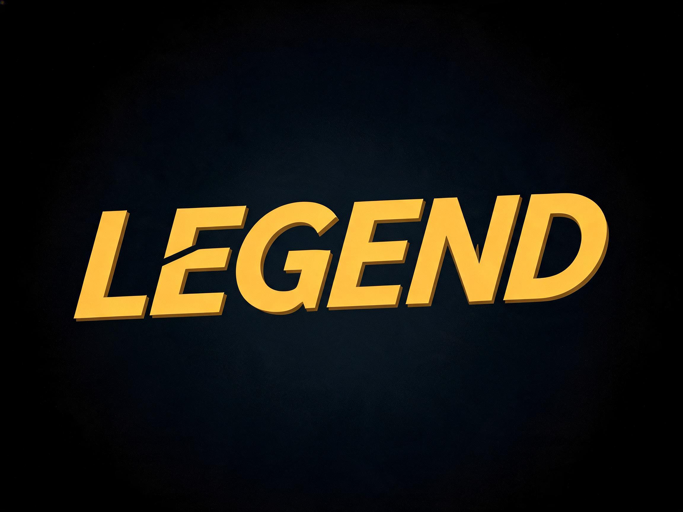
Racing Slant KI-Schrift, erstellt mit GPT Image: das Wort Racing Slant

GPT Image

Racing Slant KI-Schrift, erstellt mit GPT Image: das Wort Racing Slant
GPT Image
Anzeige

Ähnliche KI-Schriften

KI-Schriften mit den meisten gemeinsamen Tags mit Racing Slant.
Alle KI-Schriften ansehen→
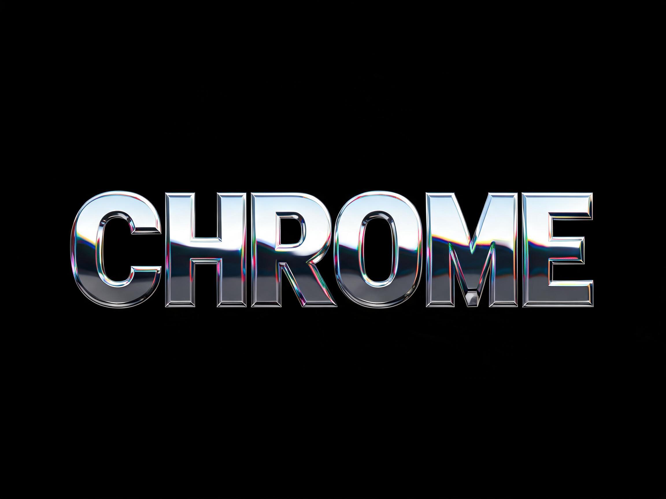
Chrome Mirror KI-Schrift Beispielbild✦Premium
Chrome Mirror
chrom · metallisch · ballon
Esports Gaming KI-Schrift Beispielbild
Esports Gaming
flach · kontur · durchschnitten
Chrome Display KI-Schrift Beispielbild✦Premium
Chrome Display
chrom · metallisch · holografisch
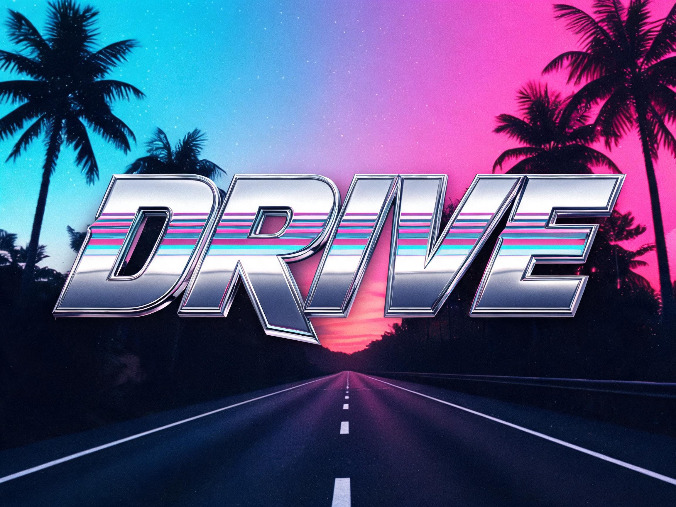
Synthwave Chrome KI-Schrift Beispielbild✦Premium
Synthwave Chrome
retro · neon · chrom
Anzeige
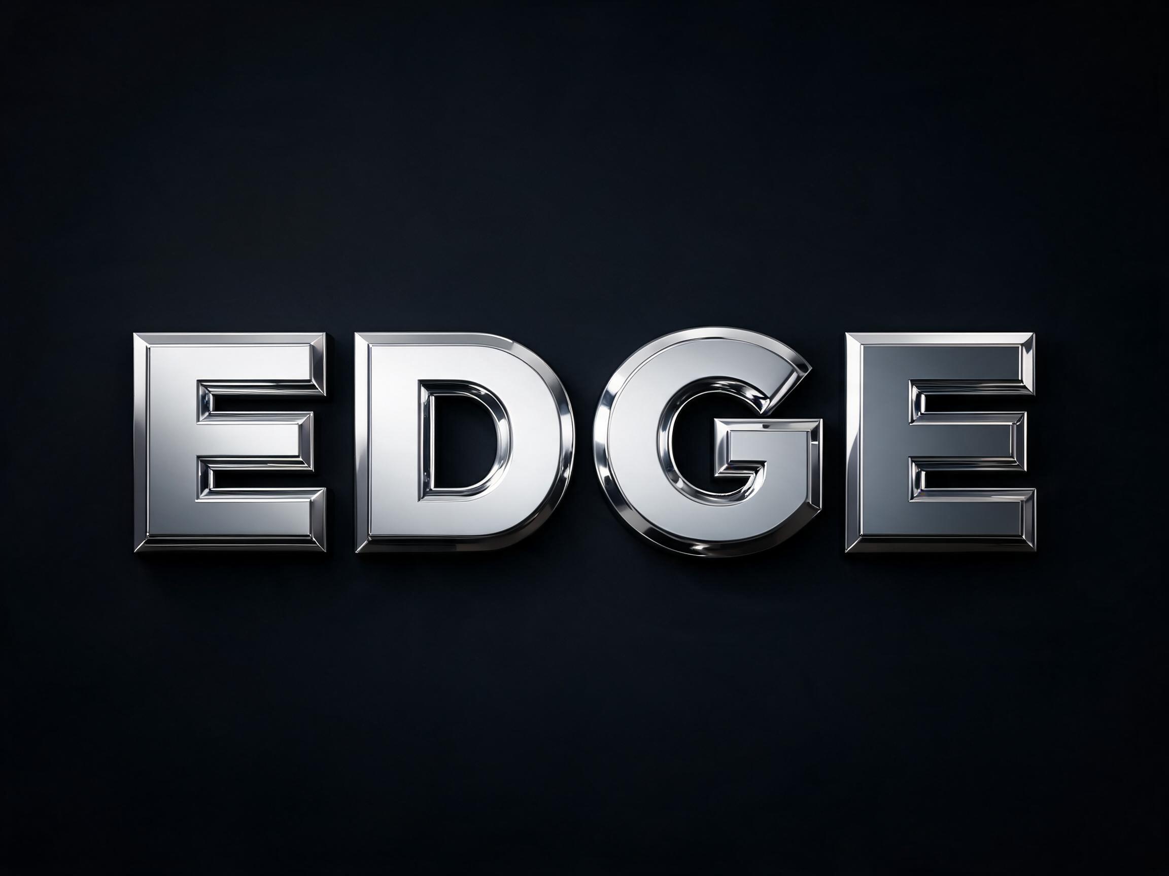
3D Chrome Bevel KI-Schrift Beispielbild✦Premium
3D Chrome Bevel
3d · chrom · metallisch
Authority Gold Hero KI-Schrift Beispielbild
Authority Gold Hero
gold · metallisch · luxuriös

Passt gut zu

KI-Schriften für eine zweite Zeile, eine Logo-Kombination oder die Fußzeile eines Posters.

3D Chrome Bevel KI-Schrift Beispielbild✦Premium
3D Chrome Bevel
3d · chrom · metallisch
3D Chrome Shine KI-Schrift Beispielbild✦Premium
3D Chrome Shine
3d · chrom · metallisch
Chrome Display KI-Schrift Beispielbild✦Premium
Chrome Display
chrom · metallisch · holografisch
Chrome Mirror KI-Schrift Beispielbild✦Premium
Chrome Mirror
chrom · metallisch · ballon
Anzeige

Über die KI-Schrift Racing Slant

A display typeface where every letter is plainly wider than it is tall, so the word reads long and low like a car seen from the side. Each letter leans, its top well to the right of its foot, and every stroke ends in the same slanted cut, all parallel and long enough to read as a main edge. Inside the letters every corner is turned in one wide curve, while the slanted cuts at the ends stay razor-sharp. The faces are painted sheet metal with a narrow chamfer round each edge.

Tags

Szene
MotorsportAutotreffenAutomobil
Gemacht als
PosterLogoYouTube-BannerLackierungMerchandise
Stil
SportlichFuturistisch
Stimmung
EnergiegeladenSchnittig
Effekt
GlänzendAbgeschrägt
Buchstabenform
ScharfkantigKursivBreit
Farben
Rot
Vibe
KlarGeometrisch

Häufige Fragen

What is the Racing Slant font?

Every letter is plainly wider than it is tall, so the word reads long and low, like a car seen from the side. Each letter leans — its top sits well to the right of its foot — and every stroke ends in the same slanted cut, all of them parallel and long enough to read as one of the letter's own main edges. Inside the letters every corner is turned in one wide curve, while those slanted cuts stay razor-sharp.

Is this the Formula 1 font?

No. Formula 1's typefaces are custom and proprietary, and its logo is a registered trademark — neither is used or reproduced here. Racing Slant is an original design drawn from the general visual language of motorsport lettering: flat proportions, a hard lean, parallel slanted cuts and a painted metal face. It has no connection to, or endorsement from, Formula 1.

How is it different from other sports and racing fonts?

Most fast-looking fonts lean the letters and taper the trailing edges, which reads as athletic rather than automotive. Racing Slant leaves the stroke weight even and puts all the character into the cuts: every stroke ends on the same long diagonal, and those cuts stay sharp even though every corner inside the letter is rounded off. That contrast between sharp ends and soft corners is the signature.

Can I download Racing Slant?

There's no installable font file. You type your text and the generator builds the lettering fitted to your actual wording, then returns a high-resolution image.

Where does this style work best?

Racing team wordmarks, motorsport poster titles, esports racing team logos, YouTube racing channel banners, race event lockups and car meet flyers. Short words work best — the flat wide proportions mean a long word runs off the edge of the frame.

What fonts look similar?

For a tapered athletic italic aimed at sportswear rather than cars, see Sport Italic. For letters machined from plate with hard 45-degree shear faces see Angular Slash Display. For a brushed-metal EV wordmark with letters cut apart see Roadster Style.