Zum Inhalt springen
AIFont
StartseiteKI-SchriftenAnlässeStileVerwendungStimmung
AIFont
AIFont
StartseiteKI-SchriftenAnlässeStileVerwendungStimmung
AIFont

KI-Schriften, die du per Prompt schreibst. Kopieren, in ein beliebiges Bildmodell einfügen, dein Wort einsetzen.

Lieber gleich das Bild statt des Prompts? FontVibe erstellt es für dich.

Entdecken

  • Alle KI-Schriften
  • Stile
  • Anlässe
  • Verwendung
  • Stimmung

Beliebte Stile

  • Luxuriös
  • Retro
  • Vintage
  • Futuristisch
  • Klassisch

Beliebte Anlässe

  • Gaming
  • Sport
  • Film
  • Technologie
  • Hochzeit
© 2026 AIFont · aifont.ai · Ein Produkt von Funovate TechnologyDatenschutz · Nutzungsbedingungen · Impressum · Kontakt
AIFont›KI-Schriften›Agency Extended Black
  • In 1 Modell getestet
  • Unbearbeitete Ergebnisse
  • Kostenlos, auch kommerziell

Agency Extended Black

An ultra-heavy extended display typeface with maximum horizontal expansion, pure monotone stroke construction, and architecturally squared…

✦Prompt

Diese KI-Schrift gibt es noch nicht auf Deutsch. Unten siehst du den englischen Prompt und die Bilder, die er erzeugt hat.
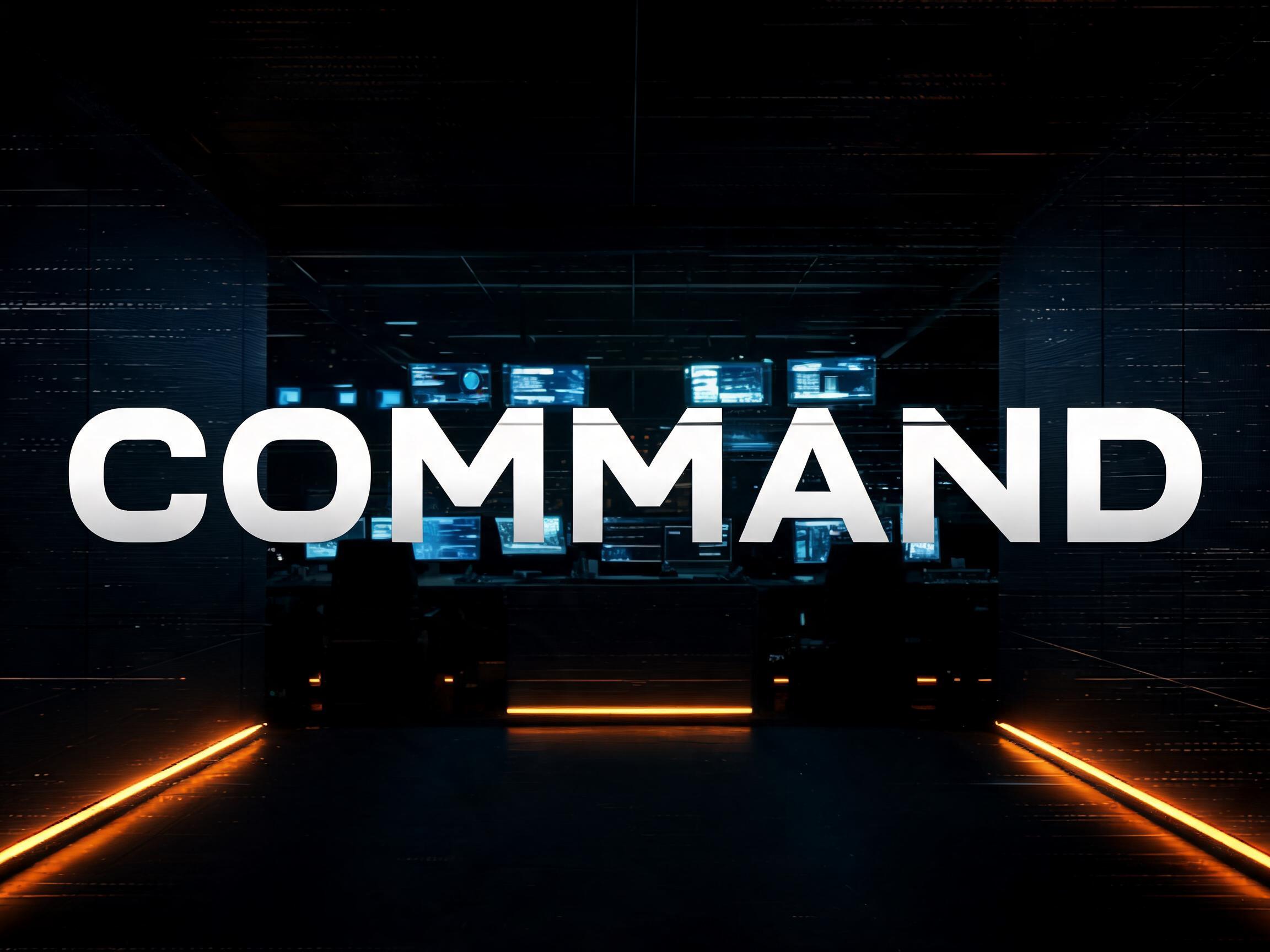
rendered in ultra-heavy extended display sans-serif letterforms with extreme horizontal expansion — letter width significantly exceeds height at a ratio of approximately 1.3 to 1, producing the dominant wide-set blocky silhouette of American blockbuster and military title typography. Stroke weight is maximum black throughout with strict uniform monotone construction — zero thick-thin contrast, pure geometric mass at every point. Letter forms are architecturally squared with sharply truncated flat terminals that function as structural load-bearing terminations rather than decorative details. Apertures are tightly compressed; counter spaces are reduced to precise minimum geometric voids. Cap height is moderate with a high x-height ratio, reinforcing the horizontal dominance of the letterforms. The silhouette of every word becomes a solid architectural form occupying the full horizontal span of the composition — a typographic wall. The typographic language of superhero franchise title cards, military force branding, blockbuster key art, stadium jumbotron graphics, and any context where a single word must register as an overwhelming physical force.161 Wörter
Auf FontVibe generierenIn ChatGPT, Gemini oder ein anderes Bildmodell einfügen und dein Wort einsetzen.
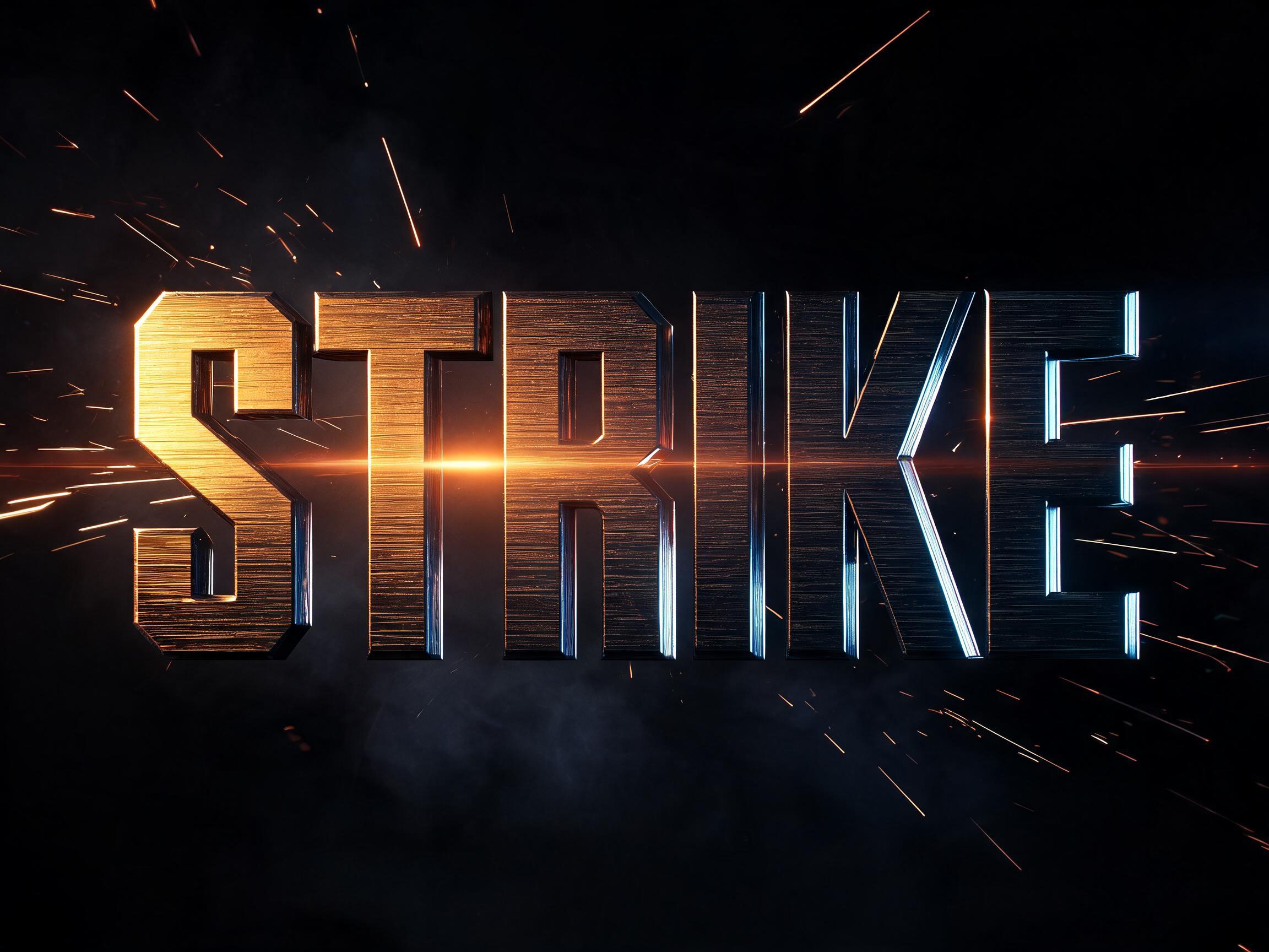
Agency Extended Black KI-Schrift, erstellt mit GPT Image: das Wort Agency Extended Black

GPT Image

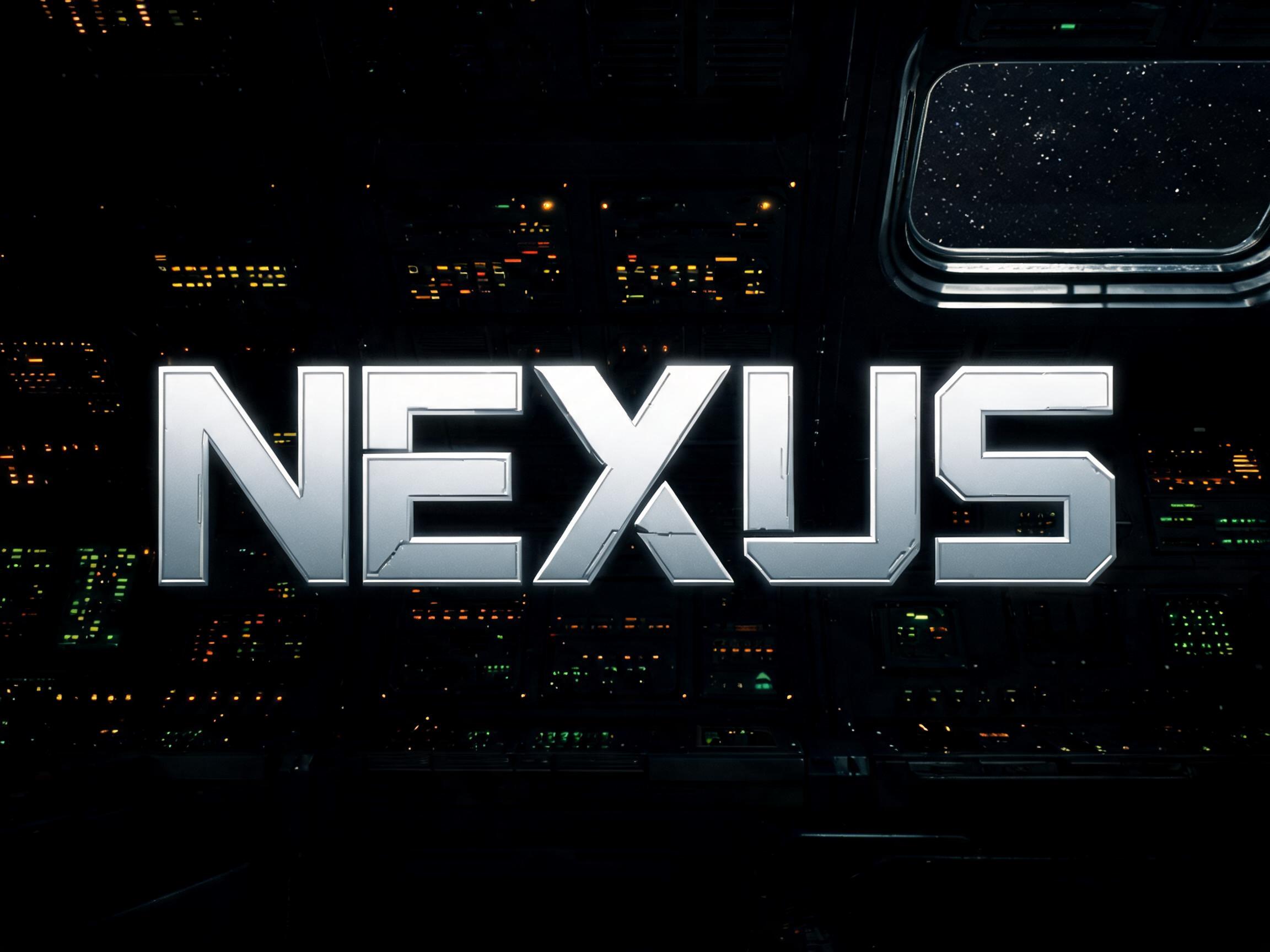
Agency Extended Black KI-Schrift, erstellt mit GPT Image: das Wort Agency Extended Black
GPT Image
Anzeige

Ähnliche KI-Schriften

KI-Schriften mit den meisten gemeinsamen Tags mit Agency Extended Black.
Alle KI-Schriften ansehen→
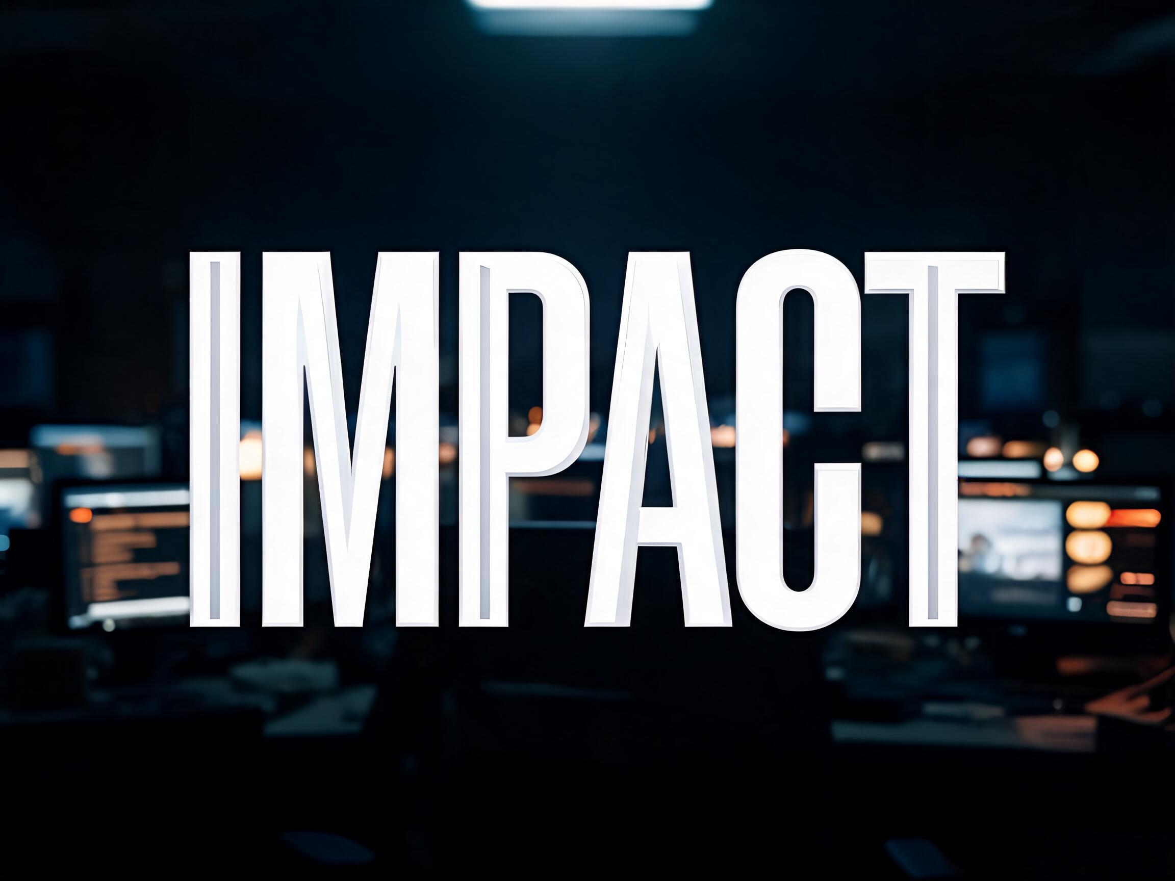
Condensed Impact KI-Schrift Beispielbild✦Premium
Condensed Impact
Brushed Steel KI-Schrift Beispielbild✦Premium
Brushed Steel
gebürstetes metall · kantenlicht · filmisch
Eurostile Extended KI-Schrift Beispielbild
Eurostile Extended
futuristisch · industriell · science-fiction
Comic Masthead Hero KI-Schrift Beispielbild✦Premium
Comic Masthead Hero
kontur · abgeschrägt · geteilte füllung
Anzeige
Slab Impact Heavy KI-Schrift Beispielbild
Slab Impact Heavy
serifenschrift · slab serif · viktorianisch
Cinematic Modern KI-Schrift Beispielbild
Cinematic Modern
serifenlos · luxuriös · filmisch

Passt gut zu

KI-Schriften für eine zweite Zeile, eine Logo-Kombination oder die Fußzeile eines Posters.

Brushed Steel KI-Schrift Beispielbild✦Premium
Brushed Steel
gebürstetes metall · kantenlicht · filmisch
Chrome Battle Worn KI-Schrift Beispielbild✦Premium
Chrome Battle Worn
chrom · metallisch · used-look
Cinematic Rush Script KI-Schrift Beispielbild✦Premium
Cinematic Rush Script
schreibschrift · pinselschrift
Condensed Impact KI-Schrift Beispielbild✦Premium
Condensed Impact
Anzeige

Über die KI-Schrift Agency Extended Black

An ultra-heavy extended display typeface with maximum horizontal expansion, pure monotone stroke construction, and architecturally squared terminals. The typographic language of superhero franchise titles, military campaign branding, and blockbuster key art — a single word becomes a physical wall of presence.

Tags

Szene
GamingSportFilmMilitär
Gemacht als
PosterTitelkarteKey ArtPlakatwand
Gelegenheit
Turnier
Stil
Filmisch
Stimmung
EnergiegeladenKraftvollIntensivAutoritativ
Buchstabenform
FettBreitQuadratisch
Farben
Monochrom
Thema
Superhelden
Vibe
FilmischMetallischSchablone

Häufige Fragen

What is the Agency Extended Black font?

Agency Extended Black is an ultra-heavy extended display face: maximum horizontal expansion, pure monotone strokes and architecturally squared terminals. It is the language of superhero-franchise titles, military-campaign branding and blockbuster key art — a single word becomes a physical wall of presence.

Can I download Agency Extended Black?

There is no installable file. You type your text and the generator sets the wide, heavy letters fitted to your actual shapes, and returns a high-resolution image.

Where does this style work best?

Film and franchise titles, gaming and esports, sports and military-style branding, event and campaign key art, poster headlines, bold identities. Use it big and short — it wants to dominate.

Can I use it for commercial work?

Yes. Generated images may be used commercially, including titles, packaging and video. No licence or attribution is required.

Why does an extended, extra-wide heavy face read as so powerful?

Because breadth and weight together signal stability, mass and importance, the same way they do in architecture and in a human stance. A very wide, very heavy letter takes up a lot of horizontal space and sits on a broad, low, grounded base — like a wide-stanced figure braced and immovable, or the broad facade of a monumental building. We instinctively read a wide, weighty form as more stable and imposing than a narrow one: it looks harder to push over, more substantial, more permanent. A normal-width bold letter is strong; stretch it out to maximum extension while keeping the heavy weight and it stops reading as a word and starts reading as a solid barrier — a wall of type. That is why franchise and military branding reach for extended blacks for a hero title: the proportions themselves communicate force and permanence before you have read a single letter, turning one short word into a monument.

What fonts look similar?

For a squared machine-console extended face, see Eurostile Extended Bold. For a heavy geometric display at normal width, try Bold Geo Sans.