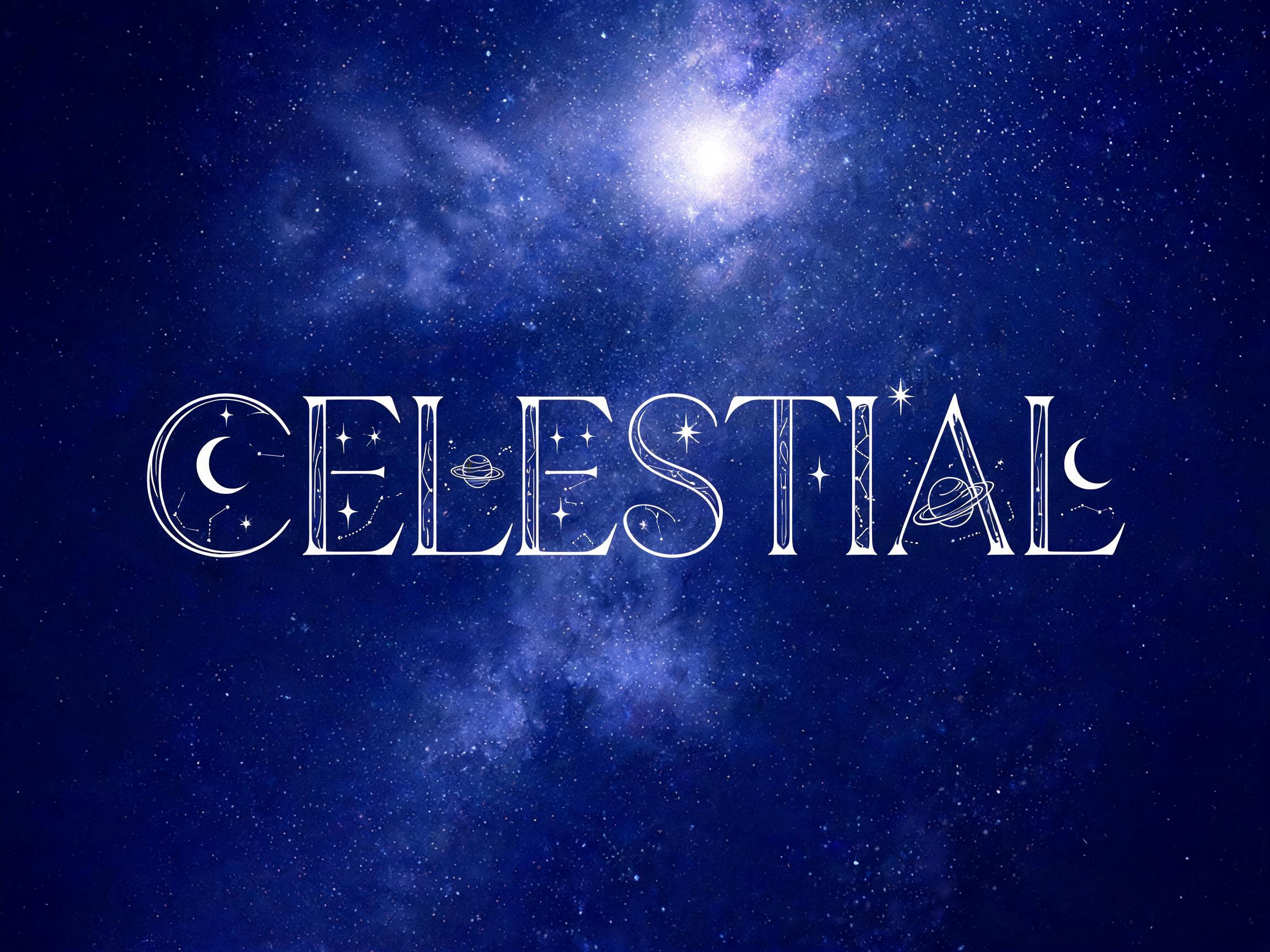
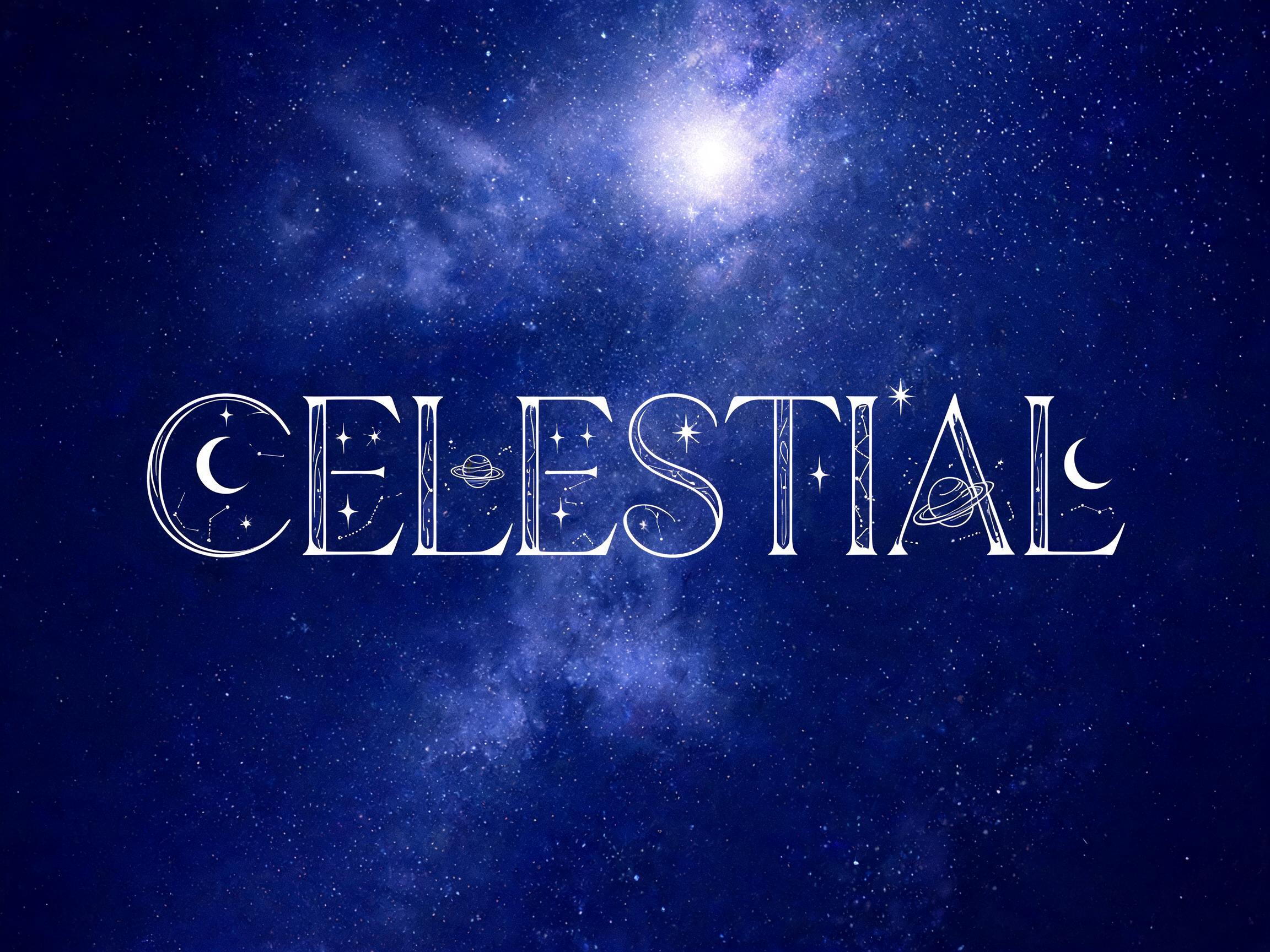
Serif display typeface where each letter contains celestial symbols — crescent moons, ringed planets, four-pointed stars, constellation…
لا تتوفر لهذا الخط نسخة بلغة العربية بعد. أدناه البرومبت الإنجليزي والصور التي أنتجها.
يظهر الثلث الأول فقط. شاهد إعلانًا قصيرًا لفتح البرومبت كاملًا، ويبقى مفتوحًا على هذا الجهاز.
خطوط تشترك مع Celestial Symbol Serif في أكبر عدد من الوسوم.
 مميّز
خطوط لسطر ثانٍ، أو لشعار مركّب، أو لتذييل ملصق.
Serif display typeface where each letter contains celestial symbols — crescent moons, ringed planets, four-pointed stars, constellation lines — embedded within the letter bowls and counters as fine-line decorative inlays. Black-on-white illustration style, boho elegant feel.
Celestial Symbol Serif is a serif display with celestial symbols inlaid inside the letters — crescent moons, ringed planets, four-pointed stars and constellation lines set as fine-line decoration within the bowls and counters. Drawn black-on-white in an illustration style, it reads as boho, elegant and mystic.
There is no installable file. You type your text and the generator places the celestial inlays inside your actual letters, and returns a high-resolution image.
Astrology and spiritual brands, boho and wellness identity, tarot and mystic packaging, event and wedding titles, book covers, jewellery and candle labels. Set it large so the fine celestial detail stays visible.
Yes. Generated images may be used commercially, including packaging, covers and print. No licence or attribution is required.
Because the enclosed space inside a letter — the counter, the bowl of a b or o — is empty real estate that already has a clean, defined boundary, so decoration placed there costs nothing structurally. Setting the moons and stars beside the letters would widen the word, crowd the spacing and compete with the text for attention; tucking them inside the counters leaves the outer silhouette of each letter untouched, so the word still reads as ordinary text at a glance. The celestial detail only reveals itself on a closer look. That gives the design a two-tier read — legible headline first, hidden imagery second — which is exactly the effect a mystic or boho brand wants: something that works as a name across the room and rewards the eye that leans in. Using the counter as ornament space is how you decorate heavily without sacrificing legibility.
For an ornate Victorian serif with a similar enchanted mood, see Enchanted Victorian Serif. For celestial and rune symbols in a Nordic register, try Nordic Rune Symbol.